Crude, the Loonie and Oil Services Index for 2014
Posted on December 29, 2013 Leave a Comment
the chart below shows the Oil Services Index $OSX (candles) w/ USDCAD (inverted/line) overlaid on top …
some observations:
- when the blue line (Loonie) is going down it is weak. when the blue line (Loonie) is going up it’s strong …
- at most inflection points, the $OSX and Loonie are synchronized nicely. however, for most of 2013 this relationship has diverged. in that, while one was going UP (Oil Services Index) one was going down (Loonie weak)
- the Loonie topped a good 6 months prior to the $OSX in 2007-2008. However, once they synced they got smashed …
- the 2009 bottom was well synchronized and since then they have move very nicely together.
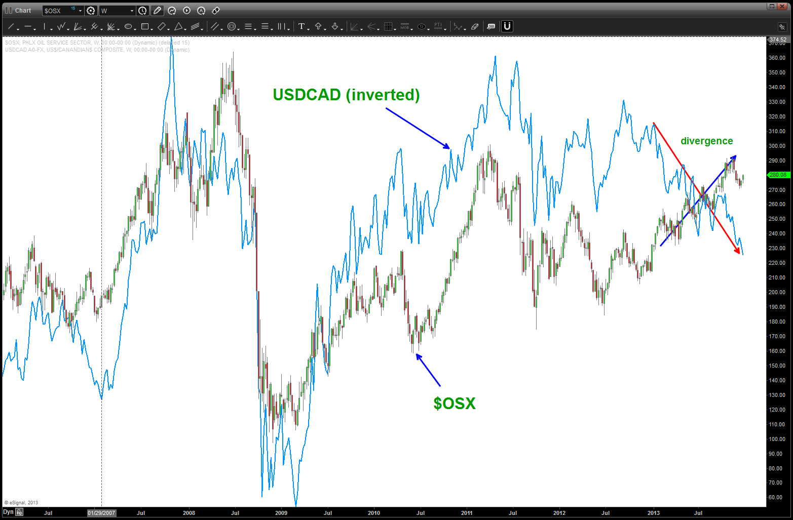
$OSX and USDCAD
below, we have added (black line) Crude Oil to the chart and, as expected, it is very synchronized w/ $OSX EXCEPT since September 2013. Note, the $OSX has held up, nicely. What is this $OSX?
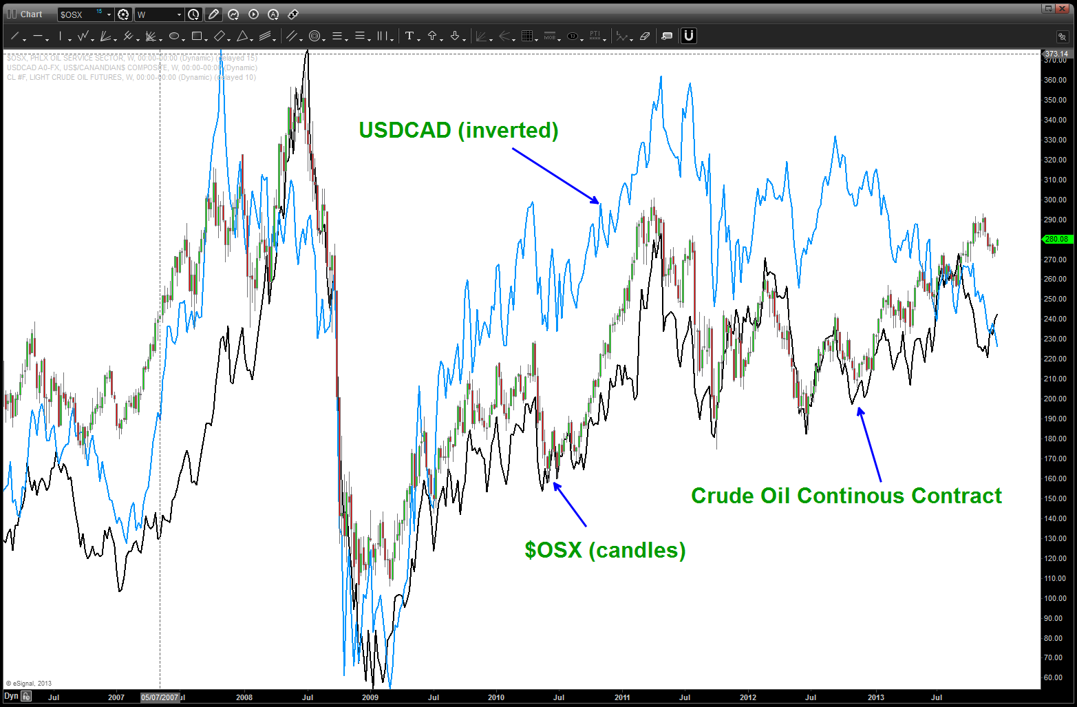
Oil Services, Loonie and Crude
The OSX tracks 15 large companies w/in the context of the Oil Services world …Changes in the Philadelphia Oil Service Sector Index tend to be associated with changes in the oil and gas markets, since greater exploration and construction of wells occurs when oil prices are high and less such activity is carried on when prices are lower. They were all affected by the Gulf of Mexico Oil spill …
so first let’s go thru the 15 components and look for big picture patterns – BUY or SELL.
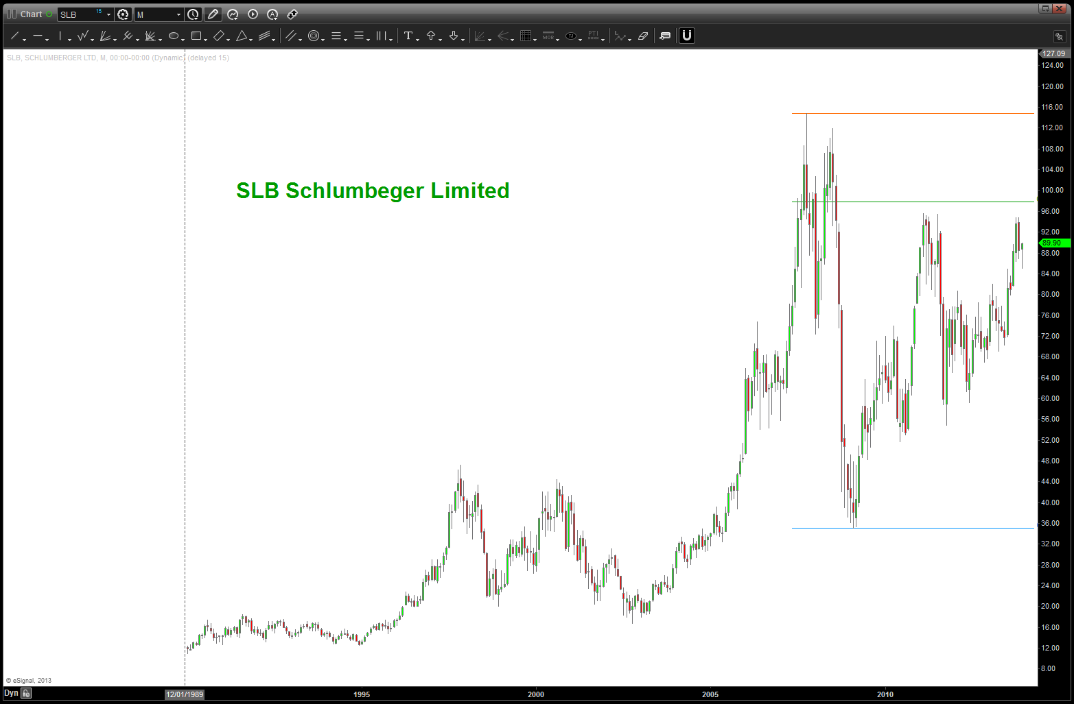
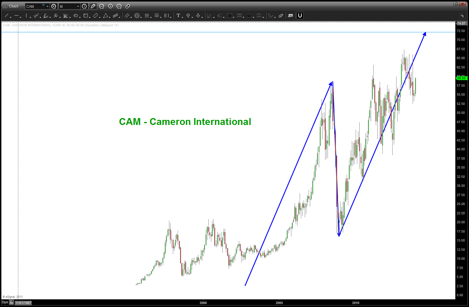
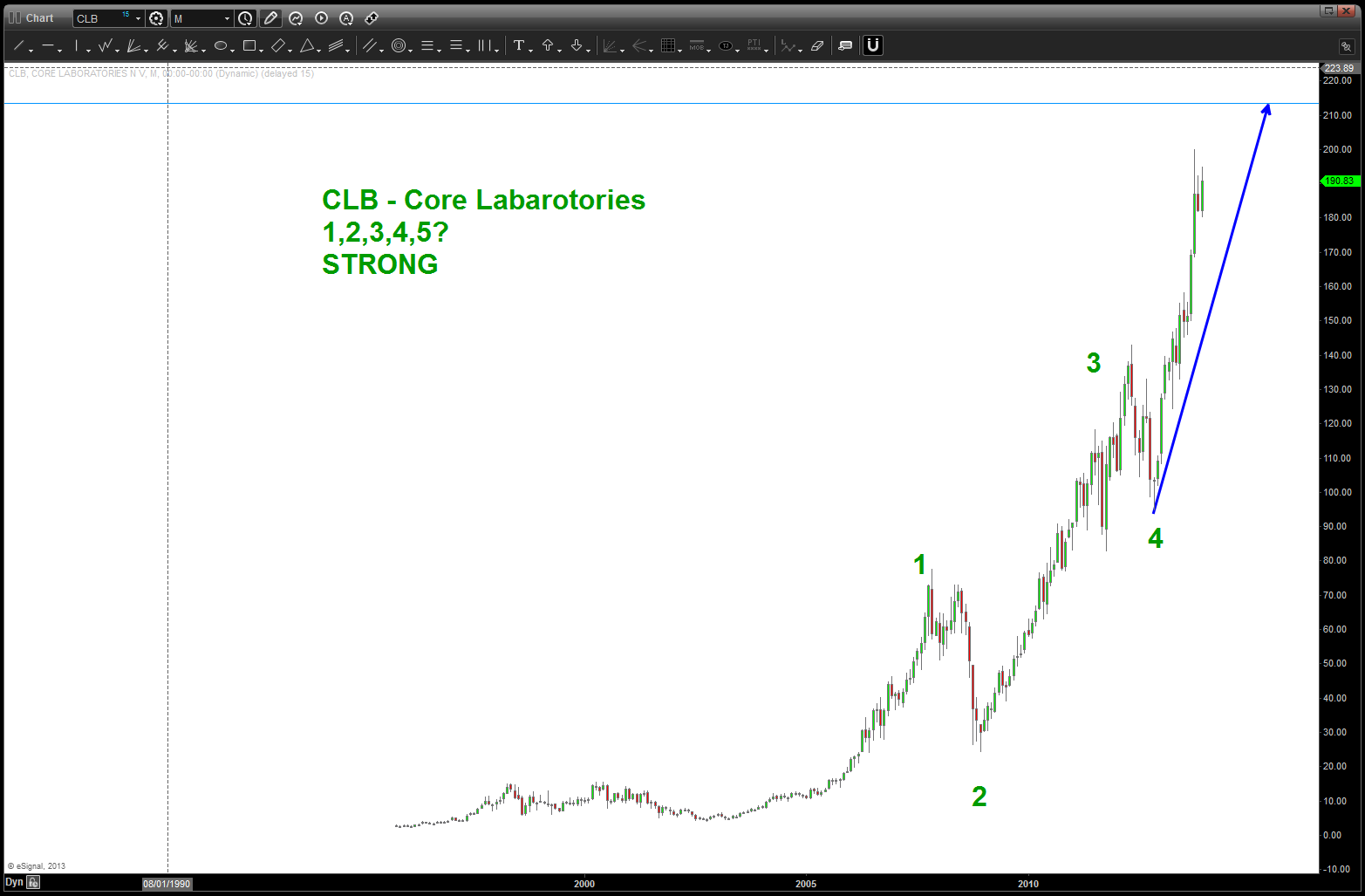
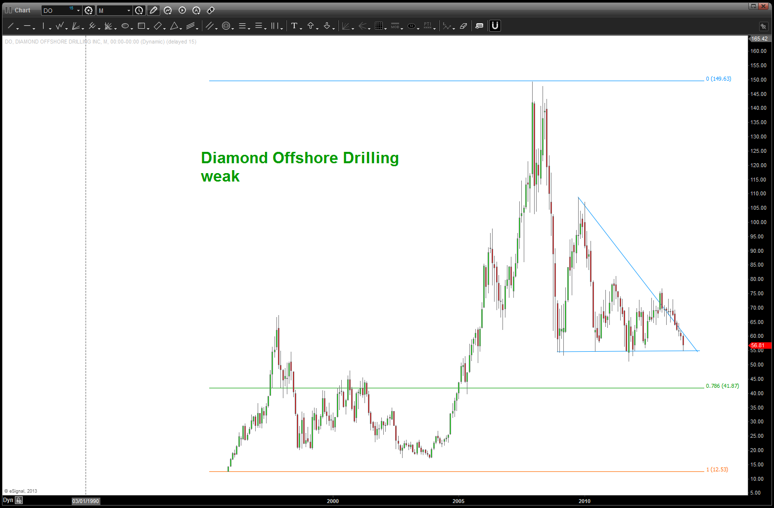
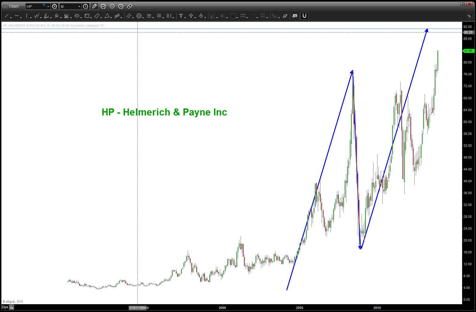
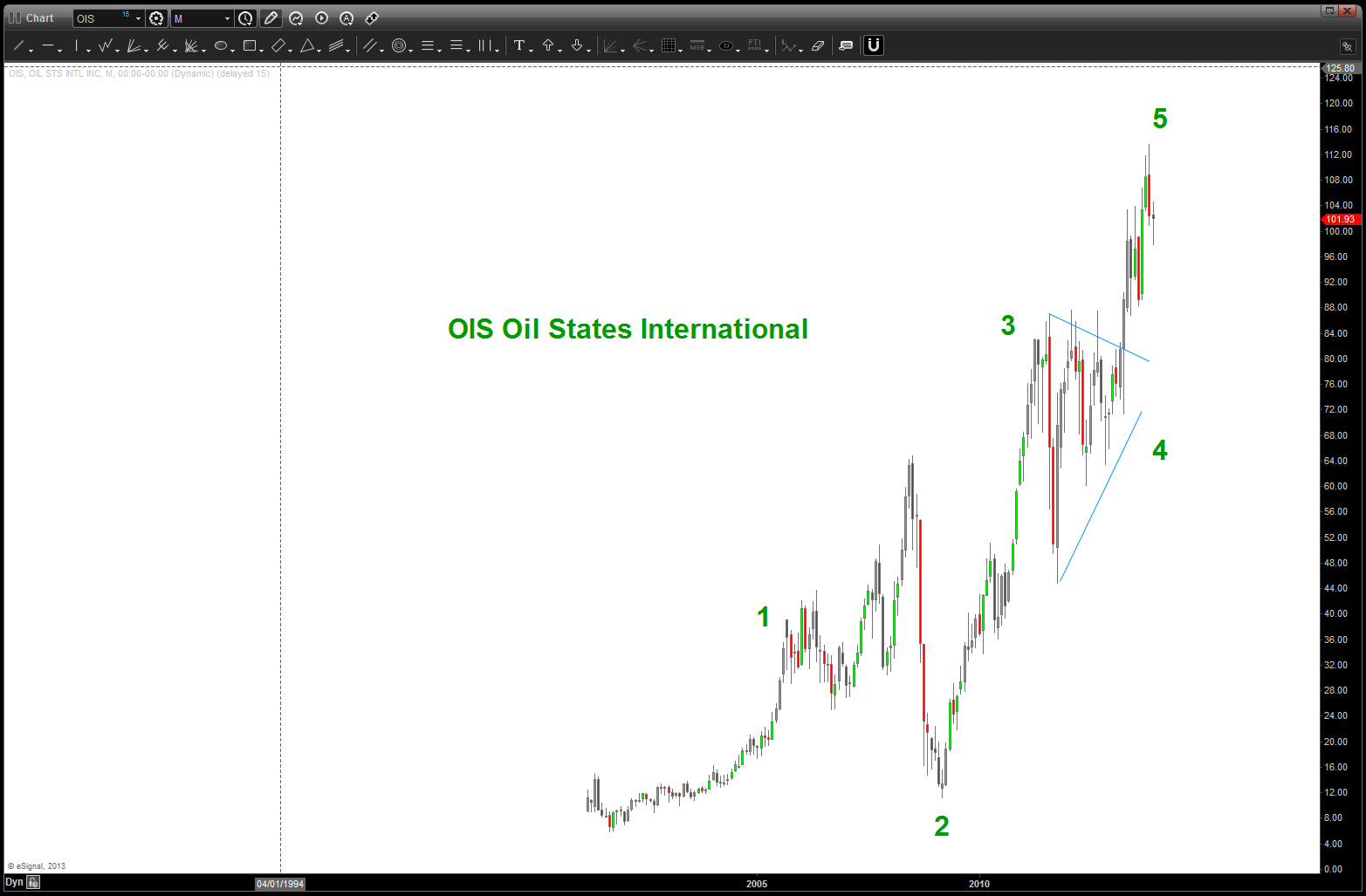
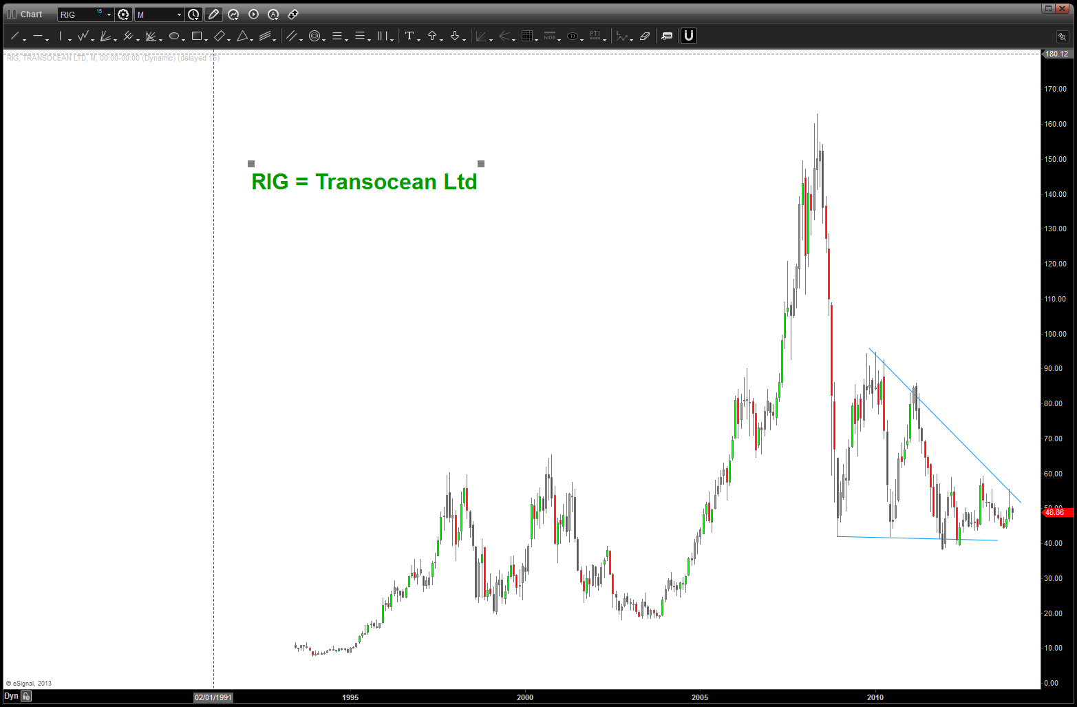
so, as we can see, there are some nice SELL patterns coming in, there are a couple weak ones and where I didn’t post any charts there wasn’t a glaring pattern to be seen. Bottom line – I’m not seeing significant strength in the index but to elevate some of the stocks to hit their targets perhaps we’ll see some more strength. so, now we need to break down each individual component …
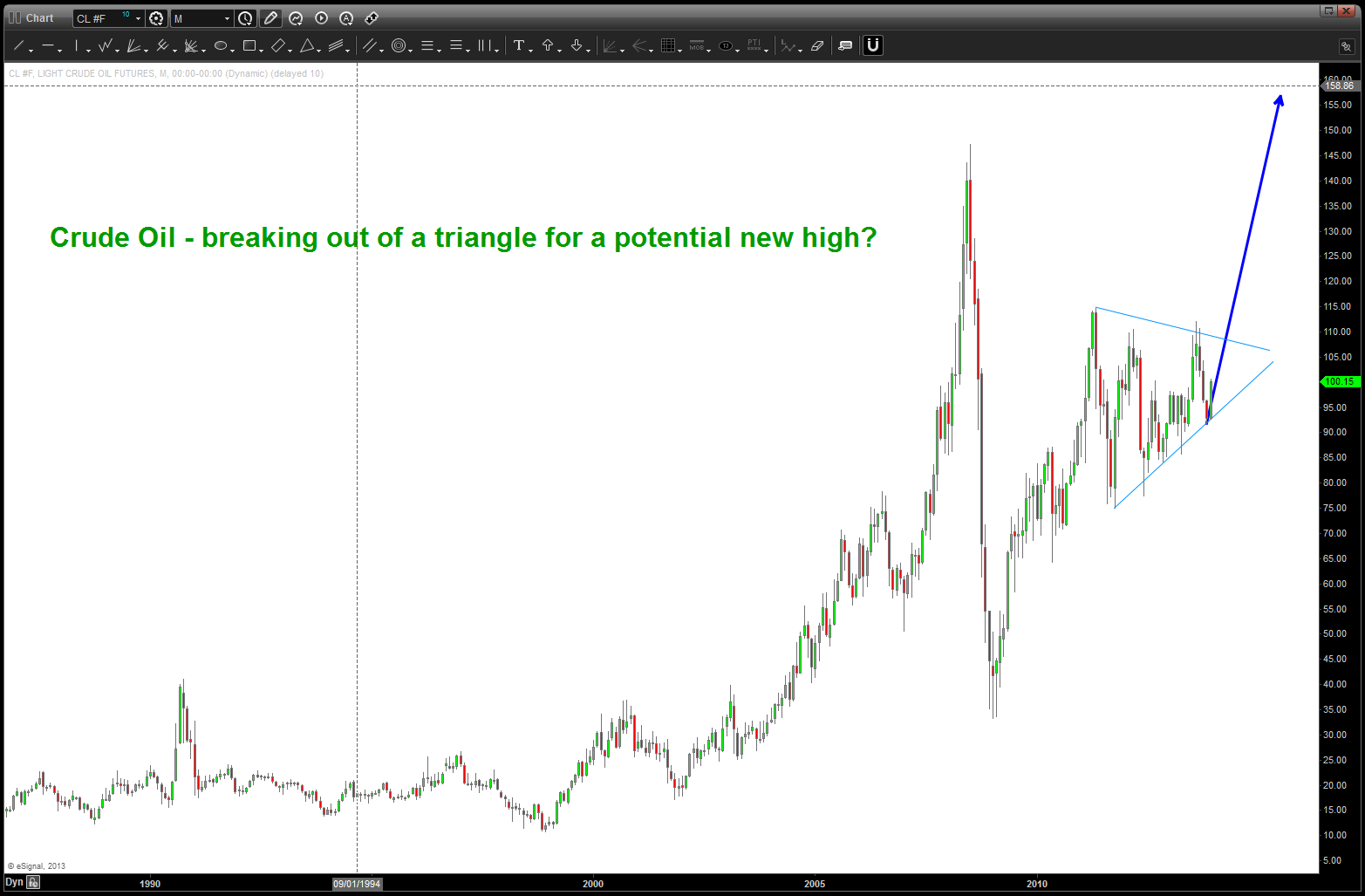
Crude Oil: https://bartscharts.com/2013/10/31/crude-oil-a-potential-roadmap/ this was my last post. I am still in the “look and feel” phase that the top at 147 was a 3 and the low in/around 35 was a 4. while the pattern completing at 110 was good, the thrust off this bottom trend line last week led me to see a triangle where we can see a,b,c,d,e – triangle complete and off to a new high ? CRUDE BULLISH
Crude Oil
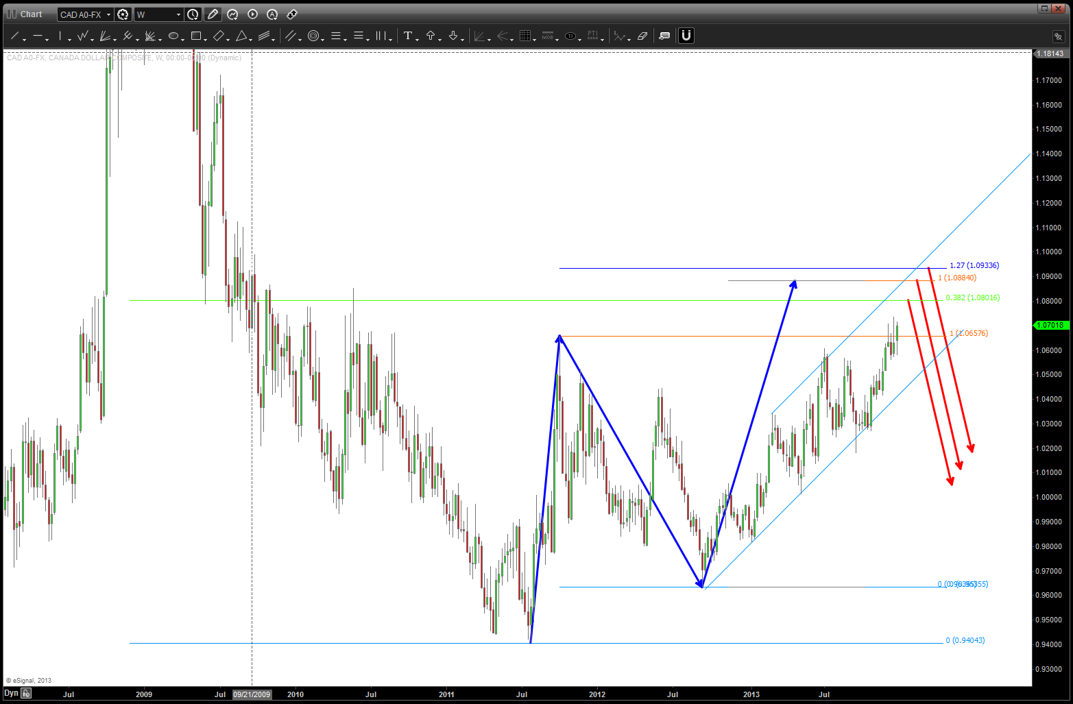
USD vs CAD: just a little bit higher (200 pips) we have some pretty major targets. while I am a DOLLAR BULL, also recognize that the Loonie is a small percentage of the overall index. LOONIE BULLISH (after a little more weakness)
CAD vs USD
Oil Services Index: the only thing “wrong” w/ this chart is that, a RULE of counting is 4 cannot go below 1. In this case it does, However, the Crude chart spikes thru but never closes below. so, I am keeping this count. Note, we smacked right into the .618 price projection area at/around 294 and are testing it again. the 306-307 level will be key.
So, our roadmap to follow is:
- Crude – breakout of triangle.
- Loonie – BUY a couple hundred pips lower
- Oil Services – break thru – with strength and conviction (read volume) levels show
one last, this is something to be patient w/ …. I would not recommend jumping all over this tomorrow but wait and see these levels get attacked … the GREAT thing about PATTERNS is we now have clear lines in the sand for where we are correct or wrong. Go back to the beginning of the post – w/ that divergence between the OSX and CAD-Crude the patterns will tell us which way this entire family (Crude, OSX, CAD) will resolve. It very well could go completely opposite but not until the pattern levels are targeted. they will either work or fail and then we’ll pounce
Sugar Update
Posted on December 29, 2013 Leave a Comment
here’s the last post on Sugar:
https://bartscharts.com/2013/09/13/buy-your-fruit-loops-now-here-comes-the-sugar-train/
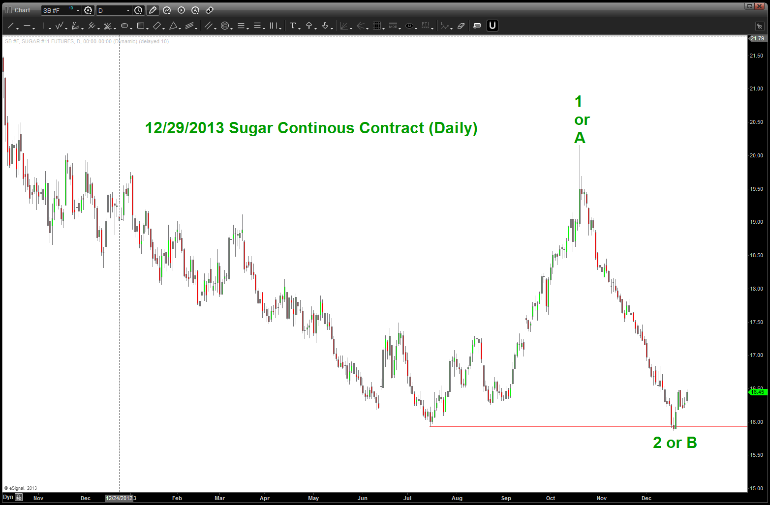
as you can see below, the level held extremely nicely but after peaking in Mid-Oct, the bid was crushed. IF this level is a significant low, then we shouldn’t go below 16 again. either way, a potential label is shown. the characteristics of wave 2 are that the general traders feel the bear trend is in fact (it could be) and it can retrace all of the first wave up ….so, that is why 16 is so crucial. If we lose 16 then back to the drawing board …
the bearish interpretation is the area labeled 1 or A is actually the completion of the corrective move and we will lose 16. not sure if that is the case because of the long term pattern that was hit back in July.
stay tuned …
Sugar Update
Happy Birthday to the Federal Reserve
Posted on December 23, 2013 Leave a Comment
December 23, 1913 the Federal Reserve was created …
relative strength of staples vs the S&P importance
Posted on December 23, 2013 Leave a Comment
in order to get up to speed, if you have not been following, please see the following post:
https://bartscharts.com/2013/10/07/staples-strength-vs-the-sp/
we completed a perfect price/time pattern BUY on the ratio and it did, in fact, respect the pattern level. HOWEVER, since then we have taken out the lows of that pattern and if we go back you’ll see that the .786 was ‘still a target.’ the importance of this ratio cannot be overstated – at every major inflection point since 2000 (I don’t have data that goes back any farther) it has pointed to all of the tops and bottoms of the market. perhaps we’ll go down and tag the .786 … what I can say, is if we blow thru the .786 then it will show a lack of institutional fear in this market as the thesis is the staples start to out perform as rotation occurs in a volatile or bearish market. so far, this ratio has been stagnant and correcting for a very long time … let’s stay tuned and see what a little lower does for our ratio.
additionally, I have included the WMT gauge. please see these posts to get a feel for the importance of this ratio:
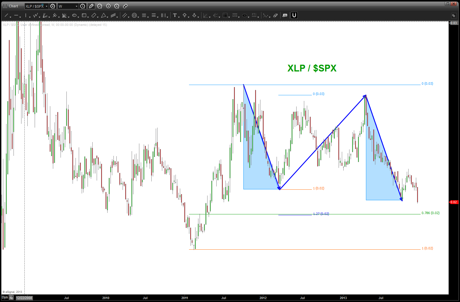
XLP/SPX – looks like lower target to get tagged …
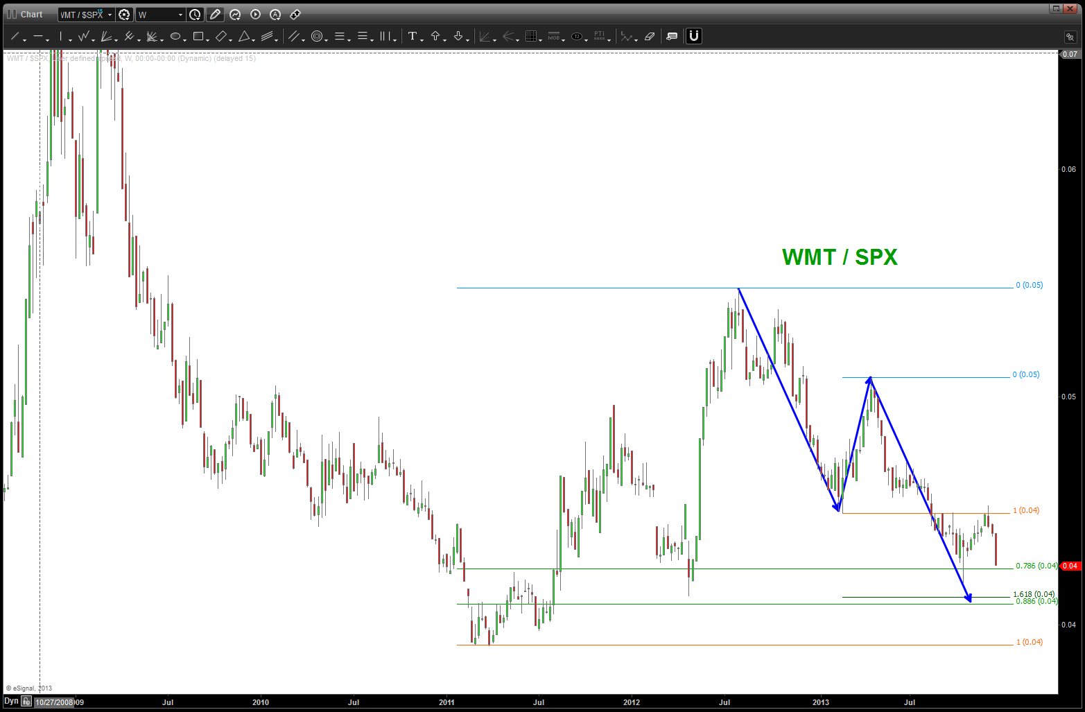
WMT/SPX – little lower …
the importance of the recent reweight in the S&P 500
Posted on December 21, 2013 1 Comment
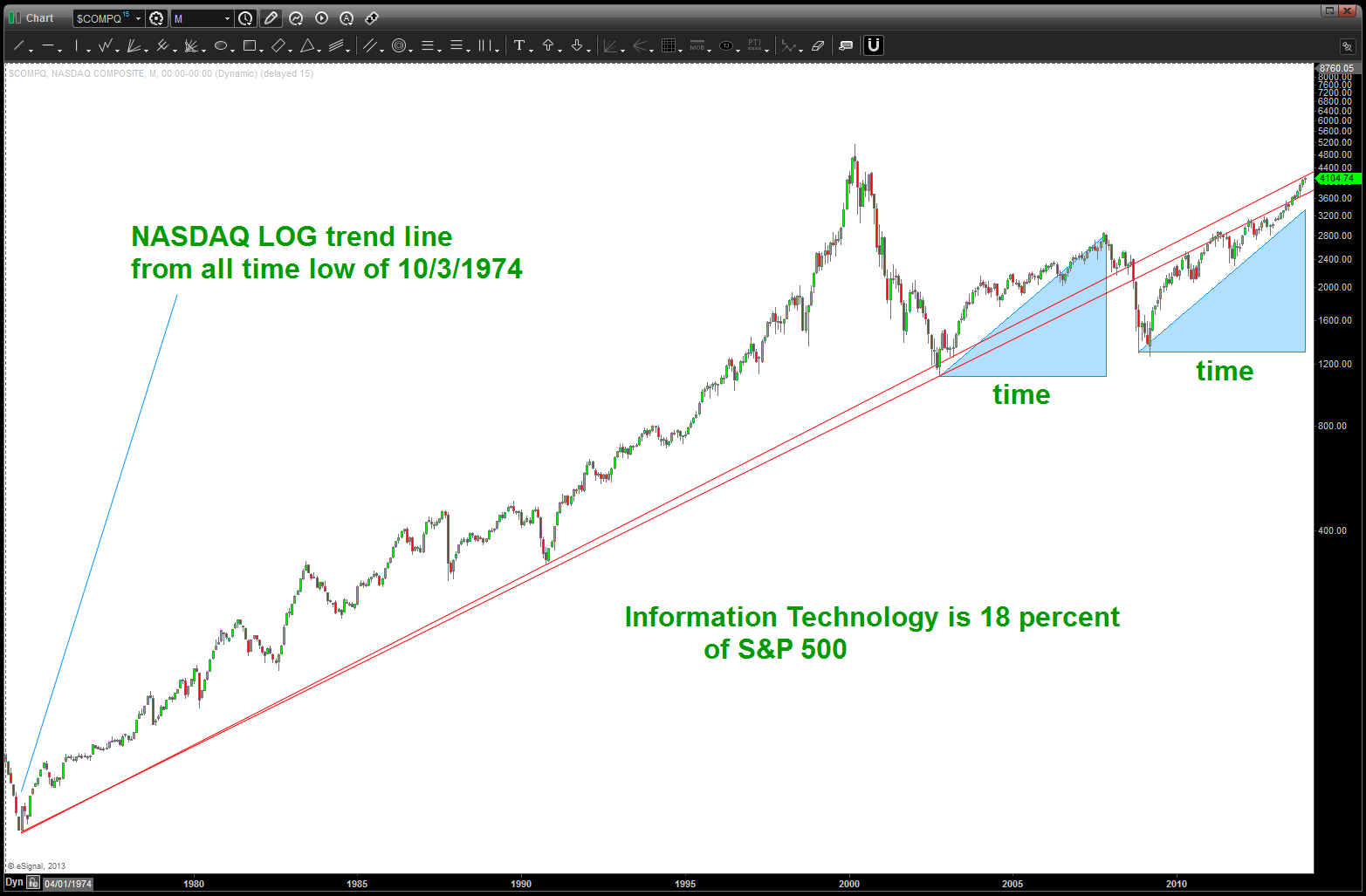
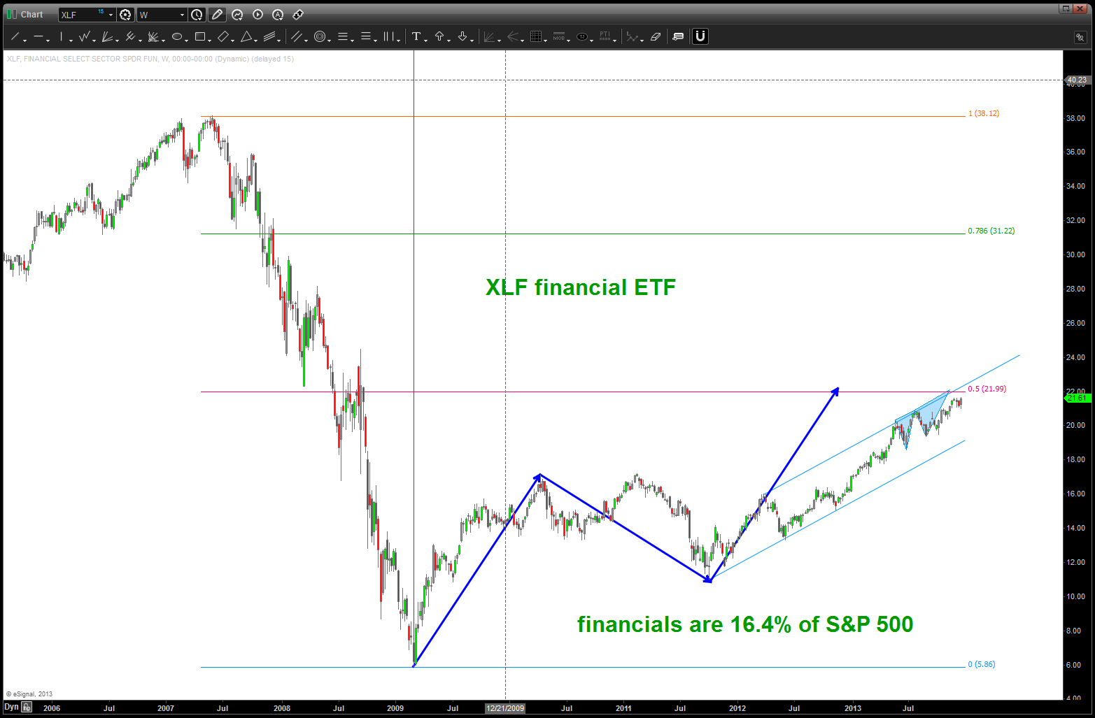
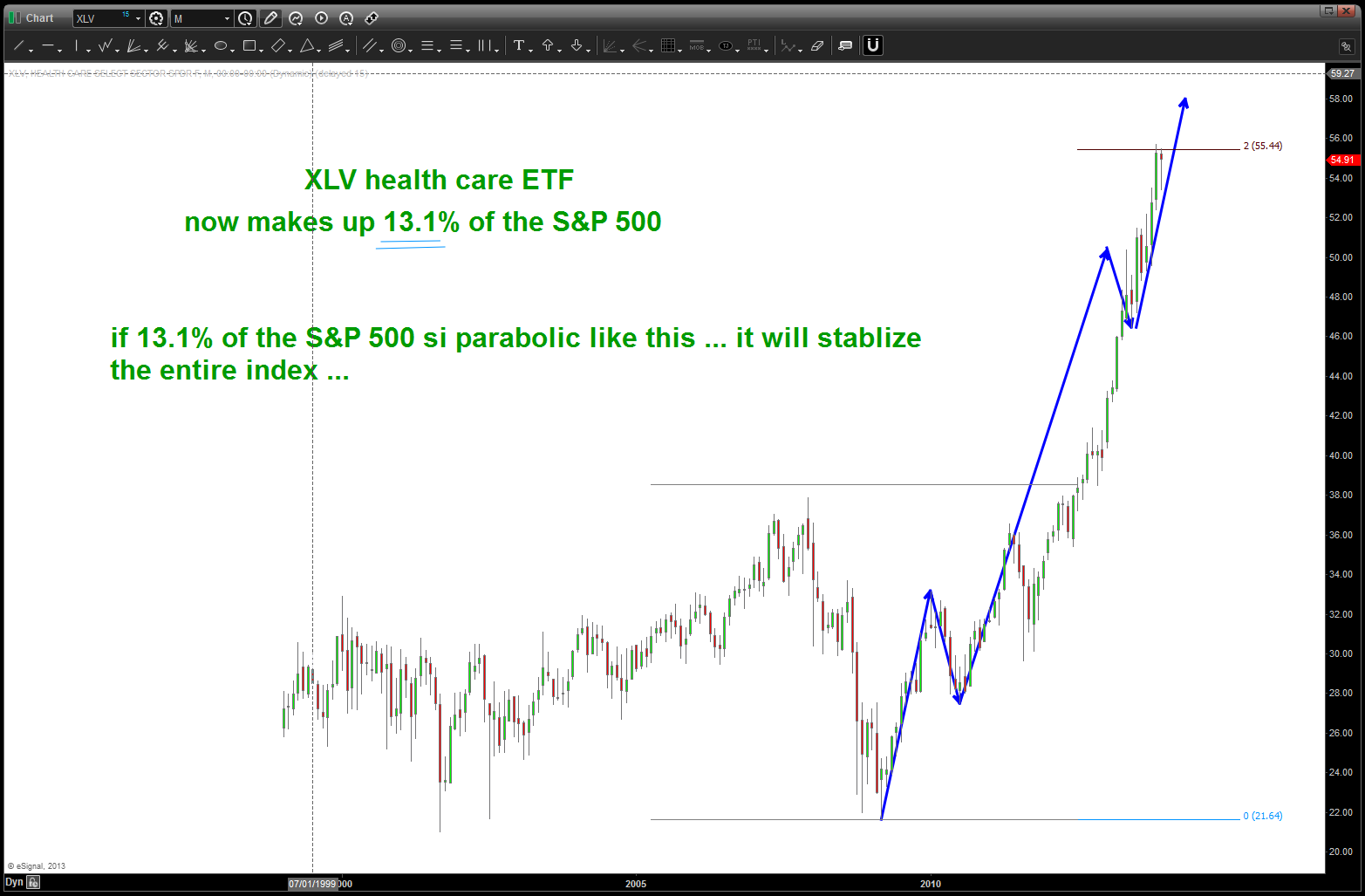
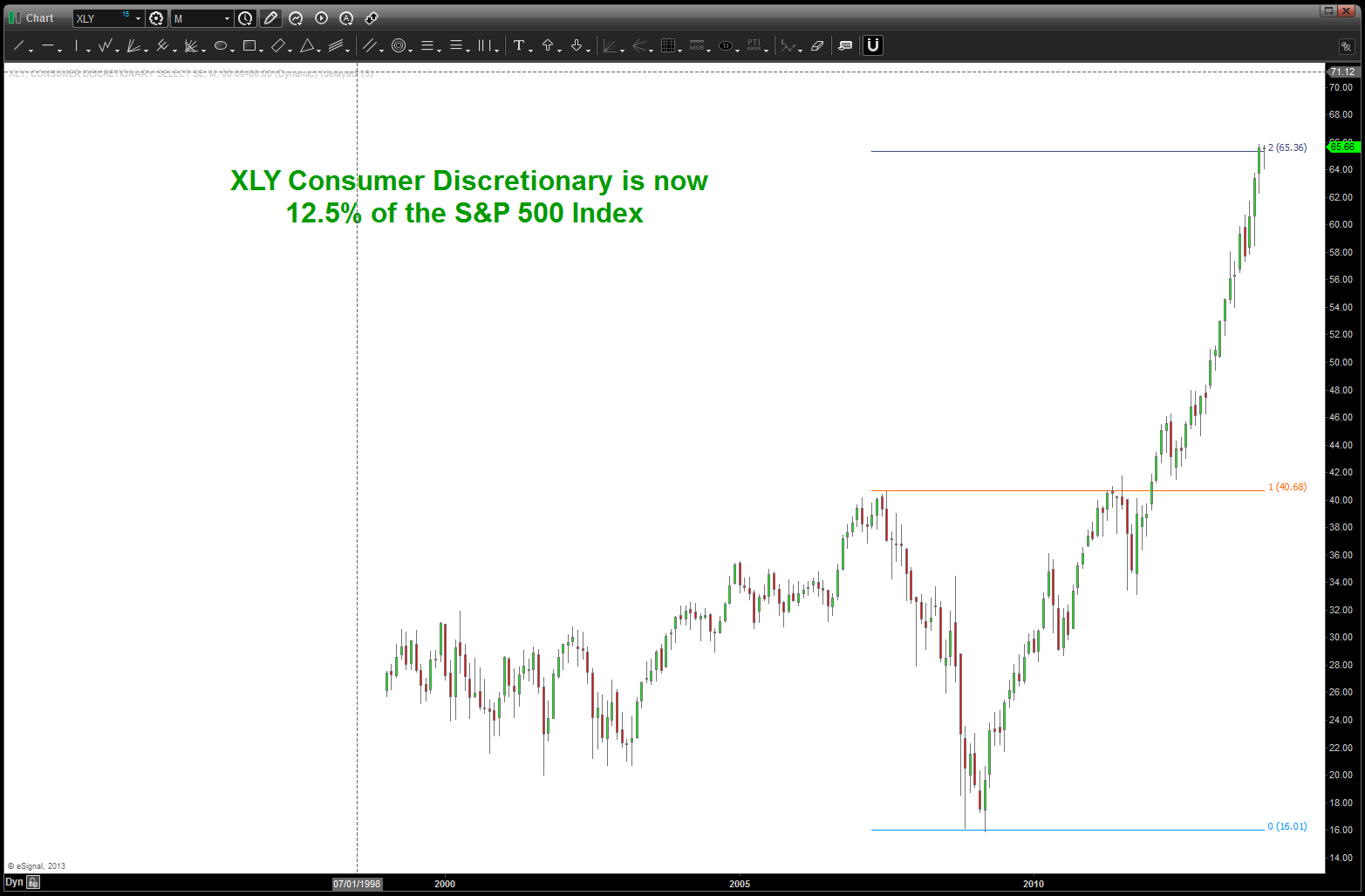
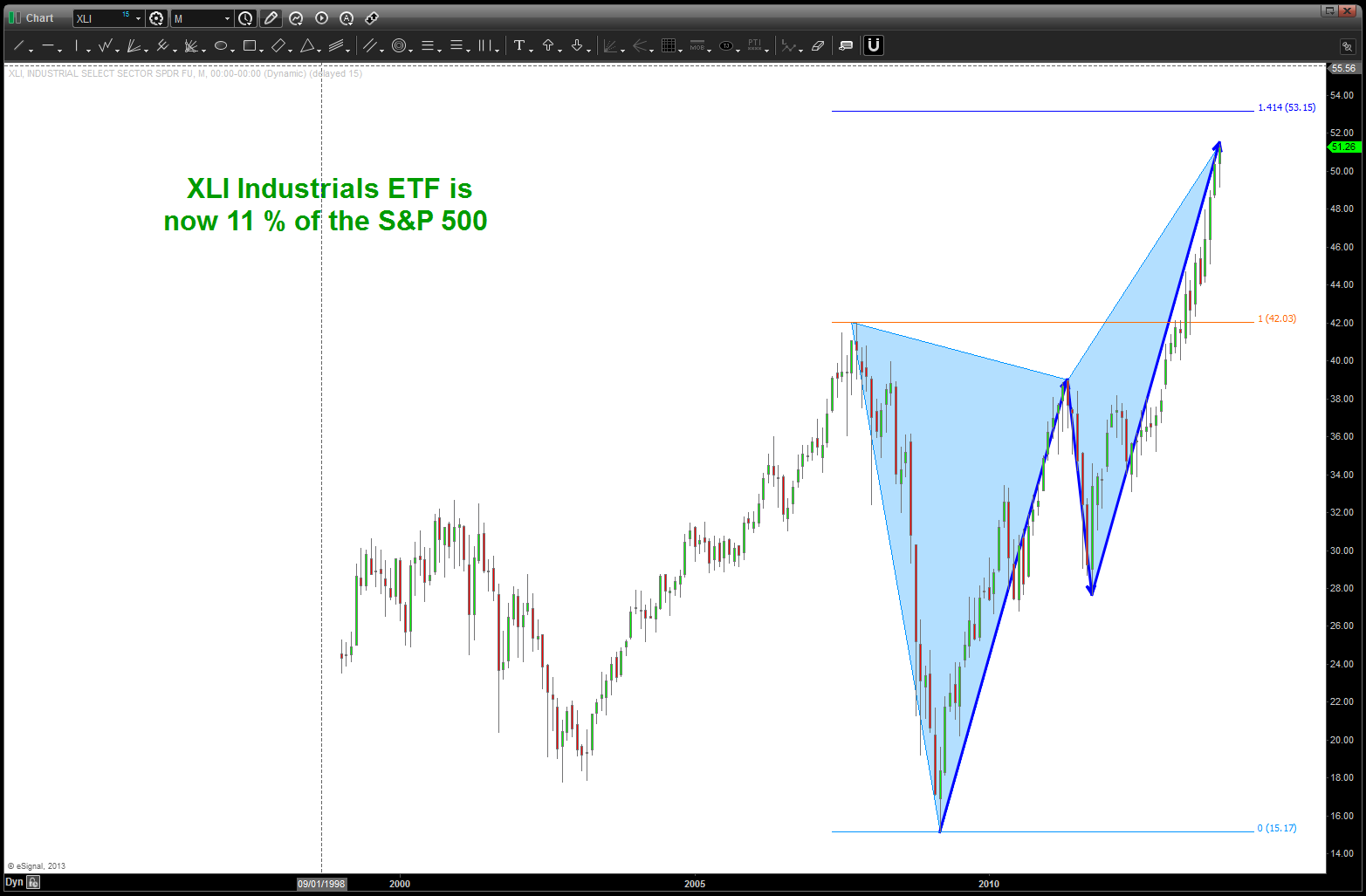
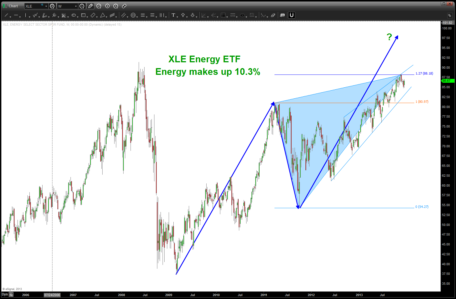
yesterday was a quarterly option expiration AND an important S&P reweighing .. our last post at the sectors of the S&P 500 were dominated by technology, energy and financials … that changed, pretty substantially. now, hot of the presses the sectors are:
- information technology 18% : using VGT as a proxy. see chart below. SELL PATTERN complete/completing.
- financials 16.4%: using XLF as a proxy. see chart below. SELL PATTERN complete/completing.
- health care 13.1%: using XLV as a proxy. see chart below. no discernible pattern however it’s approaching PARABOLIC
- consumer discretionary: 12.5%: using XLY as a proxy. see chart below. no discernible pattern however it’s approaching PARABOLIC.
- industrial 11.1%: using XLI as a proxy. see chart below. SELL PATTERN complete/completing
- energy 10.3%: using XLE as a proxy. see chart below. no new high, an extension sell pattern complete at 88 but perhaps 97 is where it will go.
so, note the inclusion of health care, consumer discretionary and industrial and there close to parabolic states continues the advance. additionally, am using VGT and the NASDAQ as proxies for the IT sector. 70% of the S&P 500 are either approaching parabolic or SELL patterns are completing …
stand by …..
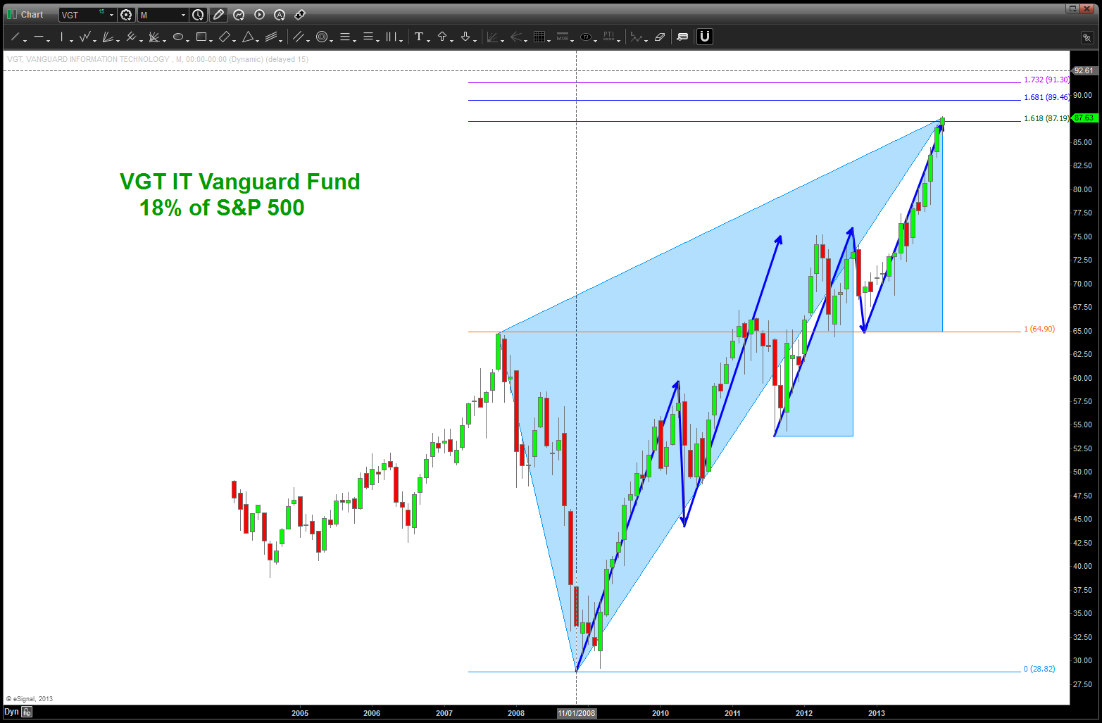
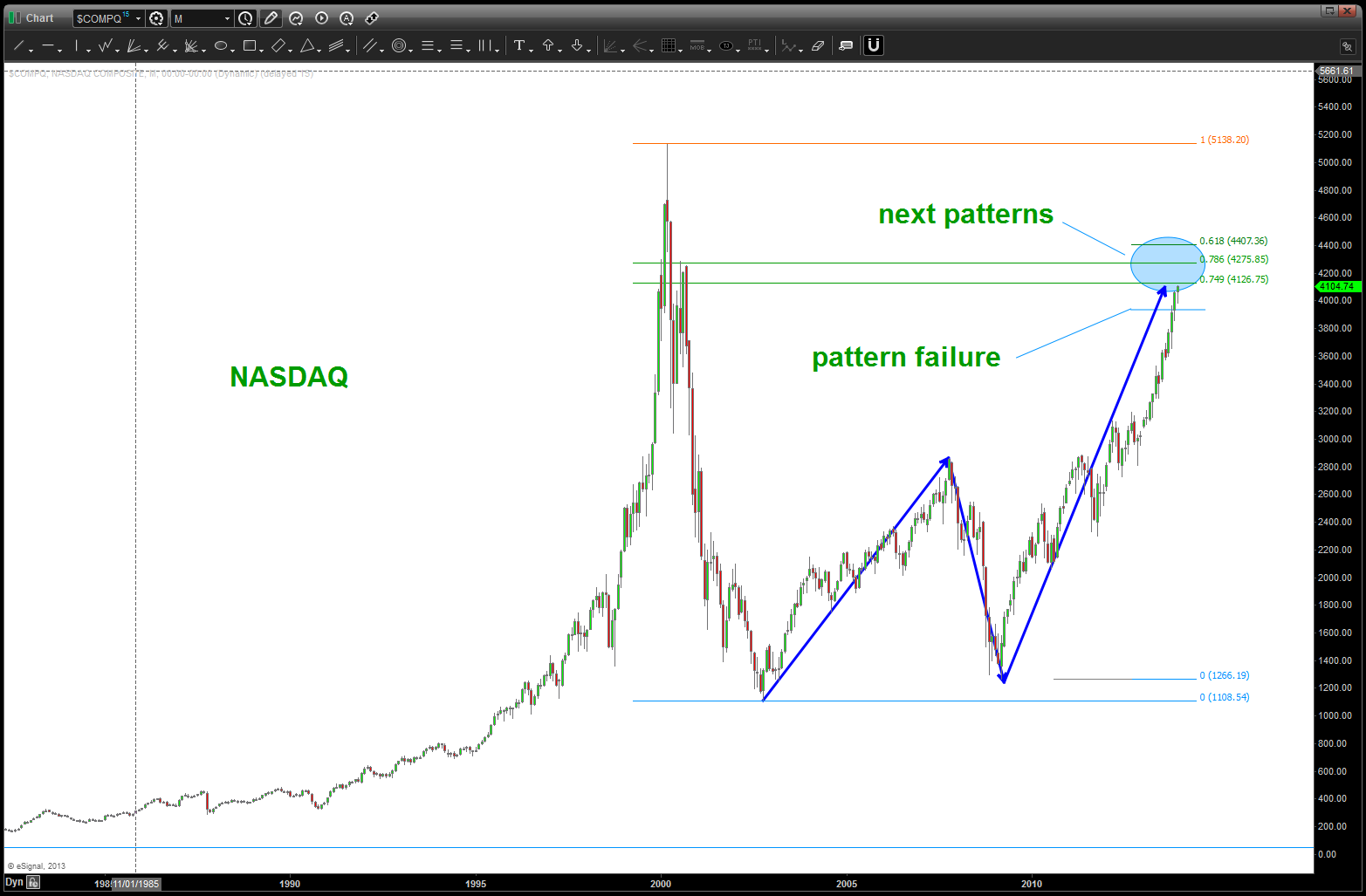
financials
health care
consumer discretionary
industrials
energy
Around the world update …
Posted on December 21, 2013 1 Comment
https://bartscharts.com/2013/09/14/part-1-the-sp-500-but-first-we-need-to-go-around-the-world/
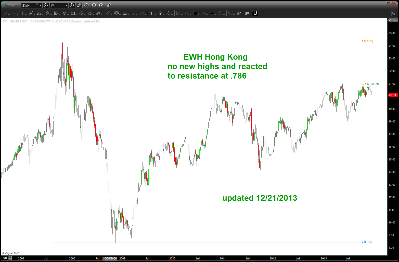
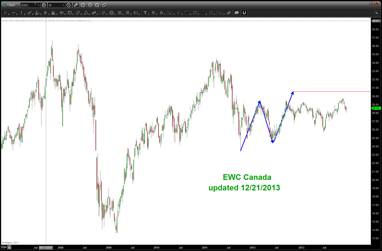
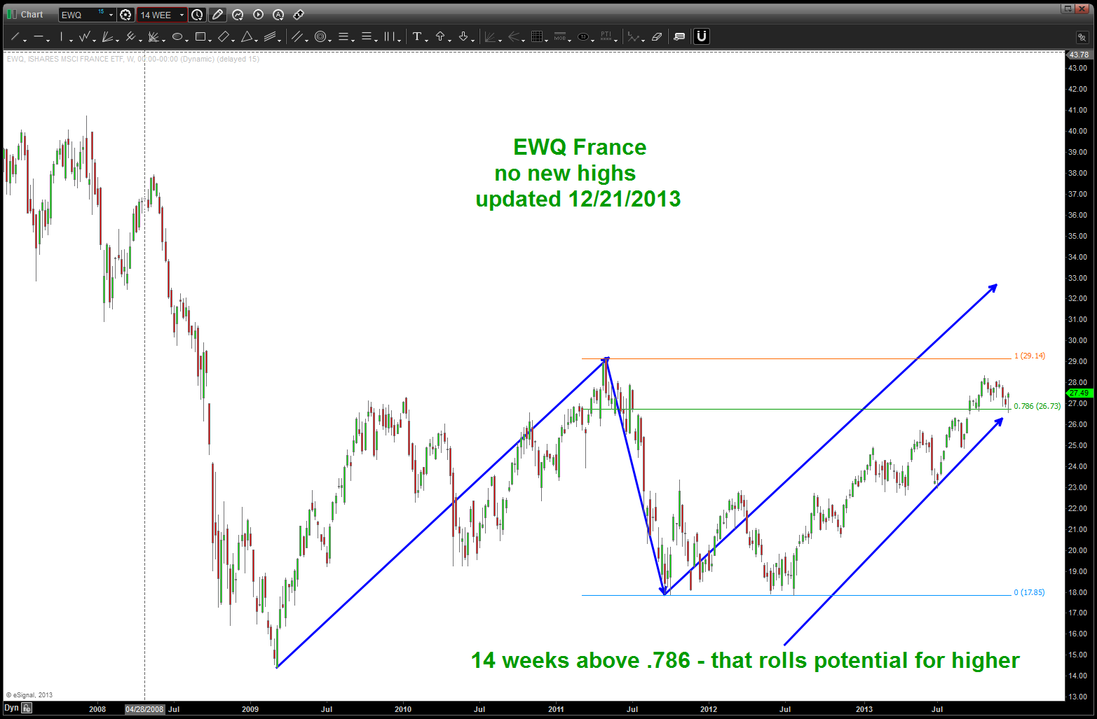
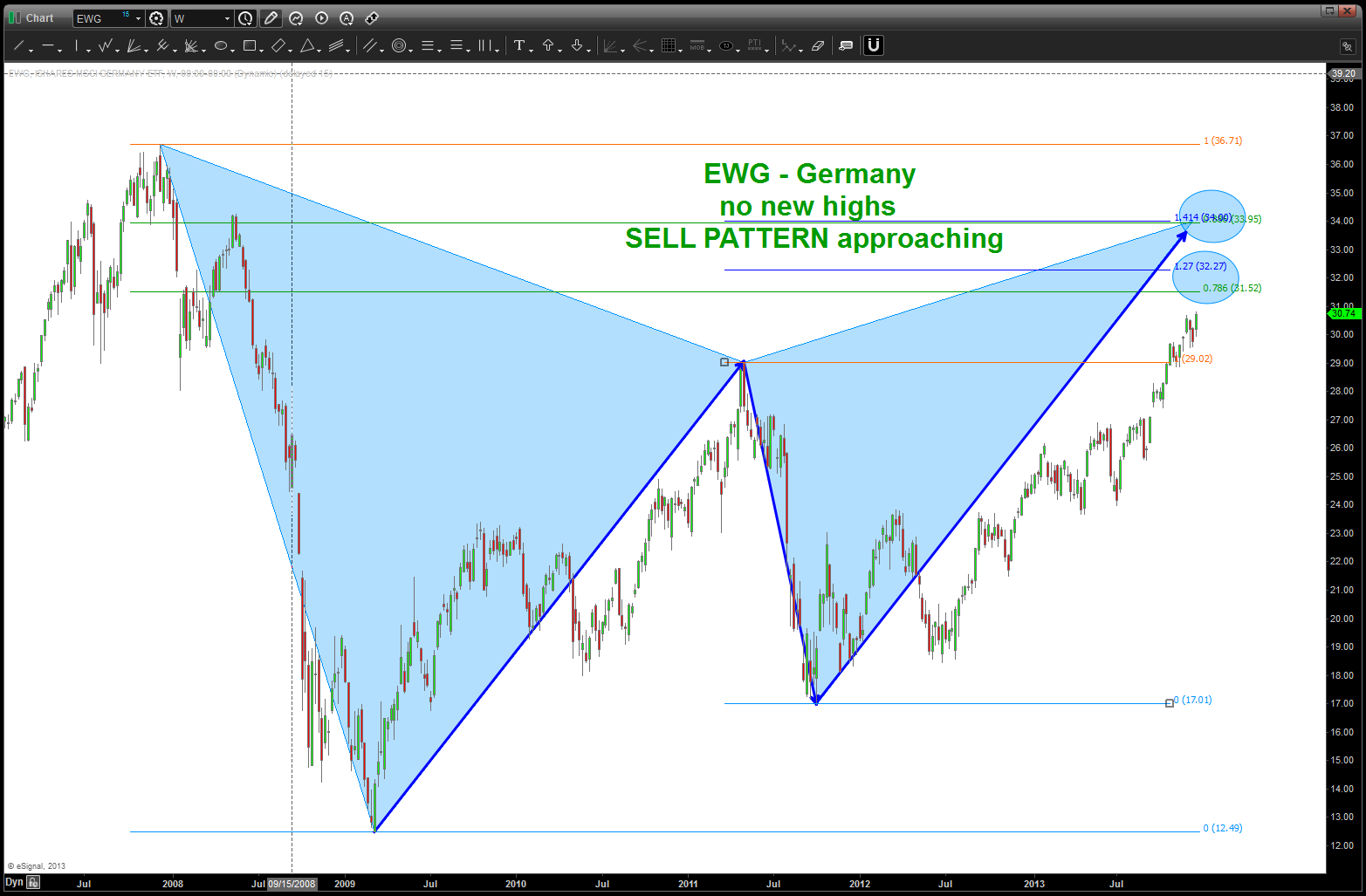
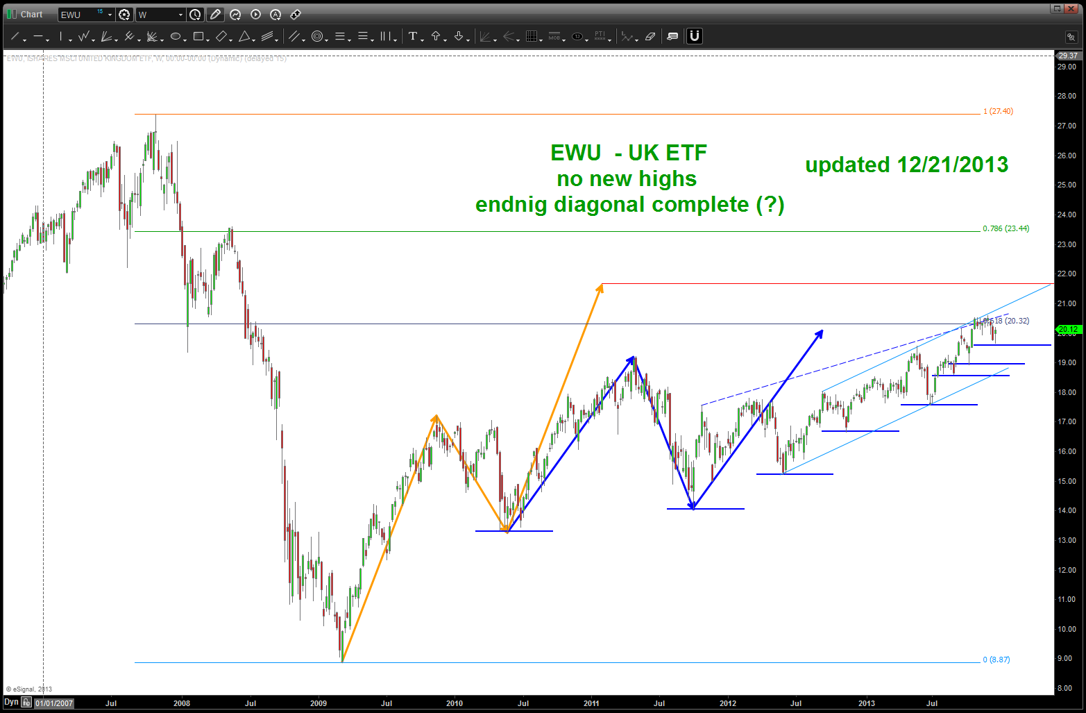
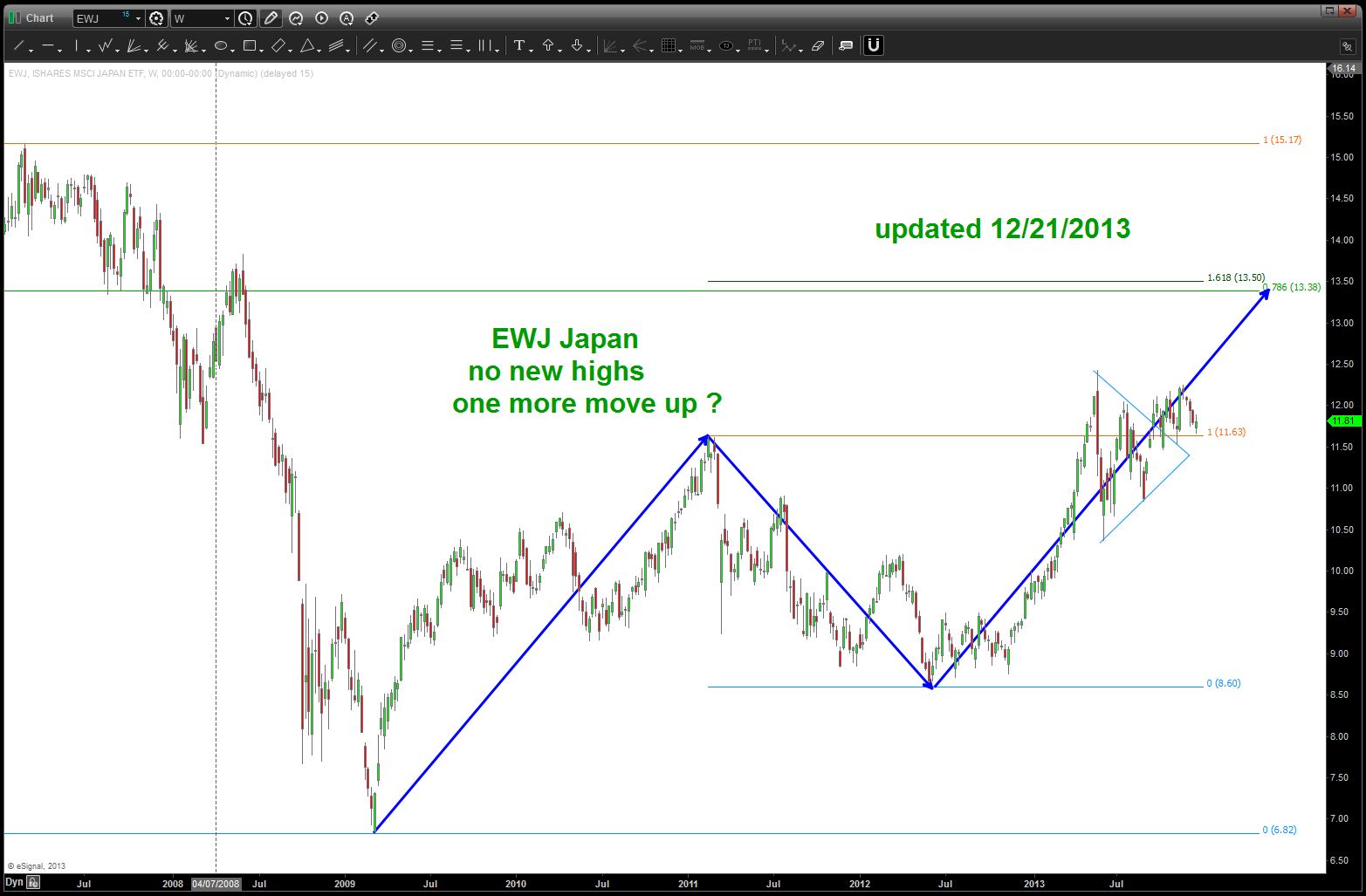
the first post going around the world was in September … nothing has changed. No other stock market – except the US – has come close to their 2007 highs …
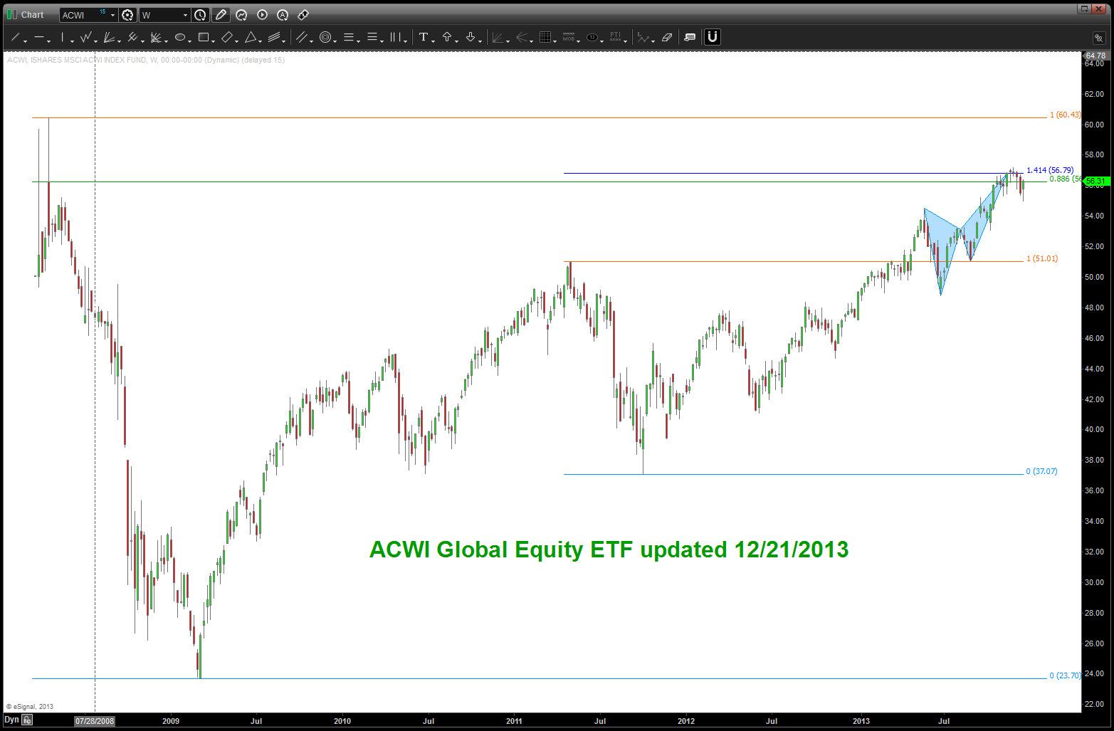
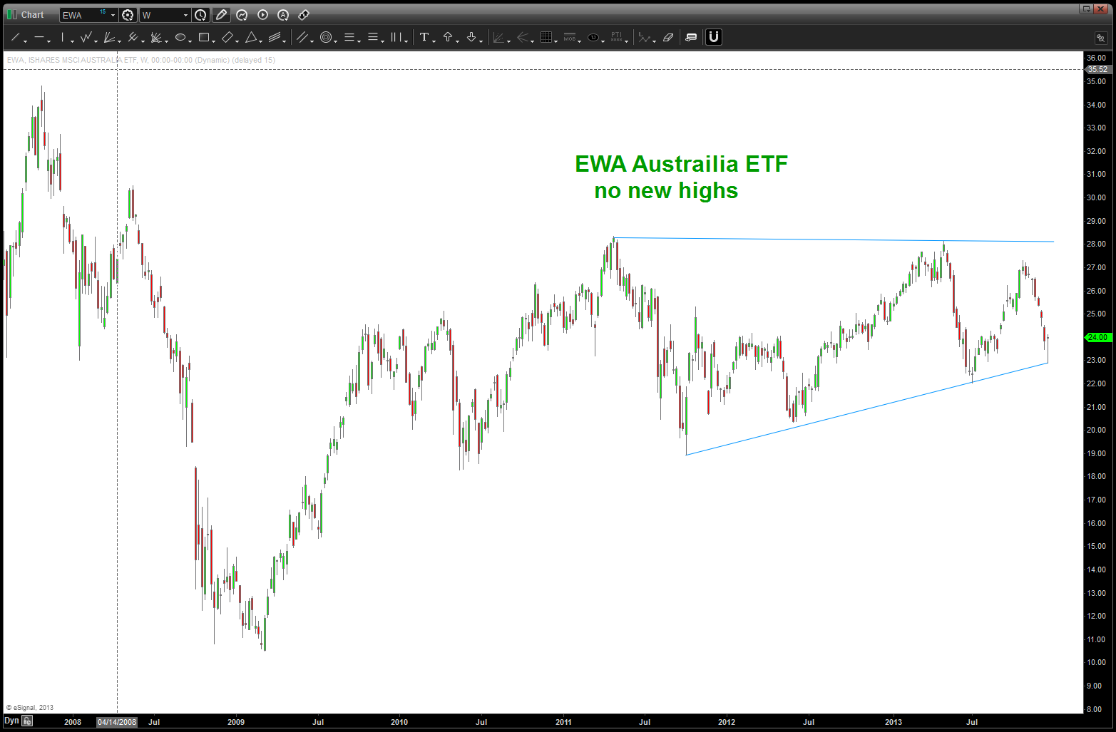
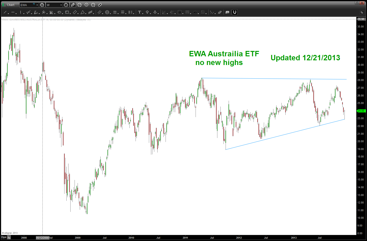
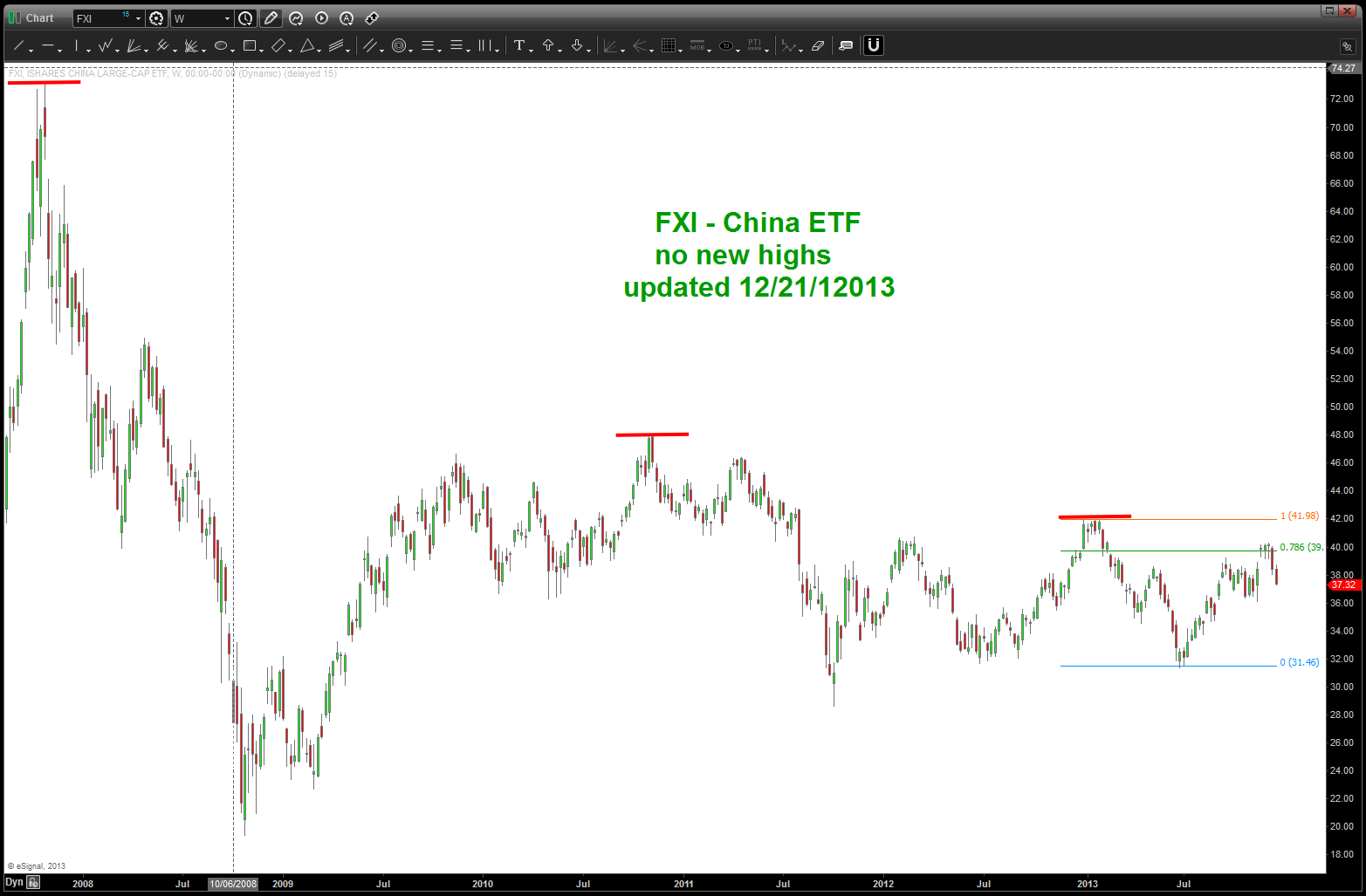
our first hint we are soon to be carving out a bottom in Gold …
Posted on December 20, 2013 Leave a Comment
as a pattern recognition dude, I simply look for patterns and try (it’s hard) to be objective and go w/ it. if you have been following we’ve been doing OK w/ everything BUT the equities. Patterns haven’t necessarily failed, but they are being tested for failure, that’s for sure. the bullish sentiment is at ALL TIME HIGHS for the past 30 years …
on the other hand http://www.marketwatch.com posted this today: http://www.marketwatch.com/story/golds-13-year-bull-run-breaks-with-29-annual-loss-2013-12-20?dist=countdown . my past couple posts on Gold and Silver have shown how I “think” we are carving out a 5th wave that could be the BUYing opportunity. As the pattern to BUY appears the PRESS will be declaring it’s no good, get out of Gold and we’ll stop seeing those CNBC adds about silver and gold and metals ETF’s …
so, I recommend not yet, but this is my first “quick look” that a low in th emetals for either a MAJOR bounce or an eventual march higher is w/in the next quarter or so …don’t jump the gun, yet.
the Copper Script …
Posted on December 20, 2013 2 Comments
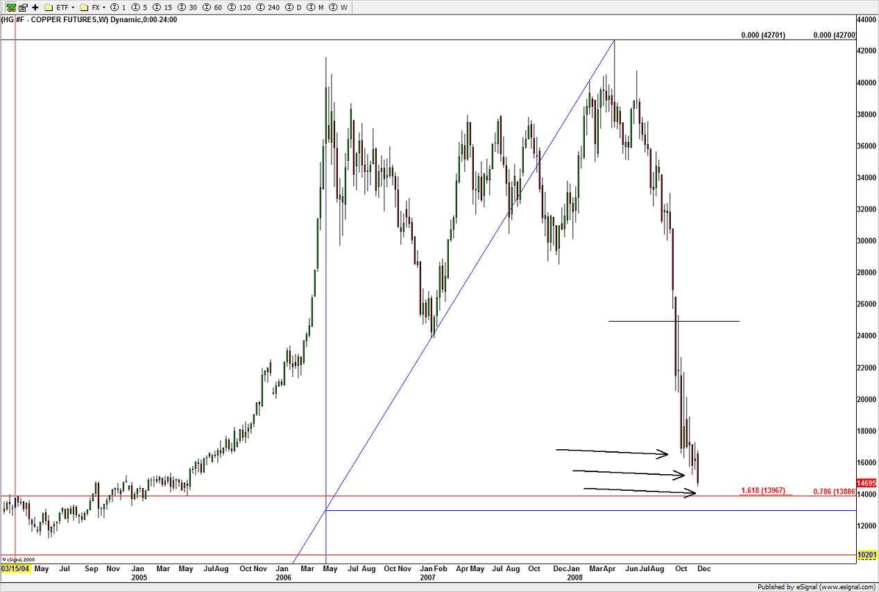
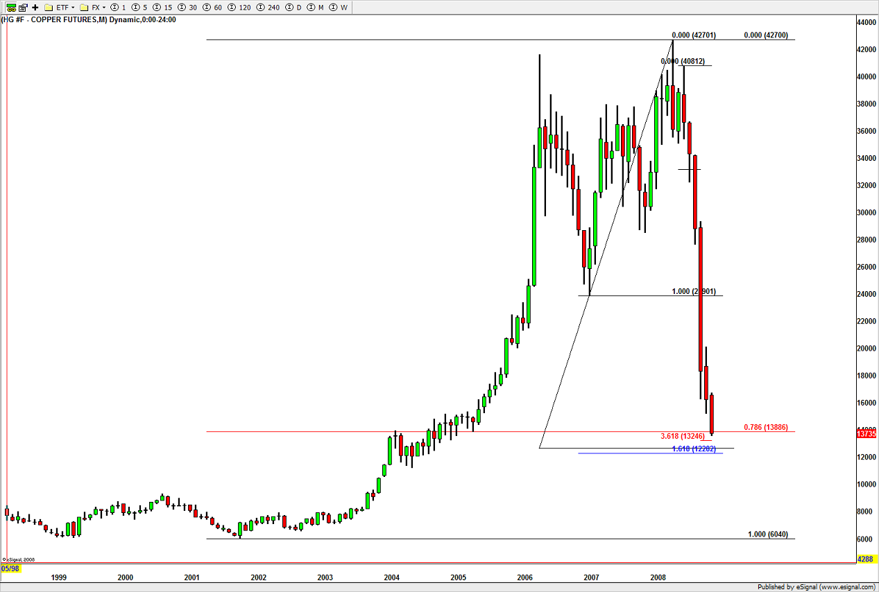
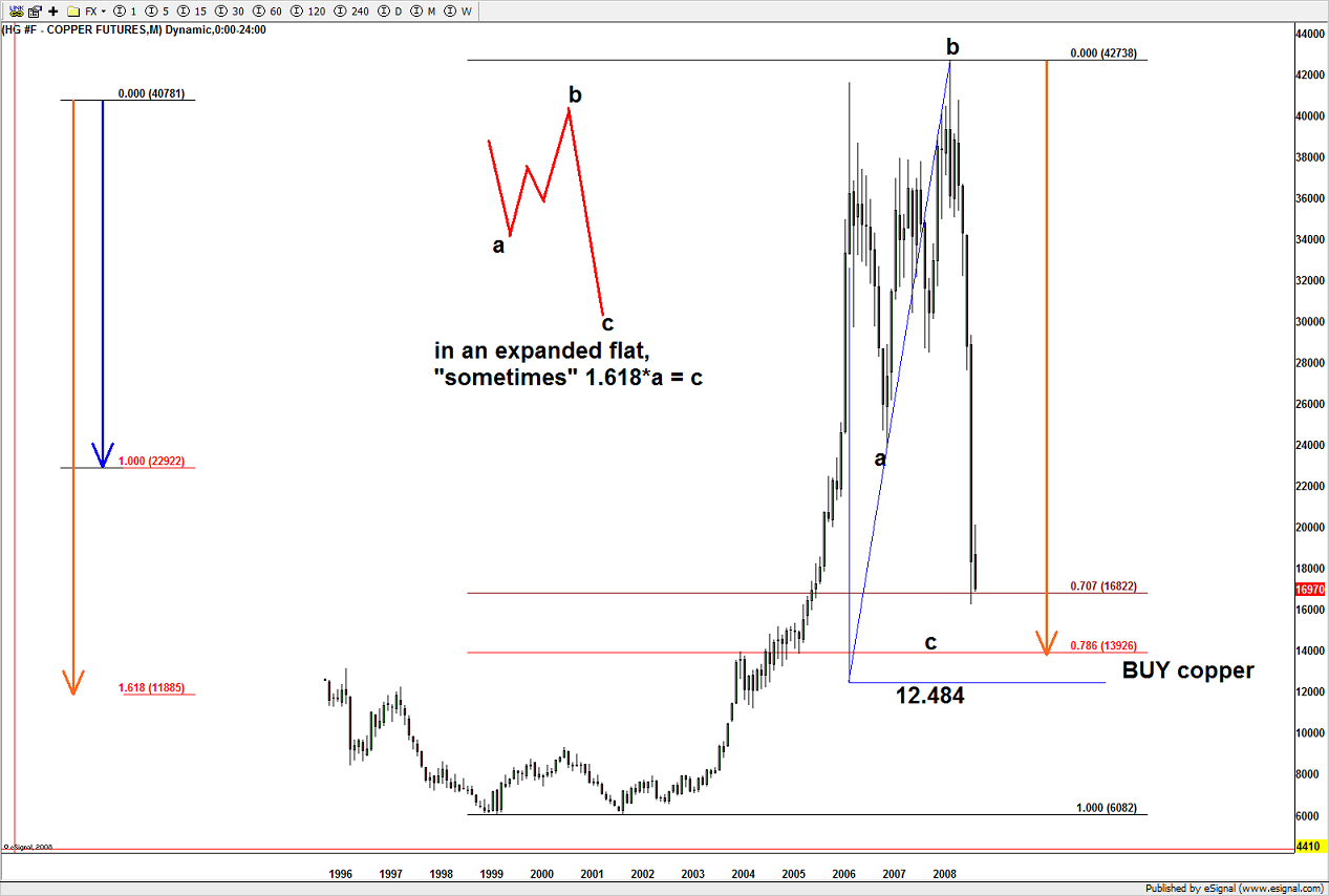
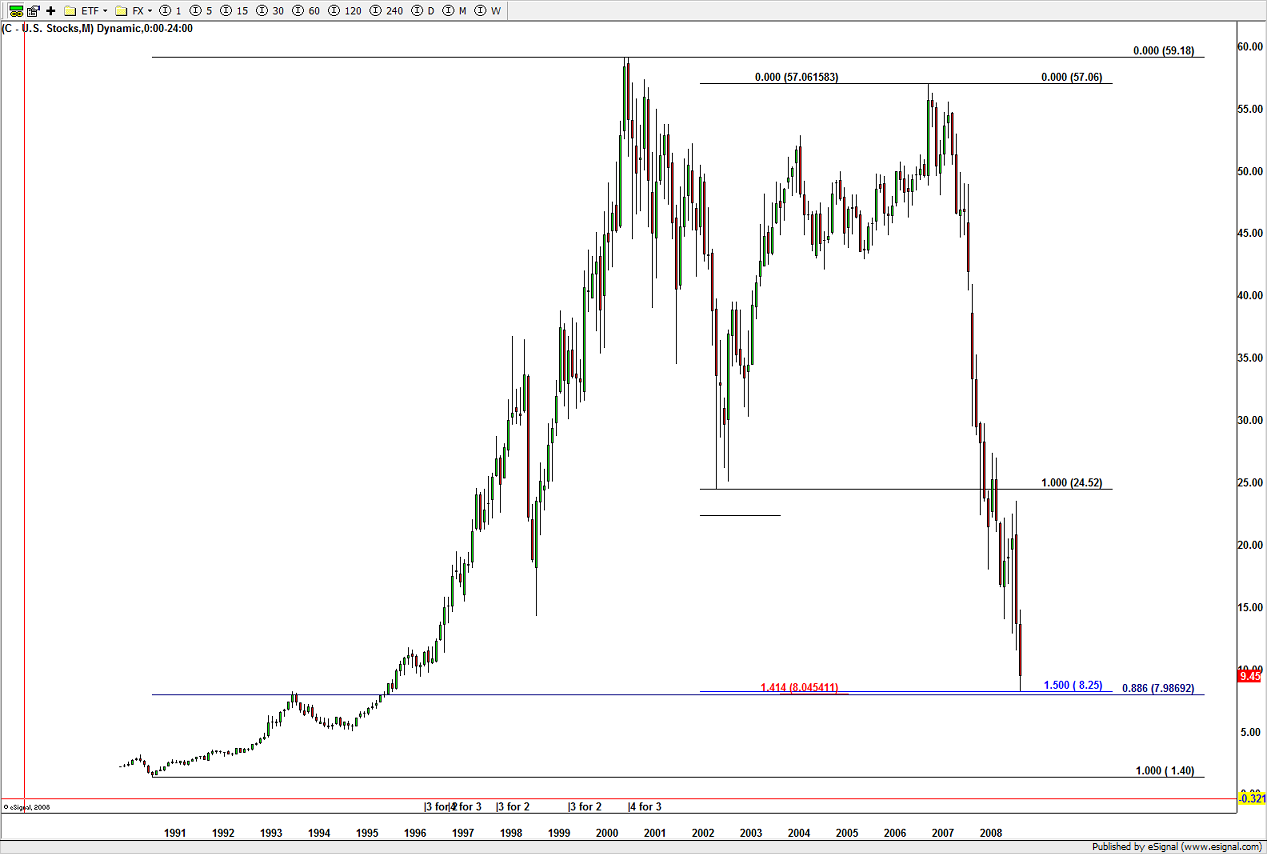
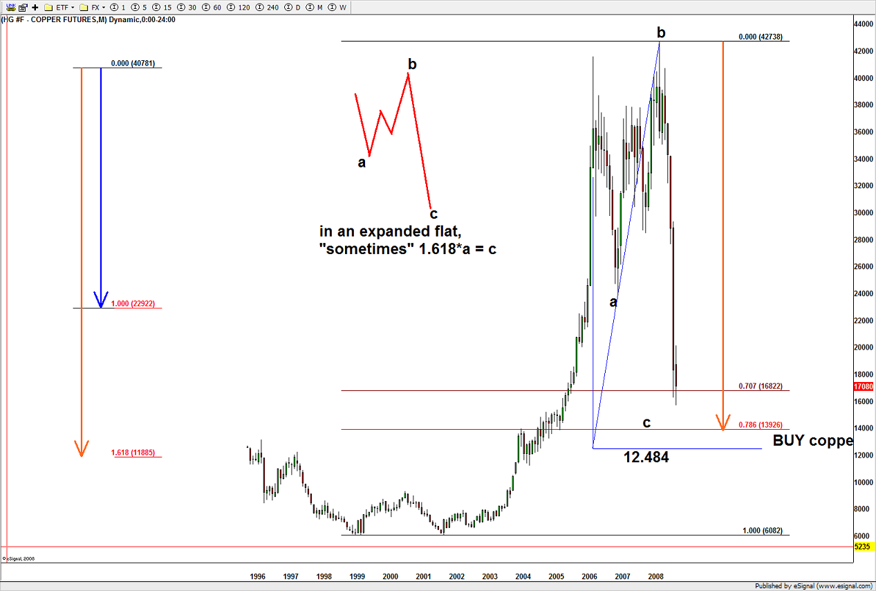
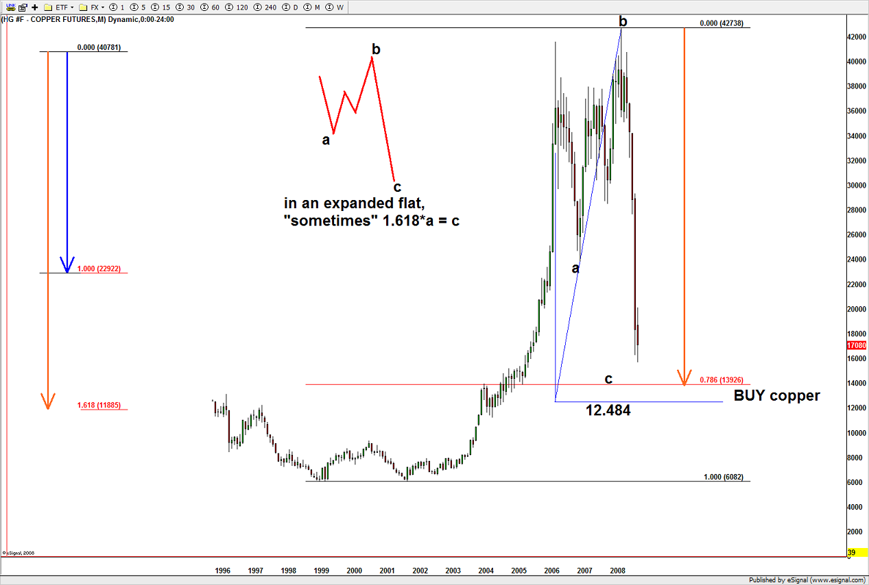
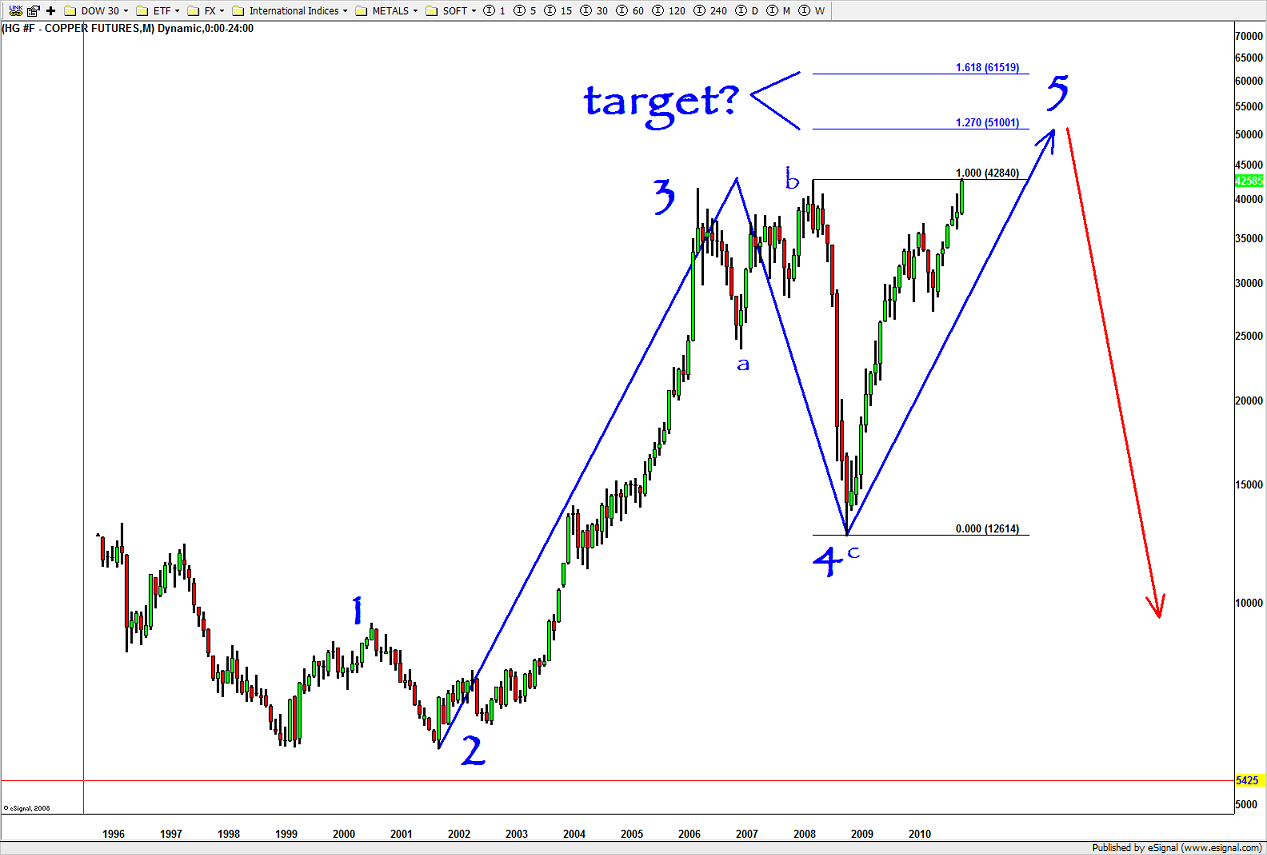
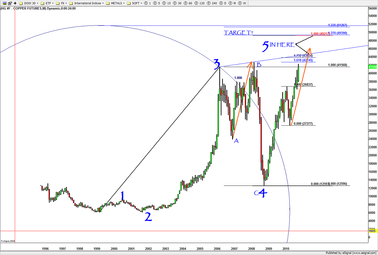
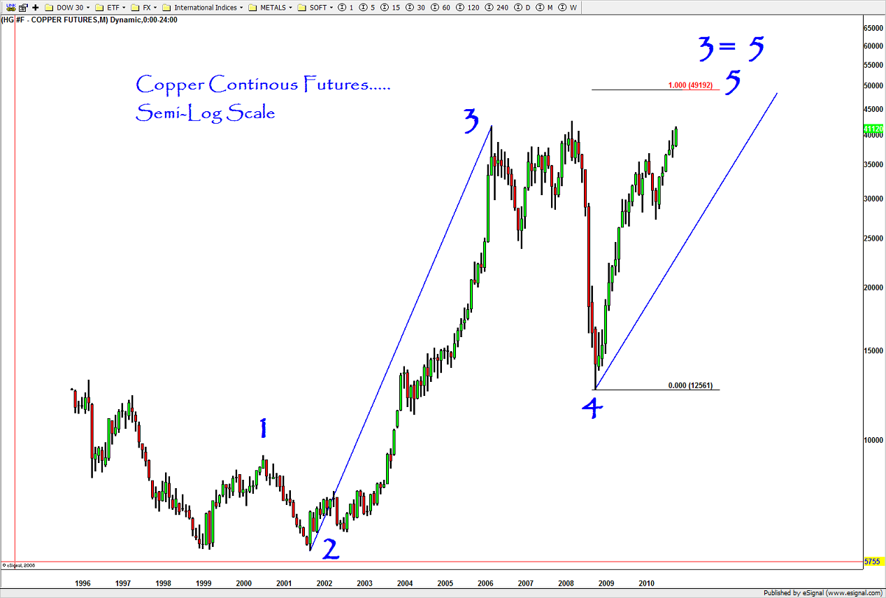
if you have been following my blogs of late, you’ll find that I’ve been throwing some bearish patterns out there. simply, there are bearish patterns. period dot … they work, they fail and we manage RISK. just to show you that I am agnostic to the BULL and/or BEAR case here’s the falling knife of copper and the BUY recommendation that was put out … the FORM/PROPORTION/GEOMETRY was PERFECT. enjoy ….I still think Copper is a big deal.
Copper and China
Posted on December 20, 2013 Leave a Comment
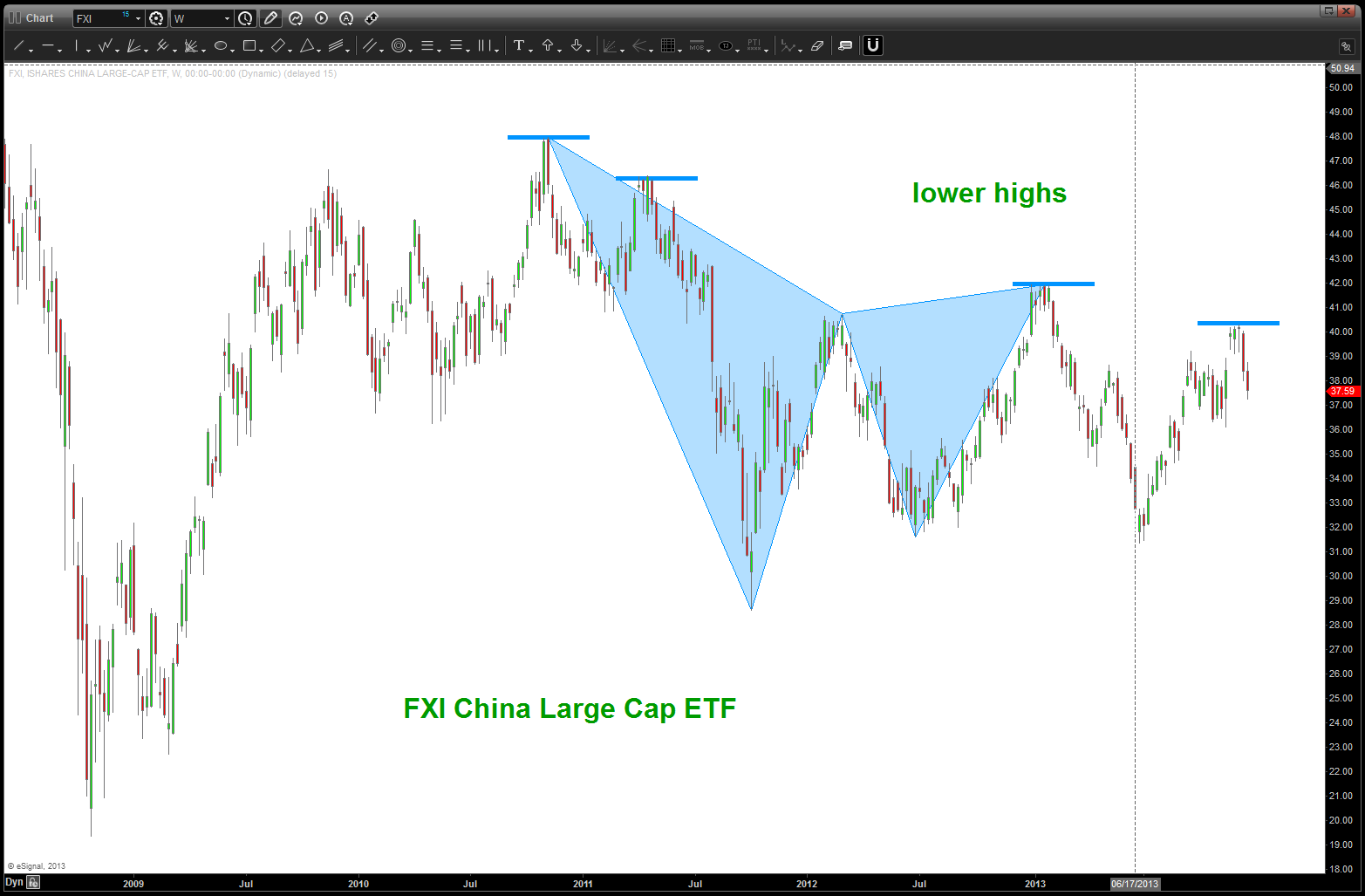
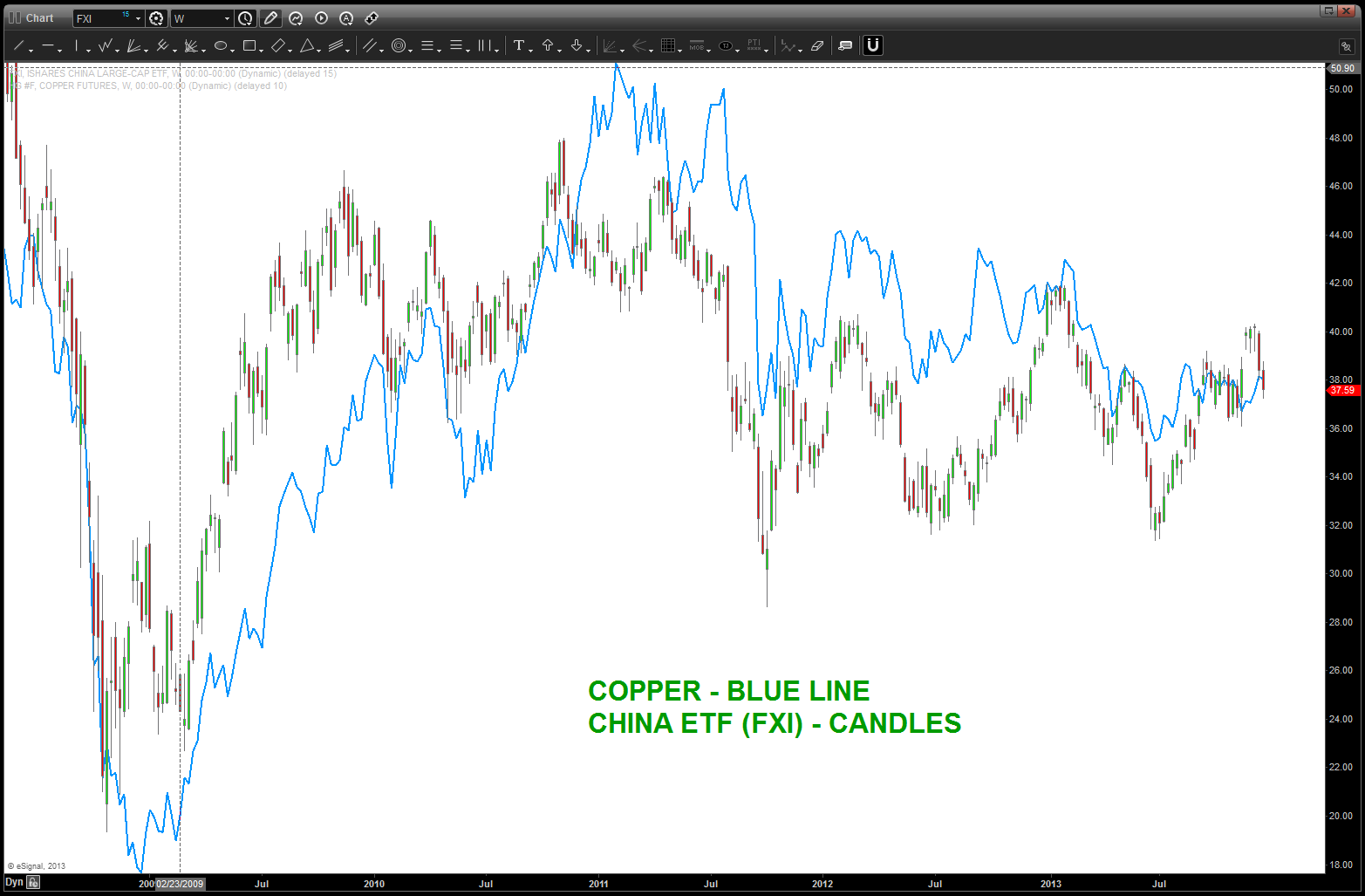
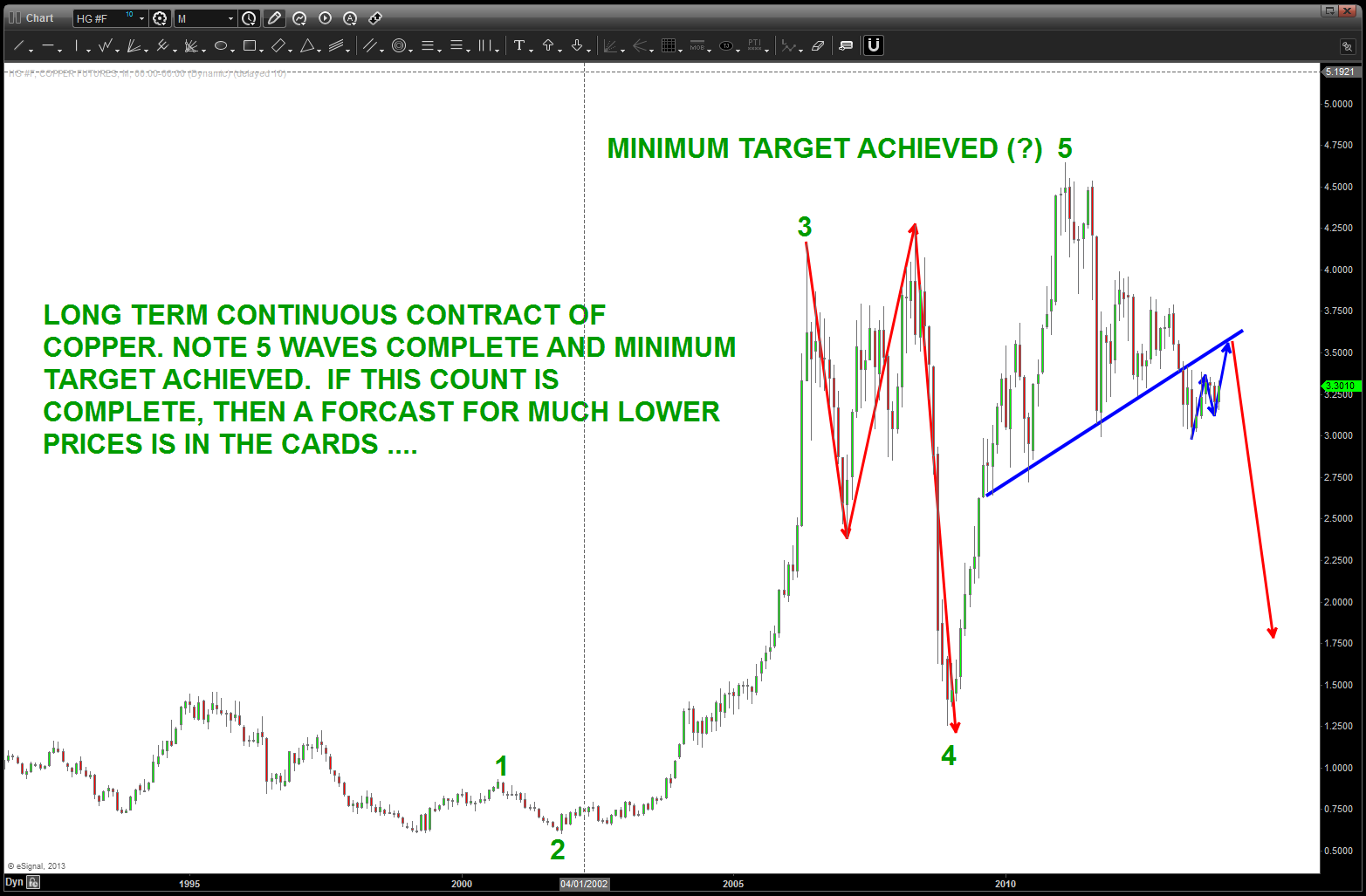
the count (long term) for copper appears to have completed a very well defined 5 wave move … if this is correct, then perhaps we have a little larger rally to kiss the neckline and then down into much lower prices. why is this important to China? well, from a chart view they are aligned extremely nicely. so, IF Copper is going to go down THEN so should FXI if the correlation holds …
the Musical Swissy …
Posted on December 19, 2013 Leave a Comment
what a week in the FX markets … amazing. if you have been following along, I have been a DOLLAR BULL the past couple weeks awaiting for what I THINK is the end of a correction that is going to set up a pretty large and powerful rally in the US Dollar.
that being said, one of the key components that everyone involved in the FX watched is the USD vs the Swiss Franc (AKA the SWISSY)
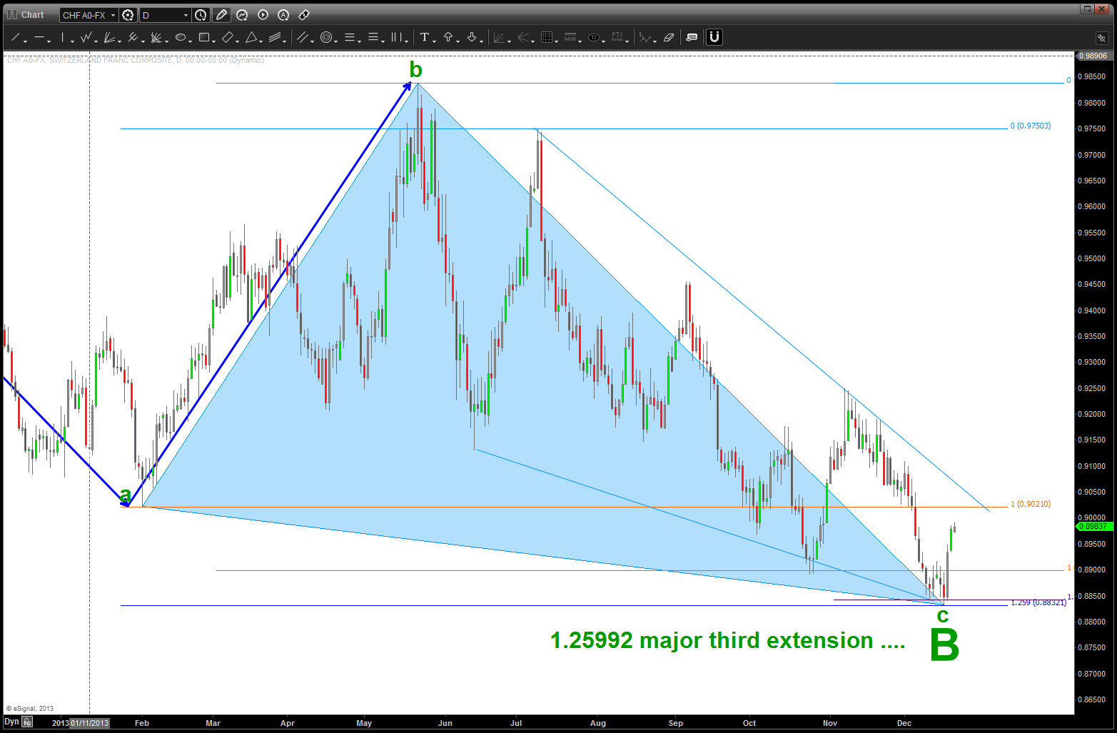
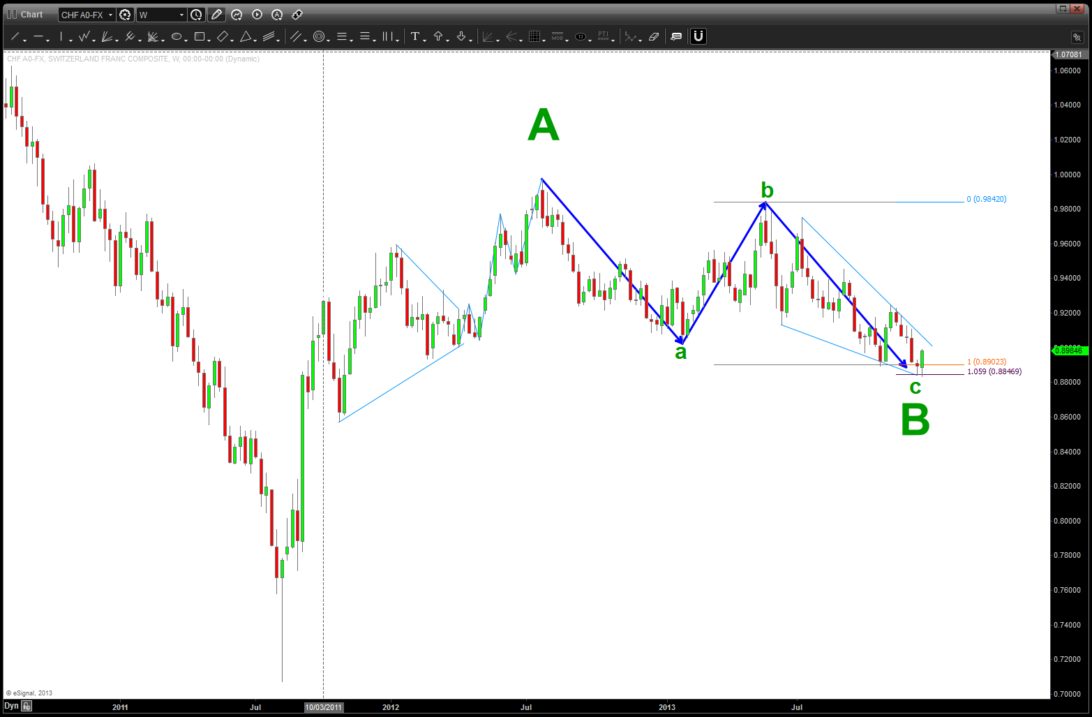
what I saw was an “ending diagonal” that was nicely showing us 5 waves down and that would have represented the end of a somewhat “flat” correction that started in July 2012. Yes, it’s been 1 year and 5 months since the high….and, think about it, it’s ONLY retraced right in/around .382.
as I followed this last move down I naturally thought we would get a bounce in/around the pattern called a zig-zag/ab=cd/equality of moves/etc. In fact as you can see, it did bounce rather strongly in/around that level (to be exact) however, the wave count wasn’t complete. so, we did one more wave down and hit exactly at 1.05946*a = c. With that level being hit, we have a weekly signal reversal and, additionally, we are selling off rather nicely w/ the Euro and the Dollar Index appears to have bottomed. Also, note the TIME component. IF we have the PRICE w/ a 1.05946 component THEN we have 27 weekly bars in the ab move so 1.0594*27=29 and that give us an PRICE and TIME equality.
as we have seen this past couple weeks the musical note ratio’s are doing some nice work in the markets. I have a small 5×7 card w/ the ratio’s and, now, they are basically memorized. recommend you do the same – they make great stop placement levels. (see GOOG 1.68179 extension target) If those of you want the why – check out this website – http://www.brooksdesign-ps.net/Reginald_Brooks/Code/Html/Gomas/gomas09.htm
if we get below .8832 then all of this is jibberish ….
 Bart's Charts