NFP and the emini …
Posted on December 6, 2013 1 Comment
at 0830 EST today I’m going to be drinking a cup of coffee, more than likely meditating or playing some kick ass music but the farthest thing from my mind is going to be the NFP. this manipulated number has BILLIONS if not TRILLION of HFT (high frequency trading programs) going crazy on the BID/ASK w/ fraction of milliseconds execution. how can a pattern recognition trader in his home office compete w/ that … not that I can’t, I’m just not …
how about the EURO yesterday? some fundamental announcement about inflation (if you don’t have inflation could you have DEFLATION (?)) and the EURO gets hammered and then, out of no where, the BID comes in (read: our FED) and today wasn’t the day and KABOOM it’s gone higher …FX is a wonderful, 4 trillion dollar/day market. the gorillas are big and they juggle dynamite!
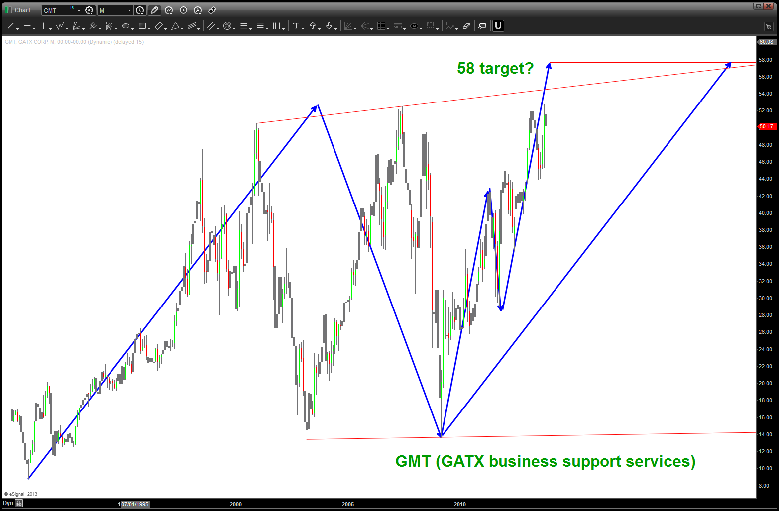
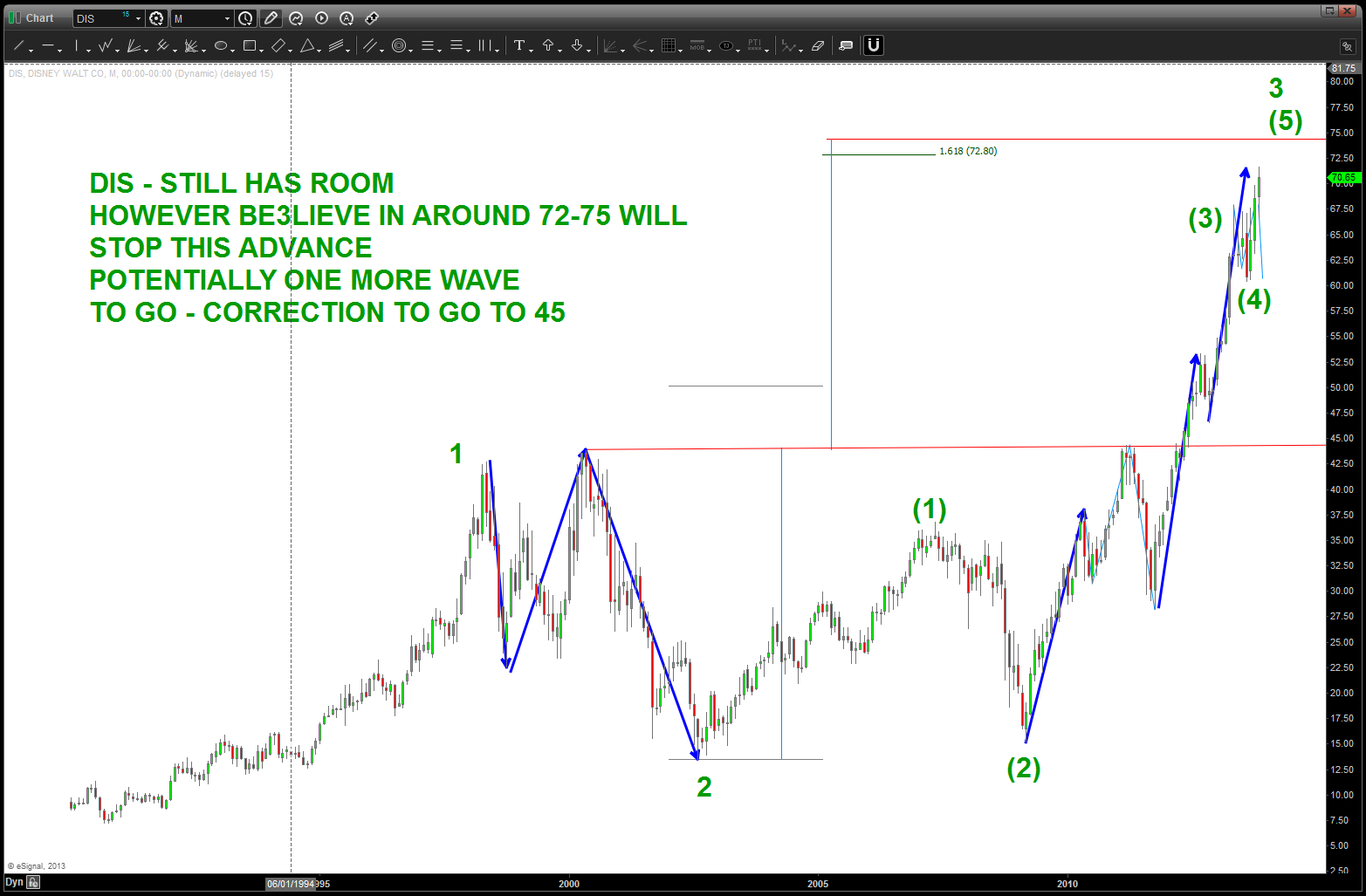
I digressed …here’s what I “see” – note a a very symmetrical 5 wave move down and now the “typical” three wave move up and a PATTERN completing in/around 1800. Upper targets are shown and they could be hit …
bottom line – grab a cup of Joe or
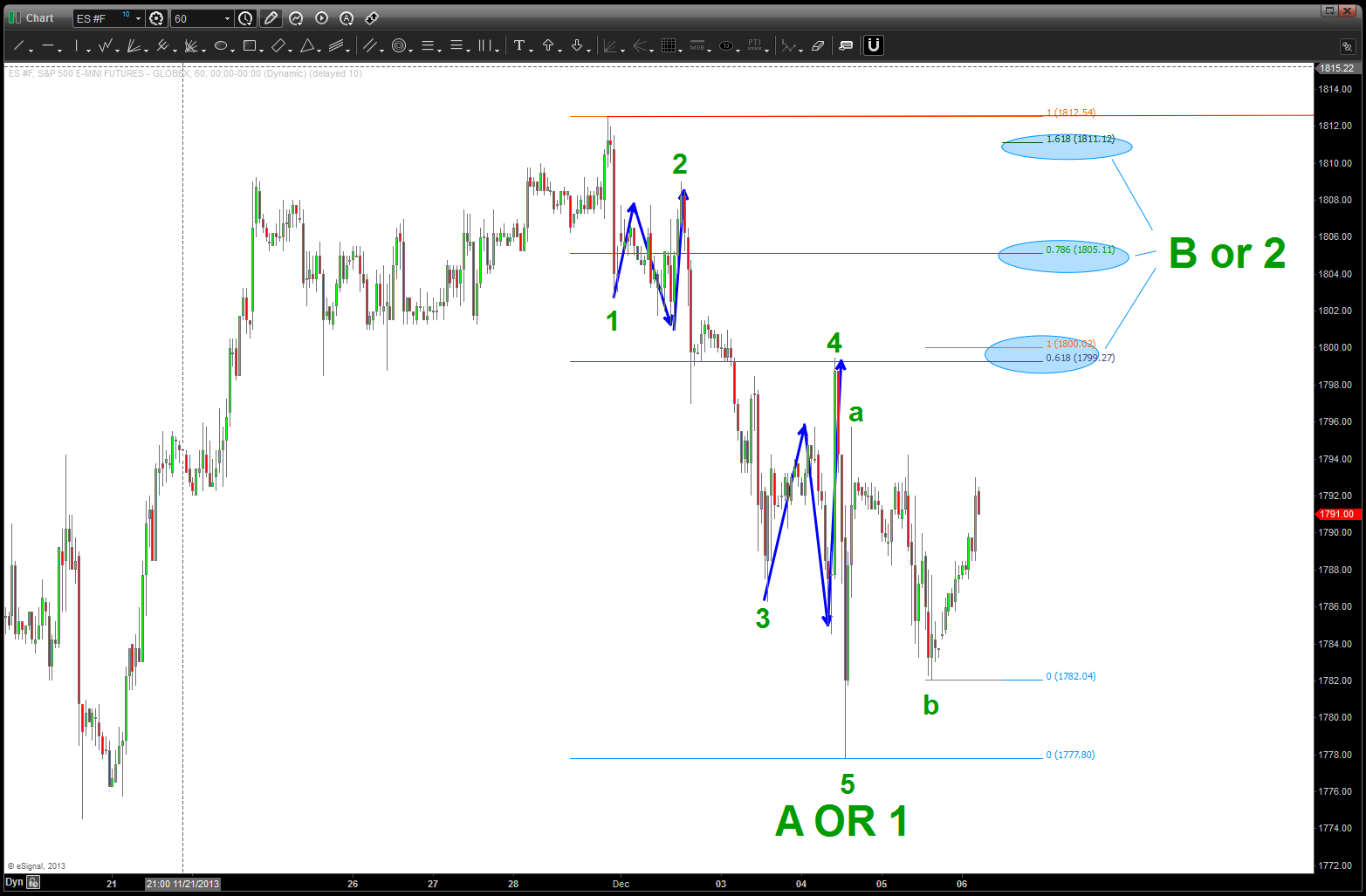
E mini before non farm
Green Tea and just sit on your hands. things will settle down, a pattern will appear and let it rip.
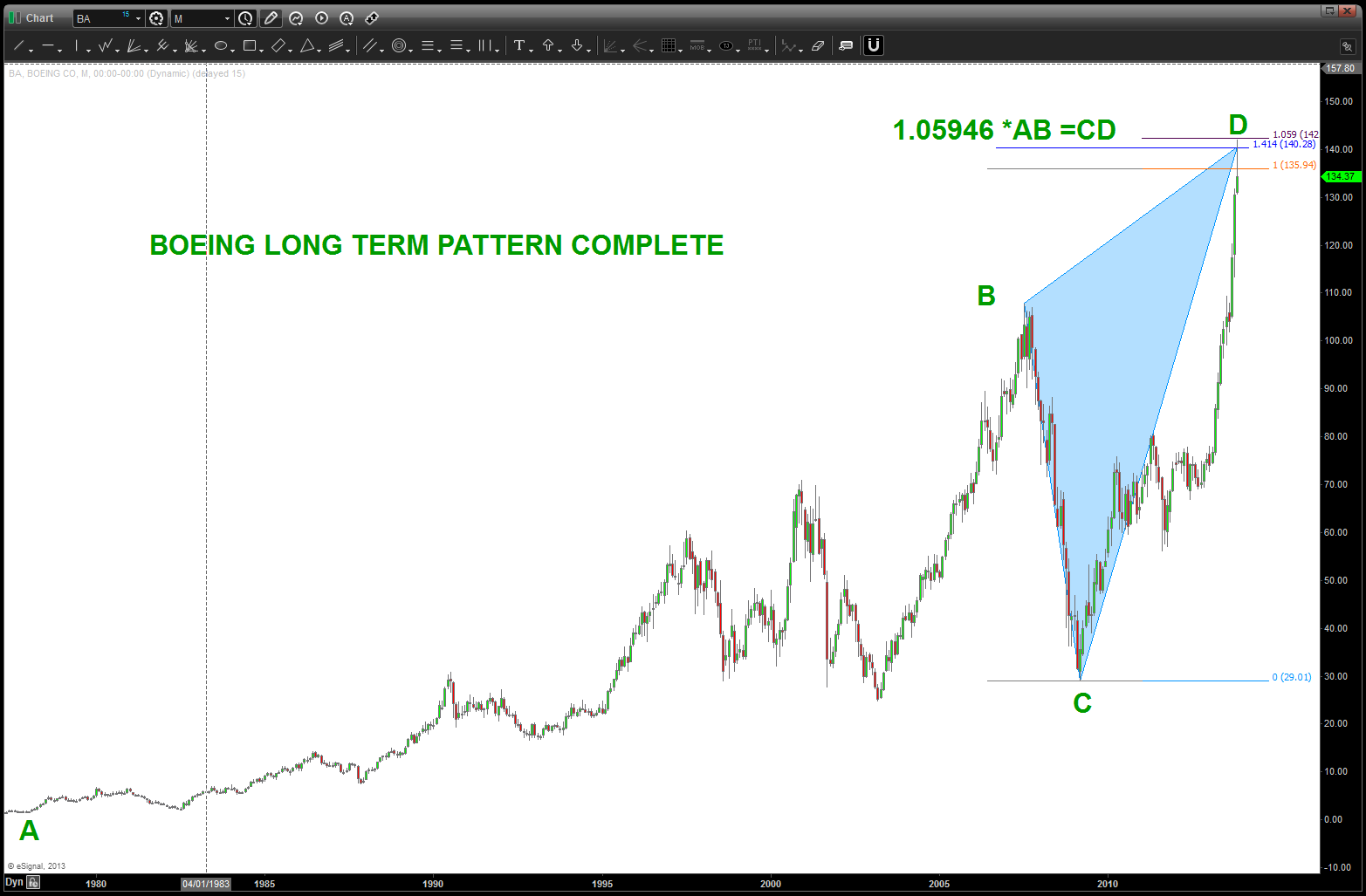
AAPL and GOOG patterns completing …
Posted on December 6, 2013 2 Comments
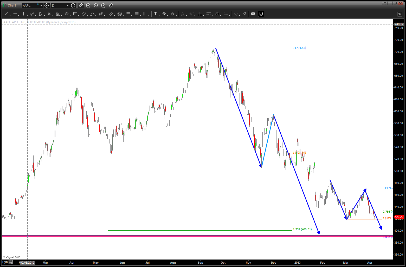
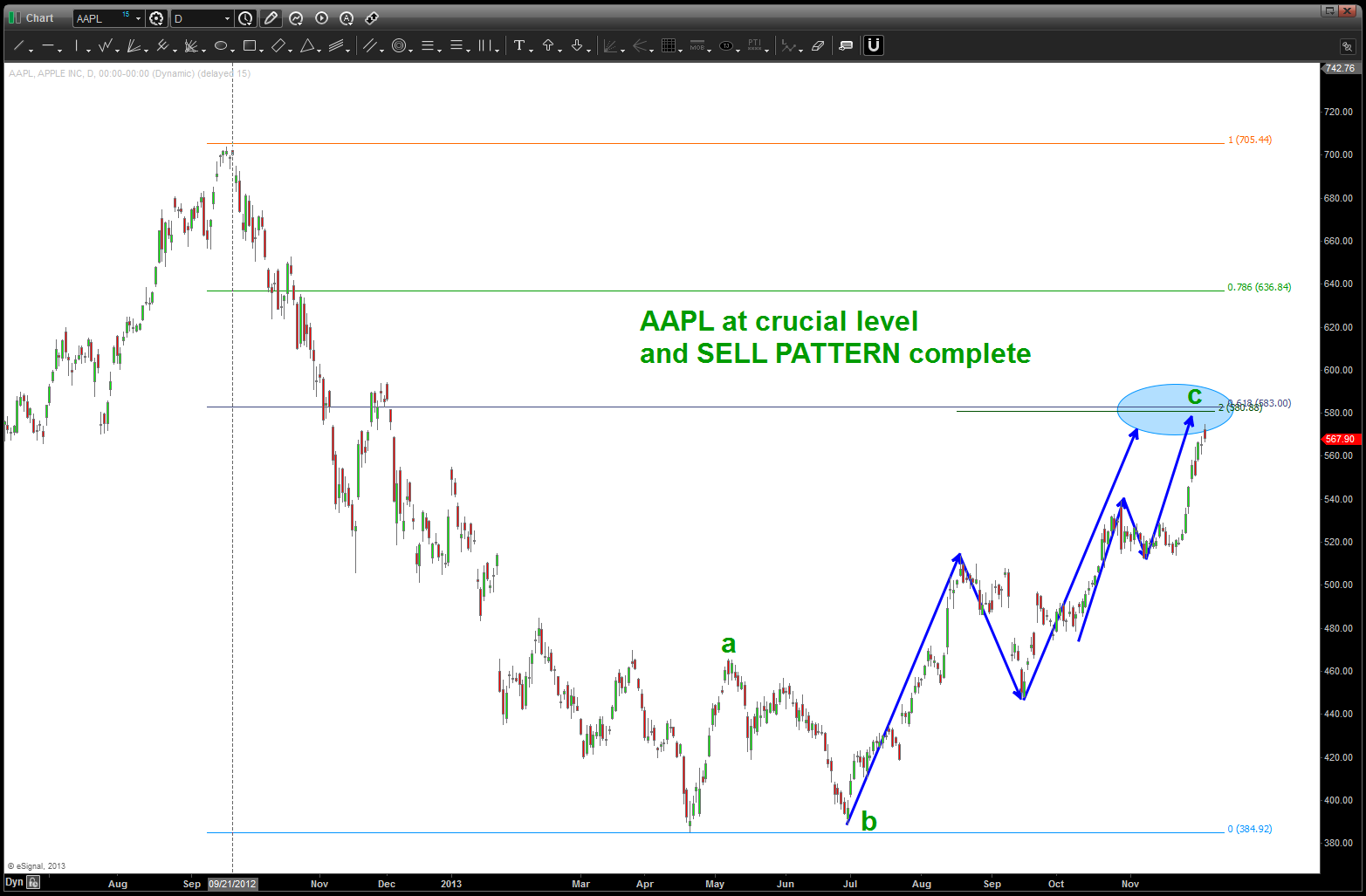
here was the geometry for the top in AAPL:
https://bartscharts.com/2013/08/20/sir-issac-newton-and-aapl-fell-from-the-tree/
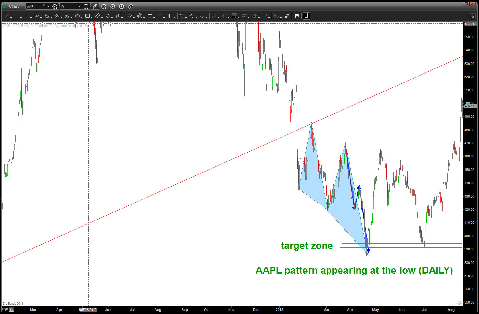
here was the geometry for the low in AAPL:
as we approached the low a very symmetrical 3 drives to a bottom appeared:
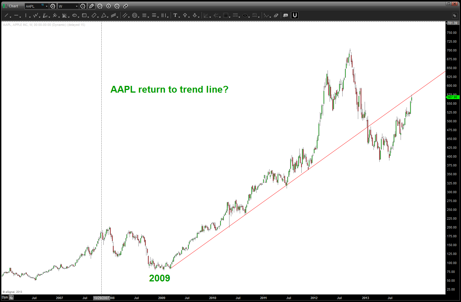
the “first” top that appeared gave us a sell signal and about 70 bucks but the market moved up and higher …now, we are completing another pattern along w/ returning to the trend line on AAPL. So, this is a very crucial juncture for the market …
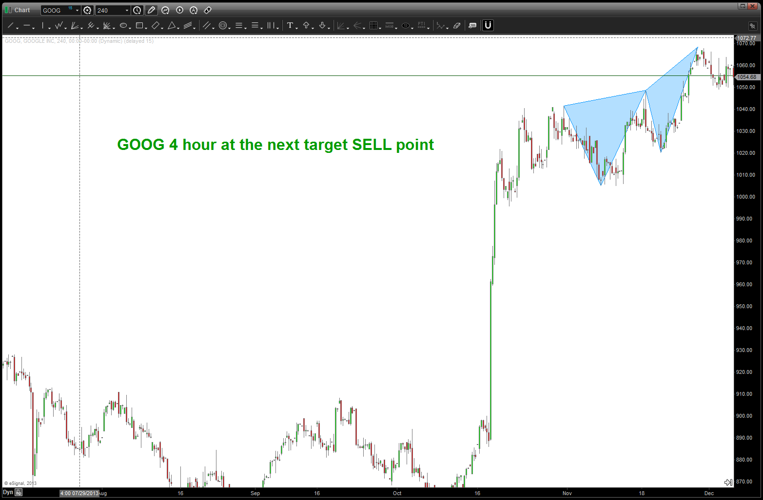
GOOG — how UnAmerican can you get – trying to short GOOG? Well, it’s just numbers and patterns so guess what we are “there” again w/ GOOG so after the near knockout punch of a simple 100 point gap in your face – why not?
here’s the blog of the “next” target:
https://bartscharts.com/2013/10/21/more-pumpkin-soup-added-a-new-ingredient-to-the-recipe-goog/
here’s the update:
Equal Octave Scale of Music and the DJIA …
Posted on December 5, 2013 Leave a Comment
my friend, fellow chartist and trader gave me the chance to do this post on his blog as a “guest blogger”
http://allstarcharts.com/the-math-behind-historic-dow-charts/
at the time, I was watching, extremely closely, the “standard” .618 price projection and it’s importance due to using the all time low from 1896 at 28.48. the market opened/closed in and around this level for roughly 5-6 months an then exploded higher.
one of the lesser know price projection techniques is actually based on the equal octave scale of music. this is NOT going to be a diatribe about musical theory, if your so inclined see a website like this: http://www.phy.mtu.edu/~suits/scales.html . as a trader, I know the musical note ratio’s and I also have some fundamental understanding of the importance of square roots and their inverses and we’ll leave it at that….
so, if we take musical note F# ratio of 1.68179 and then subtract 1 we get .68179. that is the multiple that we project from and that nails the recent high and also intersects the expanding triangle that is bearish. (1.618-1 = .618)
stay tuned and as we’ve been saying for a while, things certainly seem to be adding up ….
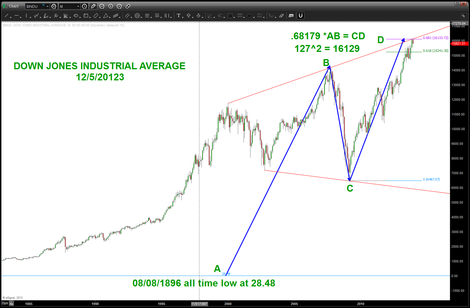
DJIA and musical note F# of the equal octave scale of music
Gold since 1913
Posted on December 5, 2013 Leave a Comment
historical data is king … w/ the correct and long term data we can make some very powerful forecasts and look for patterns that others might not see. I came across a chart the other day that showed the price of Gold in/around 20 bucks when the FED was created in 1913. so, below I plotted the PRICE action that took us up the low of 252 in 2001. I wasn’t surprised that the recent low in Gold was a .382 from 20 bucks …NOW we can understand why this is an important level. In any liquid instrument that has been on an extended BULL or BEAR run the .382 correction is “usually” a good stopping point and a place to asses market action. strong and powerful trends will hit these levels and resume like a rocket ship. weak trends or shifts from bull to bear or vice versa will, usually, respect the area, but then will give away and continue lower.
I really don’t have an opinion on the gold bounce … I do have an opinion on the wave count and that tells me lower, for now. when doing pattern work for this key commodity, make sure to use the 20.67 level. that node will prove to be important again.

SPOT GOLD since 1913
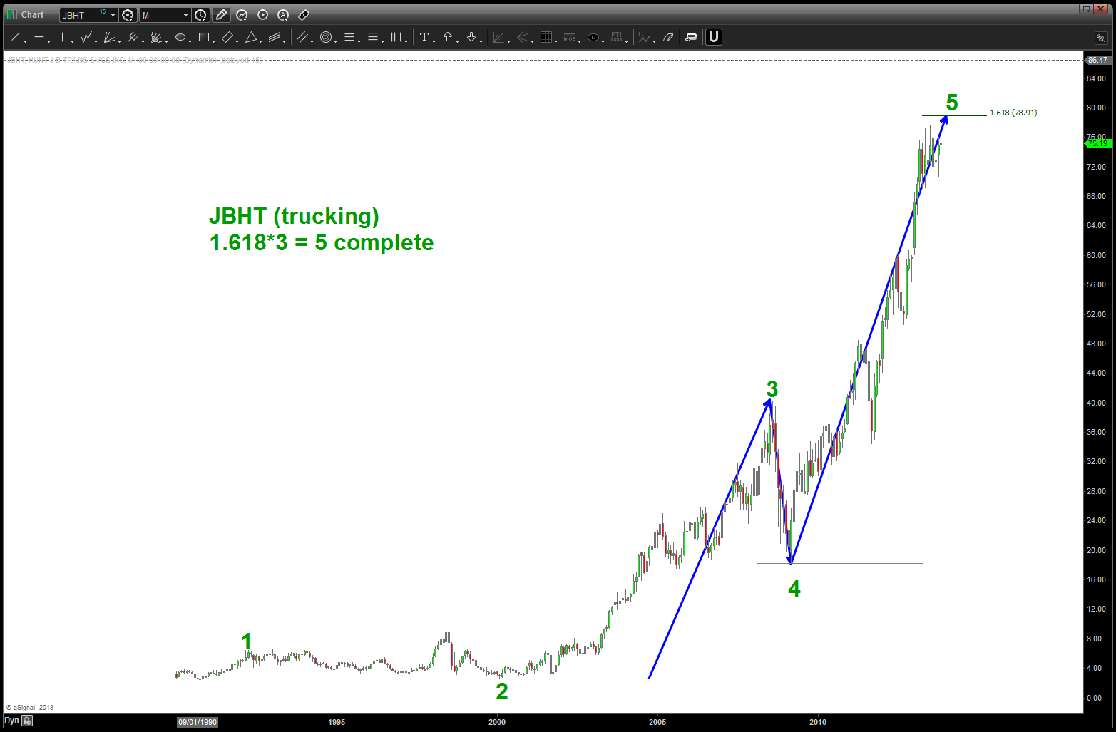
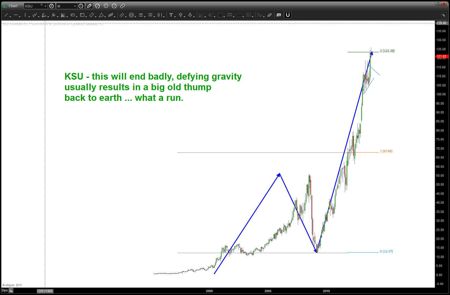
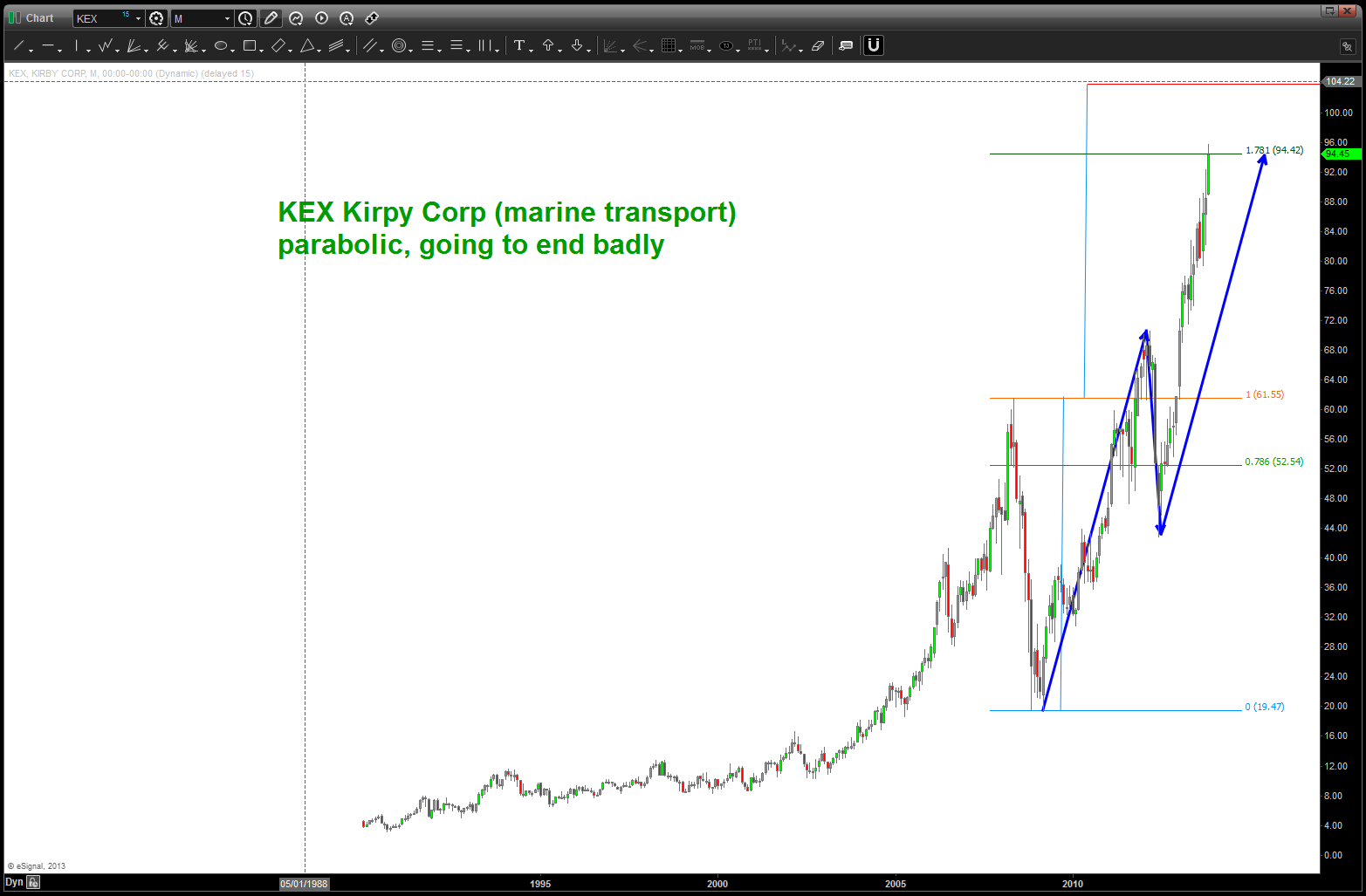
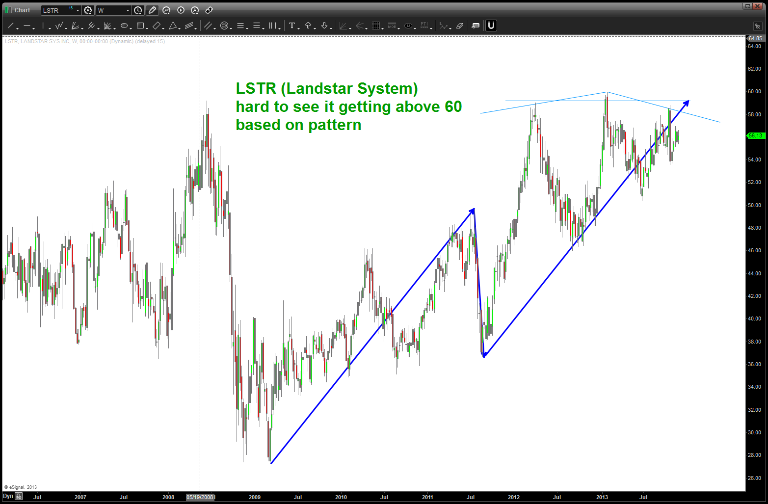
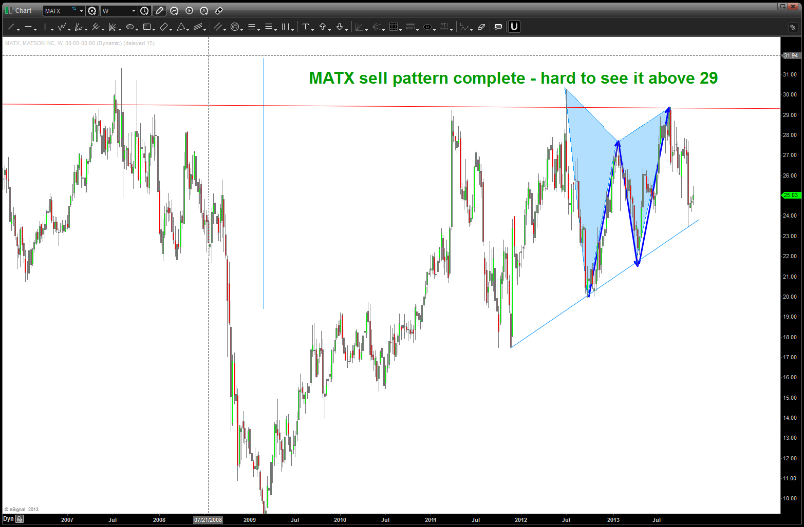
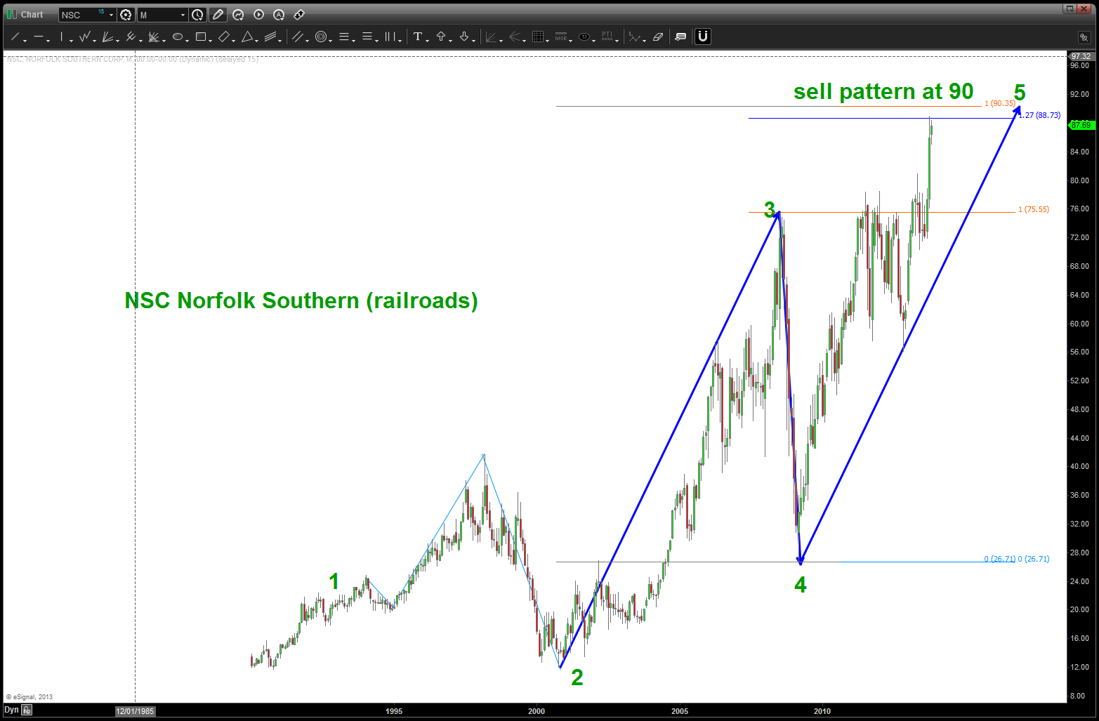
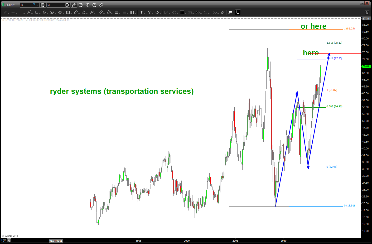
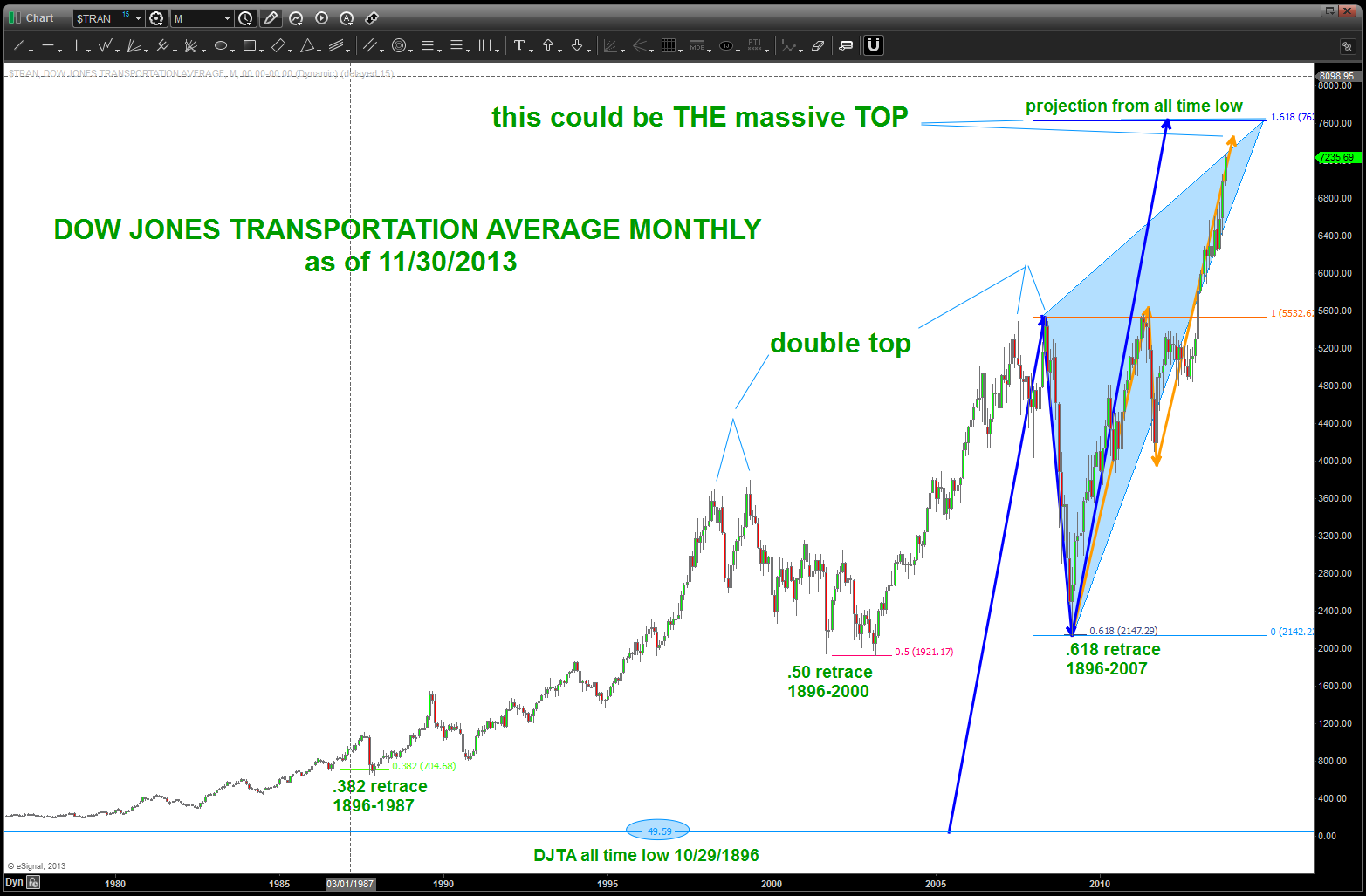
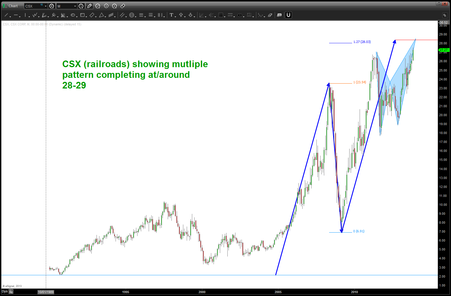
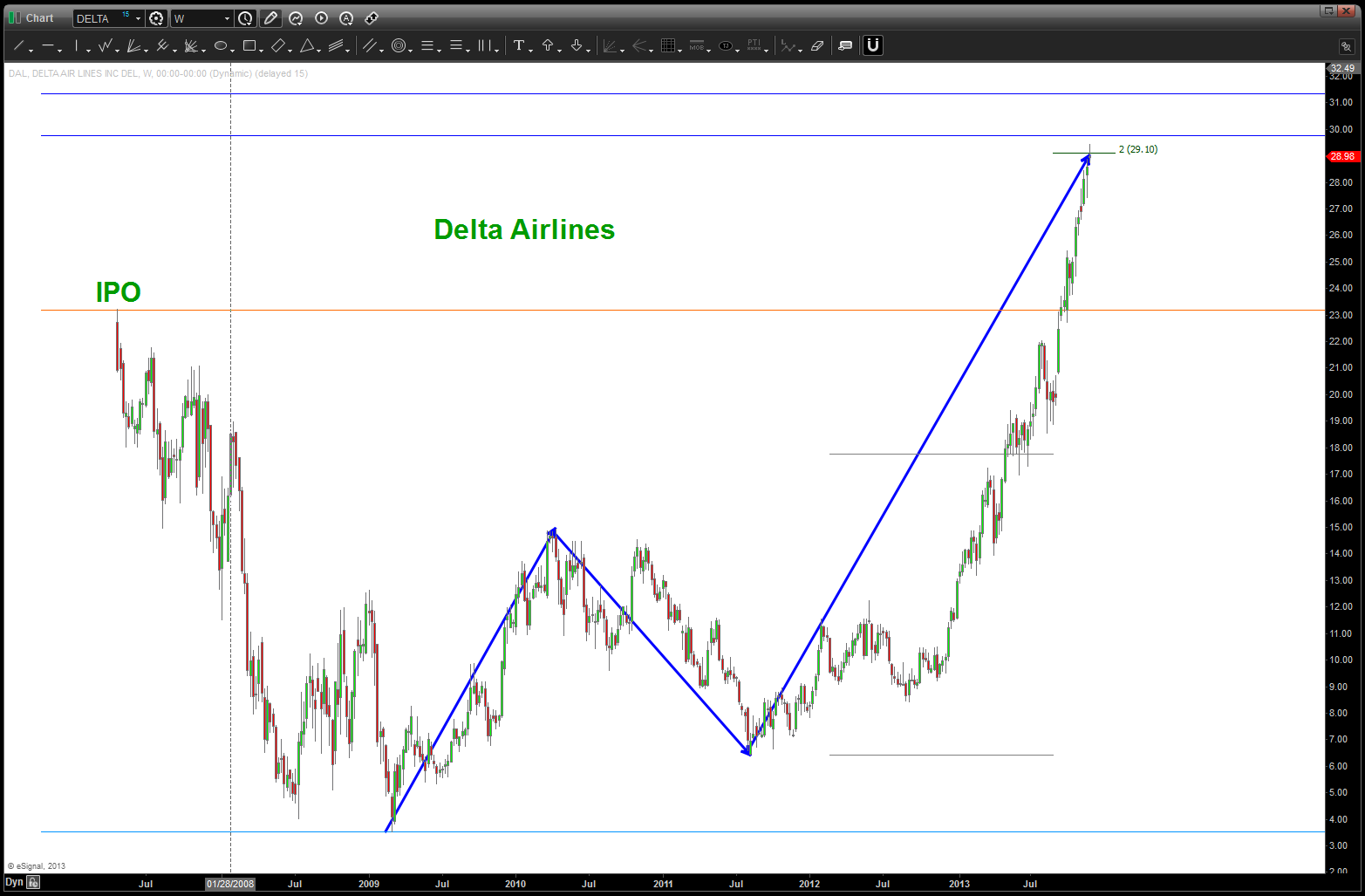
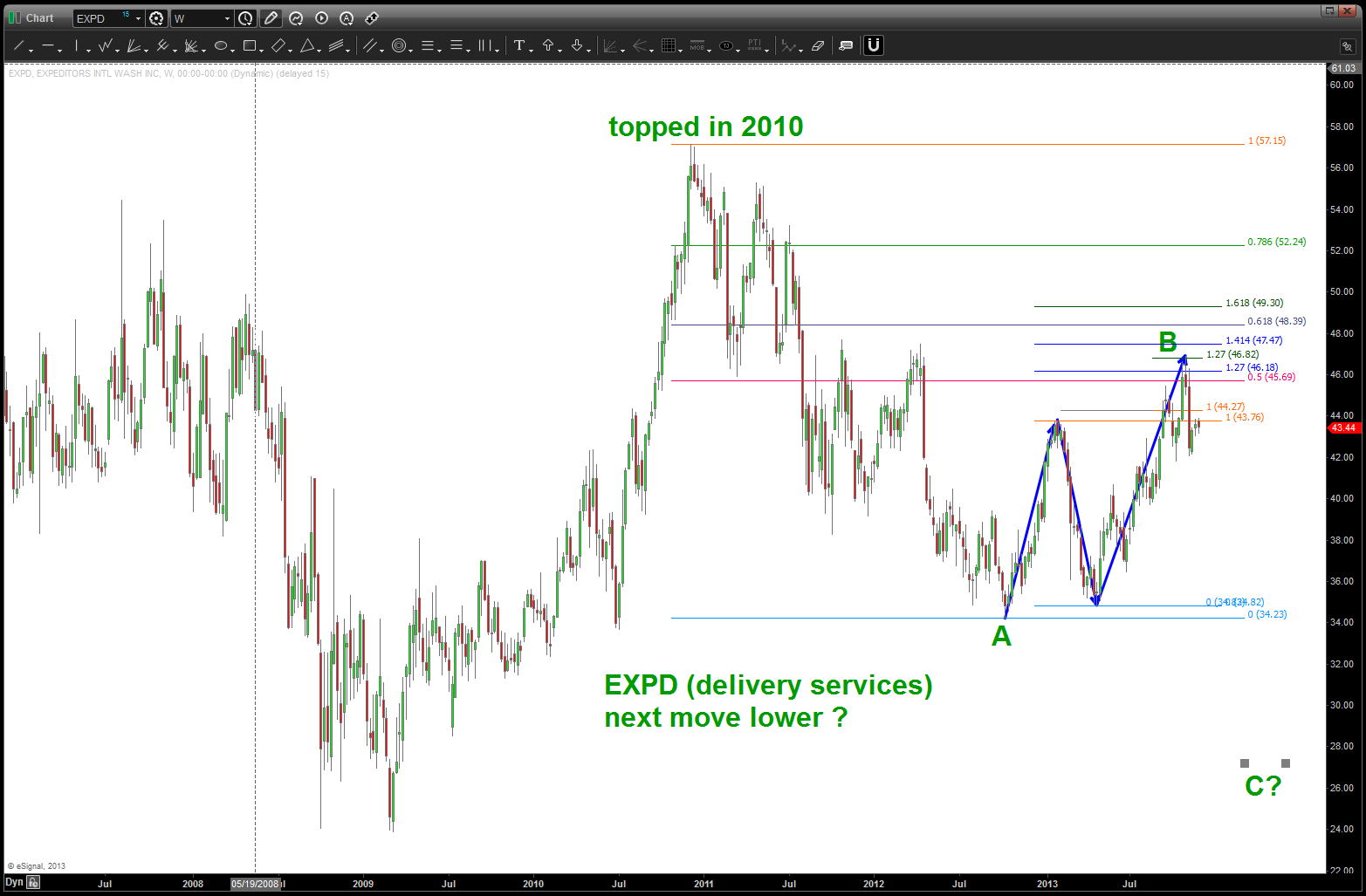
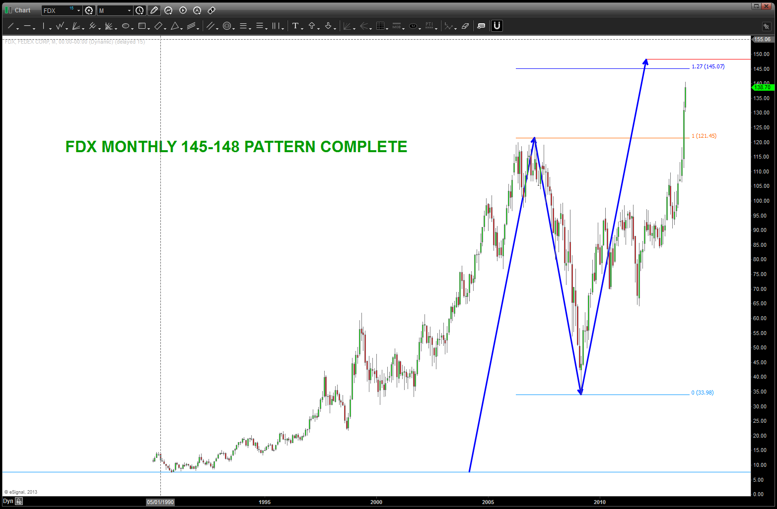
Dow Jones Transportation Average – a chart tour starting in 1896
Posted on December 1, 2013 Leave a Comment
if you have been following the posts over the past couple months, you’ll find that I’ve moved (pretty much alone) into a very cautious, if not outright bearish mindset based on the patterns that are appearing across the circle of life. one of the more prevalent patterns that I’ve been watching is the DJTA. from the all time low of 49 on 10/29/1896 it has been shown how this key “node” was the anchor behind support in 1987, 2000 and 2009. Using this node we can now project for targets on the DJTA. anywhere between 7400-7600 on the index should be extremely important resistance if not an a major inflection point. here is the chart (updated as of 11/30/2013)
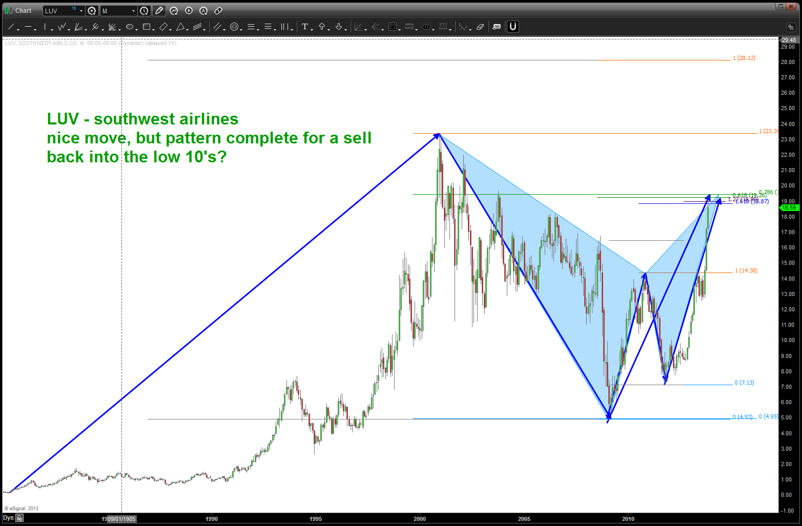
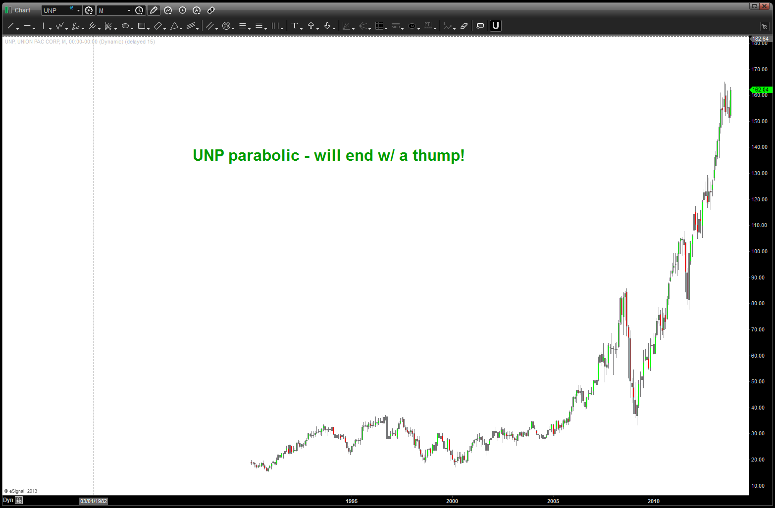
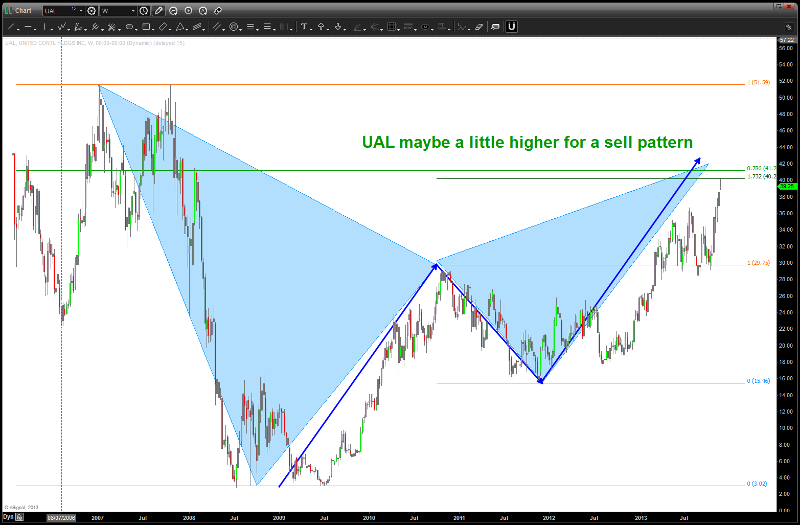
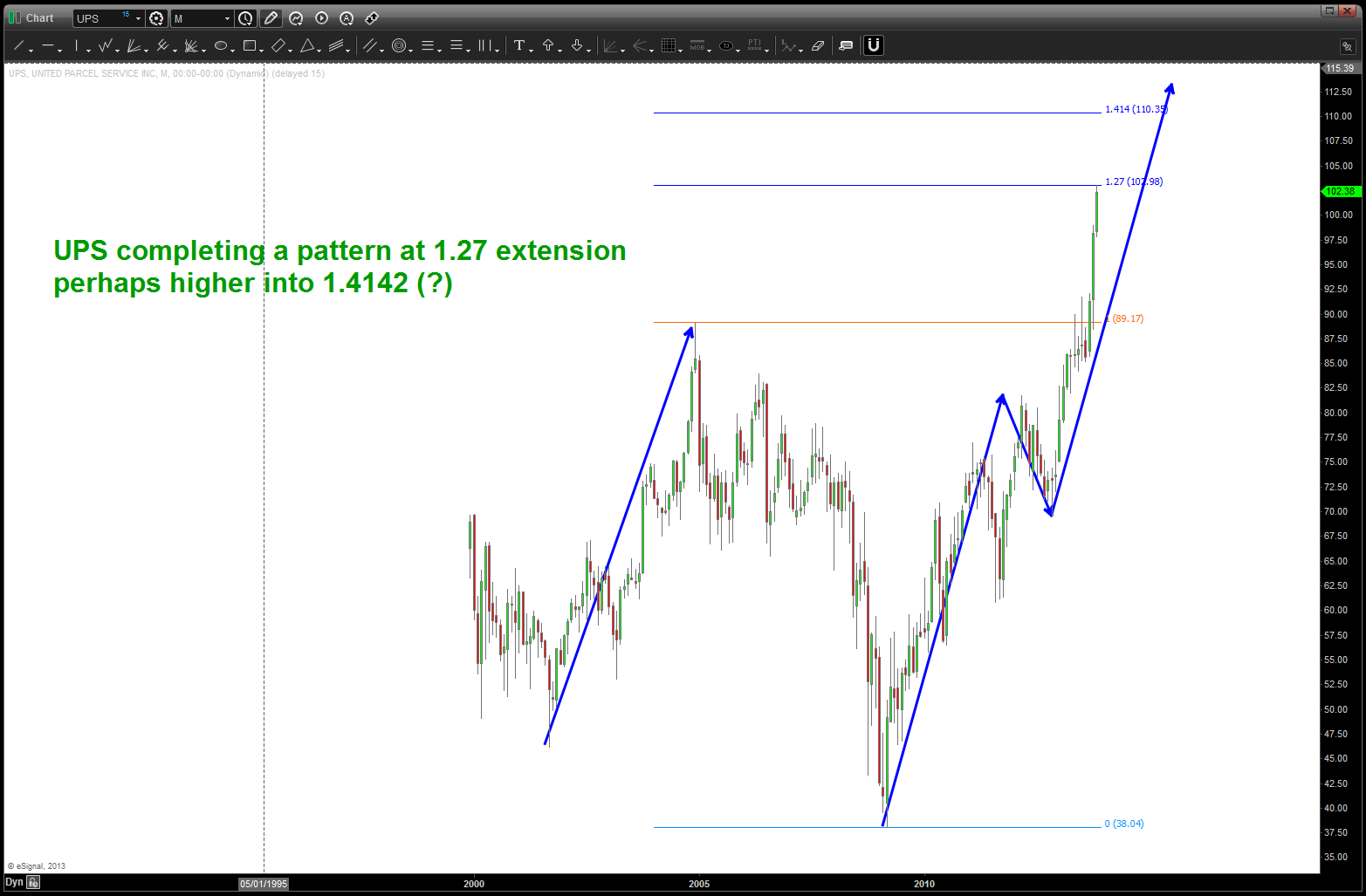
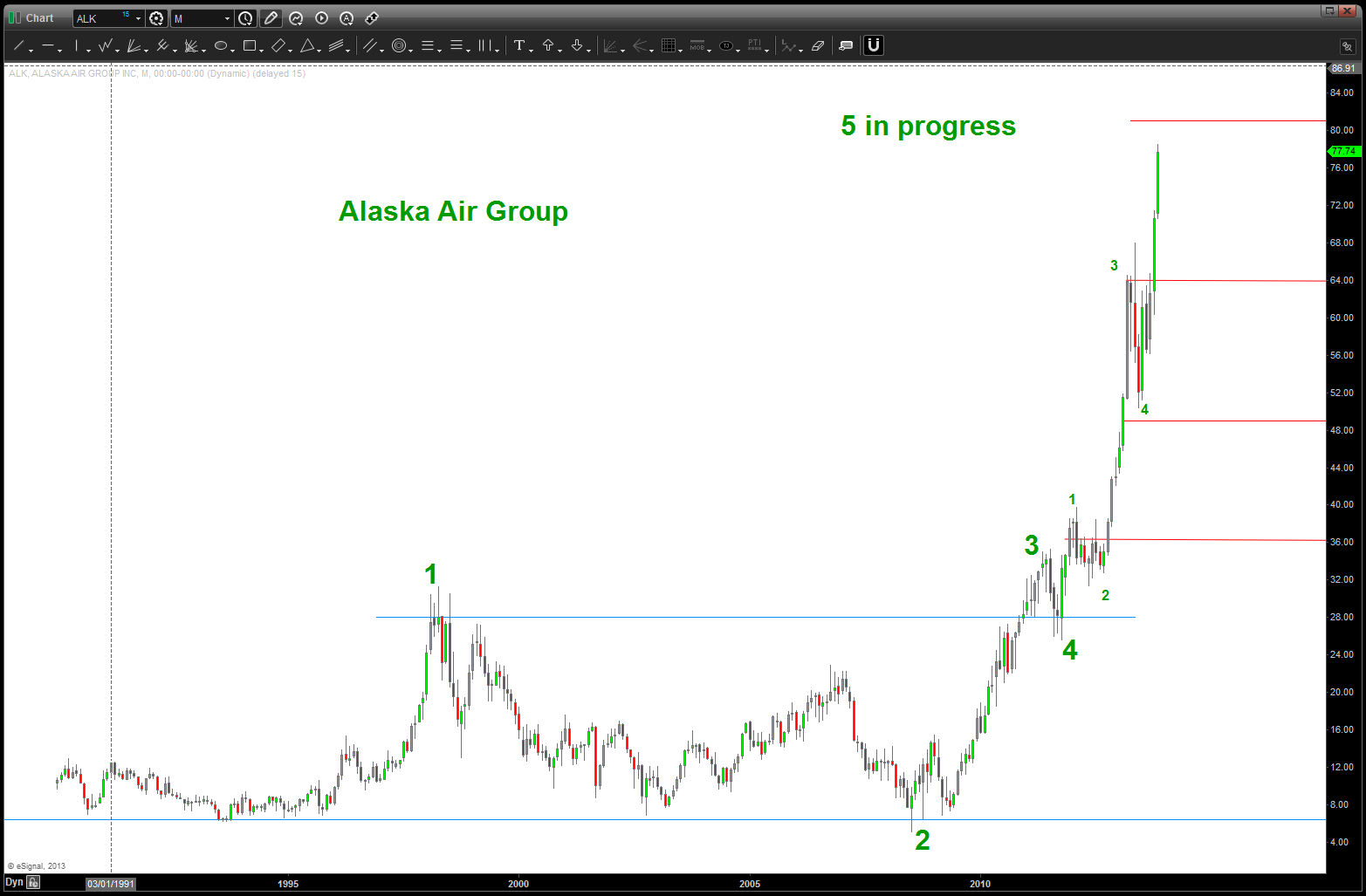
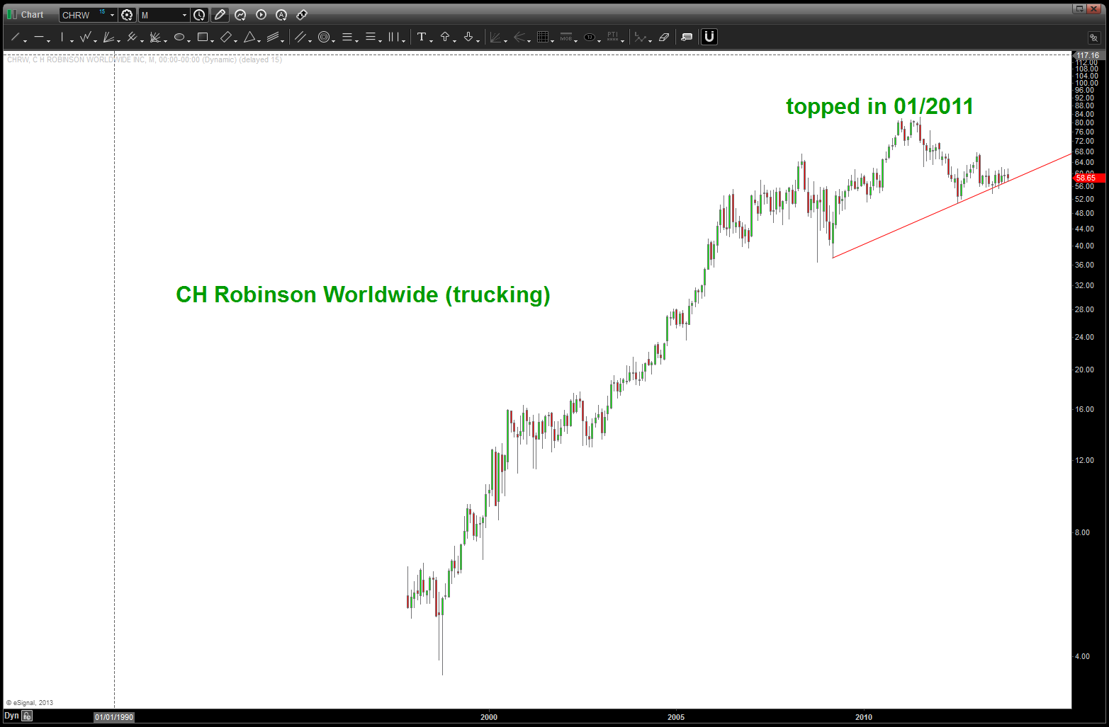
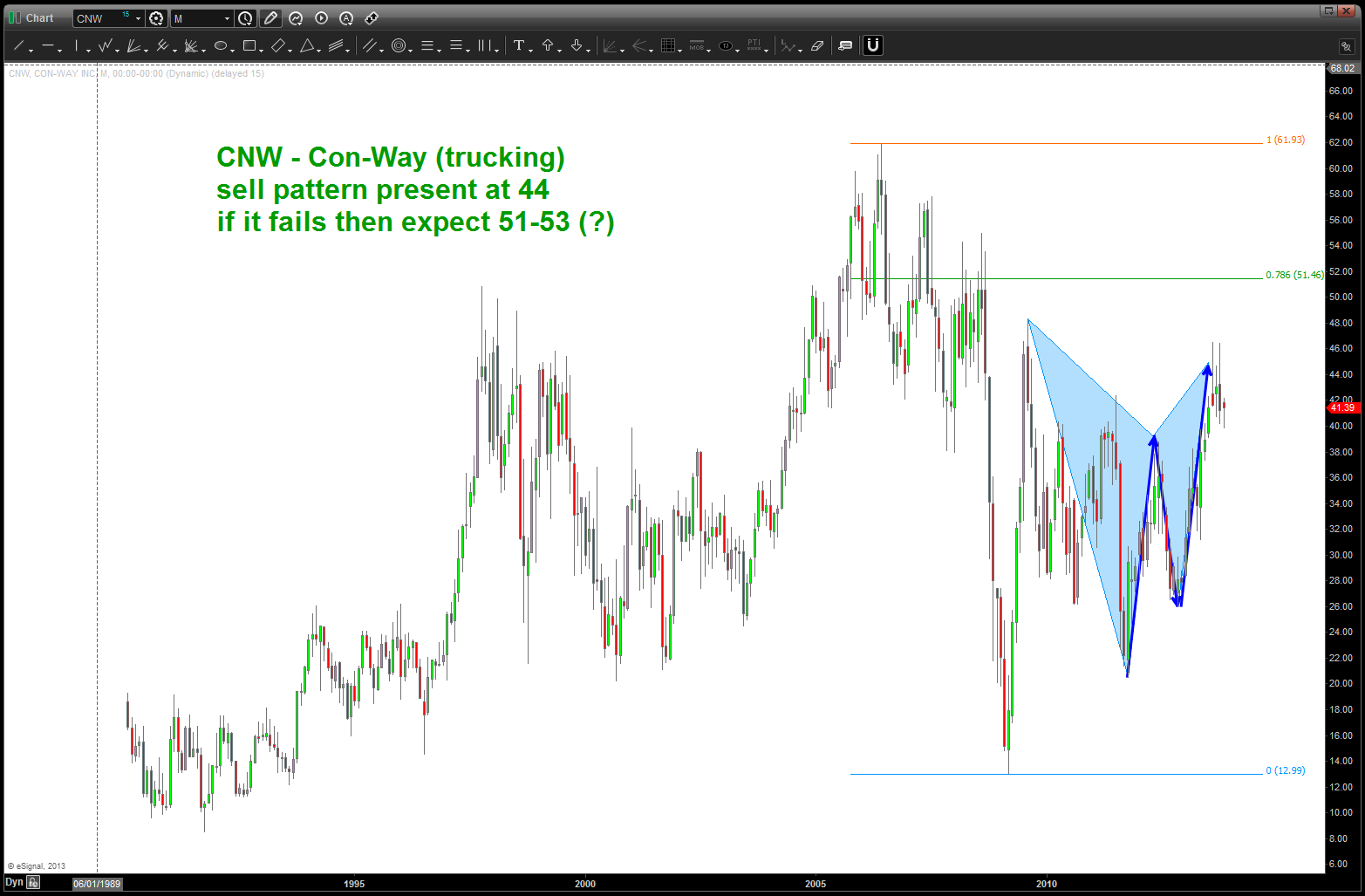
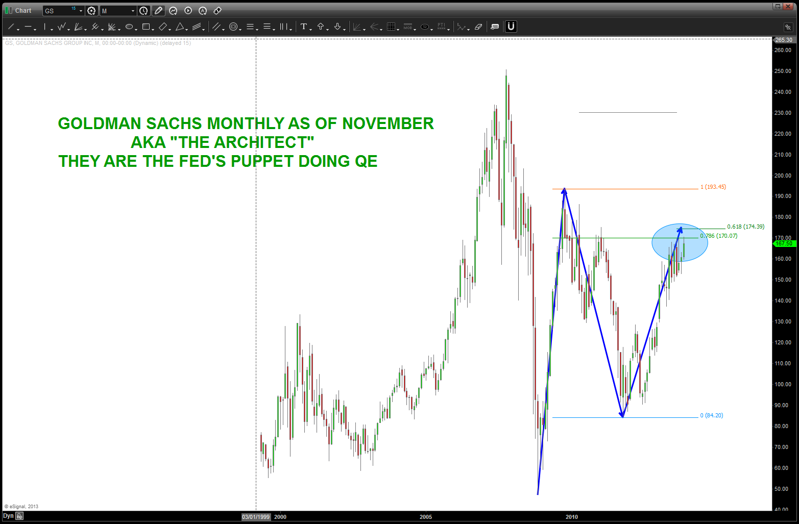
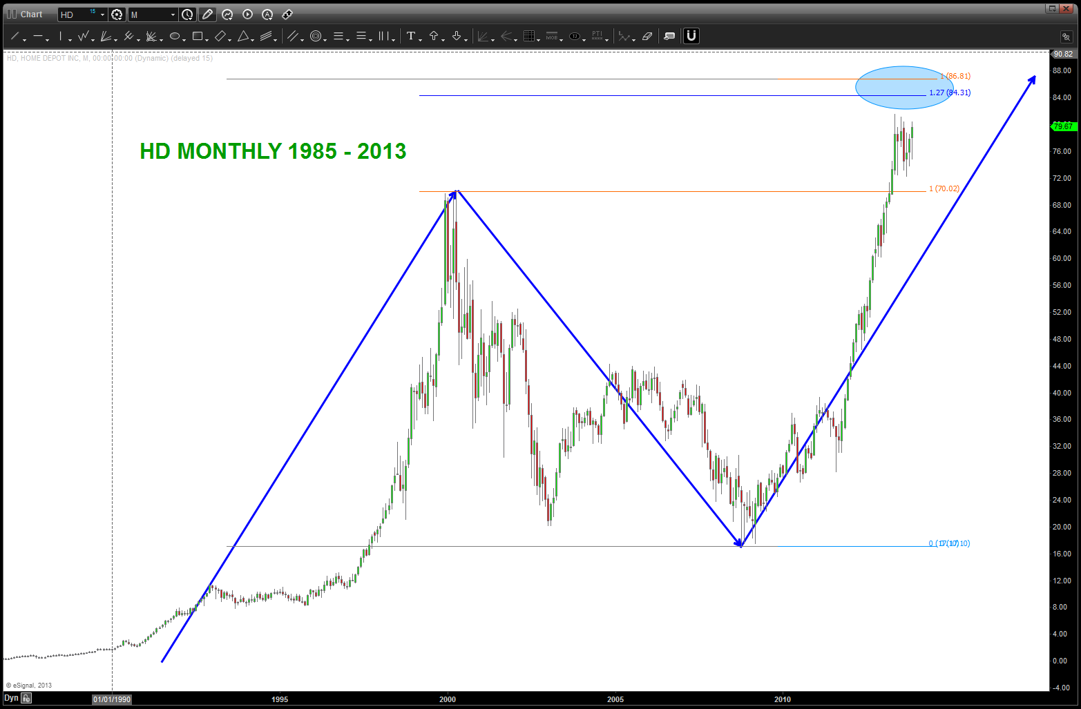
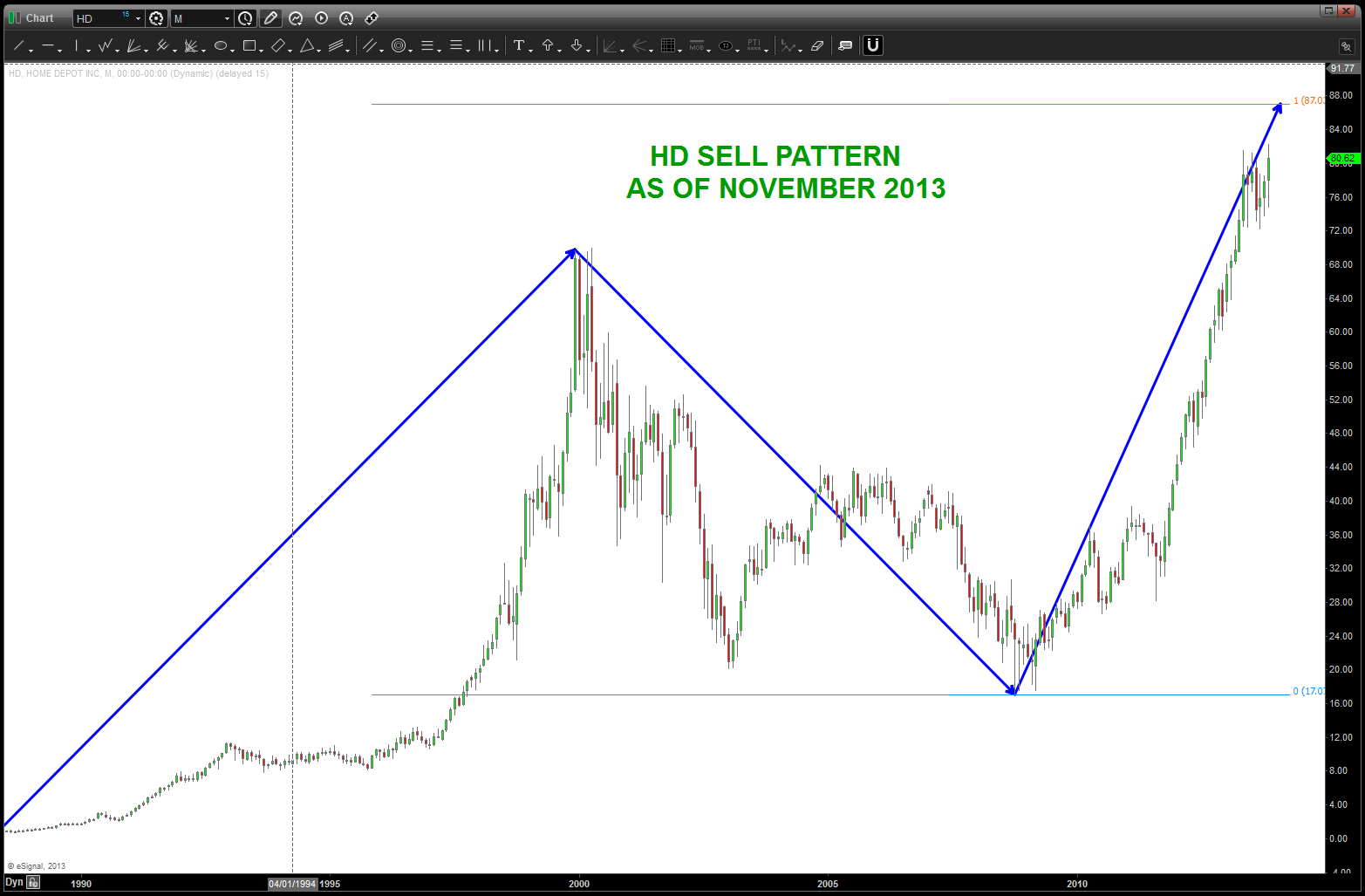
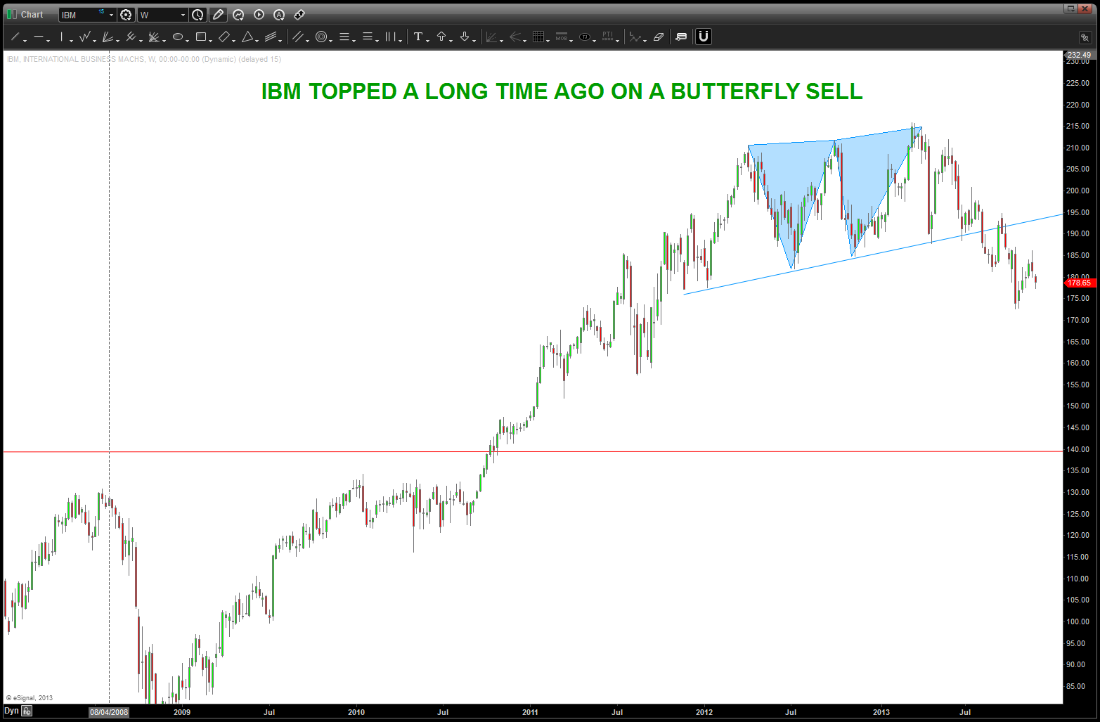
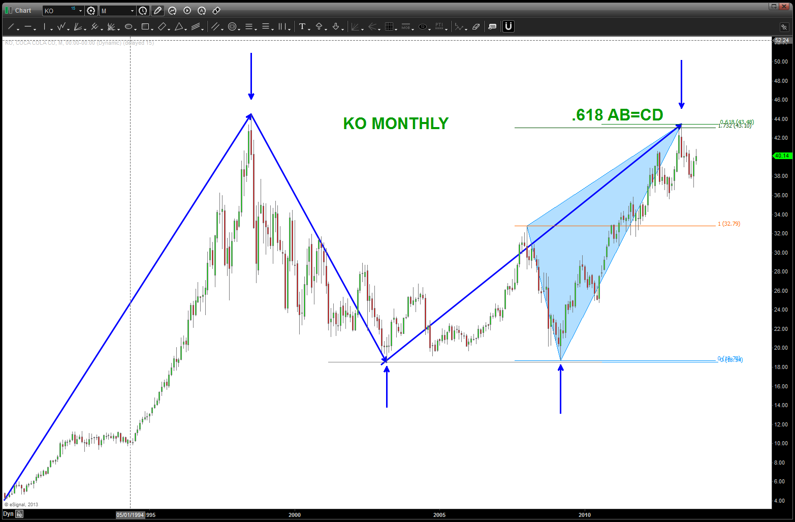
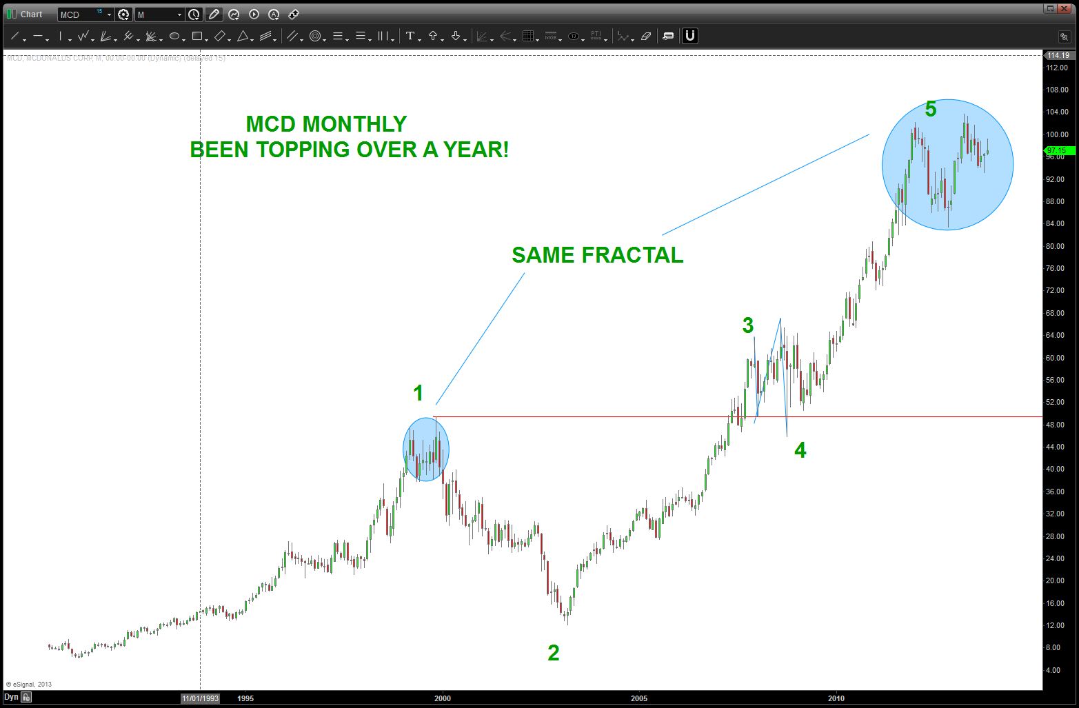
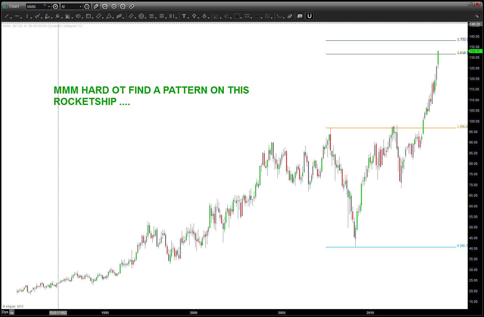
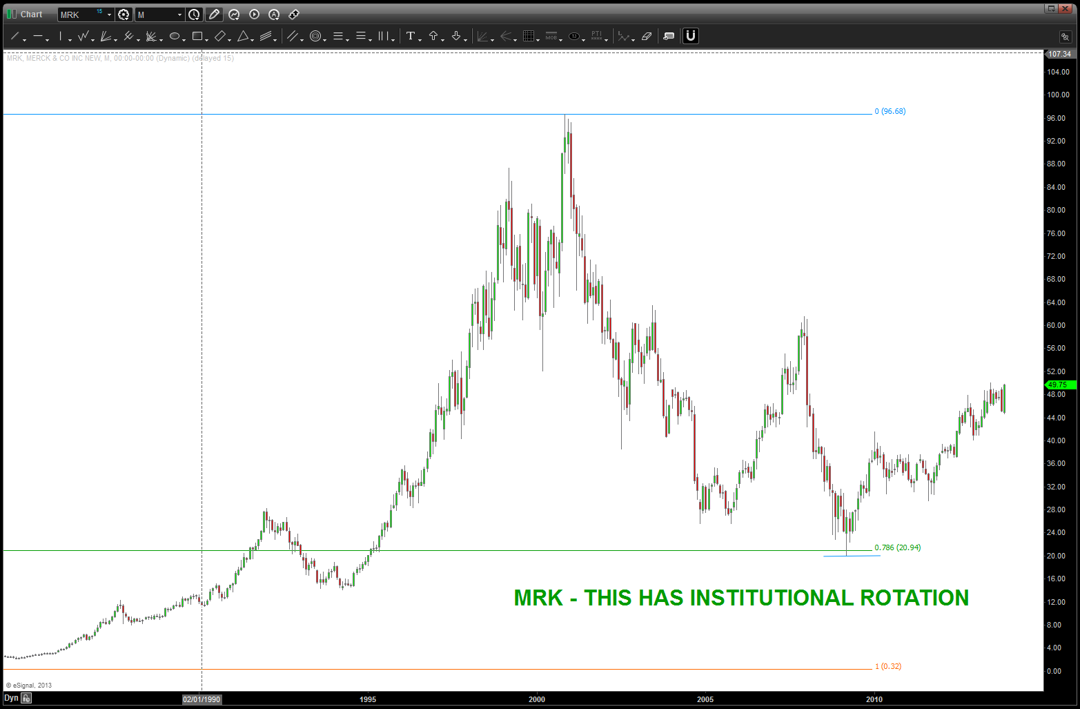
 so, we’ve got just a little bit more to the upside, so I decided to take a peak at the entire DJTA and look for patterns that support a bearish nature once this level is hit. take a view thru the charts, no screaming buys but I do see 1) parabolic rises, 2) monthly sell patterns appearing and 3) some stocks that topped years ago. so, be mindful of this level and, well, we’ll see if the patterns work or not ….

IWM what a perfect set-up
Posted on November 26, 2013 Leave a Comment
the “zone” of 113-120 should be very strong if not the “top” for a while … if this pattern fails, I’m going into gardening.

IWM
Great British Pound – again
Posted on November 26, 2013 2 Comments
if your a new reader, check out the below posts on the continuing saga of trying to get short the GBP vs USD:
https://bartscharts.com/2013/09/12/the-great-british-pound/
https://bartscharts.com/2013/09/18/the-great-british-pound-update/
https://bartscharts.com/2013/09/30/great-british-pound-update-iii-and-pumpkin-soup/
https://bartscharts.com/2013/10/22/the-pound-gorillas-and-juggling-dynamite/
https://bartscharts.com/2013/10/29/pound-negative-reversal-potential-long-term-chart/
https://bartscharts.com/2013/10/31/halloween-pound-update/
https://bartscharts.com/2013/11/02/great-british-pound-continues/
https://bartscharts.com/2013/11/05/jec-silver-past-fractals-and-the-pound/
https://bartscharts.com/2013/11/12/pound-foldback-updated/
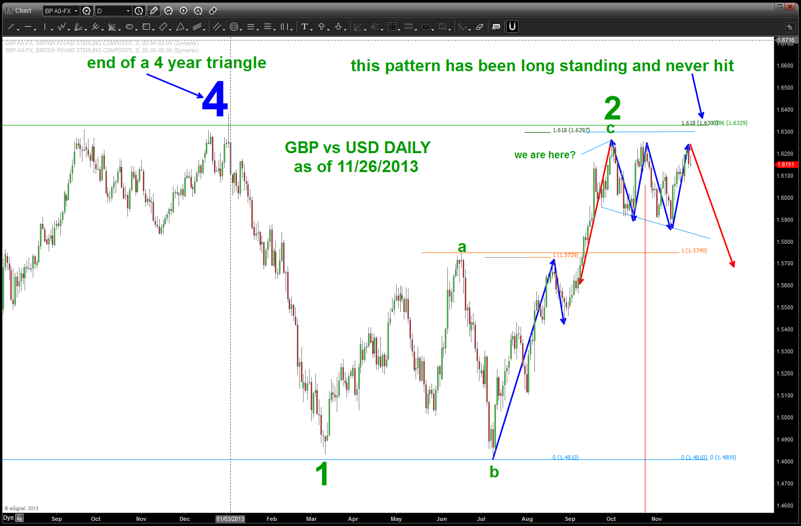
so, where do we sit now? below you will find a daily chart of the GBP vs USD and, well, nothing has really changed. let’s focus on a couple things:
- the target we had “hoped” for is, quite frankly, still out there and rest at 1.6330. it is conceivable for one more push into that short zone.
- the analysis of a multi year triangle completing (big blue 4) is still alive.
- the move from 4 (big blue) down to the 1 (green) represents 1 0f 5 in a 5th wave decline that “should” take out the 2009 lows.
- most recent price action is viewed as a 2nd wave correction in a-b-c fashion. the 1.618*a = c level is at 1.6297 (never hit)
- here’s the most important part – the 2 month consolidation is either is 1) corrective and an advance to our long standing target will occur OR 2) the most recent high yesterday is “it” and we start down. I don’t know which is which but I do see a more favorable foldback than the one originally presented on 11/05.

GBP vs USD Daily
the foldback can be seen here …
GBP vs USD foldback into Head and Shoulders
here is the 4 hour chart w/ a little more granularity …
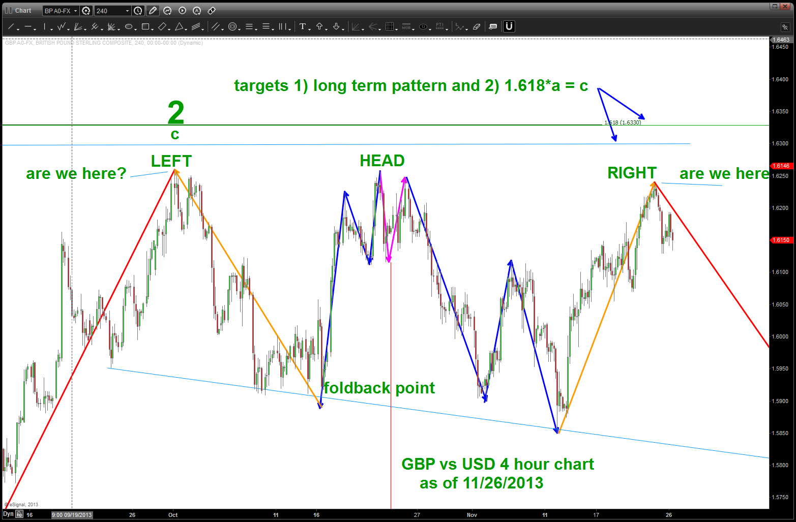
GBP vs USD 4 HR chart
will be trying to get short (again) on this potentially MAJOR move … our risk will be anything “closing” on a 4 hour – daily basis above our long term target OR above the 4 (big blue one). at that point I will ERASE everything an go back to the drawing board…
rock on, ok?
B
put the needle on the record, put the needle on the BROKEN record – caveat emptor
Posted on November 24, 2013 Leave a Comment
apologize for falling off the blog bandwagon early this week…got smacked like a brick in the face w/ a stomach bug. just resurfaced … actually got some emails from you asking where the posts are…thanks! since my record appears to be broken, thought I would add some thoughts from 50+ years of trading…each of these men are friends and mentors of mine …
Larry Pesavento (www.tradingtutor.com) put out a chart on the Shiller P/E ratio but actually added some “other” criteria to the chart in the following manner:
- Shiller P/E anything > 18 (current is 25+)
- S&P 500 at a 5 year high
- S&P 500 at least &% above 40 weeks smoothing
- Bulls > 50%, Bears < 20% (Investors Intelligence)
- Prior Instances of this happening: 1972/1987/2007
- note – in 2000 bears never fell below 2000
- note – this happened in 1929 on imputed sentiment
the most recent clusters have been in May 2013 / Aug 2013/Nov 2013 …. why hasn’t the market gone down, just a bit? Well here’s why …
mentor/friend Mike Jenkins (www.stockcyclesforecast.com) recently explained the amazing run in these terms:
“The FED buying of treasury bonds actually spills into the area of the FED buying stocks because indirectly they are. The ‘banks’ like Goldman Sachs now can borrow billions from the FED at a fraction of a percent and buy an ETF basket of stocks with 2% dividends and sell futures short as the hedge and also sell puts and calls to make up the spread difference arbitraging a good profit on the FED loan. This has had the effect of ratcheting up the market with each new buy program. The proof that this is at work is the fact that the biggest correction seen so far took place in late June when the S&P futures were expiring and in a downtrend and the September contract was at too steep a discount to roll out profitably so they had to liquidate some long baskets. This will happen again either in December or March and then there could be hundreds of billions of baskets unwinding just like the portfolio insurance of 1987. The big institutions learned in 2008 that no matter what the ‘valuation’ of a stock was, it could go to almost zero if a large enough seller was out there. They won’t wait around this time and they’ll create a ‘flash crash’ getting out…”
I’ll just leave you w/ two charts …one is the IWM (Russell 2000 ETF) and the continued march of the DJ Transports …
it’s coming folks … keep riding this wave but when you get smashed into the coral at the end of the break, hope you brought a breathing apparatus. What a great run it’s been…
one last, man, I hope I am 100% complete wrong ….
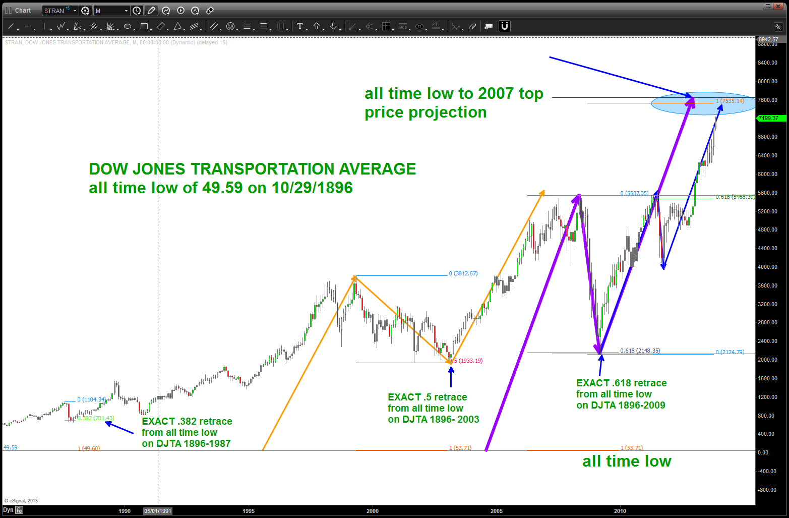
update of DOW TRANSPORTS
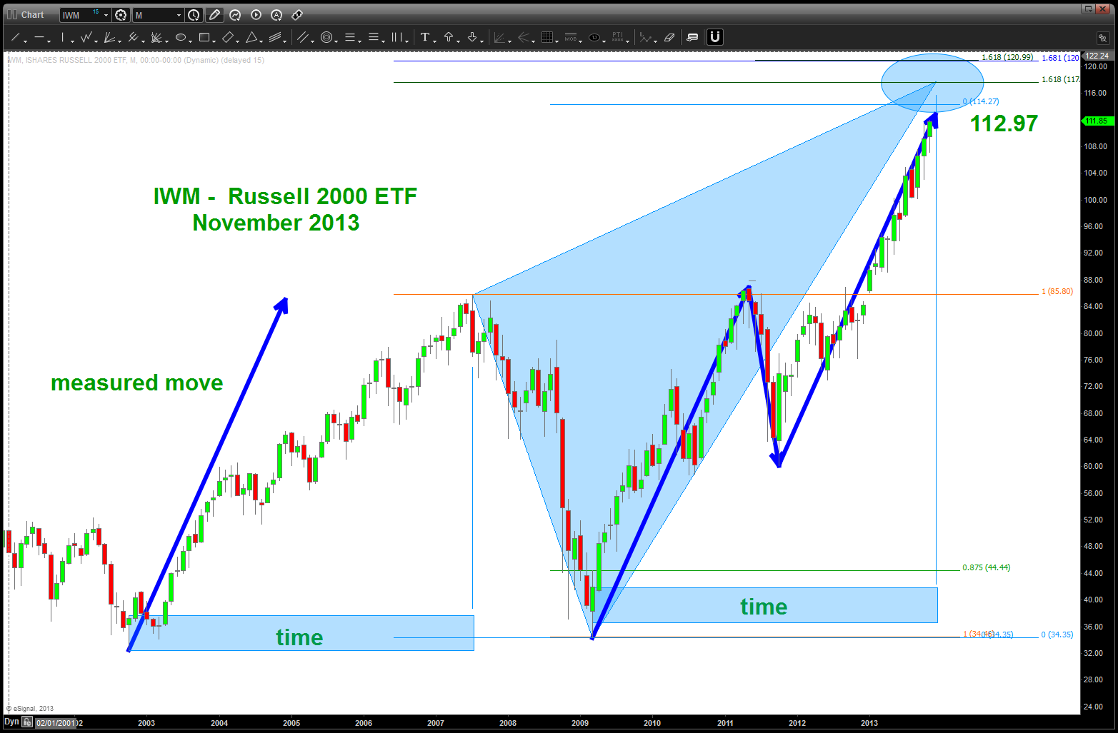
SHORT Pattern on the IWM
Silver following the script part III
Posted on November 20, 2013 1 Comment
for a view of Part 1 and Part II of “Silver following the script” please see the following: https://bartscharts.com/2013/11/08/silver-following-the-script-part-ii/ this will take you to Part II and inside of Part II is a link to Part I.
Summary: key level is 19-60-19.80 on spot silver. IF that gives away, THEN an move into the 13-14 region is a real possibility.
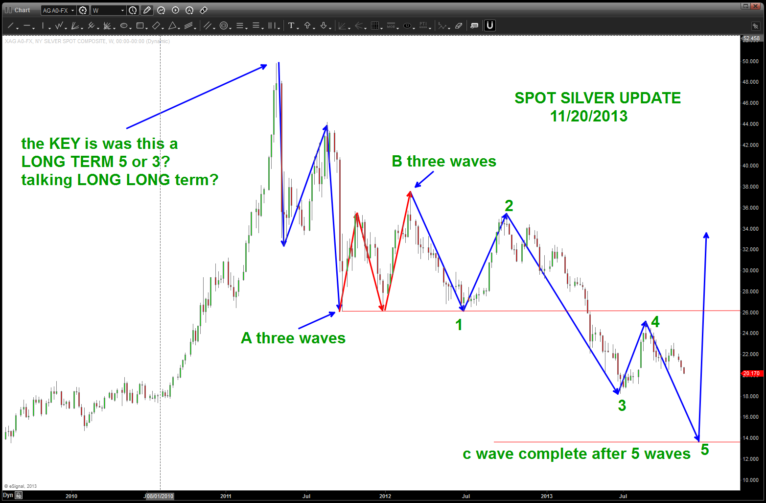
update on Spot Silver
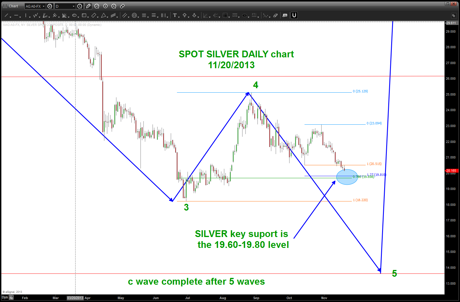
daily update showing the key level daily level (blue ellipse)
