silver following the script – part II
Posted on November 8, 2013 1 Comment
the first post on Silver:
https://bartscharts.com/2013/09/05/silver-following-the-script/
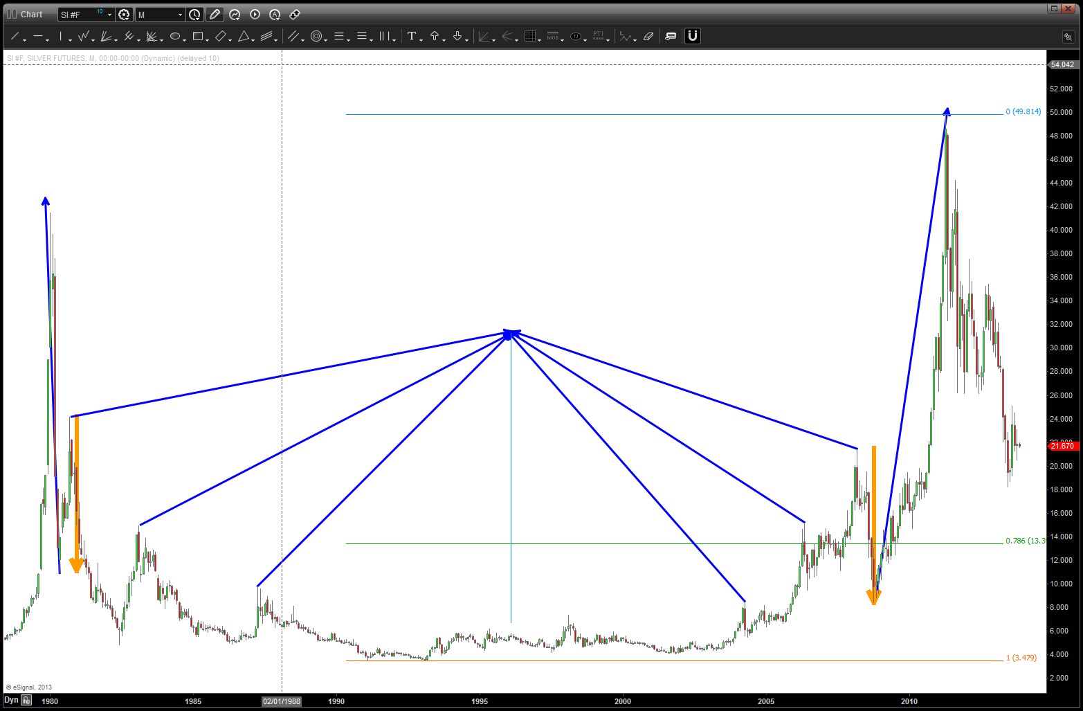
here is an update to the chart .. if our 4 is correct, we should see a strong move to the downside start to develop as we are then POTENTIALLY in a wave 3 of 5 of the 5th and final wave down into our BUY zone of 14. the only thing we need to contend w/ is IF (the BIG IF) the 50ish level was a macro 3 or 5. I can move into either camp …however, I do believe 14 will give us a nice buy signal (the first one in 2+ years)
the chart:
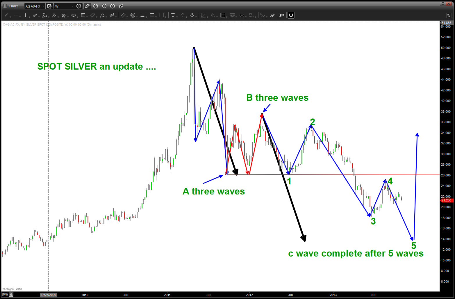
silver update
#patterns complete at 42.50 ish on $TWTR
Posted on November 8, 2013 Leave a Comment
following the bouncing ball on $TWTR …an update to this AM’s post
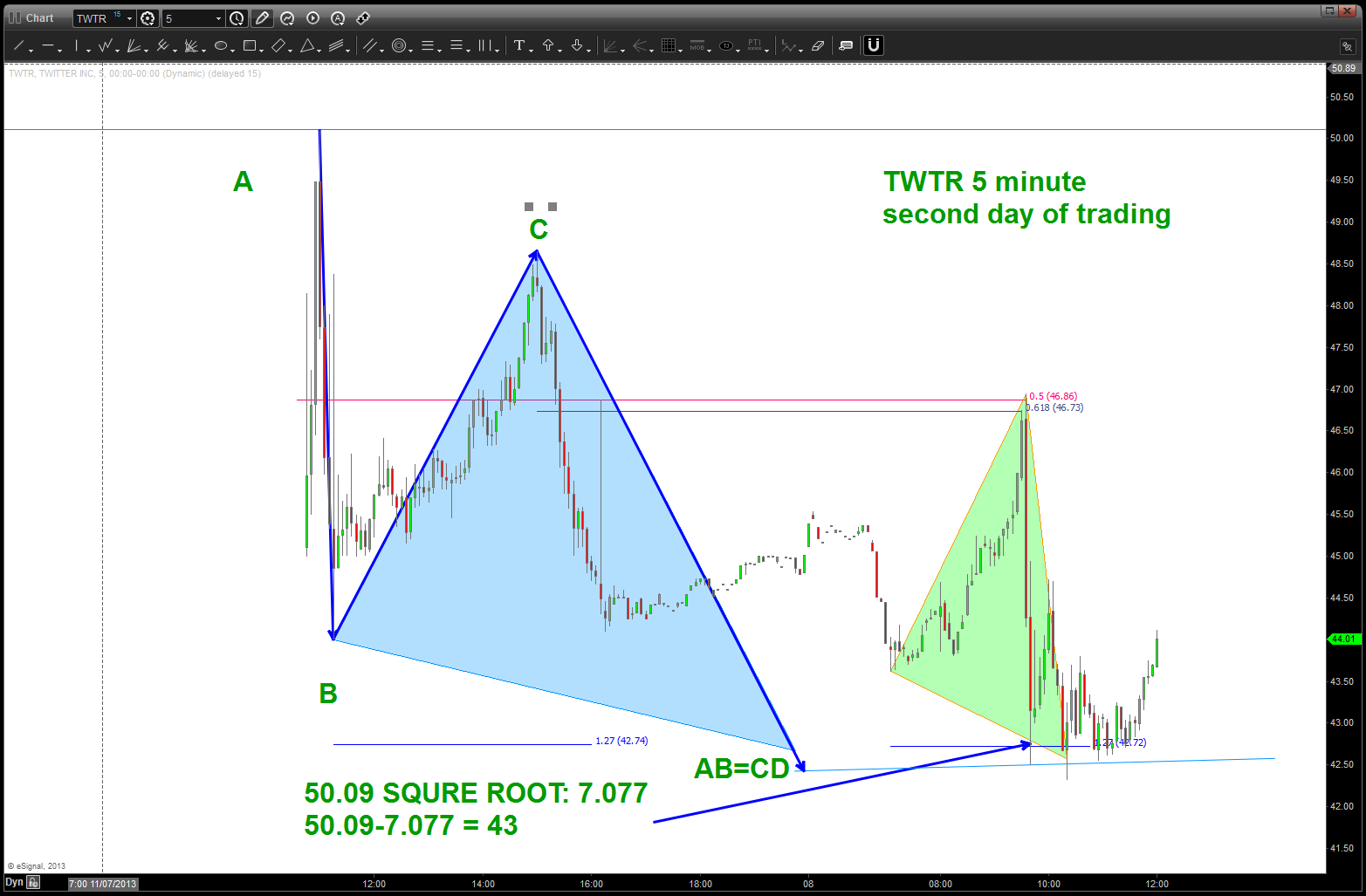
second day of trading and the first AB=CD
#hype, #bubbles everywhere, #irrational exuberance, #caveat emptor for $TWTR
Posted on November 8, 2013 Leave a Comment
certainly could be quite the story if Twitter marked the top in the market …
anyway, below is Twitters first day of trading – no patterns or anything like that, yet but I did want to show you a 1 minute chart and how most, if not all, of the swings were being governed by the numbers that we use …no moving averages, bollinger bands, oscillators or anything like that … just key numbers that put probability in your favor and allow you to work and play w/ your edge.
pretty interesting that it basically closed where it opened …and, I find it also interesting that this amazing IPO occurred when it’s index (the NAZZIE) was DOWN roughly 2% and that it basically closed where it opened … things that make you go hmmmmmm
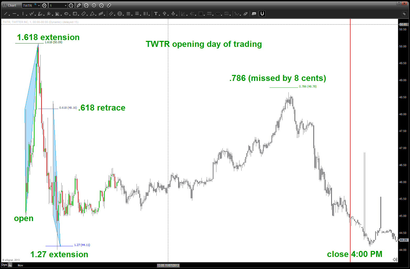
TWTR first day of trading intraday chart
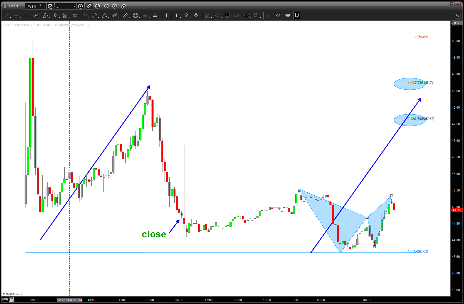
TWTR second day of trading and premarket
note, a nice little SELL pattern in the pre-market….just saying. upper targets (note w/ blue ellipses) are where the “should I stay or should I go” will come into play …
B
drove in a TESLA last night ($TSLA) so it should bounce today or Monday
Posted on November 8, 2013 2 Comments
I believe … having had the amazing opportunity and privilege to fly high performance fighters while in the Navy, I usually don’t get excited about cars. basically, I’m not a car guy. however, last night I drove in a Tesla and it was amazing. frankly, w/out being on the pointy edge of the spear, it was the closest thing to a “cat shot”that I have experienced since leaving the Navy. WOW …
yes the engine and acceleration is amazing but the user interface and MSI (multi-sensor integration) is out of this world and, then, the music system — amazing. The American ingenuity present in this car gives me pause …it’s flipping an amazing machine.
because of that, TSLA is going to bounce today or Monday … just kidding, but maybe?
here’s the update below … I put the arcs in to show you a concept I call ‘musical polarity’. as a chartist, polarity is one of the first concepts taught. (support becomes resistance and resistance becomes support) it’s ‘usually’ in terms of horizontal areas/levels on a chart HOWEVER w/ a little ingenuity (see above) you can take it to another level. the use of arcs and how to “figure out” good ones and bad ones is a week long course. however, just know that the arcs on this chart are not drawn randomly.
- take the first impulse move down and “think” of that as a rock hitting the water (the blue arrow going down from the top) that rock depending on the height, weight and speed at which it hits the water will produce waves that emanate outward (down in this case)
- when projecting the waves outward use fibonacci, sacred geometry and musical notes to look for areas of FORMER support and resistance … those areas, now into the future “should” offer the same ESPECIALLY IF YOU HAVE A PATTERN COMPLETING. LIKE WE DO — NOW.
- the arc highlighted is 1.8877 which is the note of musical note F in the equal octave scale of music….the horizontal support (blue line) is the 1.618 ratio which we are familiar with. Note, it CAUSED THE BOUNCE of support and following it down to the horizontal you’ll find support, which it did.
- the light blue arrow is a equality projection and, guess what, it lands right at the low and the intersection of the two arcs.
- so, we are “at support” and should expect a bounce and, more than likely a target of the gap from 160-170. if we lose this level, watch out … remember we are in the phase of working off the PARABOLIC EXTREME of emotions and the price is seeking where it should have normally been ….
- last thing, if you will look at the light blue vertical line that can be used as timing …it’s the vertical component of the first impulse move down and, w/ all off the patterns and musical notes all coming together WELL it might also be TIME for
 support ….
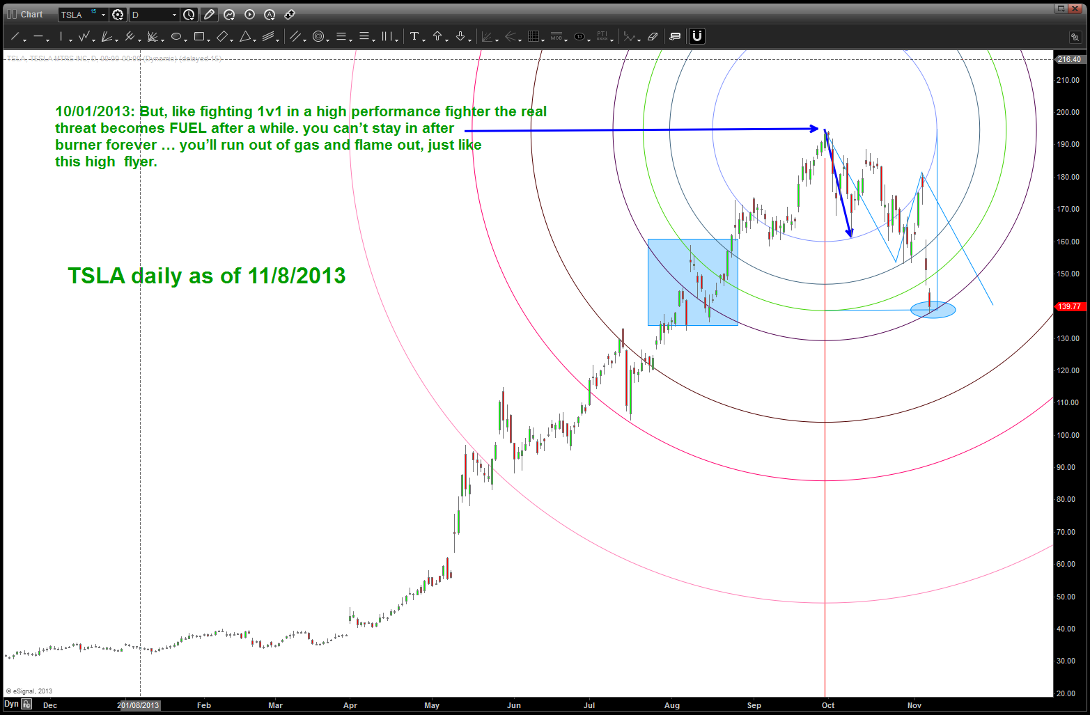
if you have 100,000 sitting around — buy one of these cars. simply amazing …
get er’ done …
B
Dollar Index and the “D” word …
Posted on November 7, 2013 Leave a Comment
updating the dollar index fro this previous post:
https://bartscharts.com/2013/10/27/us-dollar-as-of-10272013-900-pm-est/
yesterday, saw a quick blurb on the financial news channels that first mentioned the “D” word and here is the link:
today, they CUT RATES and the dollar index took off like a rocket ship. having had the wonderful experience to gain the CMT and then teach the capstone course for the CMT Level III for a while it was burned into our head that the dollar, while somewhat of a wild card will, in fact, STRENGTHEN in a deflationary environment. Sure looks like that is the case .. but now I’m going off into fundamental nah nah land (it’s not nah nah land for most of you, just me. as my skill is advanced pattern recognition which, unfortunately, is nah nah land for the people reading this. so in the end, we are all in nah nah land. I digress ..)
of note today, the US Dollar Index exceeded it’s largest corrective move since July of this year …while a pullback in the dollar is expected (perhaps intraday) I would look at this as an opportunity to add to the position. additionally, from the below charts expect resistance on the way up in/around 82, 82.50, 83.50. believe we are going to take this trip into the low 90’s. THEN THAT IS WHERE IT WILL GET VERY VERY INTERESTING …
rock on, always Bart
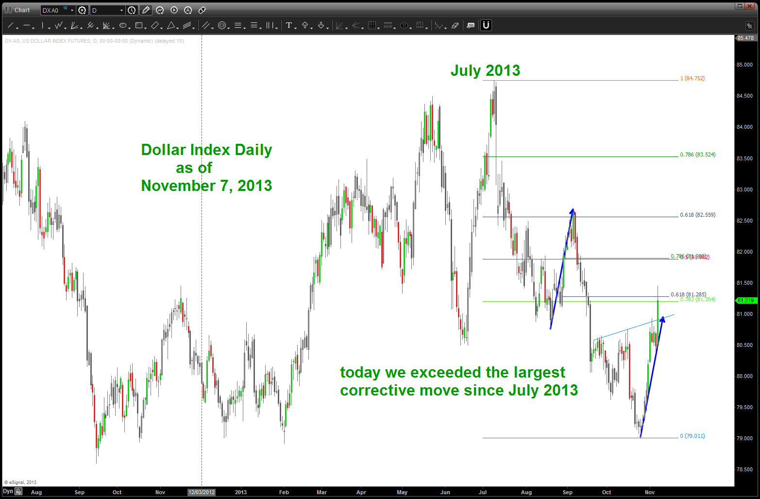
Dollar Index
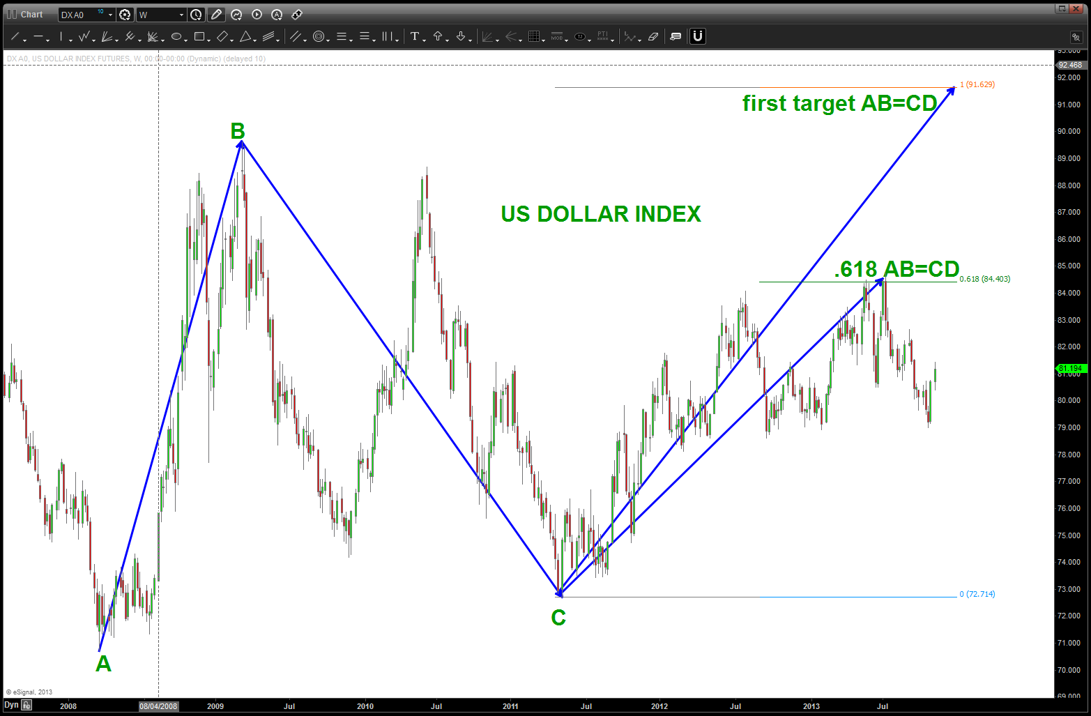
target in the low 90’s as shown
JEC, SILVER past fractals and the Pound
Posted on November 5, 2013 2 Comments
Foldbacks are amazingly accurate patterns … they occur on anytime frame and basically give us the “mirror image” of a move … the theory is as they come into an inflection point they will go out of the inflection point the same way. for those still versed in geometry, it’s basically the angle of incidence equals the angle of reflection.
here’s one of many pictures that I have of long term foldbacks in process … it’s a long term chart of JEC (Jacobs Engineering). The first chart shows the geometry of the parabolic move up, the second chart shows price action around the foldback and the third chart shows the result. 
JEC REAL TIME foldback pattern developing
JEC foldback result …
if you go back and study the Silver posts you’ll see that the most recent all time high on silver was just like the above … a mirror image foldback. IF (the big IF) you find the correct balance point then you can watch movement w/ a leading understanding of what to EXPECT (again, only PROBABILITY) Here’s a quick review of the Silver Chart … everything based on the FOLD BACK.
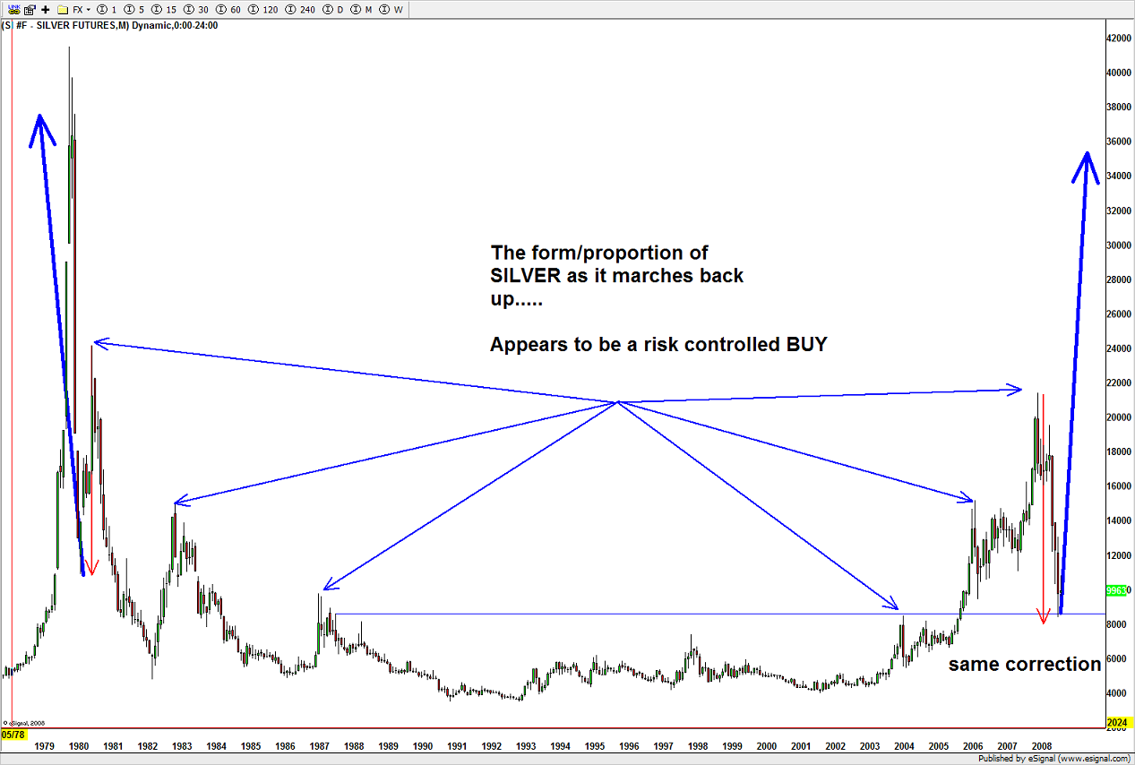
SILVER long term FOLDBACK
price action according to the foldback
so, much like JEC and SILVER we find a nice POTENTIAL FOLD BACK occurring w/in the Great British Pound Chart ….
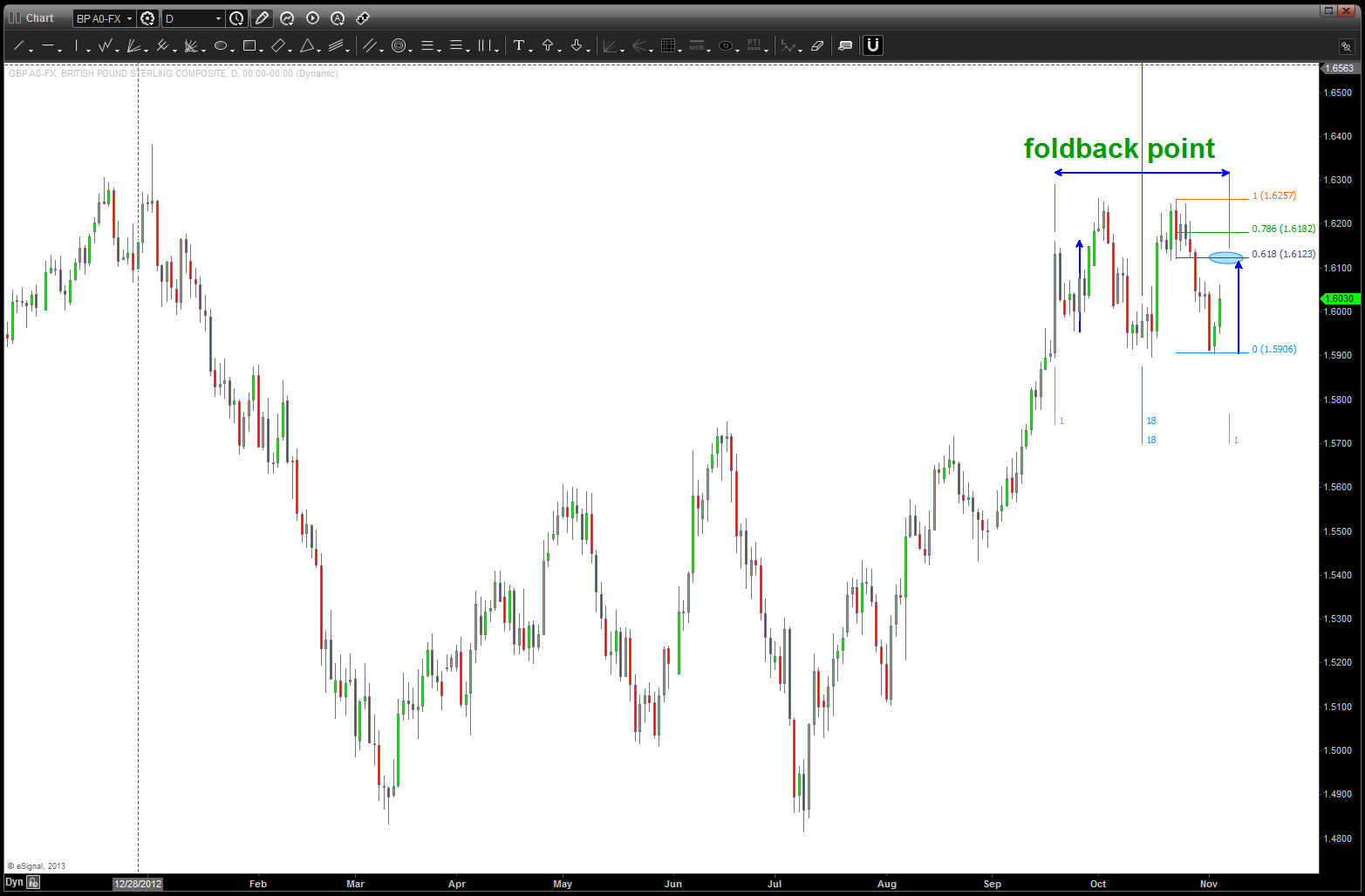
POUND foldback POTENTIAL
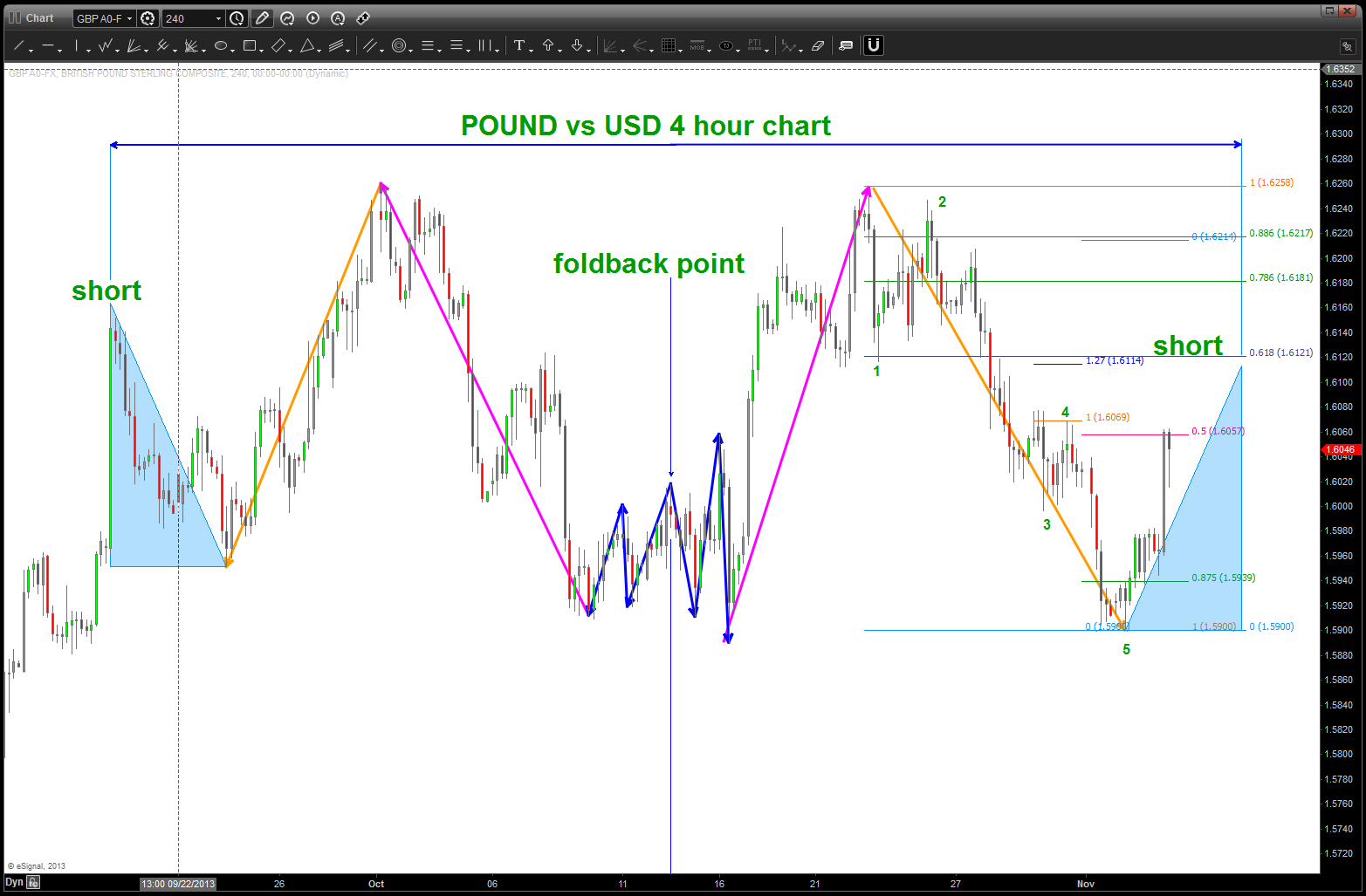
4 hour intra-day look at the pound POTENTIAL fold back setting up
only time will tell if have the fold back working … the great thing from a risk management perspective is they USUALLY only FAIL at the inflection points so a little bit higher on the Pound will tell us a lot.
Here’s past POUND analysis as I continue to try and get short: https://bartscharts.com/2013/10/22/the-pound-gorillas-and-juggling-dynamite/ OBTW ‘best and final’ is still a target so we’ll just have to manage some risk and “scale up” short. Stay tuned …
Fixed Income – TIME is right but what about the price and the underlying trend?
Posted on November 5, 2013 1 Comment
to catch up on prior fixed income posts:
https://bartscharts.com/2013/10/21/plotting-the-next-move-in-fixed-income/
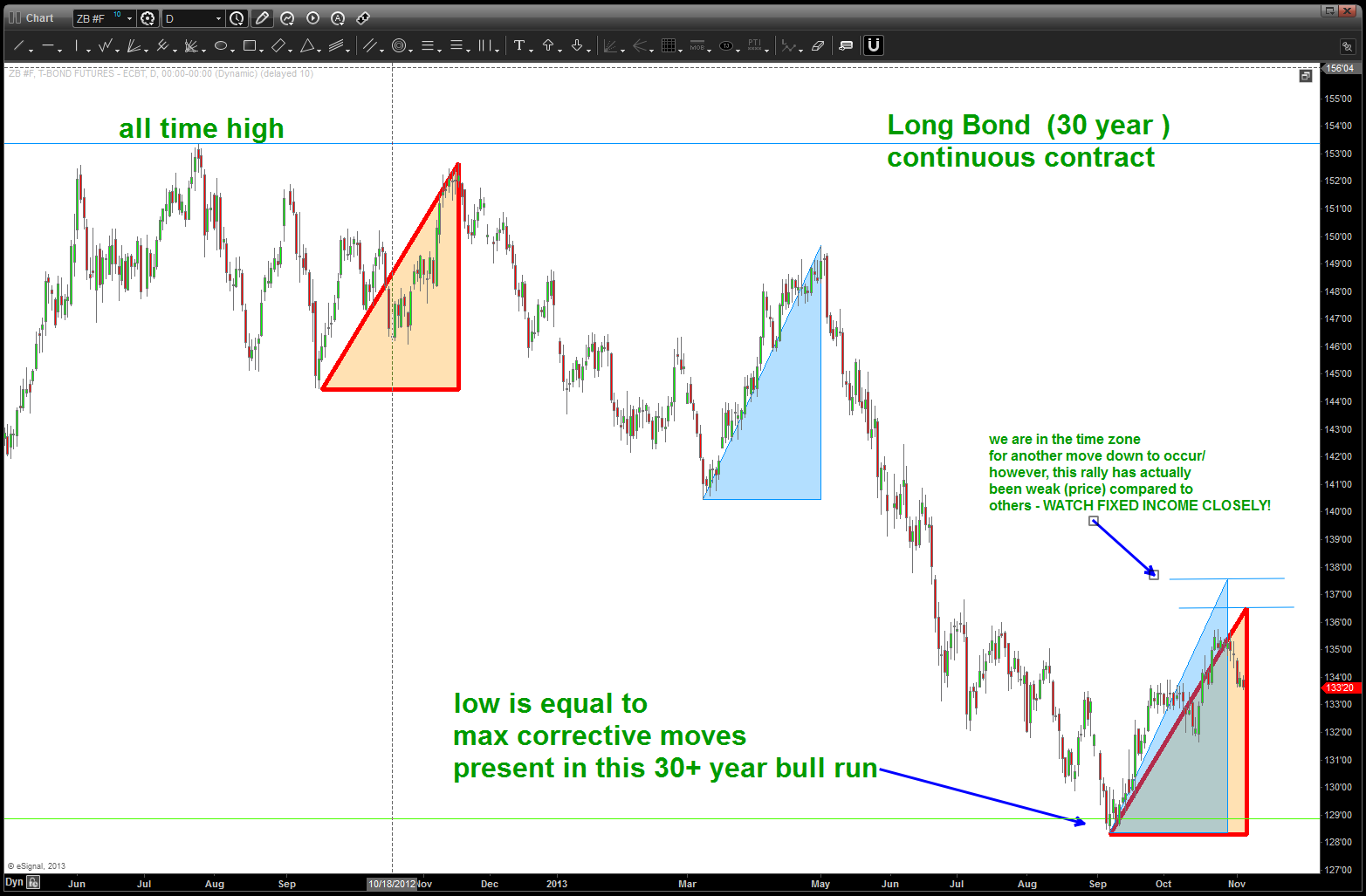
keep an eye on fixed income. the two triangles shown at the bottom of the chart represent the PRICE and TIME extremes that have occurred w/in the context of the top in Bonds last year. Note, the current rally has not exceeded either one in PRICE but we are definitely in the time window of a move down to start. IMHO it’s too soon to call a BEAR market in fixed income as we have just completed a “normal” measured move correction w/ in the context of a 30 year bull run. HOWEVER, we will see early signs appear to give a heads up …right now, w/ this time component being present it will be very informative to watch price action as continued strength above the blue horizontal lines during this TIME frame will cause prices to surge UP thereby suppressing YIELD once again.
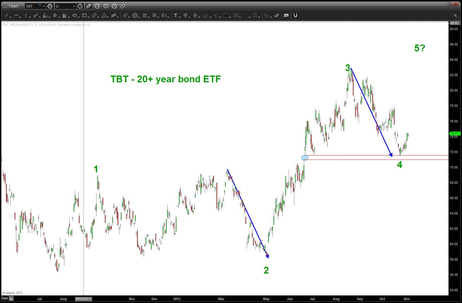
TBT another move higher?
SBUX and Coffee Futures
Posted on November 3, 2013 2 Comments
my last post on SBUX saw the 73 area as the potential price target to finish a parabolic run. it worked for almost a month but ultimately was defeated.
https://bartscharts.com/2013/08/21/sbux-and-the-land-of-not-real/
so like any good chartist it was “erase” and back to the drawing board.
one would think, as I did, that the price of coffee would certainly be a pretty close inverse relationship to the performance of SBUX. not making any excuses for my no “economic courses” world but if the price of coffee goes up or down then wouldn’t that affect profitability? here’s the chart …
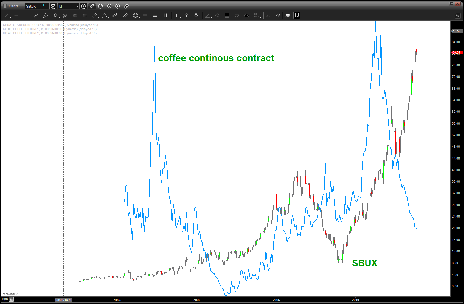
Coffee (line) and SBUX (candles) plotted together …
I can look at this one till I am blue in the face and I really can’t see any correlations … in fact, they both took off together for 10 years and, back in 1997 as prices came tumbling down (as now) SBUX just kept rising. this confused me …there has to be “some” correlation doesn’t there?
so on this wonderful fall morning it came to me “why not try the relative strength of coffee vs SBUX using ratio analysis (KC #F / SBUX)?” and, well, there it was … when Coffee has LESS relative strength (candles are going down) then SBUX rolls like the Crimson Tide. however, when the price of Coffee starts to outperform on a relative strength basis (the candles go up) then the price of SBUX flips on a dime. Picture paints a thousand words …
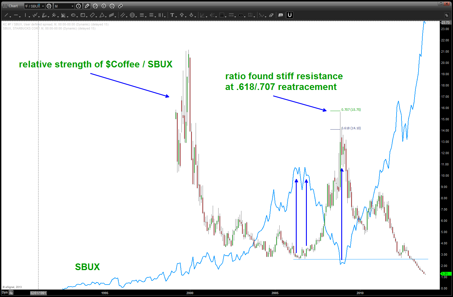
relative strength of Coffee/SBUX.
so, as someone who is a pure PATTERN recognition chartist, naturally I want to find the PATTERN on this ratio that will signal a bottom and cause the price of SBUX to crack and, once again, prove Sir Isaac Newton correct that something that goes UP will, ultimately, come down. (read: gravity) This move in SBUX is amazing .. what is even more amazing is noting the ratio support, once broken in 06/2012 (blue horizontal line at bottom right of chart) is when the parabolic advance really began in earnest …
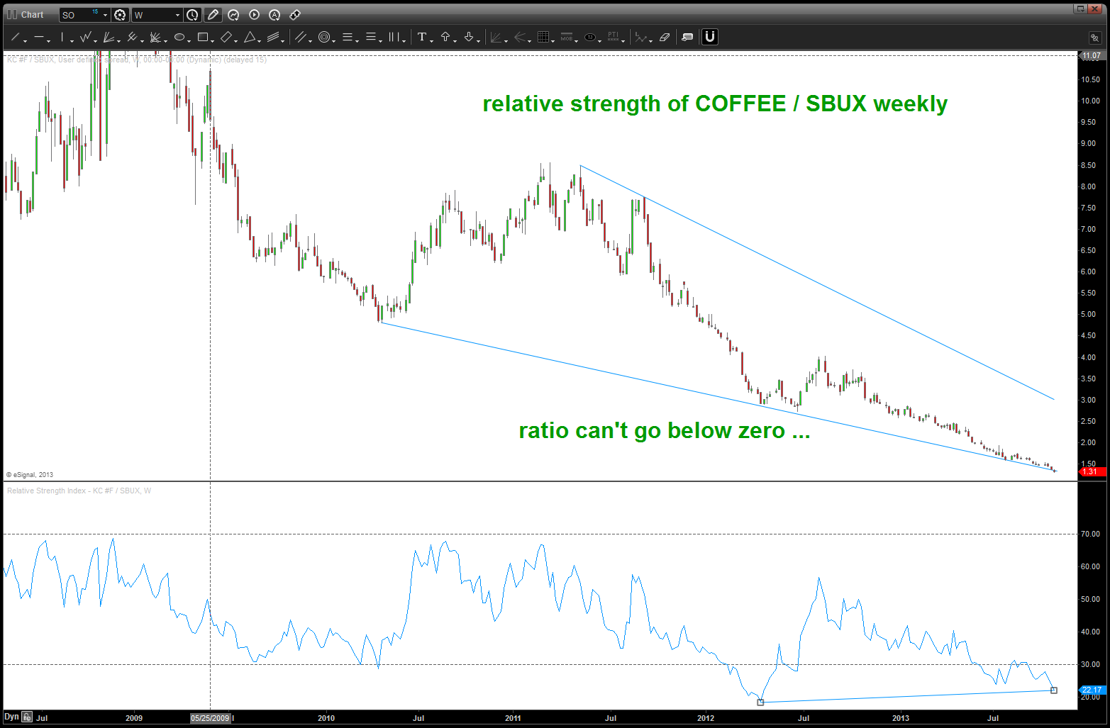
ending diagonal and bullish divergence present for the ratio
there isn’t a clear pattern coming into play as I look at the monthly and weekly charts …standard projection/extension techniques have targets that are (-) numbers and that “dog don’t hunt” so we can use RSI bullish divergence (present), contracting ending diagonal like pattern (present), very little volatility (note the small candles) (present) and the fact that we are coming to extremely important support on the continuous contract (.786 retrace from a monthly node)
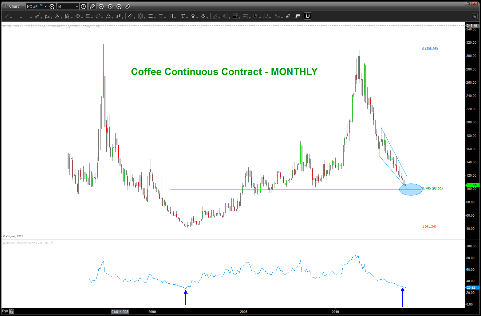
Coffee Continuous Contract Monthly approaching major support
if not NOW then, in the very near future, believe 1) Coffee will find significant support and 2) the relative strength of Coffee vs SBUX will bottom and start back up and 3) this will cause the parabolic advance of SBUX to flame out …. it is inevitable.
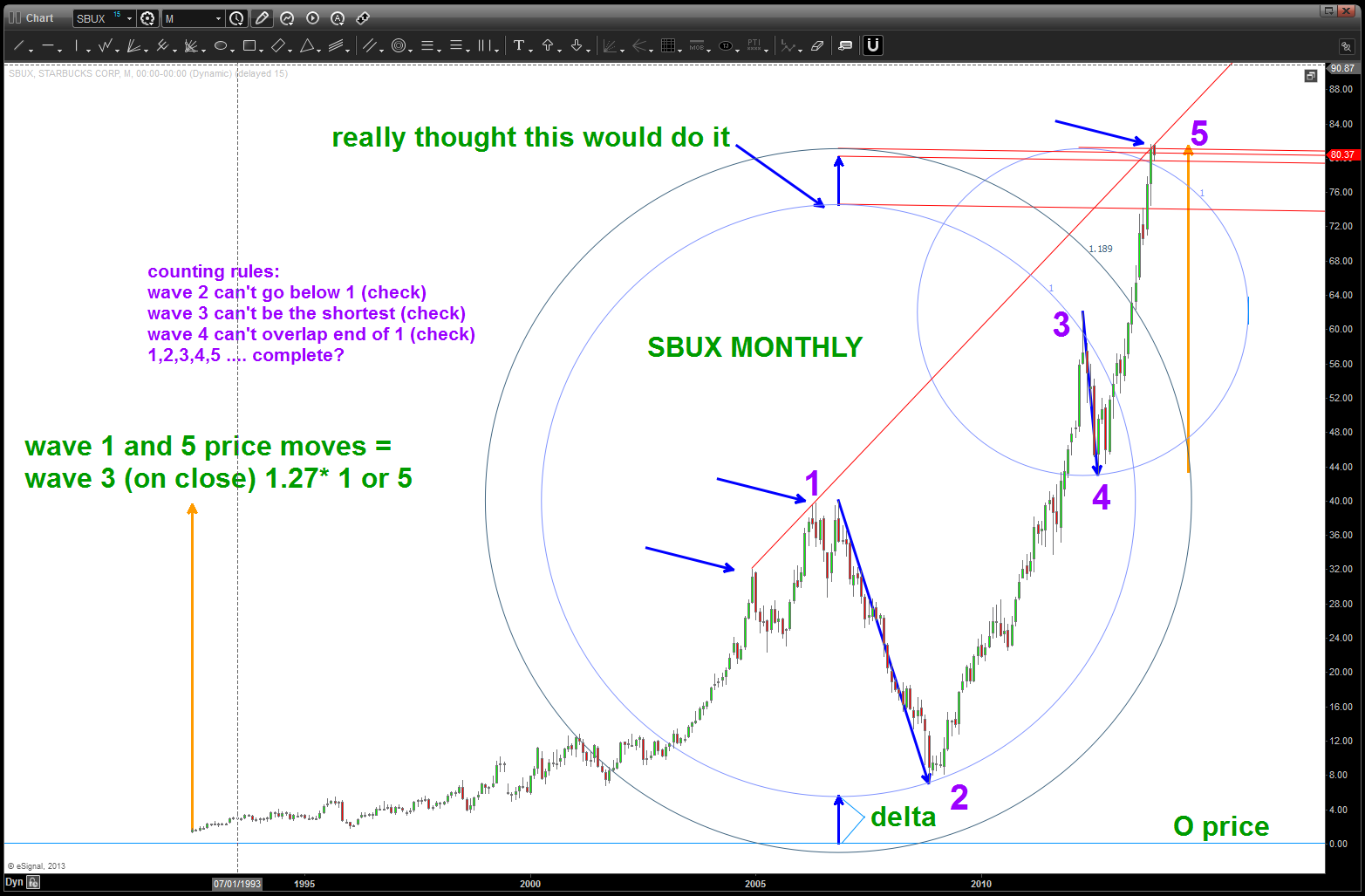
SBUX potential targets and count that doesn’t break any rules (valid (?))
Great British Pound … continues
Posted on November 2, 2013 1 Comment
“…woke up, fell out of bed and dragged a comb thru my head and … the GBP did not rally as hoping so no short was performed…on a Saturday w/ no market movement here is what I see … we are completely the first AB=CD type of pattern after what I think is the completion of a very important top … the daily chart shows a potential expanded wave correction complete either at the 1.6280 is level or a little higher. W/ most recent action in mind, she might have topped so I am trying to figured the best place for a bounce to short into … mind you, if this analysis is correct we could move 2000+ pips in a devastating wave V that has been building for 4 years. Stay tuned … 
Halloween Pound Update …
Posted on October 31, 2013 1 Comment

continuing the saga of the Great British Pound
as I debrief the action in the Pound vs the USD over the past couple days, I can say that, perhaps, I might have done one thing different … a couple days ago we called for a pattern complete in the US Dollar and that coincided w/ the top shown in the GBP. The GBP is not as prominent in the index as the EURO so I didn’t put that much weight into it. I had my entry order ready to pounce at the top red line (w/ a stop) and, simply, it never went up there …so far, this count has been working nicely. would really like the level shown right now on the Pound to hold to go up and attack the area labeled 4 … at that point, after watching price action, we’ll know where we are -1) at the start of a major leg down in the POUND or 2) a corrective move complete w/ one more rally up into our target area. I don’t know …
