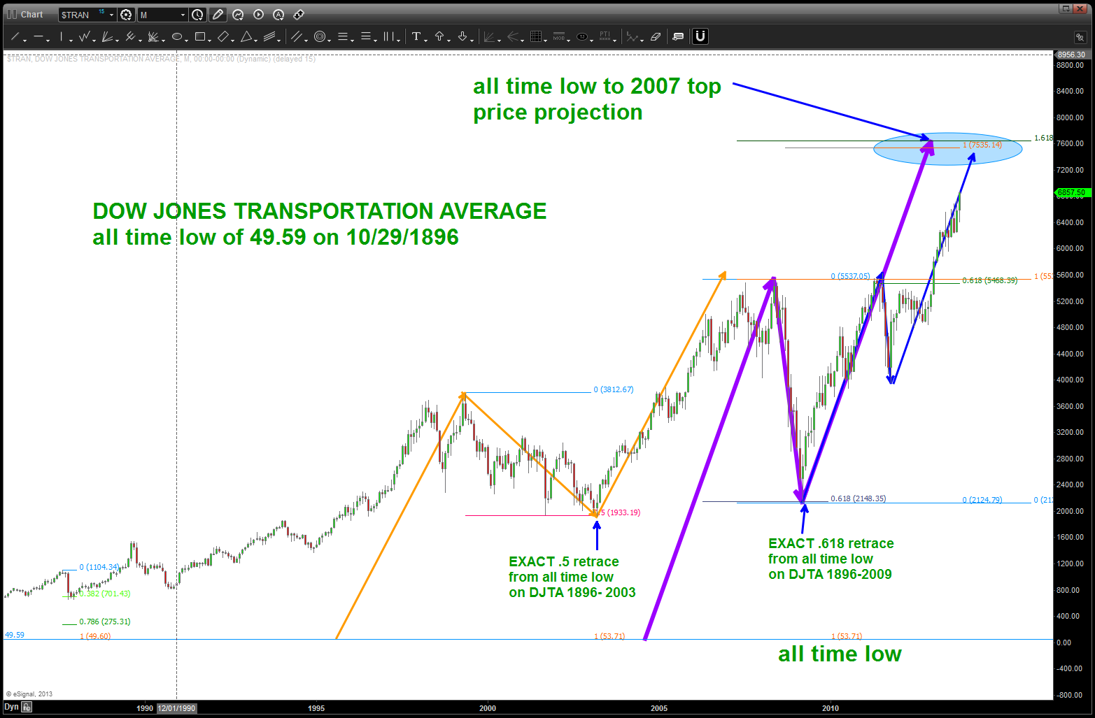
DJTA from the beginning 10/29/1896 w/ a dose of a 2.6 is 4.0 to me
Posted on October 21, 2013 3 Comments
true confession time … some of you might know and some of you might not know that I spent my first 11 years out of college w/ the privilege and honor to serve in the United States Navy. I flew jets, saw the world and knew absolutely NOTHING about the economy. In fact, here’s the confession time, I have NEVER TAKEN AN ECON or BUSINESS COURSE in my life. I was a “mathematician” at the Naval Academy simply because 1) it wasn’t engineering, 2) I didn’t have to write papers, 3) I didn’t have to take a language and 4) there was no labs. Swear to my dying days that was my thought process … and, guess what, I graduated w/ a BS in Math (note irony of BS portion) AND w/ the rocking GPA of 2.08 in my major. 2.0 and go ….my Pops used to get on me (so to speak) and I always told him — “Pops, right now, a 2.6 is a 4.0 to me so PLEASE use that grading scale!”
why is this germane to this post, tonight? Well, I was taught/shown and devoured anything and everything that had to w/ charts because, well, I thought that is all there is ….
why is that germane … because I am long over trying to convince anyone that this stuff works. do the work, prove it to yourself or not but in the end it really doesn’t matter, does it? I firmly believe the market is musical and chart patterns that vibrate to the numbers which can be found in music. That’s my edge, take it or leave it …
so, tonight, when I heard the talking head pundits on a financial tv show start slobbering over the DJTA I thought “well, I haven’t looked at that puppy in a while so go take a look …”
- always start from the beginning (or w/ the best most historical data)
- the all time low was 10/29/1896 – interesting we are 8 days from 10/29 in 2013.
- from that point I went forward in time and looked to see if this was a good “node” and it certainly proved to be ….! (yeah math)
- from the 2000 top into the low in 2003 we have a PERFECT 50 percent retrace from that low of 49.59
- if we use the low at 49.59 and PROJECT from 1896-2000 we NAIL the MAJOR resistance in/around 5500 ish on the DJTA.
- from the high in 2007 to the 2009 low … .618 retracement (EXACT)
- finally, using the 1896-2007 leg and projecting UP we get a zone of 7500-7650.
when I started this study of the DJTA I did not know any of these numbers or projections or moves would be present. it does not surprise me at all, but do you really think as the market was crashing down in 2009 that EVERYONE knew the .618 retracement level from 10/29/1896 was at that 2100 level?
DJTA – please go up to the 7500 level ….
the vibration of the DJTA since inception … pretty cool
Russell 2000 IWM and it’s repeating moves – CAVEAT EMPTOR
Posted on October 21, 2013 Leave a Comment
measured moves are powerful tools and on long term charts they are very useful for forecasting price moves. take a look at the chart below … the BLUE arrows are the lengths of the bull moves in the IWM. appears the current move will converge nicely in/around 113-114. Then, since we are all working w/ probabilities, what do you think the probability is that we find stiff/major/topping (?) resistance in around that area…? if that doesn’t stop it then watch 120-121 … either way we have the POTENTIAL for, at a minimum a 6th month correction?
last thing is some very easy time study … note the TIME it took for the first blue arrow to go up…now look at the TIME of this move that began at 34.
we have a convergence of PRICE and TIME in and around here … just saying.

IWM price and time coming together here/now or soon!
the “Ray Charles” count on BIDU
Posted on October 21, 2013 Leave a Comment
counting waves is hard … you have to develop your eye and you have to figure out when to trust a count or just let it go and “hope” (a strategy) that the count will show itself. I particularly like counts on long term monthly type of charts. simply, all the noise is filtered out and you can get a good look/feel for the overall macro trend in place.
take a look at BIDU …from a counting perspective it’s simply a wonderful picture. just recently we took out that high of wave 3 so the minimum expectation has been met but there is some serious strength so perhaps we go up and tag the 180’s-200’s. here’s what I do know … that count is something Ray Charles could see! (nothing against Mr. Charles – his music and soul changed the world)
so caveat emptor w/ BIDU and isn’t interesting to see BIDU in the last stages of it’s count as the NASDAQ is going up and tagging the targets we are watching closely … things that make you go hmmmmm
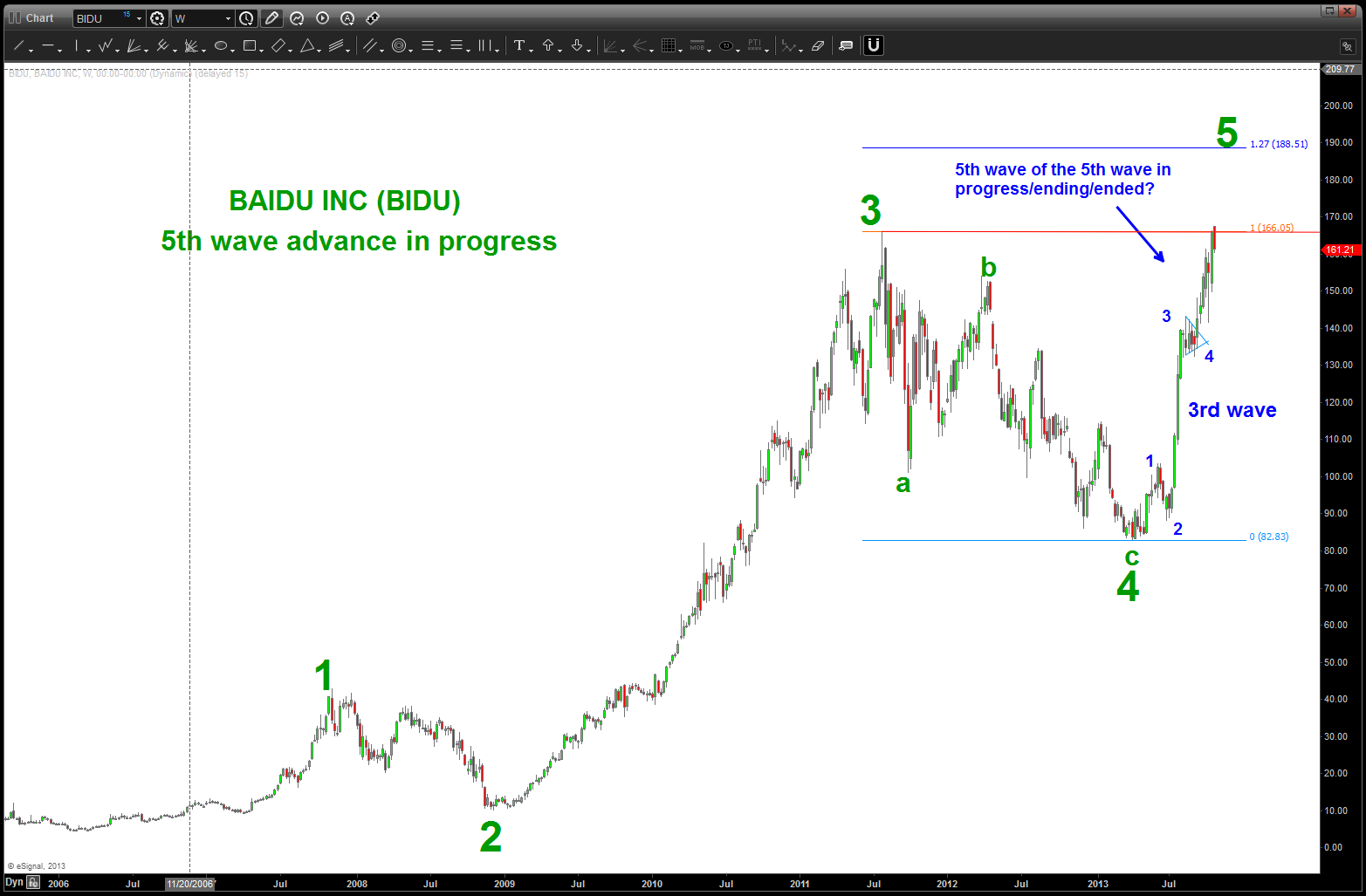
BIDU 5 wave count
More Pumpkin Soup … added a new ingredient to the recipe: GOOG.
Posted on October 21, 2013 1 Comment
classic or not that certainly proved to NOT be a head and shoulders neckline but a launching pad for a SATURN 5 and kaboom it exploded. as you can imagine the short well, took it on the chin to say the least: http://www.youtube.com/watch?v=05PKG_pWsVY !
Howard (Founder/CEO of Stocktwits) commented “as for me, I’ll stay long.” WELL PLAYED …
as for me, I’m licking the open chest wound and trying to put it all in context…
- that one day accelerated price action to such a degree that in one day it EXCEEDED the entire MONTHLY price action since GOOG’s IPO. Seriously…?
- the NASDAQ 100 has SO MANY parabolic charts it’s downright scary … have we not learned our lesson?
- the NASDAQ 100 continuous futures contract is right at major resistance / SELL pattern area
- Palladium has a very nice daily sell pattern about to complete (nice correlation in technology stocks and the palladium metal)
- our 925 level held for 6 months and then, kaboom, it exploded ..hugh?
- so, if at first you don’t excede, try try again (?)
- here’s my next set of targets w/ regard to GOOG
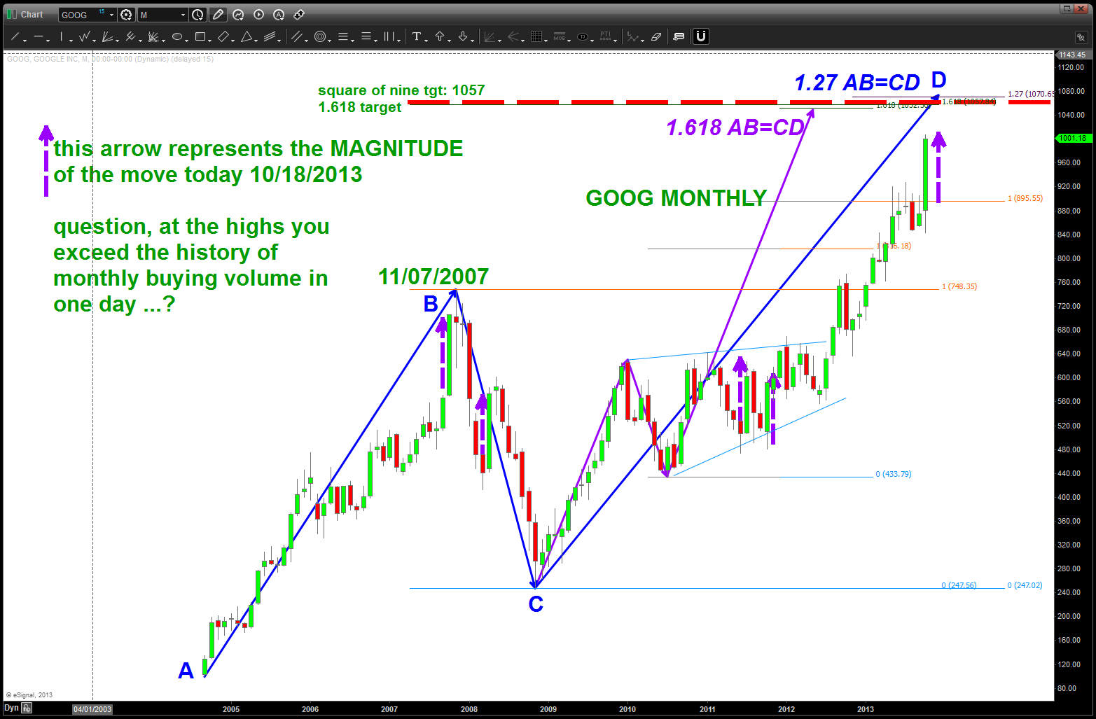
next set of targets …
Plotting the next move in fixed income …
Posted on October 21, 2013 Leave a Comment
fixed income has bounced rather nicely and now the big question is “are we going to go to new highs?”
1.5 years ago, as fixed income flirted w/ the all time highs for 5 months we correctly saw multiple correlations that put the sell pattern present in context …
http://allstarcharts.com/are-interest-rates-at-a-key-inflection-point/
from there, the bonds fell pretty hard into the lows that were hit a couple months ago:
https://bartscharts.com/2013/08/20/fixed-income-revisited/
this happened BEFORE the infamous FED meeting last month and I held my stance that the Buy Bonds (Sell Yield) was the side of the trade to be on:
https://bartscharts.com/2013/09/18/bruce-buffer-of-ufc-and-the-fed/
now, the question is will the bonds seek new highs suppressing yield to a great degree? there is a count that favors this action, but honestly, I don’t know ..just have to realize that the correction that has occurred in fixed income is almost precisely in line w/ the “normal” corrections that have occurred in the context of this 30 year BULL market. things are truly about to get very very interesting ….
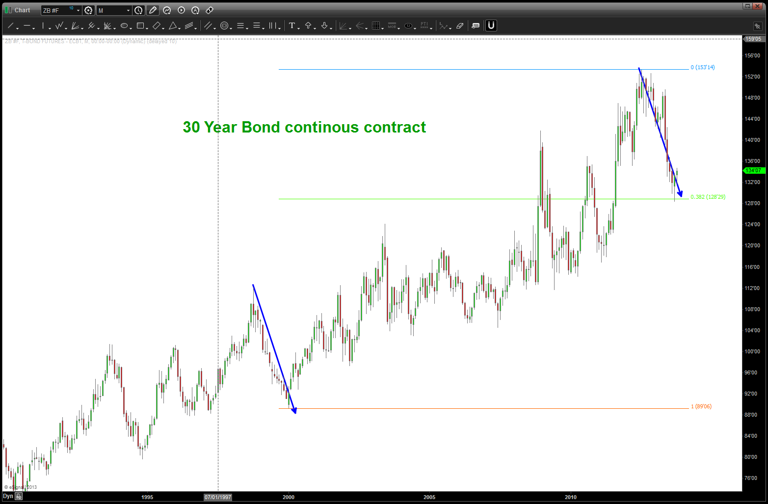
30 year continuous contract found major support … a dead cat bounce or another move to higher prices .. .stay tuned
Part 2 of Part 1-V on the S&P
Posted on October 20, 2013 Leave a Comment
Part 1 was a look around the world at different equity indices based on ETF’s:
https://bartscharts.com/2013/09/14/part-1-the-sp-500-but-first-we-need-to-go-around-the-world/
of note is the Global Equity ETF (ACWI) and the SELL pattern that is appearing as we showed in our last “around the world” update shown below. Overall, nothing to crazy but the analysis appears to have been correct. Summary: NONE of the “around the world” indices have come even close to making new highs from the 2007-2008 time frame.
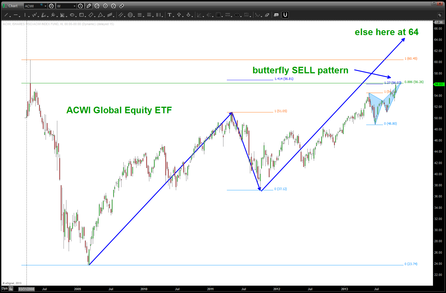
ACWI Butterfly Sell Pattern
Part 2 was the banks and too big to fail:
https://bartscharts.com/2013/09/14/part-ii-the-sp-500-and-too-big-to-fail/
The targets w/in the 21-22 area are approaching … the XLF is close to being a sell if not already one.
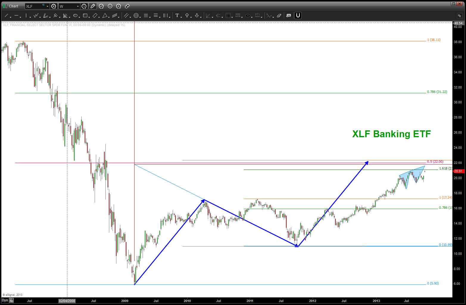
XLF update
Part 3 took a look at technology:
https://bartscharts.com/2013/09/14/part-iii-the-sp-500-and-the-influence-of-technology/
Palladium has an extremely nice sell pattern and multiple patterns were hit or are about to hit …NASDAQ futures have an extremely strong target and sell pattern coming in right here, right now
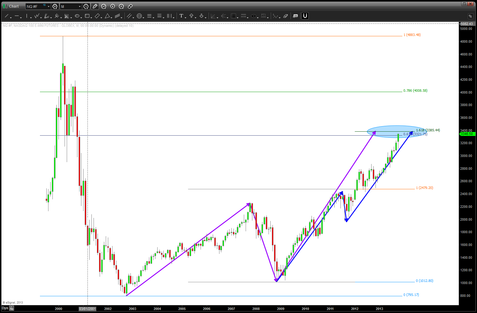
NAZZIE Futures Continuous Contract
Part IV was energy
https://bartscharts.com/2013/09/15/part-iv-sp-and-energy/
this is the one sector that isn’t showing a clear SELL signal – yet. As you can see below w/ the XLE a case can be made for another 10% higher or it needs to start down now…energy could be the one sector that holds this puppy up for now.
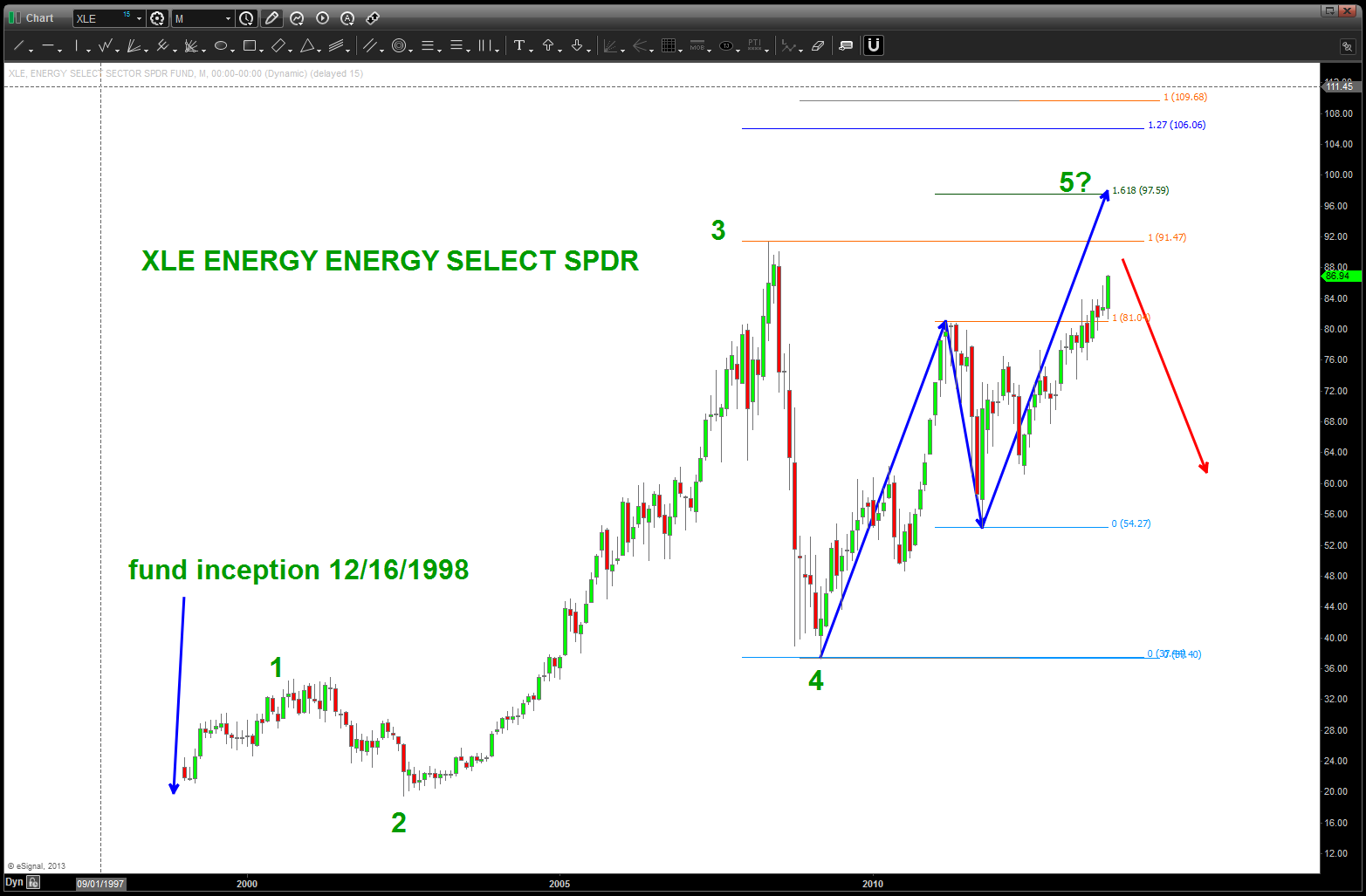
Energy, a case could be made for continued strength thereby delaying the move down in the S&P
and finally, part V was the look at ratio’s and sector rotation:
https://bartscharts.com/2013/09/16/part-v-sp-and-sector-rotation/
the pattern has completed perfectly and even w/ the S&P making new highs, this pattern has held …. this is bearish for the overall equity market.
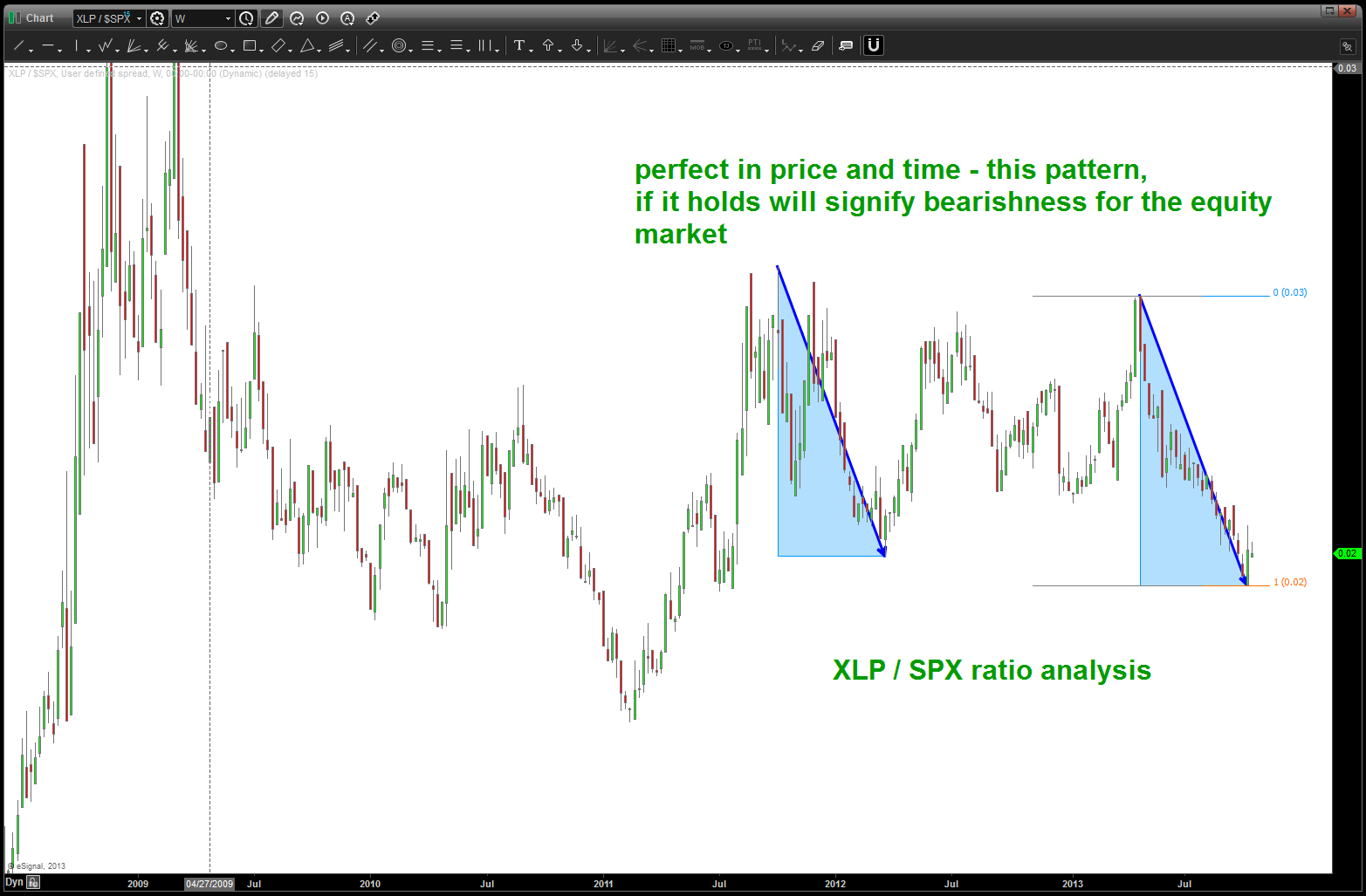
a turn in this ratio has been present at EVERY major inflection point since 2000. a BUY in the ratio is a SELL in equities
CONCLUSION:
ACWI, XLF, NAZZIE, SELL pattern complete/completing.
XLP/SPX ratio showing a beautiful BUY (SELL equities) pattern …
US DOLLAR low in here or perhaps a little lower
ENERGY needs to be watched like a hawk….
Do you really want to be long this market? The only way I would stay LONG is if all the above fails and, quite frankly, that could happen. So, watch ENERGY and DOLLAR strength for first clues.
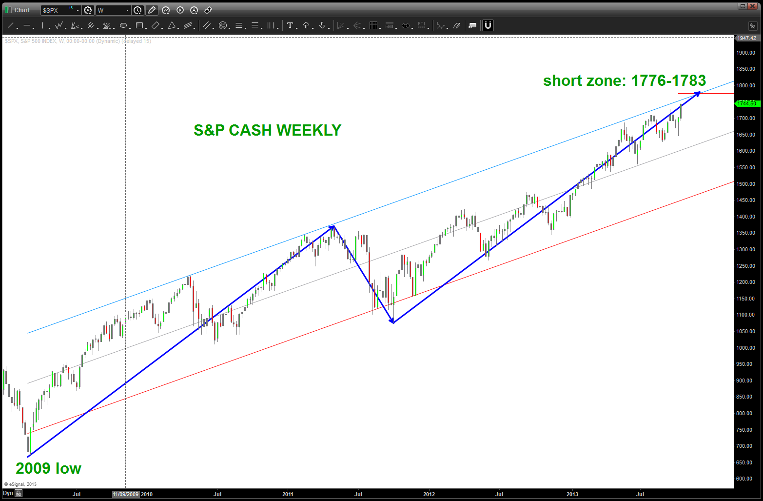
WEEKLY S&P CASH SELL TARGETS
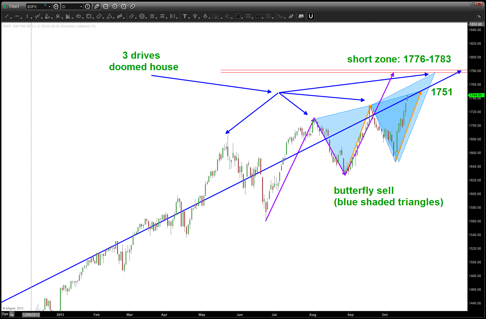
DAILY S&P CASH sell patterns appearing
the joys of the puzzle …
Posted on October 18, 2013 2 Comments
a couple days ago I posted about the US Dollar missing my lower target and the potentiality of a bottom and even saw a “nice” inverse head and shoulders that IF it broke thru would be a bullish signal. it didn’t and, now, looks like my lower target is going to be attacked. quite frankly, I’m glad … for over 2.5 months i have steadfastly WAITED and deployed NO CAPITAL. Always, thinking, “I missed it” or “why the heck did it do that” or any number of ugly “little voices” that appear. my mentors have banged into my thick head to ONLY invest at PRECISE levels because then and only then can we manage the risk. I’ve taken that to the extreme and, quite frankly, it’s my Achilles’s heal from an PM perspective. making no apologies. I think the tendency to try and “nats ass” levels is based on the HOURS upon HOURS that I spent in the Navy precisely aligning attack vectors for putting a 2000 lb pound in the center of a window from 35,000 ft at 1.2 IMN. old habits are hard to break ….
the other reason is because of a chart like below:
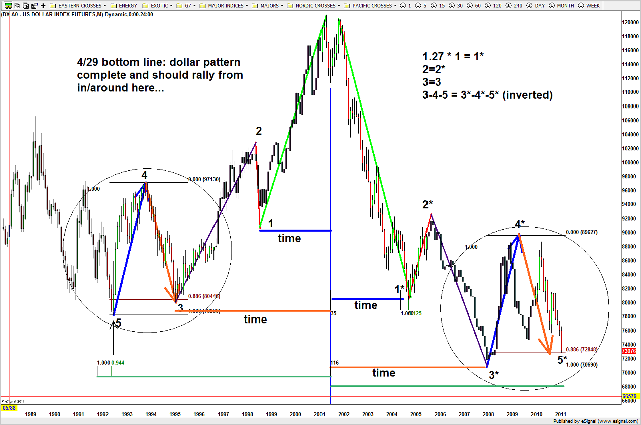
US Dollar Math and Geometry
if you take the time to STUDY the chart (and why not if your reading my post – thanks by the way) you’ll see the EXACT, again, EXACT measured moves at the low in 1992-1995 hit. so, in the context of WAITING 2.5 months for this opportunity to present itself, it’s really nothing in the context of 3 years. YES, there is and was a lot of money to be made day in and day out trading the swings. but you know what … I don’t like doing that. it doesn’t fit MY STYLE so I like to put the pieces of the puzzle together and deploy capital. So, this AM, let’s take a look at the pattern coming in on the US DOLLAR INDEX.
the key for me is the “measured move” correction like that of 05/2011. Bruce Buffer time … HERE WE GO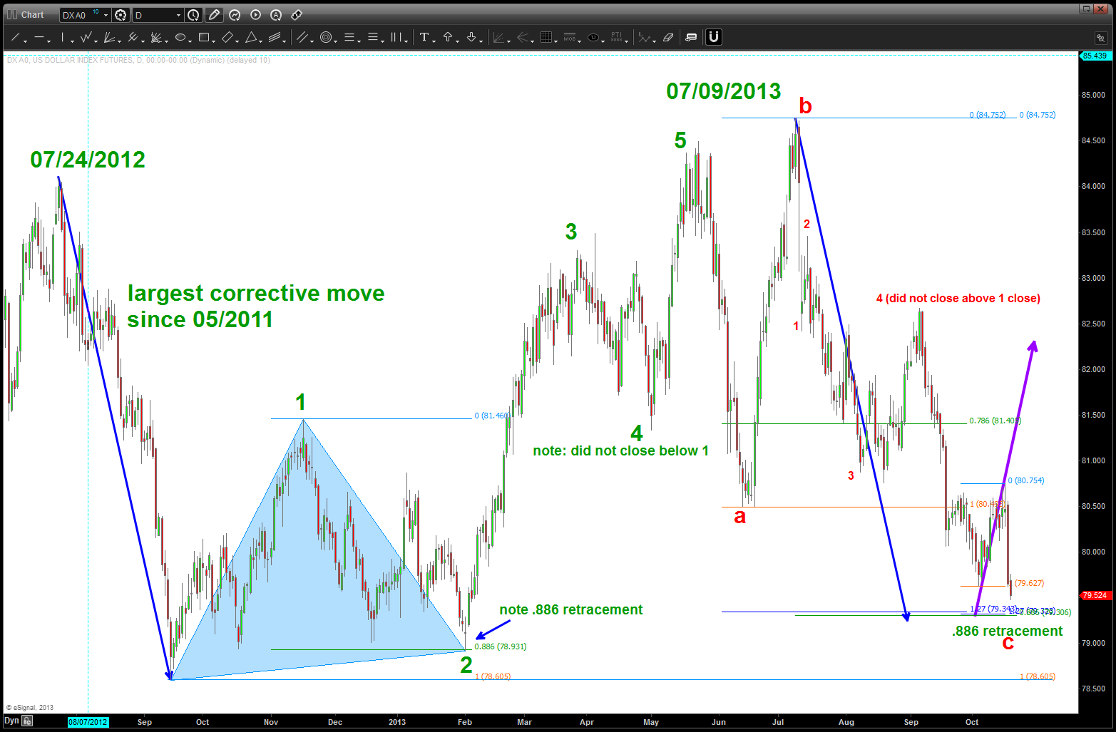
QUALCOM Confluence ….
Posted on October 16, 2013 Leave a Comment
PROJECT then EXTEND then RETRACE …
for QCOM they are all coming together a little higher. Frankly, never seen this many ratio’s come together. Stay tuned BUT that’s all she wrote ….
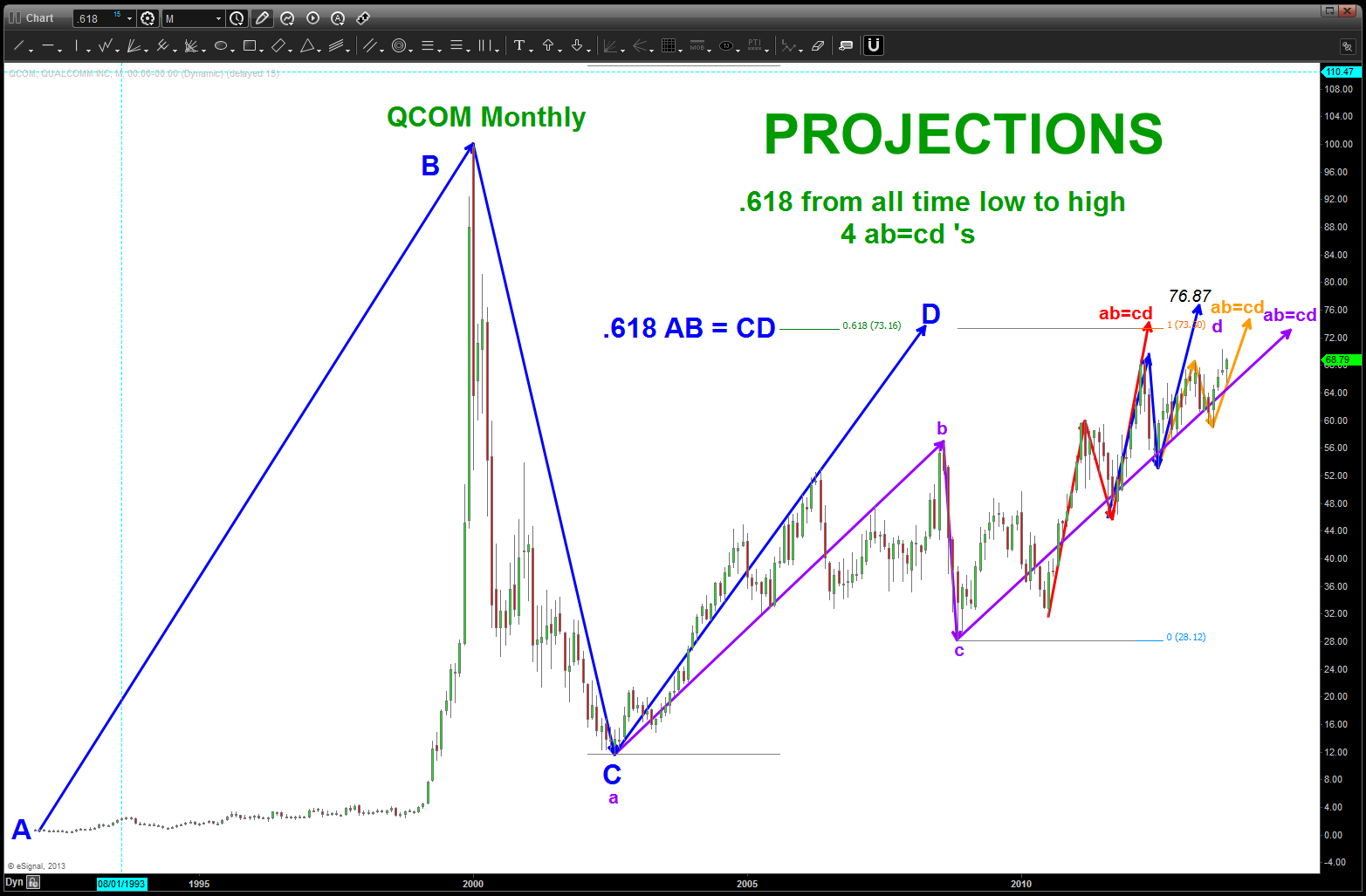
projections (basic)
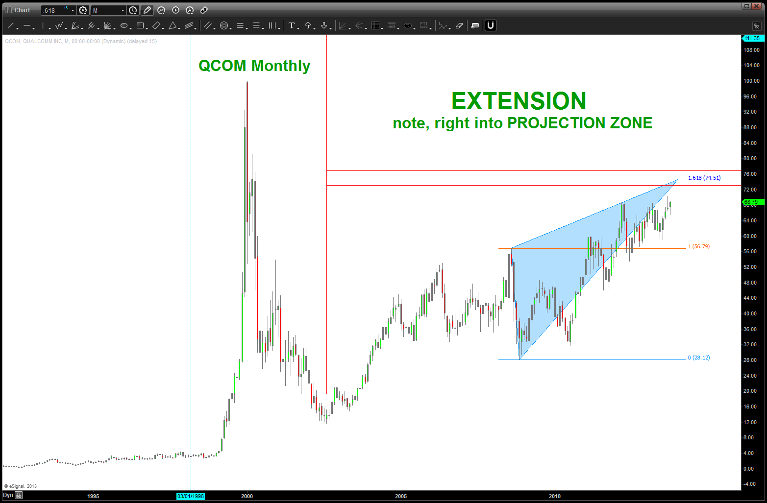
extension (basic)
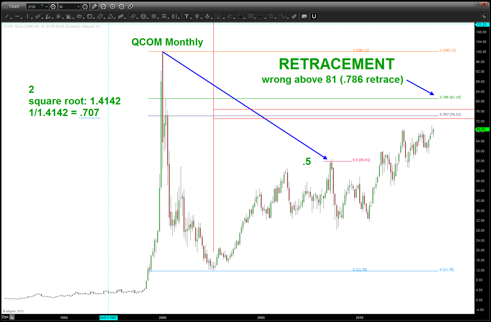
retracement (basic)
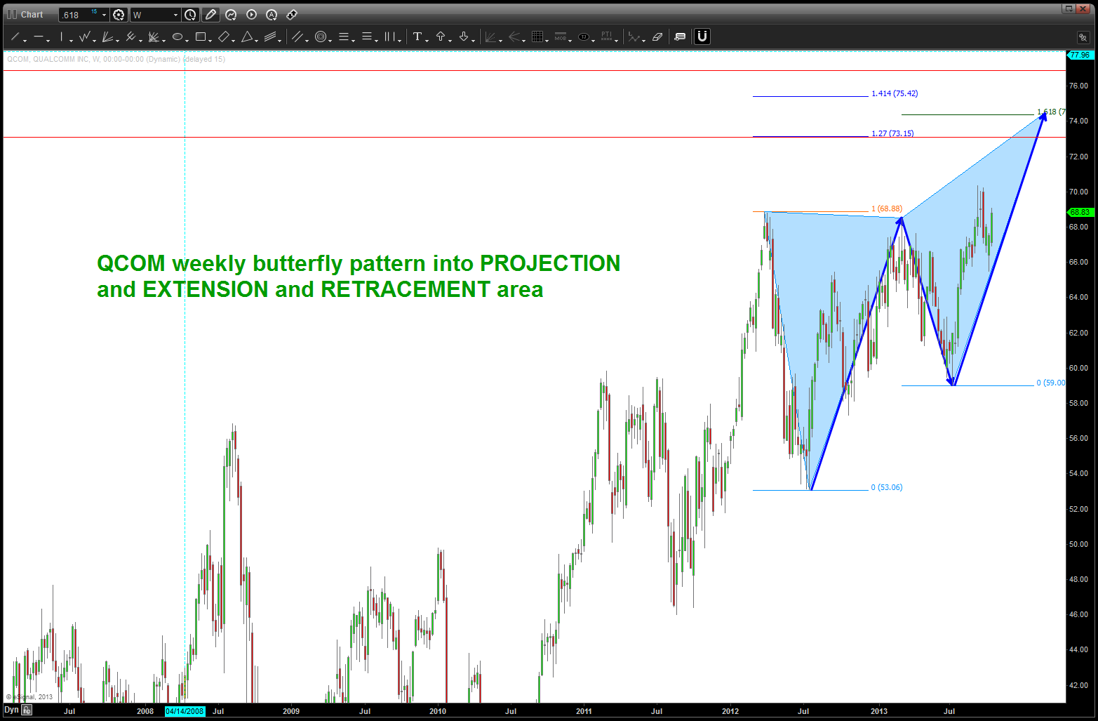
butterfly top (weekly)
the Shutdown and the US Dollar
Posted on October 15, 2013 Leave a Comment
my first post was almost two months ago and it concerned the US Dollar: https://bartscharts.com/wp-content/uploads/2013/08/august-20-2013-us-dollar.png and then it was updated: https://bartscharts.com/2013/10/01/dollar-index-done-or-correcting-or-a-little-lower/
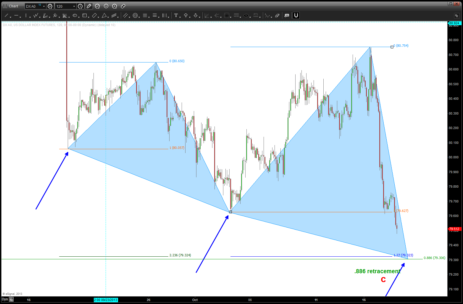
we probed the lower level but never quite reached my area that I had been watching for two months as the place to attempt the long on the USD versus either the EURO or the POUND. this am, it is showing some pretty significant strength so this is in alignment w/ my analysis. now put the investment hat on and look for the best area to get long that will manage the risk. with the chaos in DC, this target a little lower could get hit on some surge/spike/rumor/ etc…we’ll just have to wait and see. lastly, look at the 4 hour inverse head and shoulders neckline that is being attacked. Sure looks like the dollar has bottomed …
this is BARTS CHARTS … if they go UP we have more buyers and if they go DOWN we have more sellers. Playing relaxing music and watching the chart instead of listening to the talking head pundits is just easier, don’t you think?
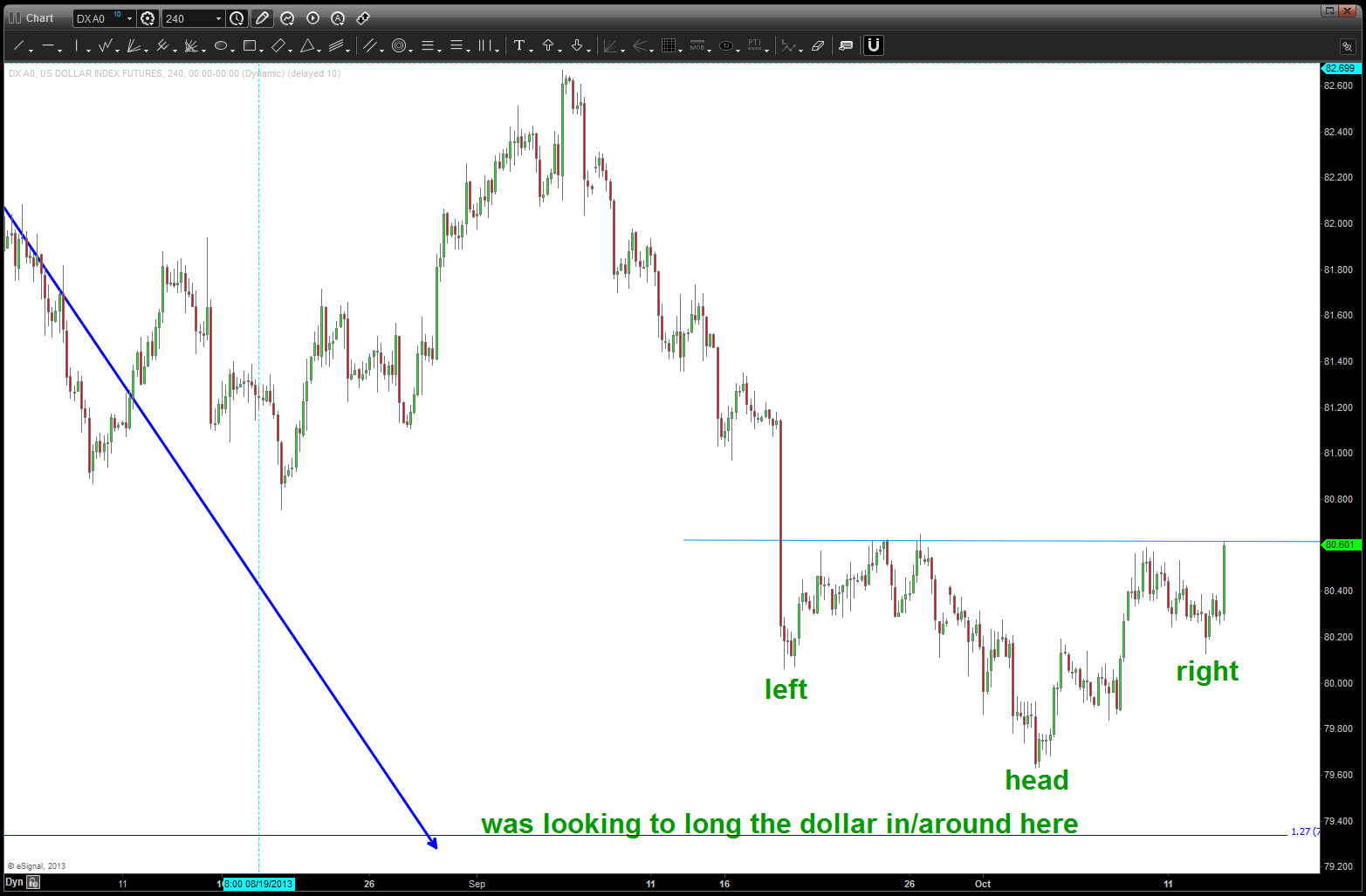
USD Inverse Head and Shoulders potential low in place
t easier, isn’t it?
Gold/Silver Index … continuing the thread
Posted on October 11, 2013 Leave a Comment
here’s the previous Gold/Silver Index posts:
https://bartscharts.com/2013/10/03/gold-silver-index-a-guide-for-the-yellow-brick-road/
so, as you can see the geometry is sure starting to unfold for a “double bottom” type of scenario and then, potentially, higher. If you read my Gold posts
https://bartscharts.com/2013/09/07/good-as-gold-part-1-of-2/
https://bartscharts.com/2013/09/08/good-as-gold-part-2-of-2/
then you’ll see how I’m looking for one more move lower on the Gold to set up a very nice buying opportunity. you’ll also see the reason why the levels approaching on the Gold/Silver Index are so key. Stay tuned on the Gold/Silver index because the level it found support in is KEY .. if we break that to the downside via a daily close below that level, then the index and Gold could certainly take a smash. stay tuned …
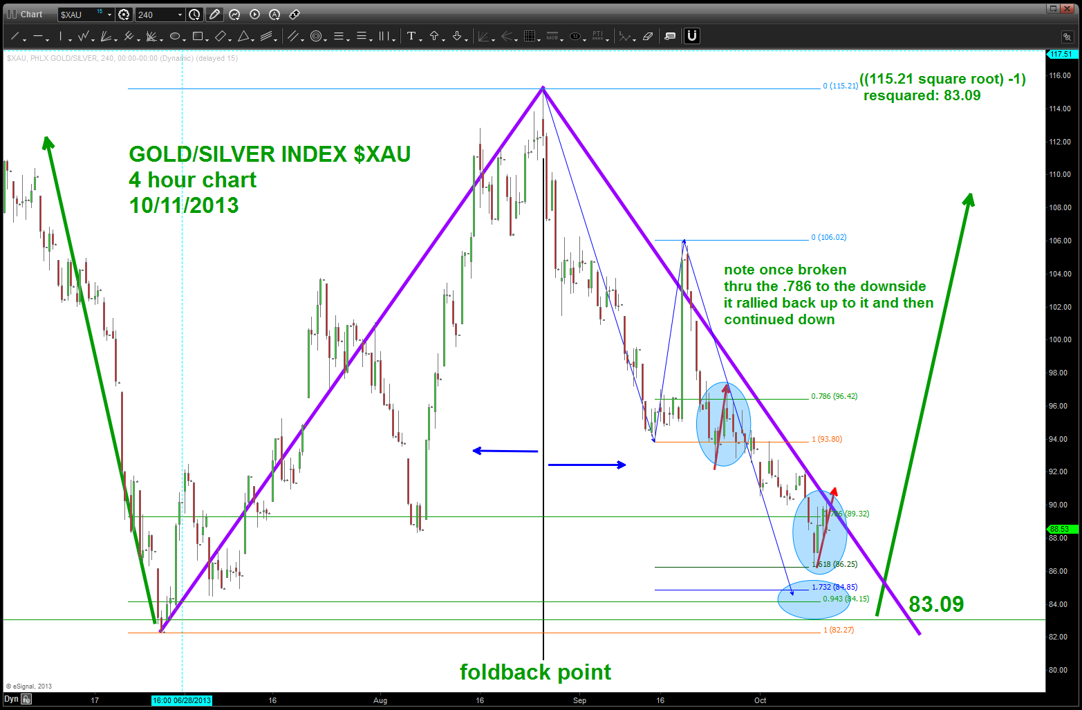
Gold Silver Index double bottom potential?
