Part V: S&P and Sector Rotation
before I started this blog I was afforded the opportunity to post w/ JC Parets (allstarcharts.com) from time to time. back in March I posted some thoughts on the importance of the Staples vs the S&P in ratio analysis form. here is the link to the post: http://allstarcharts.com/are-staples-the-key-to-this-market/ I recommend you read it.
this analysis was based on the following sector rotation flow:
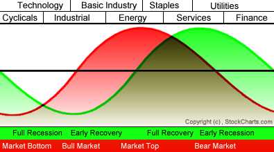
sector rotation model
if we plot (using ETF’s) the relative strength of each of these sectors vs the S&P, then they can give us an early cue of when the institutions are moving “offensively” or “defensively” and we adjust accordingly. Note, at the top and per this model when “energy” is leading the way this should allow us pause and prepare for a correction or a resumption of the trend. As the flow of funds shifts out of energy, the next sector — STAPLES – starts to outperform and the cycle starts rolling.
How accurate is this model? Well, if you go back and read thru the post on JC site you will see this ratio NAILED the highs and lows in the market since 2000. I imagine it could go back longer, however, the XLP ETF didn’t exist farther back so that will remain a subjective opinion. Here’s what the ratio is doing now:
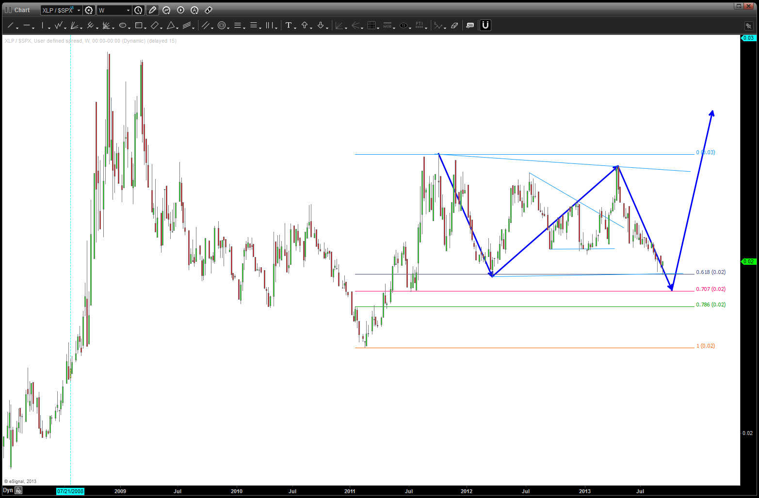
XLP / S&P ratio for relative strength analysis
some observations – the pattern shown certainly could be complete in/around here or just a little lower. If that is the case, we can start searching for signs of a top w/ in the context of the S&P. second – one would think the ratio would have gone down significantly during this 4+ year run. it didn’t … for me, that makes me pause.
keep an eye out for “strength” in this ratio, as I’m still i the mindset that it will give early indications of a top once it starts to outperform.
Bart

Pingback: Part 2 of Part 1-V on the S&P | Bart's Charts
Pingback: Part IV and “I Can’t Quit You Baby” | Bart's Charts