Ripley’s Believe it or not …
Posted on February 10, 2016 Leave a Comment
“The third-quarter and nine-months revenues not only illustrate the balance Lehman Brothers has achieved among its equity, fixed income and investment banking businesses, but also show the financial and strategic potential of new businesses the firm has been building, including private equity and high-net-worth activities,” Richard Fuld, former CEO of the former LEH
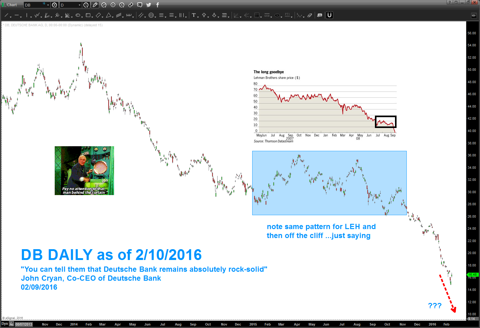
“You can tell them that Deutsche Bank remains absolutely rock-solid, given our strong capital and risk position. On Monday, we took advantage of this strength to reassure the market of our capacity and commitment to pay coupons to investors who hold our Additional Tier 1 capital. This type of instrument has been the subject of recent market concern.” John Cryan, Co-CEO of Deutsche Bank
just a little higher till pattern completes .. and we surpassed 2009 lows for the RSI
Posted on February 9, 2016 2 Comments
was talking to a money manager at my son’s basketball practice tonight and he was talking all kind of nonsense about some fundamental stuff … I just pulled out my Iphone and showed him @bartscharts and said “here, read this.”
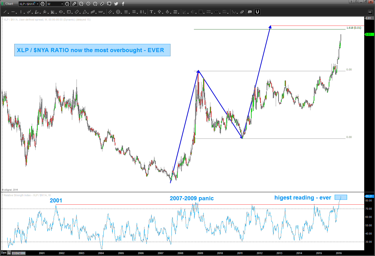
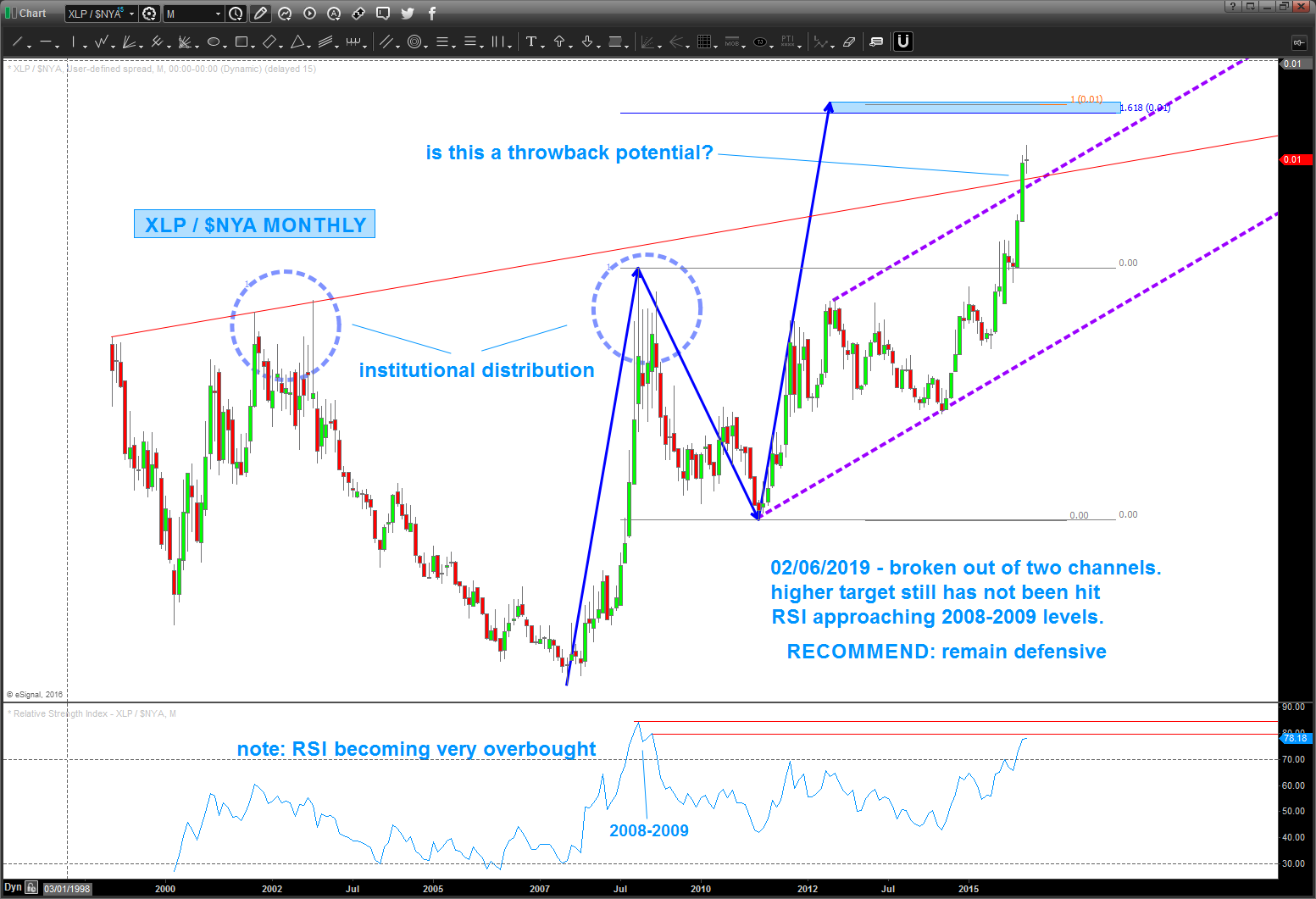
thus far, this ratio has been SPOT ON w/ providing market inflection points … its shows “risk on” and “risk off” flow of funds and in times of risk off the big guys go to shitter paper, toothpaste, canned goods and blah blah blah ….so, on this weekly chart, you’ll see a SELL PATTERN on the ratio which IF IT HOLDS is good for equities. personally, not doing a darn thing till that pattern is hit …
the probability that the ratio sells off (along w/ equities going higher) is increased due to the face that since the XLP came into existence, the RSI has never been this high …so, stay tuned but don’t go long equities till this pattern is hit …
B
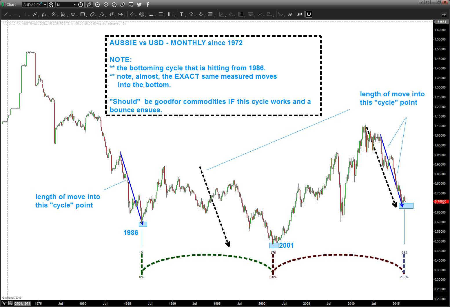
ain’t nobody LONG the Aussie vs USD .. perhaps you should think about it?
Posted on February 7, 2016 Leave a Comment
AUSSIE
- monster cycle hitting this month from 1986 on Aussie.
- take note of the “measured moves in price” coming tino the 1986 and 2001 low .. they are the same footprint
- very oversold w/ bullish divergence
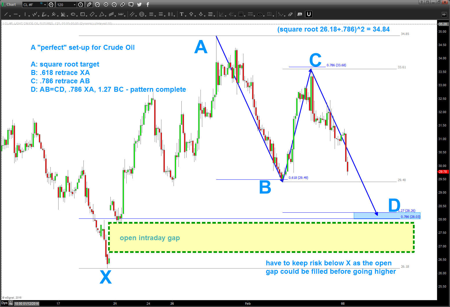
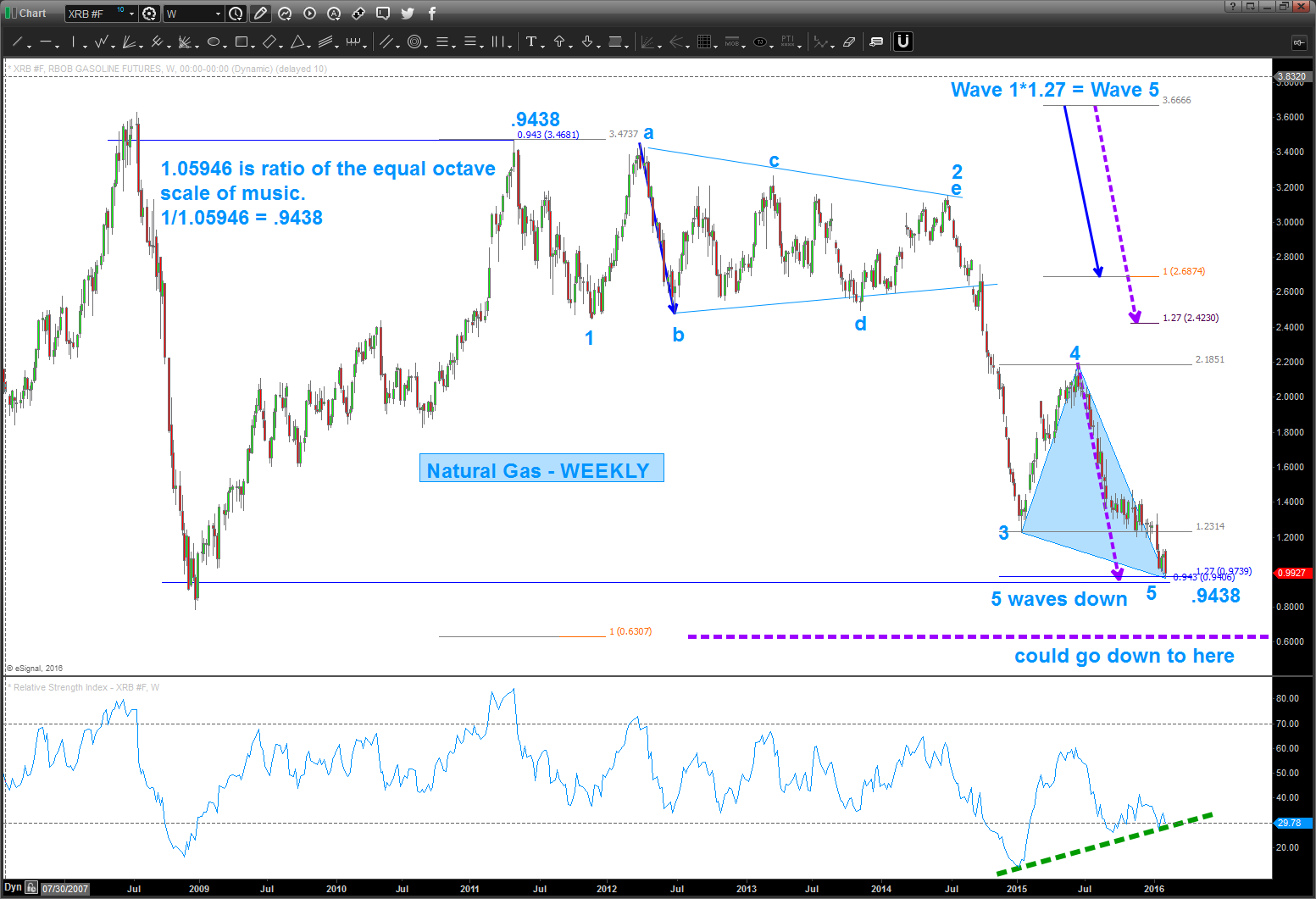
GASOLINE FUTURES
- note, 5 waves down on natural gas
- .9438 symmetry
- 1.27 extension
- 1.27 wave 1 = wave 5
- monster bullish divergence …
XLP / $NYA need upper target to be hit AND a sign of accumulation …
Posted on February 6, 2016 Leave a Comment
- note – we are forming a “doji” candlestick pattern – “uncertainty” on a monthly basis, yet the higher target remains a little higher.
- broke out of two monthly trend lines and have paused
- RSI approaching extreme overbought levels of the 2008-2009 panic.
UNTIL WE HIT THE UPPER TARGET – FOR ME – we are in no mans land.
Now, let me draw your eye to the circled part of the chart. Note, all the BIG WICKS. It took 6 months for this to carve out a top which tells me that as the market was going down back in 2008-2009 the institutions started “accumulating” and then the market took off. Not sure what will happen this time, but, again, would remain defensive till this upper target is hit OR we get a monthly close (a monthly) back below BOTH the purple and red upper channel trend lines.
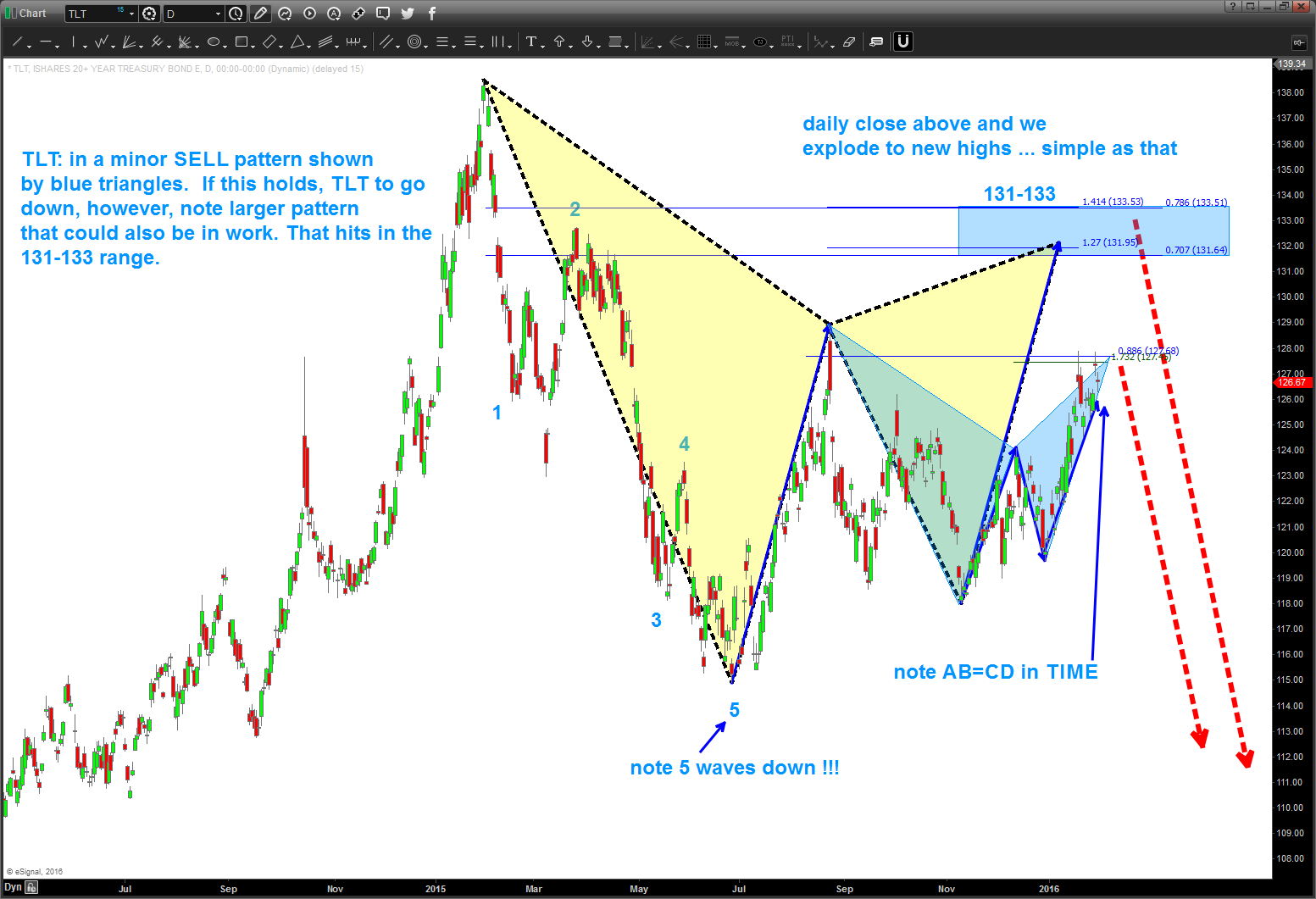
the next move in $TLT is “probably” DOWN …
Posted on February 1, 2016 Leave a Comment
folks, it’s ALL probability and as a pattern recognition trader that’s all you worry about. When a pattern appears it’s simply a probability it’s going to work OR not … that simple.
so, take a look at TLT …
- first note – we have a very clear 5 waves down. that’s either the beginning of the a trend OR a heads up that there is going to be at least another 5 wave move down (a C wave so to speak)
- if you do a search on this website you’ll find that we ‘called’ the BUY at 114 and we targeted 126 (while it was at 114) as the next target.
- since then we sold off but have found a pretty nice base at 118-119.
- this formed the blue triangle SELL pattern and it hit a little higher than 126 (by a buck) but is STILL in the realm of valid pattern parameters.
- also note, the TIME we went up AB is also equal to the TIME we went up in BC.
- SOMETHING SHOULD BE HAPPENING IN THE FIXED INCOME WORLD — SOON.
- now, if we blow thru this target then we’ll seek 131-133 and that is where the rubber will meet the road, so to speak….that’s an extremely harmonic (think music and square roots) pattern.
- the red arrows show what the PATTERNS are saying. if we blow thru the 131-133 level THEN it’s off to the races and the PATTERN failed. NOT US …
this has absolutely NOTHING to do w/ ANYTHING FUNDAMENTAL so please don’t email me telling me what it’s about or anything like that .. it’s a pattern folks, nothing more than that.
enjoy ….
B
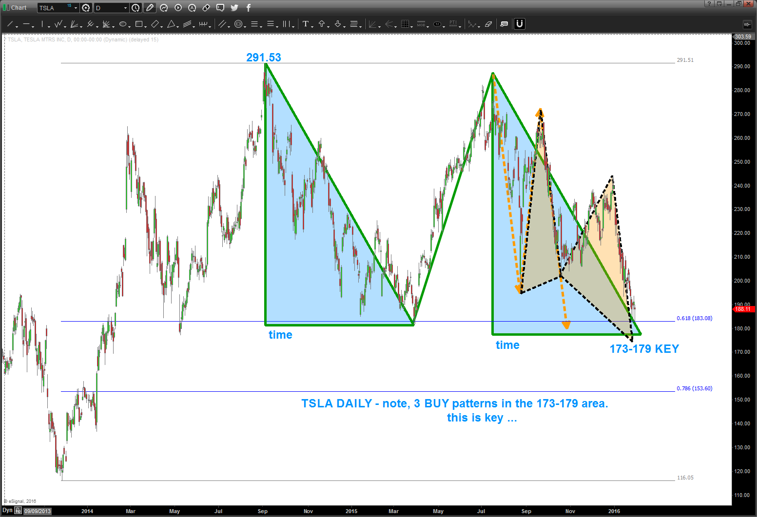
$TSLA
Posted on February 1, 2016 1 Comment
so from my fellow geek technician JC he always loves the “from failed breakdowns/ breakouts come strong moves” well here is a possible set up.
as a PATTERN guy what I have found is – totally technical – there is a reason for the market to stop at resistance or support.
in this case for TSLA you can see it’s “respecting” the .618 retracement from the last low … EVERYONE is watching this level and horizontal support.
and, if it breaks down, then “everyone” shorts and right below this breakdown level? 3 patterns coming in 173-179 ….
- pay attention to the “shaded blue triangles” as they represent equality in both PRICE and TIME. Appears 2/10 is the time frame for this level to be really equal in price and time. TBD …
- this type of pattern is a classic “FLAT” Elliott Wave correction … so, if TSLA is to go higher, believe this level needs to hold.
watch this level closely.
as a corollary, if we have a daily close below 173 then we have 153 and then, potentially, lower in the future.
let me know if you have any questions.
B
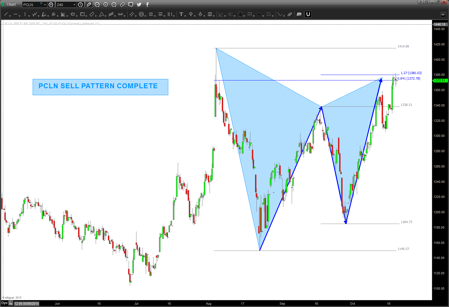
$PCLN update 2/1/16
Posted on February 1, 2016 Leave a Comment
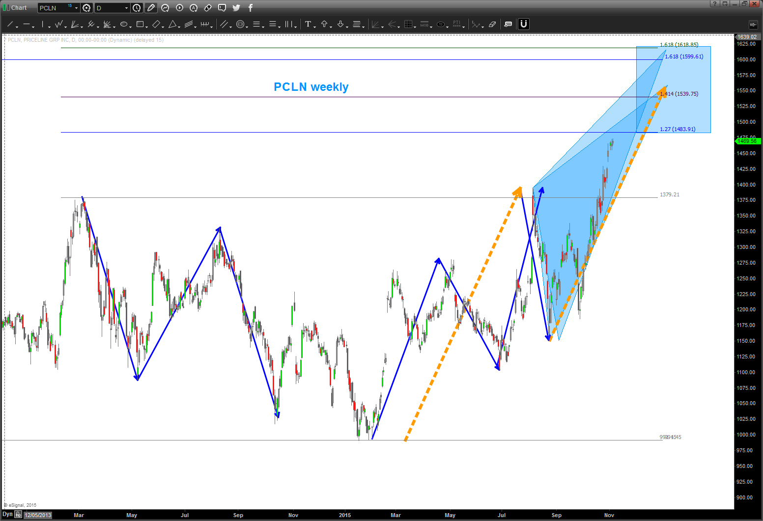
02/01/2016
as you can see below, the light blue trend line below was taken out. now we are approaching major support as shown by the polarity principle. some bid thrust/candles going into this level so this will be a key test in the coming days/weeks. if we lose this level, then expect 1.27 level to be attacked in the high 800’s.

12/20/2015: update to PCLN.
one can see that this has been an amazing rocket ship.
one can also see below that I was “seeing” a top coming in and tried the mirror image foldback, which from a price perspective DID NOT work. then, you can see that I was “seeing” a butterfly pattern and that missed the target area by a few bucks.
so, in summary, let’s watch the key low to high trend line shown in the chart below. also note the TIME symmetry around the foldback points. I missed that below, but that actually lends some credence to a potential big top.
this one has been tough .. but, then again, when you go from 3 dollars to 1450+ it’s going to take some time to digest.
anyway, for those who asked me, hope this helps w/ the gameplan for $PCLN.
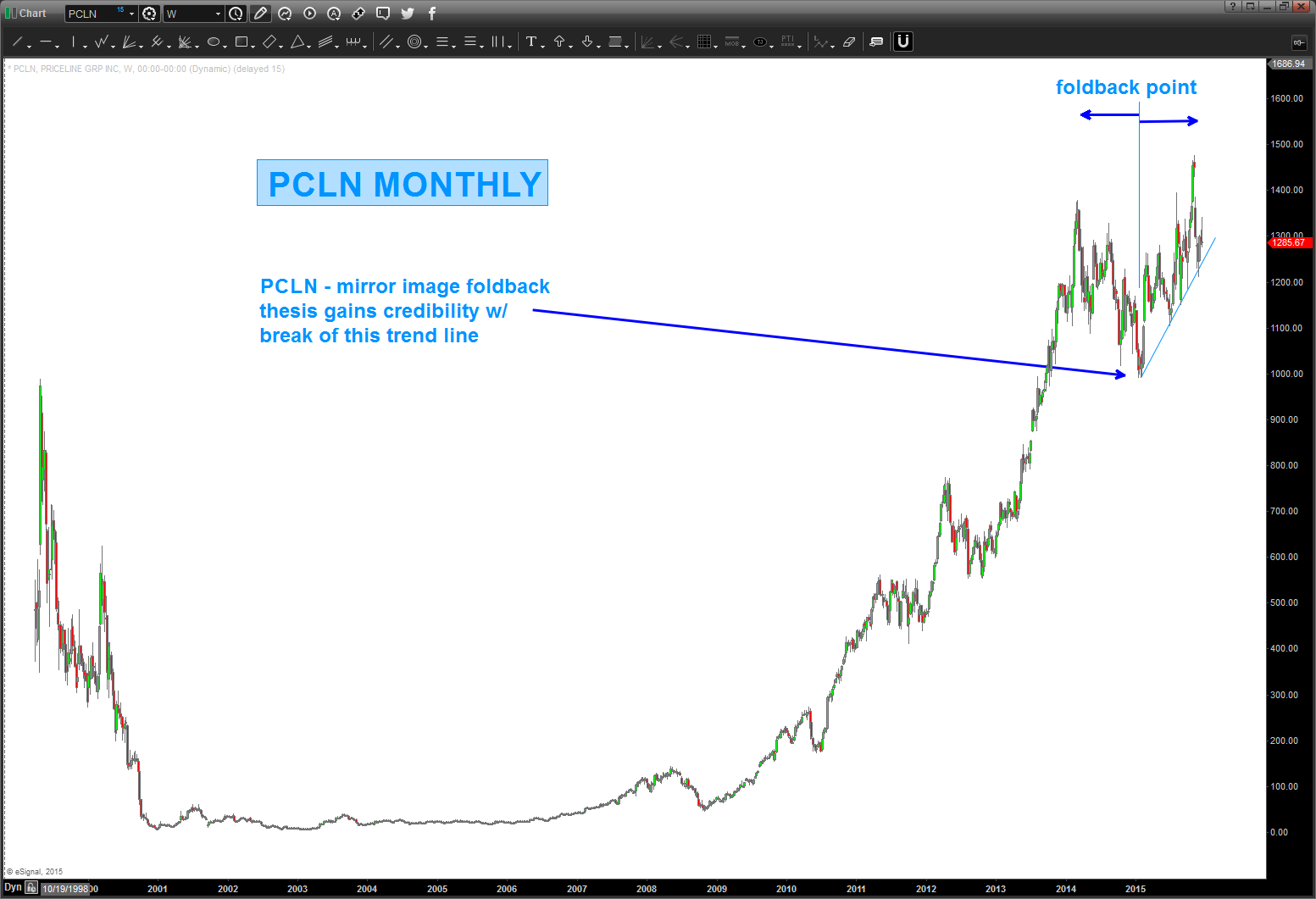
Folks, this mirror image got smoked. Much like the mirror image for Natural Gas … the mirror images fail at the inflection points and $PCLN has rolled thru the pattern. ERASE … ERASE…ERASE.
Where are we now?
Well, if we look at the candles you’ll see the 2nd largest monthly candle since the IPO occurred last month (OCT) So, we have 1484 coming in but it sure looks like momentum and thrust will carry it to the 1600 level. I’m going to spend some time on this one over the next couple days …
here’s the MONTHLY picture …
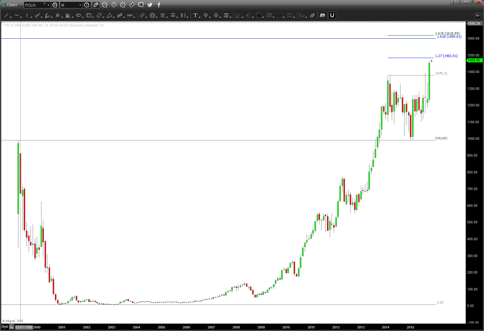
IF the mirror image foldback is in play THEN this pattern needs to hold and start down. a move below 1360 would bolster conviction that the mirror image mentioned earlier is in play.
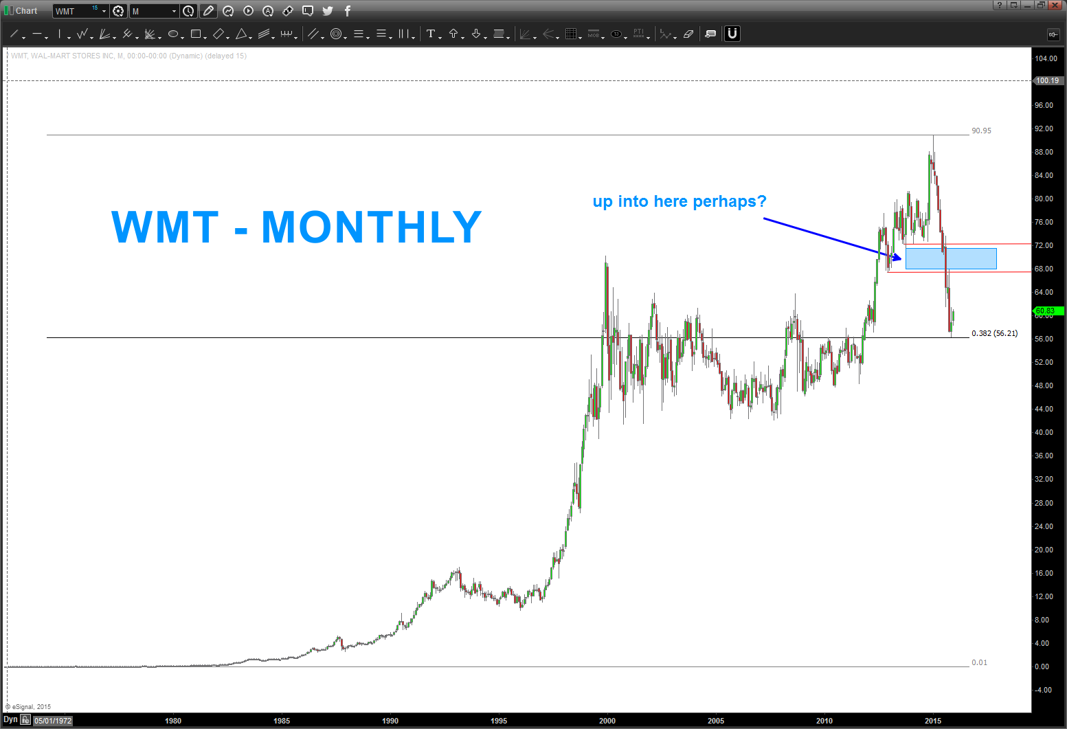
WMT – into the high 60’s?
Posted on January 30, 2016 3 Comments
1/30/2016 – WMT propelling higher. 68 or 72 potential targets, or quite frankly, new highs? too early to tell but it has been extremely bullish.
if you want to follow along – scroll down to the bottom where we show patterns into the HIGH and then use geometry and patterns to find the 55-56 area as support.
THERE IS ZERO FUNDAMENTAL ANALYSIS IN LOOKING AT THESE SWING HIGH AND LOW TARGETS.
Bart
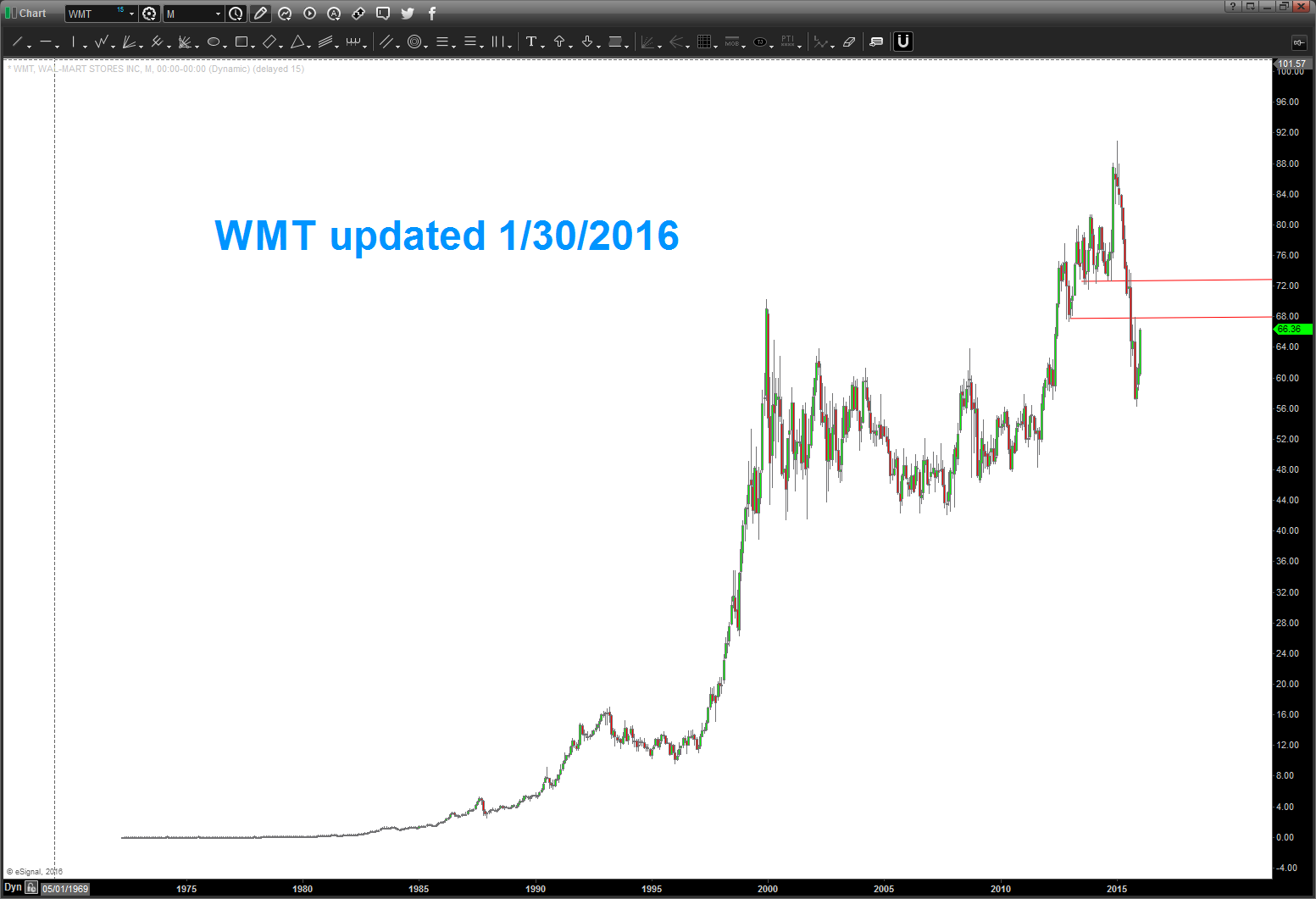
$WMT hit the support area and has been climbing. certainly appears the high 60’s could be in play? Please see below.
hope you had a great Festivus w/ family and friends.
spend some time working thru this post from the bottom up …
rock on, ok?
Bart
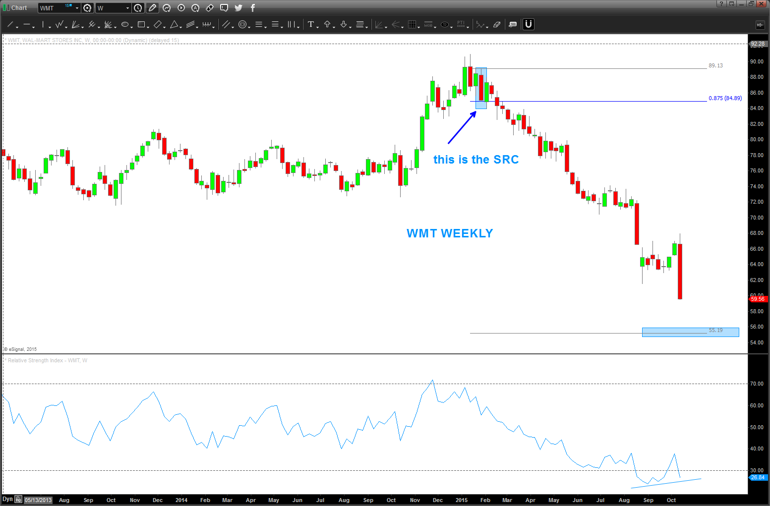
Just a heads up … were “there” or “close” w/ regards to potential WMT support.
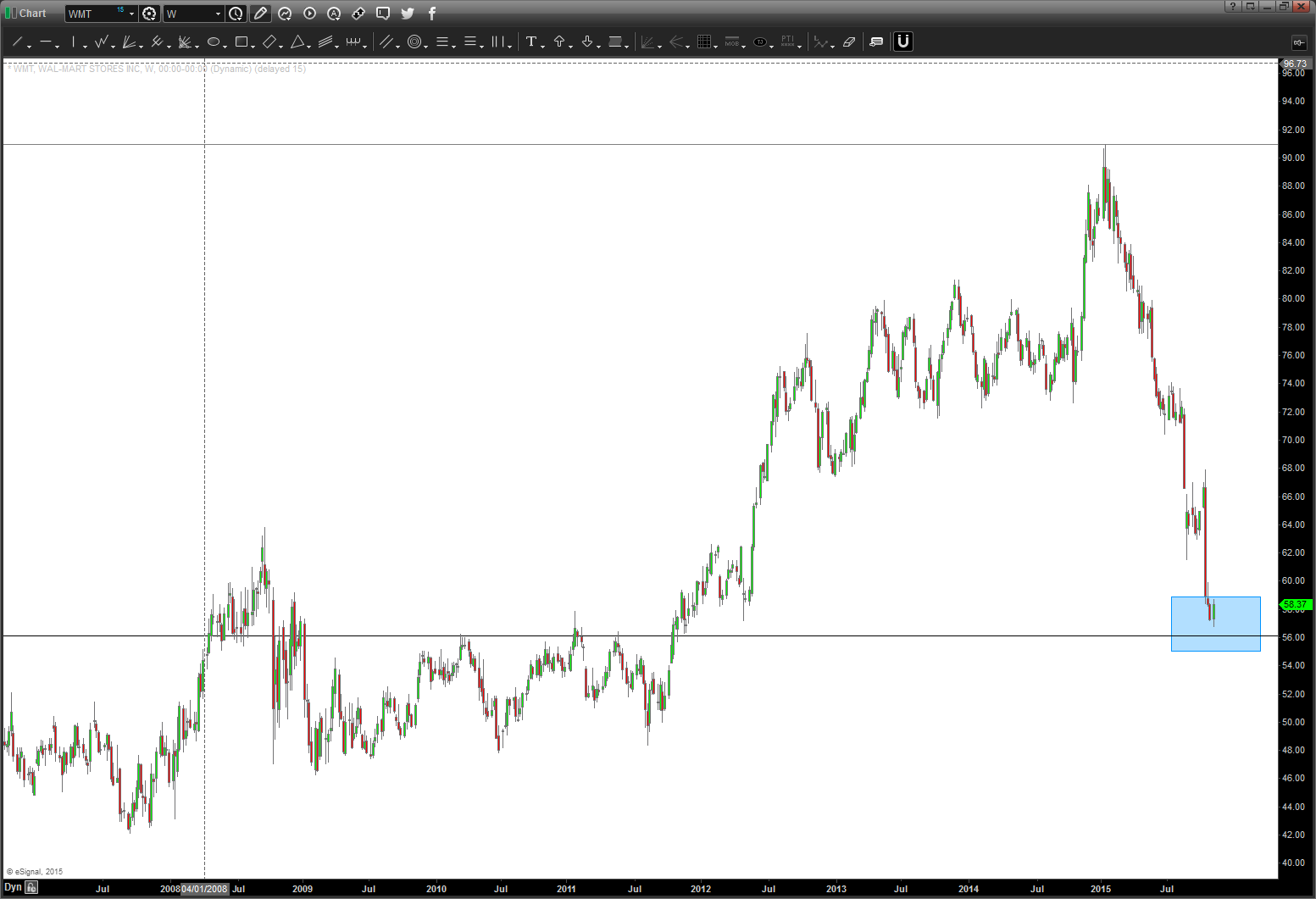
Here’s the picture of $WMT in 2013 – sure looked, at the time, we were finishing 5 waves and the circle area was the target area for a “potential” top.
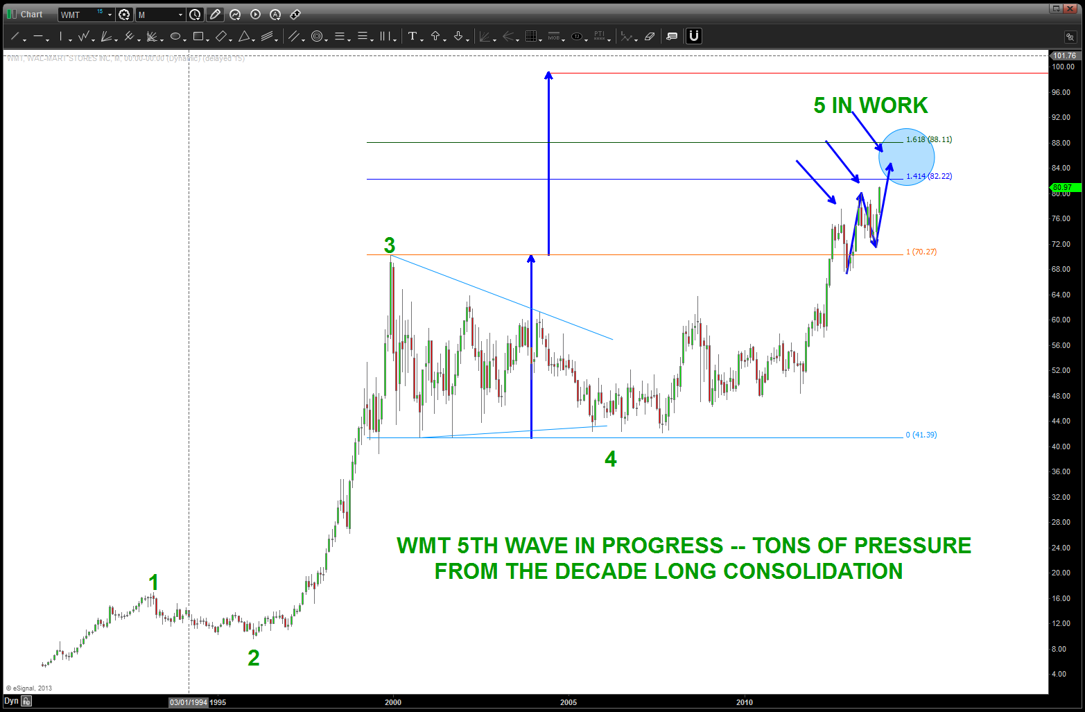
$WMT moving into the highs – Nov 2013
Target was hit and yesterday the move rally began. Hard to believe it’s roughly 2 years ago that this pattern was ID’d and it took that long for it to start to make the “news” so to speak. Anyway, now that the chaos and news is getting ahold of it, believe a look at a potential long swing trade in the mid to low 50’s is reasonable.
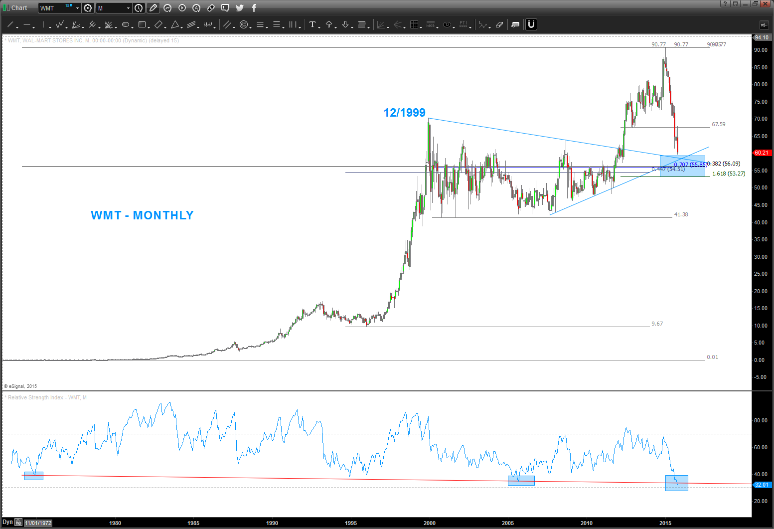
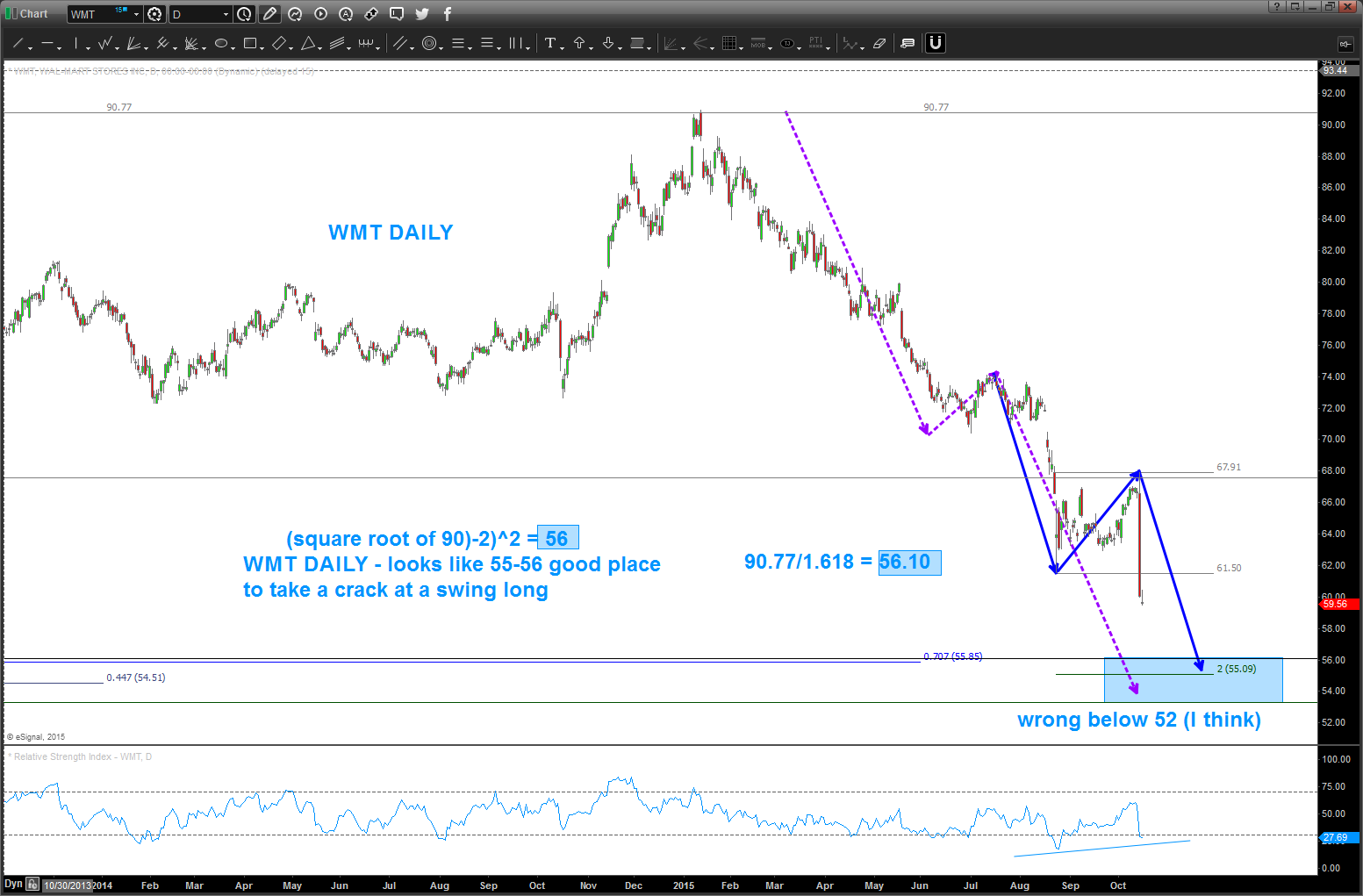
Here’s the daily chart … note the square root target of 56 lands right on the .382 retracement from the all time low. I like that … watch that 55-56 level.
Just another math thing … 90/1.618 = 56. Another reason to like the level.
Here’s the weekly 1/8th projection method …
55-56 sure seems like it’s key WHICH MEANS IF IT FAILS THEN WE GOT SOMETHING REALLY WRONG AT THE CIRCLE K.
B
