Great British Pound Update III and pumpkin soup
Posted on September 30, 2013 1 Comment
when I was flying and someone might have had a particularly bad night landing at the ship or performed the mission badly, invariably, someone would say “well at least your not eating pumpkin soup!” the Vietnam POW’s (God Bless Them All) had as one of their main meals the wonderful bowl of pumpkin soup…
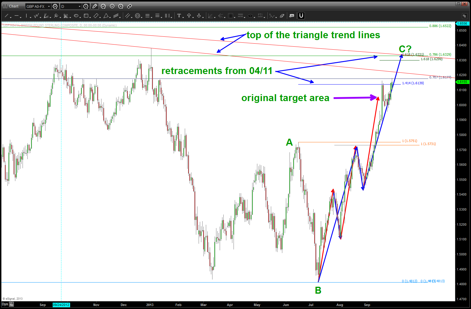
so, perhaps I am eating pumpkin soup w/ regard to my analysis of the Great British Pound. I have NOT deployed capital even though I went to “pull the trigger” a couple times. the 200+pip move engineered by the FED on QE day warned to stay away. as noted, the original target was BLOWN THRU and then found some resistance in teh 1.6140-1.6177 area. I have included the ratio’s responsible for this (in my mind)
now, what to do … I can see a target in the 1.6331 area that I will now be hawking. we have exploded almost straight up since July w/ intervening orderly corrections. the trend line making the bottom of the multi-year triangle has now been opened and closed above (bullish) and, as of this AM, it’s still showing signs of strength.
my gameplan: wait for a sell pattern to appear on a lower, intra day timeframe ELSE wait for upper target in the 1.6300’s to be attacked. If that level is taken out I will go back to the drawing board and call my e
update to GBP vs the USD
ntire analysis of the pound over the past 1.5 years as WRONG. 😦
FACEBOOK ….
Posted on September 29, 2013 2 Comments
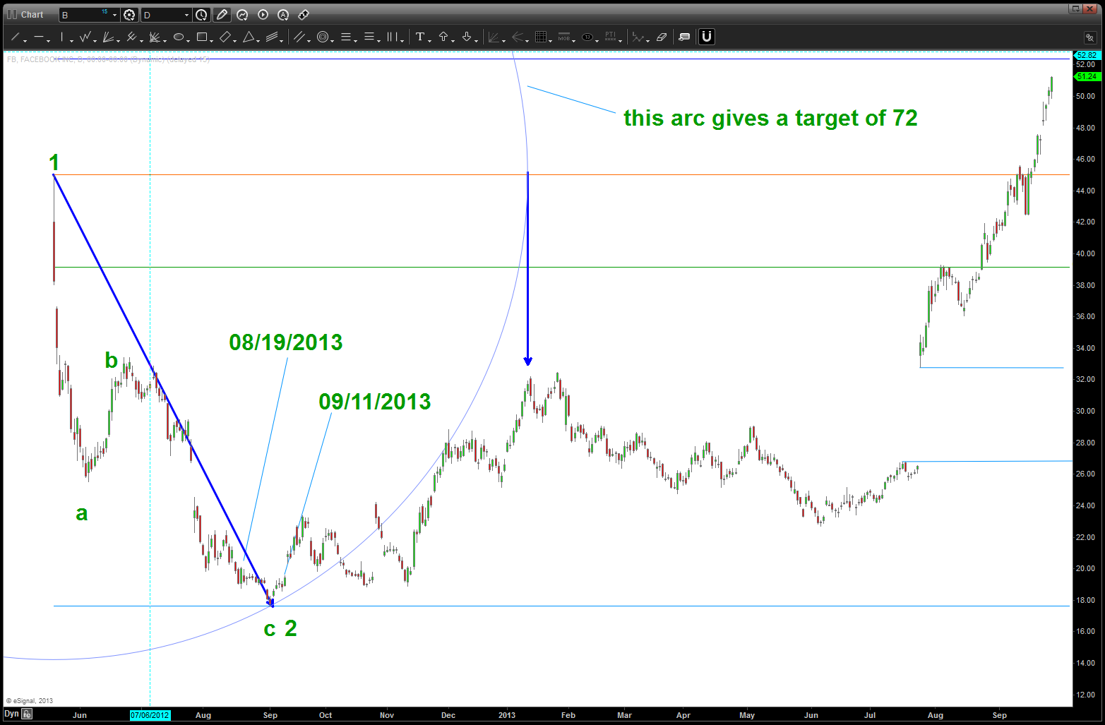
as hard as I try … it’s simply hard to not get caught up in the emotion/hope and chaos of the IPO. WE ARE ALL HUMAN!
Let’s face it … FACEBOOK has changed the game.
I spent last week at the Mid Atlantic Digital Marketing Summit and I was blown away by digital media and the incredible connected nature of our being – right here, right now. WOW … and, guess what, Facebook did it ….AWESOME!
so ( as a BEAR), when they went to IPO,I honestly thought they were like BLACK ROCK (BK) and thought … “this IPO will signal a top in the market.”
Well, as you my faithful readers know …it didn’t call a top in the market….
I was flooded w/ calls about “getting in the IPO of Facebook” and I told EVERYONE to “be patient, a buy will appear.”
So…this being BARTSCHARTS (thanks Kathy) here is the real time email traffic to my institutional clients:
Portfolio Manager
http://www.v50capital.com
703.431.9020
V50 Capital Management, LLC provides investment management and signal services for Commodities, Options and Forex investments. Note: Commodities, Options and Forex trading involves substantial risk, and may not be suitable for everyone; trading in these markets should only be done with true risk capital. Past performance either actual or hypothetical is not indicative of future performance.
V50 is NOT a registered securities adviser – the information/ opinion we provide in regards to Securities, Mutual Funds, ETFs and or Bonds (SEC regulated markets) is an uncompensated opinion; you are free to use this opinion in any manner you choose, and in no way affects the terms of service provided by V50 in regards to your managed Forex/ Commodities account.”
finding a pattern and placing it in the intermarket circle of life …
Posted on September 26, 2013 Leave a Comment
Update: looks like the level has held so pay attention to FXI in the coming days.
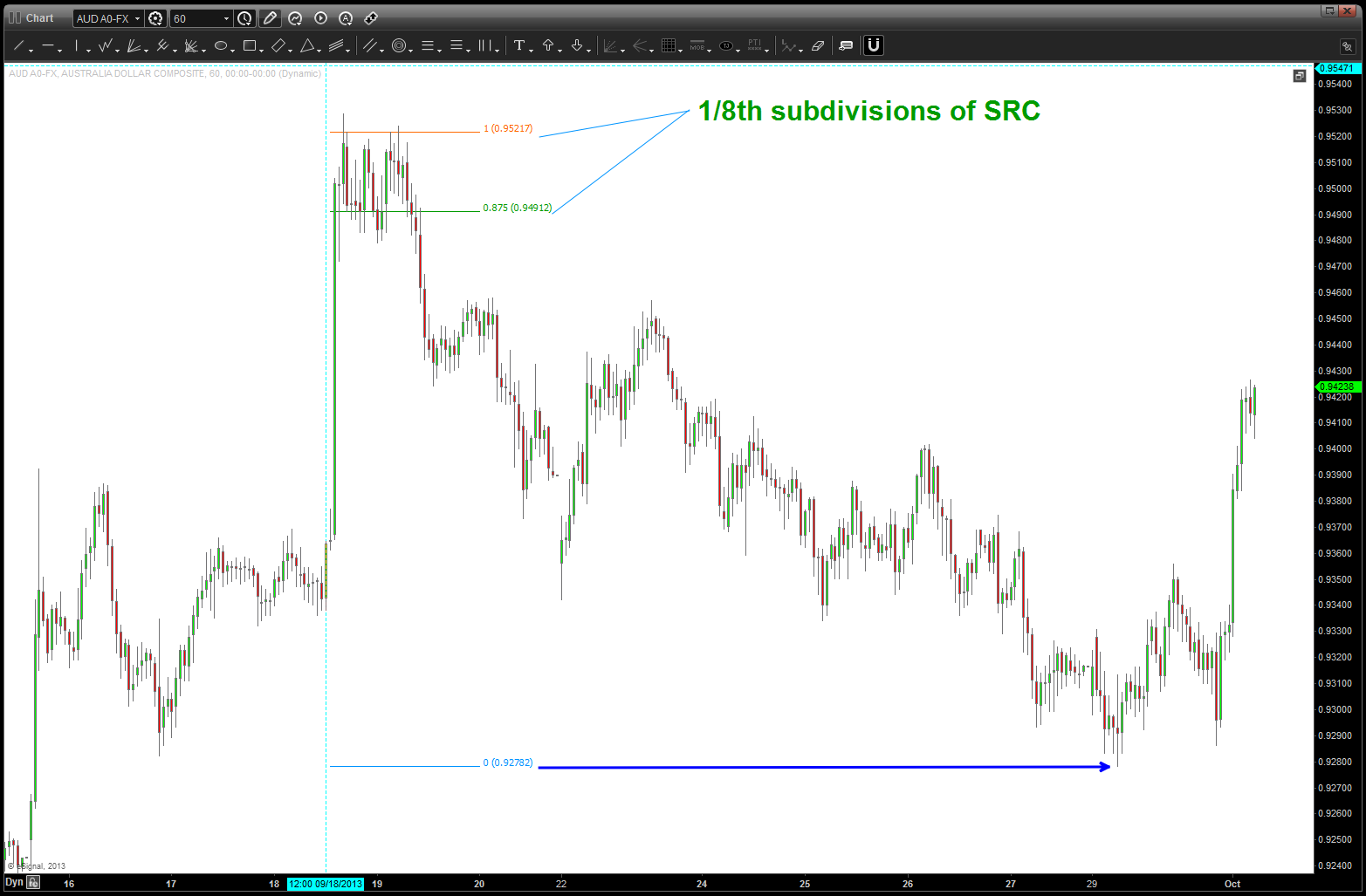
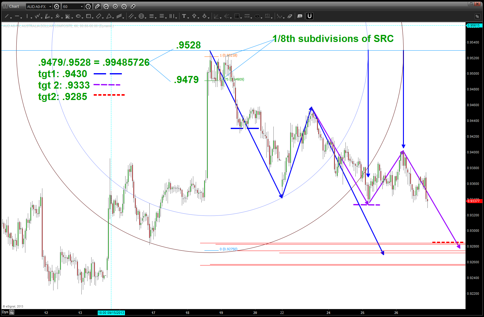
1/8th subdivisions of SRC appears to have worked
DEFINITION (BART’s) for the circle of life – fixed income, FX, equities (global and conus) and commodities and their symbiotic relationship.
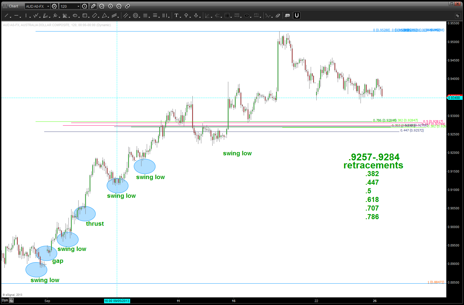
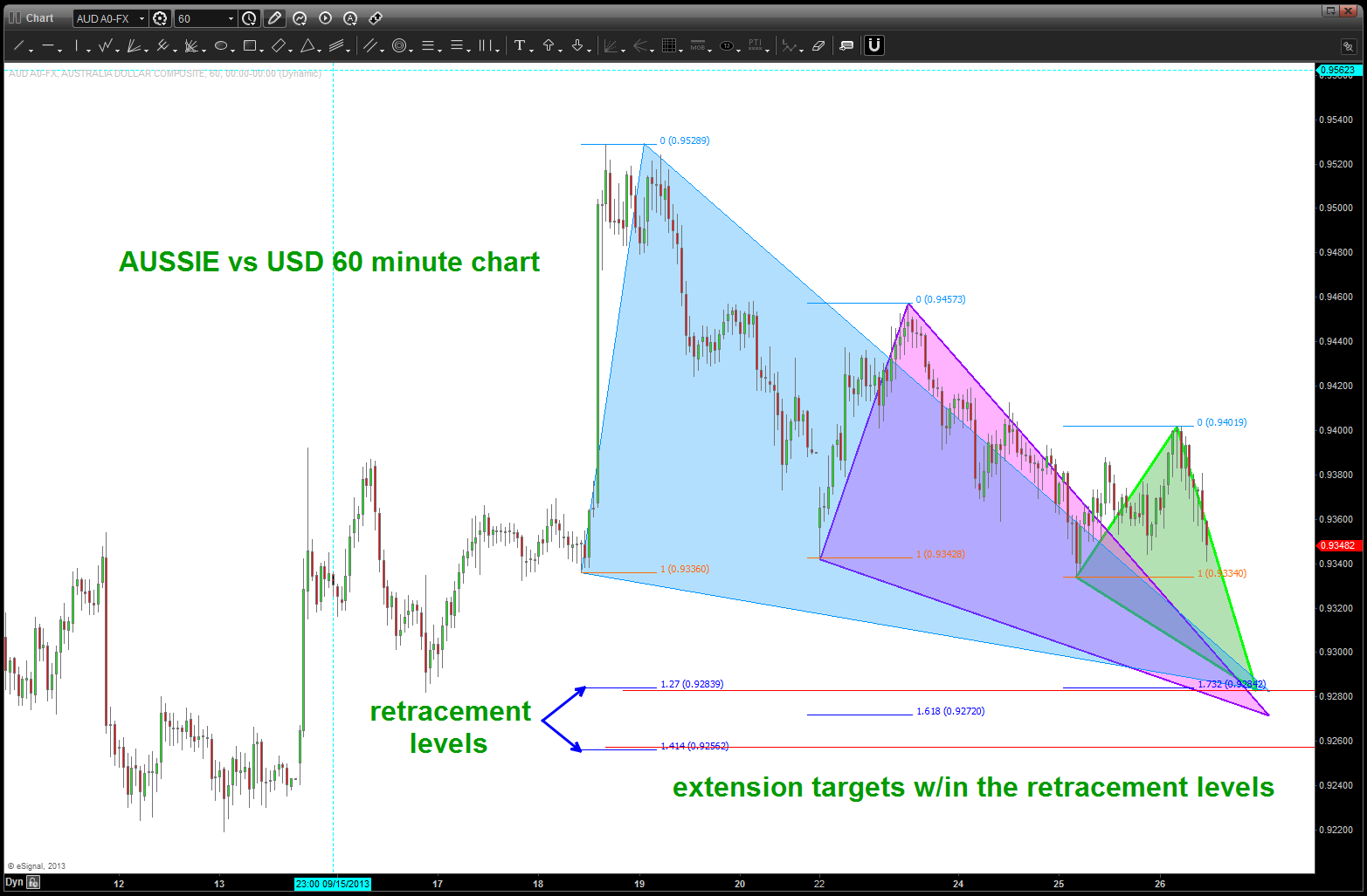
in this case, we have a BUY pattern coming in a little lower on the AUSSIE vs the USD. The following three charts show how you can diligently walk thru finding a pattern by projection, extension and retracement. Here’s the flow in chart form:
retracements
extensions
projections
as you can see above, after a rather strong move up – after quite the beating – we have a normal/controlled and pretty unremarkable pull back in the AUSSIE vs the USD. I say all that because this can sometimes be a rare occurrence. My specialty is the SPOT FX market … I like to call it the wild wild west. That being said, the patterns do work in this 3-4 Trillion Dollar/Day market.
An opportunity is simply presenting itself to manage risk. NOTHING more and/or nothing less. The pattern works or it doesn’t. Our job is to find these type of patterns and determine, beforehand, how much we are willing to risk. Because, in this world of investing/trading the ONLY thing we can control is how much risk capital to deploy. After we have entered the market, we are playing w/ dynamite being thrown by caged gorilla’s and, guess what, we are in the cage…
now, seeing this very nice level, we can now put this into the context of the intermarket world … perhaps you are aware and/or perhaps not but the AUSSIE’s do a lot (OK, probably a majority) of their trade w/ CHINA. Now, take a look at the correlation of FXI (ETF for CHINA LARGE CAP) and AUSSIE vs USD. Pretty nice and, it’s safe to say, by looking at the chart below that nice swings occur when both of them find inflection points.
so, what can we surmise …
IF AUSSIE level holds and the AUSSIE goes UP vs the USD then the Chinese market should follow higher …
IF AUSSIE level FAILS and the AUSSIE goes DOWN vs the USD then the Chinese market should follow lower …
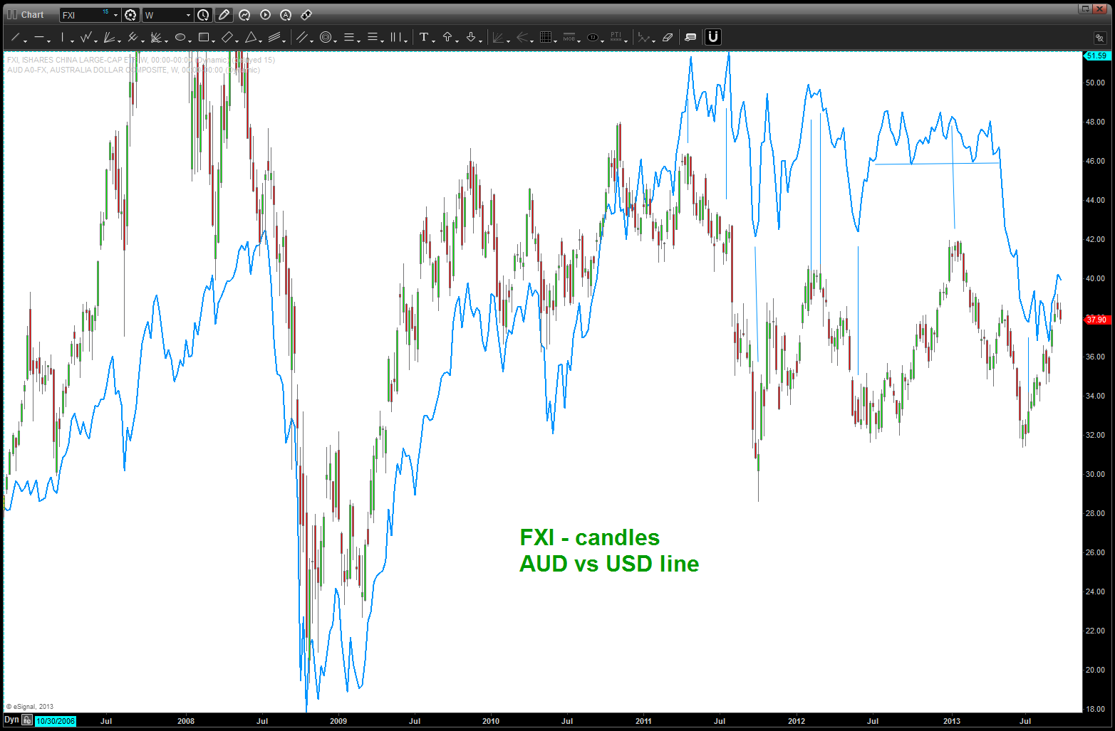
Aussie and the FXI plotted together …
advanced pattern recognition in the intermarket circle of life ….
rock on, always
B
the ratio of STAPLES to the S&P ($XLP / $SPX) – trust me, it’s important
Posted on September 25, 2013 1 Comment
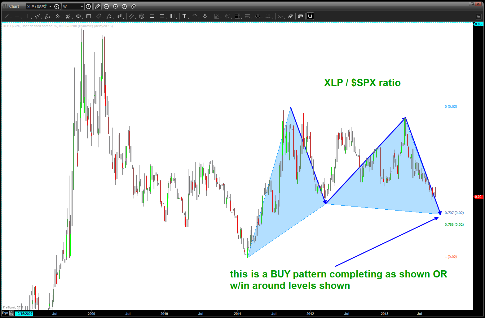
if you have the time, please read this post: http://allstarcharts.com/are-staples-the-key-to-this-market/ . You’ll note that I incorrectly saw a triangle and expected the market to roll over once the break out occurred. that analysis was wrong … however, the market went UP when the ratio went down — exactly like it’s used to. We are now approaching another pattern point here … the chart below shows how critical the time component has been w/ these corrective moves and also the beautiful BUY pattern we have approaching — If this pattern works then we should see the equities go down as this pattern works … if not, then the trend UP in equities will continue. To review, here is the pattern we are watching:
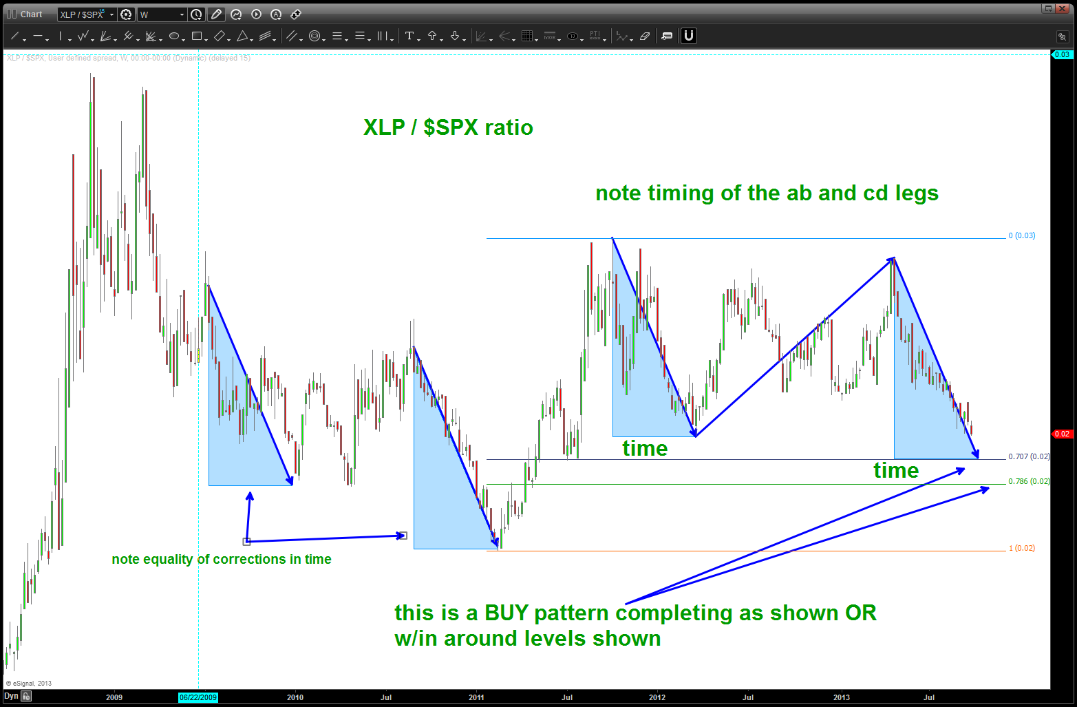
BUY pattern on the ratio
since a picture paints a thousand words and, quite frankly, I’m beat tonight I’ll SHOW you why this ratio has proven to be so accurate in the past. bottom line, every MAJOR MOVE since 2000 has been inverse to the move of this ratio. it’s almost EXACT ….I’m just going back to a weekly chart. see the above link for the monthly look.
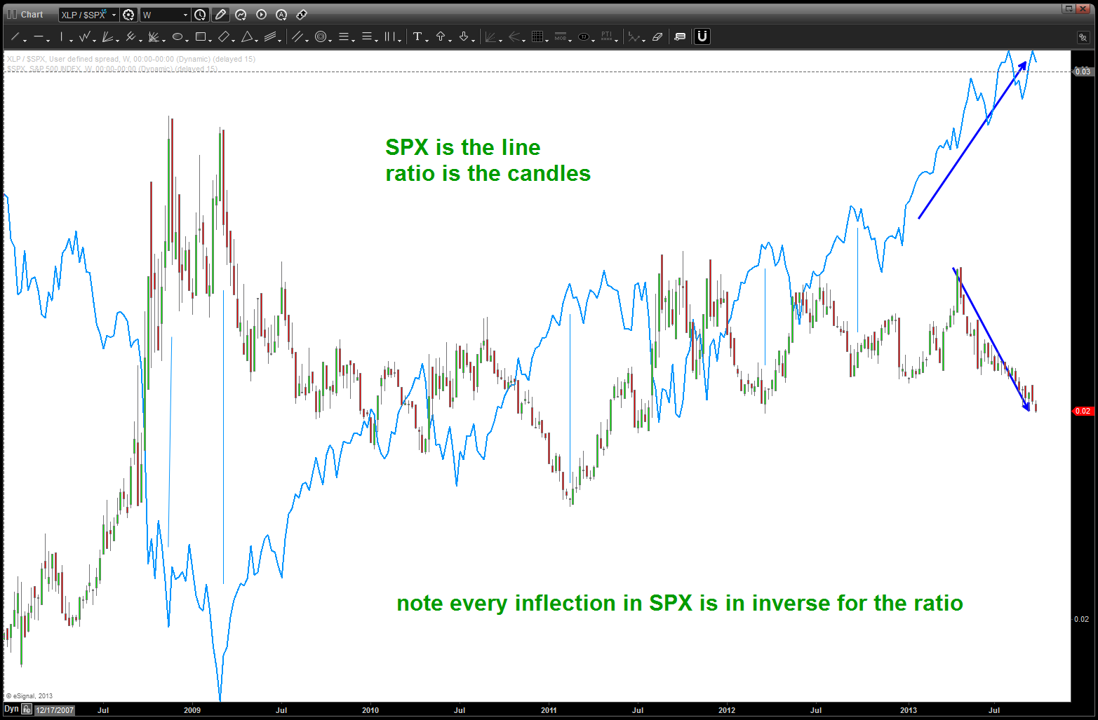
ratio w/ the SPX overlaid on top off it as the line
as a advanced pattern recognition trader dealing w/ probabilities I think this level on the ratio will tell us EXACTLY where we are …. stay tuned and monitor closely.
B
GOOGLE – a classic head and shoulders top?
Posted on September 24, 2013 Leave a Comment
first off, I love the company GOOG. what amazing innovation, passion, creativity and, most importantly, the ability to create a word into a lexicon like Seinfeld – yada yada blah blah blah. so, before I show the SELL pattern that has appeared, let’s go back in time (remember this is no “could of, would of, should of) to show the BUY recommendation. here it is w/ all of it’s geometry. note, there was a 20 point difference in the two levels I was hawking (a Naval Aviation term — HAWK TANKER was when someone was boltering all night (couldn’t land) and the hawking tanker would (very stealthfully) hawk the poor bastard who couldn’t land to save his life. ) Anyway, 20 dollars is a pretty big margin of error, but here’s what I saw coming into the low ….
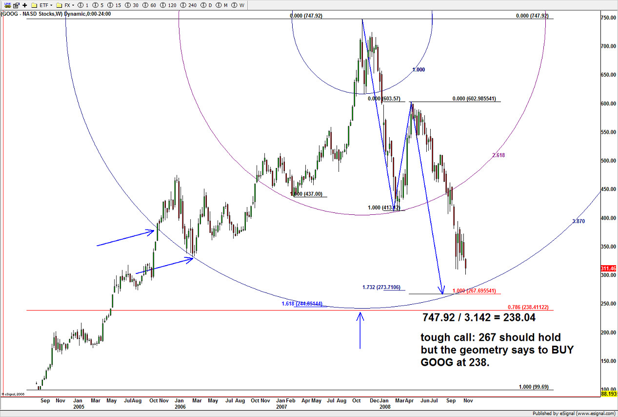
GOOG geometry and the BUY recommendation when the sh*! was hitting the fan
hit the target and off we went …. recent action (say the past 5 months) has been stopped by the 925 target. here’s a quick look at the potentiality of the 925 area being significant:

Square of Nine and the targets it has produced ….
A short was and still is being worked w/in the levels depicted and as we approached the potential area here’s the projections:
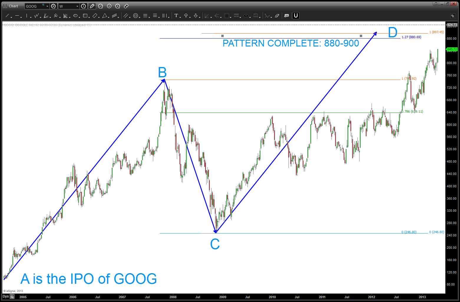
Targets on a MONTHLY pattern recognition potentiality
here’s the “real time” intraday look at the fill and, also, the BEFORE THE MARKET OPENED gun shot up to the 925 area and then the retreat …. interesting, to say the least. (sorry about the black background — again, this was real time)
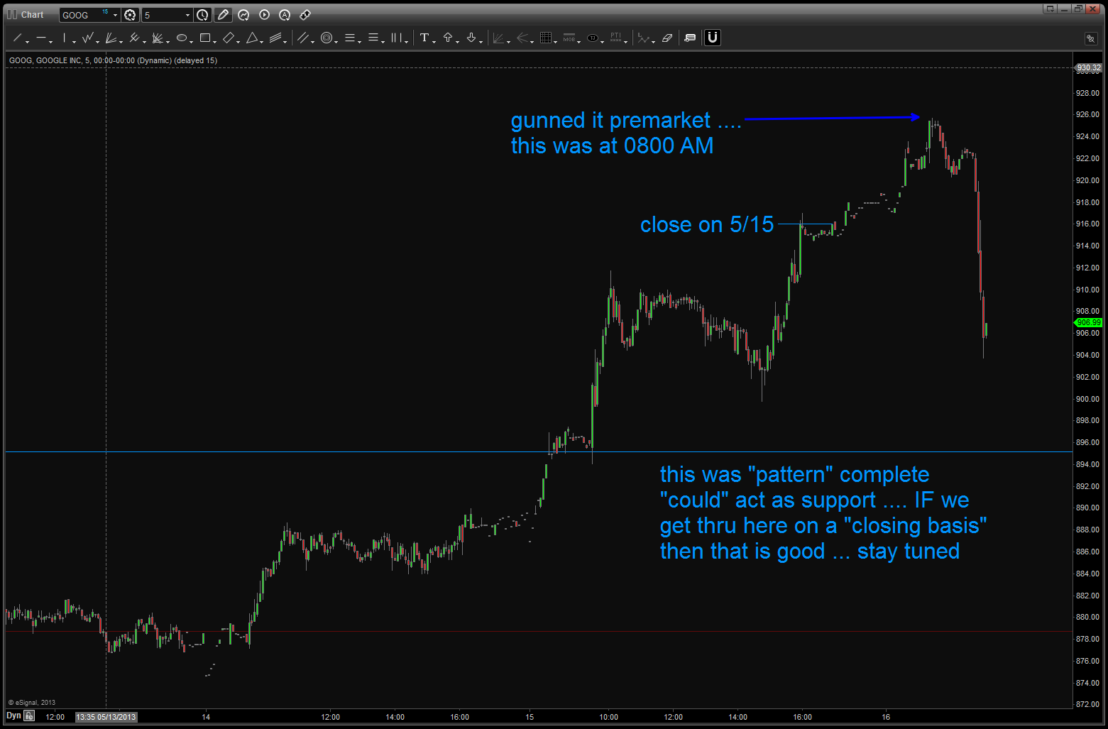
GOOGLE intraday
here’s the picture as of today …. looks like 850 is going to be the line in the sand …..
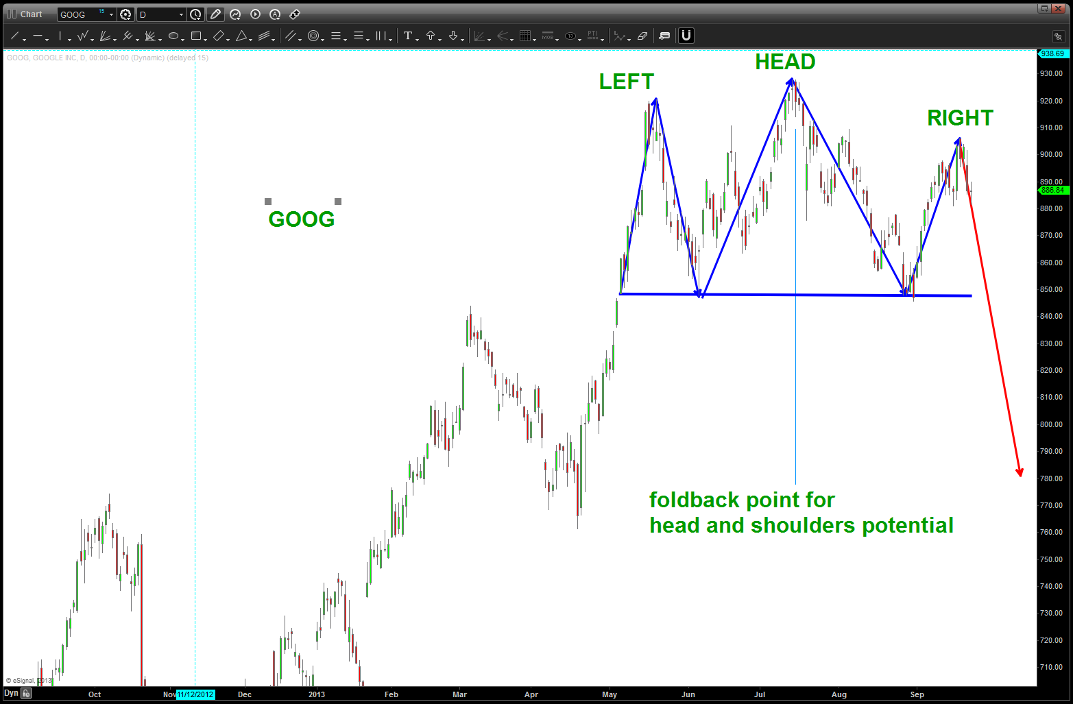
“classic” head and shoulders appearing or not?
the upcoming week of 9/22 for the S&P
Posted on September 22, 2013 1 Comment
our S&P post last week of parts I-V spelled out the overall look and feel for the S&P as we approached and eclipsed new highs … we took a look at technology, financials and energy. additionally, throughout the past weeks, we have walked thru the circle of life for fixed income, the dollar and certain commodities. Additionally, we looked – globally – at the current state of affairs for the other equity indexes. this blog post will be a quick update to where I “think” we are and some key levels to watch over the next week …
- Financials: a pattern did complete at the high for XLF at 20.92. Higher targets also remain from 21.50-22.20. Would really like those “higher” targets to be attacked to get a true feel of the market but, for now, realize 20.92 could be it on the financials. if this is complete, then it does not spell “good” for the overall index.
- Energy: as we showed in the last post a potential terminal target remains higher in around 97 on the XLE. However, we also showed at pattern completing in/around 85.20. that has hit and a break below 80 (weekly close below) would not spell “good” for the overall index. Crude sold off on Friday and the real test will be it’s “return to the top of the triangle trendline” to see if it bounces for the higher target shown in the past. the $XOI and $OSX are also showing weakness at targets described in the past.
- Technology: I am breaking down the overall technology look into the NASDAQ index (NAZZIE). if you look back at the “technology” post from last weekend you’ll see that we still have some higher targets 30+ points away. Too early to tell if Friday was a high but would, again, certainly like the upper targets to get hit and for all three of the major components of the S&P to go down together.
- I still feel that the “big guys” are going to “tip” their hand and “try” to rotate out of the high flyers and into the staples (deodorant, tooth paste, water, etc.). I am watching this ratio like a hawk. This is a perfect set-up for a BUY of the ratio which sets up a (HISTORICALLY) SELL on the S&P. That target is a little lower and, again, would really like to see that level hit/targeted.
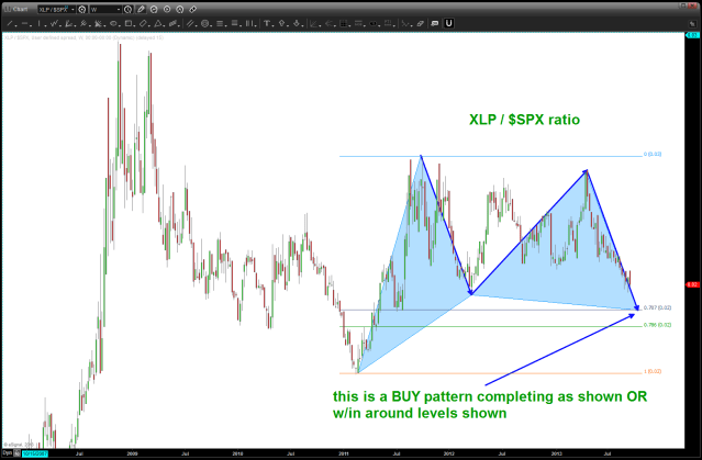
XLP / $SPX ratio analysis
- Last, I had the WONDERFUL chance to train w/ Joe Dinnapoli of http://www.fibtrader.com a couple years ago. Wonderful training and very very important information on the “internals” of the market and it’s structure and the importance of liquidity in the world of program trading, micro trading, the bid-ask and the false injections of cash that has occurred w/in the house of cards this market has produced. Take the time to watch this series of videos: http://www.youtube.com/watch?v=MQed-Aqay5w I also ask you to take a look at the picture/explanation in part 2 of 5 and in/around 10:38 and 13:01 for part 4 of 5. The series is a couple years old, but still so extremely valid and important. If you read my post a couple hours prior to the FED announcement you’ll find that I correctly surmised that the QE would continue … believe it or not, sooner or later, the illiquid nature of todays market will, ultimately, put us at risk for a potentially major move. This is ONLY a probability and one that has, more than likely, a low chance of ever happening. But education around potentialities isn’t so bad, is it?
I AM NOT DESIRING OR CALLING FOR A CRASH OR ANYTHING LIKE THAT …however, the market has been propped up by trillions of dollars and, therefore, liquidity is an issue. If this is an issue then why not put some of the profits in the bank and let some or a little ride?
What if this DJIA chart is correct …. ?
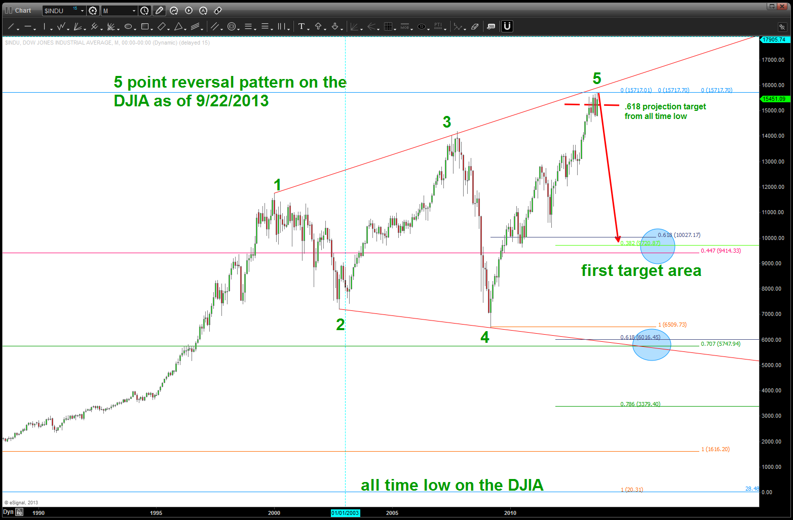
DJIA SELL pattern completed/completing w/ potential targets depicted base on the lack of liquidity present in the market
Bruce Buffer of UFC and the FED …
Posted on September 18, 2013 1 Comment
my buddies and I enjoy buffalo wild wings and the UFC night …. the energy is amazing, the beer is cold and the wings aren’t bad …. everyone gets fired up as Bruce Buffer does his amazing introductions and then, at the last minute bellows “IT’S TIME!” Well, folks “IT’S TIME” to see what “the Creature from Jekyll Island” has in store …not knowing a thing about the fundamental theory of economics (is the ramifications of printing trillions of dollars in ECON 101?) I ALWAYS go to the charts …
again, trying to give some background on the PATTERNS and the charts I have included the chart of short term interest rates below. If you remember, there was a time when they were RAISING INTEREST RATES … at the time I was asked to start “charting them” so I did and as we came into a very important FOMC meeting just like today I said, “nope, they are done raising interest rates.” Why? Well, to me it was a simple as our .786 retracement level ….
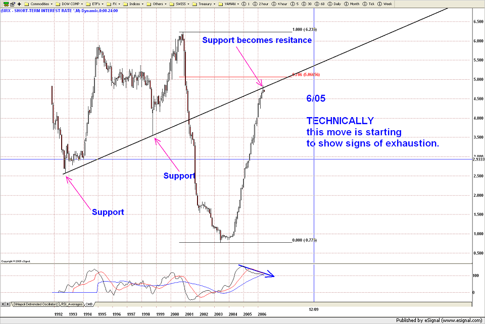
charting short term interest rates
I actually have a chart as the interest rates hit the .786 level and I’ve spent the past half hour searching “interest rates” thru folders and can’t seem to find it …bummer. note on the chart above the divergence present and the patterns that existed. bearish divergence into a .786 retracement is “usually” a sign of resistance. Plainly there for us all to see ….
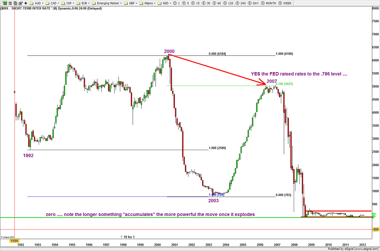
showing more patterns
I also like to track the “30 day Fed Futures”
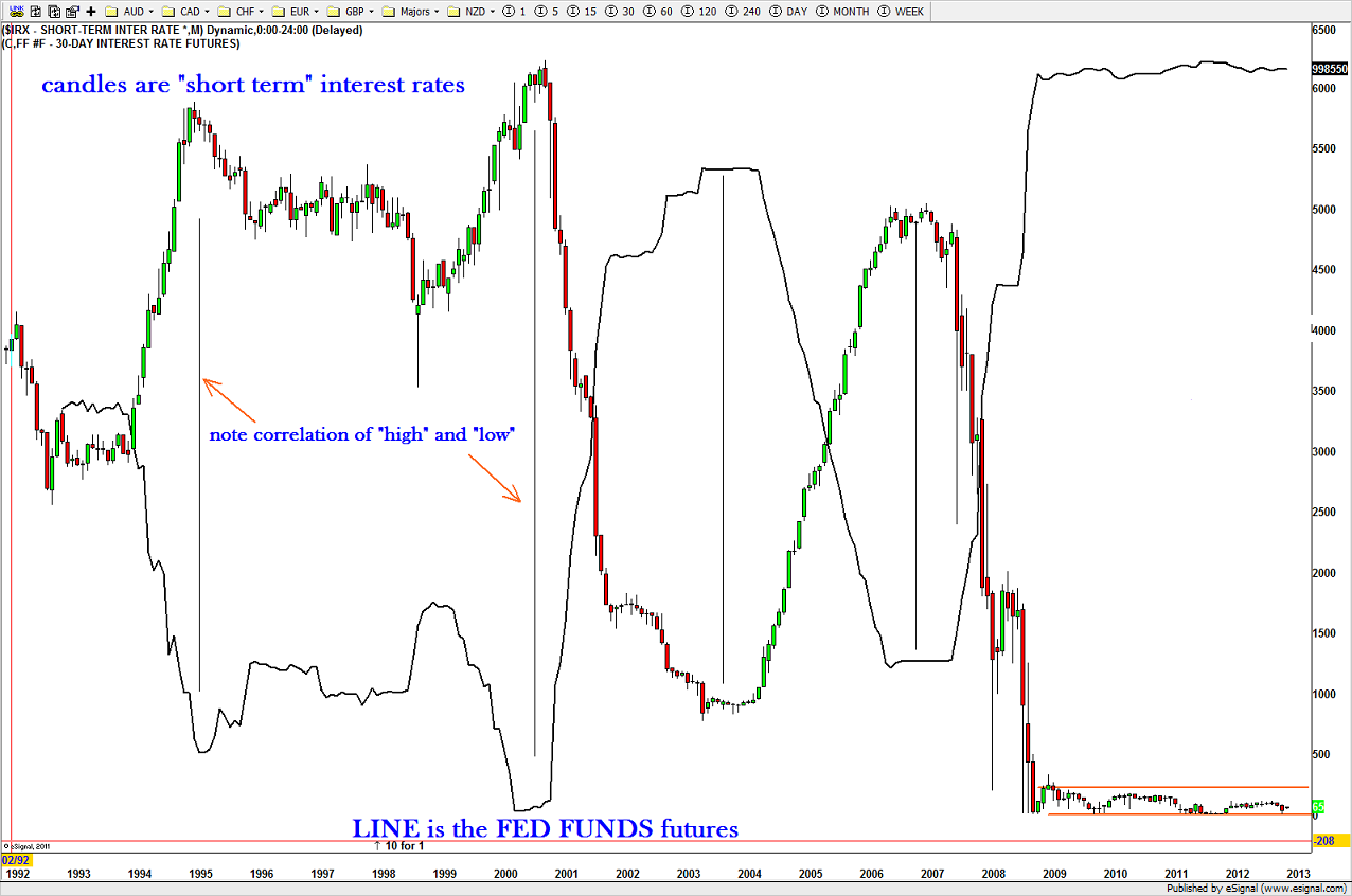
interesting … they haven’t budged
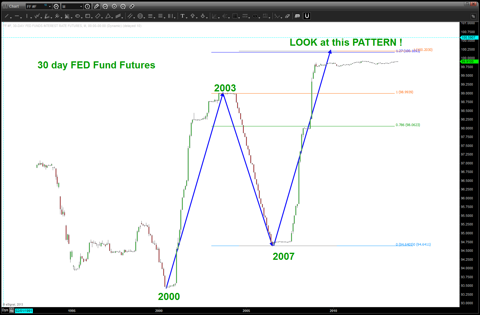
30 day FED FUNDS rate
note, not sure if that pattern can every complete because to go above 100 would mean interest rates are (-) so … consider this pattern complete (?)
It’s time … interest rates are at zero, IMHO we have a “house of cards” recovery and the ONLY direction we can go is UP w/ regard to yield/rates. HOWEVER, in the context of an amazing 30+ year bull market in the fixed income world we have reached the “normal” and “standard” correction that has existed since the beginning of this bull market in the 80’s. We do have one more correction low that “could” happen so perhaps a little lower is in the cards. what’s really fascinating to me w/ regard to the FED FUND futures chart is it hasn’t budged. the traders of the world don’t think anything is going to happen …
Per my post a week or so ago on bonds the BUY of BONDS (sell YIELD) is the side of the market I want to be on ….
https://www.youtube.com/watch?v=ilpiYHKbSAw
for information on the FED FUNDS futures see: www.cmegroup.com/trading/interest-rates/files/IR-143_30_Day_Fed_Funds_Futures_and_Options_Fact_Card.pdf
B
The Great British Pound Update
Posted on September 18, 2013 1 Comment
in my last post for the pound at: https://bartscharts.com/2013/09/12/the-great-british-pound/ I laid out the case for my analysis pointing to a wave 2 top followed by lower prices. I had the C? put in around this area. Well, believe w/ FOMC meeting today that we’ll see this area attacked and the nature of the move to come will become apparent. I have not entered, yet as I watched most if not all the targets get hit. The final ones are in the 1.600-1.6046. Here’s the updated chart:

Great British Pound Updated
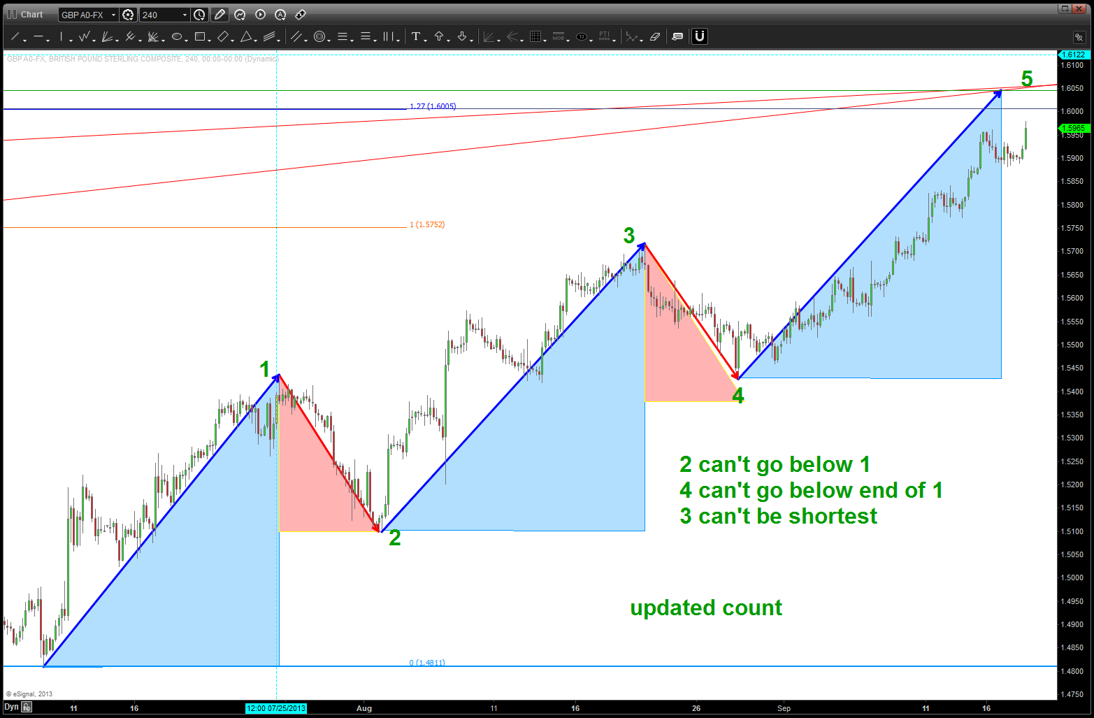
revised, and final, count. IF this count is wrong then the triangle thesis is wrong
Soup is good food … Campbell Soup at key level ($CPB)
Posted on September 17, 2013 Leave a Comment
swings on this puppy have been extremely nice ….charts below.
just follow the bouncing ball …
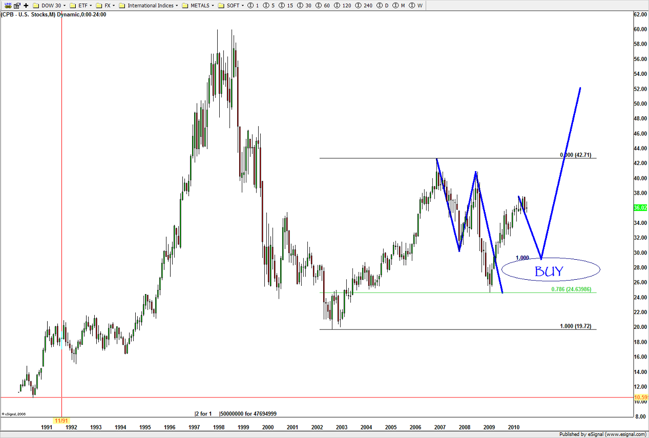
nice BUY pattern emerged at level forecast …
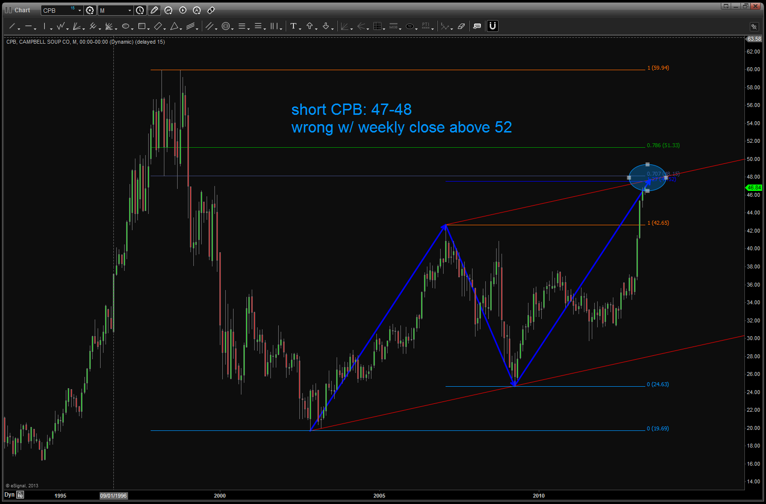
long term pattern came into play. good pattern/good defined risk …
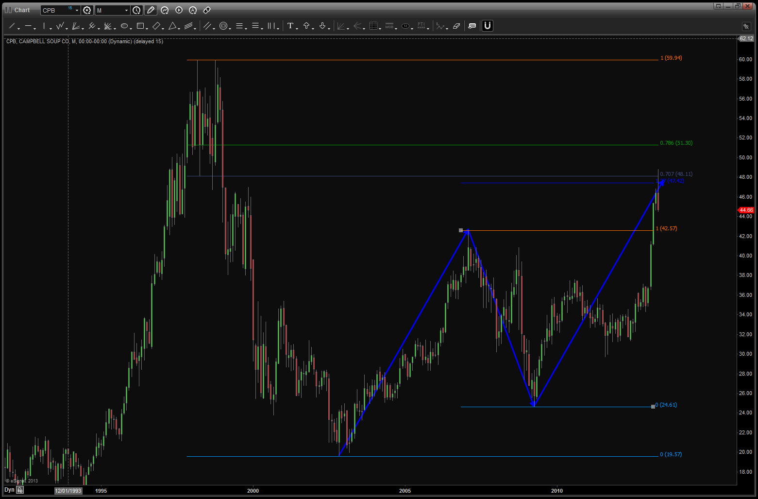
level being hit ….
note, now we have completed the equality of swings and the level held at/around 41.
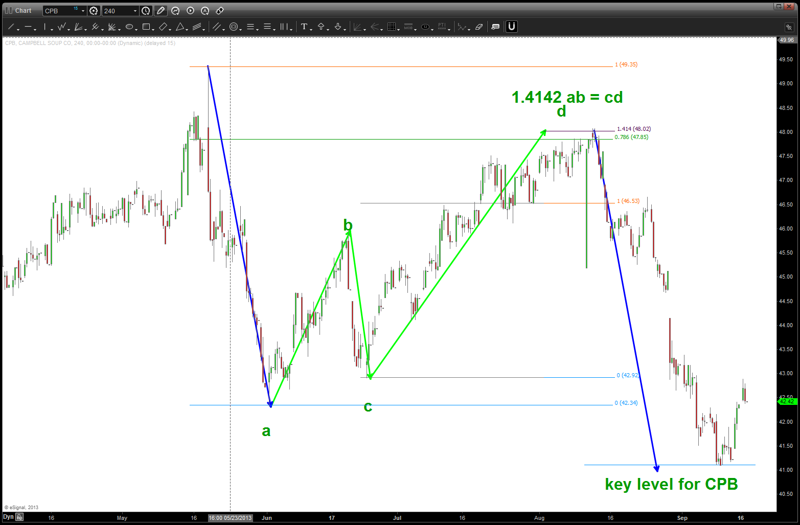
watch the lower level on CPB … if we break it, selling could really come in ….
Loonie, Confluence, Musical Theory and the Oil Services Index
Posted on September 17, 2013 1 Comment
UPDATE: picture paints a thousand words. NOTE THE HUGE AMOUNT OF THRUST THAT CAME INTO OUR LEVEL. Even w/ that much thrust it only went thru 15 pips. current consolidation needs to get going higher OR pull back a little for this level to be key. Lastly, take a peak at the oil services index below. it has not broken and is holding up nicely. per original thesis below, believe one of them is going to ‘break the pattern’ and move rather strongly .. need to sit tight and watch the show unfold but it’s coming…
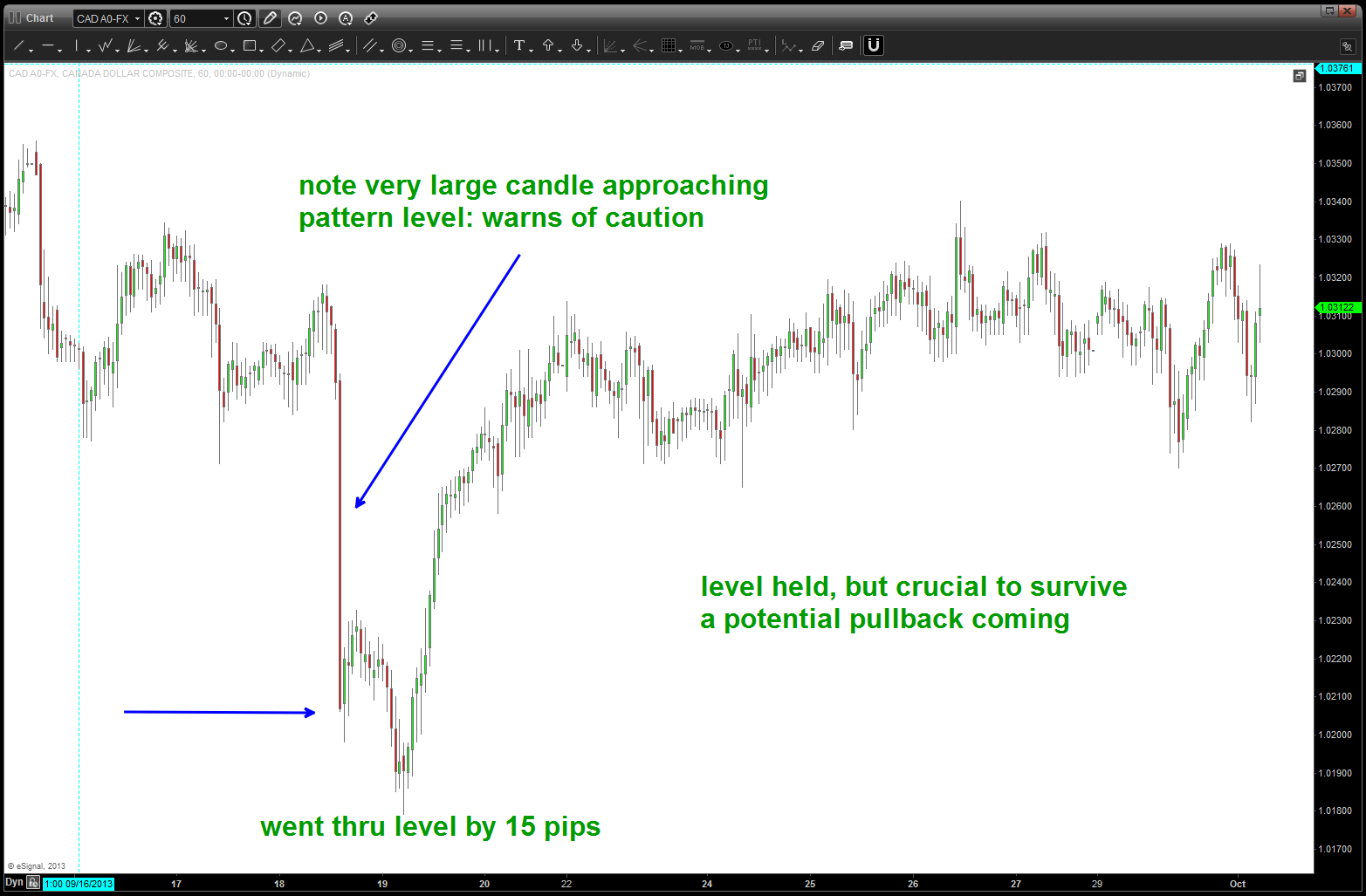
Level held … watch for pullback potential
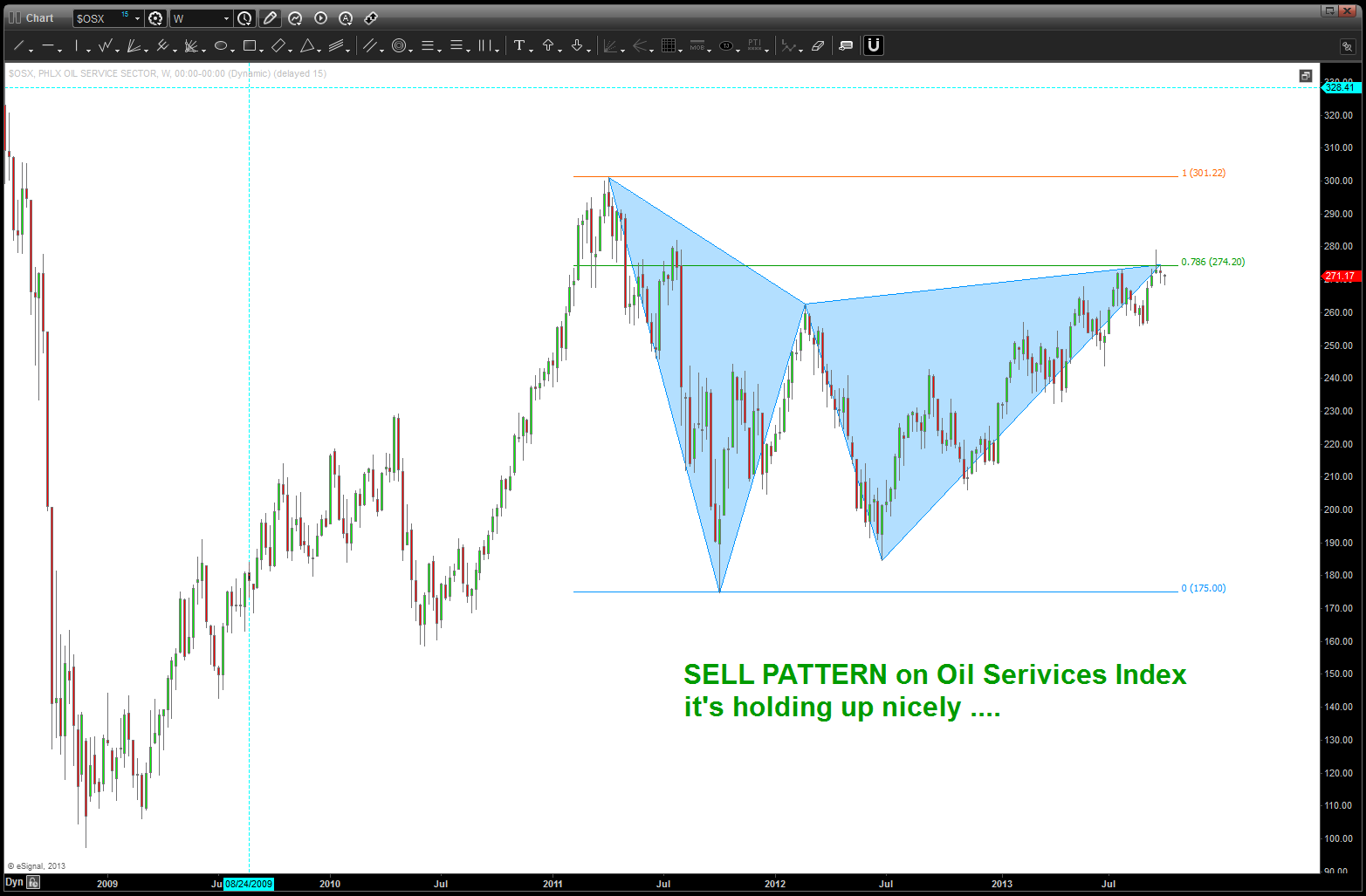
holding nicely
quite the amazing jigsaw puzzle playing out now w/in the Loonie …I’m just trying to put some of the pieces together to manage risk.
one of my mentors and friend is an individual named Mike Jenkins of http://www.stockcyclesforecast.com. he introduced me to many many techniques but what has been most important is why square roots and their inverses are so important …. in his amazing book, the secret science of the stock market, he spends a chapter on Musical Theory. Much more could be said and I’ve gone down that enjoyable tunnel but here’s the basics:
- the frequency of a string is inversely proportional to the square root of its weight/length
- directly proportional to the square root of it’s tension.
- the equal octave scale ratio used is the 12th root of 2 (2^.0833) = 1.05946
- 1.05946 is used as the primary tonal increment and give us numbers that march us UP and DOWN the equal octave scale
so, there’s our musical theory. here’s a chart taking the low (2003) of the SPX cash market and simply multiplying by 1.05946 12 times and that 12th note EXACTLY nailed the top. study the chart and enjoy
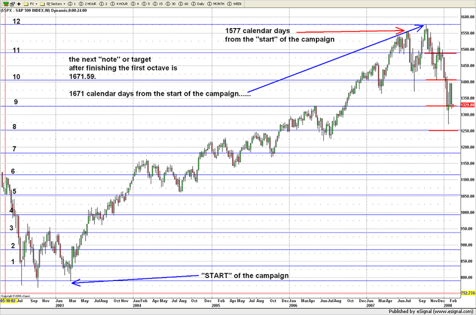
tonal increments from the 2003 low and the top in 2007 for the S&P cash
here is some more math to noodle on:
1.618
square root of 1.618 = 1.27
1/1.27 = .786
square root of .786 = .886
1/.886 = 1.128
here is the current chart of the loonie (4 hour) and the ratio’s that it’s bouncing around:
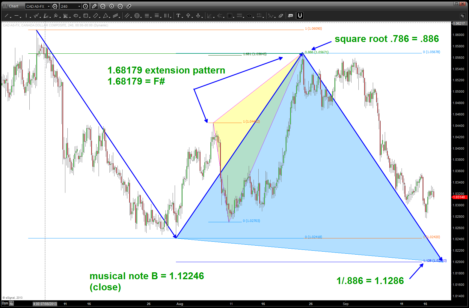
note all the different ratio’s that are based on square roots and their inverses
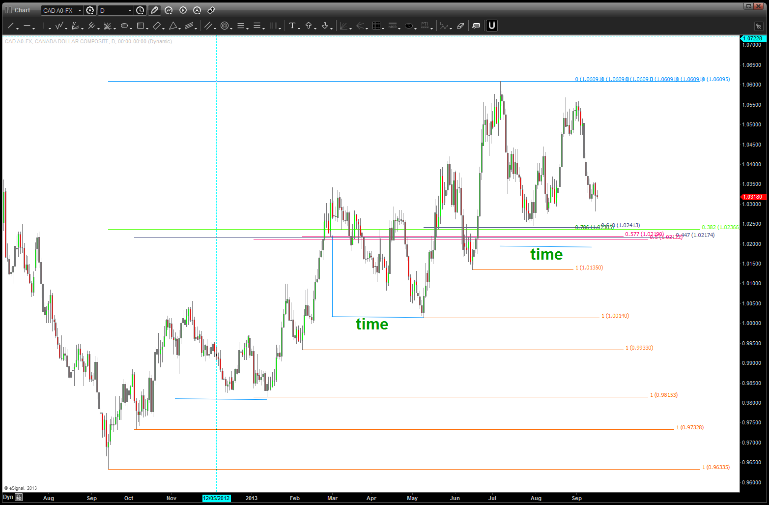
in one of my last posts we discussed the confluence level that was broken at the 3600 handle on the NAZZIE. Today we are going to look at a “daily” chart of the Loonie and note w/in a 20-30 pip window we have .382/.447/.5/.577/.618/.786 retracements all coming in w/ 1.0210-1.0240. additionally, we have a measured move (or ab-cd) coming in w/in those levels and the extension (1.1286) is right along w/ the above discussion (diatribe?) on music. additionally, look at the “time” component of the corrections that have occurred for the past year – they have been pretty symmetrical and we are basically “there” w/ regard to this correction in the Loonie vs the USD being complete. for those wondering where the .577/.447 came from see above … take the numbers 1-5, their square roots and the inverse of those square roots …. anyway, here’s the picture of the confluence level on the LOONIE vs the USD
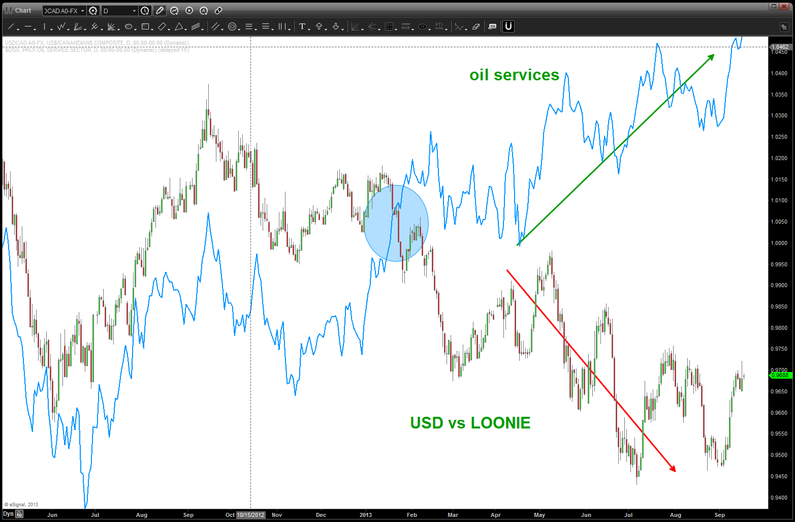
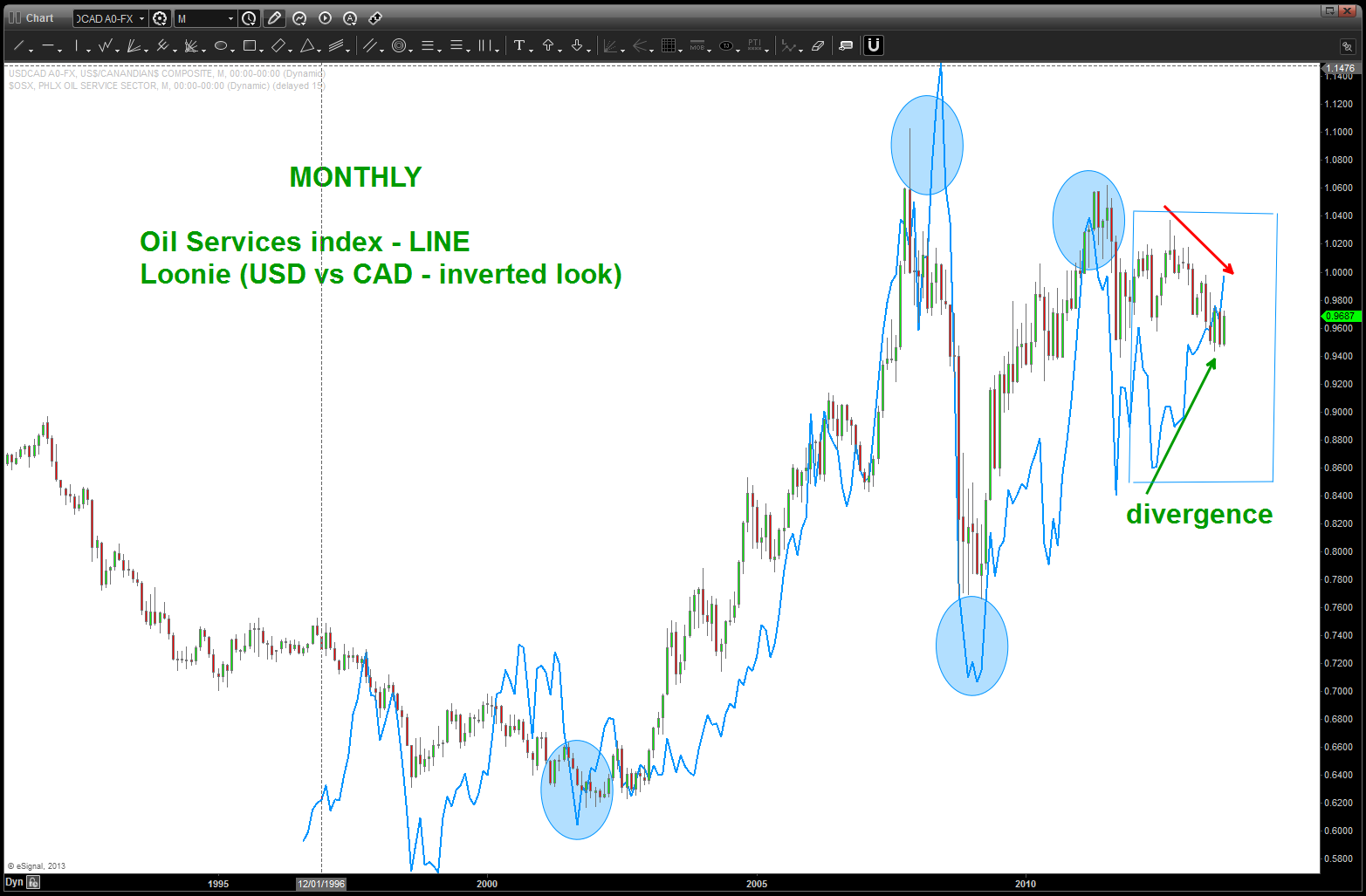
so, this is an interesting set up … but if you have been following my posts (or, hint hint, go back and read em’) you’ll see that we are watching the “energy” complex for hints of a directional move and have related that to the SPX because energy (right now) is 10% of the index. well, take a look at the relationship between the LOONIE and the Oil Services Index (the $OIX) is pretty much the same relationship.
first off, in order to synchronize the “picture” I have inverted the normal picture of the LOONIE and we plotted the USDCAD versus the “normal” CADUSD. that will give us the picture that syncs w/ the oil services index. below is a daily and monthly chart — the daily is showing a divergence that usually doesn’t happen. note how the oil services index has trended higher while the loonie has weakened. that usually doesn’t happen and I have noted where the divergence occurred w/ the blue shaded oval. The other chart is a very long term chart showing how synced these two SEPARATE markets have been.
Now, here’s the interesting part of the crossword puzzle:
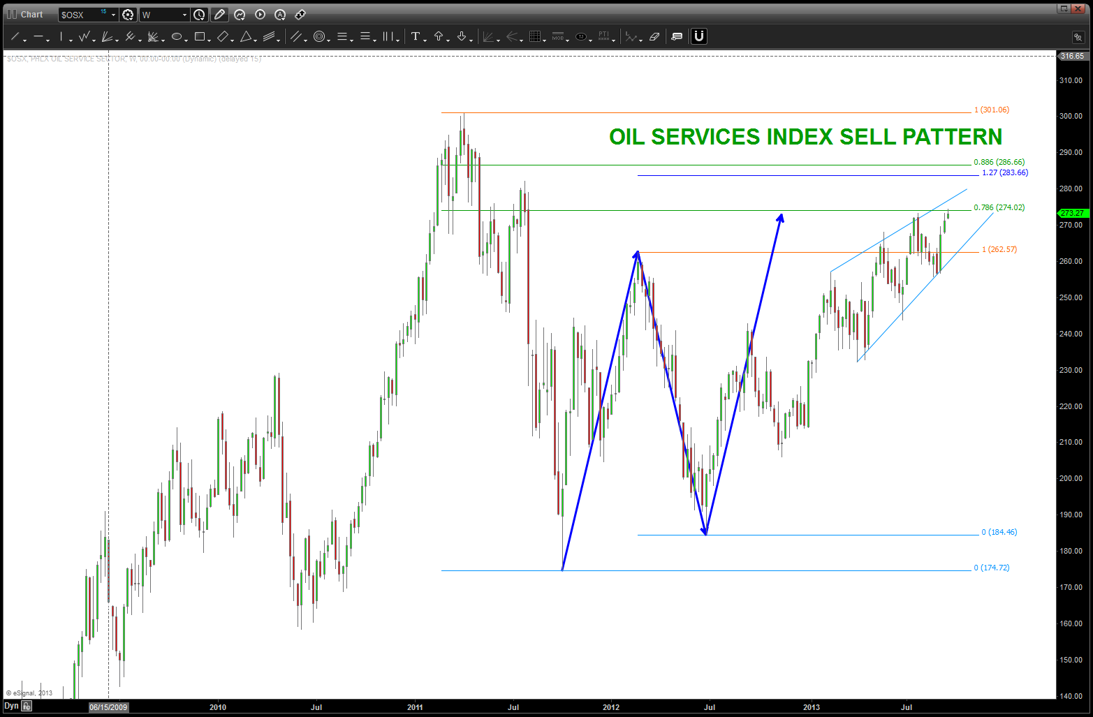
Oil Services SELL pattern here or a little higher
as you can see, we are at a very crucial level w/ the $OSX.
my puzzle fits together IF this happens – the LOW we are looking at w/ our confluence levels (BUY USD vs LOONIE = USD strength) holds AND we have current or higher levels hold on the Oil Services Index work as SELL and the two markets have synced and away we go …
this is the power of intermarket analysis using pattern recognition. we know, beforehand EXACTLY what our risk is going to be, we have a script to follow and can WAIT and see how this plays out … as an intermarket pattern recognition trader I love when separate markets that are usually synced come together at “PATTERN TIME” (note: not hammer time) and give us a nice clue. Seldom do they continue to diverge….
waiting, patiently –

