Missing $LNKD in the chain updated from September 2013
Posted on February 1, 2014 1 Comment
$LNKD has been correcting since the top in September 2013 …it’s been a series of lower highs and lower lows so nothing is glaringly bullish EXCEPT the high was noted as a 3. So, ultimately, this corrective move in LNKD should be bought. the first and normal target is the end of the 4th wave of a lesser degree and that’s around 160. also, note the time component — the wave 2 correction is noted by the blue shaded box and then copy/pasted and shows from a time perspective that we could work 2 more month’s into the equation. Here’s the chart posted in September 13′:
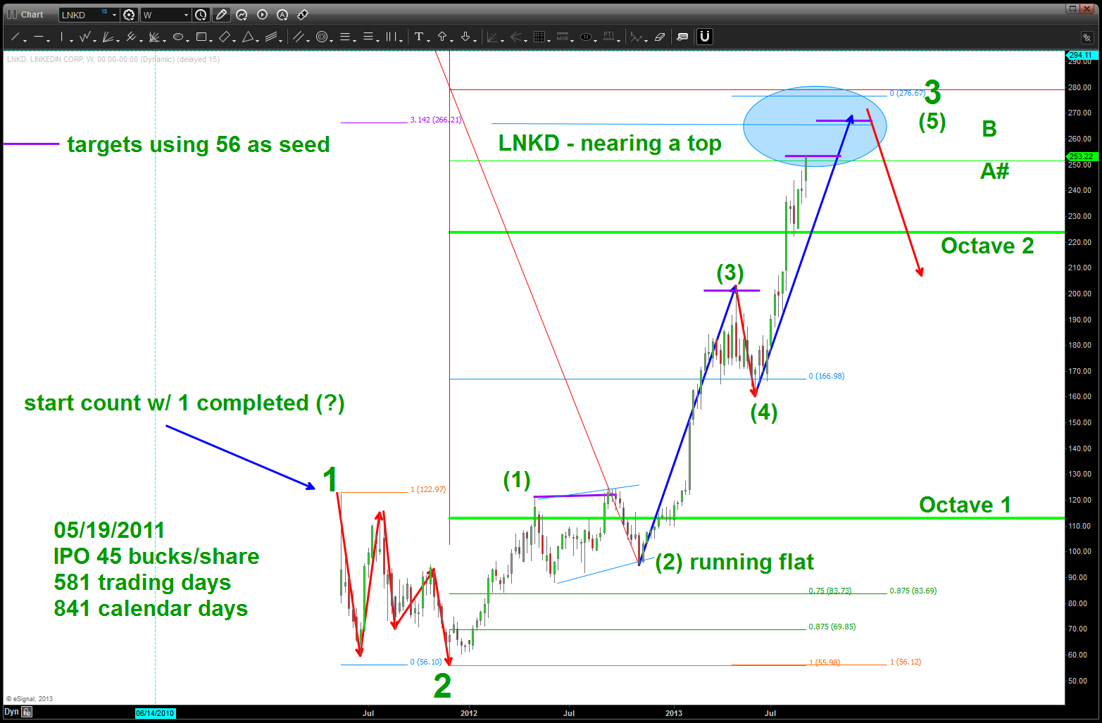
Nearing a TOP, caveat emptor
Here’s the updated chart:
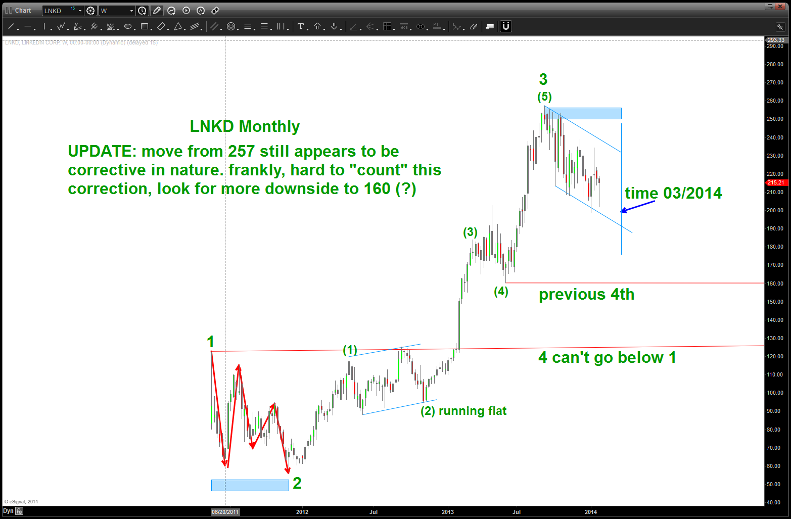
LNKD some more correcting?
the last thing I want to show is the Gold/Silver index? TILT…hugh? All I want to show is how the same PATTERN appears to be forming on LNKD and how, ultimately, it cracked and then down she went…don’t worry about the index being shown, just note the PATTERN of distribution before “they” pulled the plug.
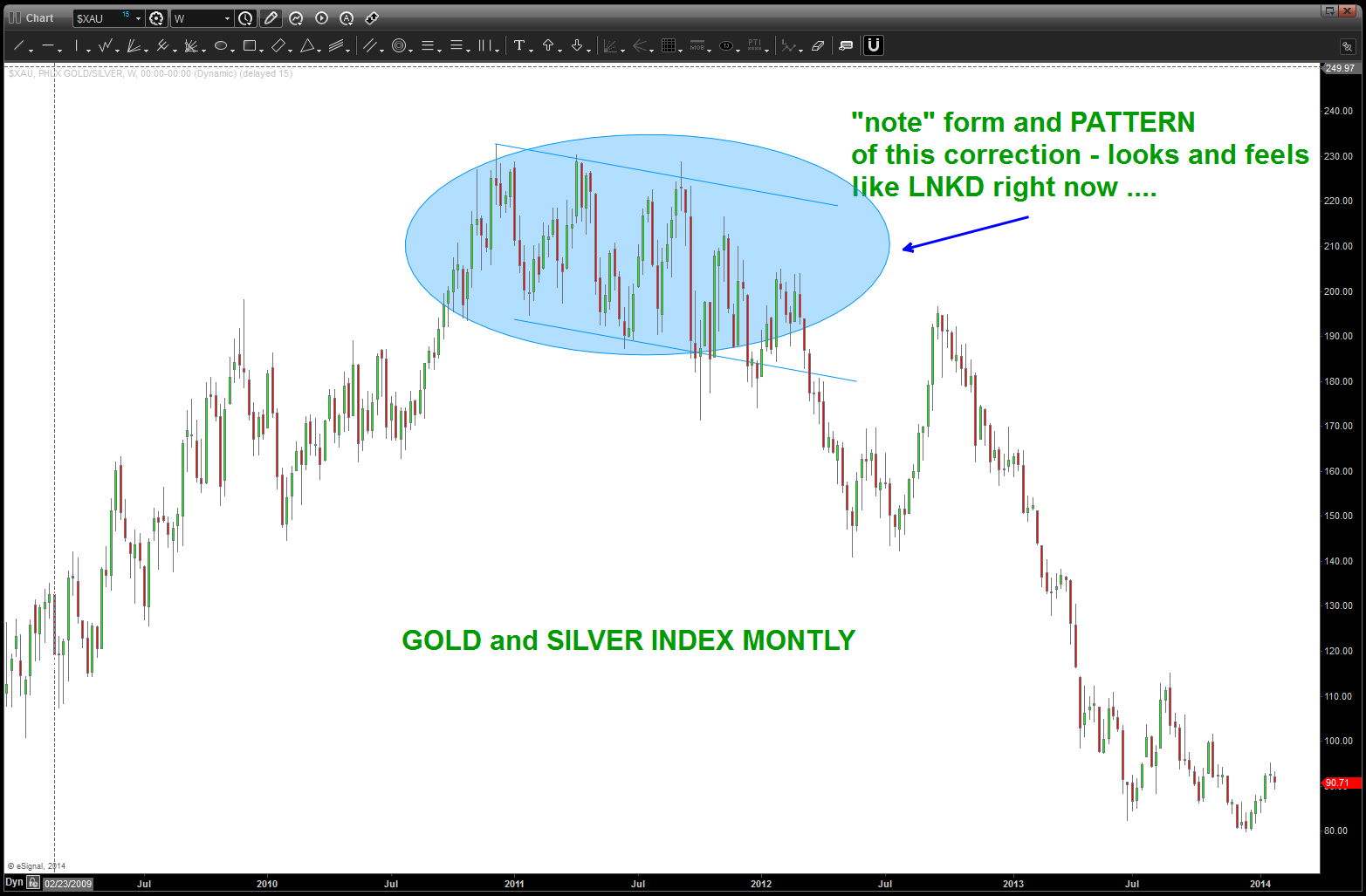
PATTERN at the TOP appears to be the same FRACTAL as LNKD.
update on the high flyers …
Posted on January 31, 2014 3 Comments
my last post on the high flyers was the following:
A look at the high flyers in 2014 – all lower significantly!
here’s the update:
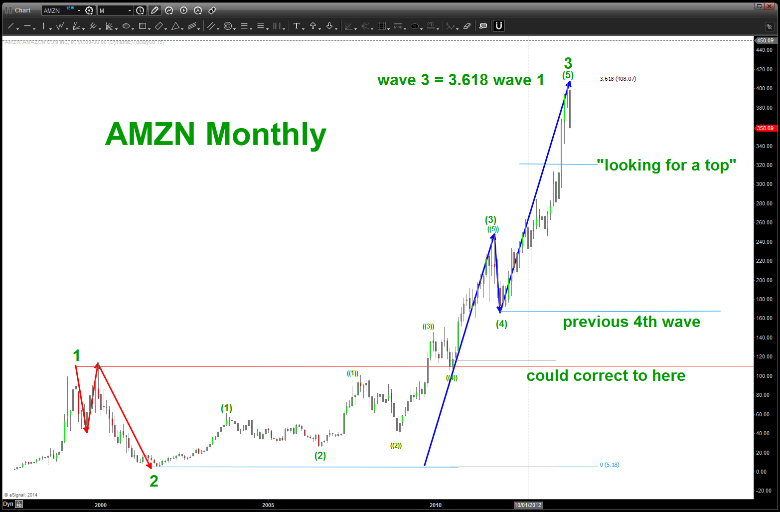
AMZN
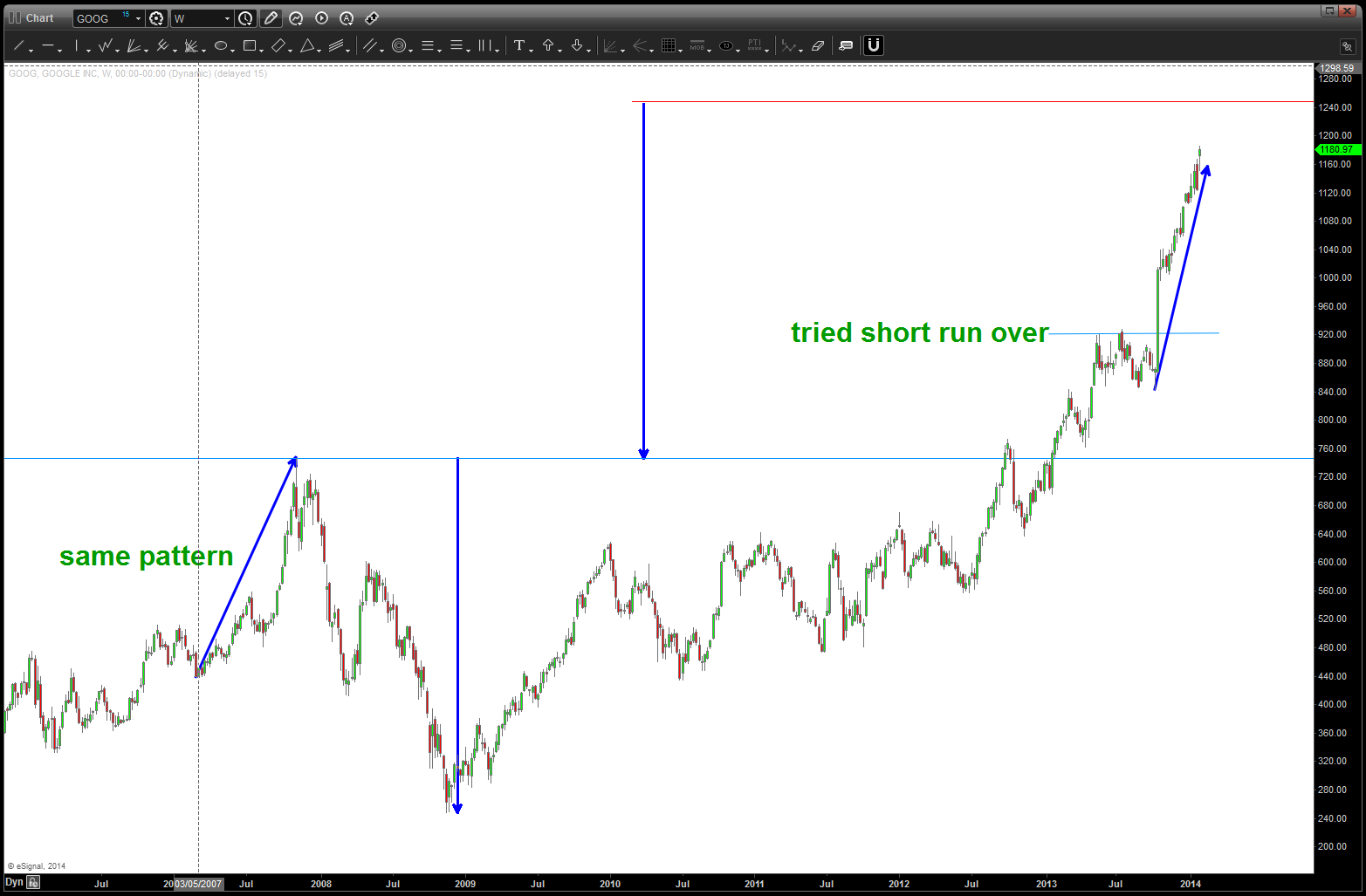
GOOG
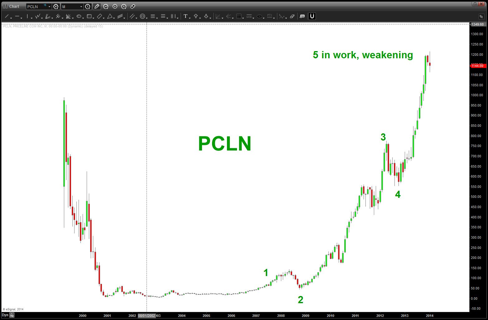
PCLN
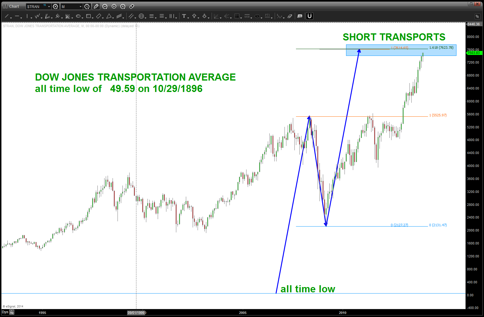
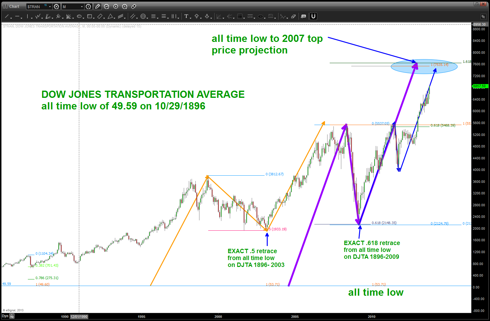
Transports pattern complete from 42,281 days ago …
Posted on January 25, 2014 2 Comments
I’m going to give myself .003% w/ regards to the pattern being complete on the Dow Jones Transportation Average. It never did hit, exactly, the 7616 target …but w/ the big move that occurred yesterday odds are that we have a MAJOR top in place. If you have been following my blog this “target” area has been forecast for a while …
I’m a pure play pattern recognition technician. I pay major attention when using “nodes” that are 42,281 days ago. I also pay particular attention when this “node” from 10/29/1896 has been responsible for support and resistance at every major top and bottom in my lifetime.
we finished a MAJOR pattern …the reaction is not surprising.
I type this blog, today, not because I did anything special. Simply, for the past couple weeks I knew a pattern was completing on the transports in this area. And, having been down the travels of a professional trader and succumbing to expectations, having to be right, etc. I simply have now trained my persona to EXPECT NOTHING. It’s a PATTERN and it will either work or it won’t …
Now, that being said, I do ask that you (my fellow bloggers) think about what could potentially be at work here … did the major institutions know this level before I did? I doubt it … did the Federal Reserve have someone tell them that the Transports were going to encounter major resistance? Again, doubtful. Did Warren Buffet have this knowledge? No, I submit nobody was CONSCIOUSLY aware of this level. But, FOR WHATEVER REASON, the psyche, emotions, feelings FLIPPED ON A DIME. At the PATTERN level EVERYONE SOLD. Think about it … no CNBC, no FAST MONEY, no fundamental talking head pundit … a NUMBER was hit (natural square OBTW) and bada bing bong boom EVERYONE SOLD. Take a moment and think about that one …
It worked, the GOOG, YHOO and others didn’t … it’s all probability.
W/ that in mind, the PROBABILITY is rising, albeit slowly, that we are on the cusp of the biggest bear market we have EVER experienced in this country or world.
As for me, I’m just going to wait for a PATTERN and deploy capital …
Make it a great weekend
Bart
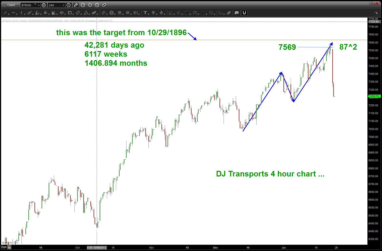
DJTA 4 HOUR CHART
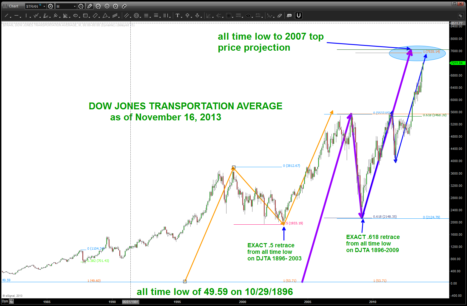
DJ Transports … 1896-2013
today, 01/24/2013, looking for a close in/around 4125-4128 to SQUARE OUT all time low
Posted on January 24, 2014 Leave a Comment
believe it or not, TIME and PRICE are interchangeable and they are the same “thing” when it comes to charts … big lows and big highs will ALWAYS tie themselves mathematically to calendar day, solar time, square roots, etc… so in the midst of today’s sell off we’ll look for a close on the NASDQ around 4125-4128. (take into account the weekend). I am writing this 6 minutes before the close …
looked for a square out once before …. https://bartscharts.com/2014/01/05/look-for-a-close-inaround-4106-on-nasdaq-tomorrow-equality-of-time-and-price/
this technique is not a panacea, but it is certainly a good idea to see and understand where these time/price correspondences come into play …
stay tuned …
Bart
important ratios – revisited
Posted on January 21, 2014 Leave a Comment
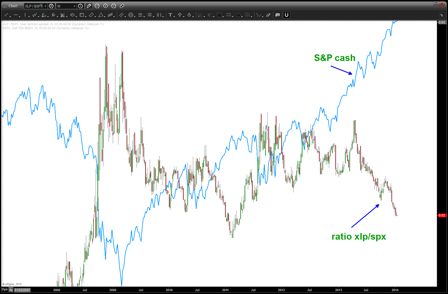
For those who have been following me since I started this summer, you’ll find I spend considerable amount of time analyzing the RELATIVE STRENGTH of the STAPLES vs the S&P. Why? The theory is that, in times of volatility and/or bearishness the “big guys” (read: institutions) will rotate into a defensive posture such as staples. We need “staples” to live … water bottles, food stuffs, toilet paper, toothpaste, etc. This does not mean that they won’t go down it simply means they are stronger from a relative strength basis. If the ratios is GOING UP then volatility and bearishness is taking place … if the ratio is going DOWN then “good times” are here and, generally speaking, it’s BULLISH. Where I take it to another level is in the pattern recognition … by using advanced pattern recognition techniques across the entire circle of life I try to develop a thesis and then deploy capital in the most risk adjusted manner …
here’s a list of some of the staples work:
https://bartscharts.com//?s=staples
- the week of October 07, 2013 we have an AMAZING BUY of the ratio that was precise in both PRICE and TIME. It hit, the market sold off but it was subsequently taken out and the PATTERN FAILED. End result: BULLISH for the stock market.
- it was also noted, that the .02 level was a potential target. at the beginning of the new year this target was hit and, while it held intraday it has been subsequently been defeated. In my mind, I try to stay away from intraday spike highs or spike lows …however, if we get a weekly close below a pattern level THEN, probability says it’s a failed pattern. Take a look at the below chart … we have a weekly close below. End result: BULLISH for the stock market.
- so … while we aren’t too far below the level depicted (1.27 and .786 overlap – usually strong support) I can tell you we need to get back up above and close above on a daily basis that level OR this S&P move could continue.
- also, I put my trust weekly 14 period RSI in to check out the “zones” for it’s support or resistance … I went back as far as my data would allow and I can tell you that 1) we have bullish divergence on the DAILY chart and on the weekly this is the lowest the RSI has ever been.
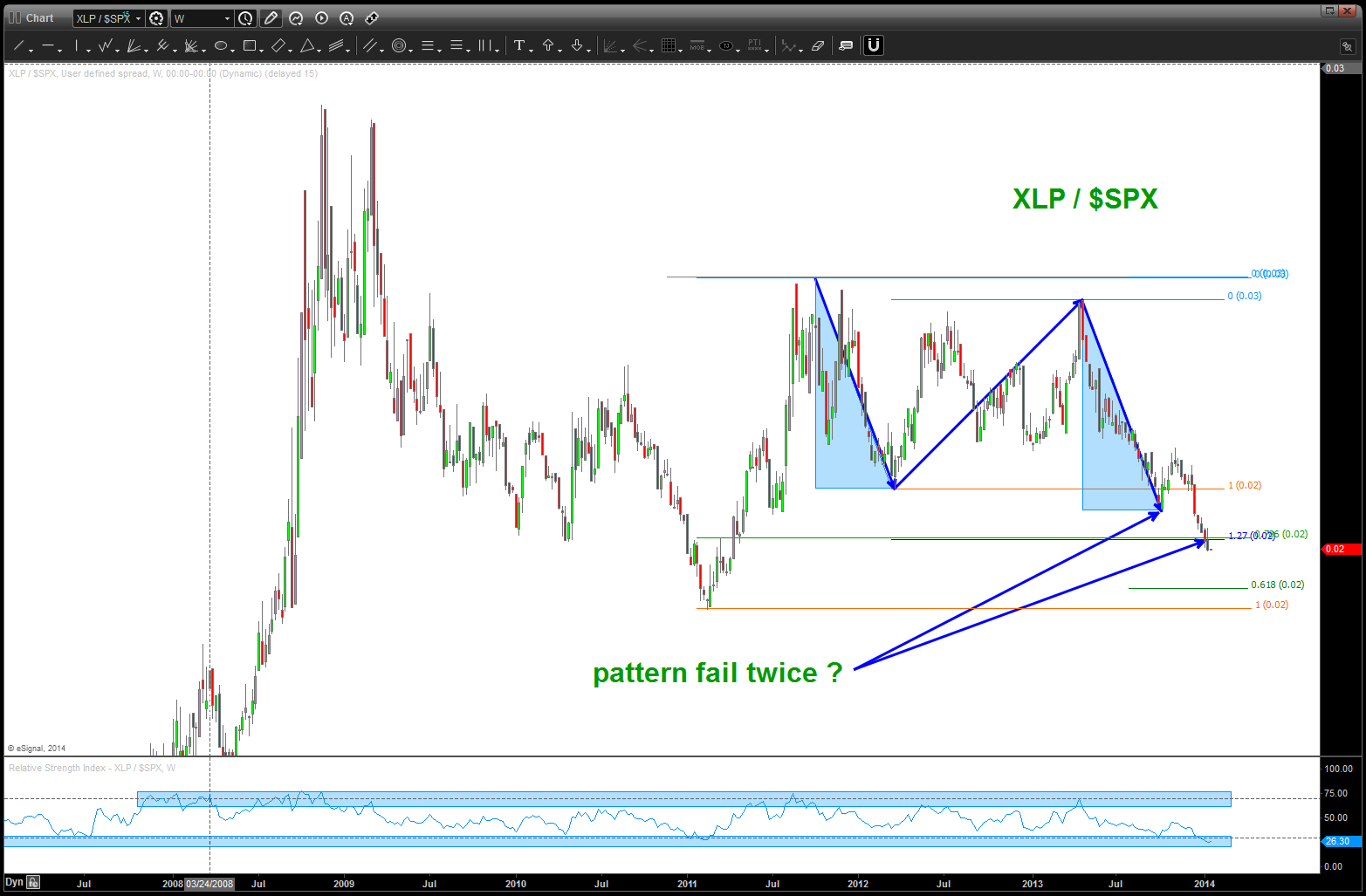
note, do we have two patterns failing on the important XLP/SPX ratio?
note at major turns, the ratio gives a good idea of inflections … it needs to turn up (xlp/spx) for the bearish case
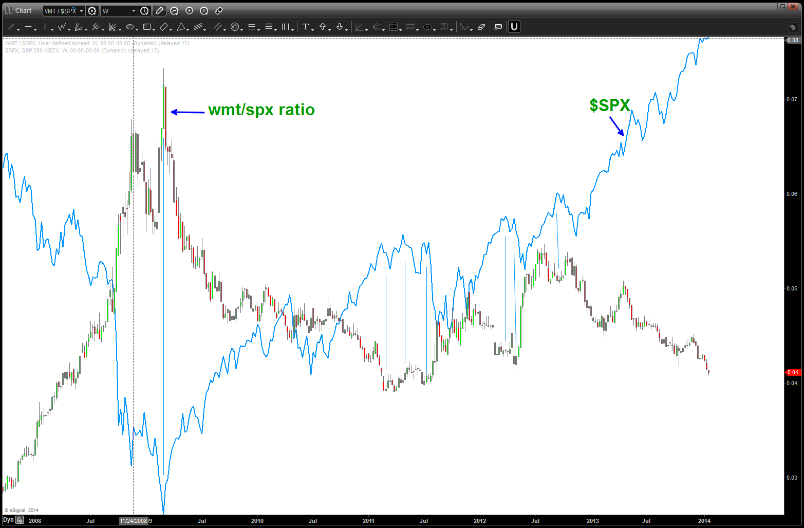
the other ratio we have looked at is the Walmart Greeter ratio … same thought process, except this is a single stock. The “whole world” loves WMT so if the volatility comes back, THEN, the “big boys” will rotate to that defensive hallmark of Walmartians. Guess what, it completed it’s pattern TODAY and, should go any lower …if the bear case is to be credible w/ our ratio’s. Here’s the last post on the Walmartians:
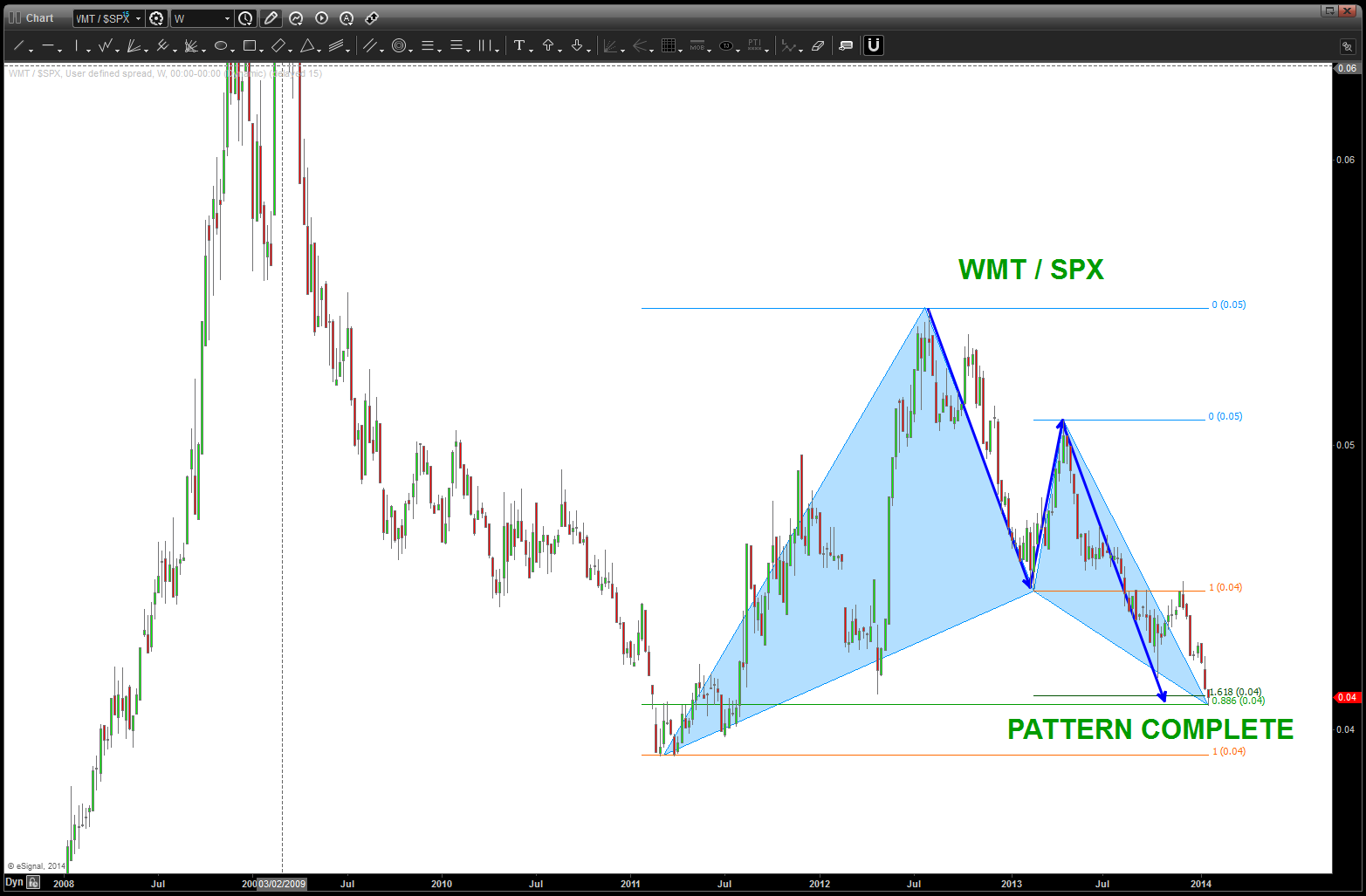
Walmartians relative strength vs the SPX
pattern complete
PUNCH LINE: these patterns are complete. for the bears to have a chance, they SHOULD NOT fail …..
DJTA … 120 points away from MAJOR pattern completing
Posted on January 15, 2014 1 Comment
Almost there … DJTA
the vibration of the DJTA since inception … pretty cool
Heads up on Baltic Dry Index …
Posted on January 14, 2014 Leave a Comment
the headlines last Friday were about the US jobs report …however, there was an even more curious and eyebrow raising event occurring .. the Baltic Dry Index crashed 11.4% on Friday in it’s single biggest percentage decline on record. It exceeded it’s last record, which occurred in October 2008. When this indicator rises, all is well and the party continues. When it drops … well, you don’t hear much about it. As an FYI, the move w/in the Baltic Dry Index is the worst start in 30+ years.
stay tuned …
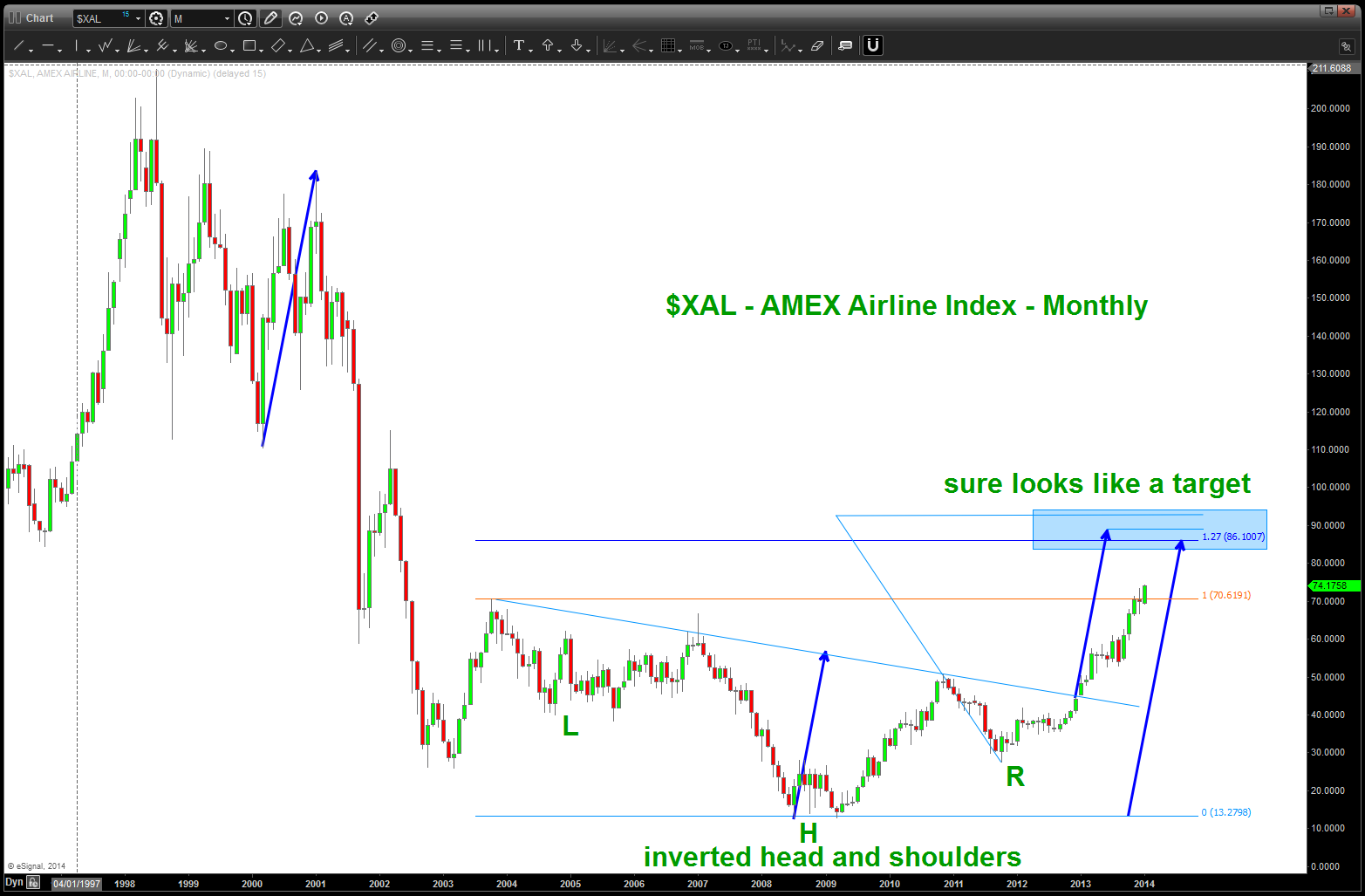
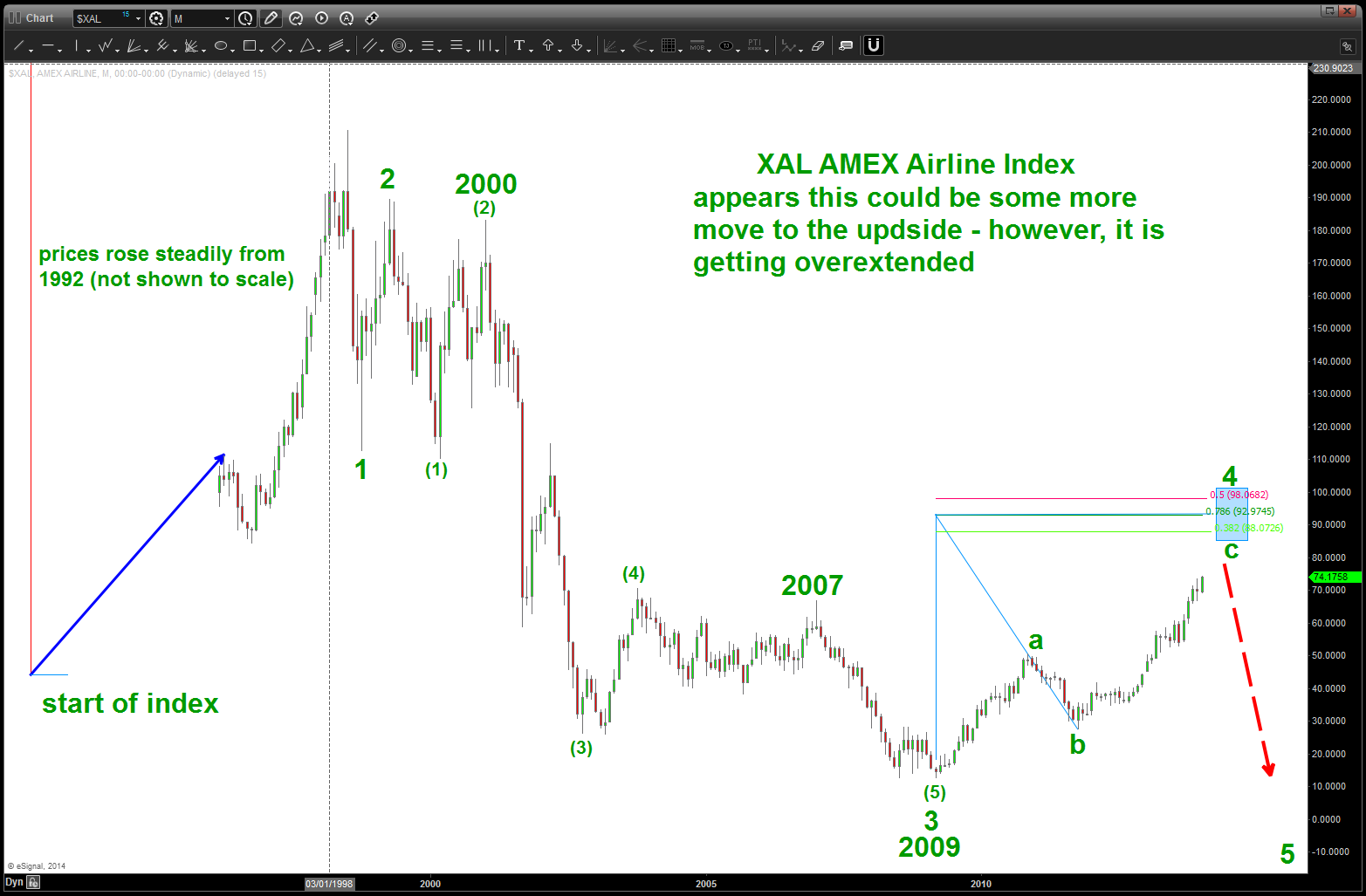
Airlines and the Recovery …
Posted on January 11, 2014 Leave a Comment
Over the past couple weeks I have had the AMAZING pleasure to answer numerous emails/phone calls regarding the AWESOME “pay out” of some of my buddies who fly for the Airlines. They are either buddies who I flew w/ in the Navy or classmates or, in one instance my best friend. To a person, they have all essentially asked “should I hold em’ or fold em?”
A GREAT QUESTION and one that I DO NOT take lightly ….but, as an expert at PATTERN RECOGNITION I am trying to be as objective as possible. Ultimately, it will be there decision. Here we go:
Equities: from a macro perspective, I see the US Equity market as very precarious, to say the least. just go back and read the posts that I have been providing …I am one of the few remaining BEARS out there. I have also been wrong about the Equities for about 1.5+ years. The length of this UP move has been amazing and when it ends, it’s going to be ugly. That I know … however, the SHORT of GOOG at 925 got SMOKED. The SHORT of the DOW got SMOKED … I am humbled and licking my wounds but I am not deterred. The equity market is a house of cards … until it’s blow over, run w/ it but certainly be ready to bail once the signs appear. IF YOU CAN …
Airlines: With that diatribe complete, I see the Airline Index as being a proxy for the “recovering” economy. Business Travel, Leisure Travel, Fuel prices, etc … they all play into the profitability, however, the airlines are acting like well run businesses. They have cut costs (my buds have really taken it on the chin), trimmed the fat and are lean and mean. That can’t be taken for granted … but in the context of where we are and what we do I see another 5-10% higher in the index at best before a major correction set’s in …CONCLUSION: if granted stock in the merger/bankruptcy ruling, then take a majority off it out of the market and 1) invest in tangible, scarce resources, 2) invest in you or your family w/ education or specific skill sets or 3) start a business or help someone start a business.
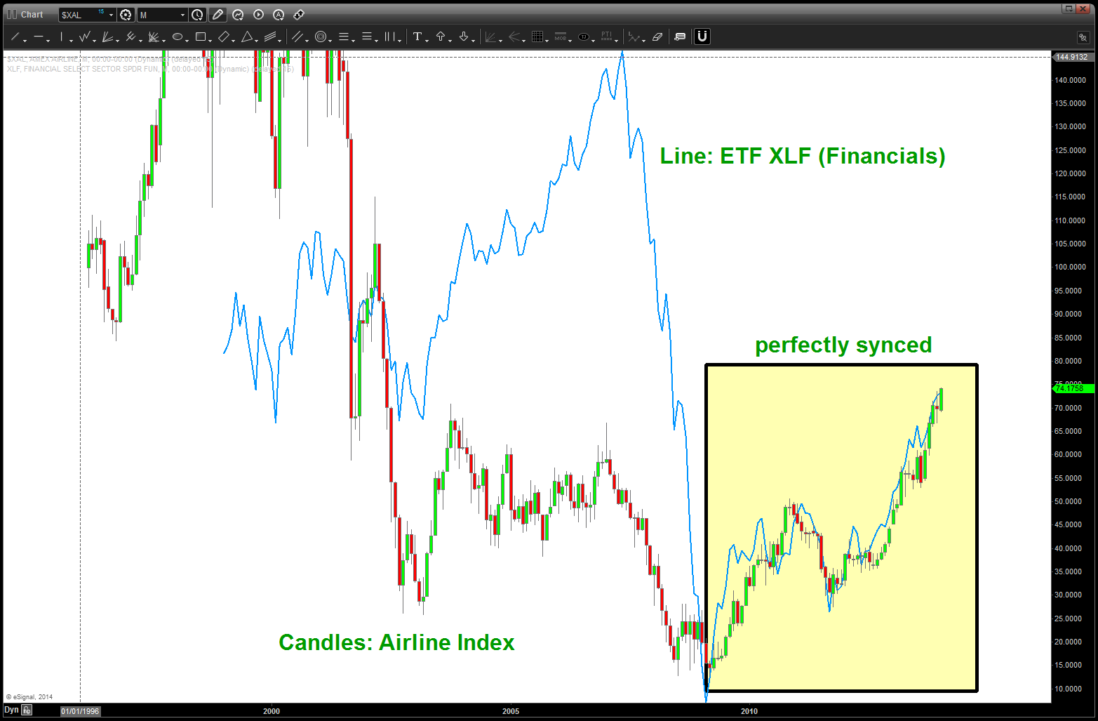
Also, take note, since the low in 2009, the Airline Index and Financials (ETF: XLF) have been almost 100% synced. Therefore, keep a watch on the Financials and if you see them start to crack, the probability is the same will occur w/in the airline industry.
Gents, that’s what I see … take some profit man and if your a gambler, then roll for the next 7-10% if you can and then take some profit …but, as I’ve been saying for a quarter – CAVEAT EMPTOR.
TWTR … BUY PATTERN appearing but caveat emptor
Posted on January 11, 2014 Leave a Comment
here’s the post on the fund that tracks Social Media (SOCM)
https://bartscharts.com/2014/01/04/social-media/
it is showing signs of a 5 wave top … now, we simply don’t know if this is the 1st of 5 to come or it’s the end of the emotional euphoria over social media. perhaps another high flyer can give us a sense? TWTR is showing the BEST BUY pattern of the bunch. the entire 50-56 area, w/ 54 being especially important, is key support. I have put a wave count that uses the IPO price of 26 as the beginning and then off to the races.
here’s my last two witter posts:
https://bartscharts.com/2013/11/14/twtr-first-sell-pattern-coming-into-play/
obviously, who ever got in on the TWTR IPO doubled their money so good on them … interesting to note, and shown on the chart below, is the .618 price projection of the SELL PATTERN back around 44 held price EXACTLY and then off we went. (38.81)
just like the last JPM Morgan (JPM) post – trade what you see. I see a BUY PATTERN appearing on TWTR. If it WORKS (I don’t know if it will or won’t) then we could go up and see new highs. If it fails and goes below 50, then this count is WRONG and it’s back to the drawing board.
take note of the SOCM post – it looks due for a big correction – that is – the entire space. So, just make sure to keep an eye on these levels …it’s a BUY PATTERN but I still recommend CAVEAT EMPTOR.
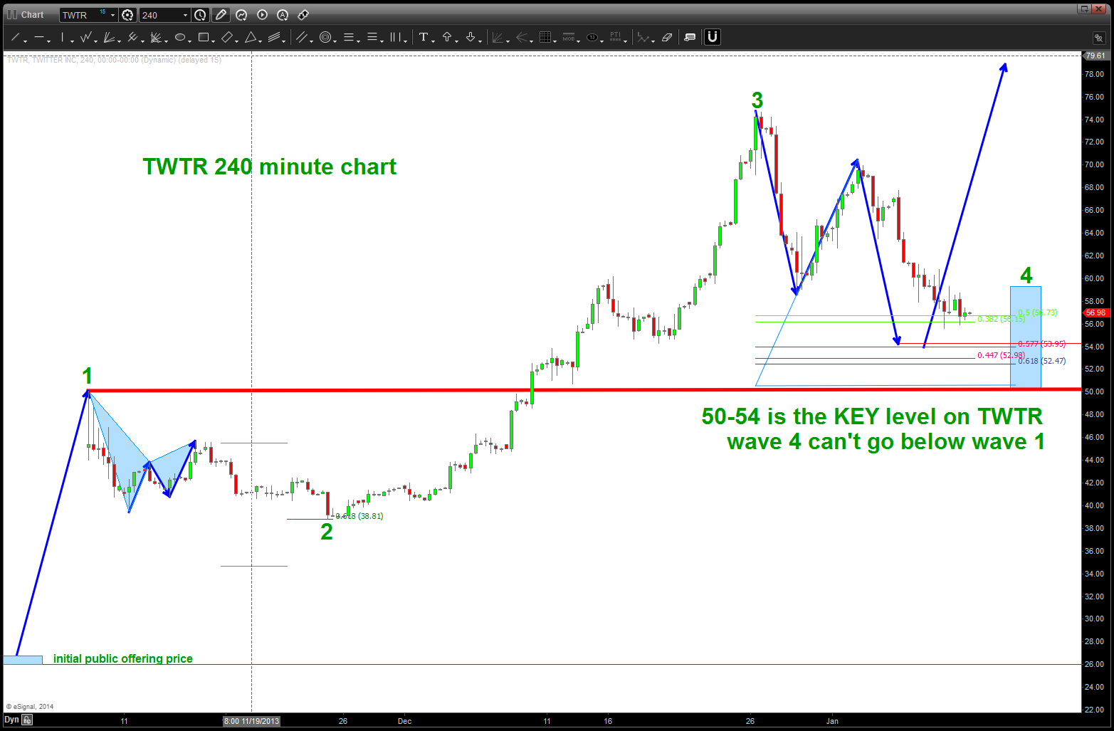
TWTR BUY PATTERN
Check this out- amazing whitepaper on wealth creation!
Posted on January 7, 2014 Leave a Comment
Wealth is Created in Private Markets
Had the opportunity to read this informative philosophy from Bill Militello; www. militellocapital.com A must read! – Bart
