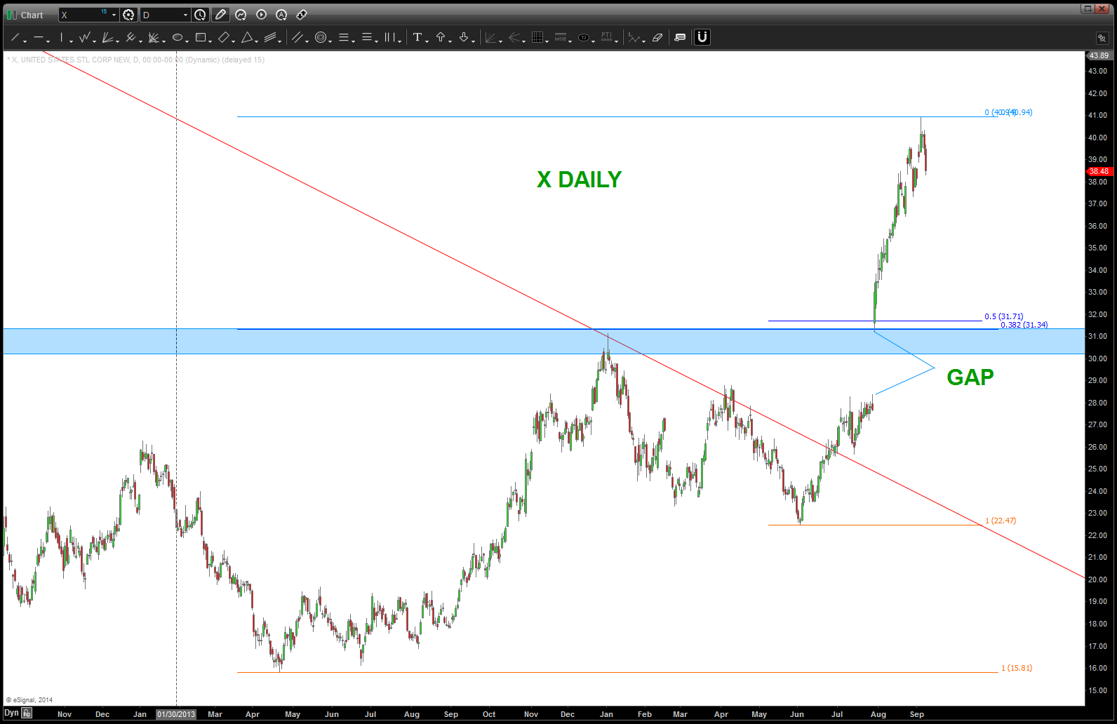
US STEEL – classic return to the neckline approaching
Posted on September 9, 2014 Leave a Comment
CLIFF NOTES: believe this breakout in X is real and it “should” come back down to highlighted areas for another BUY.
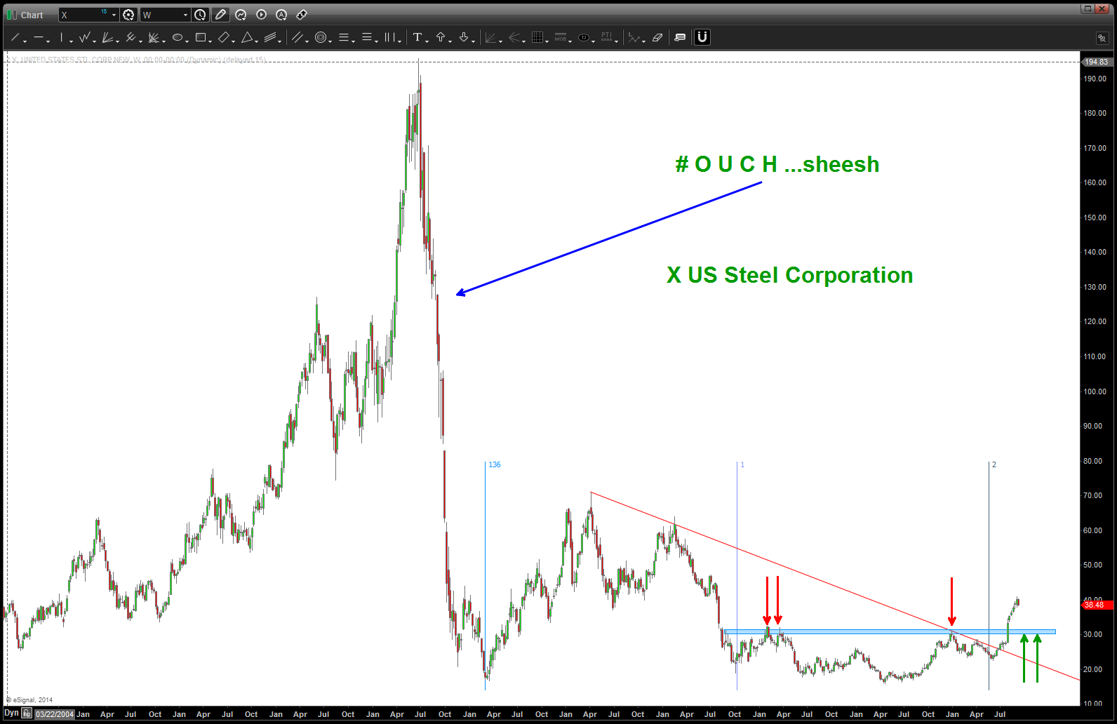
X
dollar strength foldback up move – complete
Posted on September 9, 2014 Leave a Comment
September 9, 2014
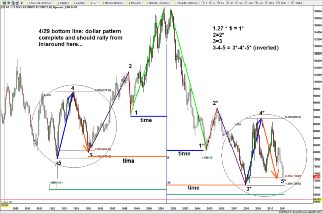
CLIFF NOTES: the mirror image foldback that we have been following has, for all intensive purposes, completed the move up. Expect some dollar weakness and, believe it or not, the entire leg down noted by the red arrow to the left of the chart could be a possibility. the key point – when mirror image foldbacks fail, they usually fail at the key inflection points so watch the current levels on the USD and the levels on the Pound, Euro, Swissy, Loonie, Chief, etc. for signs of dollar weakness.

Dollar Index Foldback – next leg complete
as a side note, I’ve added a long term chart of the US Dollar that began the entire dollar strength run back in 2011 …it’s a beauty.
long term US Dollar Foldback
May 08, 2014
CLIFF NOTES: I thought I had posted this once before .. the POTENTIAL mirror image foldback on the US DOLLAR. I have gone thru my charts and I can’t find it but I know I sent it to Larry P so … here it is. Also, go back and look at the UUP (Dollar ETF) chart that we looked at for the .886 retrace and “one last hope.” Well, today’s action was pretty impressive …is the dollar bull thesis still alive? Shoot, I don’t know so I sit on my hands, STILL. Keep an eye out on the dollar … perhaps it set a low?
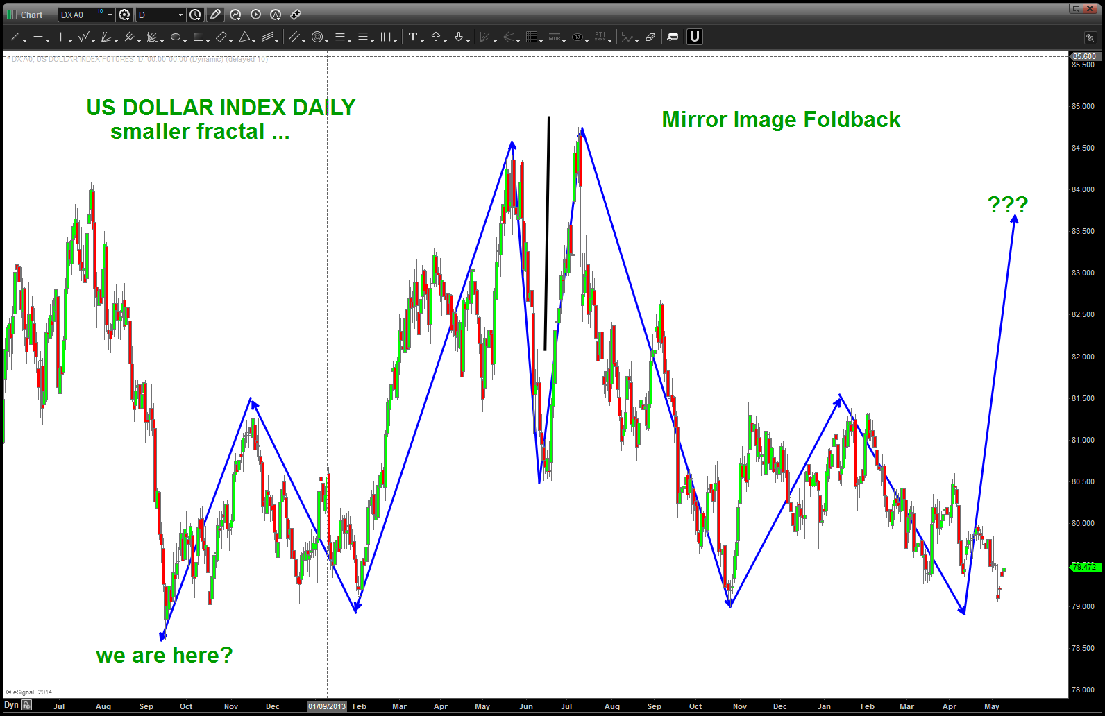
Mirror Image Foldback
the other thing that is interesting is the FRACTAL pattern that appears to be working itself out on a longer term chart …
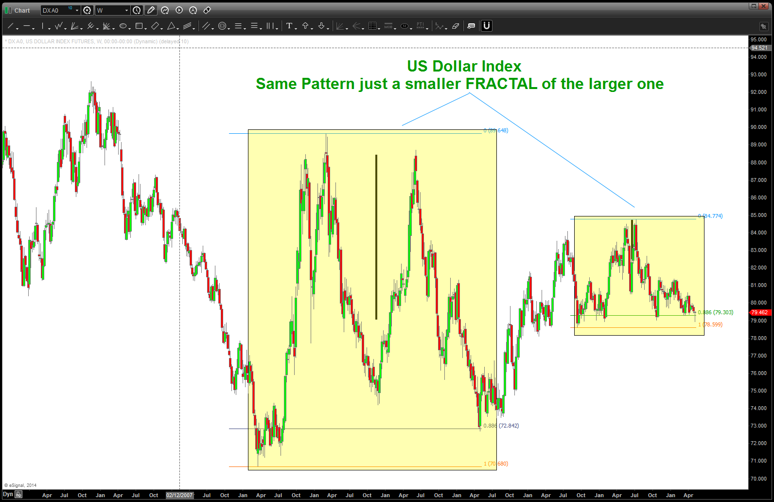
Chinese Yuan Pattern forming ….
Posted on September 8, 2014 Leave a Comment
09/08/2014 – let’s not forget this looming shot across the bow. It’s close/at our BUY level so watch this Currency Pair closely. The “trend” is DOWN so expect the levels shown to fail but if they don’t …that could be a “big deal.”

Chinese Yuan at/approaching key levels
For years institutions have “bet” on the continued strength of the Yuan as a “safe bet.”
That might have all changed around mid January of this year … from Jan-March the Yuan weakened appreciably.
To quote one news article – “this move is particularly notable, as the yuan has broken through the 6.20 yuan per dollar mark. At that point, some investments that bet on a strengthening yuan should start to incur “sizeable losses,” (my emphasis added) according to foreign exchange strategists from Bank of America Merrill Lynch.”
Folks, the pattern shown below is a BUY pattern which, if correct, will lead to another move HIGHER – weak Yuan vs the USD. Right now, as we move down from the notable move UP perhaps all seems OK. Put this into the context of the recent sell-off in the equity markets — I’m guessing here, but I bet it’s “safe” to assume 100’s of billions of dollars are tied up in some exotic way for the institutions to grab any yield out there w/ regards to the “safe bet” on the Chinese Yuan. If this thing starts going back up again then my hypothesis (only a thought) is the “institutions” are going to try and unwind these positions – maybe in a hurry.
There are many ways countries muscle their weight around … cyber, traditional weapons, deterrence, etc. In the end, these are usually reactions to the global flow of funds. The next move by the Chinese will be extremely interesting (folks, they control (manipulate) the currency level – it’s not a true float) on the global scale.
If you don’t think it’s true then just think of the masterful move by Mr. Putin. Right before an invasion of Ukraine (maybe) the Russians sign an order to BUY BILLIONS of dollars of planes from Boeing. Now isn’t that interesting …. (http://www.reuters.com/article/2014/08/06/ukraine-crisis-russia-airlines-idUSL6N0QC3JK20140806 )And, why they are at it, let’s give Snowden another 3 years in our country. CHECKMATE … China, your next move please?
WATCH CLOSELY ….
B
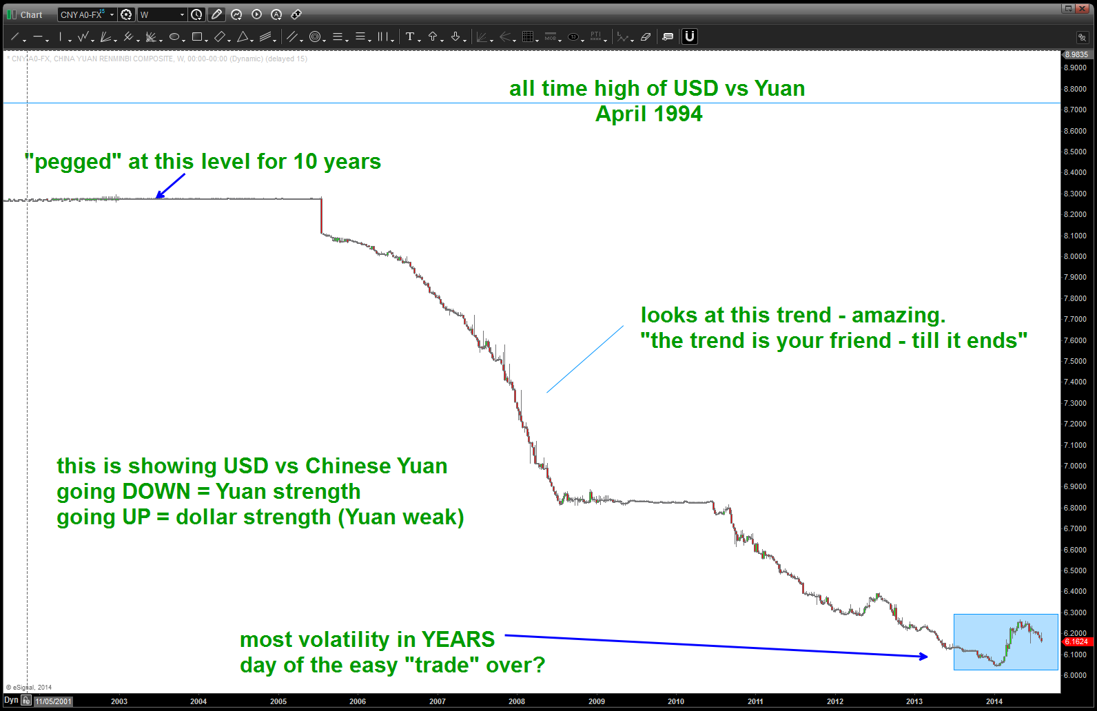
on pressure from the US (and others) the YUAN has steadily strengthened for years … is that over?
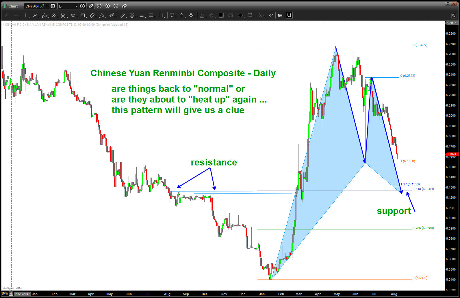
BUY pattern appearing on the Chinese Yuan vs USD (if holds = YUAN weak)
USD vs JPY YEN update
Posted on September 8, 2014 Leave a Comment
CLIFF NOTES: was looking to buy in the blue shaded area around 98. Obviously, it held the 101 handle and appears to be off to the races. I am going to watch the 107.11 area for big resistance and then look to BUY a pullback. Not sure of the level to look for a buy as of yet.

Daily USD vs JPY
Musical Polarity and having fun w/ Voo Doo EURO waves
Posted on September 4, 2014 Leave a Comment
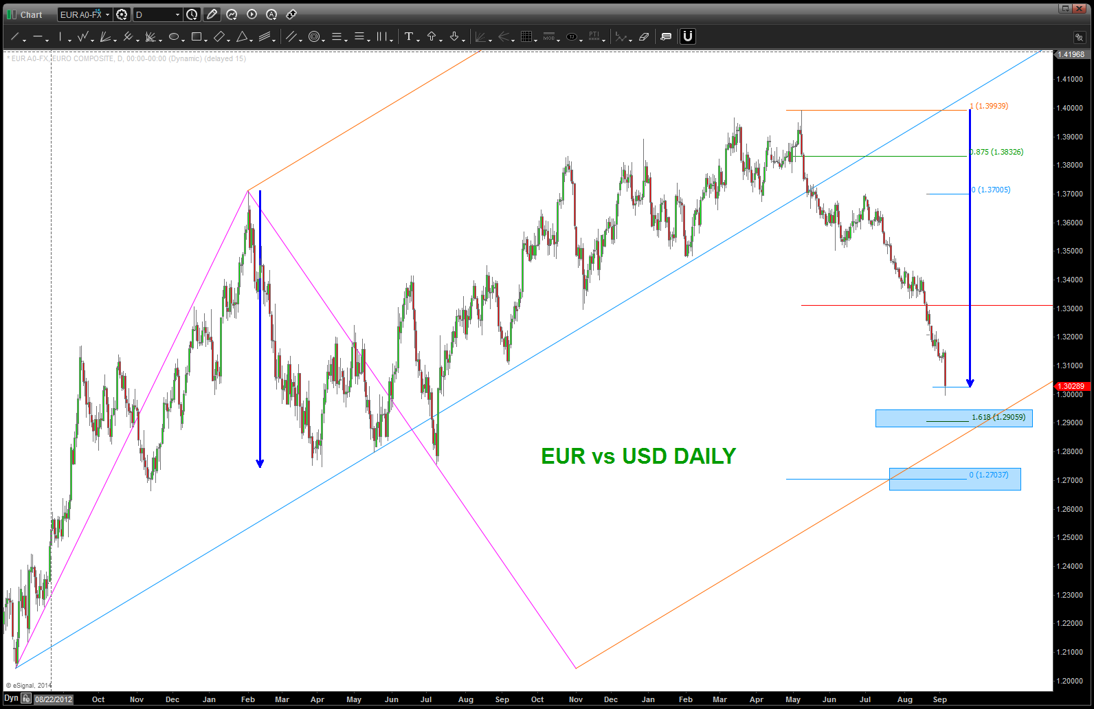
If you read this blog you know that we’ve been a dollar bull, for a while. Great … how do you make money from that? Do you simply step into the fray and short the EURO right here right now OR do your rules require you to wait for a PATTERN to appear … my rules are the latter.
so, you’ve seen some “support” areas ID and, while they worked for a bit, they were all taken out, eventually. SO I WAIT …
this AM, some craziness about ECB, rates cut, QE ( I like QEE – quantitative easing European), deflation and blah blah blah. who cares ….
let’s find a pattern for support and MAYBE BUY this puppy up into the 1.32-3400 handle. Or, just wait for the bounce and sell pattern to appear.
either way, here’s my latest attempt.
I’m pulling out fundamental frequencies and arcs/waves/music … the Voo Doo is in full grunt (reference flying fighters – full afterburner = full grunt) and am now looking for the 1.3000 handle to offer support. We’ll see …don’t read too much into the charts. Just think of a ROCK hitting the WATER and depending on the velocity and weight of the rock hitting the water WAVES will appear and those waves are mathematically defined by their periodicity, frequency and period. Folks, same goes for the market …
Believe it or not …

rock hitting the water and waves appear
if you don’t believe this lie is true, ask the blind man as he saw it too! http://strobowave.com/index_7.htm
typical TA looking for targets for a (insert HOPE) bounce
note in the chart below, we define the rock hitting the water as the initial impulse move down. from there we can calculate the fundamental frequency and come up w/ a target. that is the horizontal blue line ….
since WAVES are being produced we can now project those waves for price and time targets. how do we do that … we use the POLARITY PRINCIPLE. expand the initital impulse arc by fibonacci (music), sacred geometry (1-5, square roots, inverse of those square roots) and the equal octave scale of music. the KEY is to use past ARC resistance and support and look for the future areas transposed on the arcs as you project them. as technicians we “usually” use horizontal support and resistance. we are basically doing the same thing but w/ a twist … we are using the natural plane of the markets movement (X,Y,Z) to see the waves and therefore musical polarity.
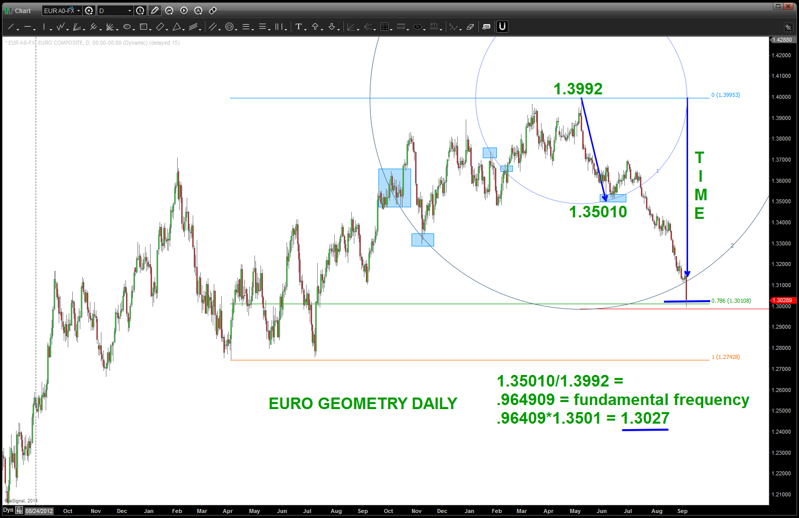
EURO Voo Doo
rock on, ok?
B
Putting up a good fight …
Posted on September 2, 2014 Leave a Comment
09/02/2014: hard to believe it’s basically been 6 months since we looked at this LOG trend line from the NASDAQ but here we are again. It’s certainly giving it a good run for the money isn’t it? Well, I’m not sure which way it’s going to go but i do believe it’s “important” as some major inflections have occurred there in the past. So, we’ll see …here’s the chart:
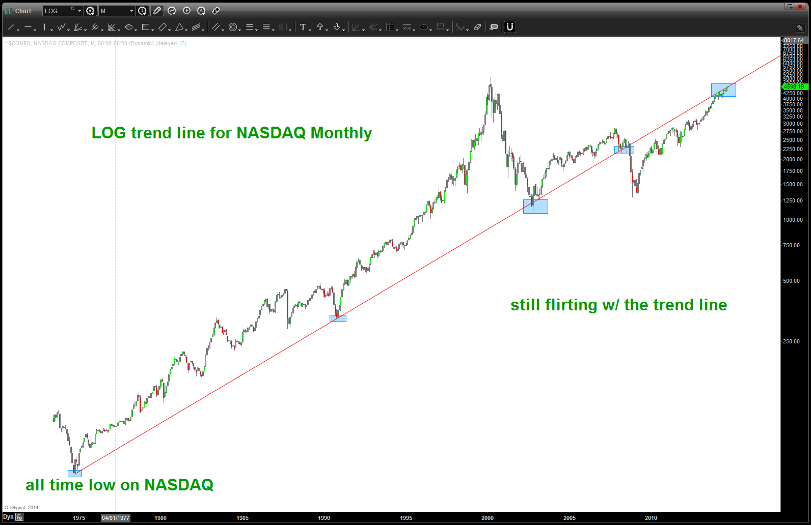
LOG trend line from the all time low on the NASDAQ
what has me most baffled … well, you know I am a pure pattern dude and, well, this level shown “should have” held the market at bay. Seriously, when you work w/ all time low and all time highs and all that stuff there is usually a little bit of resistance. Nope …not one bit. here’s the chart:
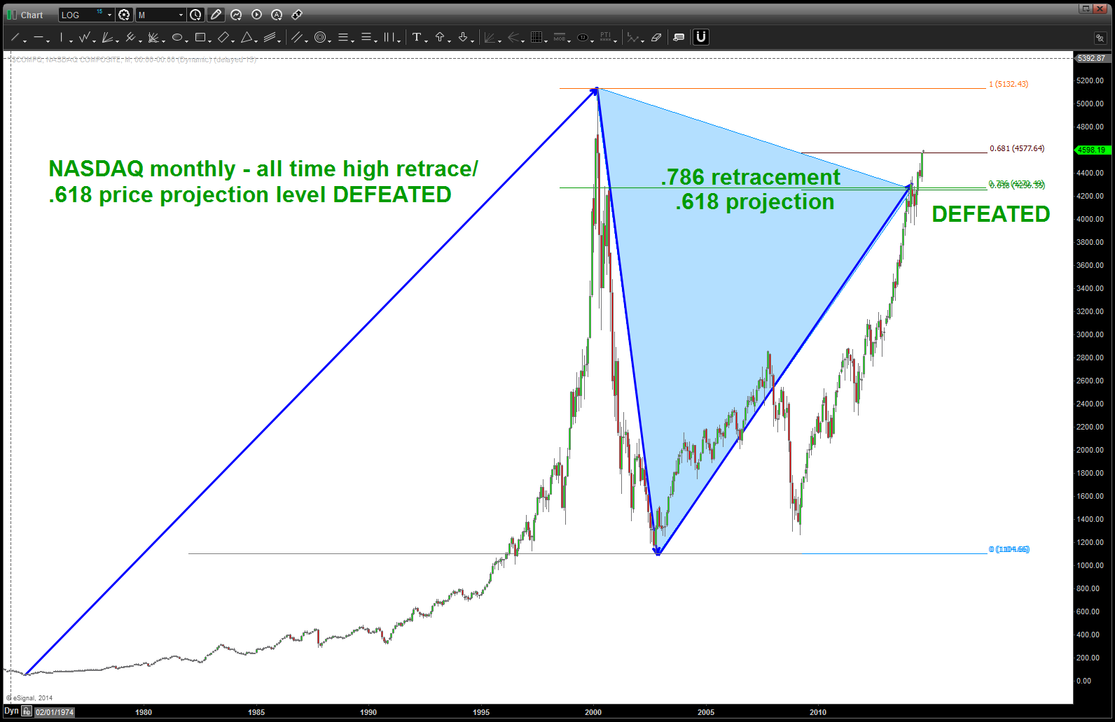
major resistance shown defeated
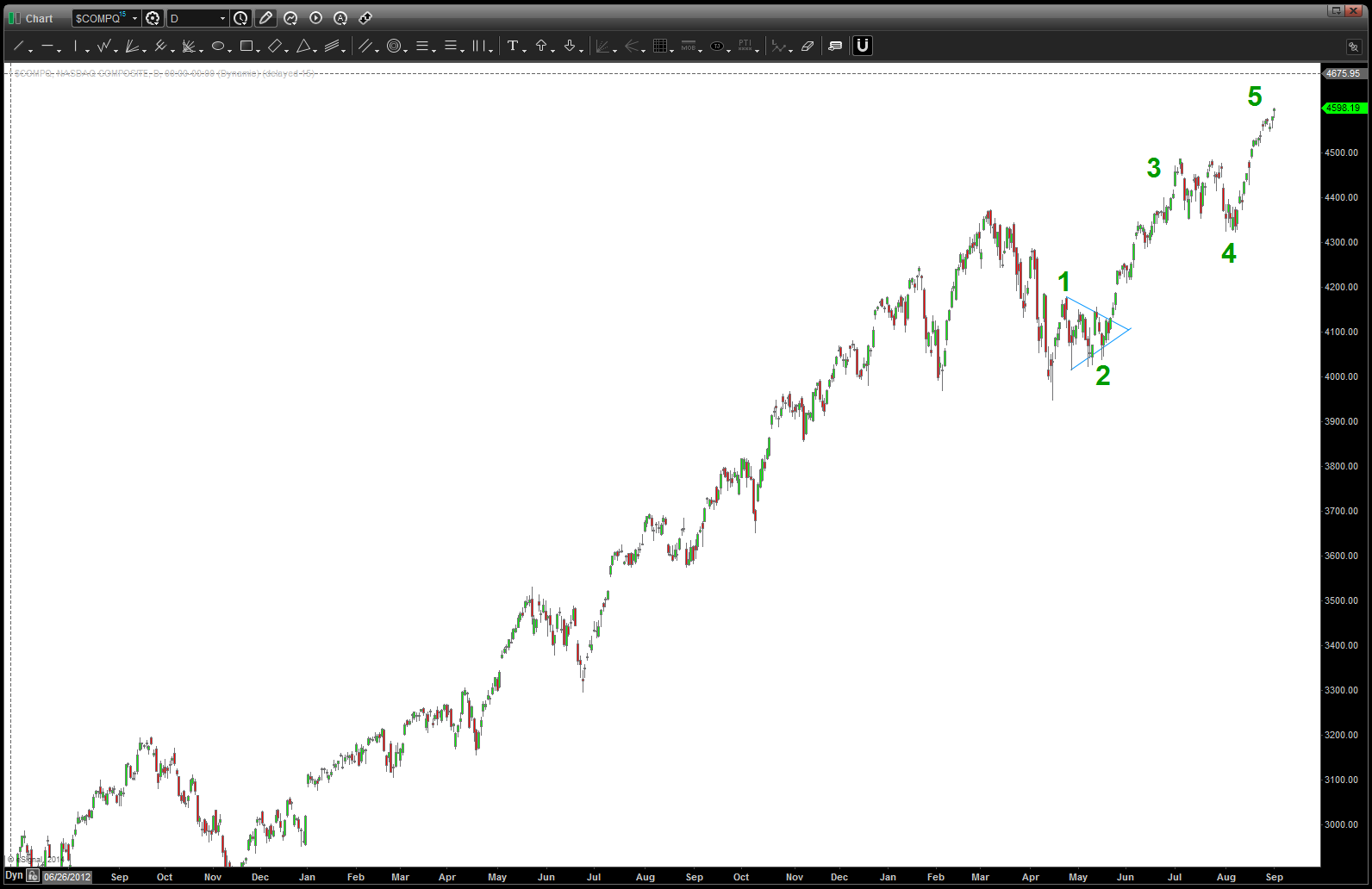
so, what do you do … well, here’s a daily look and I can clearly see 5 waves up … 1,2,3,4,5
so, what’s the cynic in me say …? well, I am a PATTERN dude but I’m not stupid. Do we think that for ONE MOMENT “they” aren’t going to hold this market up for one of the largest IPO’s ever – Alibaba? BABA baby BABA ….and, don’t forget this — https://bartscharts.com/2014/08/24/palladium-at-major-resistance/
03/27/2014: CLIFF NOTES: this is major resistance on the NASDAQ
folks, it’s all about the swing low … while the NASDAQ is continuing to break down like our targets expected, it has not broken a major swing low, yet. This weekend will be very key as we “square out” in days the all time high of 5132. Additionally, note we are only 15 points from 4188 which is the calendar day count from the 10/10/2002 low. So … we have 1) targets being hit in PRICE and 2) equal TIME rally up (noted by blue triangles) and 3) butting against major trend line resistance and 4) a potential square out of price and time from major highs and lows.
NASDAQ LOG trend line from all time low
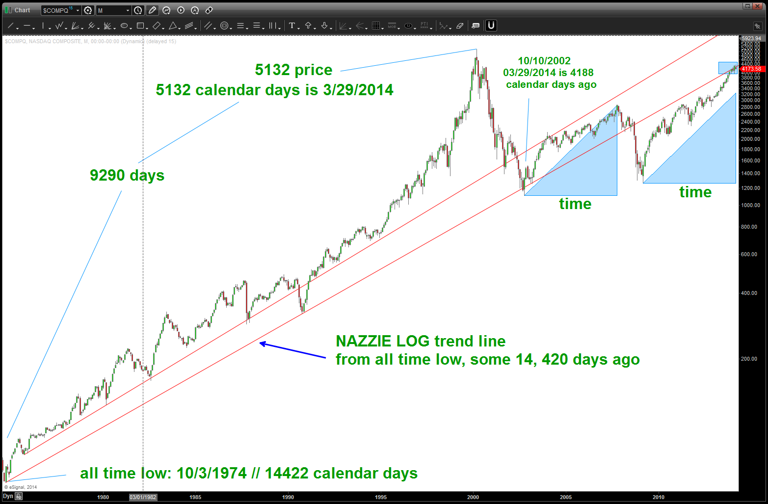
Here’s what a PRICE EQUALS TIME trend line looks like …
Posted on September 2, 2014 Leave a Comment
in the world of numbers … well, they (being the numbers) don’t care about decimal points. A new friend and extremely talented CMT recently twittered that the bull market is 66 months old. if we simply move a decimal point we get 666 which was the low and we also get 2006 days ago at/around a price of 2006. anytime this market “touches” the “square out trend line” below it usually takes a dip. one of these days it will take a “big dip.”
I AM NOT SAYING ANYTHING MORE THAN THE MARKET IS SQUARING OUT PRICE AND TIME … NO DOOMSDAY, THE SKY IS FALLING, BEAR MARKET, CRASH, ETC. JUST WE ARE SQUARING OUT THE LOW IN THE CASH S&P AND THAT’S SOMETHING TO PAY ATTENTION TO …

a “perfect” price and time trendline
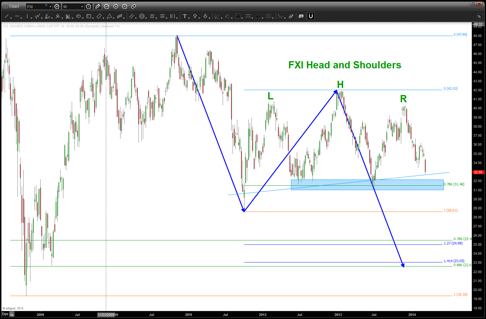
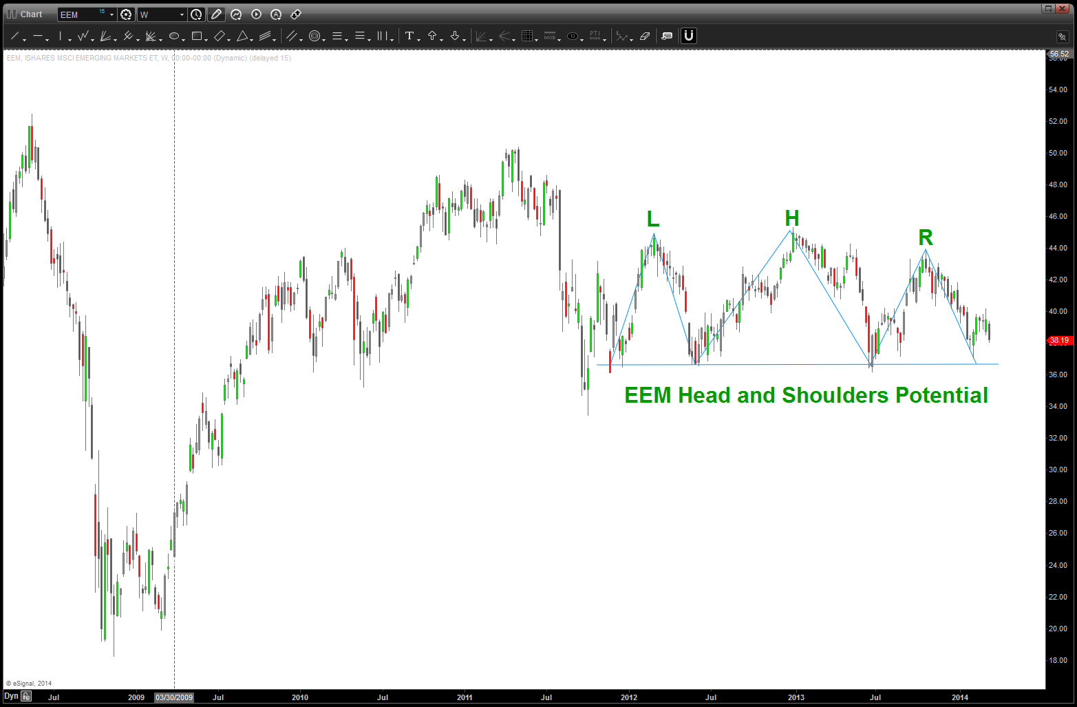
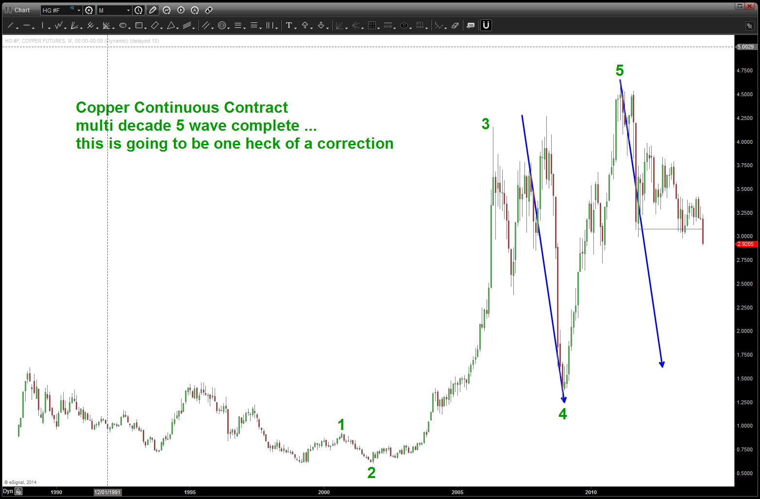
Inflection point for bearish or bullish EEM / FXI now
Posted on August 30, 2014 Leave a Comment
August 30, 2014: the CLIFF NOTES is we are at a crucial point for the EEM, FXI and Copper. Patterns suggest a bearish stance is prudent.
The bottom line is the neckline shown in FXI and EEM did not break and a very strong rally has taken place. That being said, BASED ON THE VERY BEARISH COUNT OF COPPER ON A LONG TERM BASIS, believe the EEM, FXI and Copper should start back down again. The charts will show the PATTERNS. Right now, I remain BEARISH on the FXI and the EEM because of the LONG TERM TOP in COPPER. Note, divergence is present in the recent price action. So, even thought they (FXI, EEM) have been linked very strongly to Copper, this linkage could be broken and they are now decoupled. With recent price action this is a distinct possibility. Let’s see if the patterns shown on EEM and FXI fail before we come to this conclusion.
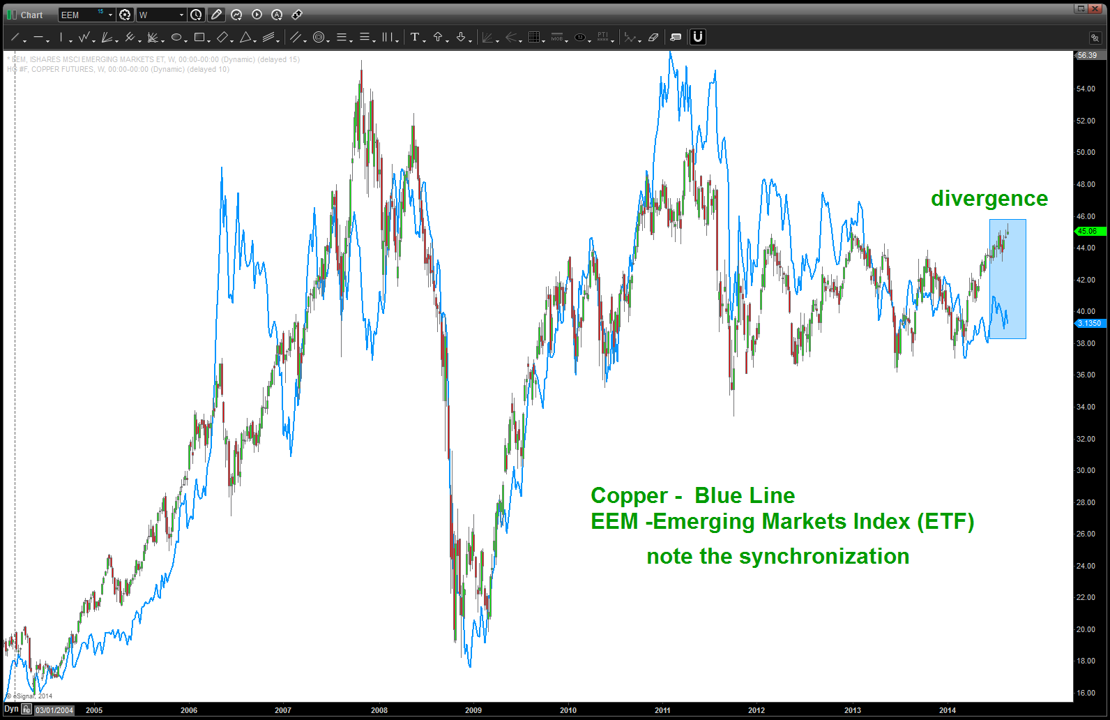
note the CLOSE correlation of Copper and EEM for a “pretty long” time
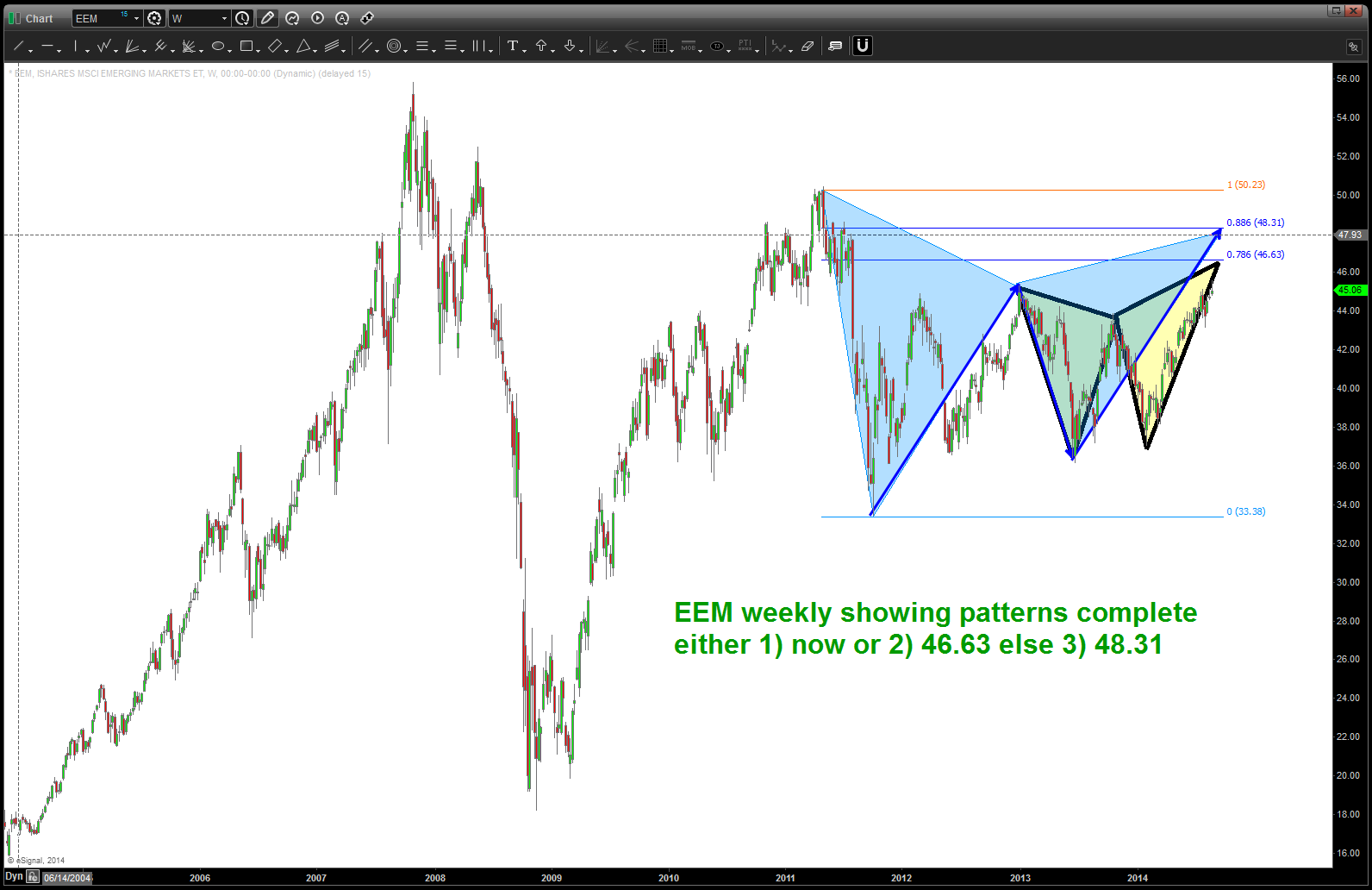
EEM sell pattern …
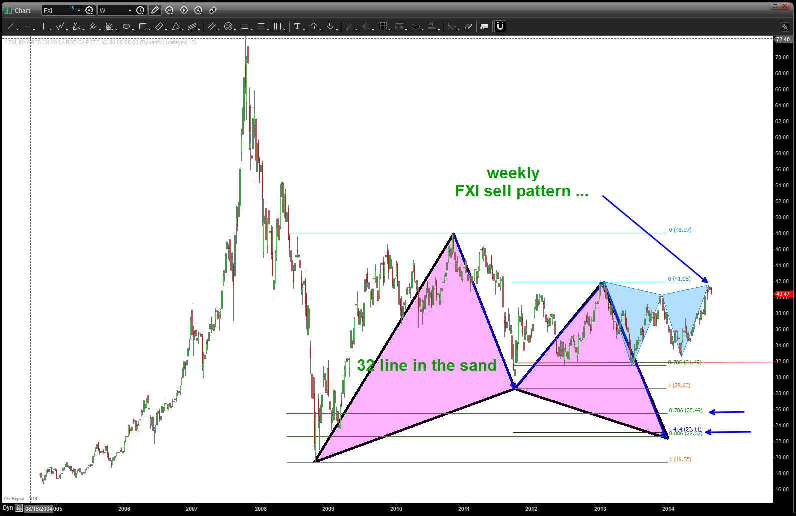
FXI sell pattern complete
Here is the bottom line of these markets (EEM/FXI, COPPER) – If the point labeled 5 below was NOT the high (but a little higher on copper around 5 is the actual target) then these patterns will fail and we’ll see another move higher and I will update new targets. RIGHT NOW – behave/manage risk like the 5 on the chart below is 5 – and folks it’s a long term 5 – then the EEM, FXI and Copper securities should be starting down in/around here. DOES THAT MAKE SENSE? Enjoy the Labor Day weekend w/ family and friends.
please see this post to see why the high in copper is so important: https://bartscharts.com/2013/12/20/the-copper-script/
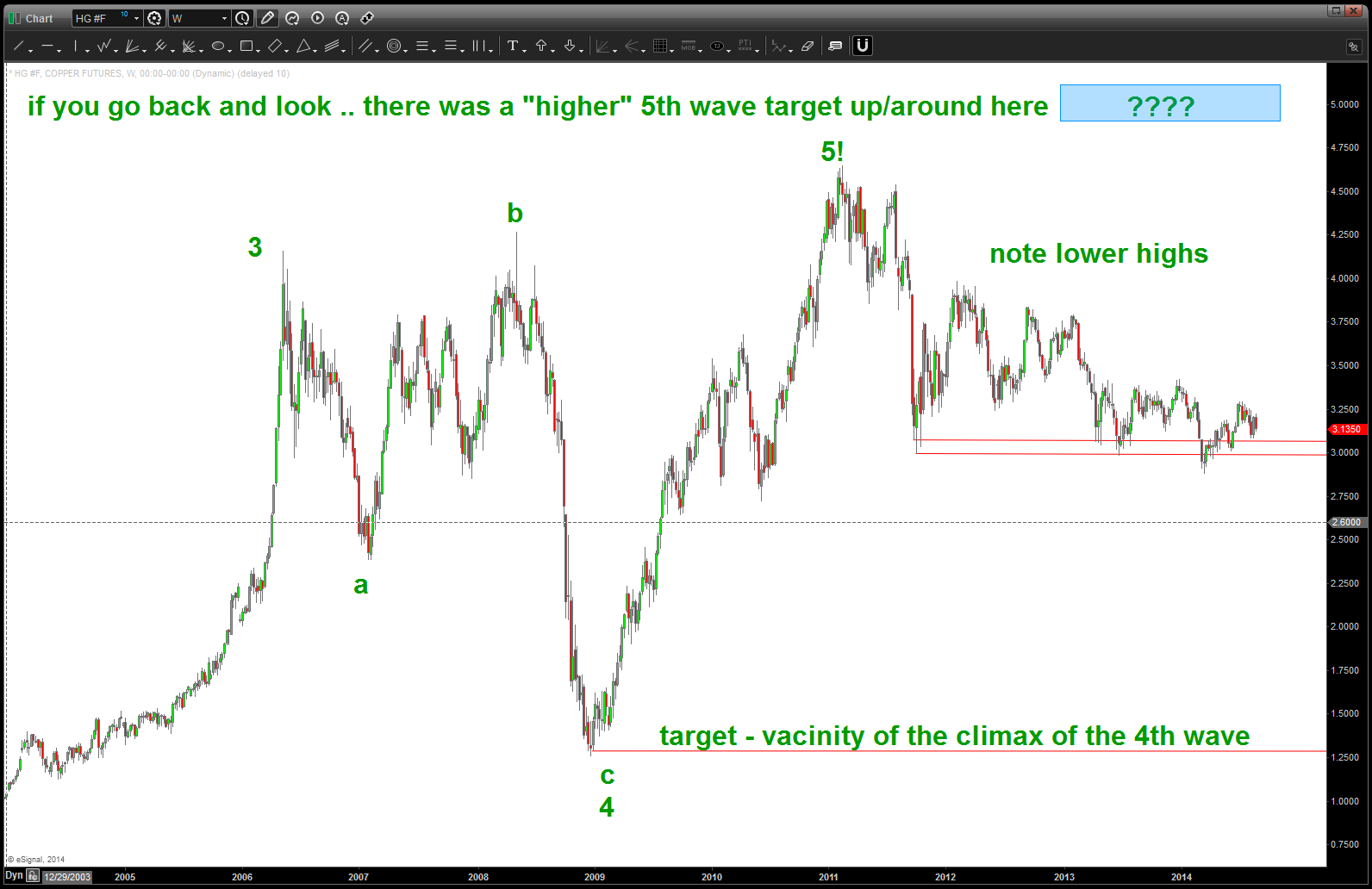
note a POTENTIAL for an ENORMOUS top in place for Copper 1,2,3,4,5
one last, note below the relative strength RATIO of EEM / SPY. Since 2010, on a relative basis the EEM has been getting smoked by the S&P500 as a whole. Also, note that the .618 retrace supported, for a while, but the broke and is now the REASON for the resistance. A little lower (blue shaded rectangle) is a NICE target to potential watch for a flow of funds into the EEM. Would hold off for now BUT do watch closely as we did break above the median trend line (like in the end of 2012 – which was defeated – blue arrow) and we should start down now w/ the SELL patterns present.
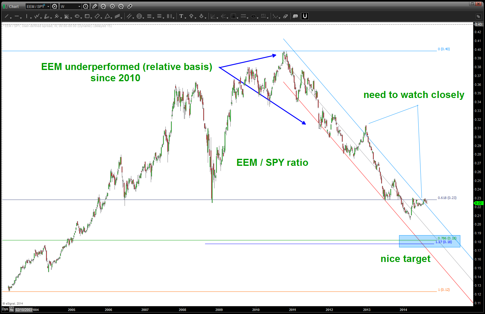
Relative Strength of EEM / SPY
Rock on, ok?
Bart
March 13, 2014:
CLIFF NOTES: the move in copper should not be surprising // we are correcting a multi-decade 5 waves up complete. This has shown to put pressure on emerging markets and china. All according to the script.
if you would like to search for “copper” on this blog you will see that we have had a bearish stance for a good couple of years. A strong case can be made that Copper finished a multi-year 5 waves UP and is now undergoing a potentially very violent correction. if you also click on this link you will see the correlation between FXI (chinese ETF) and EEM (emerging markets ETF) and Copper : https://bartscharts.com/2014/02/01/copper-and-the-emerging-markets-eem-etf/ also here are the highs and lows in Copper: https://bartscharts.com/2013/12/20/the-copper-script/
The most recent breakdown in copper does not play well for FXI or EEM.
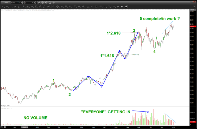
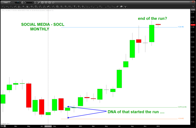
Social Media Strategy ($SOCL)
Posted on August 29, 2014 Leave a Comment
08/29/2014: social media is REAL, it makes a DIFFERENCE and it is developing business models that are changing the landscape. I believe in this space …however, all that being said – I believe in PATTERNS more! 🙂 So, throughout 2014 I have been watching the $SOCL mutual fund. (please see: http://money.usnews.com/funds/etfs/small-cap-funds/global-x-social-media-index-fund/socl for more detailed information. It’s not equally weighted but it does encompass a nice landscape of the social media space players. As you can see from the charts below a well defined 5 waves up led to the correction into the middle of the year. From there we have bounced nicely right into the zone of 20-21 which “should” offer resistance and another move down. Here’s the rub … the 1,2,3,4,5 was excellent and warned, nicely, of a coming correction. Please see this chart:
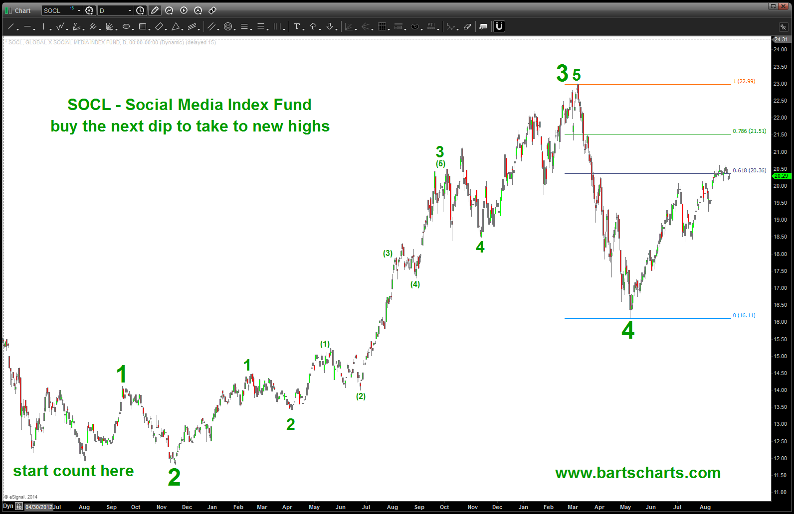
NOTE – going to call the last high a 3 and see this move ongoing taking out a new high
see the change …. ? You know what … I’m going to start the count a little early and note that the recent high was 3 so, w/ the rampant bullishness of the equity market and that it can’t even correct 5 % I’m going to put a “new count” out there to make it go up to make a new high. So, if we can get an intraday pattern to BUY why not give it a change. will be watching …
04/28/2014: expect 14-15 to maybe be support but the 5 wave sequence is complete and I consider this space done for a while …My last post on SOCL is below. Missed it by a buck: