TBT – BUY (?) No, I’m not crazy UPDATE 06/08/2020
Posted on March 8, 2020 1 Comment

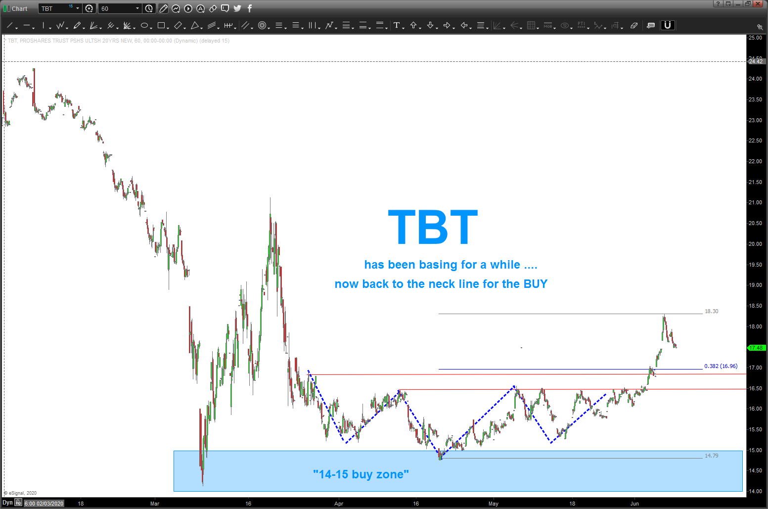
06/08/2020 UPDATE: breakout from a long base and inverted head and shoulders and appears to be going back to the neckline for the BUY. the “low” was right inside a tight “buy” zone depicted below.
______________________________________________________________________________________________
yes, I know that even thinking of BUYING TBT in this current market is insane BUT I really don’t care … it’s a BUY pattern that works or doesn’t. i did a quick blog on interest rates last week and those targets were SMOKED by the end of the week action but take a look below and then figure out a gameplan.
please see below:
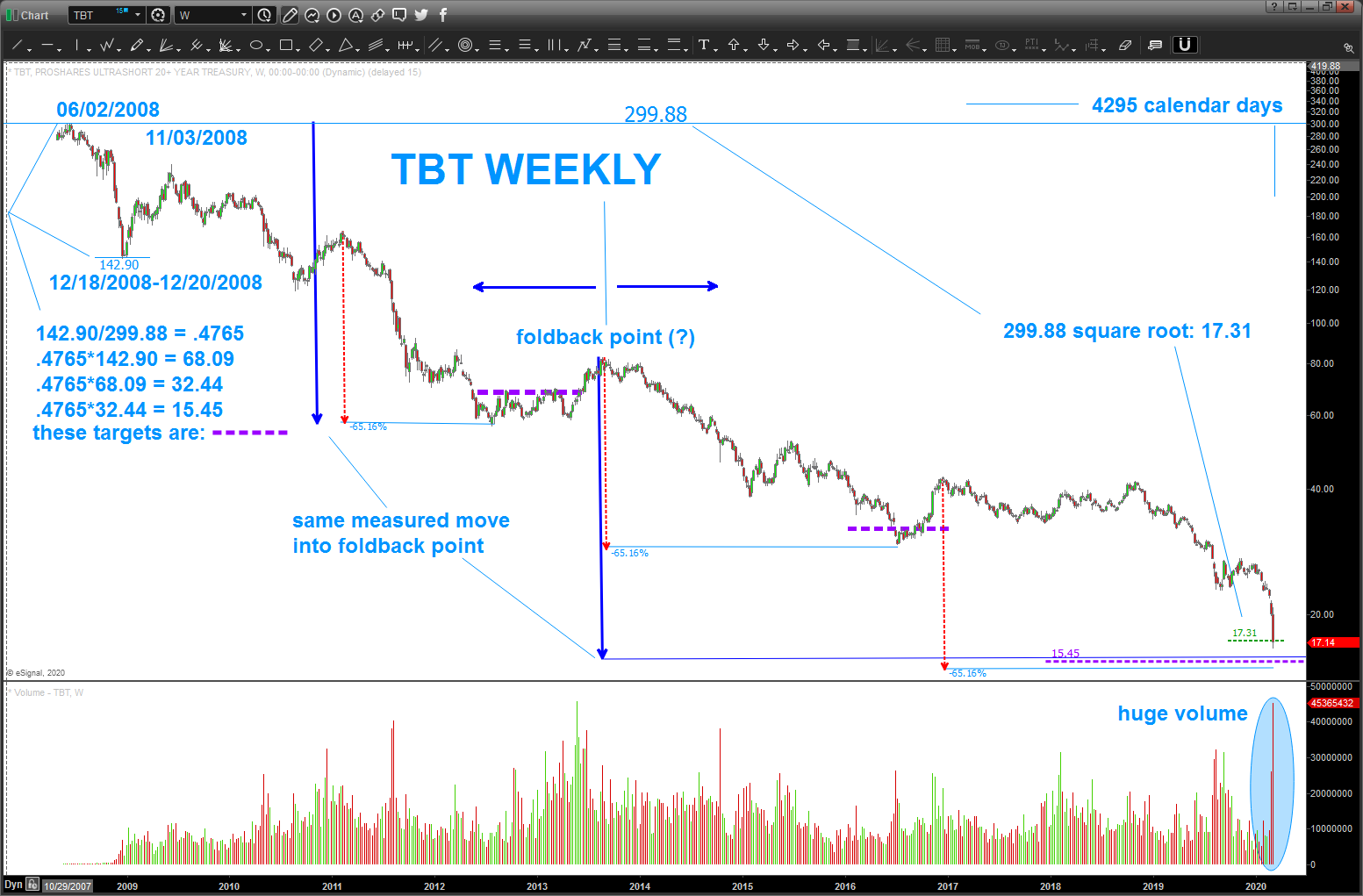
we have a lot going on here:
- Fundamental Frequency: take a ‘major’ high and low or vice versa and divide them. you now have the ‘fundamental frequency’ to define the move … see the purple dashed lines? those are fundamental frequency targets
- Square the High: if you take the square root of the all time high you get 17.31 which is basically where we closed
- Projections
- the market likes to go ‘down’ around 65% per swing
- additionally, if look at the foldback point we have the two big blue arrow s equal in their measured moved
- Volume – MOST VOLUME EVER. capitulation low? Hmmmm
So, let’s don’t be a hero but … let’s see if the low was in place on Friday OR the market goes down a little more (TBT) into the buy zone of 14-15 and then wait for the market to EXPLODE off these levels and then try to get in .. if the market does a dead cat bounce and well, just goes pfffffffff … then stay away.
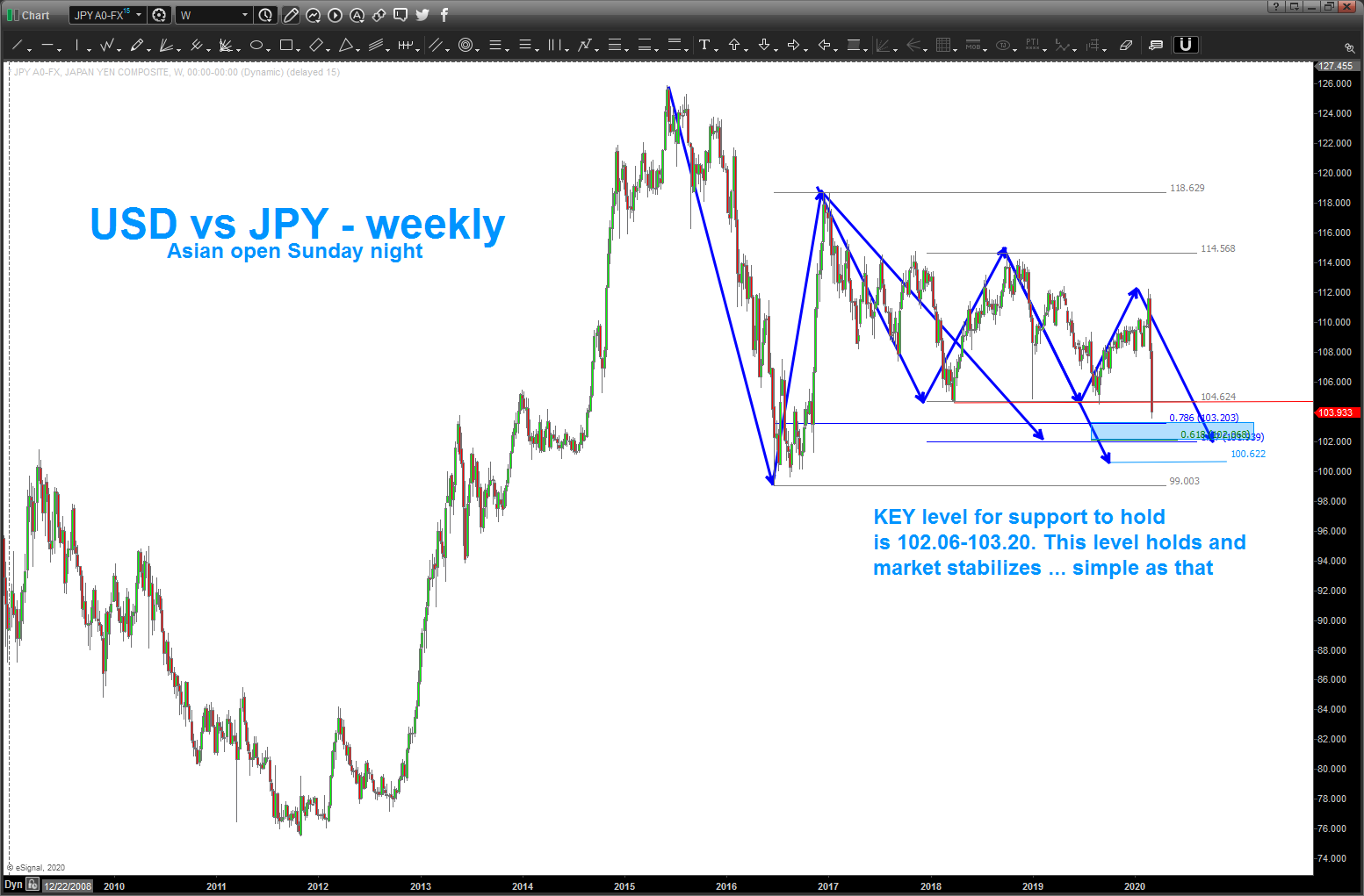
03/08/2020 Asian Open Update
Posted on March 8, 2020 Leave a Comment
the USD vs YEN cross rate is a BIG FX pair to monitor for equity strength and weakness. we had a nice ‘nominal’ 1100 point gap down to the open the DOW futures in Asia and a 20 percent drop in crude. rocking and rolling folks …
as the night progresses, just watch 102.06-103.20 on the USD vs JPY and, a little lower 100.62. We’ve already sliced thru 2 years of support – easily – but do look for these levels to offer a modicum of support over the coming hours/day (s?)
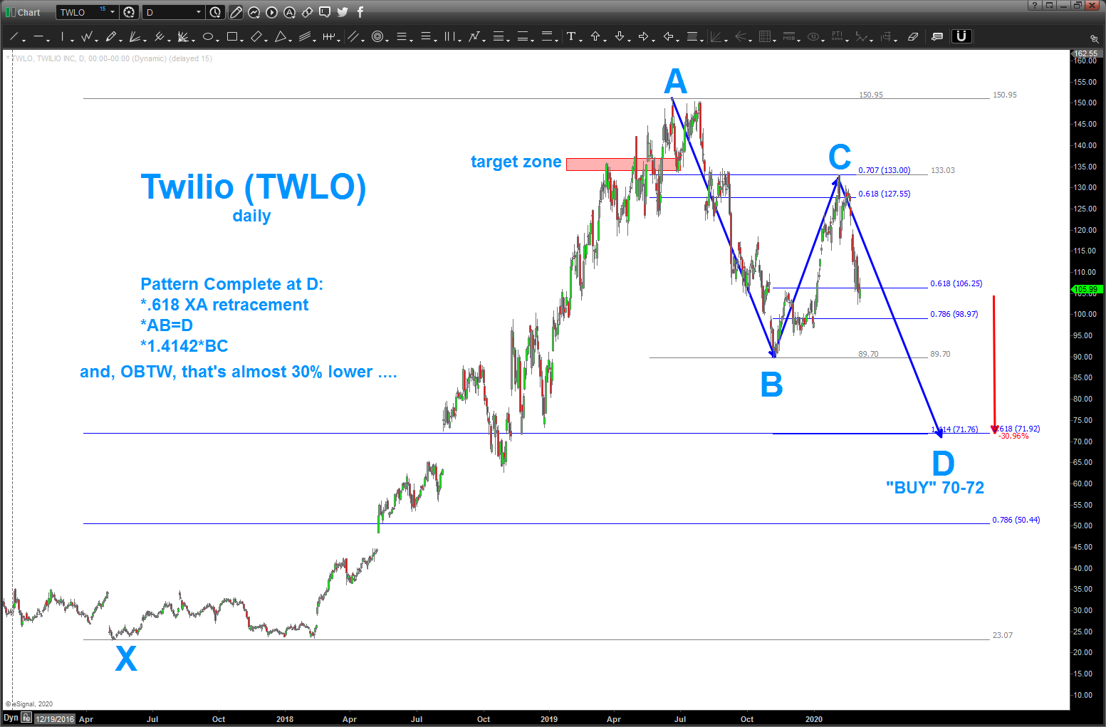
TWLO update 06/08/20
Posted on March 5, 2020 1 Comment
06/08/2020 – harmonics and patterns are amazing aren’t they … sheesh, look at this one that worked out. now, appears 5 waves are complete w/ projections and extensions showing “why” TWLO topped out … might be time to set this one aside, for now.
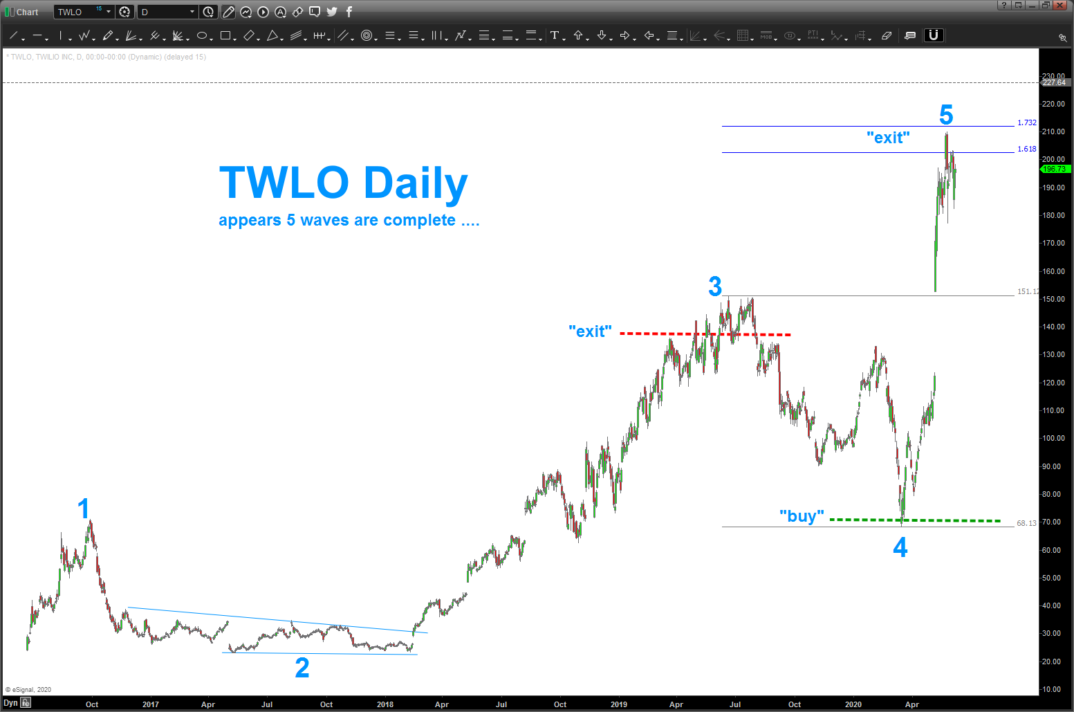
_______________________________________________
can’t believe it’s been roughly a year or so since I blogged about TWLO and used vector math and the Vesica Pisces to generate some targets. I was drawn to the 133-135 level. market went a little higher and since then has been getting beaten up pretty good ..
all that being said, it’s showing one of the ‘nicest’ buy patterns emerging in this chaos right now … and, gulp, it’s still about 30 percent lower to complete the pattern. so, let’s keep this on the radar in around 70-72
Bart
Interest Rates … the trend is your friend, till it ends
Posted on February 23, 2020 Leave a Comment

I really like an email I get once a week from the Visual Capitalist https://www.visualcapitalist.com/ as they visualize some of the most interesting subjects and break these subjects down for the common man (me) to understand.
I’ve been ruminating (my newest word) on the state of bonds, negative yields, sovereign debt and the like and, it just so happens that the Visual Capitalist did an expose on Interest Rates!
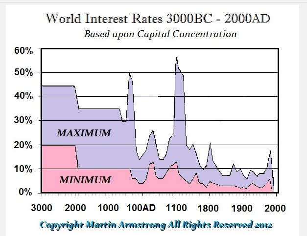
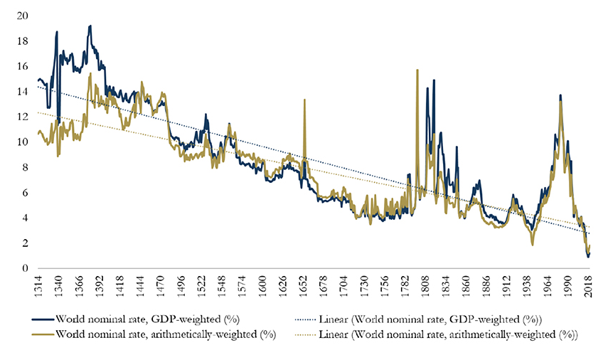
I also follow Martin Armstrong of Armstrong Economics and he posted this graph which shows interest rates are at 5000 year lows. so, per the title of this post, we have a 5000 year trend working w/ regard to the ‘trend’ of interest rates. folks, work w/ me, but that’s a trend!
Visual Capitalist has some great graphics, but they only go back 700 years. Still, that’s a pretty big trend, isn’t it?
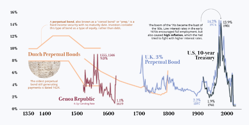
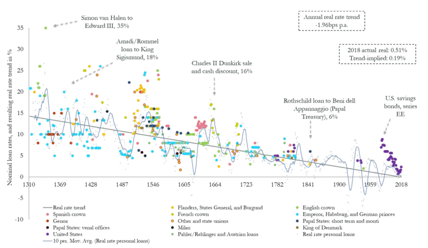
Here’s Bond Yields since the 1300’s … another trend that is pretty strong, no?
So, just to paint the picture a little more, here’s a global look at outstanding debt. Folks, it stands at a mere 69 Trillion and counting …for comparison sake, 2 decades ago it was “only” 20 Trillion. Right now, IMF estimates, the debt to GDP ratio is 82%. The highest in human history ….
But, the band plays on … right? All time highs in the stock market, a REPO crisis that NOBODY is talking about, Trillions of derivatives out there that nobody can account for (watch $DB please) and the Euro Zone is a mess. Can one imagine what an uptick of just a 1/2 percent in rates does do the payments/load on 70 Trillion?
Not trying to spread doom and gloom as 1/ nobody would believe it and 2/ the world is drunk on buying equities and 3/ it’s just not worth the hassles.
Folks, it is NOT all good.
So what do we do … well, I’ve told multiple people that BUYING rates will go down as one of the greatest investments of our lifetime. But, do I really want to step in front of a 5000 year trend of lower and lower interest rates? Hell no! And, just because we have a trend that has been rolling since before common era (BCE) there will be a day that the trend stops. Maybe it will be in our lifetime.
Additionally, you can make money intraday, daily, weekly or even monthly buy going long rates. in the past, those are simply counter trend bounces of a 1000+ year trend.
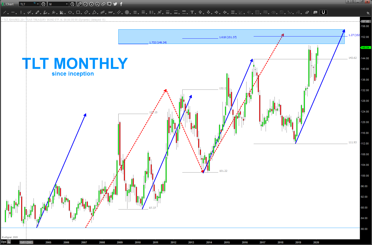
Here’s TLT – 149 to 154 looks like STIFF resistance ….
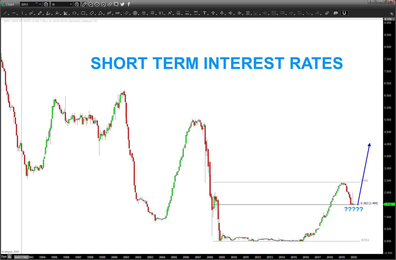
here’s a monthly of short term interest rates, sitting right on a .382 retracement. IF a STRONG MOVE HIGHER THEN .382 should/could hold it
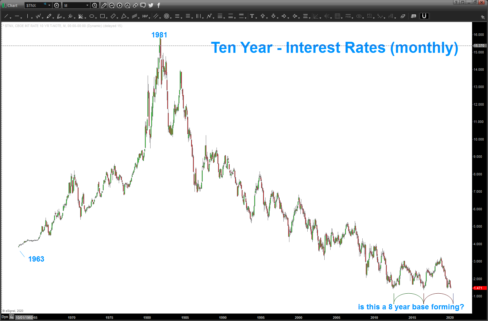
here’s the 10 year rates chart going back to the 1960’s … only thing I want to note is 1/ it’s been STRAIGHT down w/ intermittent ‘bounces’ but 2/ of late, notice we have pretty much – technically – been forming a key support CLIFF (and it is that ) around 1.5% and it’s been trying to base for around 8 years. nothing from a time perspective compared to 5000 years BUT maybe something for us to watch, closely, for a 40 year wave of lower interest rates?
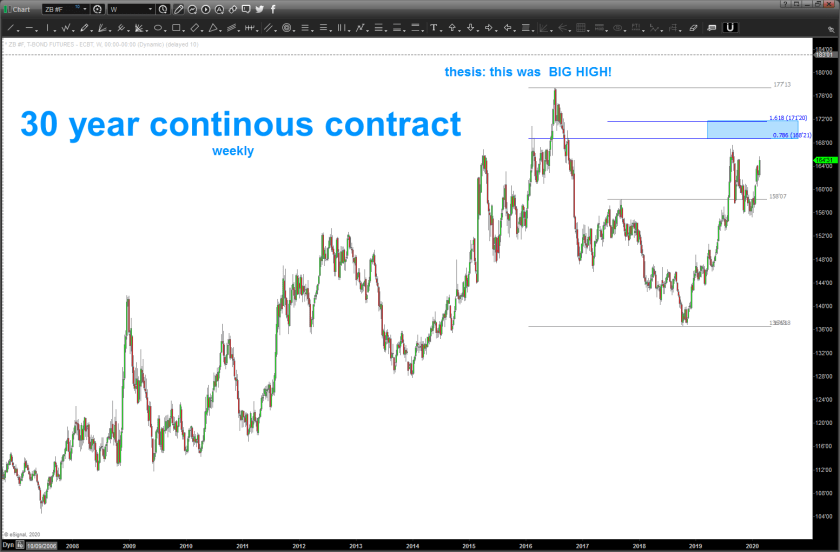
30 year long bond: not approaching new highs and withing striking distance of a nice “long rates” target zone … hmmmm?
one last … Fed Fund Futures. sitting at .382 … what’s the market trying to say about the FED’s next move? Or what are they telling the FED to do because the FED is trapped ….
so, stay tuned and really pay attention to the fixed income market – globally – and the flow of funds.
I’m flat interest rates right now and, honestly, trying to wait (operative word) for a PATTERN to signal to give it a shot (long rates) I have the same ‘feeling’ I did when the USD vs JPY was down around 75-76. I tried (again the operative word) to go LONG the USD at 76 ish and was stopped out 5 times in a row (don’t judge – it is what it is) and found my P&L go to -18% and my first digestion of investor/trader cryptonite – the draw down.
I like the ‘feel’ I have but don’t like the result from last time w/ the JPY so I’ll continue to be patient. but just wanted to share and be real and honest … while it looks like trading/investing isn’t hard (it isn’t) it’s just not easy.
Bart
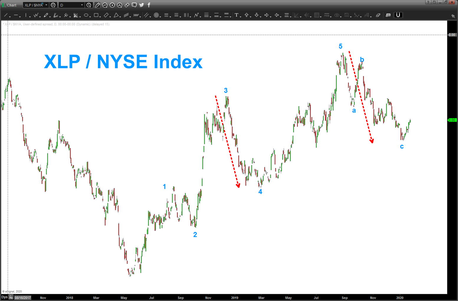
Intraday BUY ratio = sell equities
Posted on February 12, 2020 Leave a Comment
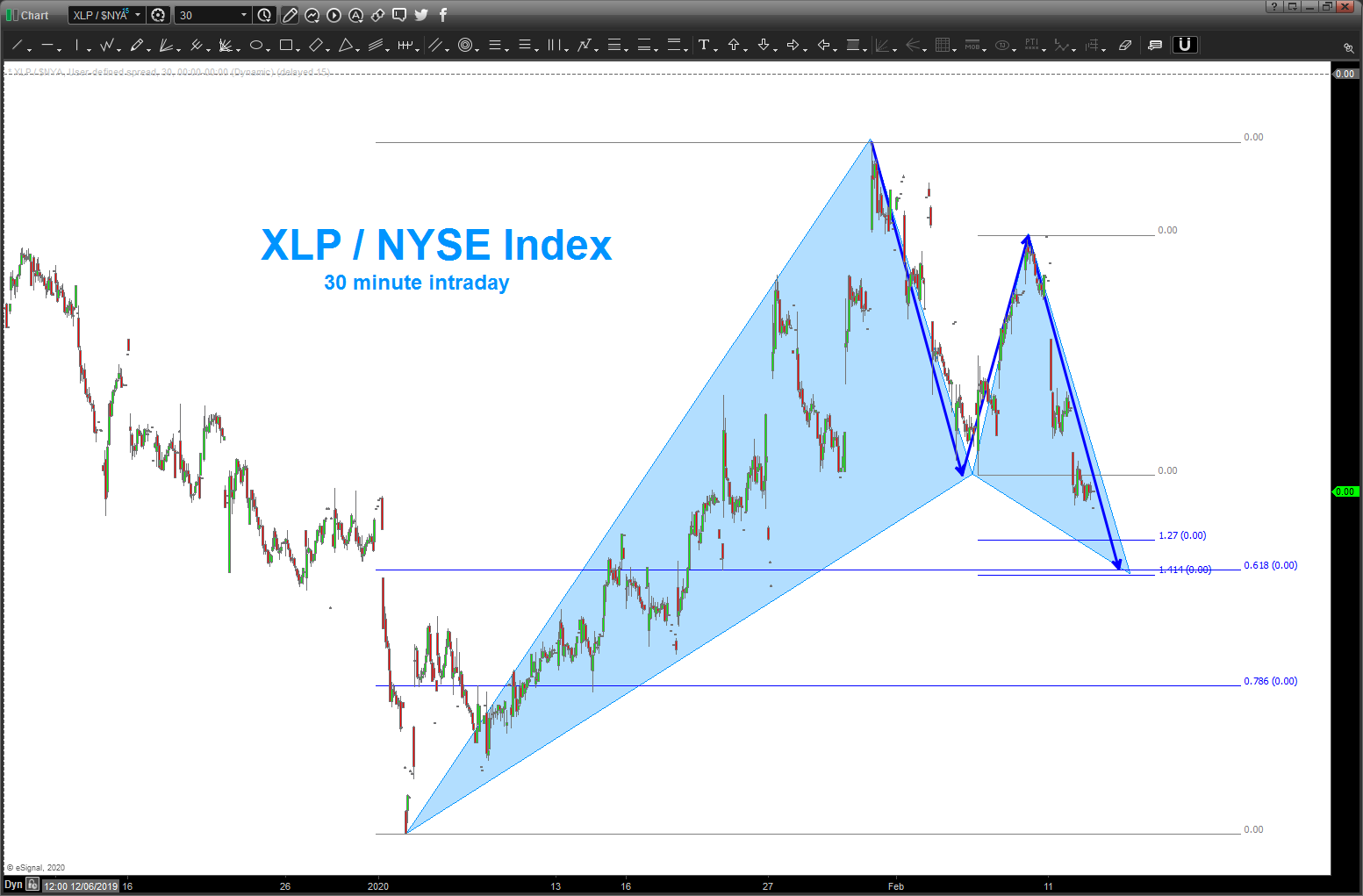
here’s an intraday look at the XLP/NYSE Index ratio … 30 minute chart. a near ‘perfect’ BUY PATTERN.
with a buy pattern, that will signify ‘risk off’ for the big guys and therefore a sell equities.
if (the big if) this pattern fails then the likelihood of a continue advance is high …
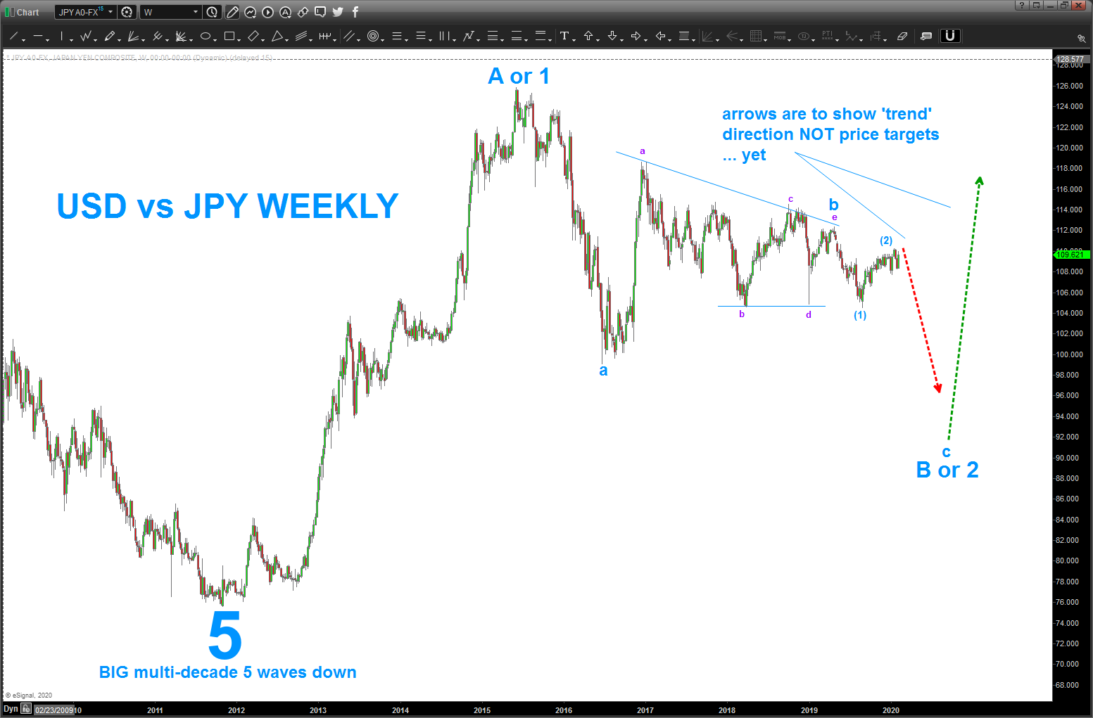
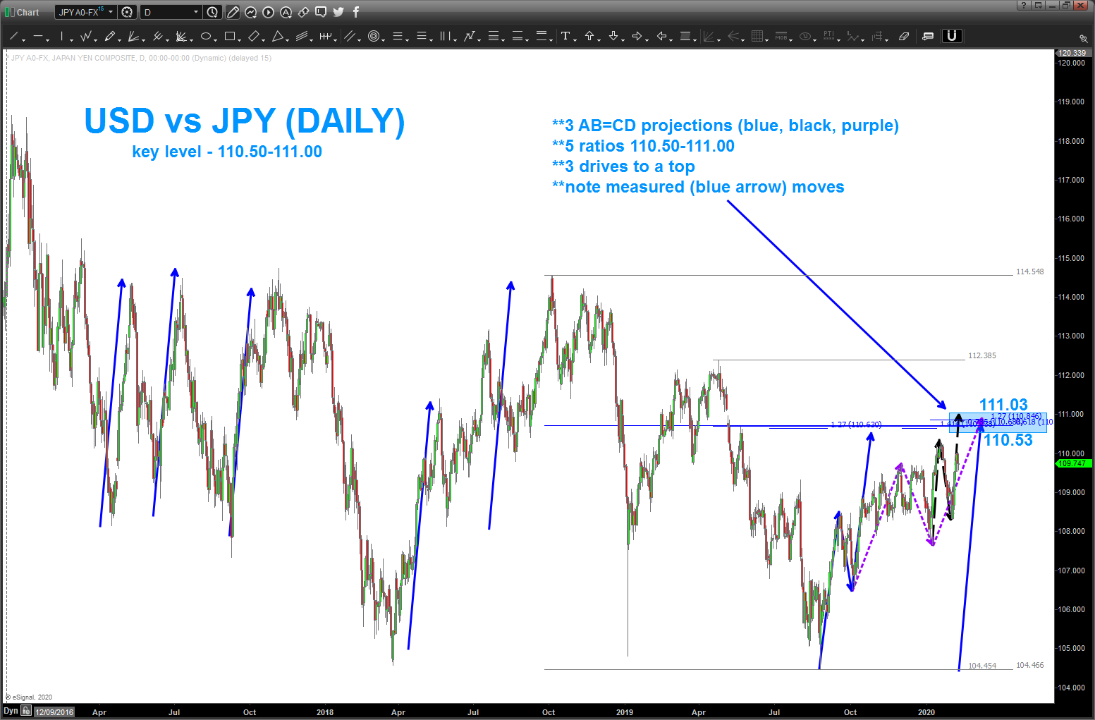
USD vs JPY key level ahead
Posted on February 10, 2020 Leave a Comment

for those that have been following my posts over the days, weeks and years you know that I try (operative word) to look for patterns that allow for risk controlled entries into and out of the market.
I also like to use the classic CMT world of intermarket analysis to look at ‘other’ markets to understand correlations and how they may affect each other from a bull or a bear perspective.
I’m also neither a bull or a bear. I’m a PATTERN dude. period.
Sometimes the patterns work, sometimes they don’t. they allow one to know where they are are wrong … the key to surviving this investment game.
from a correlations perspective, it is widely known that the USD JPY is a good proxy to look at for equity health or sickness. when the JPY strengthens it’s usually a risk off and equities correct and when the USD strengthens its risk on and the bulls run over in the equity market.
in the case below you can see we have a LOT of confirmations that the USD vs JPY has formidable resistance around 60-70 pips higher.
elliott wave, projections, measured moves, and a host of math come into play from 110.50-111. IF this proves as resistance AND the elliott wave count is correct (a BIG IF) then the equities should correct to finish this final ‘c’ leg of a multi year correction from highs on the USD vs JPY. stay tuned and watch this level closely …
in the fx world, 80 pips can get taken out in minutes or grinding in hours … either way, it’s not that far away.
salute – Bart
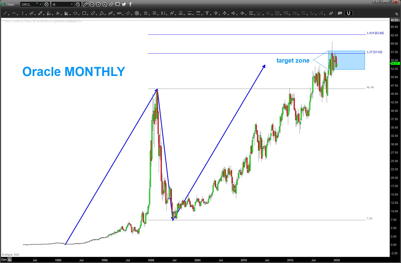
ORCL – target(s) hit
Posted on January 26, 2020 Leave a Comment

been watching this area on ORCL for a while: https://bartscharts.wordpress.com/?s=orcl it’s a long standing target in this area and we’ve reached it …
EEM – now a SELL pattern complete
Posted on January 26, 2020 Leave a Comment

last post on the EEM was a nice BUY PATTERN: https://bartscharts.wordpress.com/2019/08/06/eem-big-buy-pattern/ now, we have a larger (purple shaded regions) SELL PATTERN that hit at the beginning of last week. for now, the EEM should stay below the 46.50 area ….
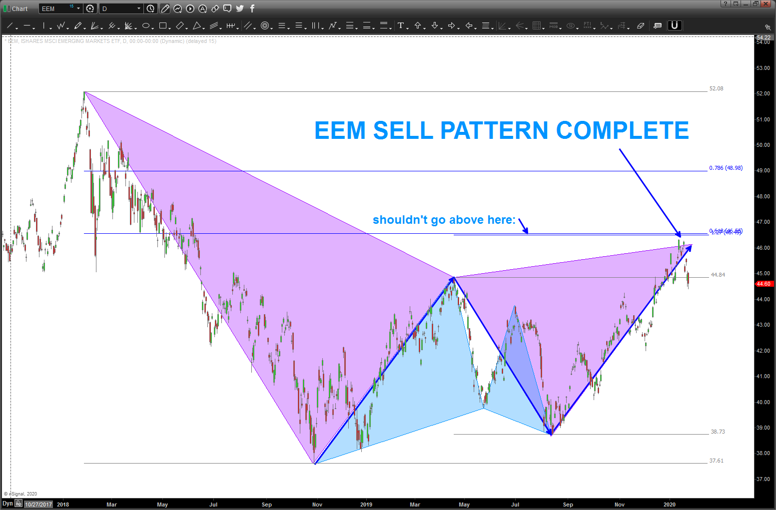
for those interested in PATTERNS I’m using the colors to show how a complete pattern presents itself via connecting the swings. in this case the ‘first’ pattern was a BUY pattern shown by the ‘light blue’ triangles and then the market rallied from that area into the shaded purple sell pattern area …
Targets a plenty ….
Posted on January 25, 2020 Leave a Comment

02/24/2020
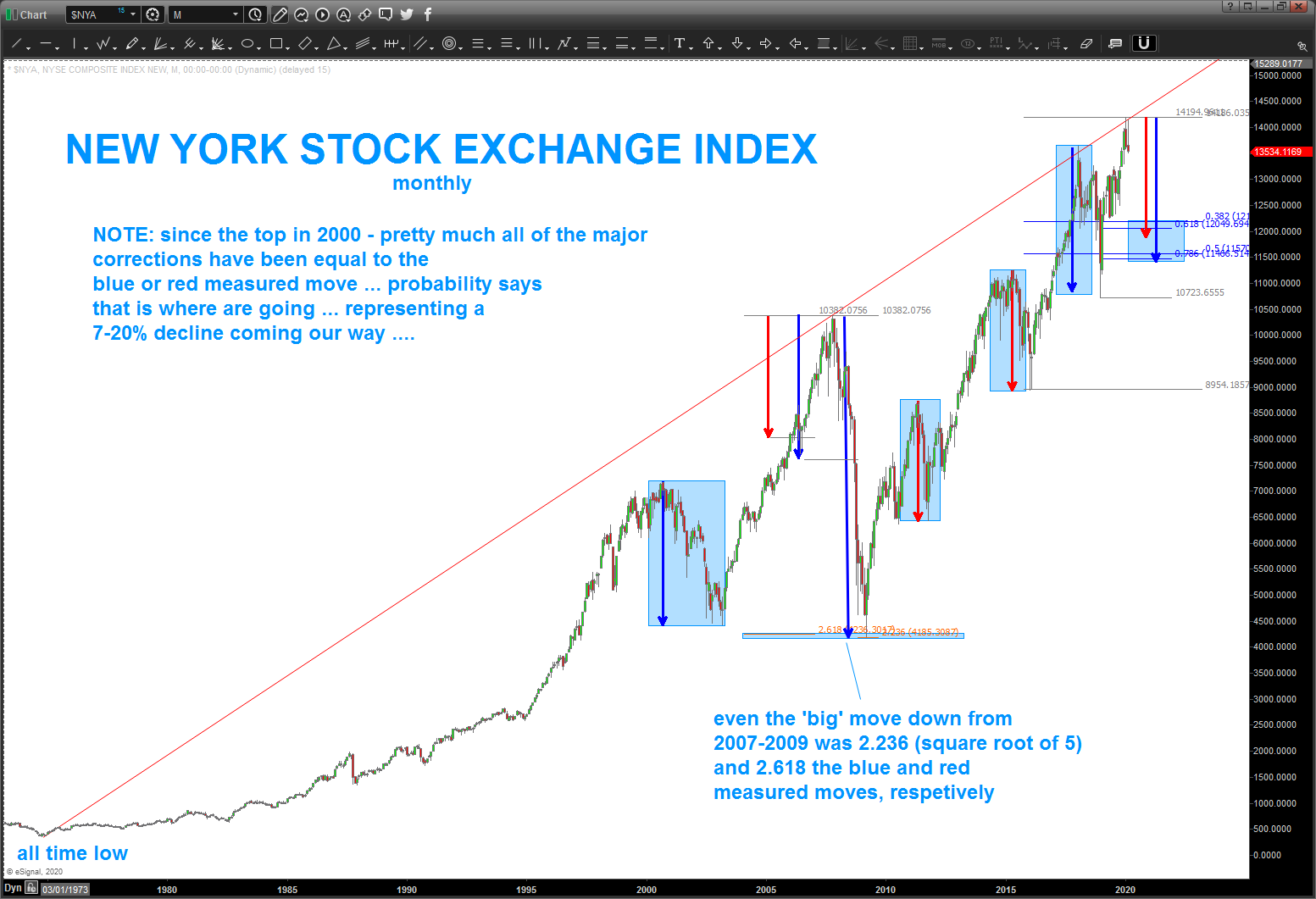
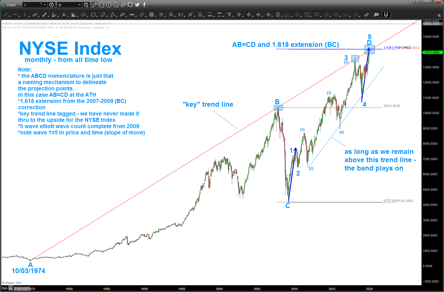
UPDATE: well today was a pretty smashing day as “days” go but in the big picture it’s really nothing. but, he fact that the NYSE Index hit the target – from the all time low – so nicely, we do have to be defensive as explained, roughly a month and a half ago …
updating the NYSE Index for potential targets and you can see 11500-12100 ish as the most likely move … that’s roughly 7-20%. yes, I know that is a big range but all I’m doing, for now, is looking at past corrective measured moves and projecting down. as can see by the below chart, the blue and red arrows have been responsible for pretty much EVERY correction for the past 20 years. so, isn’t it a high probability that this is where the market will go? Seriously, take a few minutes from your ADD Social Media frenzy to study the chart below … folks, it’s EXACT. EVERY CORRECTION HAS BEEN EITHER THE RED AND/OR BLUE ARROWS. also, take a peak at the 2007-2009 thump. that correction was harmonic to the blue and red arrows being 2.236 (square root of 5 and one of our ratios) * blue arrow and 2.618 (Fibonacci) * red arrow. hence, all of the corrections have been harmonic. now that being said, we have finished a LOT of 5 wave sequences sooooo this corrective move might go a little deeper than any of us think BUT a pattern will emerge to give us an opportunity to BUY … so just chill out, turn off the news and, well, hang on.
rounding out everything from the previous post:
if you have been following my blog of late, I’ve slowed down posting because I was ‘waiting’ for some targets to be hit … it looked like a high level broadening triangle was at work – WRONG. 🙂 and w/ the recent breakout to the upside I had to erase pretty much all of the major indices and, well, go LONG TERM and look for ‘other’ patterns / targets to come into play … well, they have and did last week.
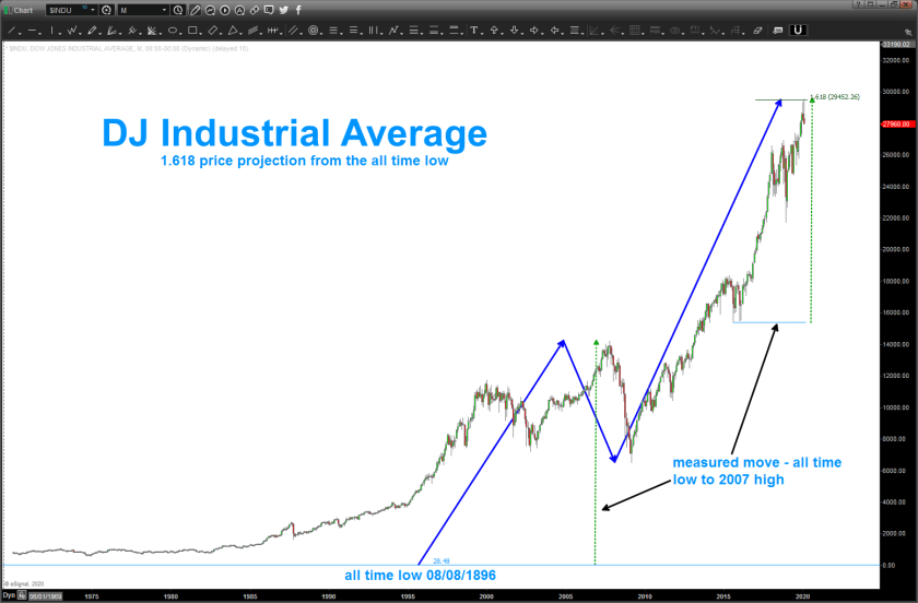
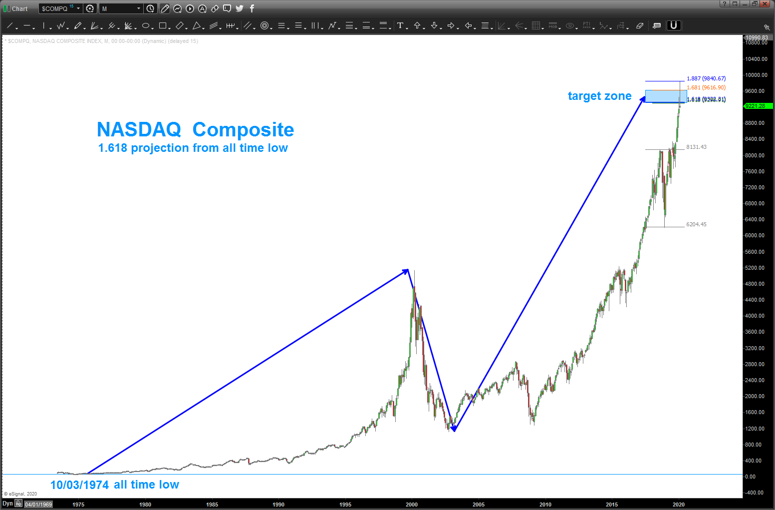
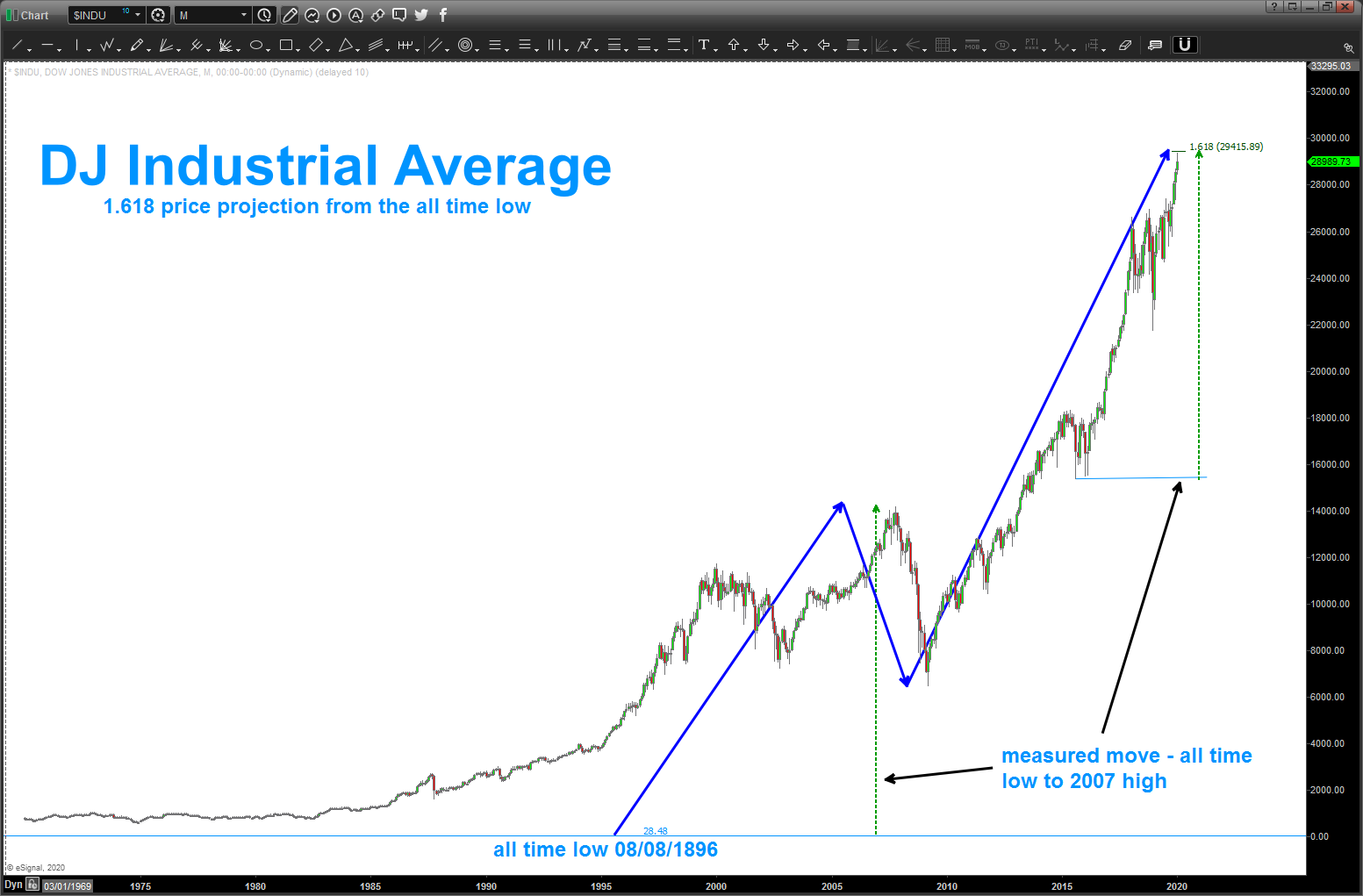
here’s a look at the long term targets that have been hit or are less than 1% away from being hit. if these charts were intraday or daily charts then I would ‘wait’ for 1% but when, in the case of the DJIA, we are looking at a projection a mere 124 years in the making then I’ll take a percent here or there …
in no particular order …
Dow Jones Industrial Average: the all time low on the DJIA was in 1896 at 28.48. Using that low as A we move the line sector AB into the high of 2007. Mulitplying that by 1.618 to get the 1.618 price projection we get 29415. Looks like that was hit on Friday. also, note the dashed green lines going from the all time low up into the 2007 high. same measured move into the 29415 high.
if we put a 14 period RSI on the chart .. yup, we would have bearish divergence present.
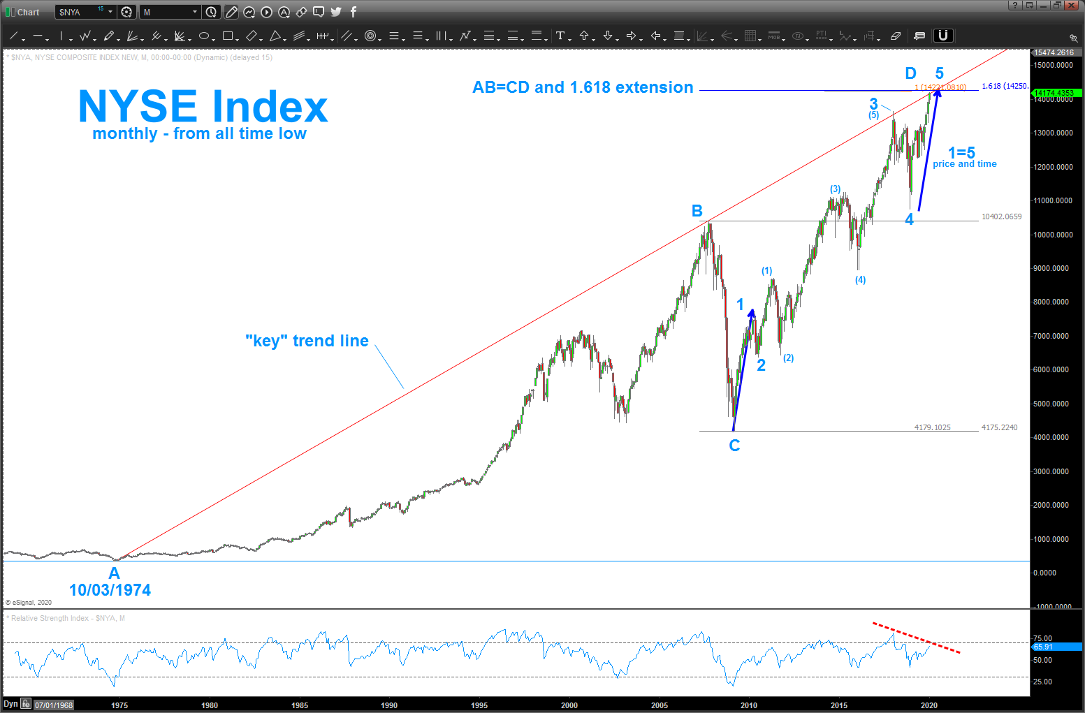
New York Stock Exchange Index: take time to study the notes on the chart. bottom line – multiple confirmations (different techniques) of strong resistance
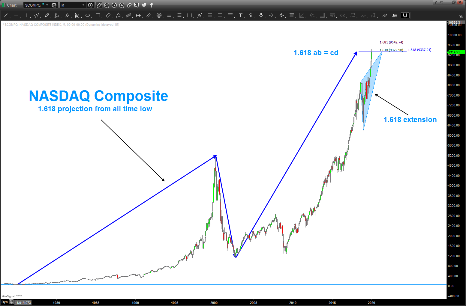
NASDAQ: 1.618 price projection target hit and closed right on it Friday. Also, note we have an overlapping 1.618 extension target hit …
one last, our target zone for the XLP/NYA ratio was hit … continued strength will show the defensive move into staples by the big boys. watch this ratio closely ….