Lumber revisited
Posted on August 20, 2015 1 Comment
I know nothing about the harvesting techniques of wood/lumber.
The post below the two dashed lines is over a year old.
These targets were generated from harmonic pattern recognition.
Notice, there are NO oscillators, moving averages, bands or anything like that .. just PRICE and TIME.
They were all hit … sometimes they work, sometimes they don’t.
There is no “back tested” or “could of, would of, should of”
Patterns exist for only one reason … to let you know when your wrong.
What comes next? I don’t know, find a pattern …
Bart
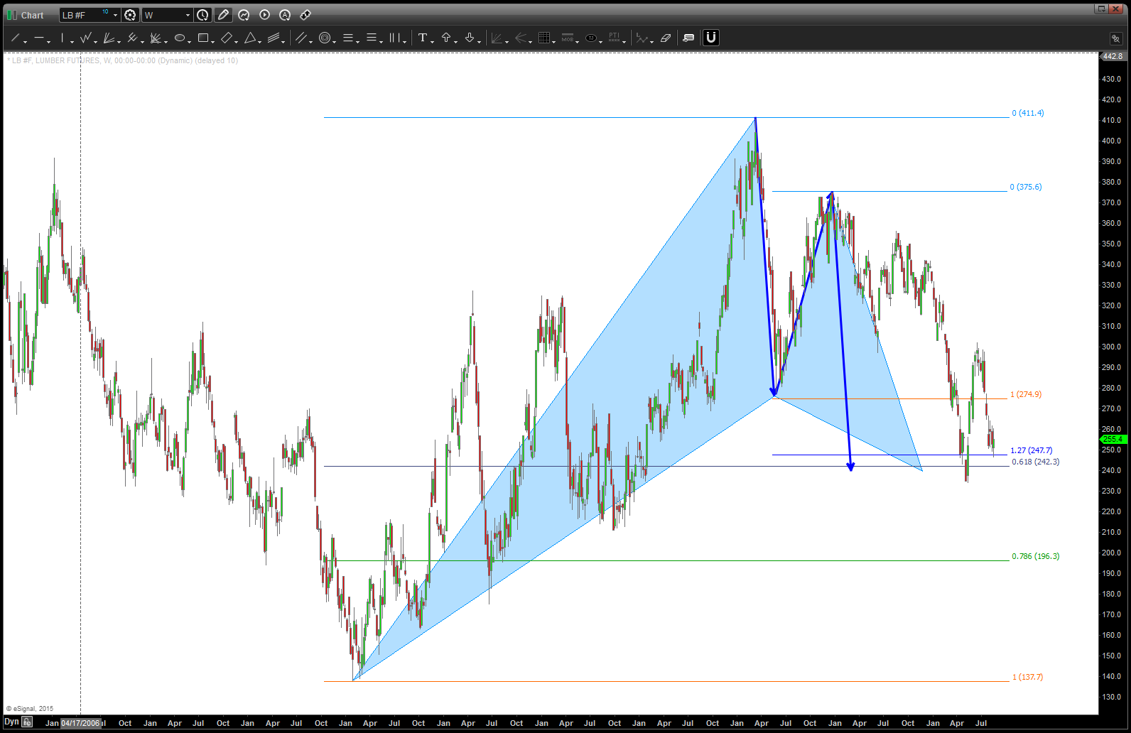
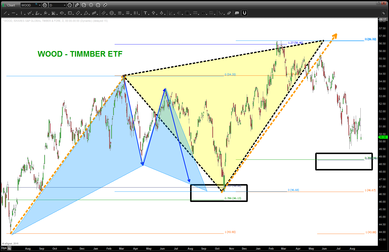
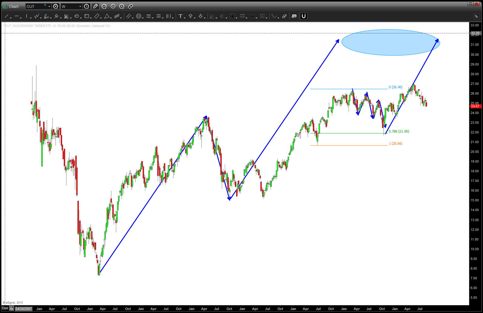
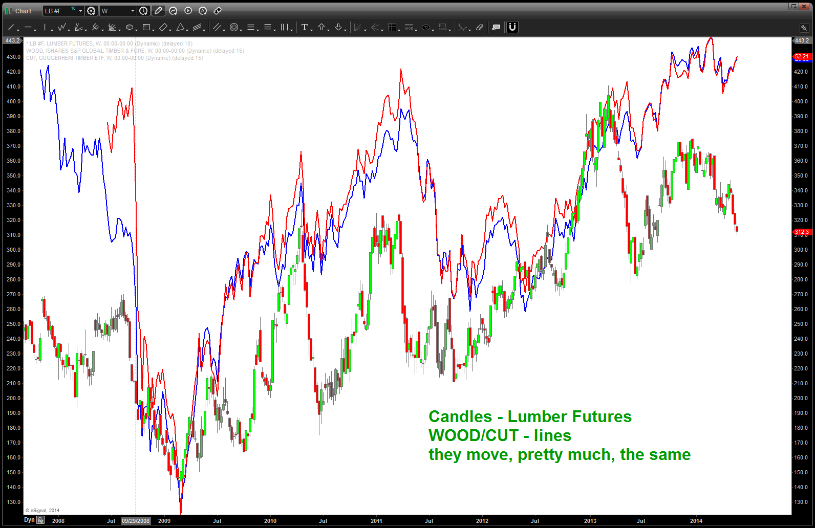
CLIFF NOTES: below is a weekly continuous contract of the lumber futures. all the ratios come together at 241-242. this is a very nice one….stay tuned. might/could find support a little lower and then it’s off to the races in/around here but the larger pattern is very nice. appears bullish from a WOOD/CUT/Lumber Futures perspective.

Lumber Futures
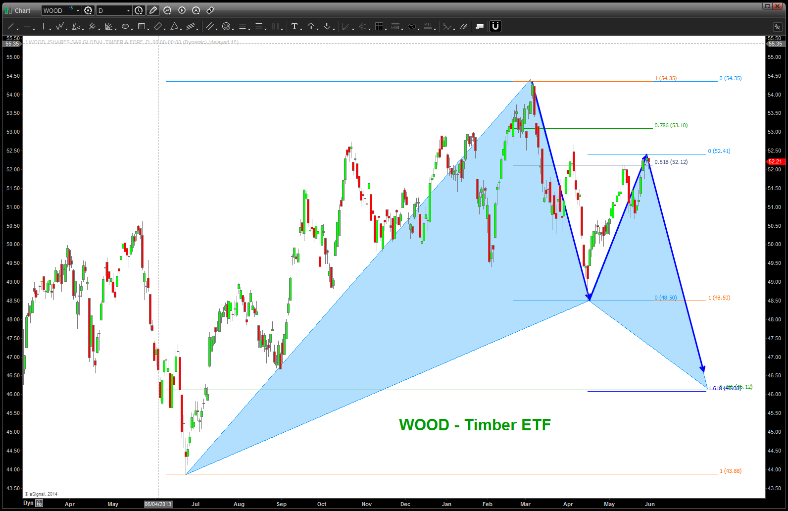
WOOD – Timber ETF
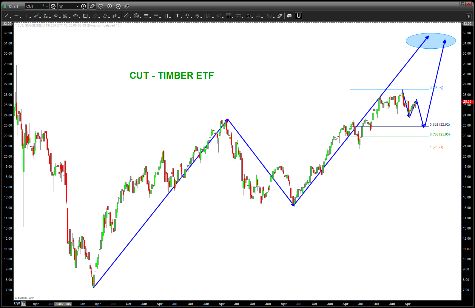
CUT
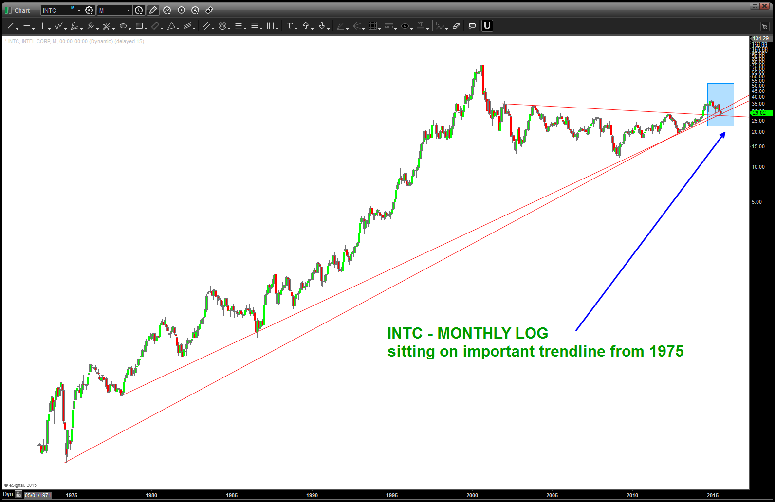
Was the $INTC breakout real? We’ll find out, soon …
Posted on August 16, 2015 Leave a Comment
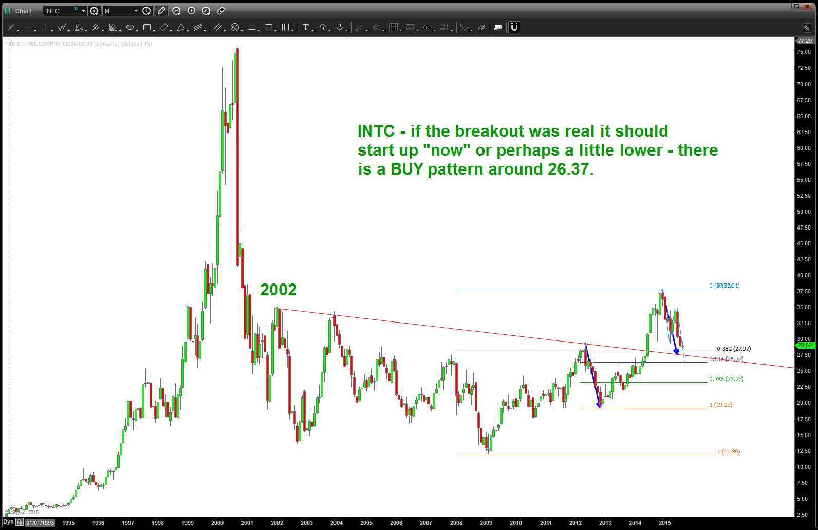
$INTC – note the breakout and now the return to the neckline. Needs to hold here or a little lower to get going ..
ratio analysis of $INTC to NASDAQ

$NFLX kicked my ass
Posted on August 14, 2015 Leave a Comment
if you look thru or have been reading my blog you’ll realize that the patterns do fail .. invariably when this occurs I’ll go back to the drawing board and come up w/ another PATTERN. check out WYNN … you never know what’s going to happen and the PATTERNS do fail. manage the risk …
$NFLX has beaten me – alot. Uncle ….
https://bartscharts.com//?s=NFLX
that being said, I hit erase all on $NFLX chart and took a fresh look at it … I still see 5 waves up w/ no RULES broken so the count is valid and there’s monthly bearish divergence and we are about to tag the upper long term trend line that is roughly 10 years old. I still say be careful up here but .. again … UNCLE.
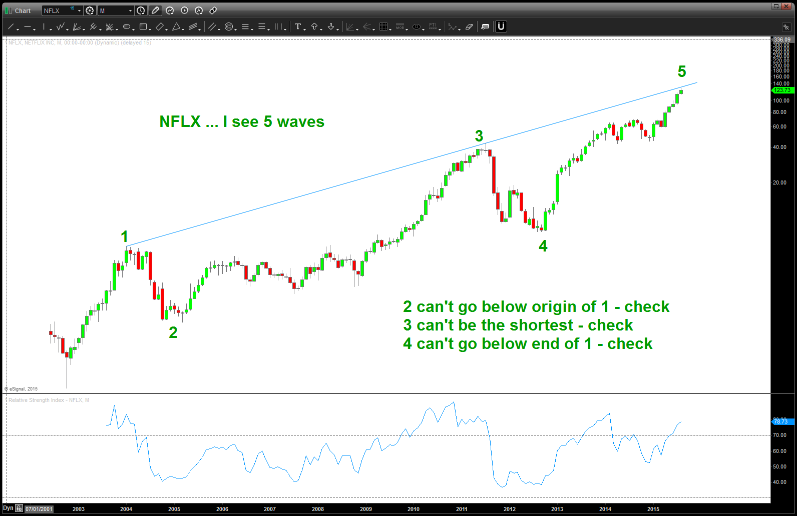
NFLX Monthly
but what’s the next pattern or set of target areas? No flipping idea …nope, not going to do it.
“f’it dude, let’s go bowling”

most important chart to end 2014 .. revisited in August 2015
Posted on August 13, 2015 Leave a Comment
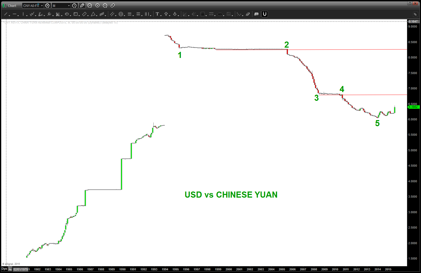
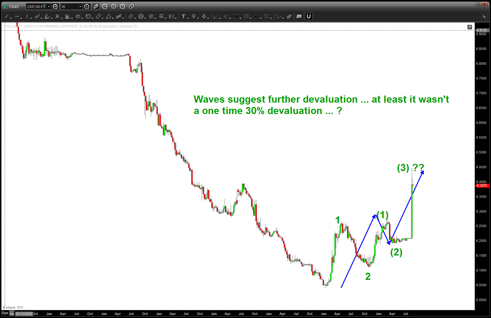
I felt pretty strongly about this one back at the tip of the year. I still do … here’s what I know – FX is the name of the game. Again, you can watch, talk and also make a lot of money trading the $YELP, $GPRO, $GOOGL, $AAPL, etc of the world but the REAL market is the currency market … this past year we have had a very real race to debase. and, quite frankly, it ain’t good folks.
This move by the Chinese was 1) expected and 2) ranks up there as a very big deal … nothing to really watch now, believe they are committed to depreciating their currency also.
One has to ask .. why is the worlds second largest economy taking these measures? Well, of course it’s because all is well and the global economy is doing GREAT! Or, could it be a global sovereign debt crisis and a house of cards?

Folks, there is a major global move occurring in the biggest market in the world – the FX market.
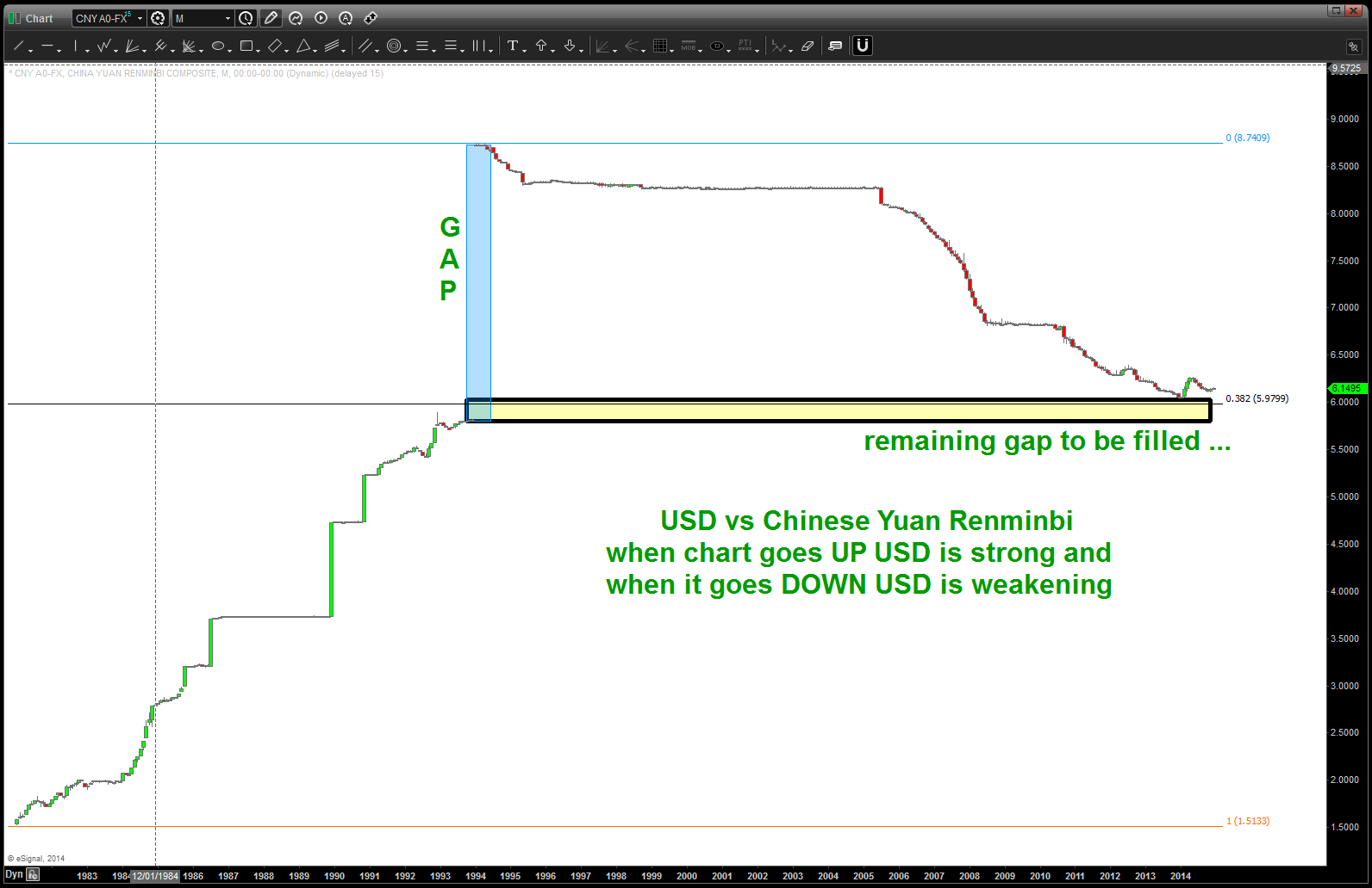
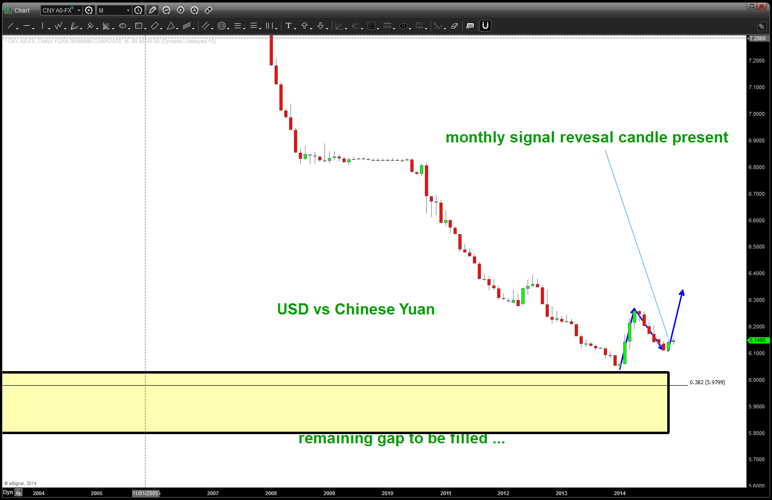
Not only is the YEN,RUBBLE and EURO simply crashing the Chinese Yuan continues to weaken against the USD. This is a big deal and should be watched closely. We’ve been blogging about it for a while (https://bartscharts.com//?s=yuan )
Appears, for now, our pattern has worked and the $$$ has again started to rise …
PATTERN repeat, watch for them at tops and bottoms
Posted on August 13, 2015 Leave a Comment
I’ve blogged a bunch about the power of using technical analysis and ratio analysis. you don’t have to read a 500 page diatribe about the fundamentals (which are important) but you plot A/B and see if it’s going UP or DOWN. UP A is outperforming .. DOWN and A is underperforming. DONE.
so as everyone gets their panties in a knot about the Death Cross (I like to call it the Iron Lotus – actually got a “like” from Blades of Glory on Twitter – how cool is that?), China and the Yuan and a low VIX and let’s see what else … blah f’ing blah. I go to the chart. What is it telling us?
John Murphy – technician extraordinaire – taught us in the CMT program to look for discretionary and staples to give us clues. How do you find clues? do the ratio….
Here it is …
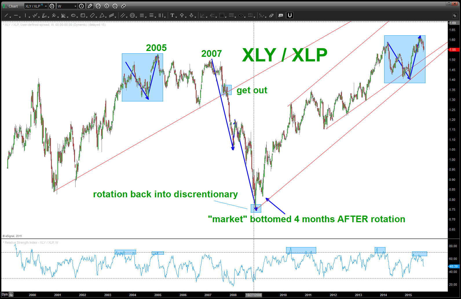
XLY / XLP
what sticks out to me …? we have the SAME PATTERN at the top … but it also took time to finally crack. to the tune of 2-3 years….
I’ve drawn some simple trend lines to watch and if/when they are taken out on a weekly close below then it’s time to look for Will Ferrell’s head on the ice because the Iron Lotus failed (meaning the sharp skate cut his head off … tragic) Take a look at the “get out” portion of the trend line from 2007 time frame. We can see it got tested and then it broke … time to get defensive. Believe that’s a good playbook for now …until tested and broken the band “should” play on ….
here’s the $NYA overlaid .. note the distribution that occurred at the 2007 top.
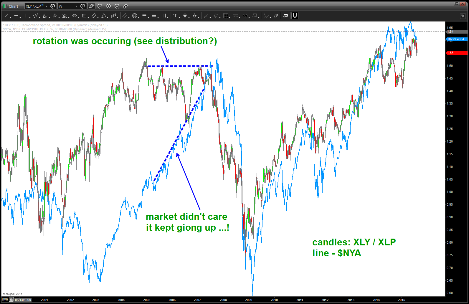
XLY / XLP ratio and $NYA
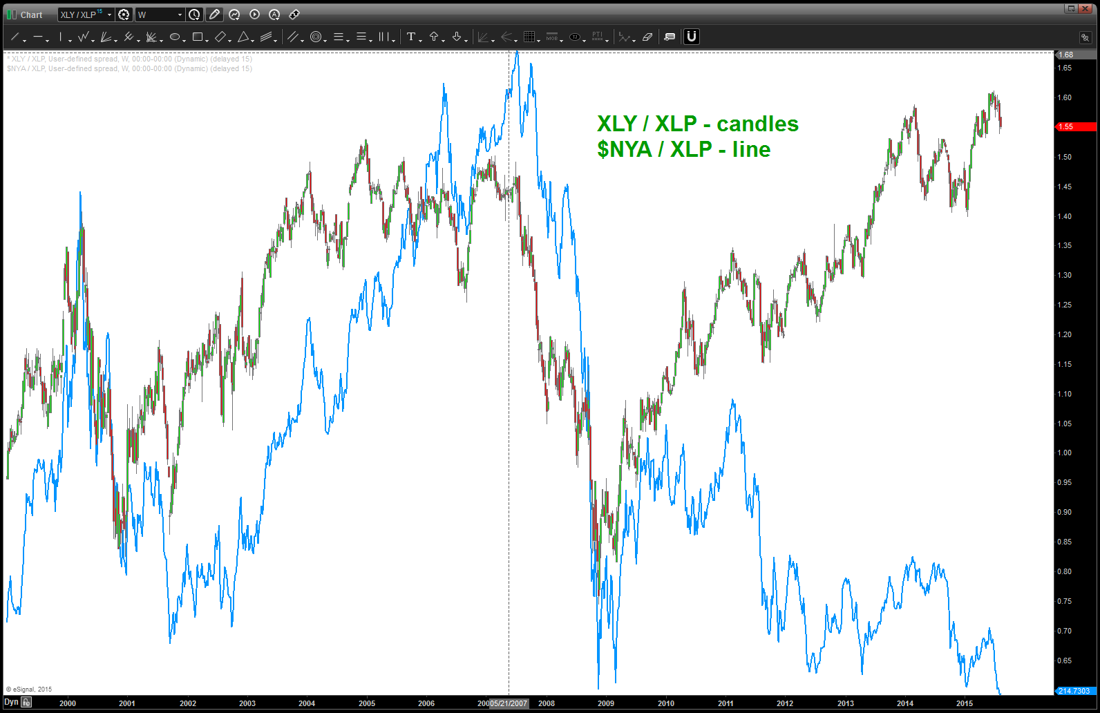
here’s the XLY/XLP ratio w/ the $NYA/XLP overlaid on top of it … why is it important? Well, as you can see, much like the last post: https://bartscharts.com/2015/08/08/bill-and-teds-excellent-adventure-meets-the-matrix-in-two-charts/ we can see that the ratio of the NYA/staples is plumbing all time lows … this is not a very good picture.
so, if the rotation really occurs out of the discretionary’s, believe this ratio will break support and start downhill fast.
so, now we have some trend lines to watch for weakness.
it’s all one big jigsaw puzzle.
rock on, ok?
B
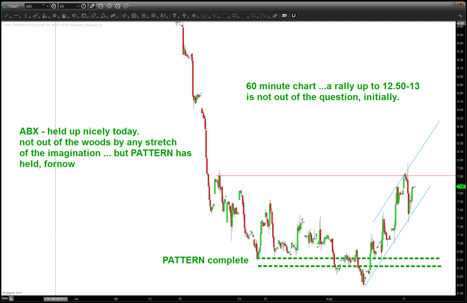
ABX held up nicely, not out of the woods yet
Posted on August 11, 2015 Leave a Comment
today, $ABX held up nicely. looking for a nice bounce from here …
$ABX target hit …
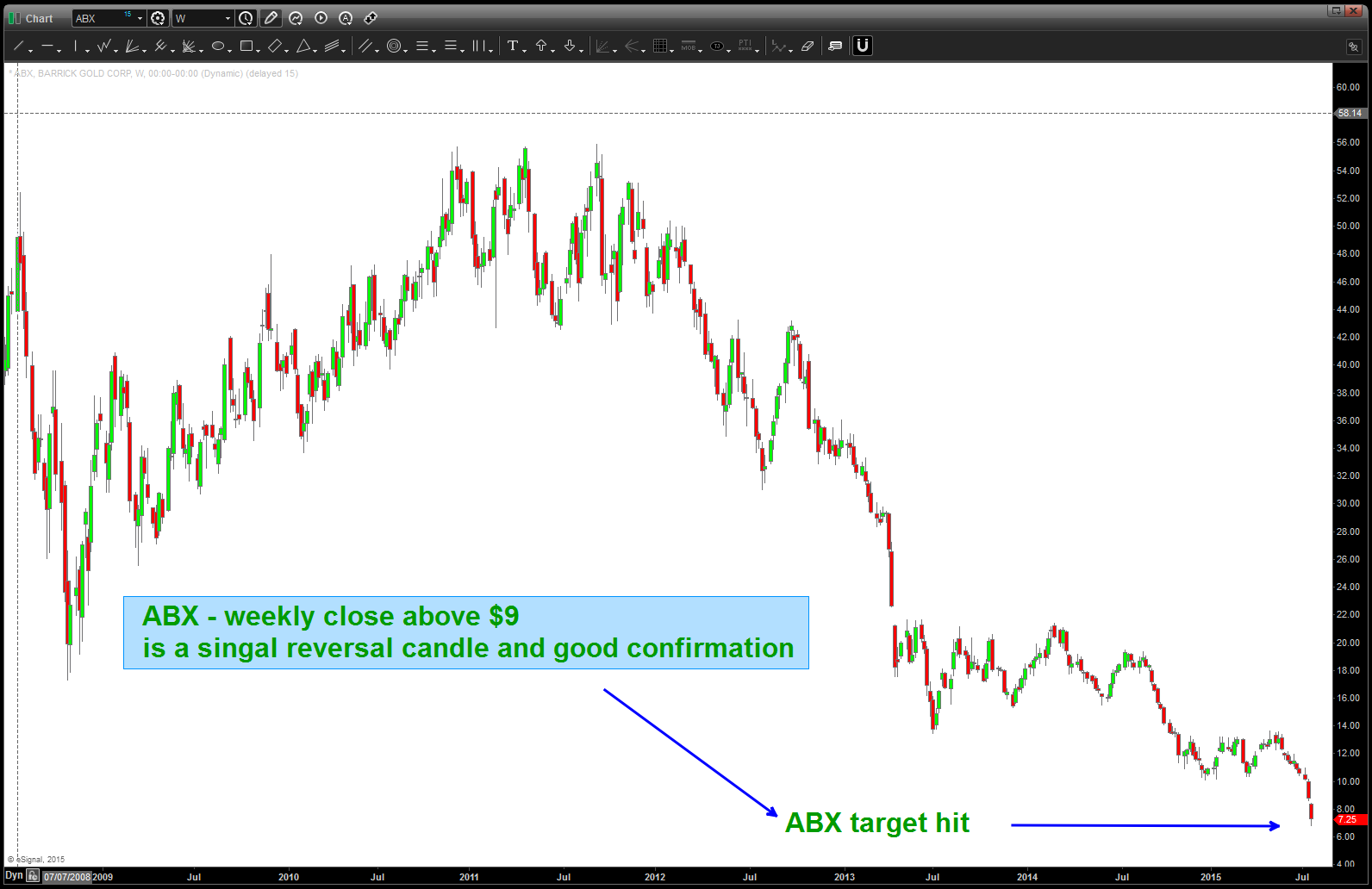
Target Hit …
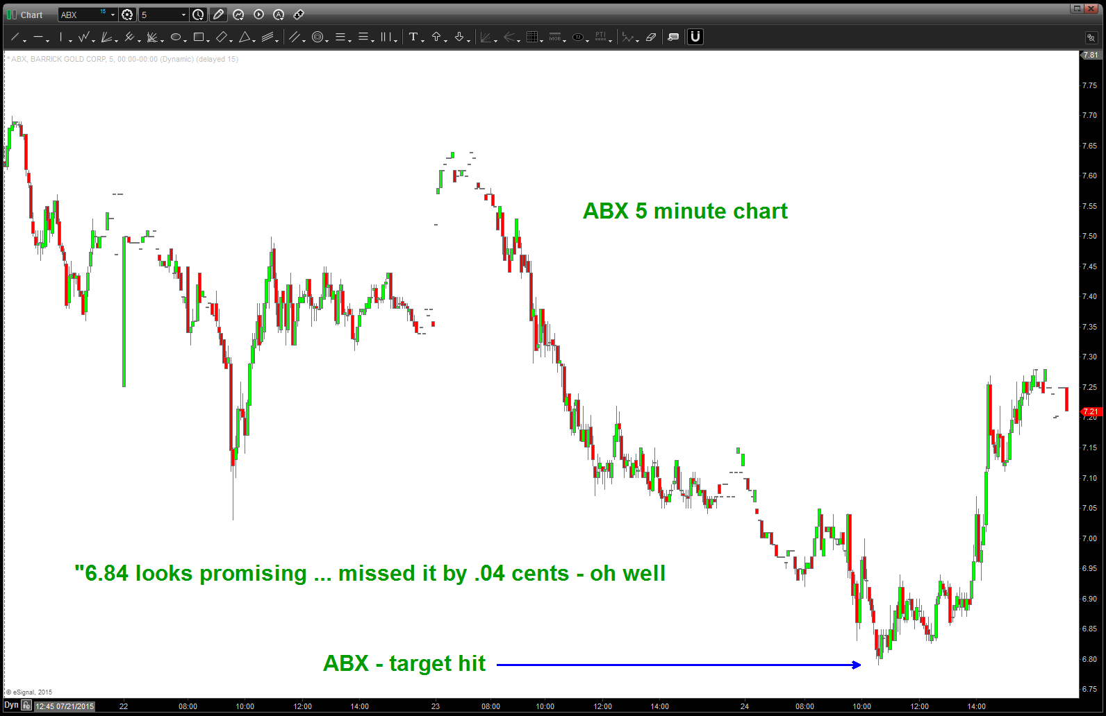
5 minute chart …
“6.84 looks promising”
the press is out and the Gold Bulls are only 13% bullish … the “look and feel” of Gold is that it’s “done” and in a bear market to stay … while stocks like $NFLX, $GOOG, $DIS, $NKE continue their parabolic ascent the “crowd” is pitching out and now it’s time to focus our efforts and sectors that have really been hammered.
Here’s a chart of $ABX. 6.84 sure looks promising.
Thanks for reading.
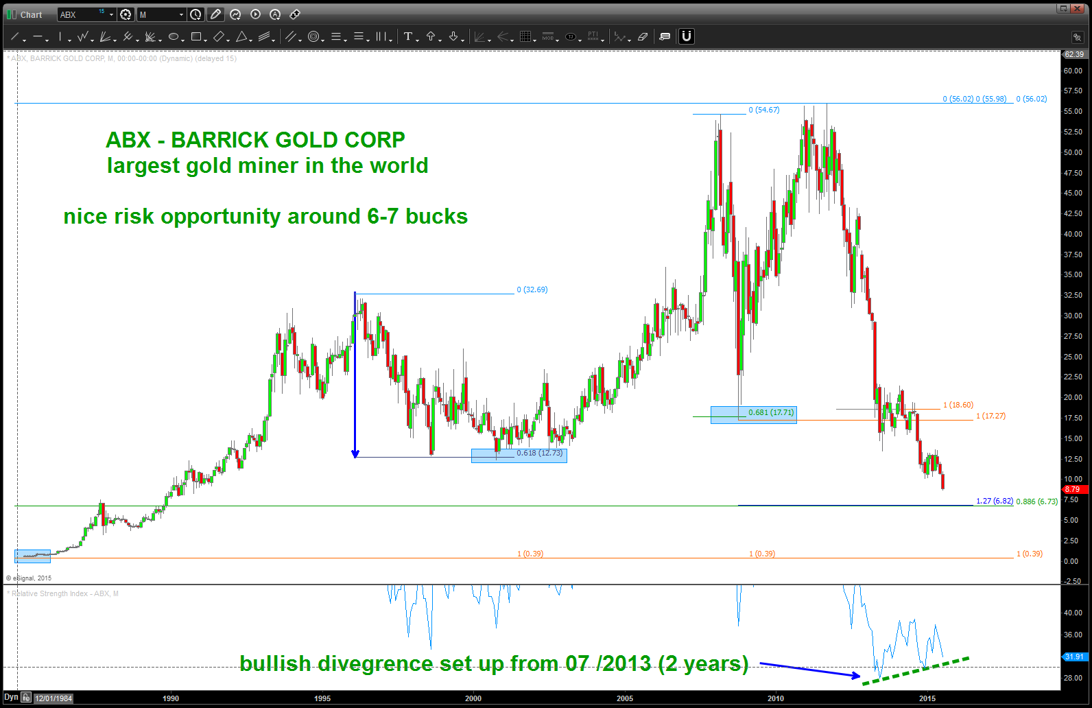
$ABX – NOTE the bullish divergence 2 years in the making
$YHOO should find support …”should”
Posted on August 11, 2015 Leave a Comment
the last time we blogged for @seeitmarket about $YHOO we looked for pattern completion around 48-50. http://www.seeitmarket.com/will-yahoo-stock-top-alibaba-ipo-yhoo-13758/
since the highs we’ve corrected roughly 33 percent in the biggest correction since the 2008 lows.
today, we finished the first pattern BUY since the top and we also have 34 a little lower.
- .382 retracement from 2008 lows w/ a projection (blue arrows) SHOULD be support. we’ll see ….
if your a bull, these are critical levels. also, note on the weekly, the RSI does not show bullish divergence at lows (blue arrows) – it hits the RSI low and then starts back up. we “might” go lower on the RSI but bullish divergence isn’t needed.
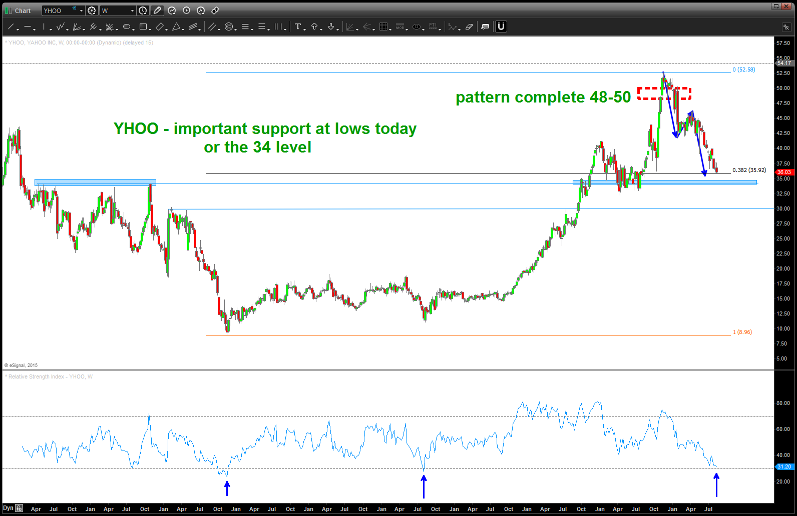
YHOO weekly
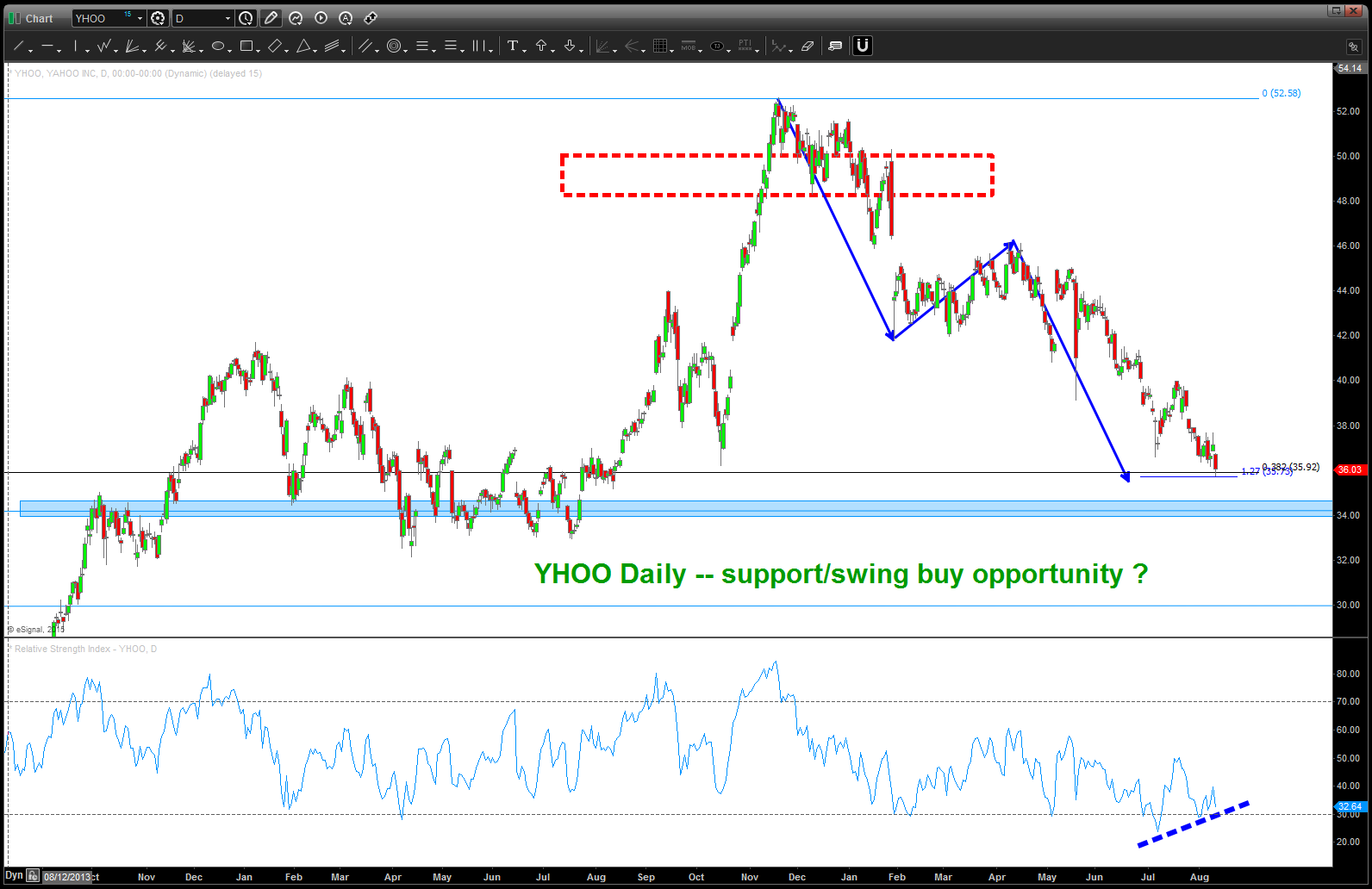
YHOO daily