perhaps draw trend lines like this …?
the earth travels around the sun in 365 days … we all know that.
a circle has 360 degrees. we all know that.
how do you keep track of “where” the sun is w/out the internet, calculators, etc …?
basically how did the ancients do it?
one, potential, was by tracking a planet from a certain starting point in the sky and then calculating how long it took to return. make sense?
so, perhaps, just perhaps, they could tie in music (music of the spheres – pythagoras) and understand the square root aspect of tracking stuff and time?
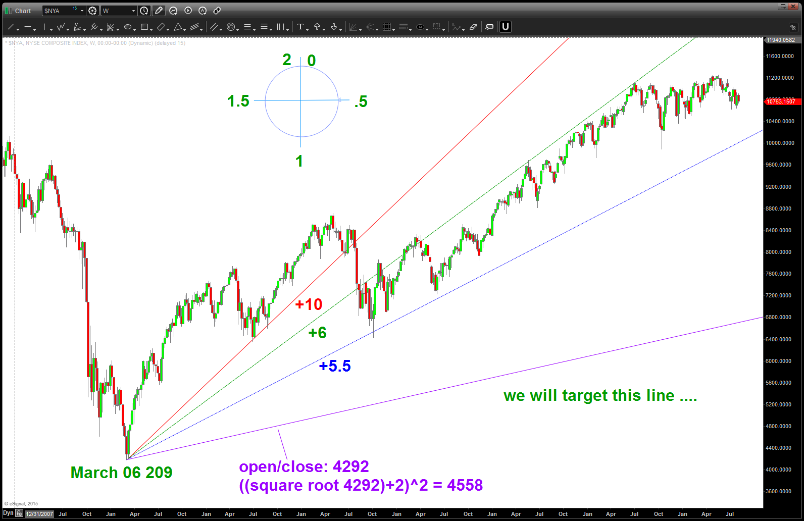
so, perhaps, just perhaps, if we have stock that starts at 4292 then we could “track” it’s progress using the same principles?
in order to get around a circle – numerically – we have to take the square root and then add 2 (if going up) and then resquare it to travel once around the circle.
we also know that we have 4 seasons based on equinoxes and solstice so every 45 degrees might ( 🙂 ) be important so to get to them we would add, say, .25, .5, .75, 1 (we are now half way around the circle) etc. to find those points in PRICE and TIME.
w/ this knowledge we “should” be able to draw trend lines that are harmonic and provide a road map of the journey up and down.
just did this w/ the NYSE Composite Index …one thing I didn’t do is connect trend lines and then calculate. No, I just took my calculator and did this:
- square root 4292
- +2=67.51
- resquare: 4558
- go out to March 06, 2010 and plot that price (purple line) – one year after the low (remember the sun above?)
- did it all the way up to 10
now we have the trend lines that are basically showing us the way … sure looks like the $NYA wants to go tag the blue trendline … another 300 points or so will give us a good feel. here’s the chart
why are these trend lines important …? Well, let’s take the TOPS and BOTTOMS and horizontally move over to touch them and then go up or down to look and see what happens …
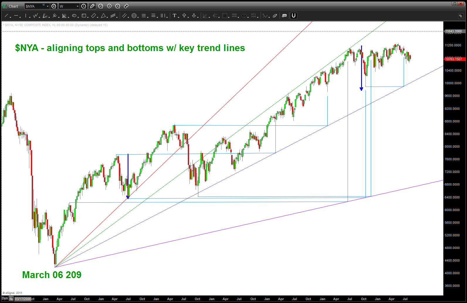
now remember, we need to be patient and realize their could be some slippage … this is a weekly chart. BUT, what we can know is that important tops and bottoms are ALWAYS harmonically related to the future tops and bottoms and by simply taking the time to draw these type of trend lines and then look for synergy between the highs/lows that are intersecting them and then moving up or down we find “roadmaps” to manage risk.
let me ask you … if you look at the first top after the march 06 low and then move horizontally across to intersect the purple line and then move UP into the present time do you think it’s by chance that we are now finding resistance in TIME …..?
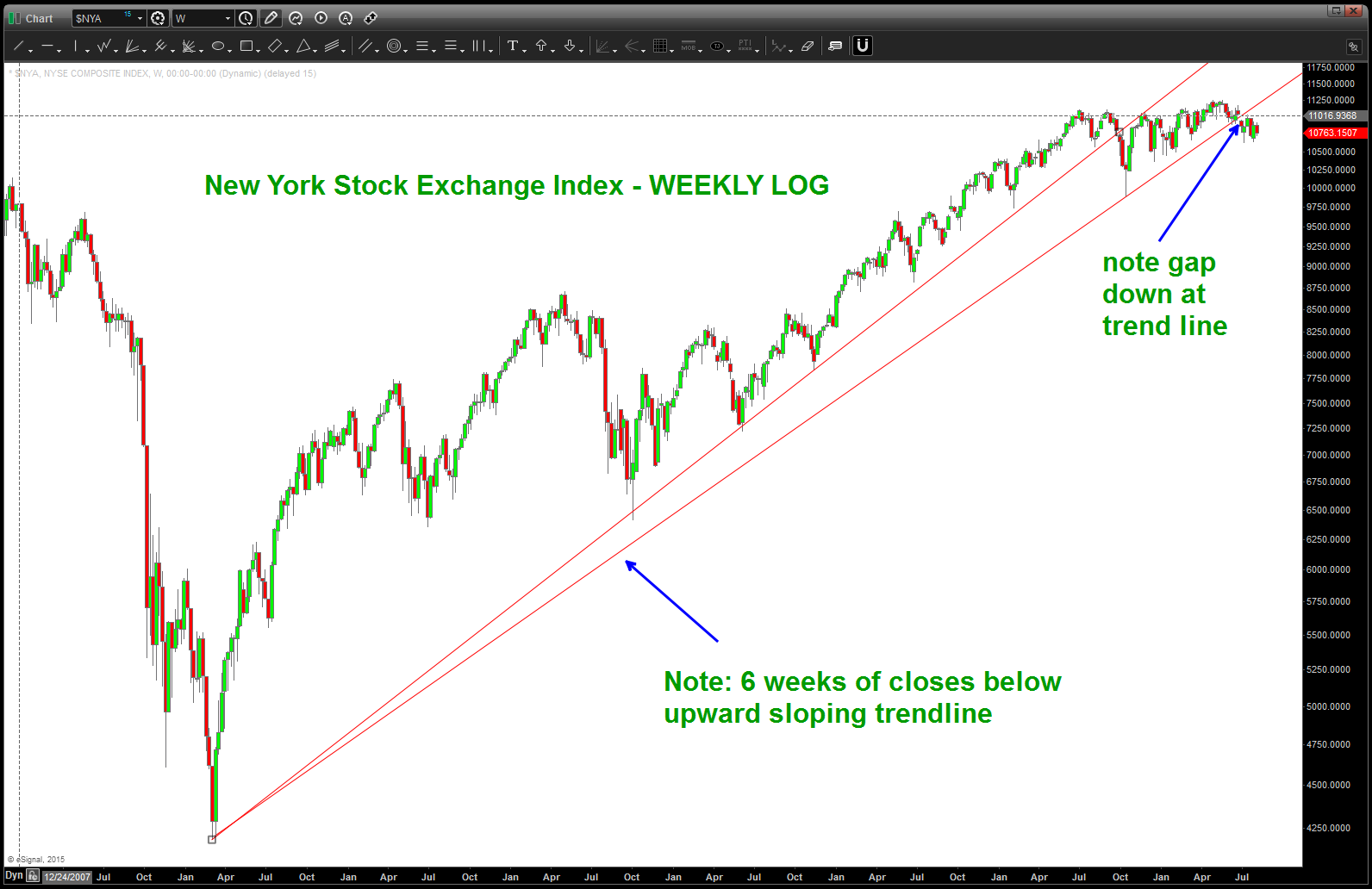
here’s the LOG of the $NYA – the face that we are below, on a 6 week closing basis, doesn’t make me very confident UP in this cards near term. need to see us regain that trend line in a hurry …