Target hit on Barrick Gold ($ABX)
Posted on July 25, 2015 1 Comment
$ABX target hit …
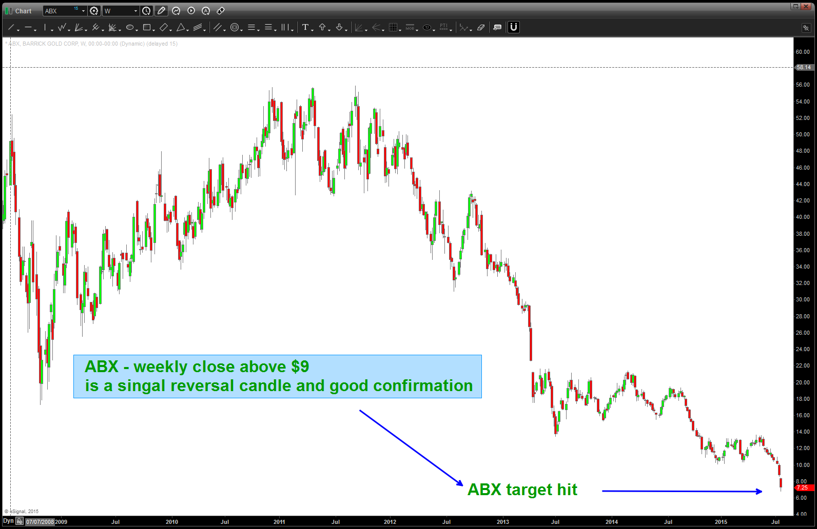
Target Hit …
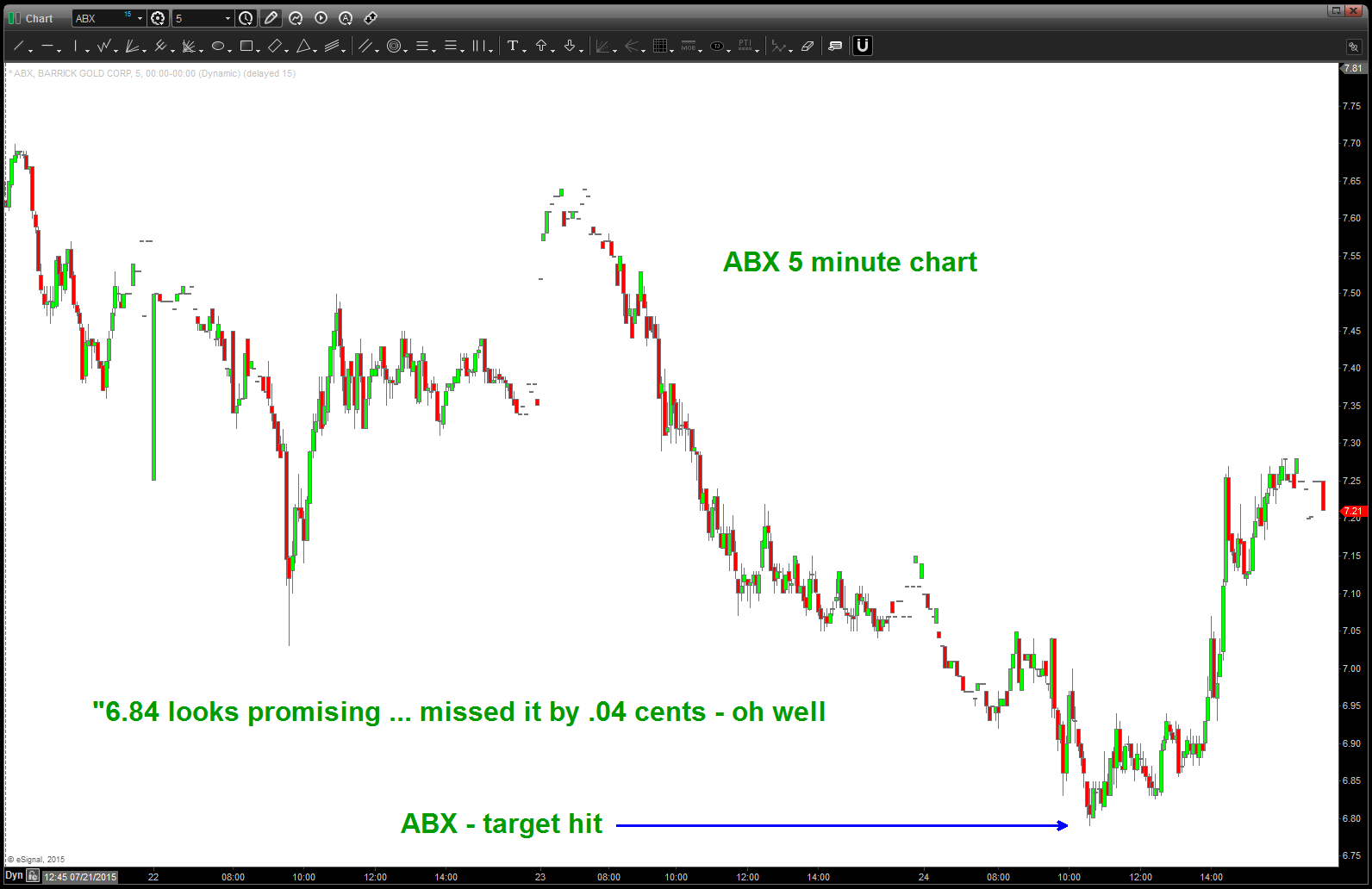
5 minute chart …
“6.84 looks promising”
the press is out and the Gold Bulls are only 13% bullish … the “look and feel” of Gold is that it’s “done” and in a bear market to stay … while stocks like $NFLX, $GOOG, $DIS, $NKE continue their parabolic ascent the “crowd” is pitching out and now it’s time to focus our efforts and sectors that have really been hammered.
Here’s a chart of $ABX. 6.84 sure looks promising.
Thanks for reading.
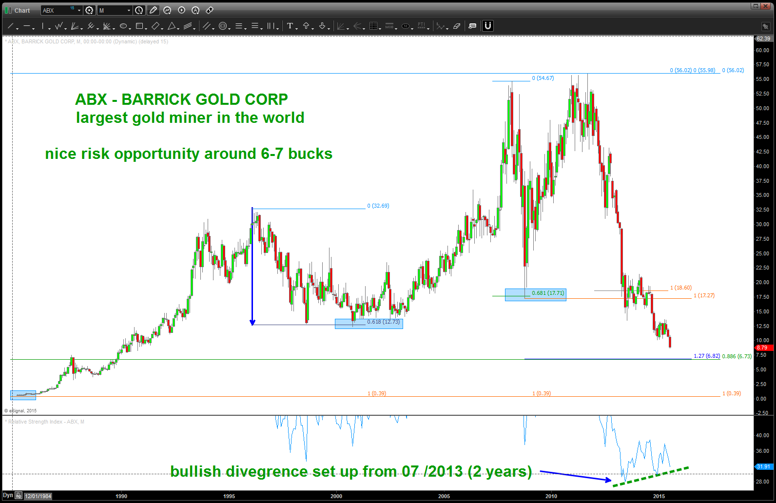
$ABX – NOTE the bullish divergence 2 years in the making
meanwhile, over in China ….
Posted on July 25, 2015 Leave a Comment
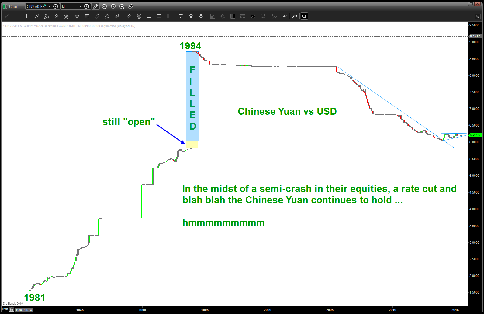
Yuan … no change but does appear ready to move.
What is the Chinese Central Bank up to …?

Per Bloomberg.com a couple hours ago:
China’s one-year interest-rate swaps completed the biggest weekly drop in four months after the central bank cut borrowing costs and stopped draining funds in open-market operations.
The People’s Bank of China reduced its benchmark rates for the first time since 2012 a week ago, supporting growth in an economy set for the slowest full-year expansion in two decades. Yesterday’s auction window was the first since July that the monetary authority didn’t offer repurchase agreements at, and maturing contracts added a net 35 billion yuan ($5.7 billion) to the financial system this week, the most since August.
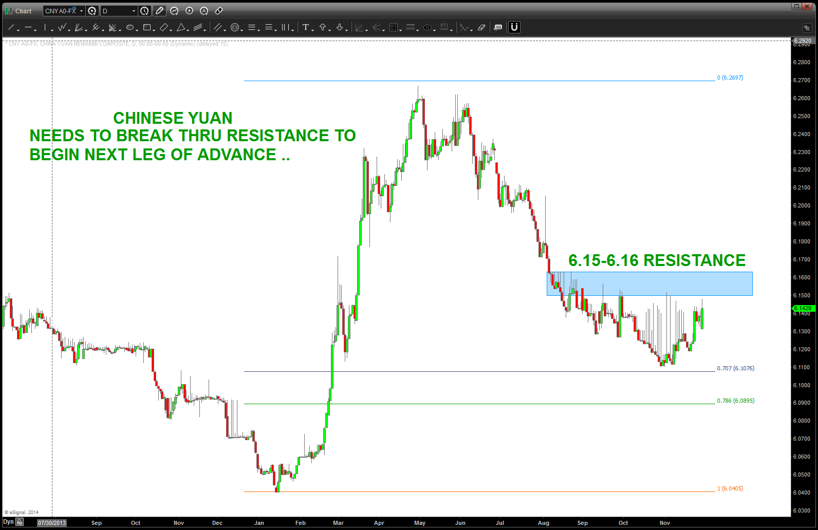
Chinese Yuan Pattern Complete
watch this … closely.
YELP BUY PATTERN coming into play …
Posted on July 19, 2015 Leave a Comment
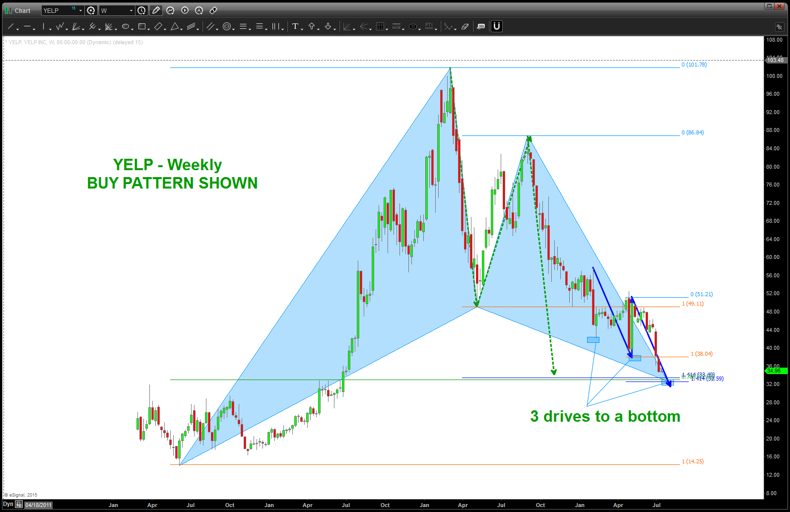
YELP – long term BUY PATTERN and 3 drives to a bottom … all coming into the zone
Barrick Gold ($ABX)
Posted on July 19, 2015 1 Comment
the press is out and the Gold Bulls are only 13% bullish … the “look and feel” of Gold is that it’s “done” and in a bear market to stay … while stocks like $NFLX, $GOOG, $DIS, $NKE continue their parabolic ascent the “crowd” is pitching out and now it’s time to focus our efforts and sectors that have really been hammered.
Here’s a chart of $ABX. 6.84 sure looks promising.
Thanks for reading.
$ABX – NOTE the bullish divergence 2 years in the making
Using ratio analysis to look for inflection points …
Posted on July 16, 2015 Leave a Comment
I like ratio analysis .. it shows rotation, strength vs weakness and a bunch of stuff.
Greece and Eurozone have been all the rage and, well, rightly so – I guess.
But I’m trying to tune all that out and just draw some pictures.
Here’s the deal .. when the DAX underperforms the NYA (the candles go down) then the EURO bottoms and goes UP against the dollar (red line)
So, we just finished a SELL PATTERN of RELATIVE STRENGTH of the DAX vs NYA. So, the DAX should underperform and, if 2015 is any guide, then the EURO should bottom and start up for a tradeable long.
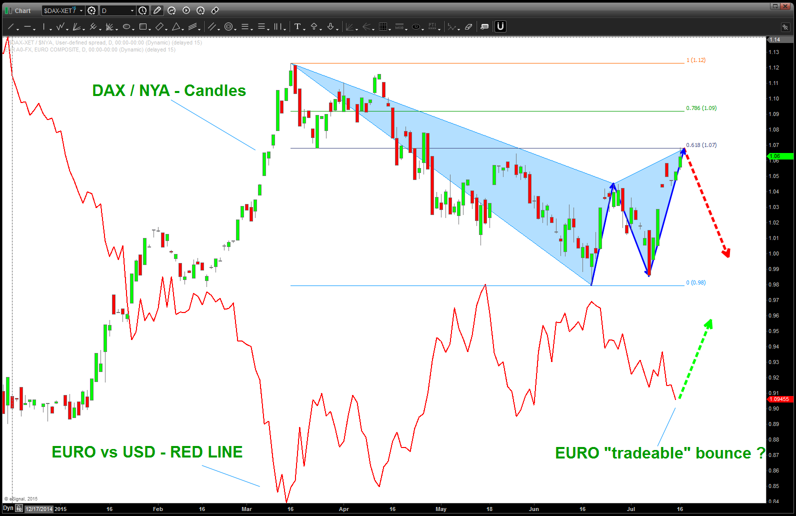
candles is the relative strength of the DAX vs NYA. the line is the EURO vs USD. NOTE the inverse relationship …
why we should care about Australia redux from November 2014
Posted on July 2, 2015 Leave a Comment
the All Ordinaries has gone up and hit the target shown below and, while the .786 retracement target has not been hit, it appears a top could be in place. Over the coming weeks/days watch this one closely for an opportunity to trade a pattern to the short side.
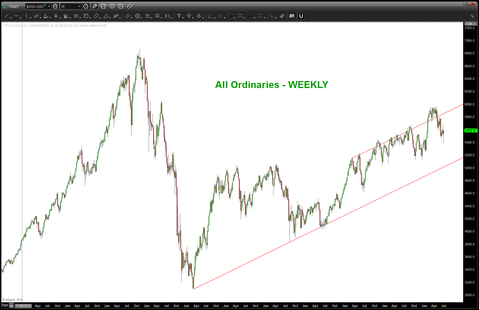
All Ordinaries – weekly w/ target area hit
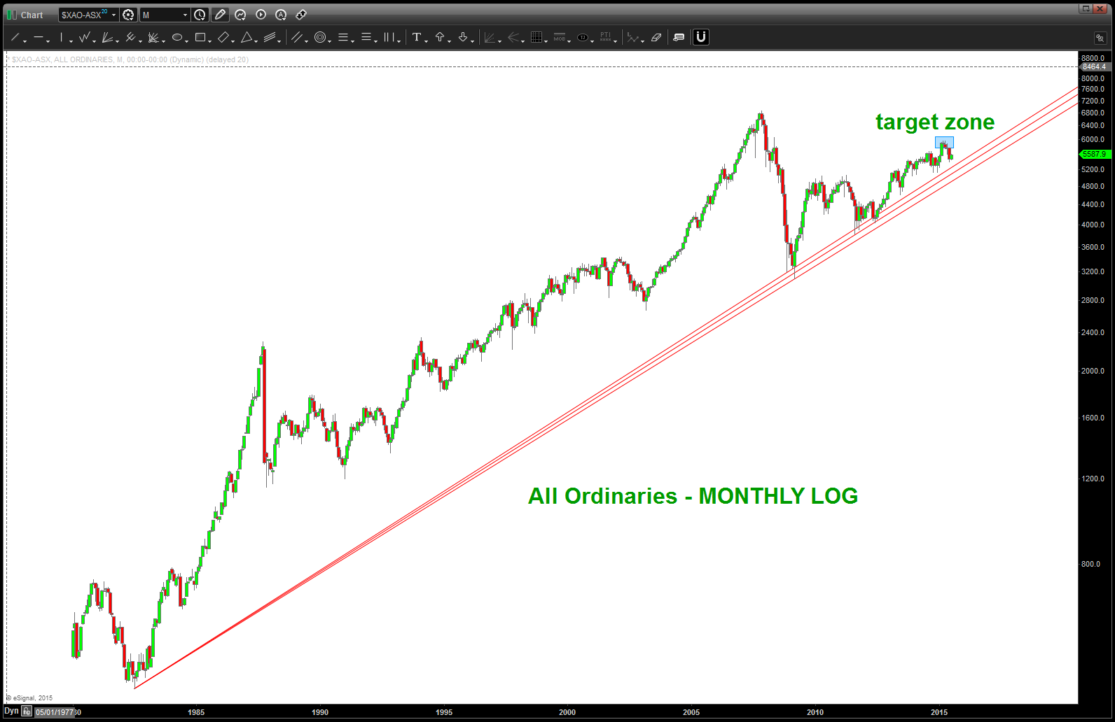
All Ordinaries w/ LOG trend line – watch a weekly or monthly close below
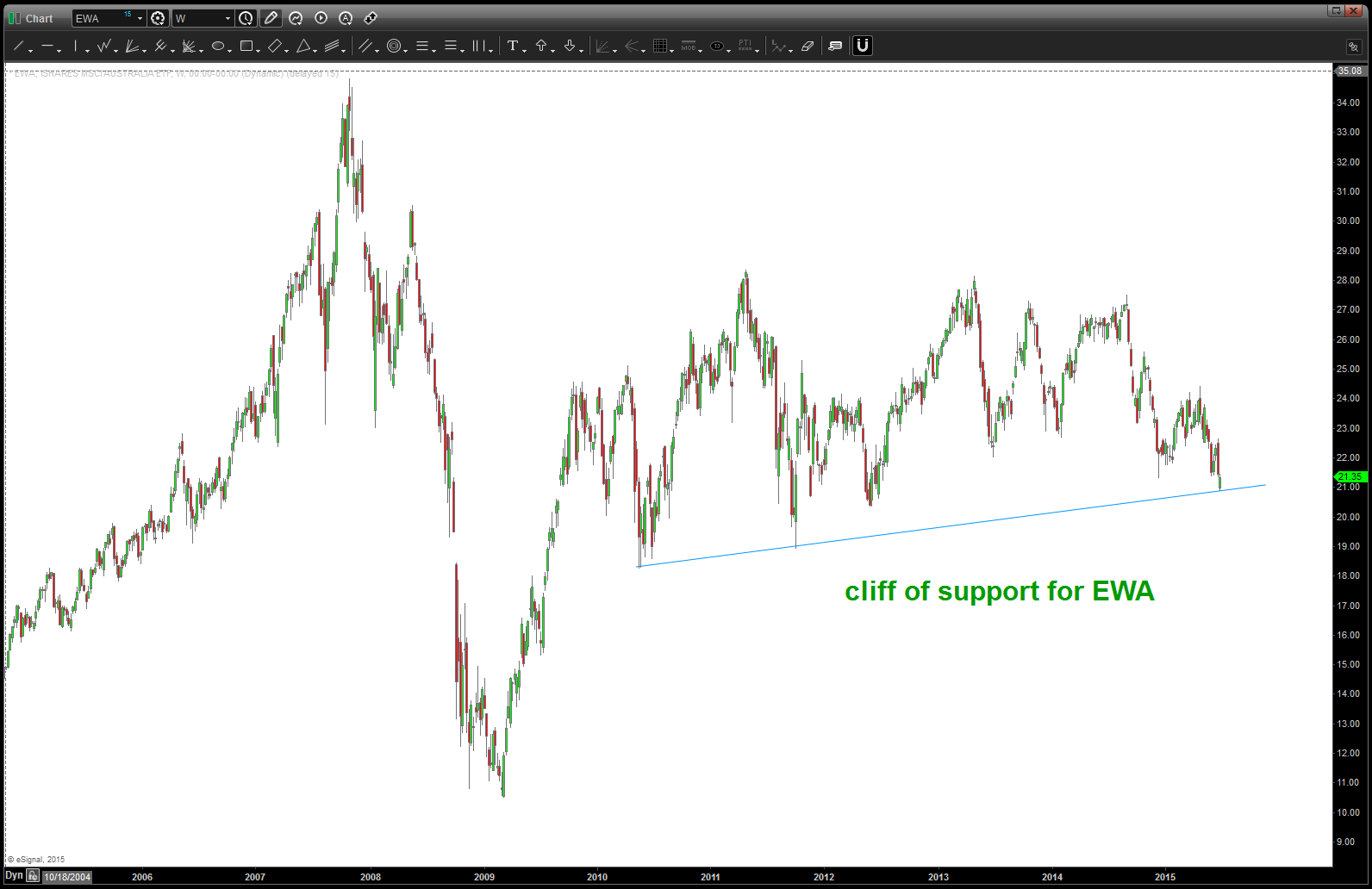
EWA ETF for Australia is sitting on a cliff of support
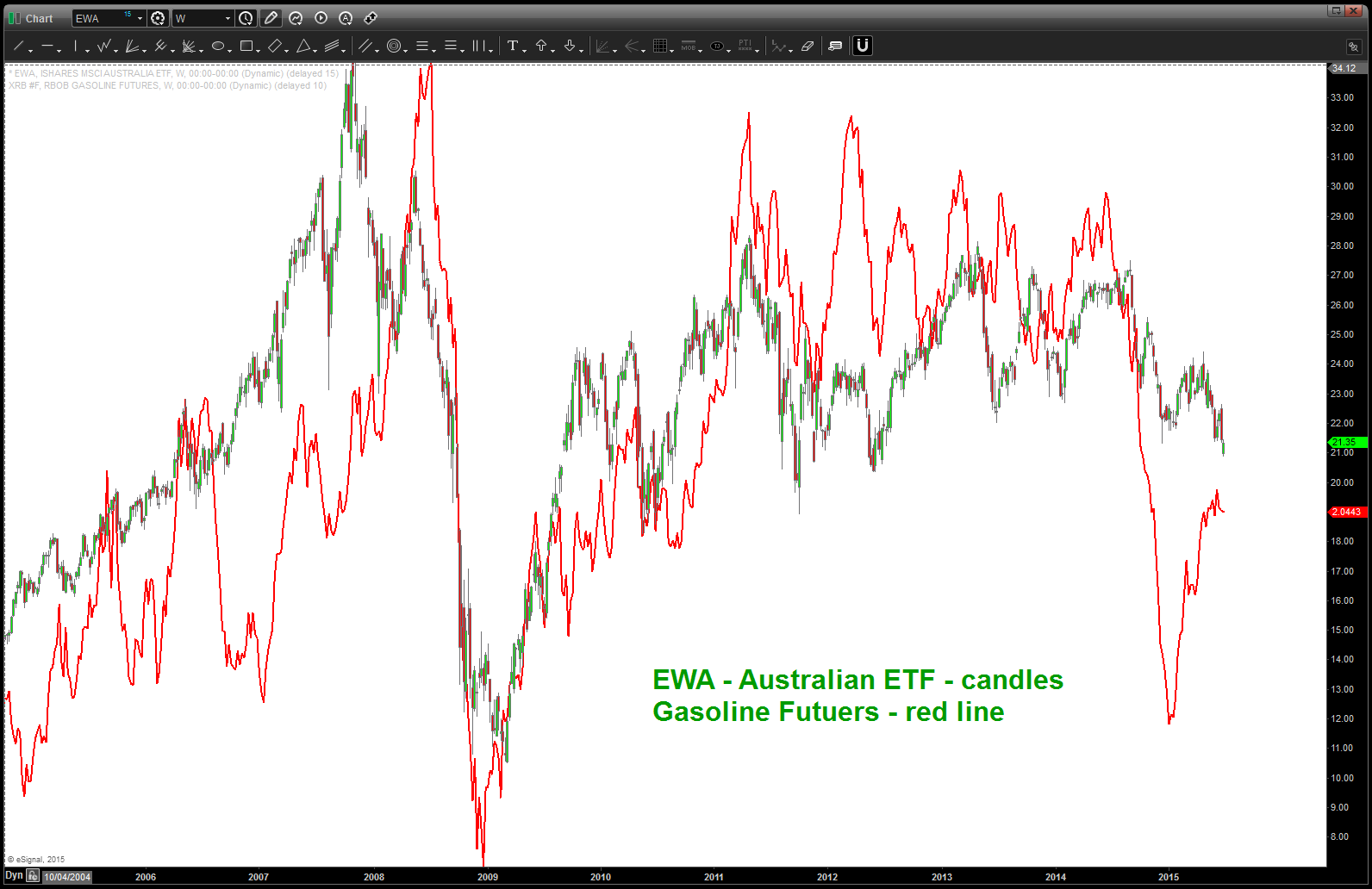
Gasoline Futures broke badly but EWA held up. Gas has rallied but EWA has not .. watch gasoline for next directional move of EWA
November 2014:
the All ordinaries never hit the target SELL pattern and this PATTERN is still valid. the zone of 5760-5835 is the key w/ the old realiable .786 retrace up at 6060 the highest it “should” go if the SELL PATTERN is valid. As you know we NEVER know which one works or doesn’t …
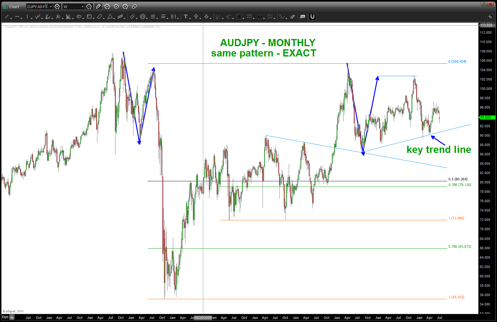
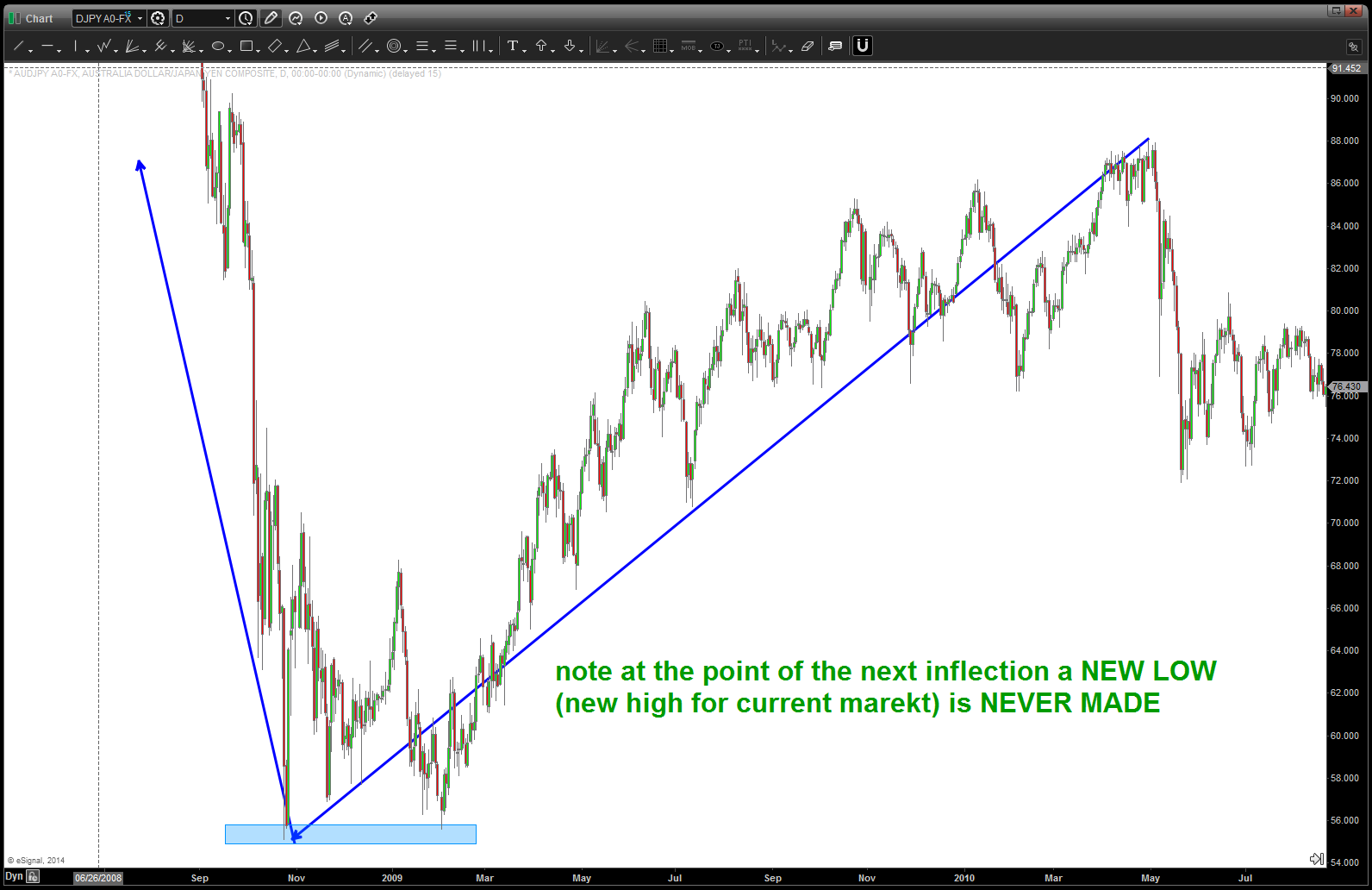
what makes this particularly relevant, in my HUMBLED opinion is it’s correlation to the AUDJPY and the VERY interesting PATTERN that is appearing w/ regards to the AUDJPY. For a review, here is the pattern on the All Ordinaries:
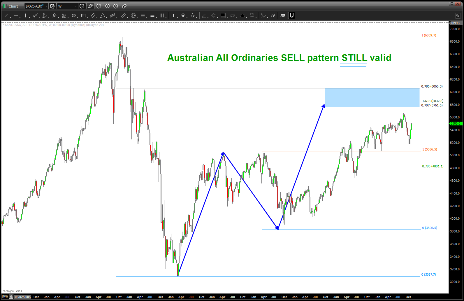
All Ordinaries SELL PATTERN
here’s the importance of the AUDJPY and the All Ordinaries …
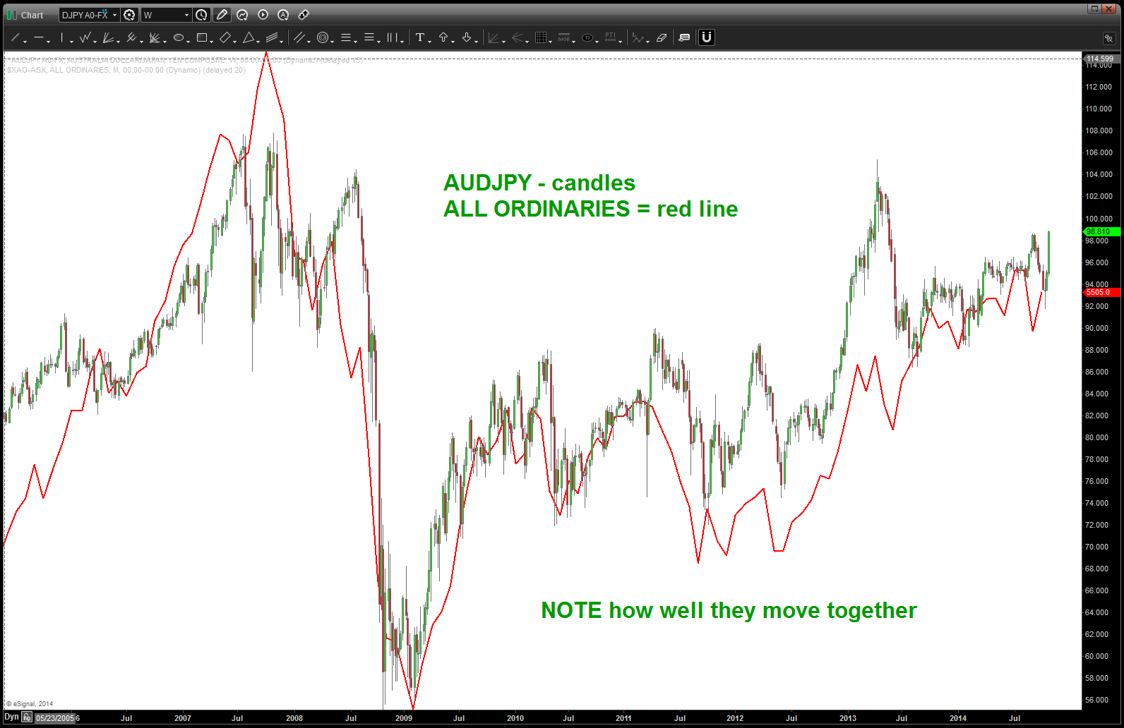
AUD vs USD and All Ordinaries
so we have a SELL PATTERN on the All Ordinaries so that “should” cause the YEN to strengthen against the AUSSIE .. ONE PERCENT OPPOSITE OF THE INTERVENTION WHICH TOOK PLACE ON FRIDAY! as you well know, I know NOTHING about the fundamentals behind this move. And I don’t care … but IF the All Ordinaries SELL works THEN historically speaking the PATTERNS and CHARTS tell us the YEN will strengthen against the Aussie …here’s the charts:
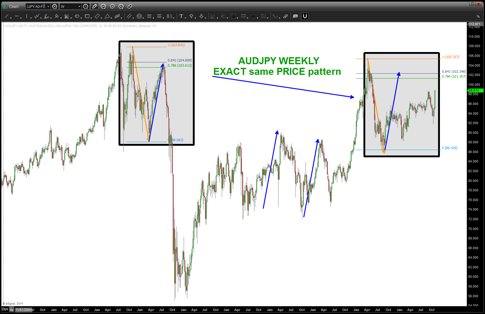
ADUJPY note same PATTERN
look at this MIRROR IMAGE foldback …
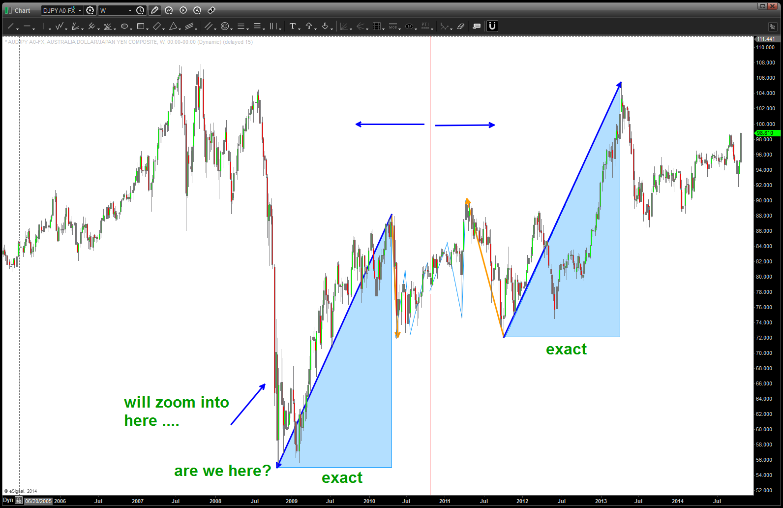
mirror image foldback
mirror image foldback point 2009
here’s the PATTERN, again, on the AUDJPY …
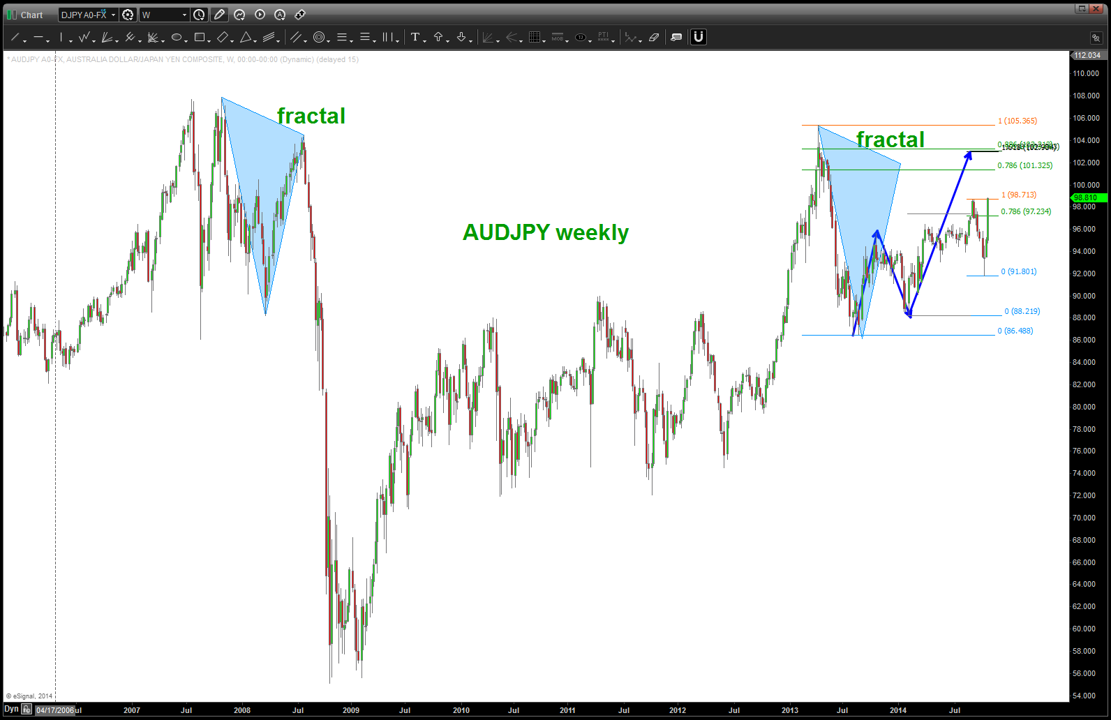
AUDJPY pattern
Palladium, NASDAQ and AAPLE update …over @seeitmarket
Posted on June 29, 2015 Leave a Comment
Palladium Correlations: Flashing Caution For Apple (AAPL) And The Nasdaq?
enjoy and would love your feedback …
$ITB Home Construction Index – SELL PATTERN complete
Posted on June 28, 2015 Leave a Comment

Home Construction ETF WEEKLY
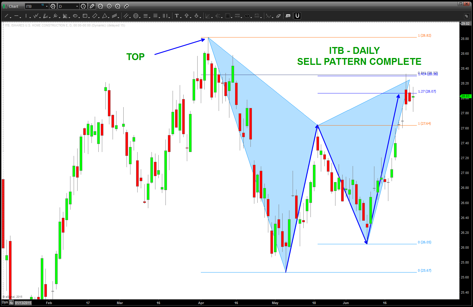
Daily GARTLEY SELL pattern on Home Cosntruction index
also, note how correlated the $ITB is with $XLF.
did a blog post for @seeitmarket on the financials: http://www.seeitmarket.com/whats-next-for-the-financial-sector-etf-xlf-14447/
watch this pattern – closely.
good weekend to you.
B
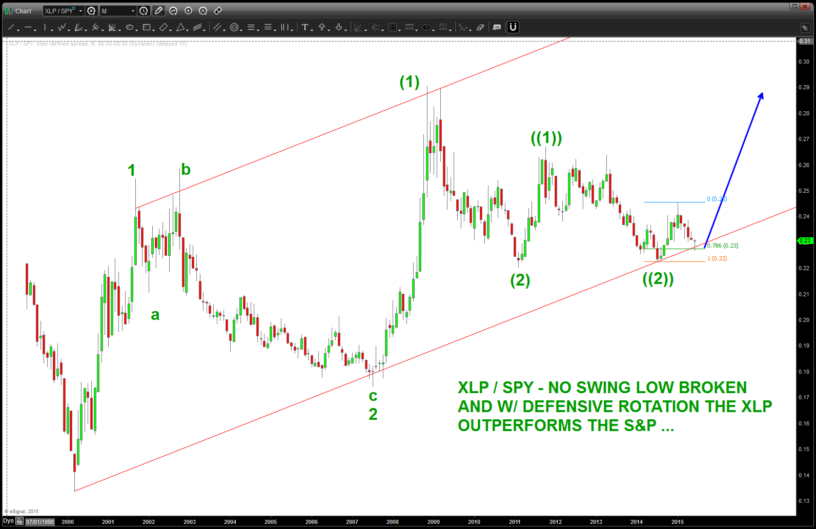
revisiting the XLP/SPX ratio … AGAIN in June 2015
Posted on June 27, 2015 1 Comment
time for another update … take note, HIGHER LOWS in the ratio and it bounced off the .786 retracement w/ a nice MONTHLY hammer. It sure appears this ratio is about to go up, which should put pressure on the stock market to move higher.
this has taken a LONG time to itself out ….
potential count for the ratio – note the higher bottoms since 2009.
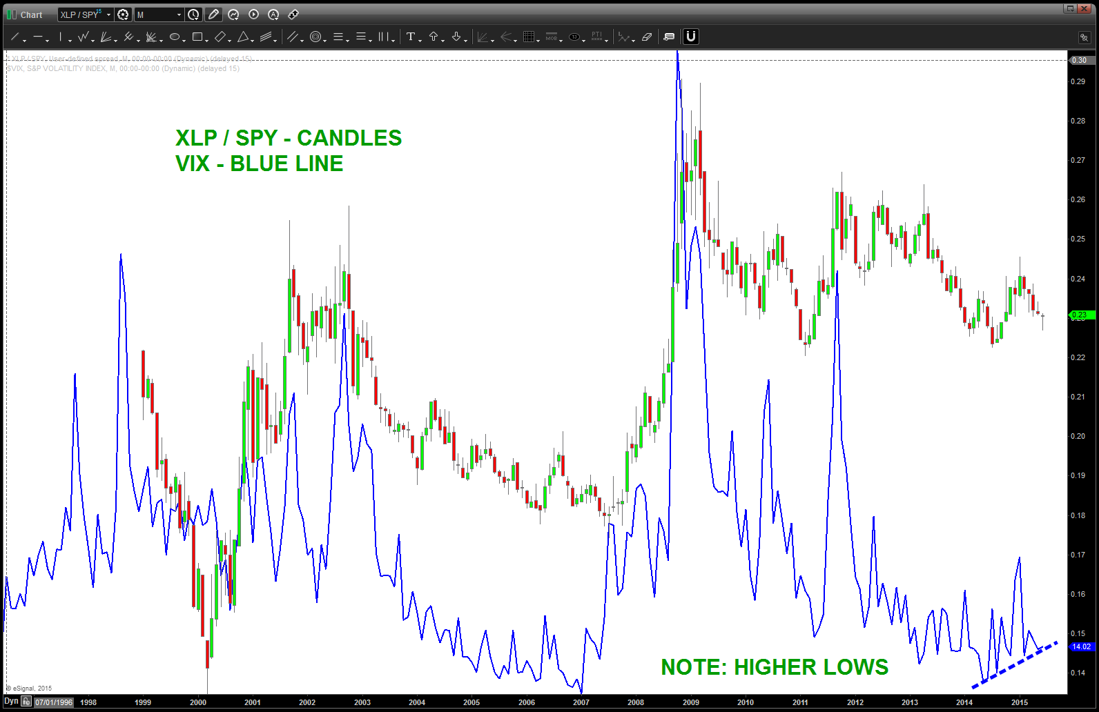
inflection points in the ratio correspond to movements i the VIX. NOTE THE HIGHER BOTTOMS IN THE VIX
one last, below, showing the importance of this ratio and the monstrous divergence present.
- w/ the Equity market soaring to new highs the RATIO should have been falling like a stone. IT HAS NOT….again, in fact, it has made higher lows. This is a very important sector rotation development that needs to be paid attention to closely. It WILL resolve itself.
EVERY HIGH and LOW in the equity market has corresponded to an inflection in the ratio….
folks, bringing this up, again, because this divergence is MONSTROUS.
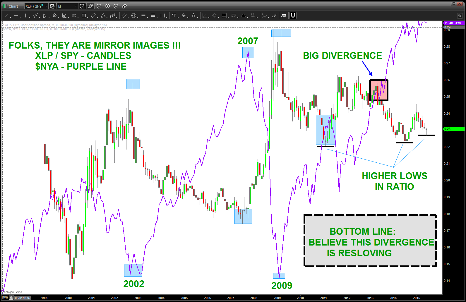
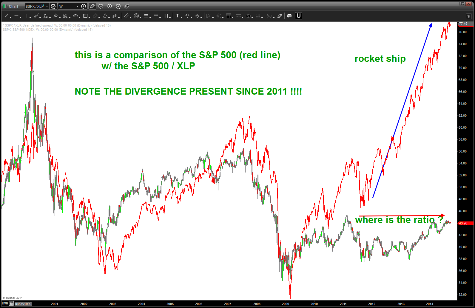
in order to show the divergence and how something is “not quite right in toon town” I’ve actually inverted the ratio to show the S&P 500 on top this time. t
the only reason is it shows the amazing divergence present .. when you look at the chart below notice the perfect synchronicity between the S&P500 and the S&P500/XLP. but notice around 2011, the dance breaks up … that’s a big deal to me and while it’s true you obviously can’t fight the fed and it’s different this time what I believe it tells us is the “smart money” has stayed in staples or haven’t jumped into this amazing bull market as much as anyone thinks.
notice the divergence!
now, here’s the same ratio but this time we have the STAPLES has the numerator … note, when this ratio BOTTOMS the S&P 500 TOPS and when this ratio TOPS the S&P 500 bottoms. EXACTLY … the theory is the institutions move in/out of “defensive” names during times of volatility so we expect the relative strength of the XLP’s to increase during bear markets / sell-offs (the ratio goes up) and decrease during bull markets/rallies (the ratio goes down)
the ratio HAS NOT GONE DOWN during the past 2 year rally phase … tells me the institutions have kept their powder dry.
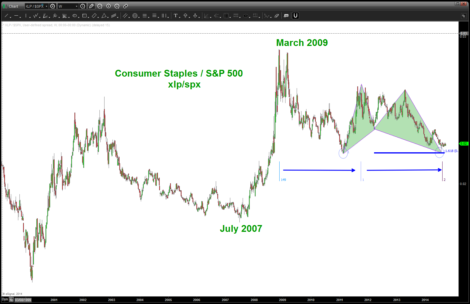
XLP / SPX – note divergence and NO NEW LOWS on the ration ….
just a matter of TIME …
