is it LIVE or is it MEMOREX – what is going on w/ fixed income?
Posted on August 10, 2015 1 Comment
great commercial w/ that dude sitting in his chair …
one of the things that I’ve been watching amidst the “noise” (yes, noise) of the talking head pundits saying “rates this and rates that and rates are xxxxx” is, simply, the Fed Funds Interest Rate Futures. In past posts we have successfully captured swings in the fixed income market via ZB #F, $RYJUX, $IRX, $TBT, $TLT. they have been swings w/ a backdrop. What do I mean? Well, in the back of mind, I’ve been asking myself – “is this the one or is it more of the same?”
Essentially, is it “real” or is it “memorex” …. have the bonds finally “topped” and are rates going higher?
here’s some past blogs:
- http://www.seeitmarket.com/30-year-treasury-bond-study-bull-market-13842/
- https://bartscharts.com/2014/02/08/fixed-income-pattern-and-october-1987/
- http://www.seeitmarket.com/treasury-bond-etf-tlt-nearing-upside-trading-targets-14647/
- http://www.seeitmarket.com/20-year-treasury-bond-tlt-nearing-price-support-target-14375/
here’s what I wrote a year ago …and the chart to accompany it:
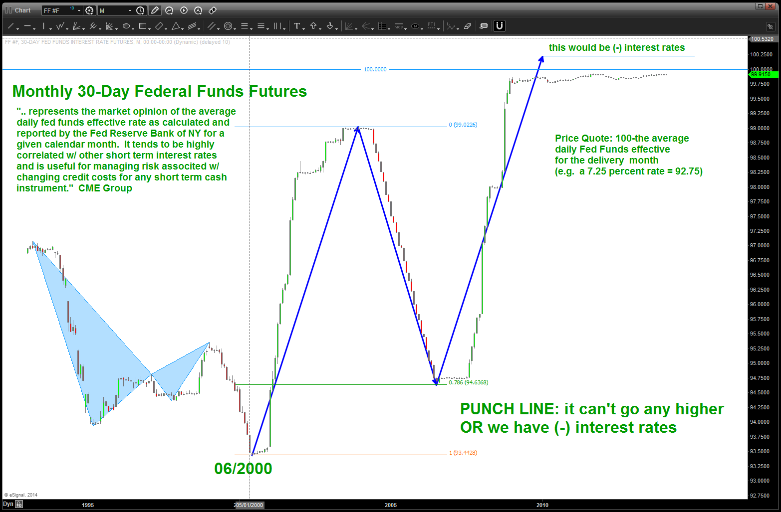
“BUT for all intensive purposes, it can’t go any higher. It really hasn’t budged, which makes sense. So, if you don’t like playing the LONG side of RATES down here at these levels THEN monitor the Fed Funds for a breakdown. Believe it will be a big move to the downside, ultimately, but will be a nice confirmation of a generational low in interest rates has had it’s day and the “trade of our lifetime” to go LONG RATES is at hand.”
So, what has me “spooked?” Check out this breakdown that occurred last week in the FF#F …
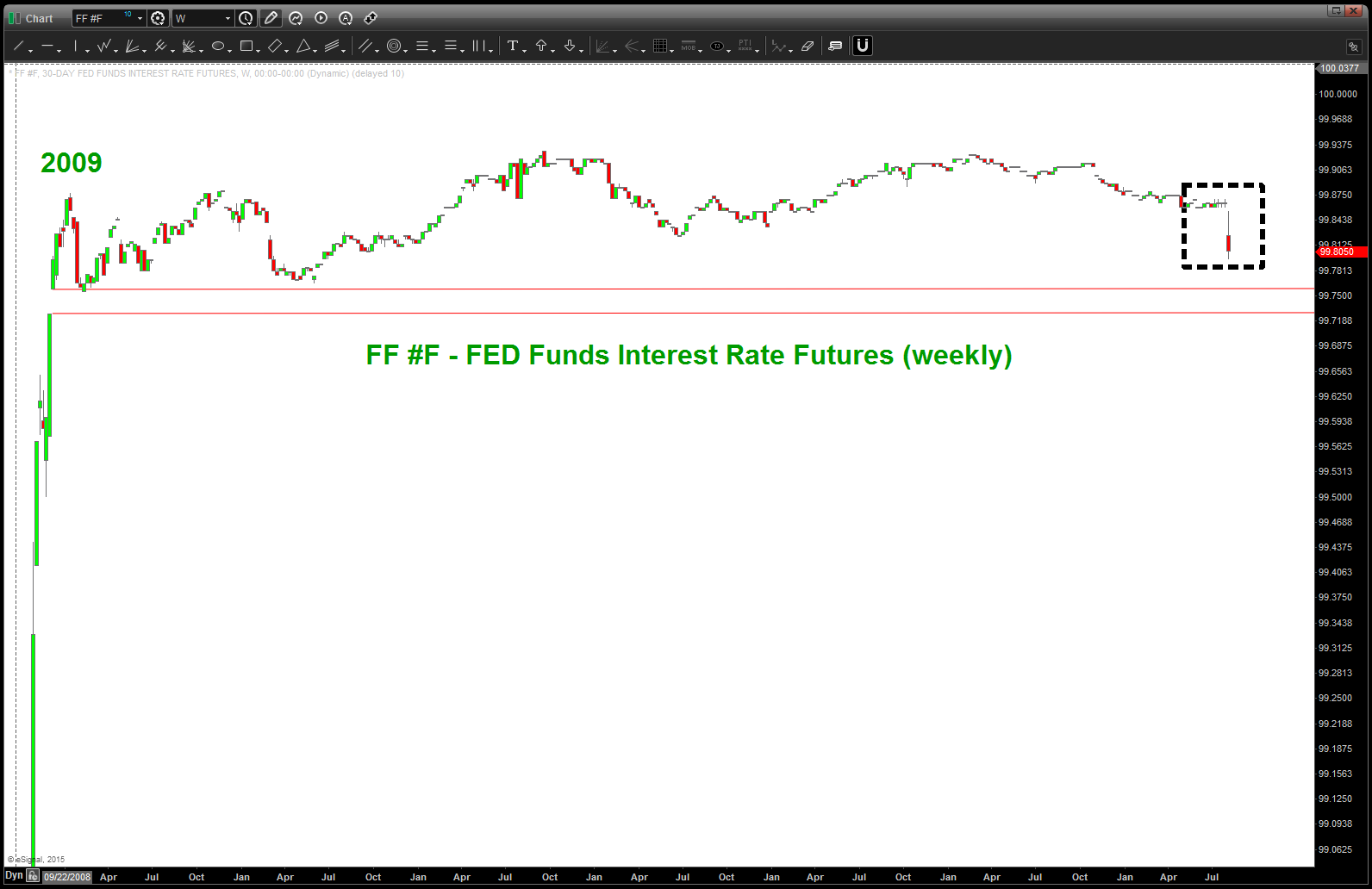
is this the first sign of a breakdown or more of the same? Is it LIVE or is it MEMOREX. WATCH closely!
folks, it could be a “breakdown” into the gap and support is found on top of the “open window” and it meanders back and forth into the abyss of low rates. that 100% could happen … I don’t know. What I “see” (not believe) is an early indication that 1) this is a big candle and 2) it gapped down and more than likely (look at the past gap downs) it will target the lower end of the range. IF we close on a weekly basis below that range then get ready to rumble as it could be the beginning of higher interest rates … WATCH CLOSELY.
Punch line: support found on red area – Memorex // breakdown (weekly close below) -it’s real and the LONG RATES could be the trade of a lifetime.
rock on, ok?
Bart
the Music of $NYA
Posted on August 9, 2015 Leave a Comment
equal octave scale of music is based on the 12th root of 2 … 1.05946. (darn there goes those square roots again)
taking the all time low of 346 we can project price just like we do music.
if you look below, it’s good to pay attention to where an octave ends … looks like we just completed 5 octaves, almost perfectly, on the $NYA.
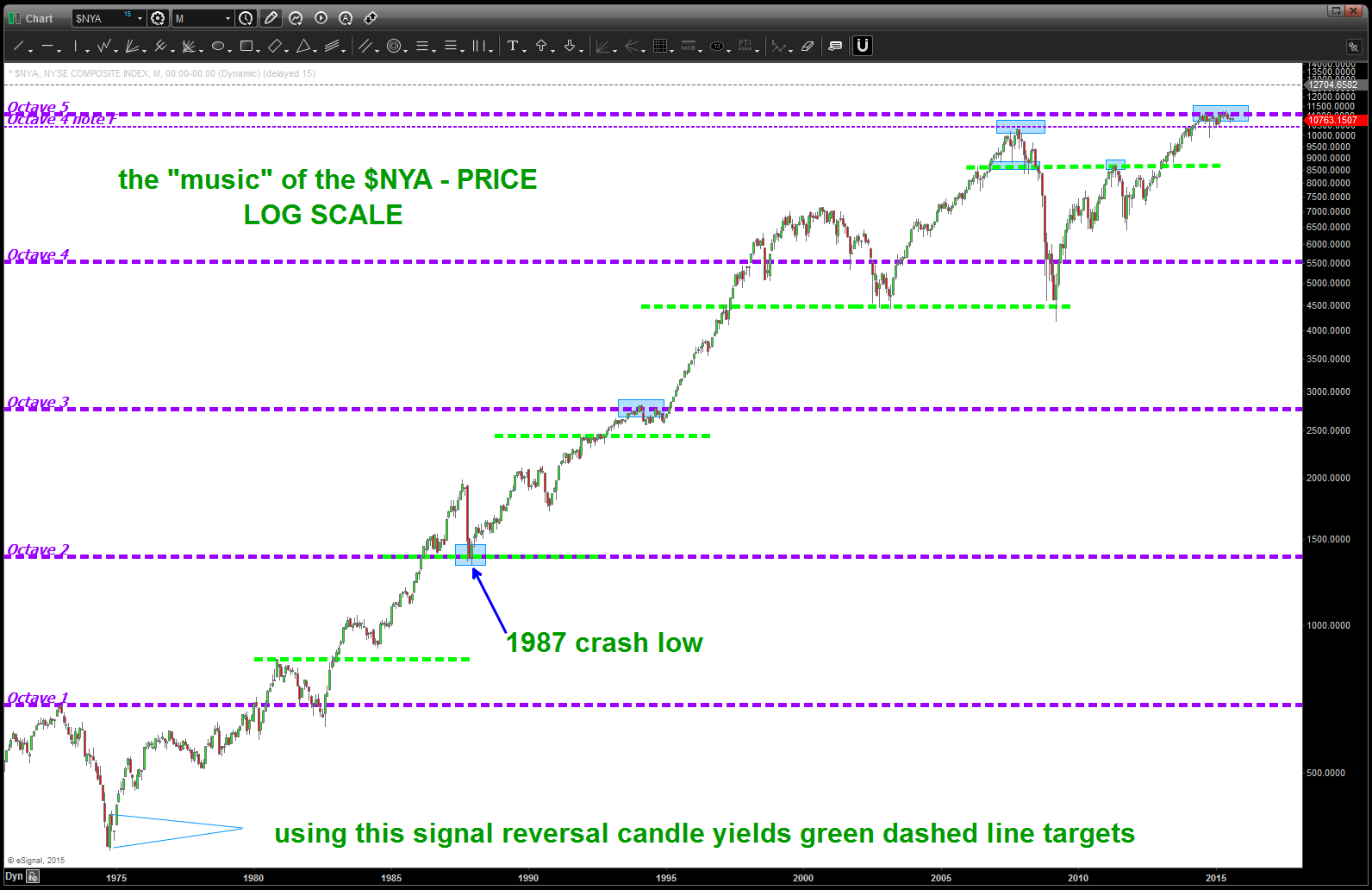
so, if PRICE equals TIME (which it does) THEN we can take a PRICE delta between an octave – in this case between Octave 4 and Octave 5 (non log) and look for a time cycles to spin out from important highs and lows? right?
please see below ….
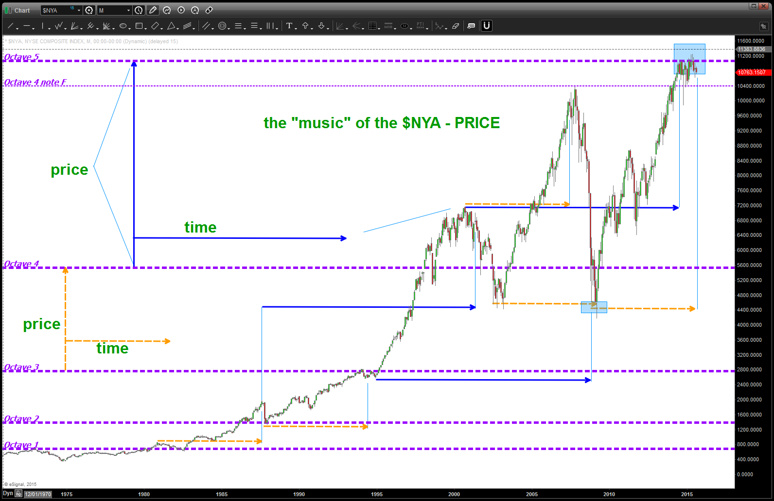
perhaps draw trend lines like this …?
Posted on August 9, 2015 Leave a Comment
the earth travels around the sun in 365 days … we all know that.
a circle has 360 degrees. we all know that.
how do you keep track of “where” the sun is w/out the internet, calculators, etc …?
basically how did the ancients do it?
one, potential, was by tracking a planet from a certain starting point in the sky and then calculating how long it took to return. make sense?
so, perhaps, just perhaps, they could tie in music (music of the spheres – pythagoras) and understand the square root aspect of tracking stuff and time?
so, perhaps, just perhaps, if we have stock that starts at 4292 then we could “track” it’s progress using the same principles?
in order to get around a circle – numerically – we have to take the square root and then add 2 (if going up) and then resquare it to travel once around the circle.
we also know that we have 4 seasons based on equinoxes and solstice so every 45 degrees might ( 🙂 ) be important so to get to them we would add, say, .25, .5, .75, 1 (we are now half way around the circle) etc. to find those points in PRICE and TIME.
w/ this knowledge we “should” be able to draw trend lines that are harmonic and provide a road map of the journey up and down.
just did this w/ the NYSE Composite Index …one thing I didn’t do is connect trend lines and then calculate. No, I just took my calculator and did this:
- square root 4292
- +2=67.51
- resquare: 4558
- go out to March 06, 2010 and plot that price (purple line) – one year after the low (remember the sun above?)
- did it all the way up to 10
now we have the trend lines that are basically showing us the way … sure looks like the $NYA wants to go tag the blue trendline … another 300 points or so will give us a good feel. here’s the chart
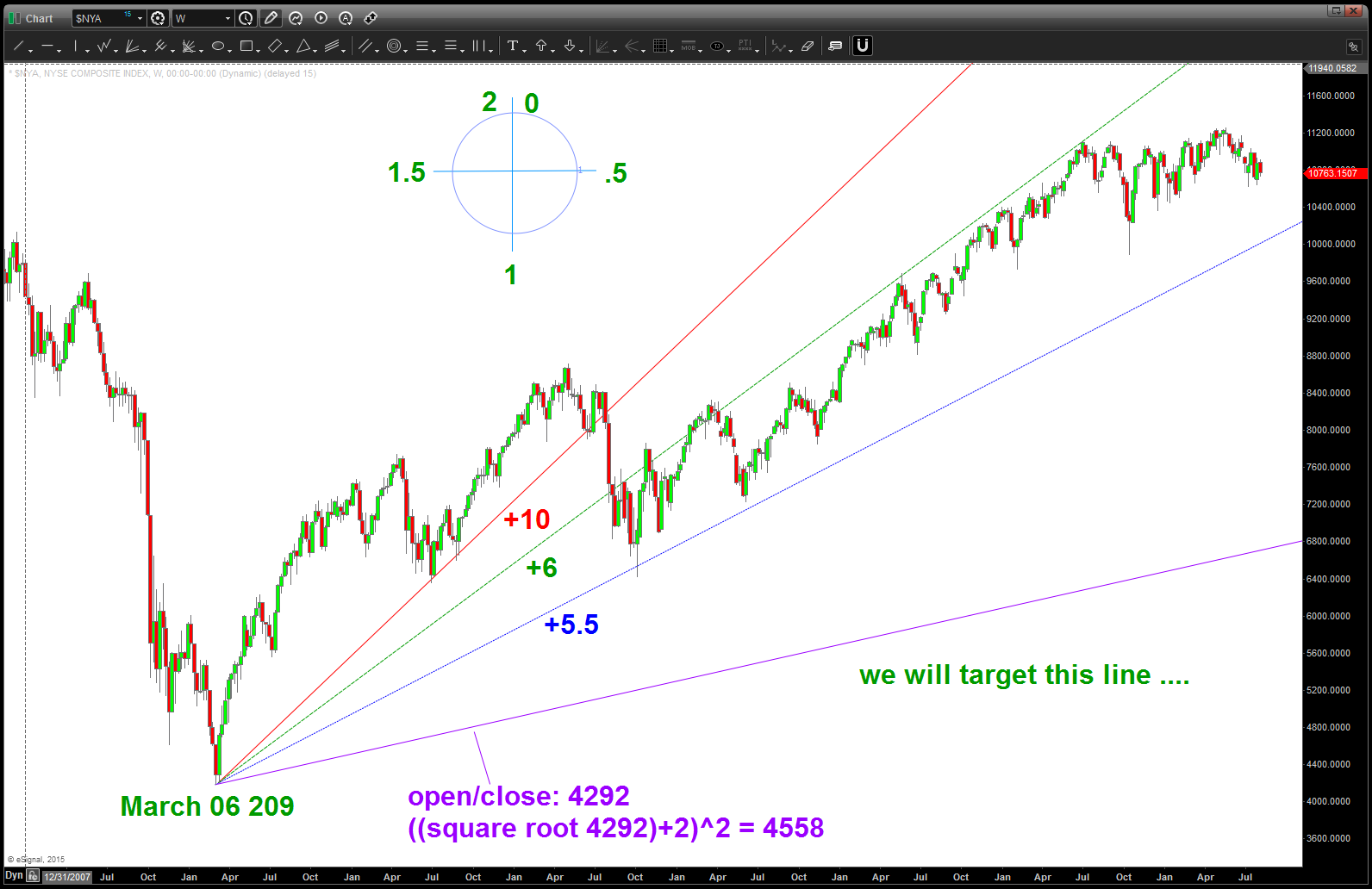
why are these trend lines important …? Well, let’s take the TOPS and BOTTOMS and horizontally move over to touch them and then go up or down to look and see what happens …
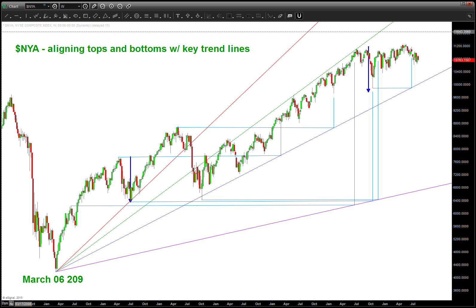
now remember, we need to be patient and realize their could be some slippage … this is a weekly chart. BUT, what we can know is that important tops and bottoms are ALWAYS harmonically related to the future tops and bottoms and by simply taking the time to draw these type of trend lines and then look for synergy between the highs/lows that are intersecting them and then moving up or down we find “roadmaps” to manage risk.
let me ask you … if you look at the first top after the march 06 low and then move horizontally across to intersect the purple line and then move UP into the present time do you think it’s by chance that we are now finding resistance in TIME …..?
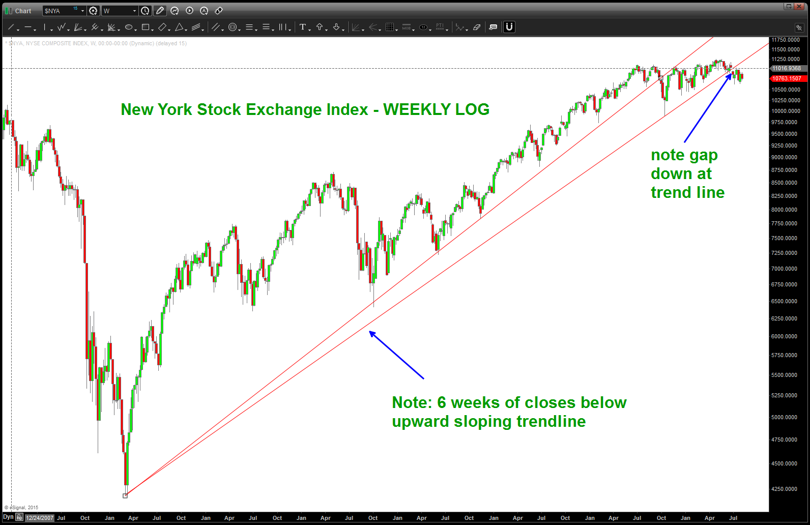
here’s the LOG of the $NYA – the face that we are below, on a 6 week closing basis, doesn’t make me very confident UP in this cards near term. need to see us regain that trend line in a hurry …
Bill and Ted’s Excellent Adventure Meets the Matrix in two charts …
Posted on August 8, 2015 Leave a Comment
folks, work w/ me …
- ratio analysis: A/B ….if A stronger (relative strength) then chart goes up. if B stronger (relative strength) then ratio goes down.
- $NYA – New York Stock Exchange Index – largest barometer of stock market health
- XLP – institutional rotation occurs into staples in a “risk off” world .. people need “staples” to live so they should outperform and have more relative strength …
here’s my “if-then” logic …
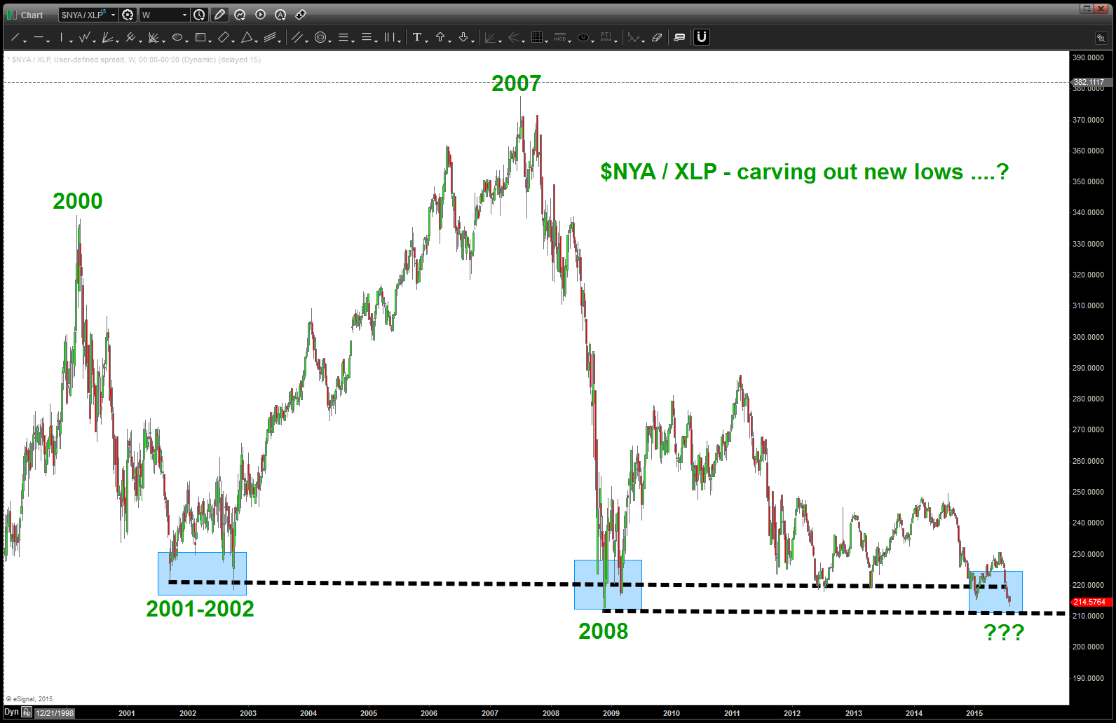
IF $NYA is good to go and healthy THEN a ratio of $NYA/XLP will go UP and IF the ratio of $NYA/XLP is going down then something ain’t right at the circle K ….
something aint right at the circle k
$NYA / XLP
Note: at these levels (in the past) the $NYA has always started to outperform (the ratio goes UP).
Now, take a look at this chart w/ the $NYA overlaid on top of the ratio ….
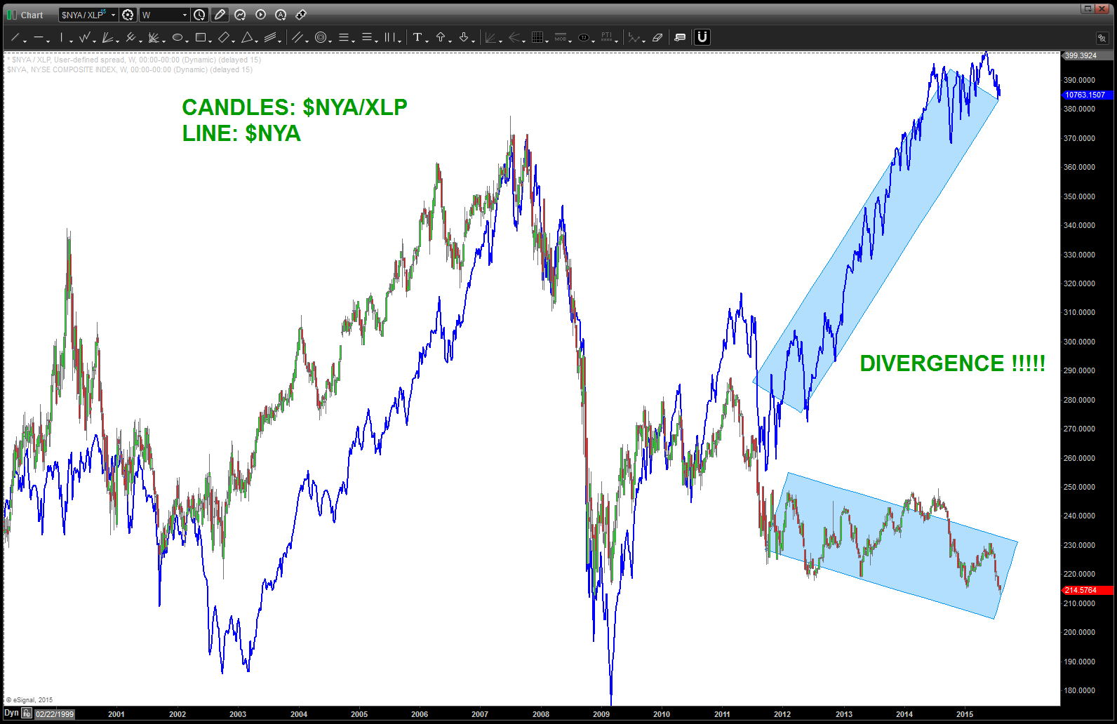
note the massive DIVERGENCE – the ratio should track the $NYA UP into new highs … instead it’s plumbing new lows. IT WILL RESOLVE
so, if you’ve read this far, then your a SPECULATOR and you like to play. One thing that I’m fairly certain .. this discrepancy in the ratio and the $NYA will resolve. Two outcomes …
- w/ $NYA at new highs, the ratio will find support as it did in 2001-2002 and 2008 and start back up and the $NYA will take off and move higher and higher and higher …
- w/ $NYA at new highs the ratio will crack thru this decades old support (showing institutional rotation into staples) and cause a rather big move to the downside and, perhaps, much larger correction than anyone is expecting.
YOU CHOOSE:

Blue – $NYA keeps going higher and higher …
Red – $NYA cracks, ratio accelerates to new lows and … you do the math.
PICK!
rock on, ok?
B
Sheep, Milk and the Kiwi …
Posted on August 7, 2015 Leave a Comment

7:1 sheep to people ratio in New Zealand
In New Zealand, there is roughly 7 sheep to every person. They have a lot of sheep and sheep = cotton, correct? The country has the highest density of sheep per capita in the world. However, this year has seen the sheep numbers fall to their lowest level in 75 years.
Around 1987 farmers to took to dairy farming and that overtook conventional sheep farming which until then had been the backbone of the New Zealand Economy. Take a look at the chart below … at most inflection points in Cotton Futures the KIWI followed suite.
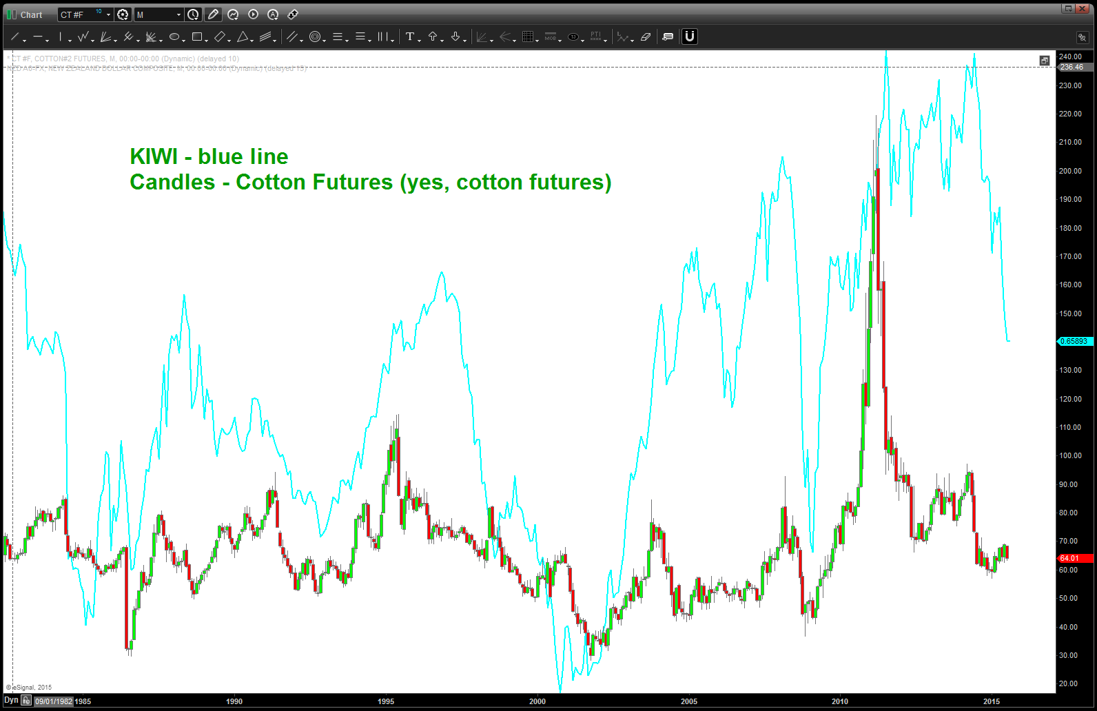
KIWI and Cotton Futures .. they turn together
Mooooo
As discussed above, the dairy industry is the backbone of the economy. Prices have plunged.
Below is a chart showing Class III Milk future w/ the KIWI overlaid on top of it. Note, milk futures have completed a buy pattern so prices “should” start back up and therefore KIWI can potentially find some support. Emerging Market Currencies are at an extreme low w/ regard to sentiment.
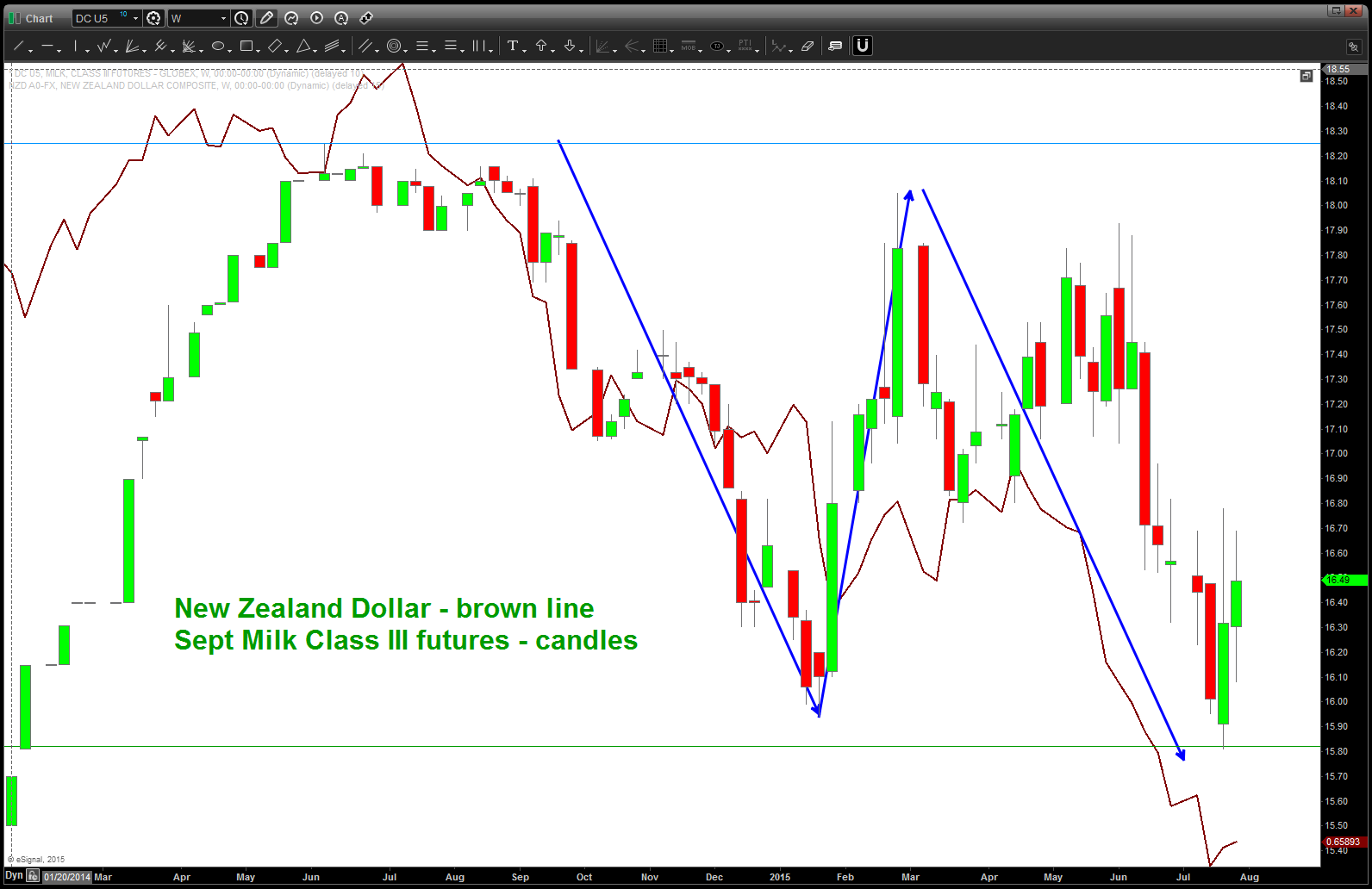
note the brown line (KIWI vs USD) and how it tracks milk …
The next chart below is of Non Fat Milk futures (continuous monthly) and note the synchronization of tops and bottoms. These are the lowest prices in decades ….
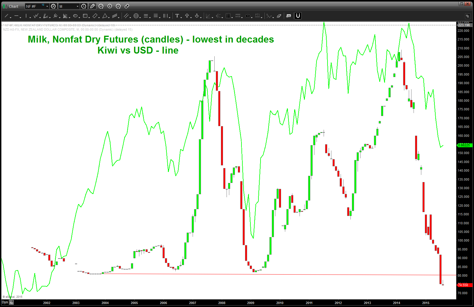
Milk Nonfat Dry lowest in decades …
Here’s the KIWI today … decimated sentiment for EM Currencies, RECORD low dairy prices, cotton hanging in there and a big old thump into very oversold bullish divergence .. it’s going to start up today or soon.
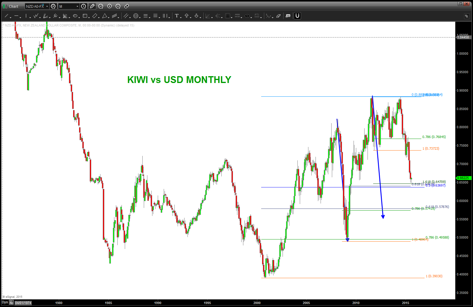
KIWI vs USD Monthly
so this looks so PROMISING but when I put the EEM (Emerging Market ETF) w/ the KIWI overlaid on top of it I see a very nice symmetry BUT I also see a CLIFF OF SUPPORT that the EEM is about to fall off. OUCH ….
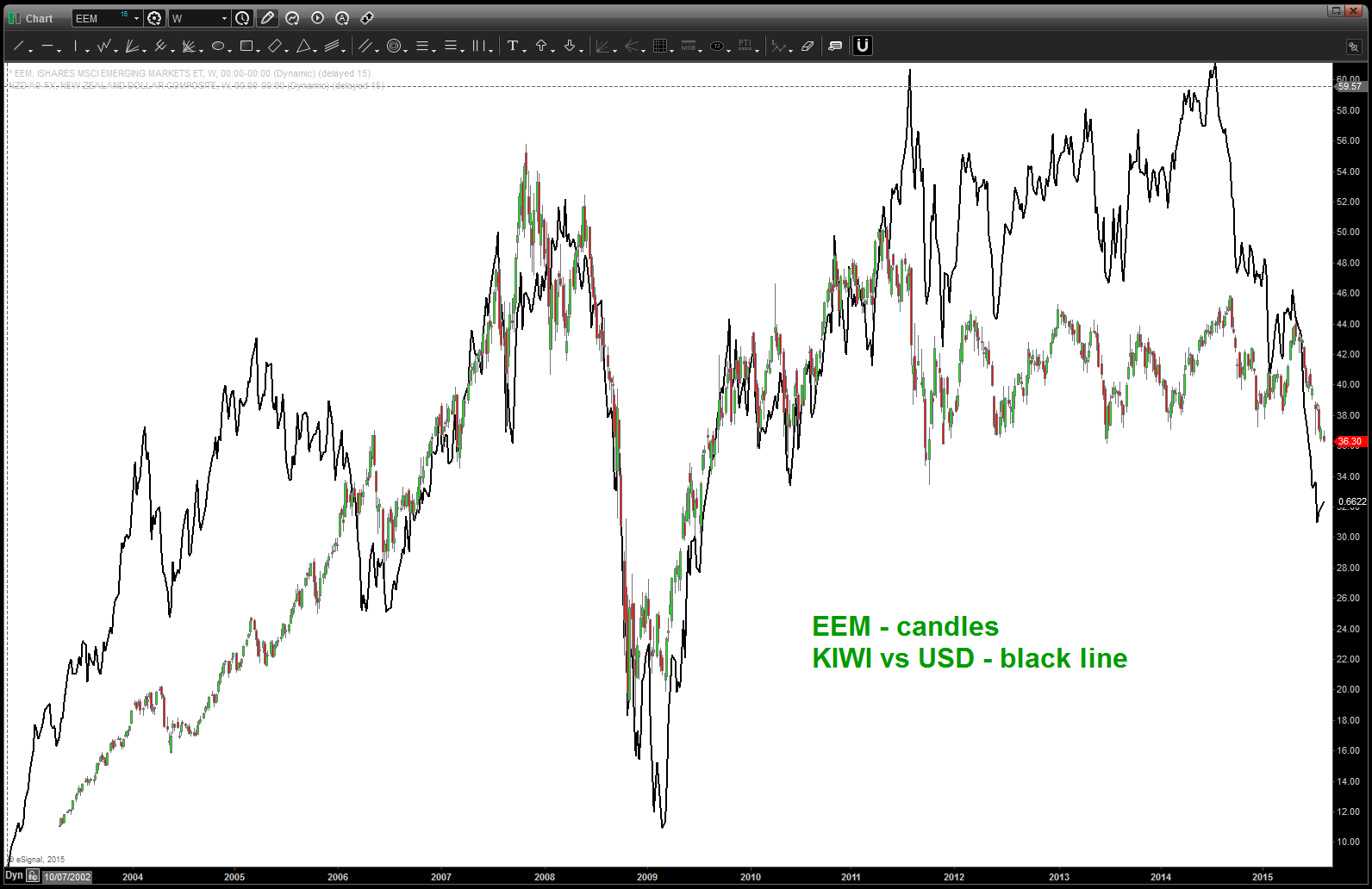
EEM:
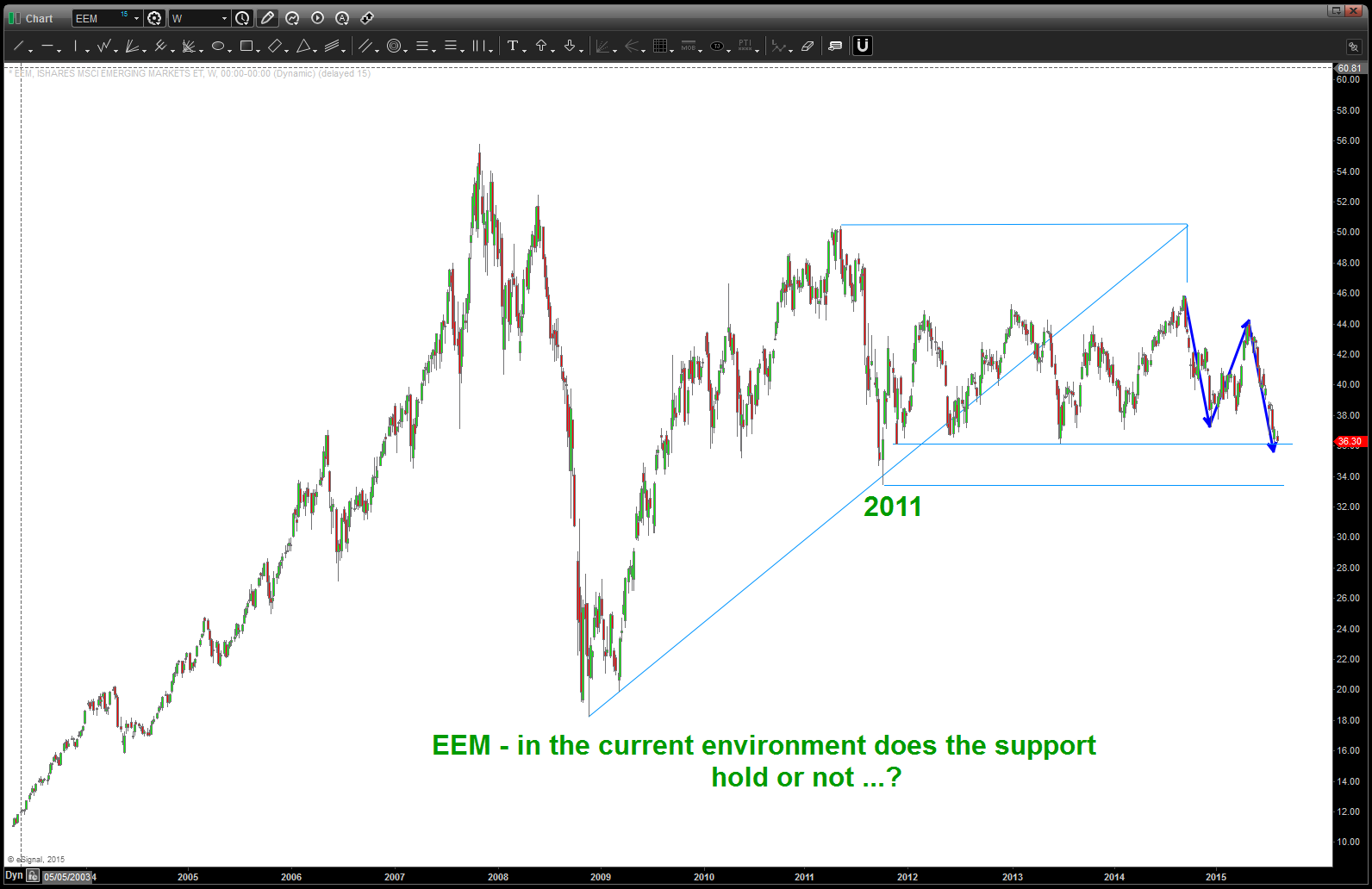
note EEM and pay attention closely. IF WE ACCELERATE THRU THE 4+ YEAR SUPPORT THEN EM FX SHOULD FOLLOW …playing a bounce for the FX so this is a major area to watch for Risk and Reward …
$CVX and 40 years of market history
Posted on August 6, 2015 Leave a Comment
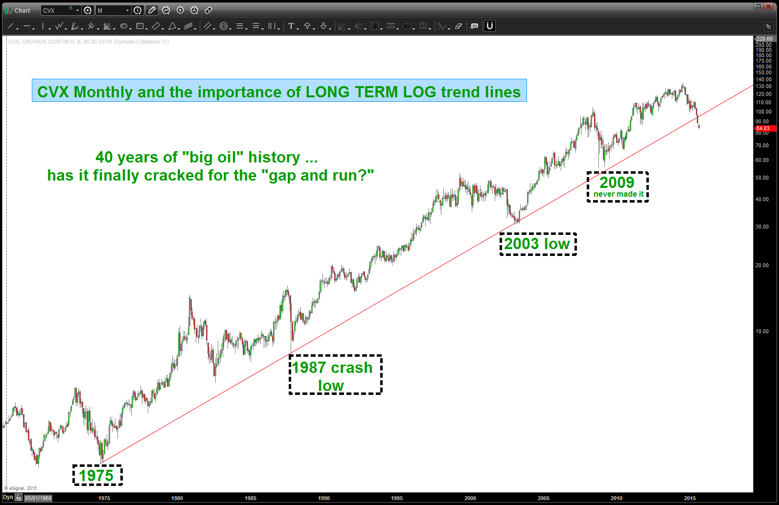
simple chart … long term LOG TREND (monthly) and their importance when broken.
note, $CVX, first MONTHLY close below in 40 years. folks, the probability is this is not good.
trade/invest what you see not what you think …
rock on, ok?
$FIT and square roots …
Posted on August 5, 2015 Leave a Comment
I don’t like to post “after the fact” but today – w/ the air conditioning being blown and tons of BD work done I thought I would sit back and check out some stocks. Had a great conversation w/ a friend about EPS, PE and stuff like that and told him it was all BS but that’s just showing that I’m ignorant about fundamentals so I should probably learn about them … nah. I left the smart people do that ..
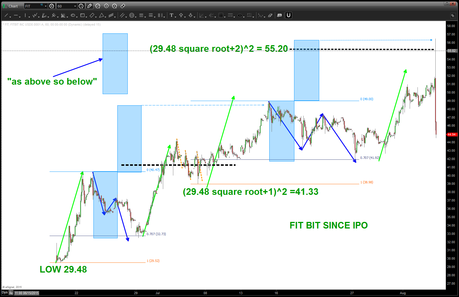
For me, I like square roots … here’s a an hourly on $FIT. Just sat back and did some math to relax (I know most chartist dudes and dudettes are geeks.)
All I know is $FIT smacked right into the square root target from the low … if you want to really get close you could use the “open” but I think the point is made. When you +/_ 2 you have done one full circle around the Gann Wheel. The Gann Wheel is of course a square root calculator, a planet and number synchronization tool (that’s what they used the Great Pyrmaids for) and, well, blah blah blah.
Just to have some fun, did the square root-1 to go half way around …
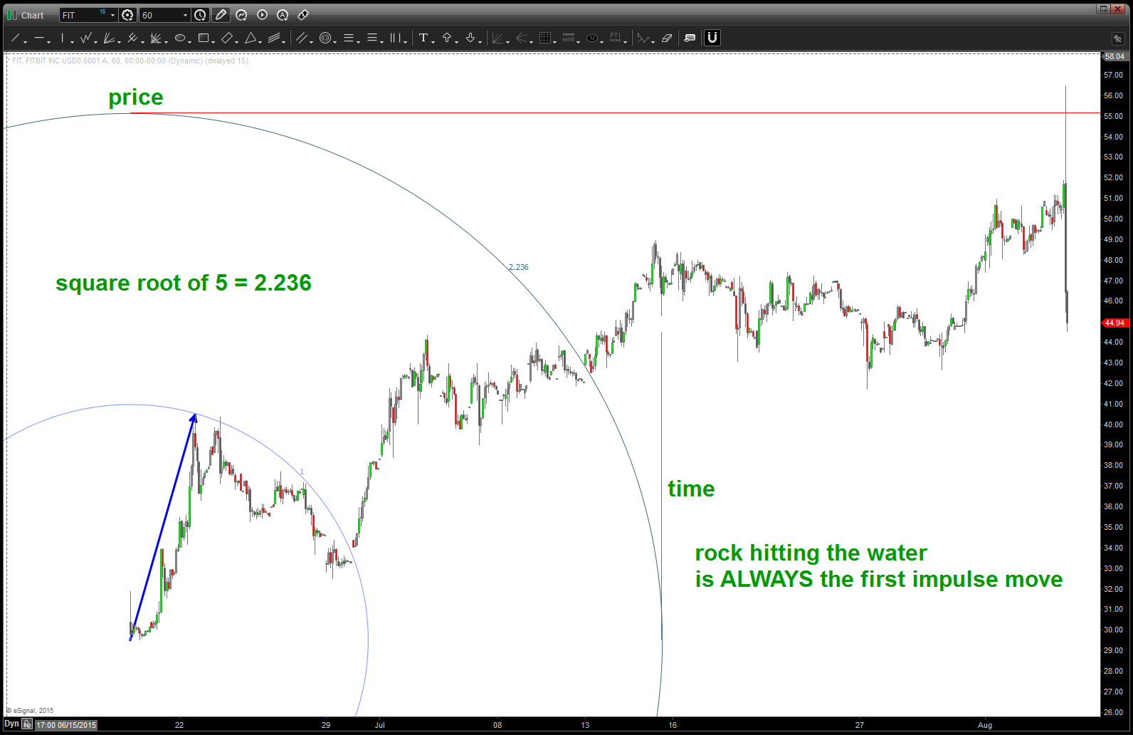
There is tons going on in this chart .. spend some time studying it. $FIT has a nice rhythm …
One last, take note of the blue rectangles…as above, so below. Just a neat technique to balance harmony, form and proportion ….
Rock on, ok?
Bart
$FIT vibrations
FIT ripples

FIT geometry – all from the initial impulse move UP
Blogged w/ @seeitmarket back in FEB about a potential $APPL top around 130
Posted on August 5, 2015 Leave a Comment
$AAPL now making news …
certainly enjoy “playing” w/ the pro’s from @seeitmarket – thanks Andy!
Rock on, OK?
Bart