Palladium and NASDAQ and AAPL Oh My ….
Posted on May 13, 2016 Leave a Comment
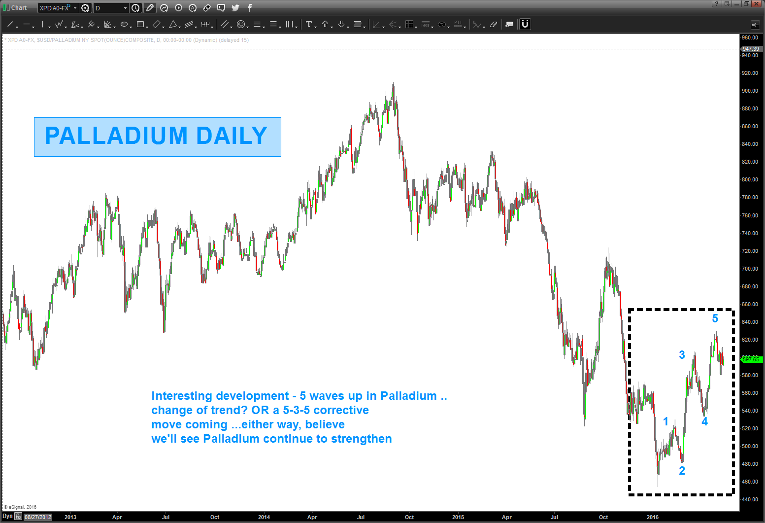
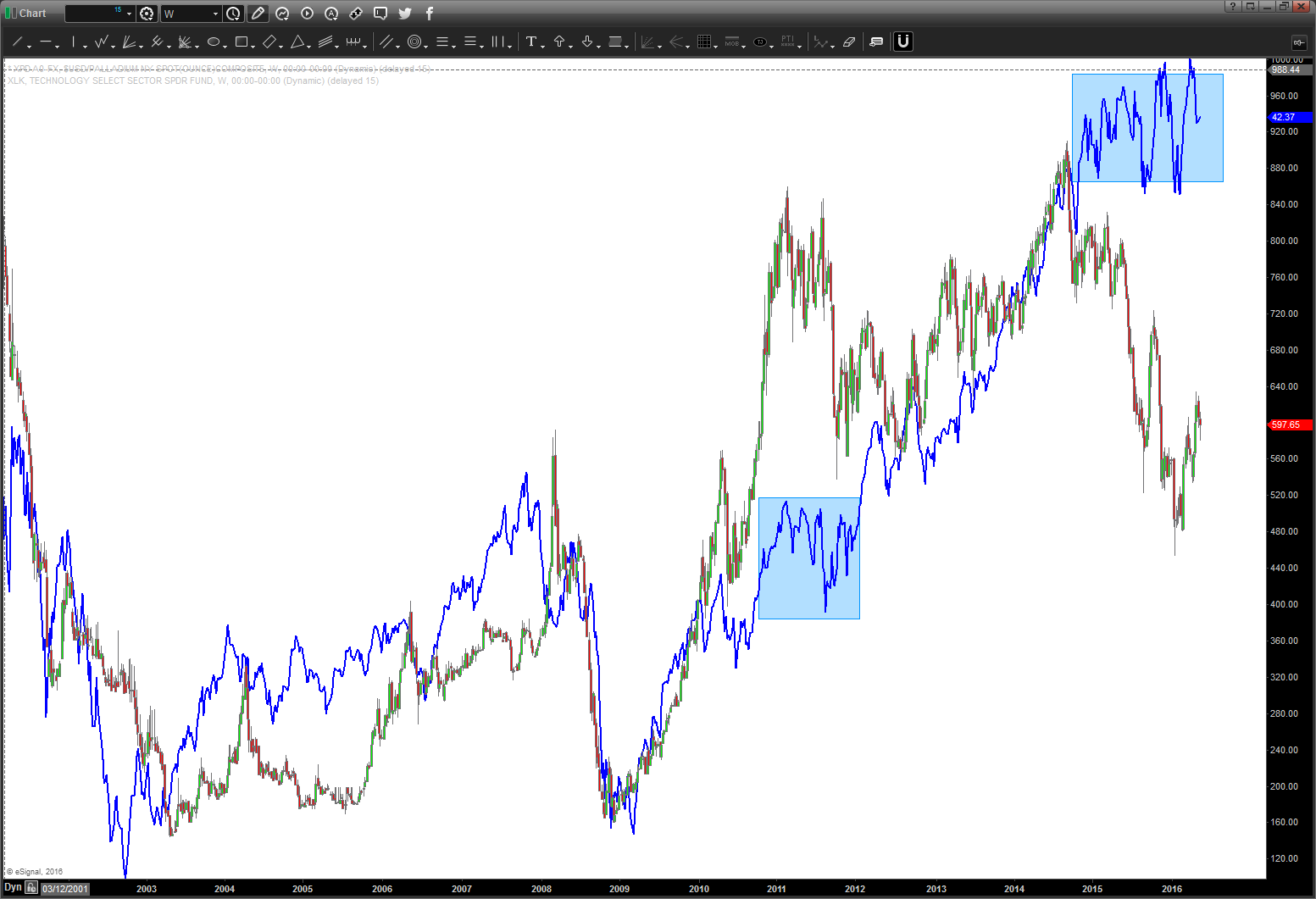
Palladium and AAPL and NAZZIE and XLK (tech ETF) – are VERY interesting right now.
- Palladium – CLEAR 5 waves up ….
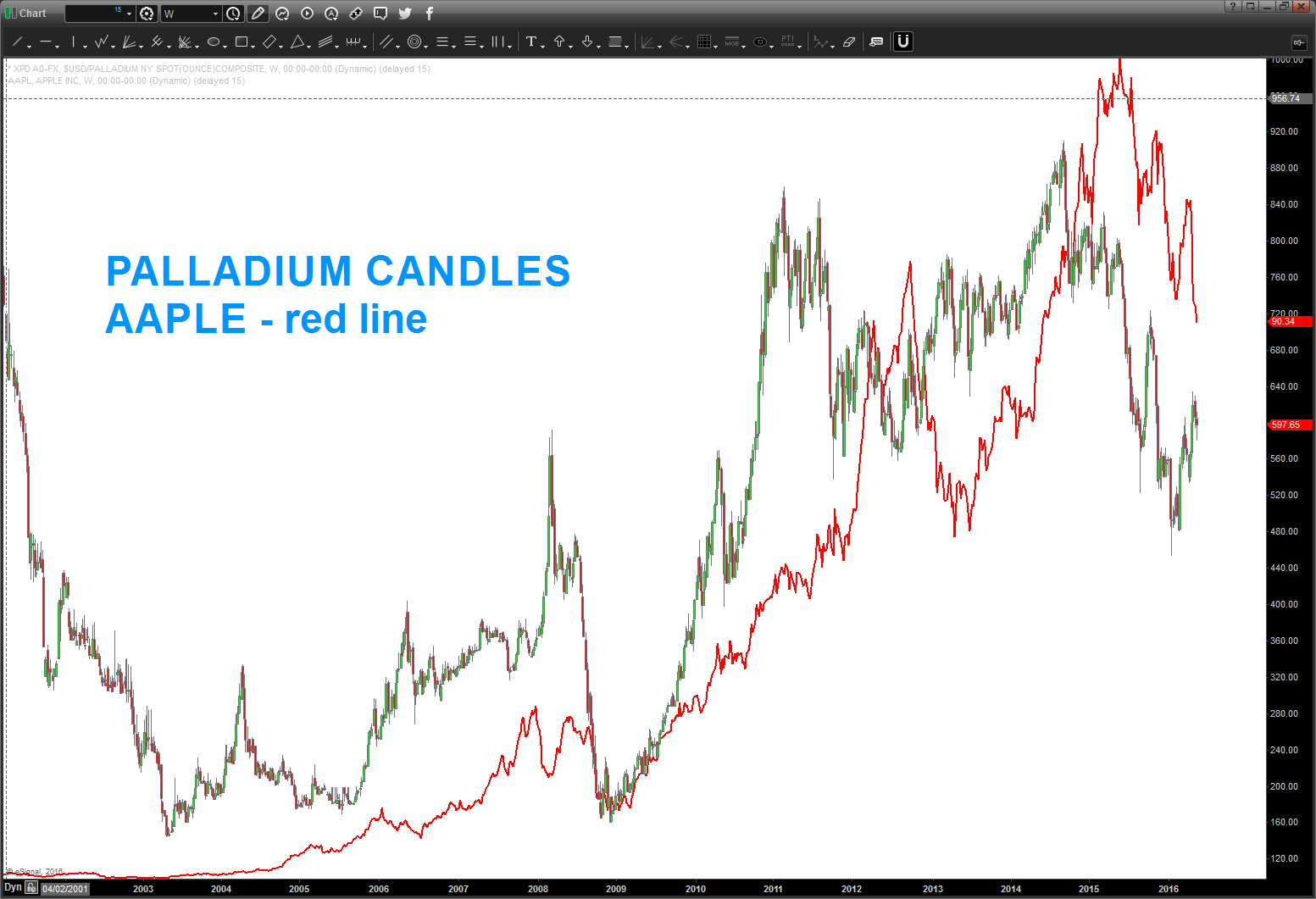
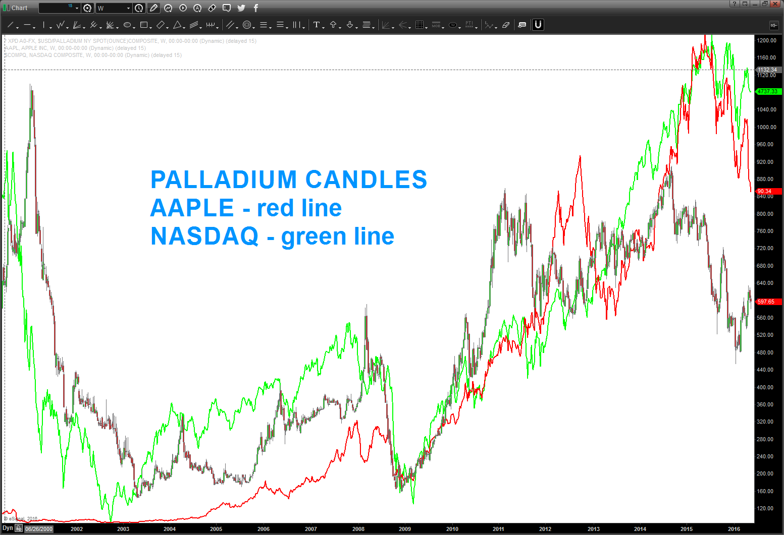
- Note the charts below – while not exact they do trend the same and while at times leading and lagging each other, once they do turn they sync and roll.
- Note, the XLK and PALLADIUM.
- They are almost exact coming into the lows in 2003 and all the way up into 2008 and then down into 2009
- The most interesting aspect is the big corrective move down in Palladium in 2011-2012. Note how XLK paused and consolidated and then took off.
- What’s happening now …? Palladium has collapsed – big. And XLK has paused and held the highs … with XLK showing a clear 5 wave move up we might be on the verge of a big move in technology. (hint hint: perhaps the target on AAPL is a BIG LOW and off they go?)
Charts – check em’ out and draw your own inclusion.
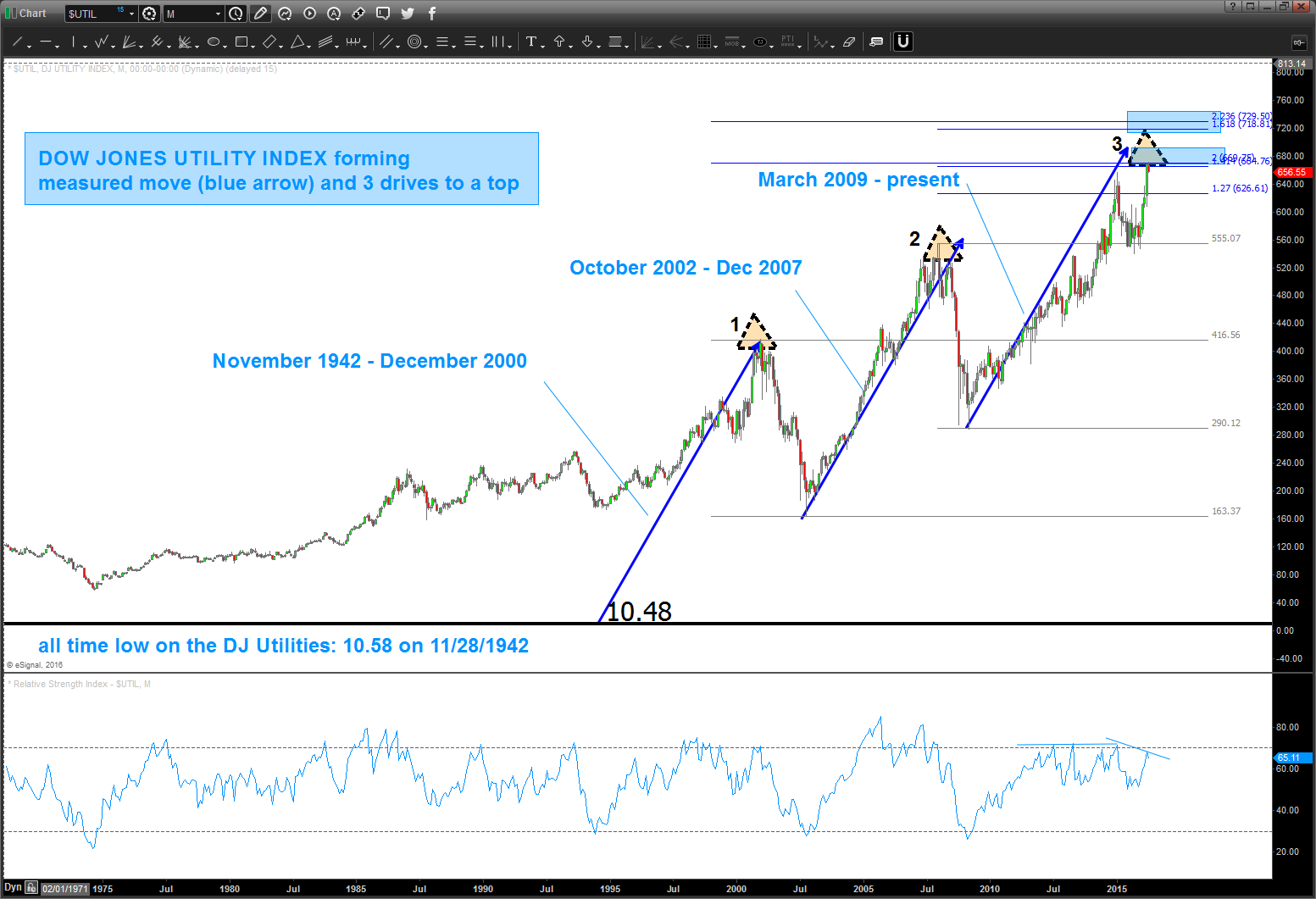
I think this is a big deal … Utilities
Posted on May 12, 2016 Leave a Comment
going to show this chart again of the Utilities … watch closely, the upper target is pretty darn close. Since the low in the 1940’s the Utilities have never gone farther than this (or close to this – still some upper targets) w/out a major pullback.
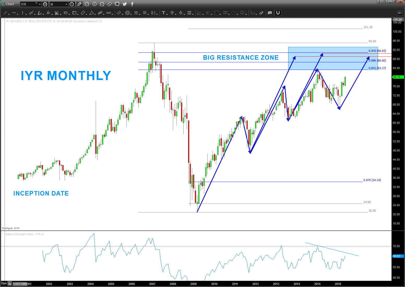
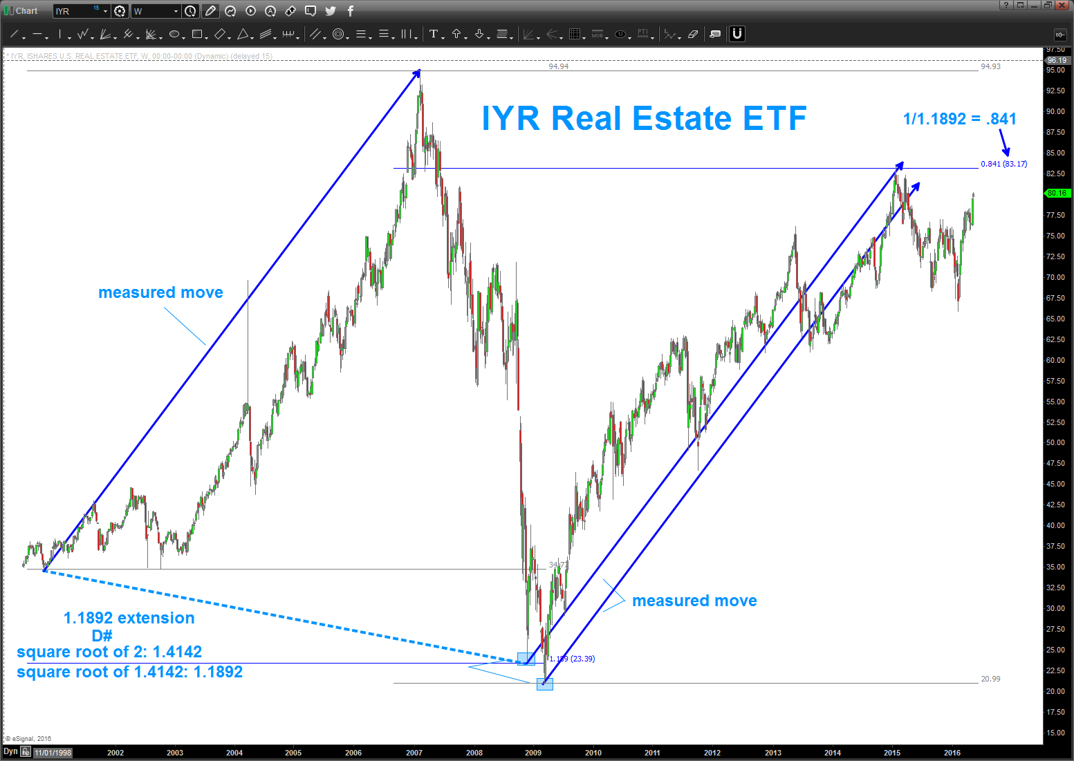
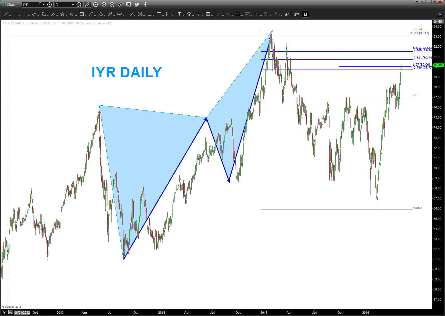
Real Estate
Posted on May 9, 2016 Leave a Comment
I know it’s cyclical and it’s location location location but I also know that some didn’t too bad in the next downturn and some did really bad …I see some major targets being hit and or a little higher in real estate.
Perhaps I’m an idiot, but me and the wife close on the sale of our house in two weeks. I am so glad to be liquid for the forthcoming storm … hoping to buy a MONSTER Beach House in the Outer Banks after the “flood” of deflation and debt reach our shores.
Charts below:
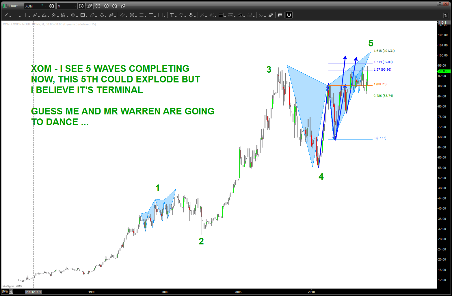
XOM update
Posted on April 24, 2016 Leave a Comment
04/24/2016 – the “zone” shown below has worked and XOM is rallying in 3 waves. IF the thesis that the high at 104 was a big top THEN this pattern shown below should work. If not, then it will continue higher. This is a very nice sell pattern.
please read the entire post from the bottom to the top to understand what could possibly going on here ….
thanks and hope you have had/are having a good weekend.
Bart

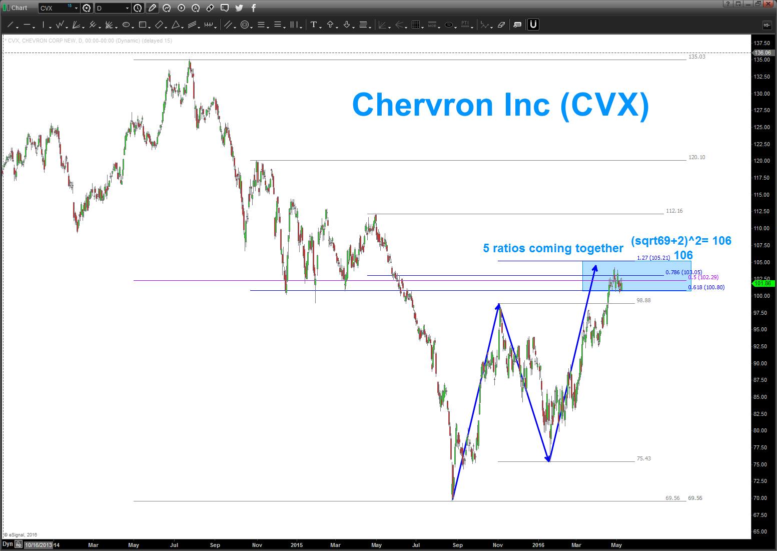
folks – I am sorry that I didn’t post this earlier as this ranks up there as a “no brainer” in my simple mind …
- the ENTIRE KEY is the square root target
- IF square root targets lie on top of 3 Fibonacci retracements and a measured move then Lions (square root target), Tigers (measured move) and Bears (pardon the pun – retracement levels) it is “usually” market magic.
also, the pattern from November 2013 is included. was looking for 101-102. shoot me …
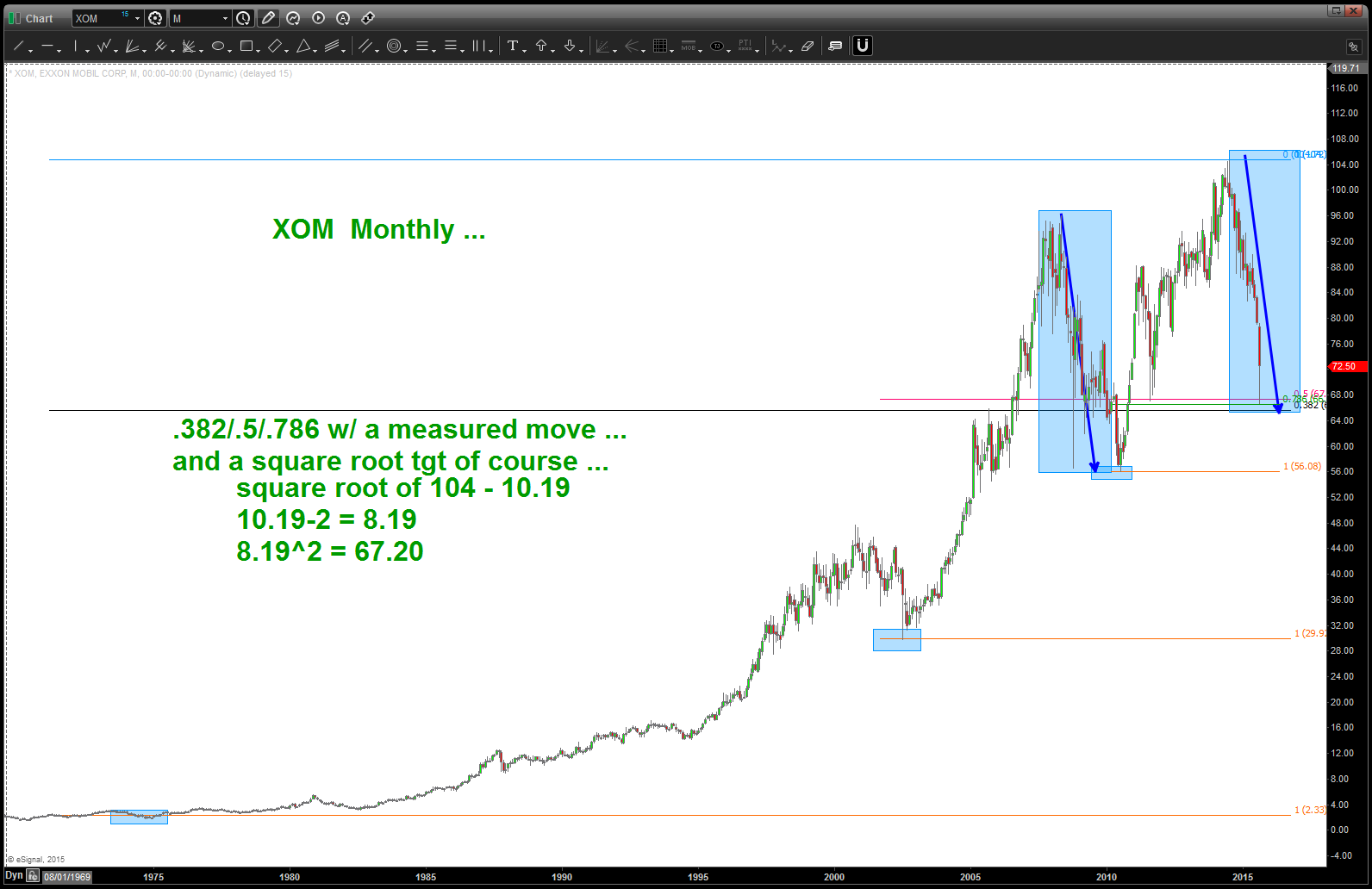
strategy is key here .. as you can see we do have a target a little lower also BUT that daily candle is impressive, wouldn’t you say?
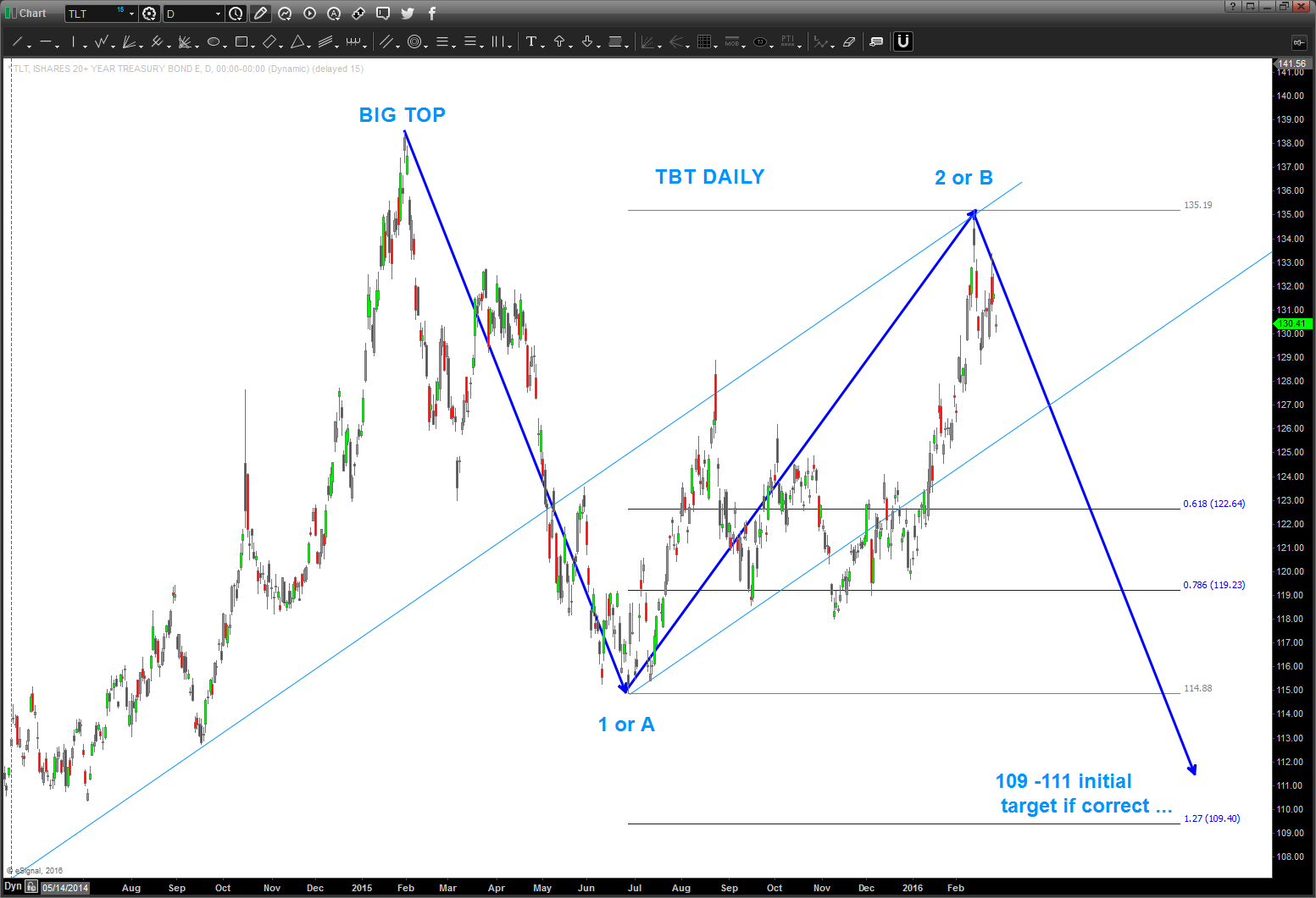
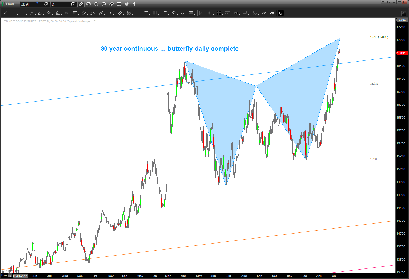
update to TLT and 30 year continuous futures …April
Posted on April 23, 2016 Leave a Comment
04/23/2016
very important level coming into play w/ the TLT.
watch 125 for support but if bearish bonds then this level must fail. if not, then we’ll keep bouncing around in this chaos.
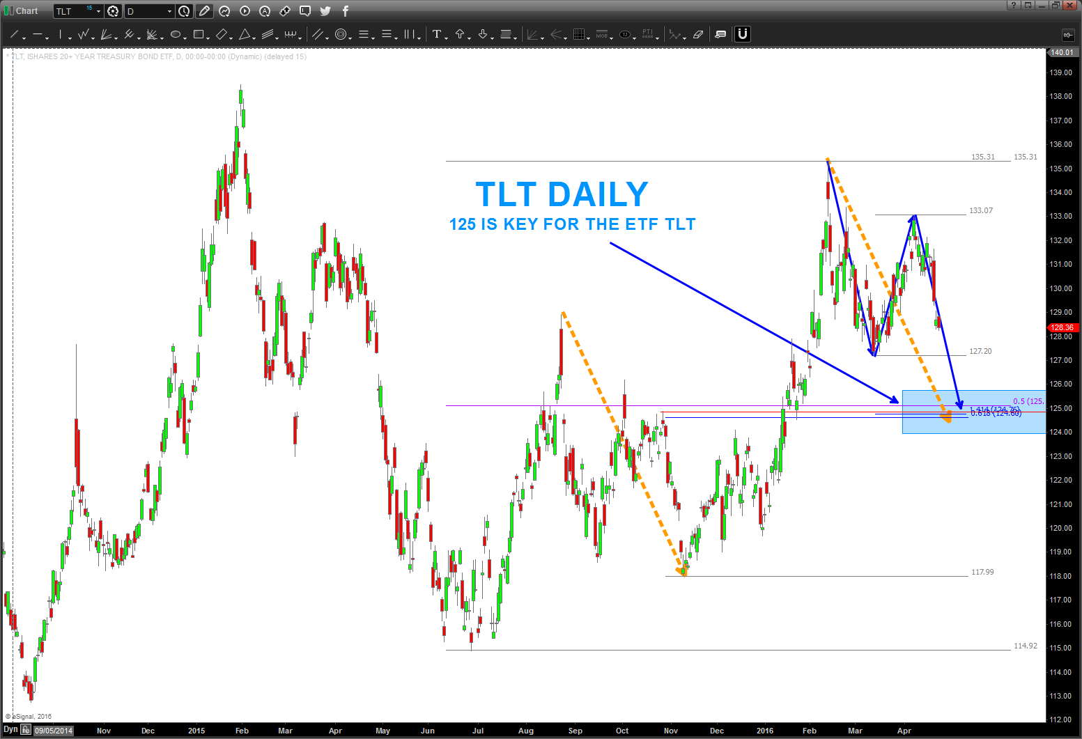
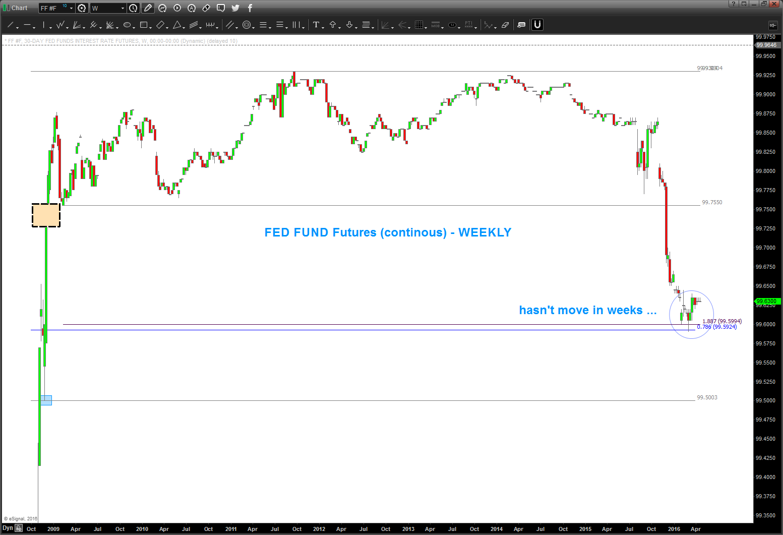
Fed Fund Futures haven’t budged … higher interest rates?
03/14/2016
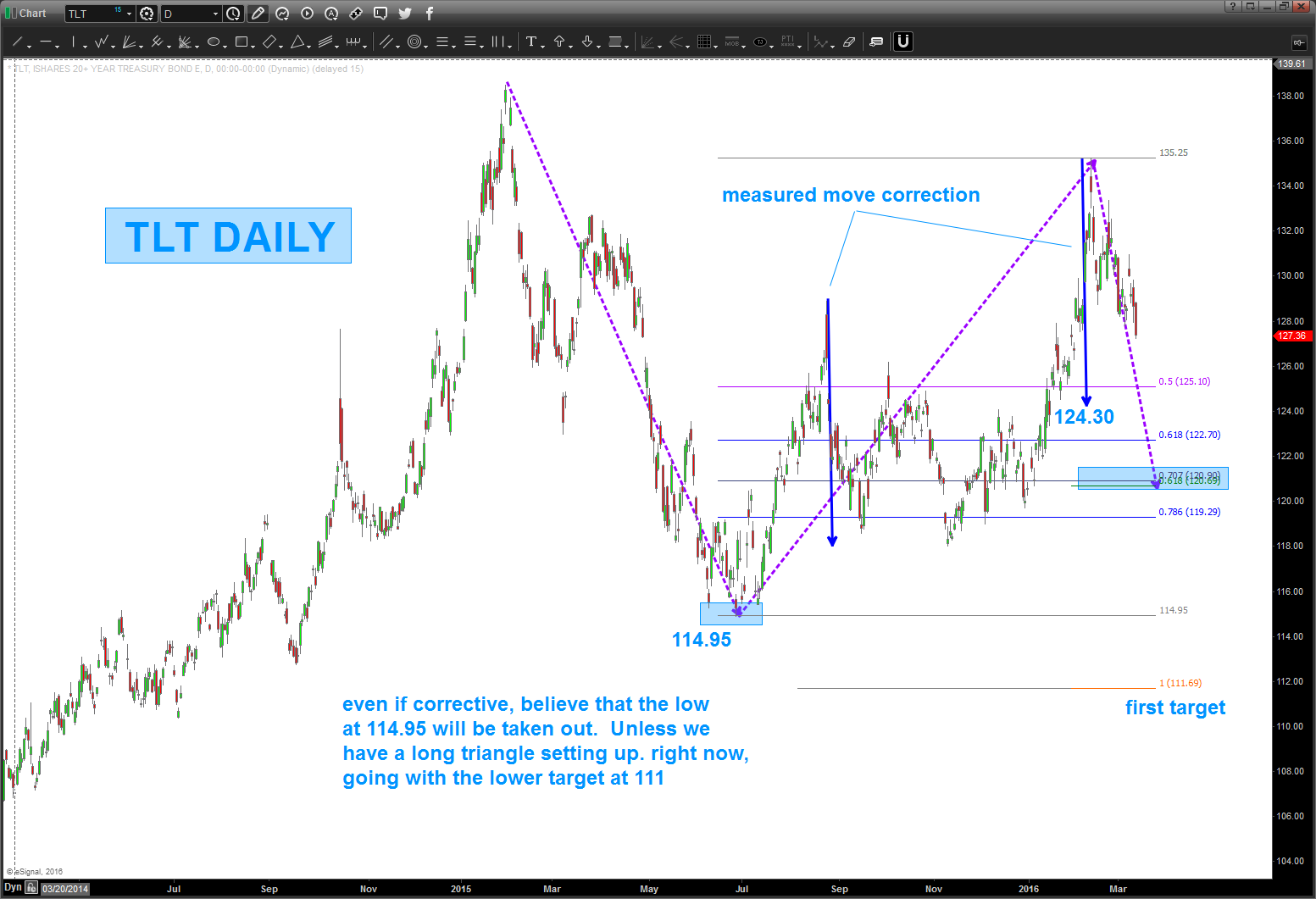
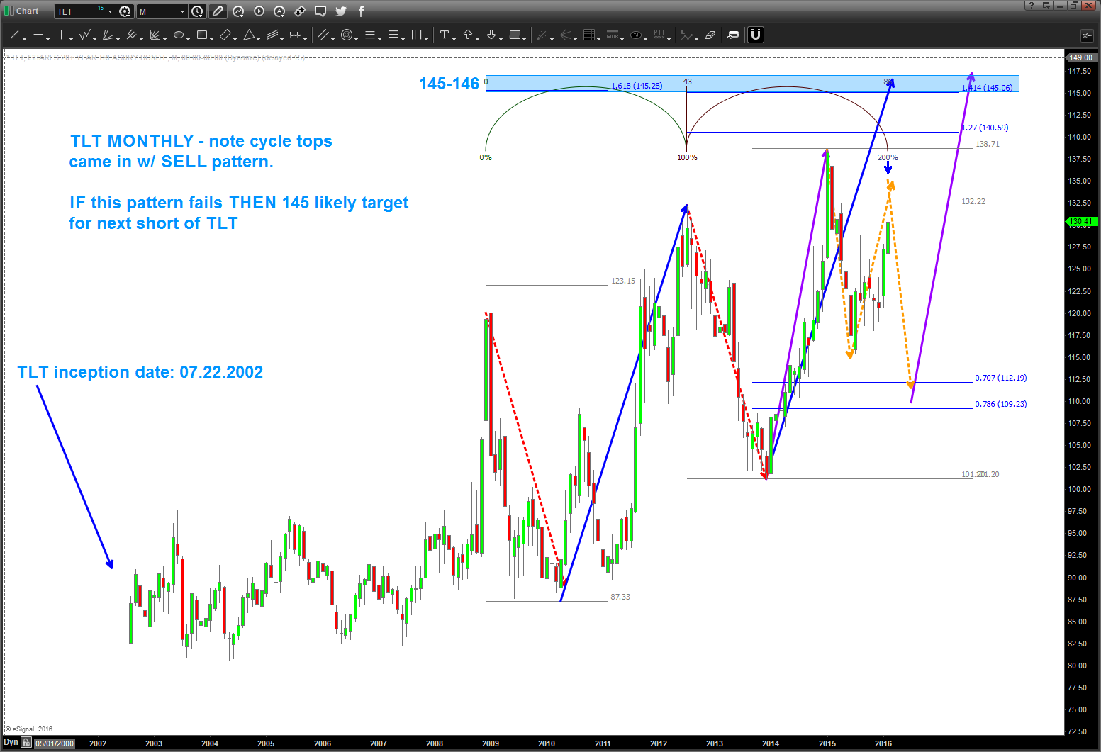
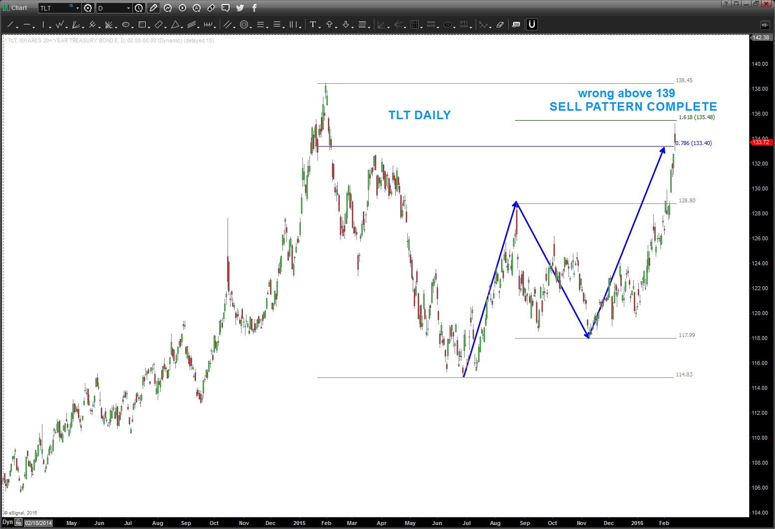
02/27/16 – TLT, if correct, should be losing steam over the coming days/weeks. Initial target appears to be 109-111.
note, if this pattern fails, then 145 is a very strong target as shown below. also note, the cycle top times came in w/ pattern completion. right now, favor the short side into the 109-111 area but do want to show possibilities.
DJ Utility Index – an update
Posted on April 23, 2016 Leave a Comment
04/23/2016 – update to the Dow Jones Utility Index. they took quite the beating this week, yes, so this pattern could be finished as mentioned below. There were higher targets but we’ll just have to watch price action over the coming days/weeks to ascertain if a big top is in place. Not time to buying into this sector IMHO.

IDU is an ETF but it’s LONG Utilities … perhaps a short? Wrong above 124.
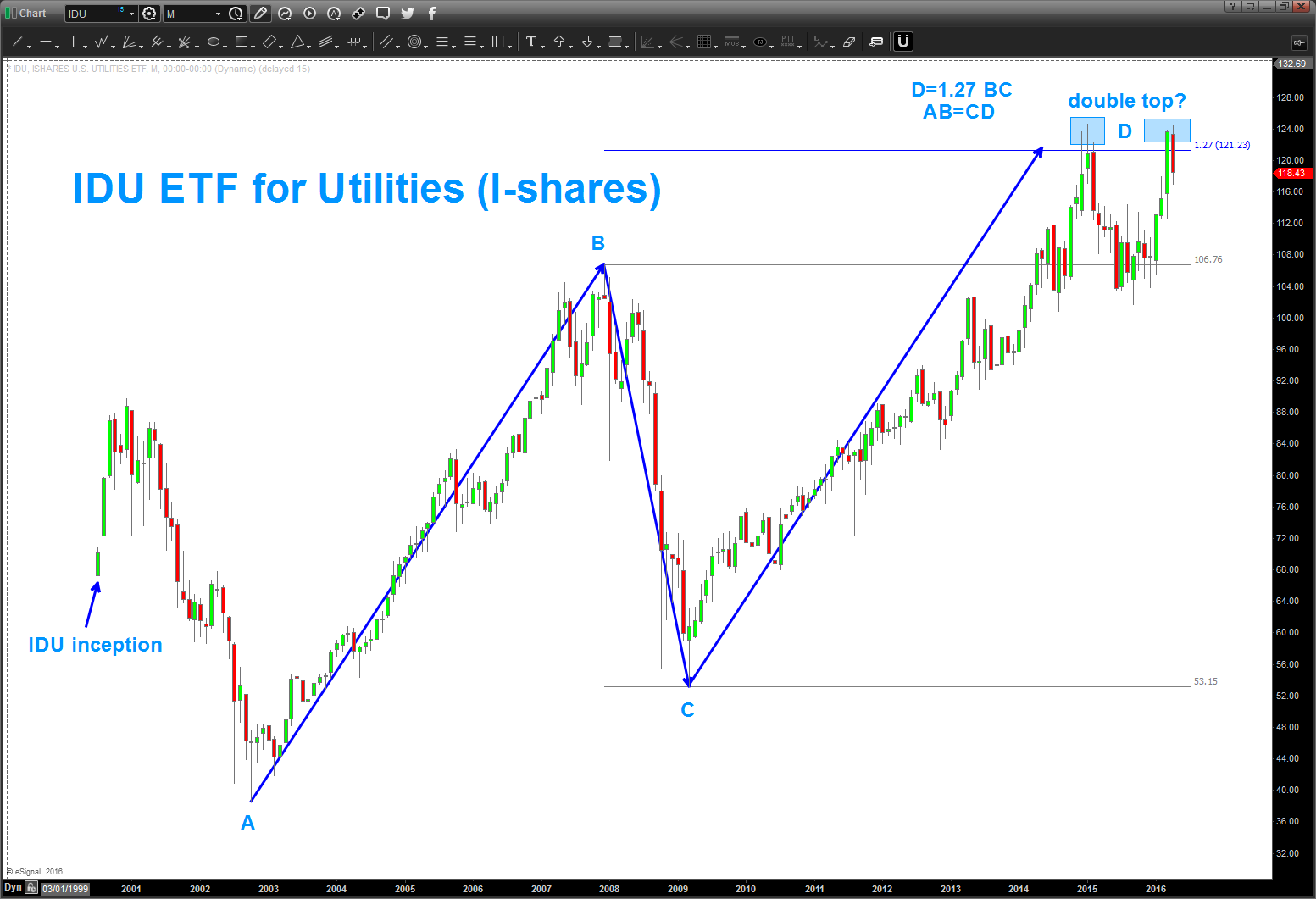
04/05/2016 – as you can see below, the pattern failed on the Dow Jones Utility Index in/around 560-570 and propelled higher.
now, per the chart below, you can see we are at another crucial juncture. the “blue arrow” represents the MAXIMUM that the Utility Index has moved since it’s low in 1942. In around the orange triangle labeled 3 (for the 3 drives to a top) the average should run into MAJOR resistance. this “should” put pressure on the bonds ….also, note the monthly bearish divergence present.
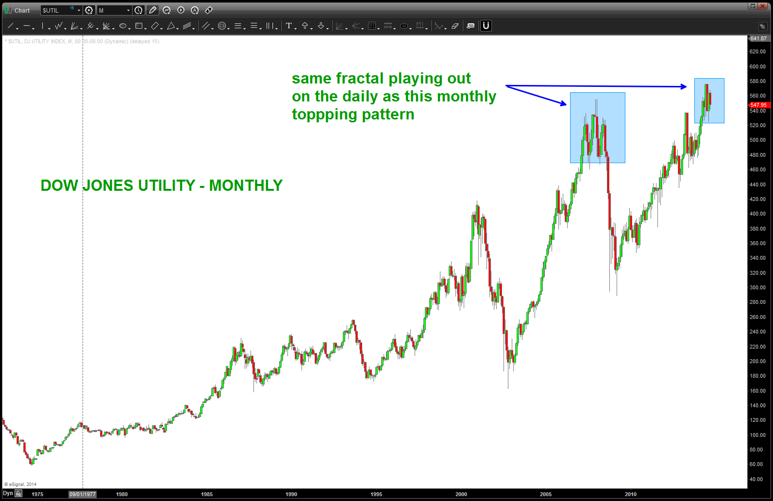
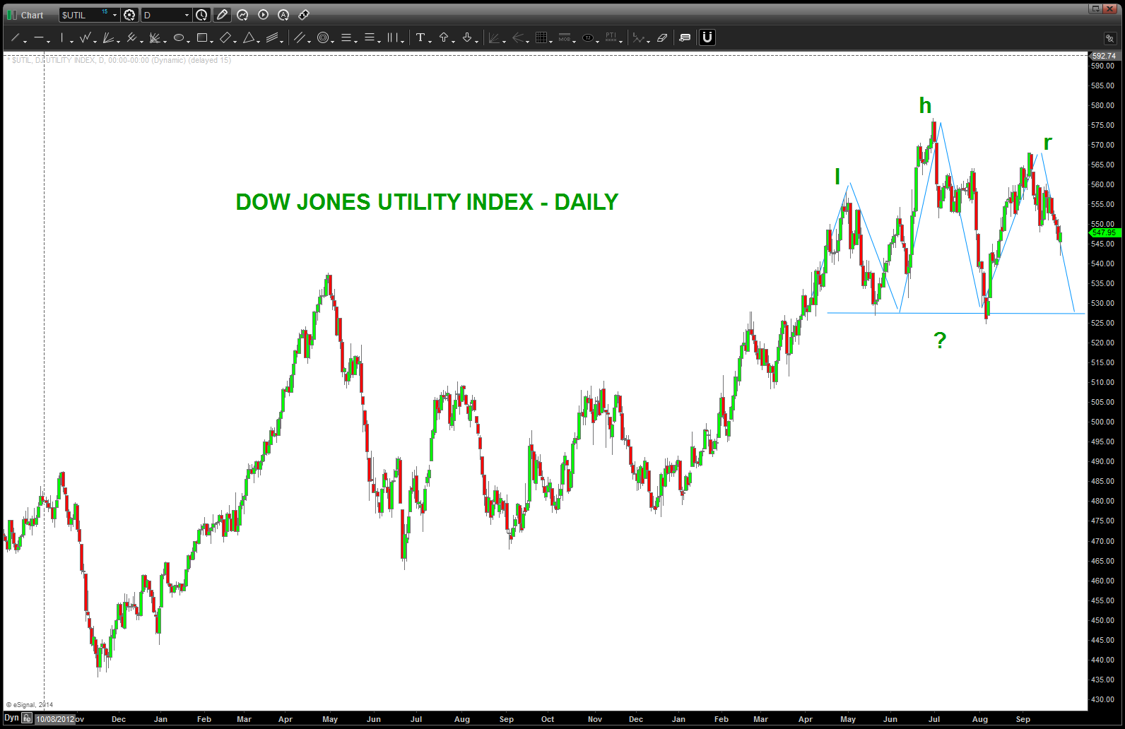
Warning sign, pay attention.

back in April 2014 (https://bartscharts.com/2014/04/19/dow-jones-utilities-long-term-1942-price-pattern/) we ID’d a long term pattern that was completing. the market subsequently went up into Jun/Jul and hit the target. now it appears we “might” be carving out a Head and Shoulders Daily topping pattern. Note, this same pattern came into play on a MONTHLY basis during the 2007-2008 time frame.
the reason we are watching this closely is because of the presence of this long term topping pattern that has hit and held, thus far.

@seeitmarket YEN update and an ETF to use for this move – YCS
Posted on April 23, 2016 Leave a Comment
update on my USD vs YEN post over @seeitmarket.com : http://www.seeitmarket.com/currency-spotlight-usdjpy-bottom-dollar-yen-15587/
chart of YCS use the low of 70 as the “don’t go below” point for stop considerations. 84 next area of resistance.
Bart