ABX is the next move higher upon us? Take a look
Posted on April 11, 2016 Leave a Comment
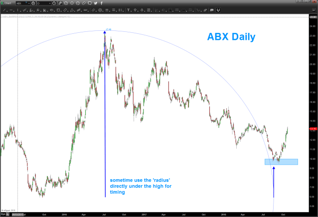
10/21/2018
as you can see below, we thought the 11-12 wave promising but the form, proportion and balance hinted of one more lower … that proved to be the case and the 9’s held. I’ve included another nice timing tool. sometimes – you have to play w/ it as nothing is perfect – you put the radius vector underneath the high instead of using the low to high vector. where the circle lands at the 3 o’clock position AND a pattern is visible you have a nice time component …
anyway, IF (always the big if) the count is correct this puppy could roll into the high 20’s and shoot for 28 believe it or not.
look to buy the first pullback …
Bart
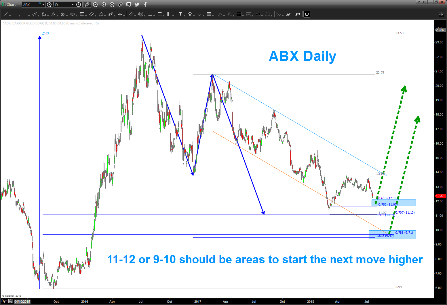
07/21/2018
Note, ABX completed a nice buy pattern at 11.10. the 11-12 area is promising BUT wave counts could have 1 more move lower into the mid 9’s . either way, believe the next larger move is higher for ABX. if you look at the charts below, you’ll see the ‘reason’ for the low in the 6’s.
keep this one on your radar screen.
Bart
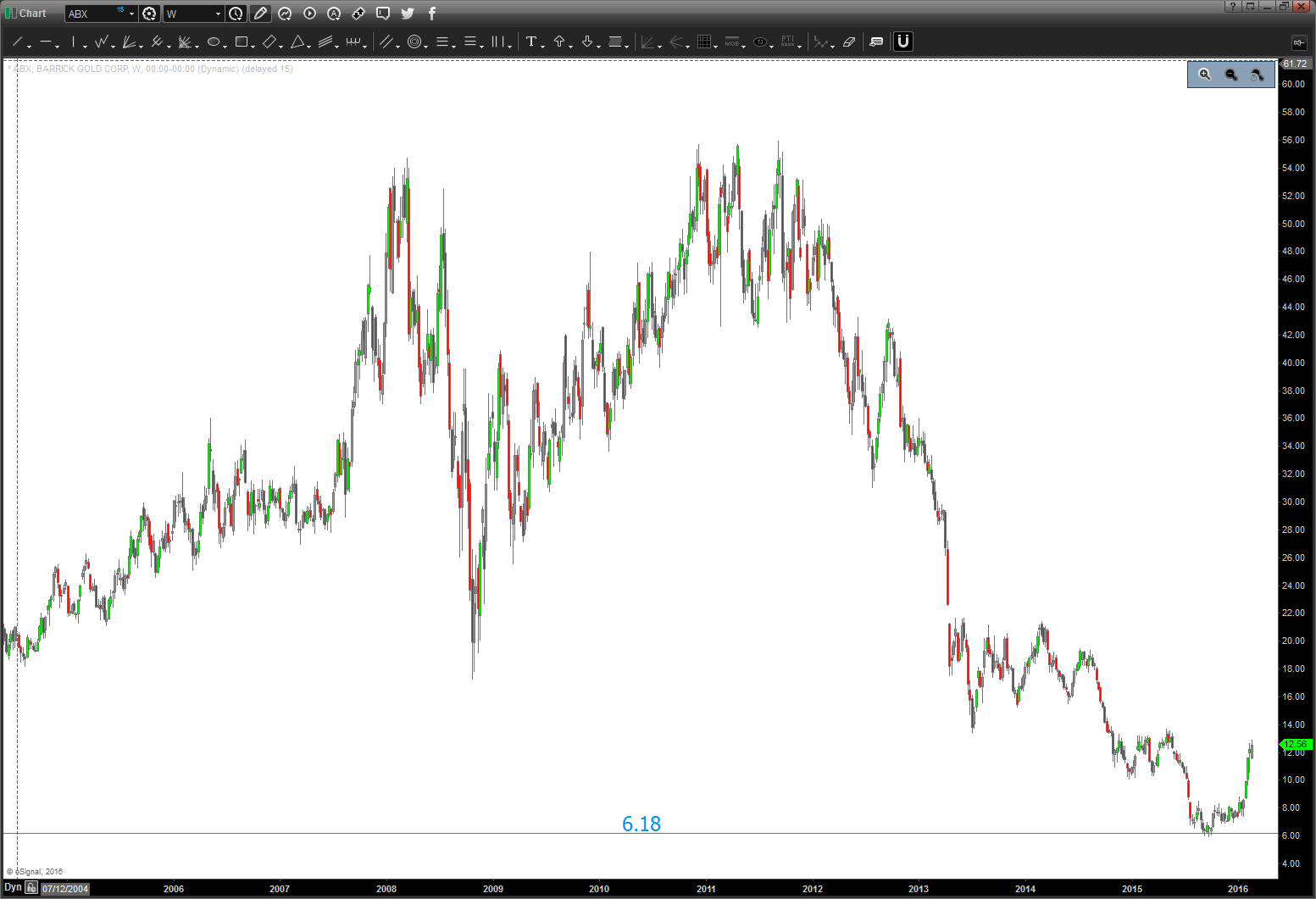
04/11/2016 update: ABX gap up today was impressive. this puppy is on a tear ever since it closed at the low of 6.18. HA … pretty cool.
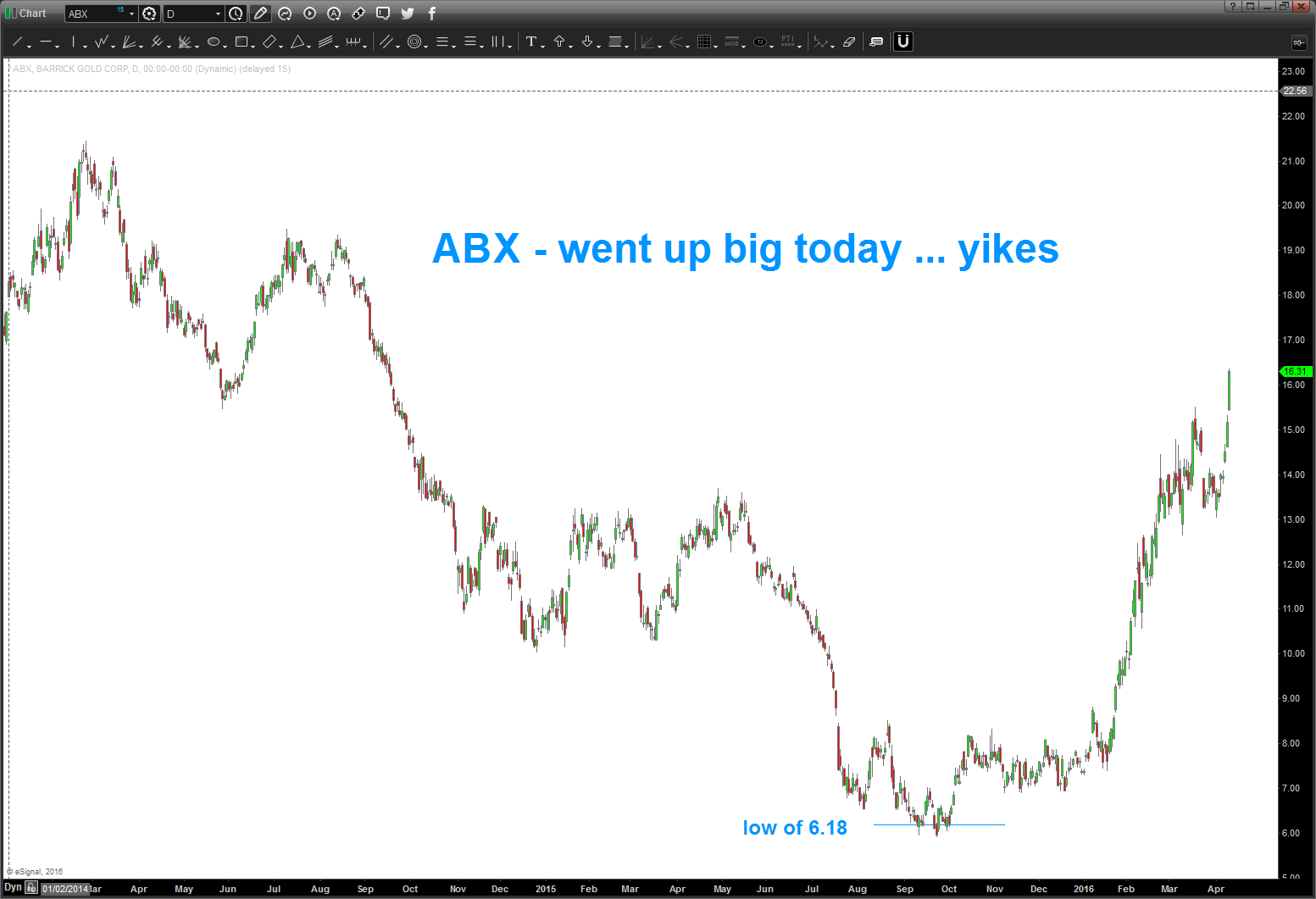
going back in time, here was the set-up.
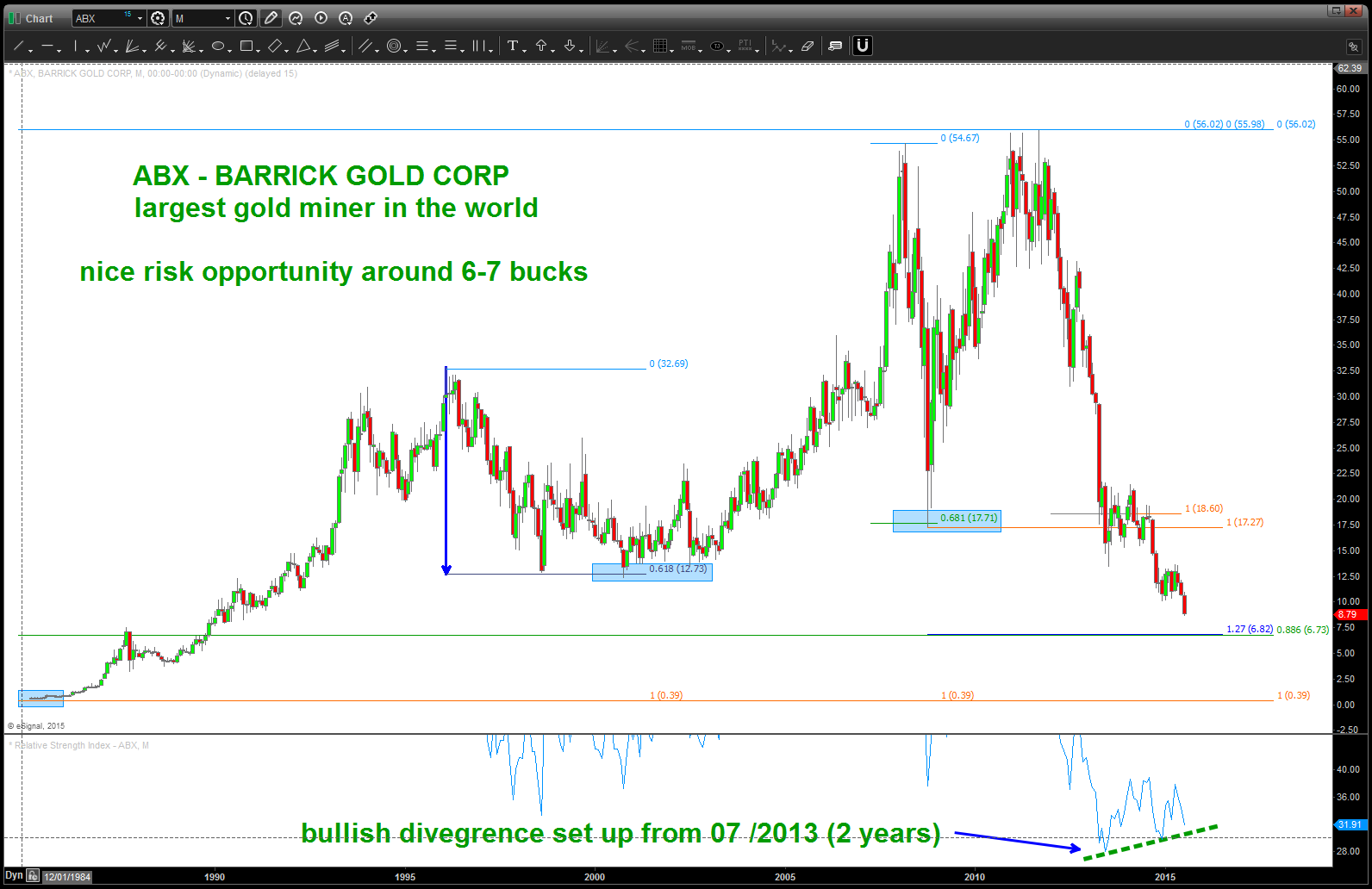
$ABX – NOTE the bullish divergence 2 years in the making
So, again, PATTERNS fail and PATTERNS work and it’s all about managing the risk. NOTE – it went below the “actual” pattern by 60 cents or so but “ultimately” close right at 6.18 (.618) It’s a Friday and, frankly, I’m too tired to figure out “why” it stopped where it did … but, trust me, there is a reason.
have a good weekend …
B
PS — note, looks like a we are in a 3rd of a 3rd so a pullback “could be coming … believe 18-20 dollars is a very nice target to shoot for. Will watch over the coming weeks.
ABX updated … wow
Posted on April 11, 2016 Leave a Comment
04/11/2016 update: ABX gap up today was impressive. this puppy is on a tear ever since it closed at the low of 6.18. HA … pretty cool.
going back in time, here was the set-up.
$ABX – NOTE the bullish divergence 2 years in the making
So, again, PATTERNS fail and PATTERNS work and it’s all about managing the risk. NOTE – it went below the “actual” pattern by 60 cents or so but “ultimately” close right at 6.18 (.618) It’s a Friday and, frankly, I’m too tired to figure out “why” it stopped where it did … but, trust me, there is a reason.
have a good weekend …
B
PS — note, looks like a we are in a 3rd of a 3rd so a pullback “could be coming … believe 18-20 dollars is a very nice target to shoot for. Will watch over the coming weeks.
Visa … an amazing business model and an amazing ride and some cool math.
Posted on April 9, 2016 Leave a Comment
Hint: take some profit …
Here’s some charts on Visa .. actually doing this blog post to the JOSHUA TREE by U2. What a great piece of poetry .. “The Mother of the Disappeared” is amazing. Anyway … I think this run in Visa is done “here” or into the 3 drives. check out the monthly bearish divergence present .. should be topping “now-to soon”
cheers, continue to make it a great weekend …
Bart
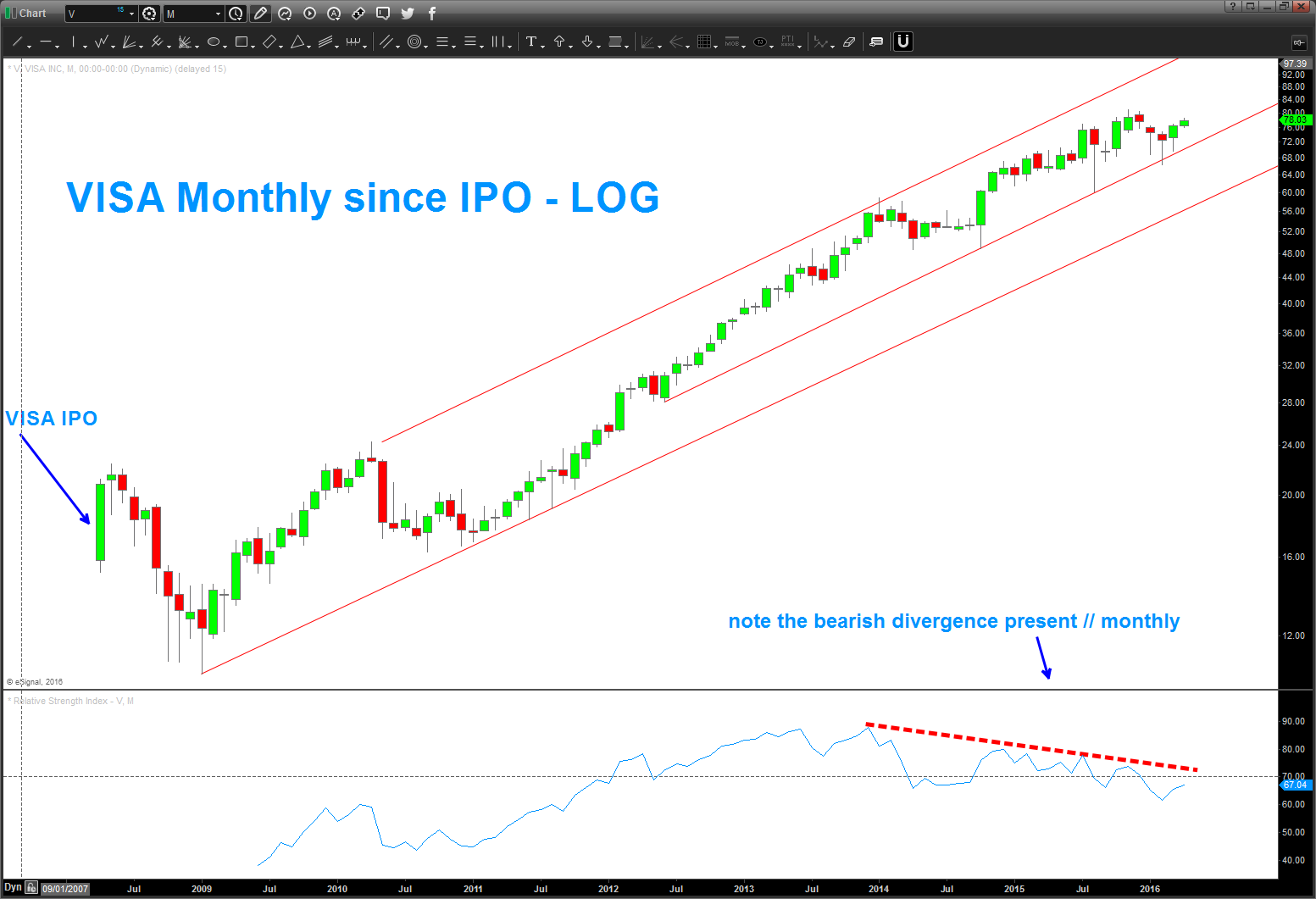
might go up to that upper trend line but this “long term” bearish divergence has me concerned … check it out.
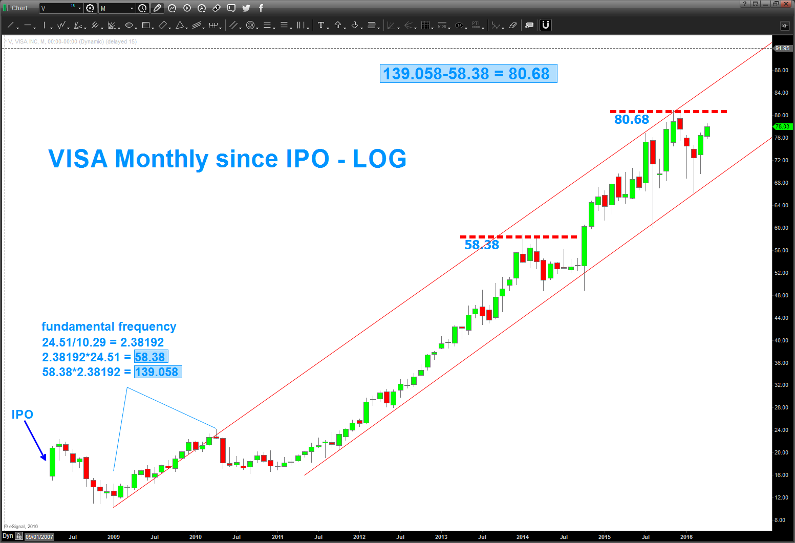
folks, the above chart shows the fundamental frequency. if you want to figure it out …check out http://www.stockcyclesforecast.com as Michael Jenkins is not only an amazing mentor but he’s a friend. HE TAUGHT ME THIS … the credit is all his.
above are the targets …not sure which one it will be.
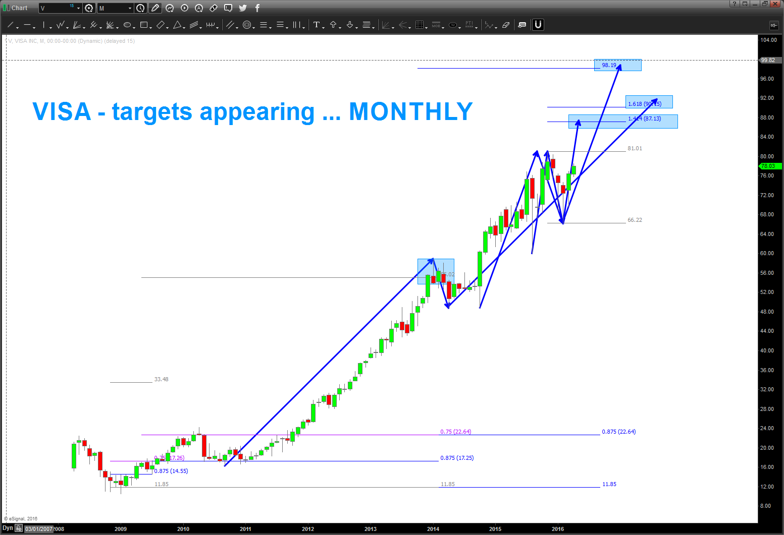
all that being said – we have a GREAT SELL PATTERN appearing NOW.
so, IF this holds then Visa could start down BIG ELSE it will seek the higher targets.
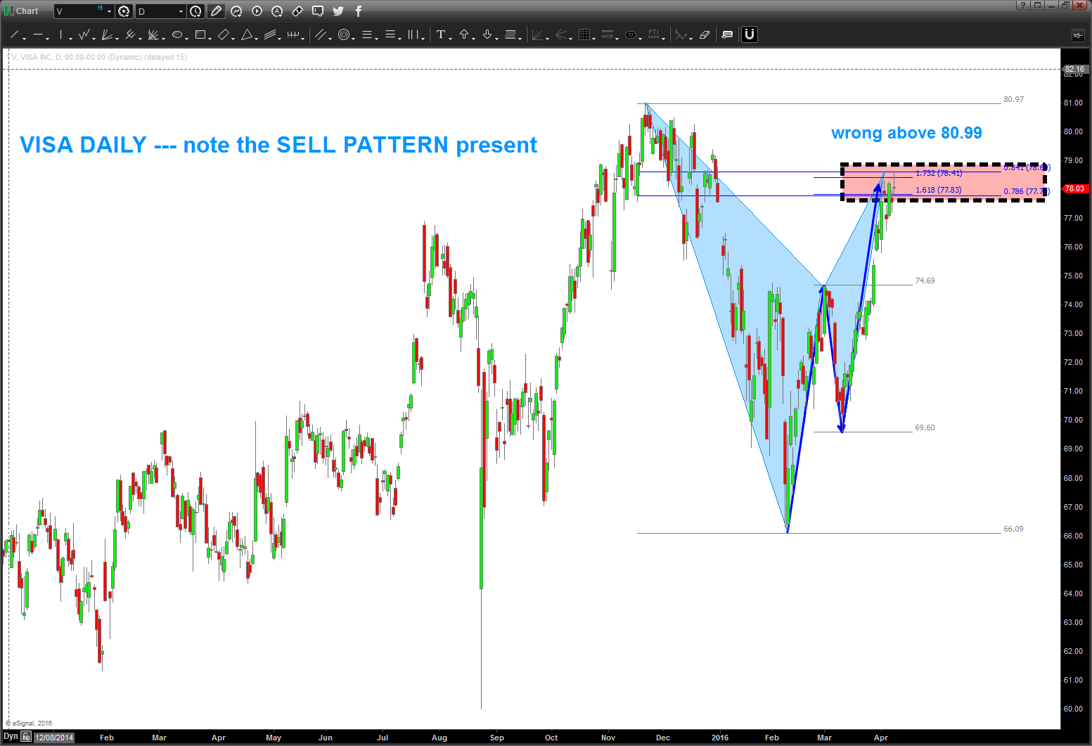
So, on the long term charts the monthly bearish divergence coupled w/ the targets shown above and the SELL PATTERN hitting on Friday say that this goose is cooked. I will be shocked if Visa can overcome the levels shown above … but that doesn’t mean anything, it’s all probability.
let me know if you have any questions.
B
NYSE Index – UPDATE
Posted on April 9, 2016 Leave a Comment
did a little bit of work on the NYSE for my friend Larry P and found some pretty interesting “form and proportion” w/ regards to the $NYSE.
folks, it’s almost ALL the SAME.
Here’s what I see on this chart:
- note the blue triangles
- the vertical represents PRICE and the horizontal represents TIME
- from 2007 high we went down into the area shown “started down” and consolidated for, roughly, 6 weeks and then it broke.
- in Nov 2008 we found a low and rallied the EXACT same as the rally after the first break (the dashed black line)
- form the 2009 lows we move up into May 2011 and then corrected – the EXACT same price. Note, the time was “off” but when it did hit the same TIME the market fell, found support and rallied up into the May 2015 highs.
- we’ve corrected DOWN the same amount and rallied UP the same amount (black arrow) and we are at the “time” for it to start down again.
- the vertical represents PRICE and the horizontal represents TIME
guess the big question is will it start DOWN DOWN or will it find support.
I do not know ….but what I do know is it appears ready to start a leg down. If your a bull then WAIT for the first BULL PATTERN to appear. If your a bear, get short in/around here and stop out above the black arrow. Hope this helps.

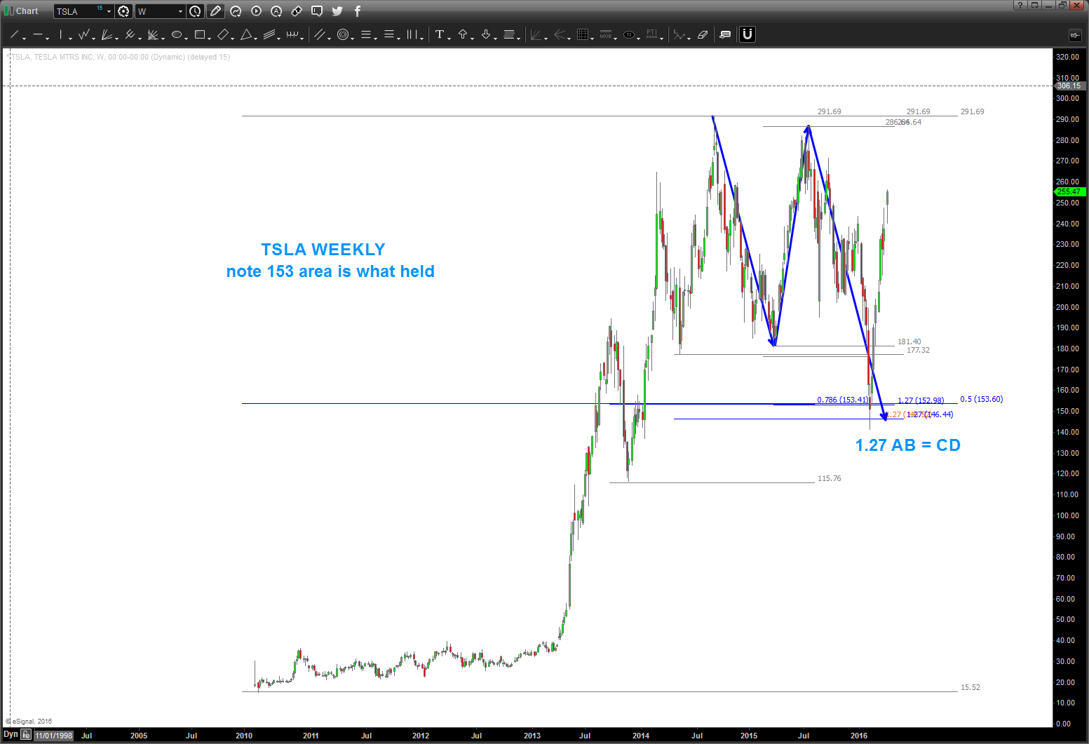
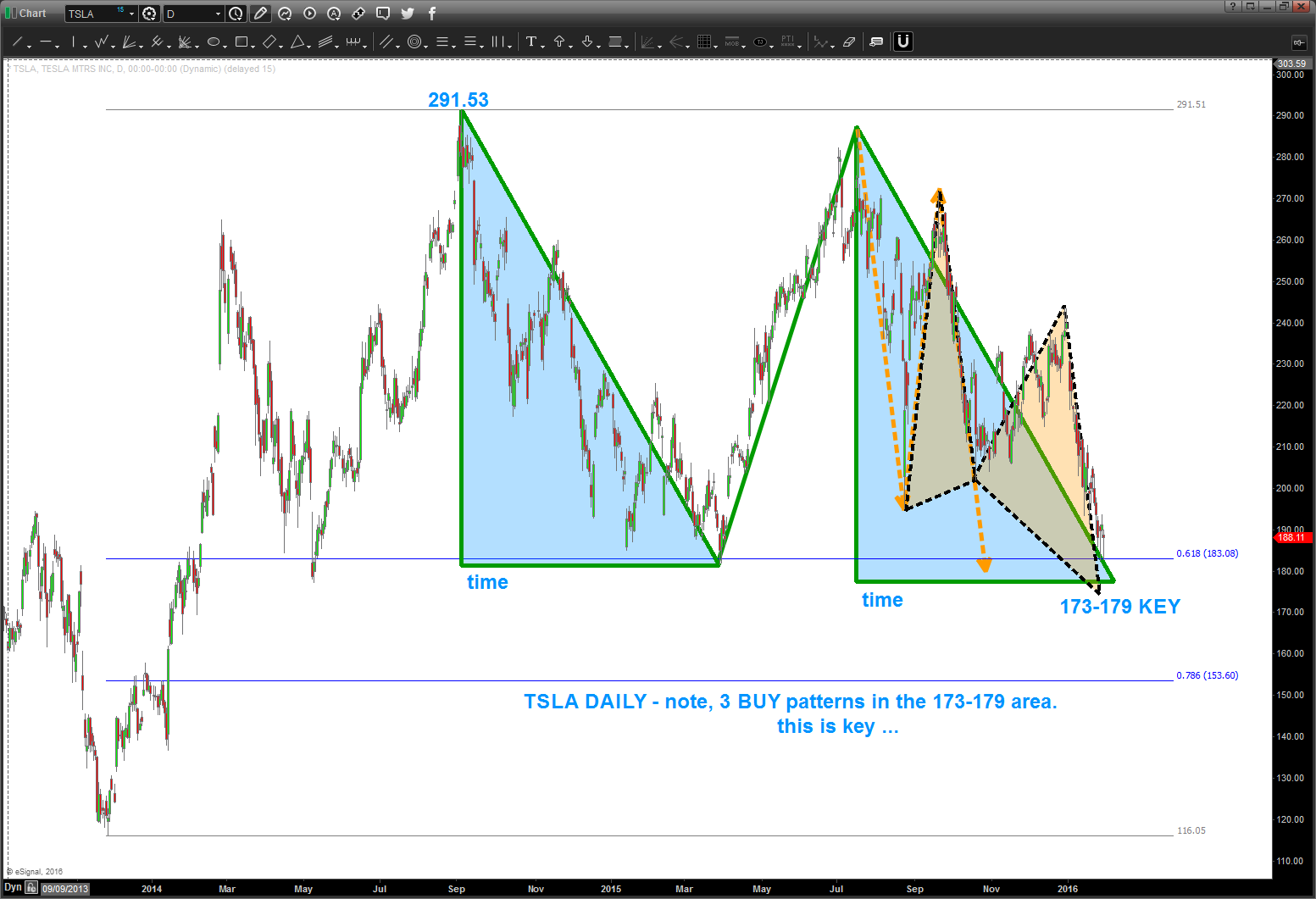
$TSLA
Posted on April 5, 2016 Leave a Comment
04/05/2016
As you can see the pattern in/around 173-179 got smoked. Folks, they don’t all work … but you also see I mentioned 153 would be the next stop.
so, patterns work and patterns fail. want to show you the NUMBERS that led to the next target (I hate the could have would have should have but just want to show) and also note the measured moves UP that TSLA has done. don’t be greedy, were at an important level right now.
Bart

so from my fellow geek technician JC he always loves the “from failed breakdowns/ breakouts come strong moves” well here is a possible set up.
as a PATTERN guy what I have found is – totally technical – there is a reason for the market to stop at resistance or support.
in this case for TSLA you can see it’s “respecting” the .618 retracement from the last low … EVERYONE is watching this level and horizontal support.
and, if it breaks down, then “everyone” shorts and right below this breakdown level? 3 patterns coming in 173-179 ….
- pay attention to the “shaded blue triangles” as they represent equality in both PRICE and TIME. Appears 2/10 is the time frame for this level to be really equal in price and time. TBD …
- this type of pattern is a classic “FLAT” Elliott Wave correction … so, if TSLA is to go higher, believe this level needs to hold.
watch this level closely.
as a corollary, if we have a daily close below 173 then we have 153 and then, potentially, lower in the future.
let me know if you have any questions.
B
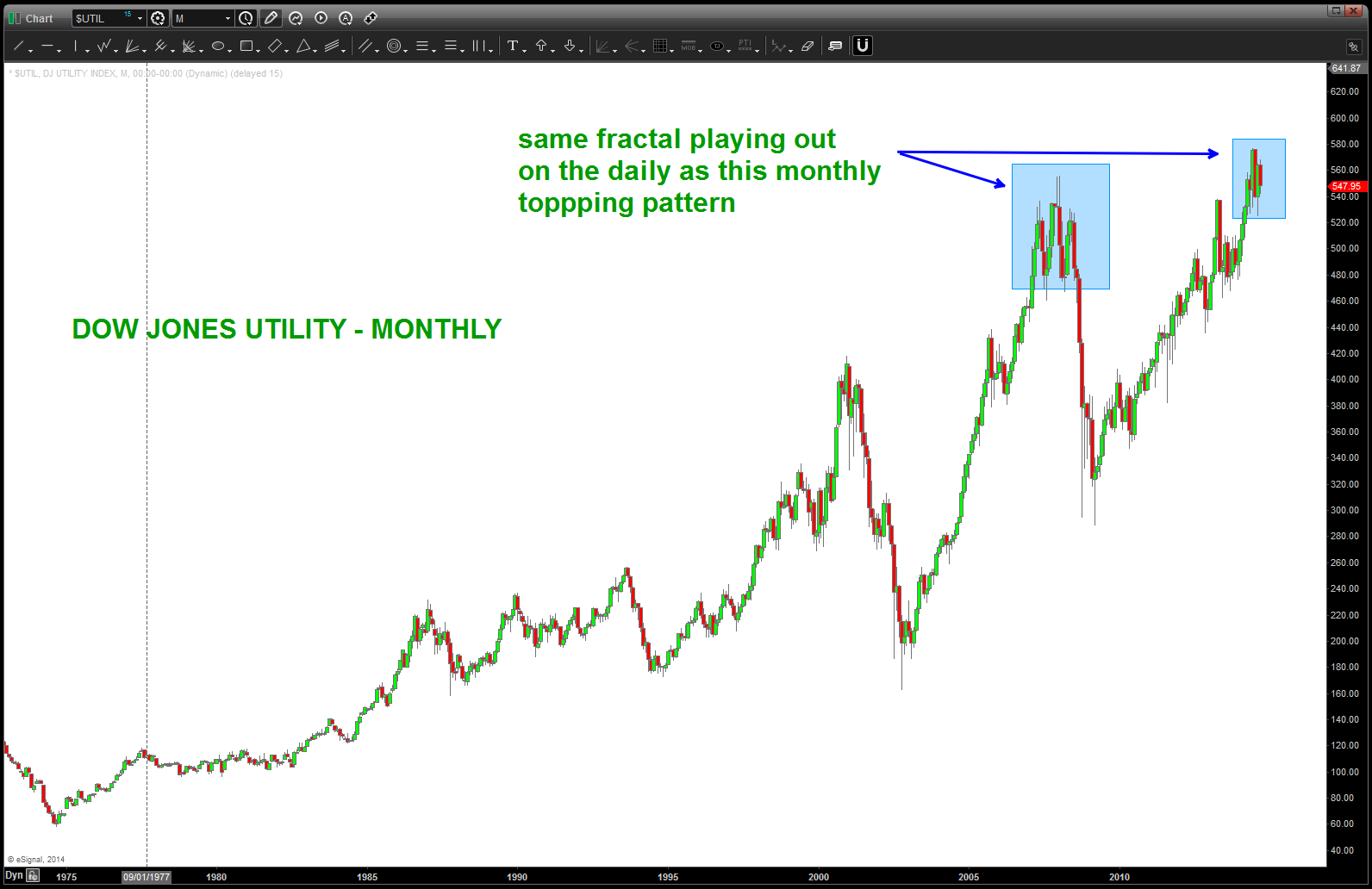
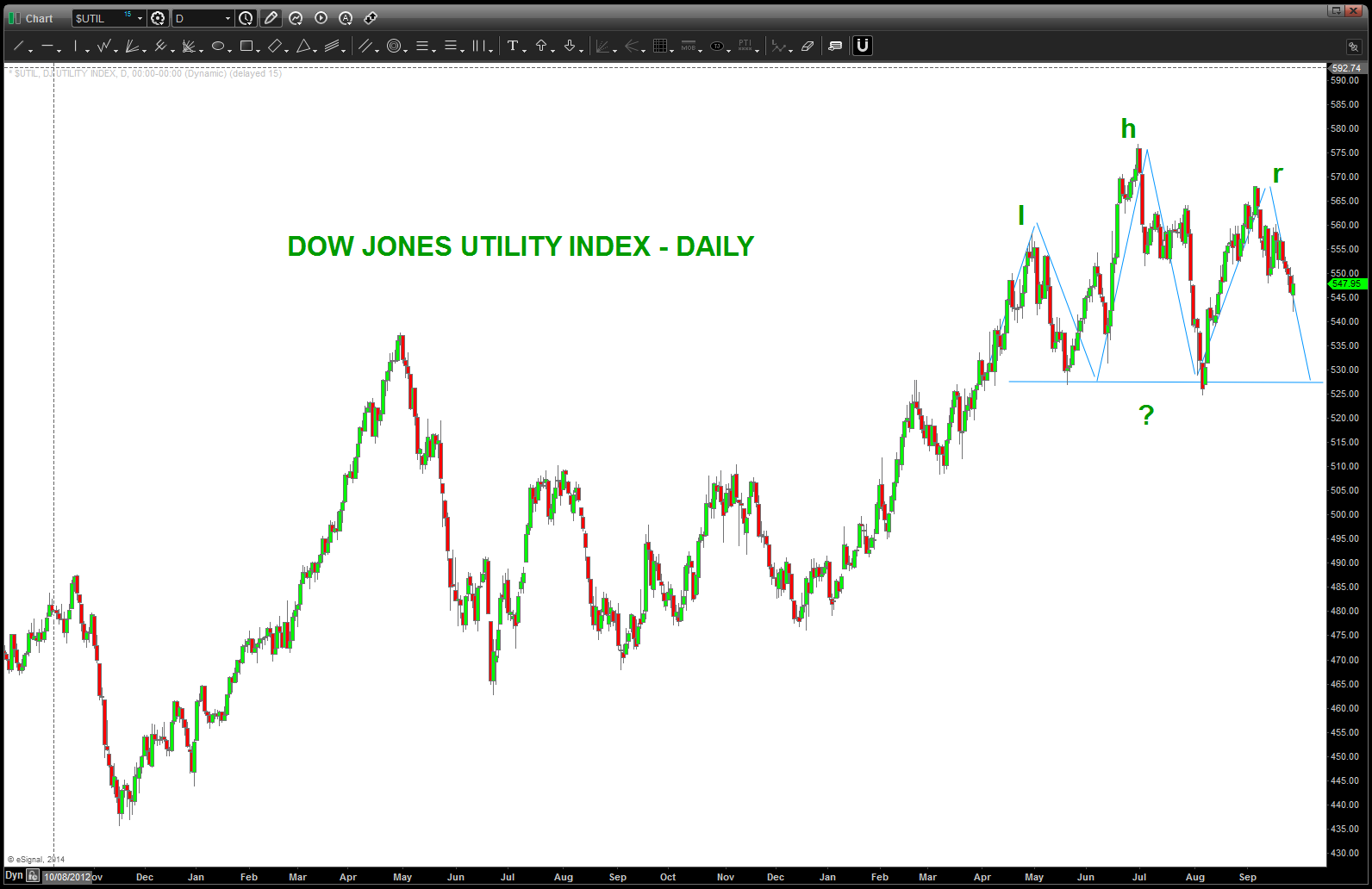
DJ Utility Index – important SELL pattern formed/forming. heads up
Posted on April 5, 2016 Leave a Comment
04/05/2016 – as you can see below, the pattern failed on the Dow Jones Utility Index in/around 560-570 and propelled higher.
now, per the chart below, you can see we are at another crucial juncture. the “blue arrow” represents the MAXIMUM that the Utility Index has moved since it’s low in 1942. In around the orange triangle labeled 3 (for the 3 drives to a top) the average should run into MAJOR resistance. this “should” put pressure on the bonds ….also, note the monthly bearish divergence present.
Warning sign, pay attention.
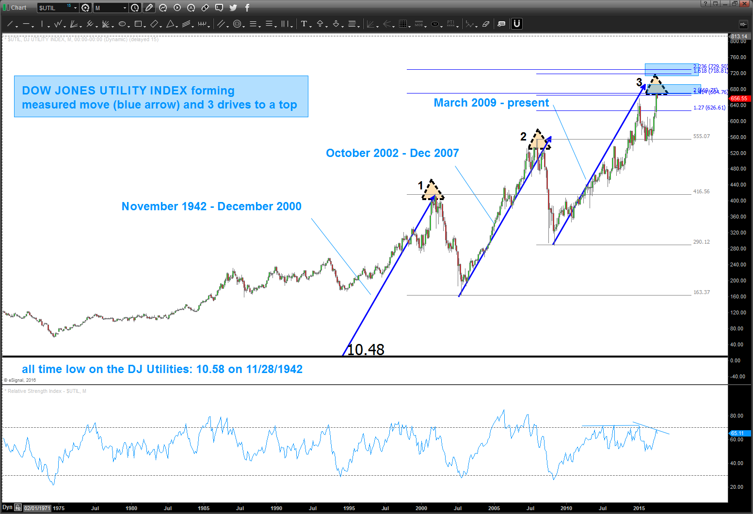
back in April 2014 (https://bartscharts.com/2014/04/19/dow-jones-utilities-long-term-1942-price-pattern/) we ID’d a long term pattern that was completing. the market subsequently went up into Jun/Jul and hit the target. now it appears we “might” be carving out a Head and Shoulders Daily topping pattern. Note, this same pattern came into play on a MONTHLY basis during the 2007-2008 time frame.
the reason we are watching this closely is because of the presence of this long term topping pattern that has hit and held, thus far.

Final copy of brief …
Posted on April 3, 2016 4 Comments
Might tweak it here and there but this should be it:
Looking forward to it, let me know if you have any questions.
Bart
thinking I’m going to use these slides for the “conclusion” and “summary” portion
Posted on April 2, 2016 2 Comments
limited in time but wanted to tie it all together like a Seinfeld Episode, so to speak.
Bart
Virtruvian Man and the market … square that circle!
Posted on April 1, 2016 2 Comments
having a blast putting together my presentation .. the only problem, I have TOO MANY charts. LOL …
I’ve added just a little bit more flavor to the intro and I’m trying, in 10 charts, to simply show:
- EVERYTHING is a system of pure pattern in FORM and PROPORTION
- EVERYTHING vibrates and puts off a sound or signature
- IF we understand SOUND then we can understand the universe
- Study sound thru the principles of music
- Apply this study to the market …
so now that the theory is done … I worked my way over into the Virtruvian Man and the POWER and real meaning behind that drawing by Davinci and, yes, applied it to the market. Had to cut out some of the slides because there isn’t enough time but thought it was interesting to see how one can “square the circle” in the market.
Believe it, or not?
Make it a great weekend.
B
US Dollar Index – doing what it always does but the EURO is throwing an important head fake
Posted on March 31, 2016 Leave a Comment
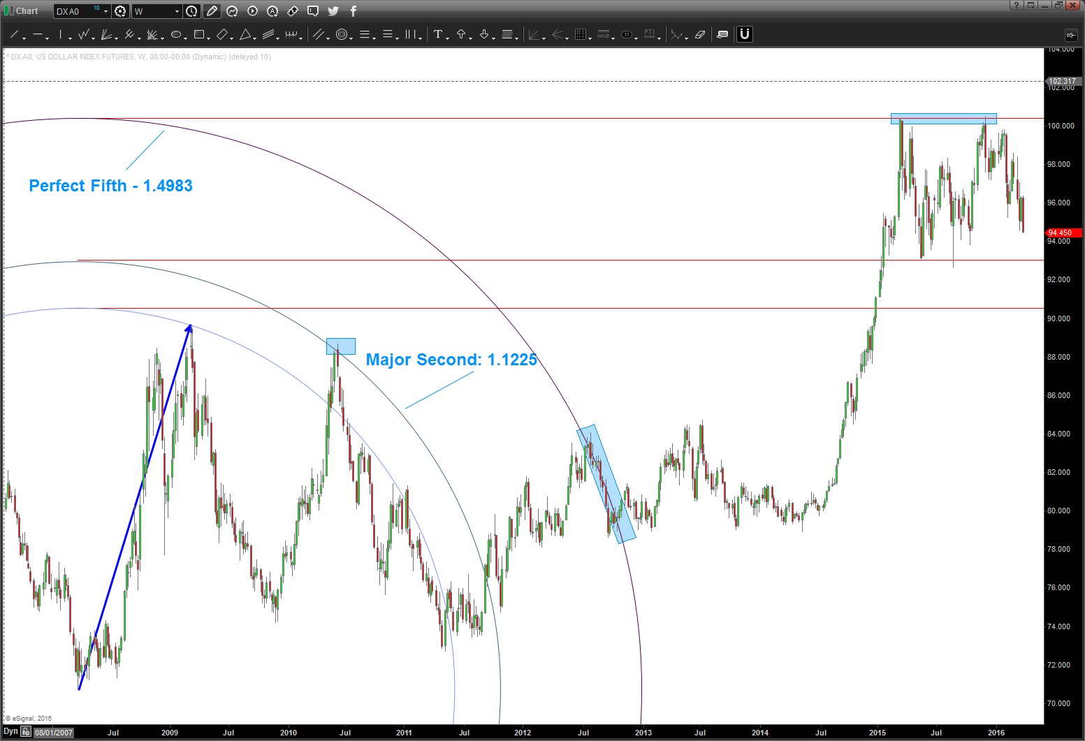
I believe the US Dollar Index is coming close to completing a year long “flat” corrective move and will, over the coming, weeks explode to new highs.
There, I said it. I have no idea what the fundamentals say, what Janet Yellen says, blah blah. All geometry and music – all the time.
Here’s the corrective moves of the past .. they have ALL arced out a “N” corrective move (see red lines on chart below)
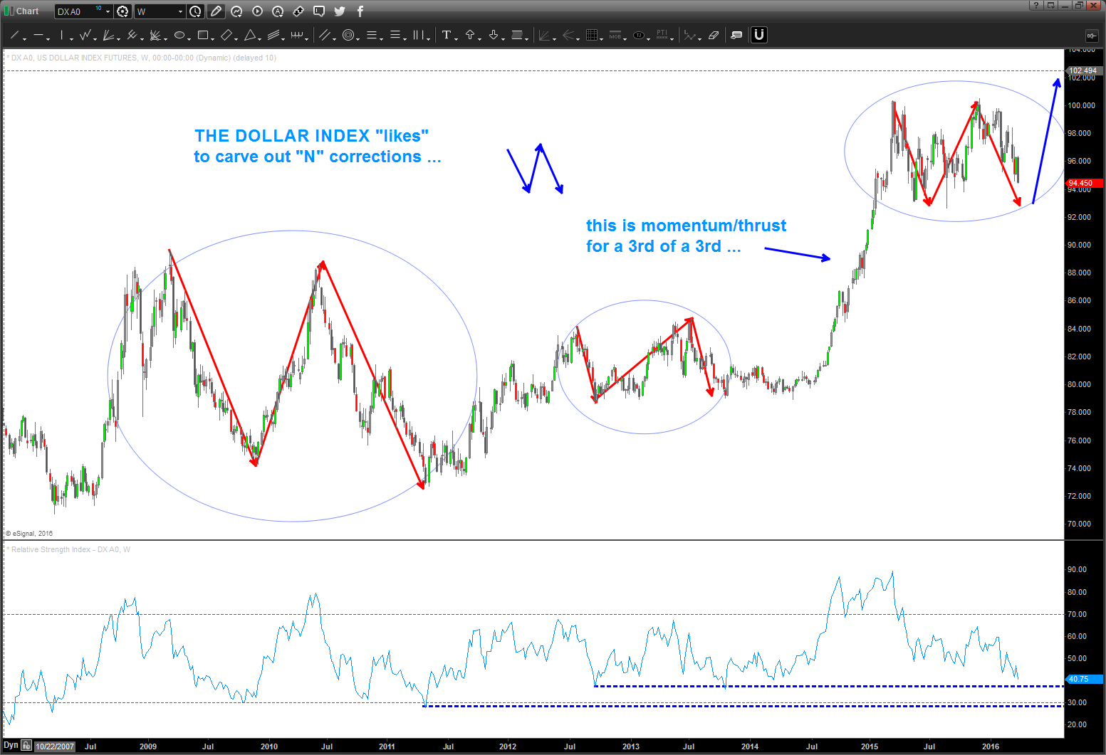
also, notice the 3rd of a 3rd thrust into this higher level … lastly, were getting to the lower level of the RSI (weekly)
the question? why is it holding this support? Well, music of course .. here’s the chart:
 from the initial lows we POP up and that move is the corresponding “energy” we use to move the “waves” out .. in this case we used all musical notes from the equal octave scale of music and used “musical” polarity to project the top of the circles as both support and resistance. (see the blue rectangles)
notice how these musical notes formed the channel of support and resistance for the USD…. cool, hugh?
knowing the EURO makes up a majority of the USD Index – let’s see what it’s up to!
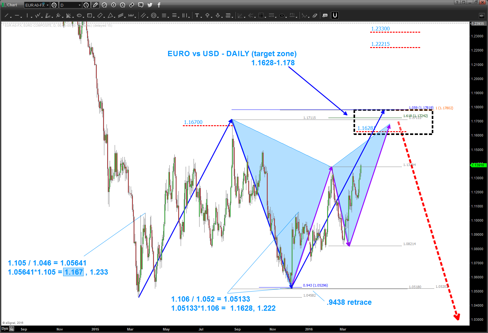
as you can see above, the triangle thesis is pretty much “out” but the formation of two very powerful patterns is occurring. I’m going to eye for 200 pips or so higher for another short opportunity.
how about the longer term weekly?
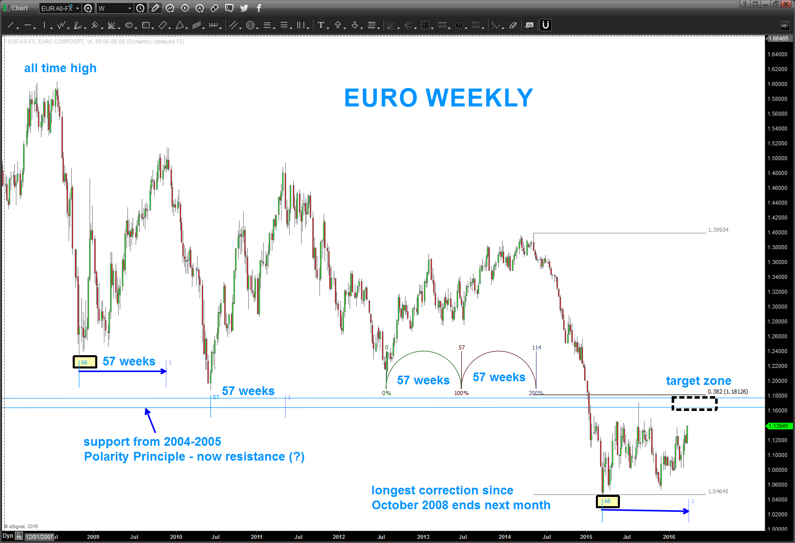
if you take a peak – you’ll see that we still haven’t even reached .382 of the most recent swing high. Additionally look at the TIME of the corrections. next week marks 66 weeks – the longest corrective TIME period since the all time high. (NOTE THERE IS A MISTAKE ON THE 2008-2009 area – it should NOT read 57 weeks but 66 weeks – apologies.)
also, note thee target zone comes right into VERY STRONG POLARITY RESISTANCE from 2004-2005.
Appears “bearish” doesn’t it ….?
WELL, HOLD YOUR HORSES … this could be a HUGE move based on a QUARTERLY LOOK at the EURO:
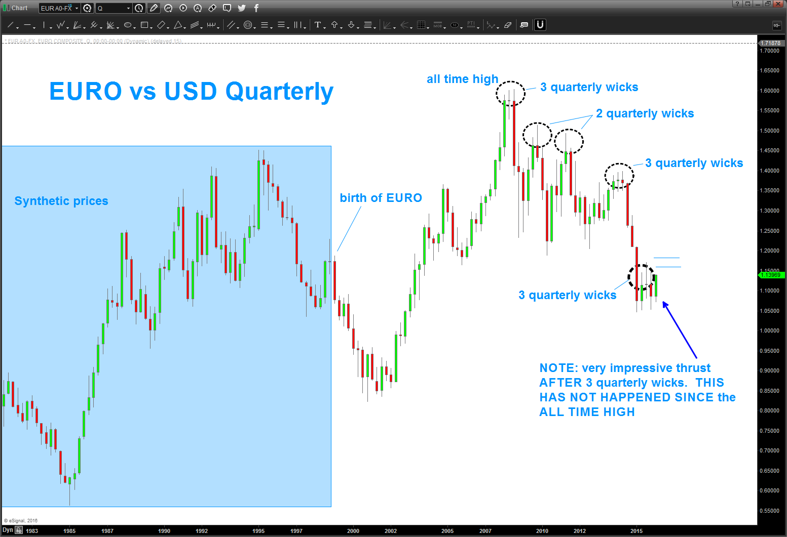 in this LONG TERM QUARTERLY chart you can see that it produced 2-3 “quarterly wicks” and then dropped .. THE OPPOSITE HAS HAPPENED and w/ the CLOSE of the QUARTER TODAY this is a VERY STRONG CANDLE. This target area shown (blue horizontal lines) must be respected to start the next leg down.
Very crucial and important time for the Worlds Currency Complex across the globe …
Let me know if you have any questions.
