the EURO now (finally) we are interested ….
Posted on June 5, 2014 Leave a Comment
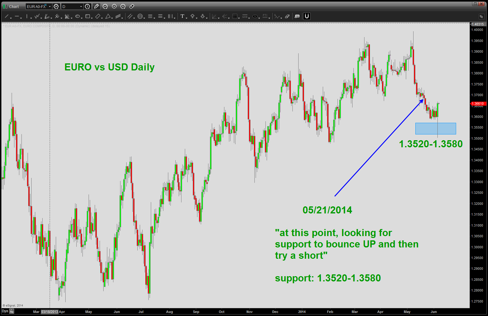
On 5/21/2014 we posted that we were waiting for 1.3520-1.3580 to provide support for the bounce UP to SHORT. W/ the ECB announcement today it got going BIG TIME and went thru our level by 8 pips. Negligible. Did I deploy capital for V50? ABSOLUTELY NOT … no, I’am building my case for entry on a short and waited, albeit patiently for the level area to get tested and either work or not … it worked so now we build the case for entry and potential entry points. To review the post from 05/21 please see:
https://bartscharts.com/2014/05/21/euro-vs-usd-at-this-point-looking-for-support-to-bounce-up-and-then-try-a-short
NOTE: I truly did not care one bit that the ECB is showing the world how dire their situation is in the Euro Zone today … I trust my patterns and the levels and now build the case for a EURO short and I will deploy capital WHEN/IF a pattern appears. Let’s get to work …
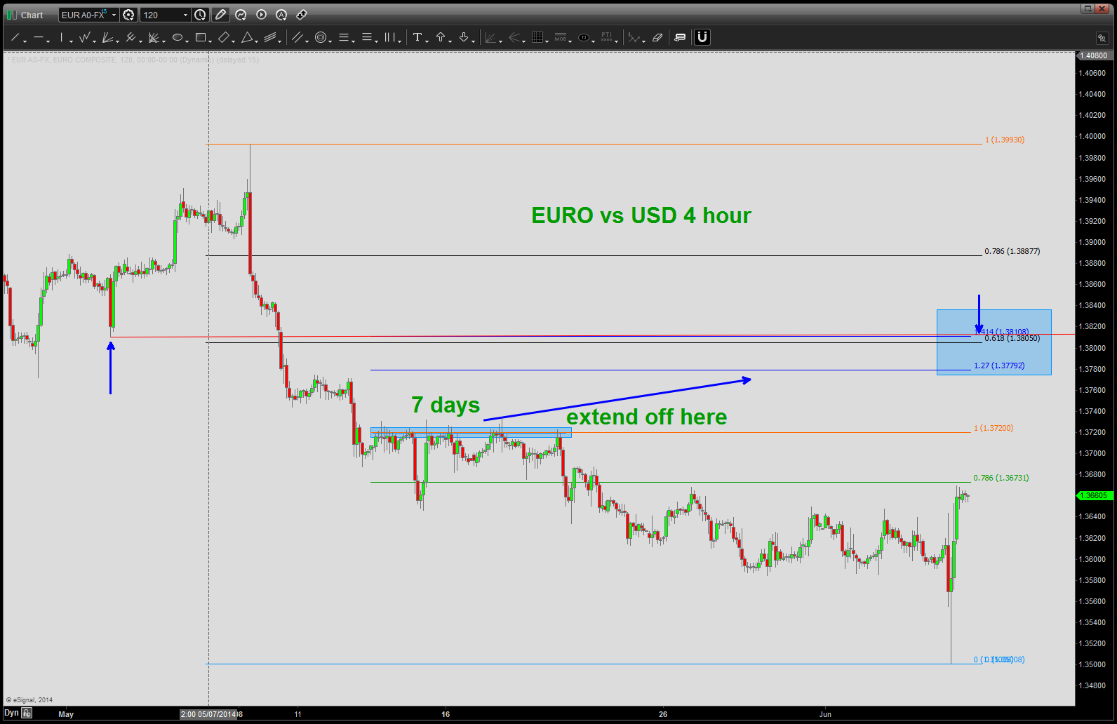
- note blue arrows and .618 overlapping. Polarity on top of a .618 retracement. I like that …watch this level at 1.3805.
- note the blue rectangle shaded area .. price held at that resistance point for 7 days. EXTEND off of that point.
now we are going down to a 30 minute chart …THE KEY TO THIS ENTIRE MOVE IS THE SIGNAL REVERSAL CANDLE …note the blue arrows. I am now PROJECTING UP using this candle and NOTE it stops right at the 4/8 th (.5) increment. This is good because the 8/8 is RIGHT AT THE .618 retracement …
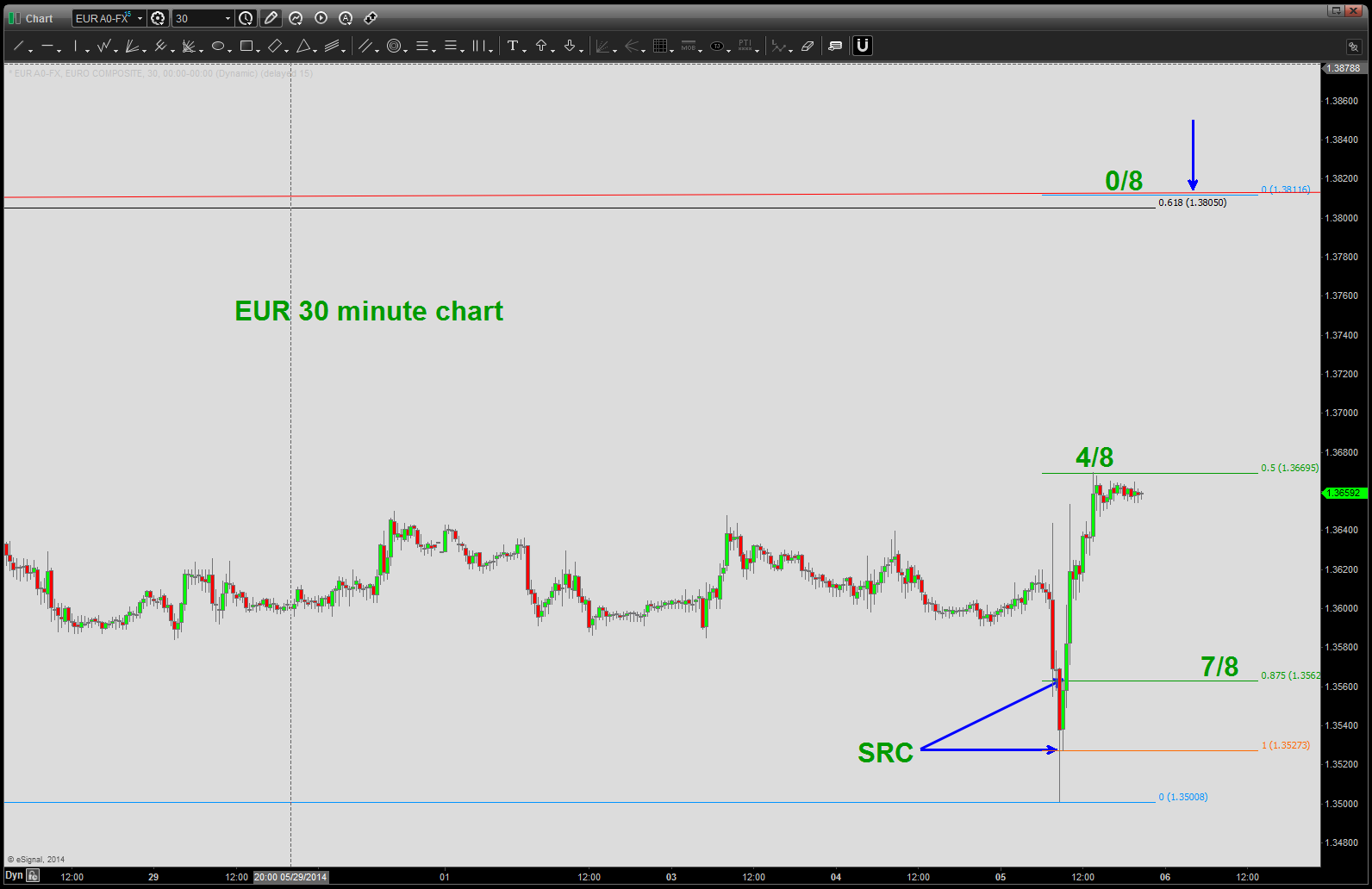
so, the nice thing we are expecting is a 3 wave corrective move UP into our target zone. nothing to do now but wait … you know it will be crazy tomorrow morning so just sit on your hands for non farm payroll. The opportunity to make money will be next week …trust me on that one.
good night!
reheating the Campbell Soup post from Sept 13′
Posted on June 2, 2014 Leave a Comment
CLIFF NOTES: here is the post showing the pattern completing and the short that was recommended. https://bartscharts.com/2013/09/17/soup-is-good-food-campbell-soup-at-key-level-cpb
Here’s the deal … they don’t get any better than this …it was a “near” perfect set up in PRICE AND TIME. An, if you think about it, the entire pattern took from 03/98 to 09/13 to complete. but you know what … it sure is strong. So, the .786 is a little higher around 52 so if we get above that it could really take off.
just thought I would show you a pattern at work …
think about it – go back and look at the post from last September and you’ll see a PATTERN completing and, for whatever reason, price went to that level (note it was actually a high at 49 – 7*7) and the BUYING STOPPED ON A DIME.
Patterns work and sometimes they don’t but they do work 100% of the time .. letting you know when you are WRONG!
Try em’ sometime, you might like it …
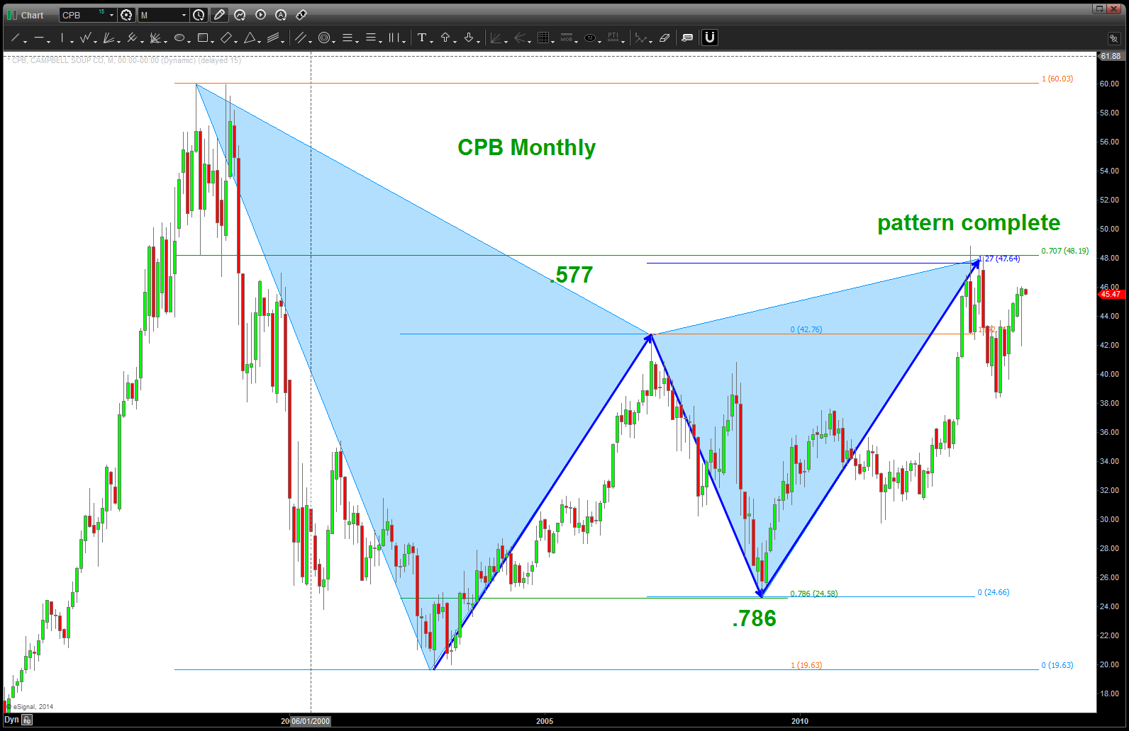
Campbell Soup
Hewlett Packard
Posted on June 2, 2014 Leave a Comment
Cliff Notes: w/ a weekly or monthly close below 105 become defensive. It appears clear that a 5 wave sequence is/has unfolded (ing). Other reasons for the resistance are shown below.

HP Monthly
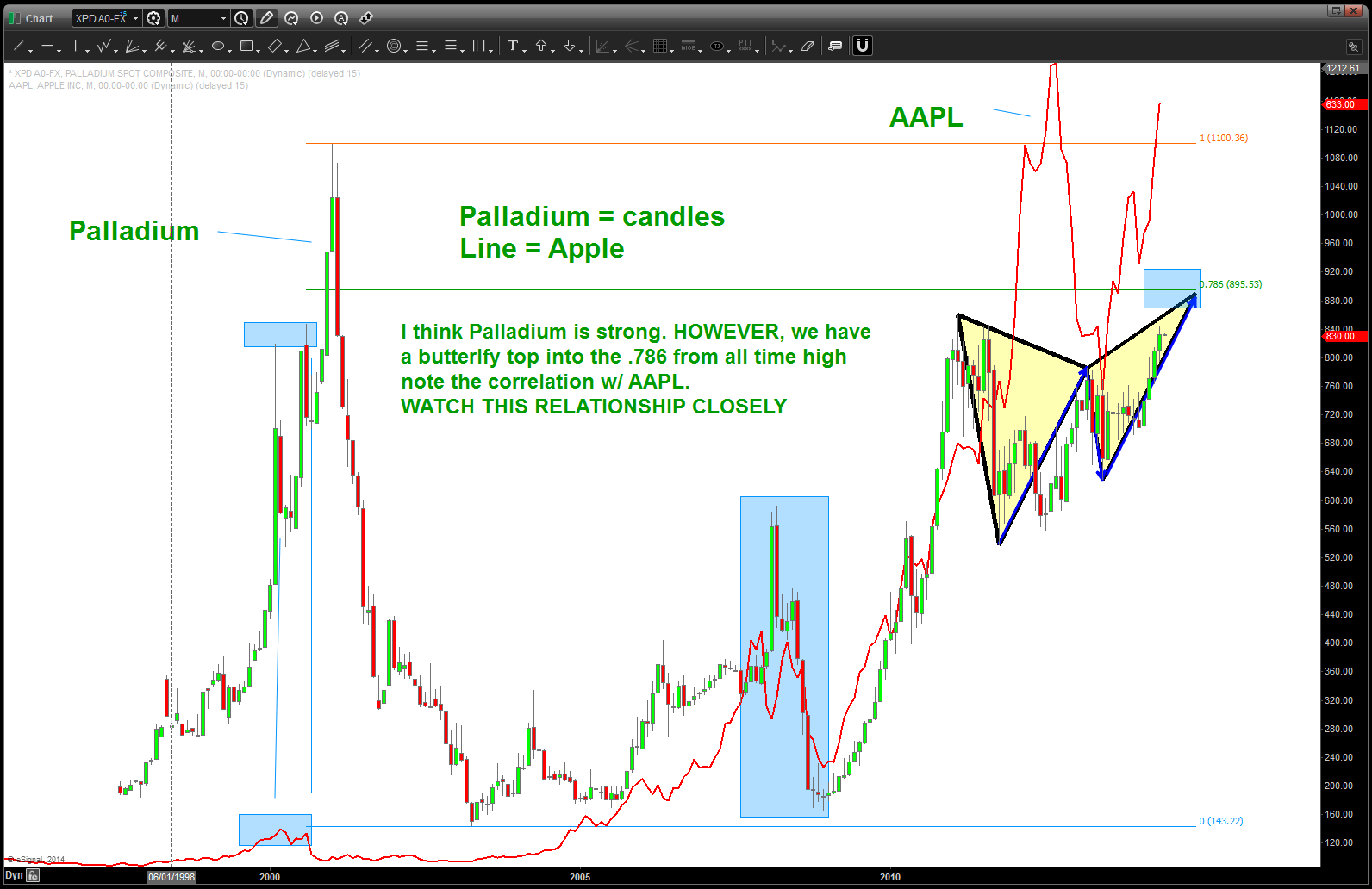
Palladium and AAPL
Posted on June 2, 2014 Leave a Comment
CLIFF NOTES: The second-biggest application of palladium in electronics is in the manufacture of multilayer ceramic capacitors,[42] in which palladium (and palladium-silver alloys) are used as electrodes.[34] Palladium (sometimes alloyed with nickel) is used in connector platings in consumer electronics.[43][44] It is also used in plating of electronic components and in soldering materials. The electronic sector consumed 1.07 million troy ounces (33.2 tonnes) of palladium in 2006, according to a Johnson Matthey report.[45]
CLIFF NOTES 2: for a while it was nearly perfectly synced w/ AAPL until AAPL went parabolic. It has recently broken out of a consolidating triangle while AAPL corrected from it’s near 50 % drop. Once AAPL bottomed, XPD started the leg up. Now we have what is called a butterfly top into the .786 from the old time high.
STRATEGY: watch this level on XPD (880-895) for signs of a top (weekly signal reversal candle) and w/ this confirmation would lighten/close any long AAPL positions. IF we get a WEEKLY close above the 895 level then continue to hold AAPL long.
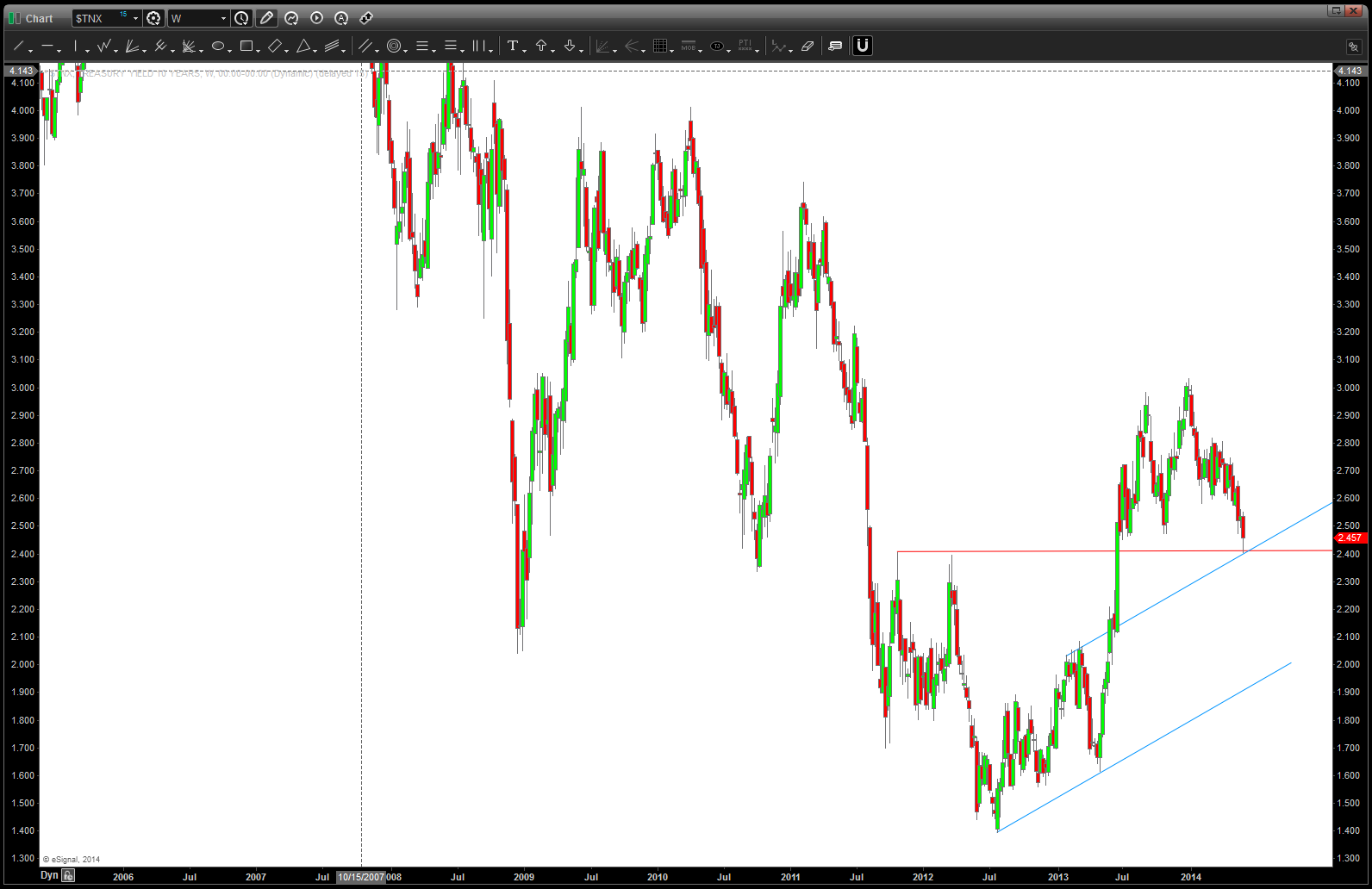
Ten Year Treasury Update Part II
Posted on June 2, 2014 Leave a Comment
Cliff Notes: here is the last post which was targeting the area where the rates went to …
. Now, it’s time for them to turn back up or else this pattern has failed.
Ten Year Update
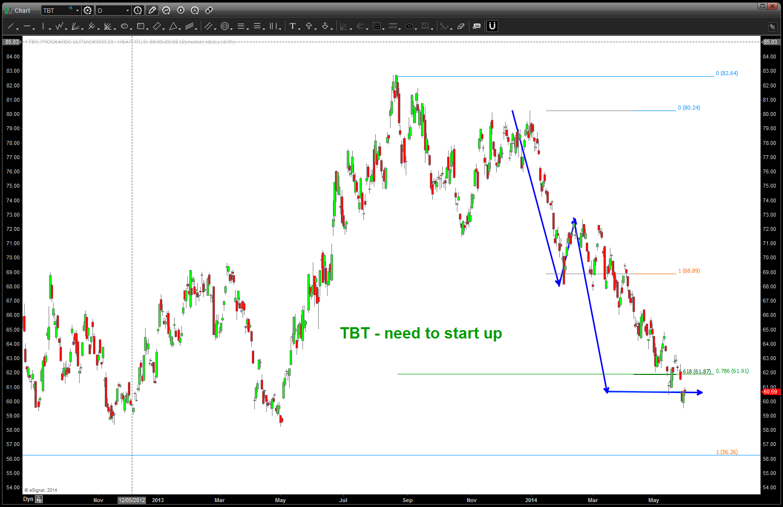
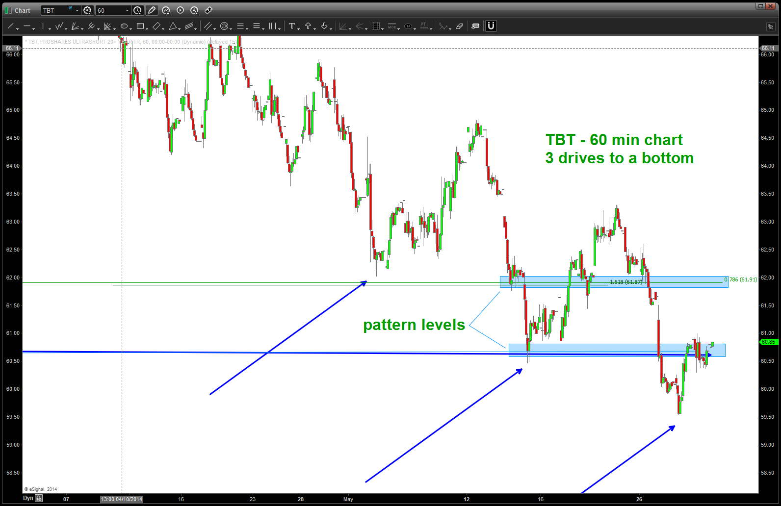
intraday tbt 3 drives to a bottom
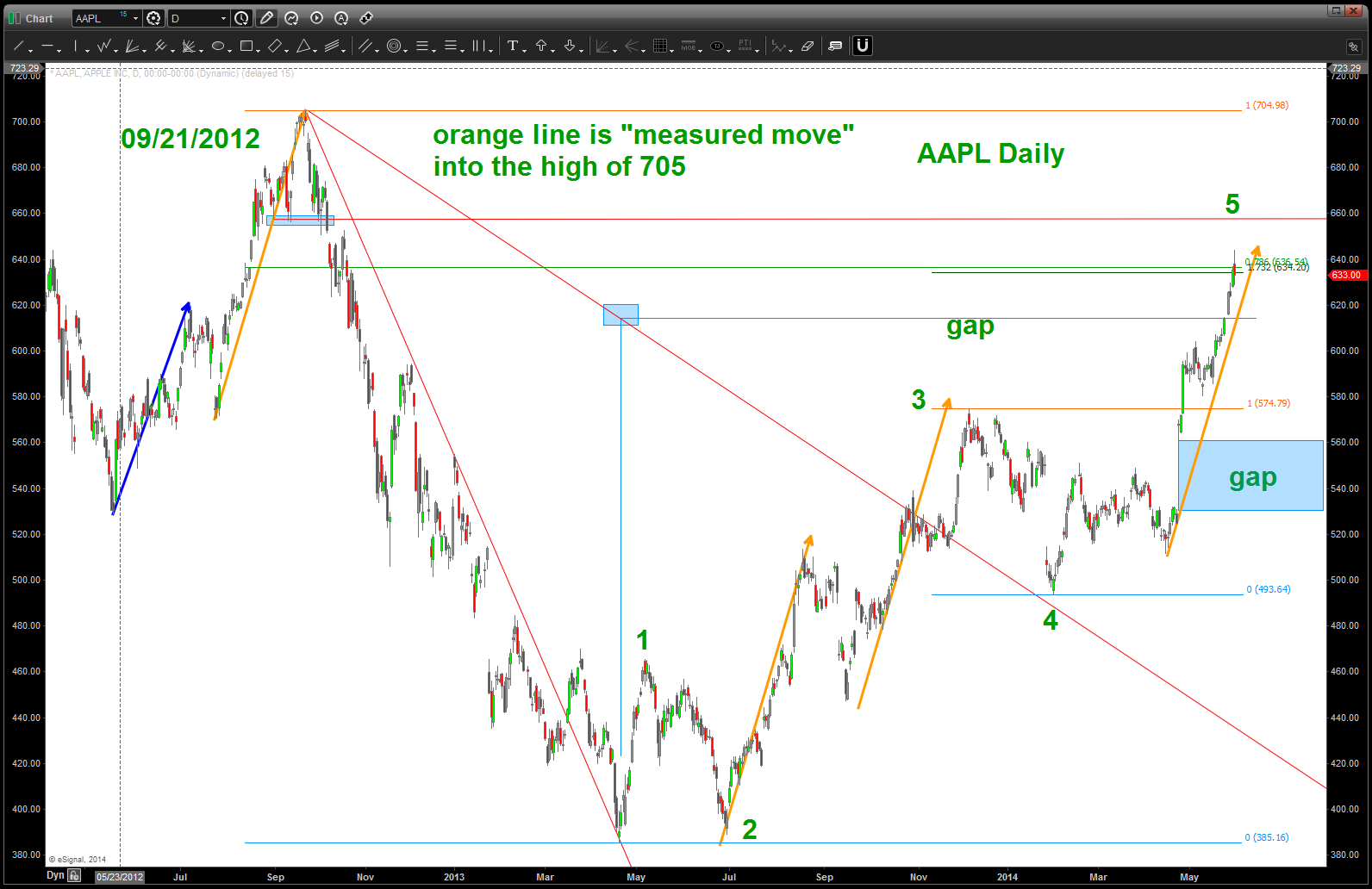
AAPL at key resistance
Posted on June 1, 2014 Leave a Comment
CLIFF NOTES: previous work on AAPL –
CLIFF NOTES 2: lots of swings showing key resistance on AAPL right where a bunch of numbers, measured moves and other stuff are coming into play. take this into account w/ the recent post on the S&P 500 sectors. As AAPL goes – the market usually goes in that direction. We shall see …
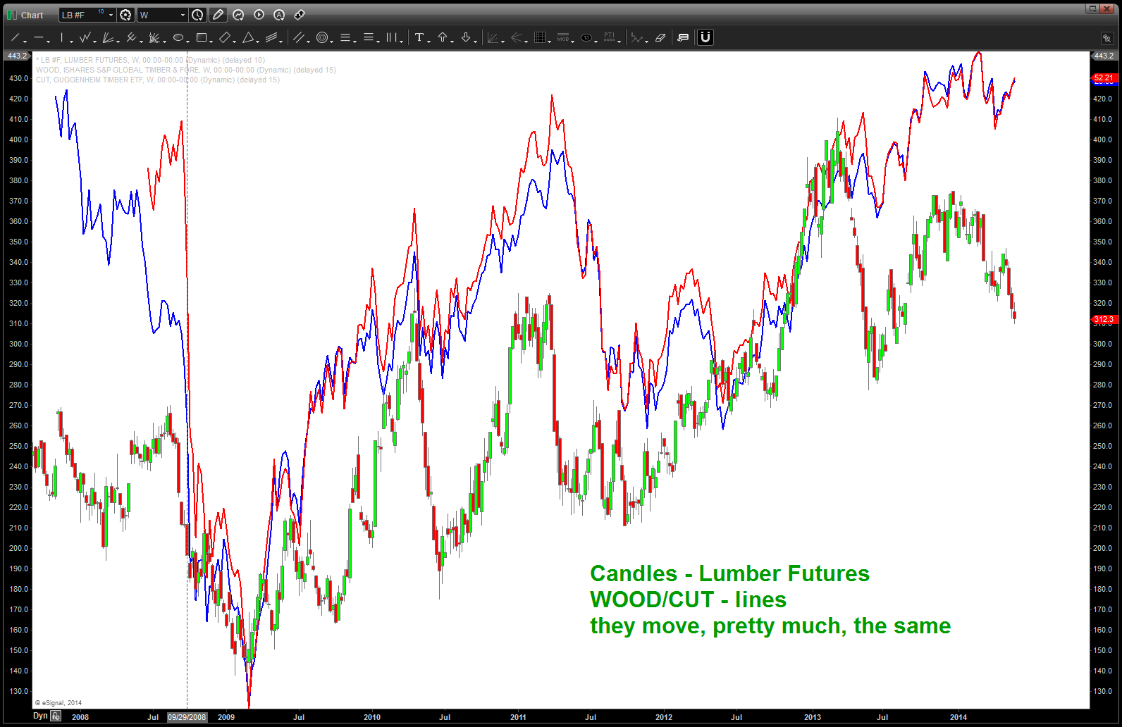
Lumber Futures and WOOD, CUT etf’s
Posted on May 31, 2014 Leave a Comment
CLIFF NOTES: below is a weekly continuous contract of the lumber futures. all the ratios come together at 241-242. this is a very nice one….stay tuned. might/could find support a little lower and then it’s off to the races in/around here but the larger pattern is very nice. appears bullish from a WOOD/CUT/Lumber Futures perspective.

Lumber Futures
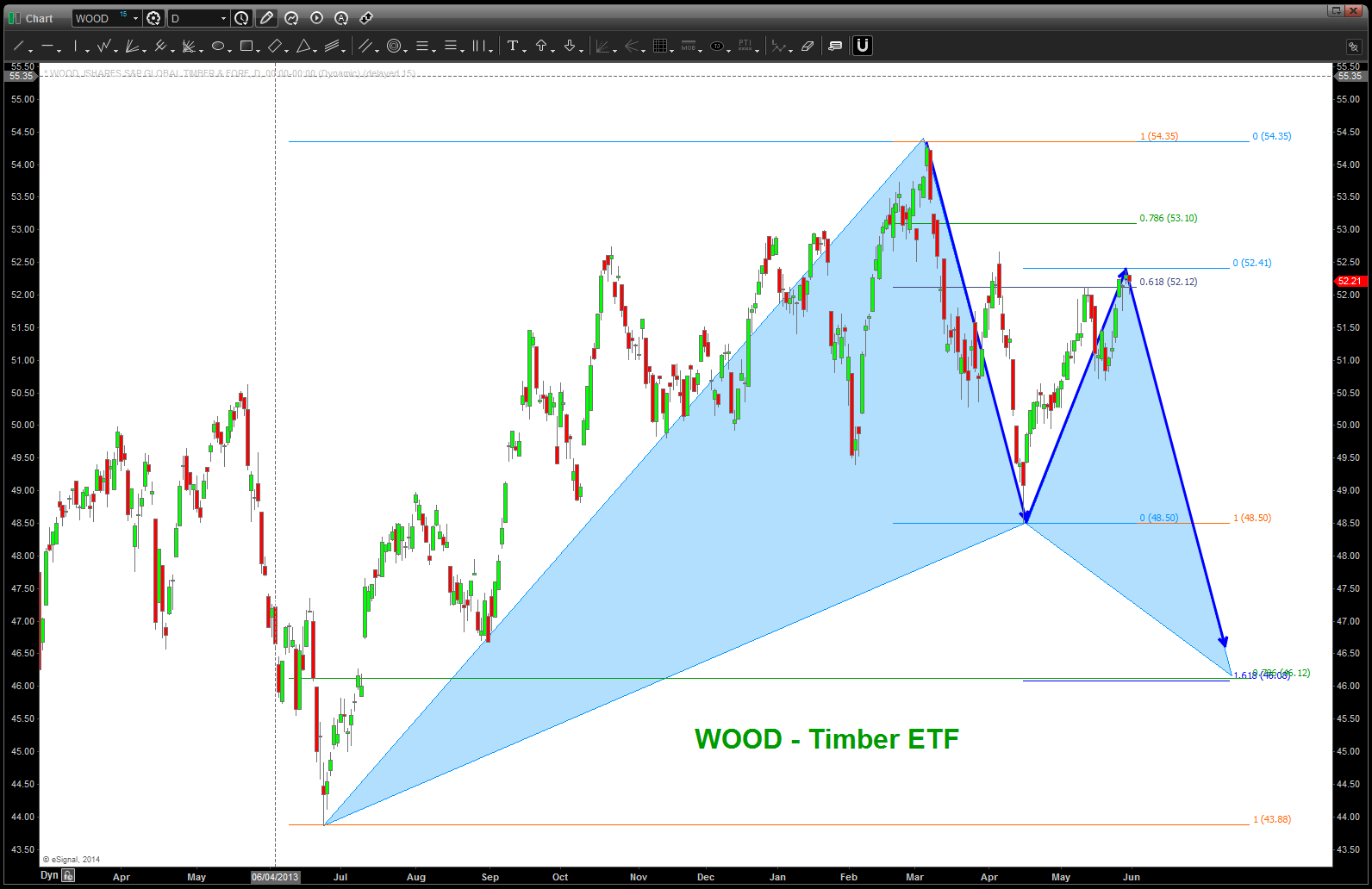
WOOD – Timber ETF
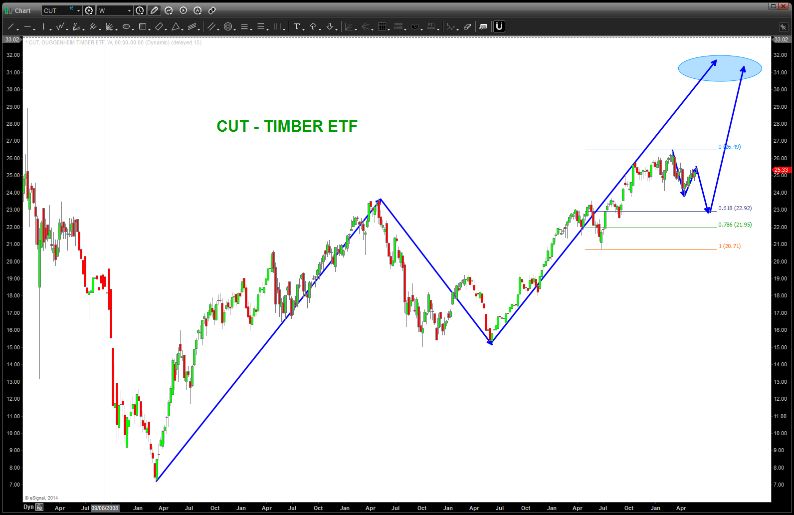
CUT
CTRL-ALT-DELETE. The S&P 500 sectors, AGAIN
Posted on May 31, 2014 3 Comments
CLIFF NOTES: the “chart of my lifetime” is still just that – an amazing chart of, quite frankly, my lifetime. I think it’s safe to say that the pattern from genesis of the Dow Jones Transports has been defeated. A pattern that took 45,000 days (+) to form and complete. Again, please, let that sink in … read it again, and one more time. In the world of probability this was a highly probable pattern that should have at least cause some pullback congestion ….! NOPE … not even close. Take a look at the BREAKAWAY MOVE and the explosion from the pattern area. Reminds me of the GOOGLE short at 921…if you remember, that level held for 6 months! Then exploded higher in a 100 point gap that was definitely egg in my face. O U C H …but, this pattern was less than 10 years old and it held GOOG for 6 months. Please, again, go back a couple sentences …the Transports pattern was 100+ years old. The PATTERN didn’t even hold it for a week …
CLIFF NOTES 2: I’ve gone back thru BA, AAPL, WYNN, PCLN, FB, IBM, LNKD, AMZN, SBUX, etc and those patterns WORKED and while they have all retraced the initial crack lower they sure do appear to be ready to surge forward w/ the rest of the market.
CLIFF NOTES 3: I’m baffled, a little concerned and well quite angry. Why? Not because the PATTERNS failed or didn’t….that’s called probability folks. I’m sharing my emotions because this puppy NEEDS TO CORRECT and that’s a good thing. Mentors of mine that have traded for 40+ years have taught me (which I believe) cycles that are extremely reliable and some of the most BEARISH CYCLES that we have ever witnessed (if you know it or not) hit in MAY and NOTHING happened. Read that last sentence again … it was, literally, the perfect storm of cycles. Am I questioning the cycles – nope. I AM QUESTIONING WHAT THE HELL IS GOING ON !!!!
CLIFF NOTES 4: if you have read this far. thanks. so, in order to do what the subject line states I am spending this SAT AM W/ you to reevaluate the S&P 500 sectors that “weigh” more than 10% and, as I type, I have removed any bias from patterns or talking head pundits or any outside influences. It’s me, the charts and 10,000 hours + of chart time (see this link: http://www.dailymail.co.uk/news/article-1078842/Practice-makes-perfect-Why-takes-10-000-hours-success-according-academic.html )
Here we go …as of 5/31/2014
1. IT makes up 19% of the S&P 500. I have chosen to use the VGT ETF as a proxy.
- I see blue arrows which represent maximum measured moves since 2009. We are completing one of those moves up against the 5 year trend line.
- I see a black/yellow triangle which represents TIME and we are 7 weeks past the last major move w/out a “nice” correction.
- I see BEARISH DIVERGENCE
- I see an increase of volume which reminds me of FOMO “selling at the bottom” and “buying at a top”
- CONCLUSION: resistance and correction ahead. Expect anywhere from 94-100 to hold this puppy back. 64 is not out of the question for a correction.
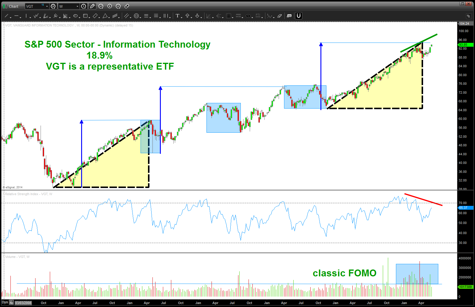
IT ETF 19% of S&P 500
2. Financials are 16% of the S&P 500. I have chosen XLF as our proxy vehicle for this sector
- I see the “basic” AB=CD (blue arrows) holding, so far.
- I see bearish divergence
- I see very very low volume
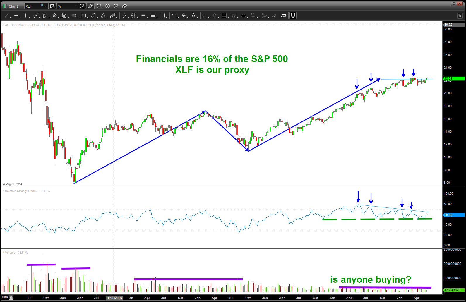
XLF Financial ETF
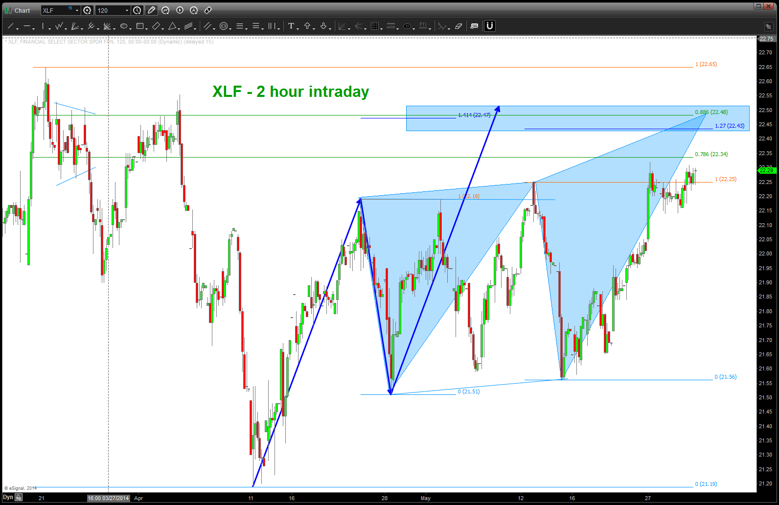
intraday XLF
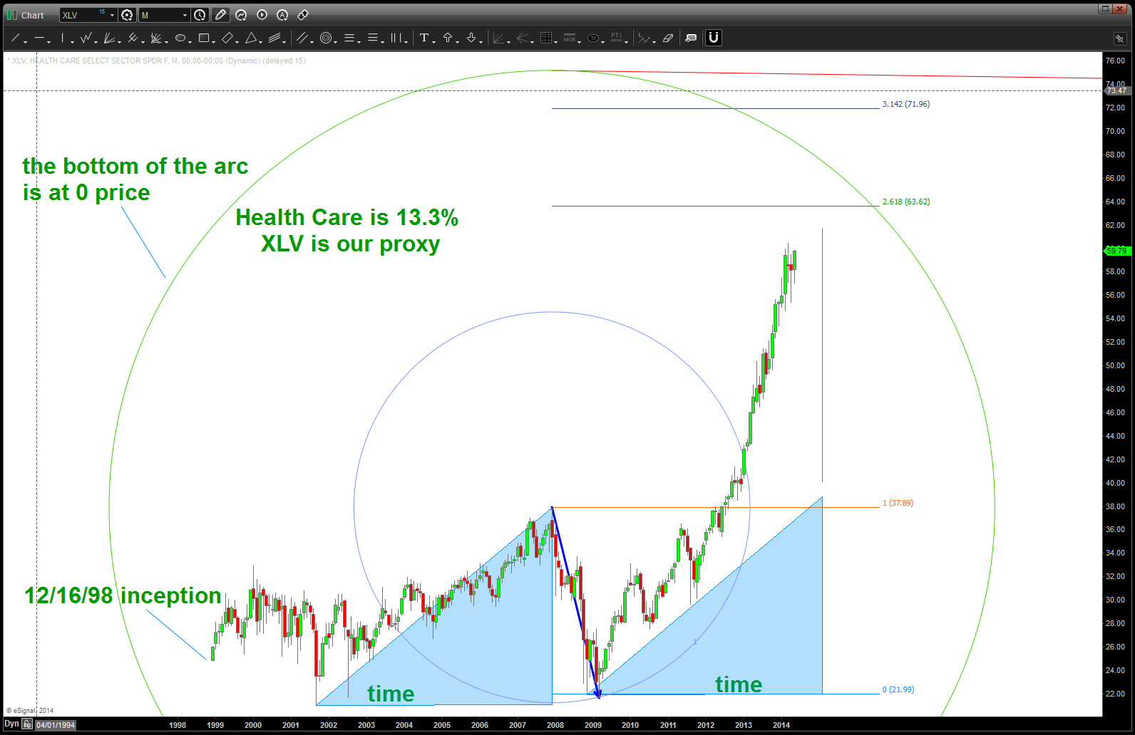
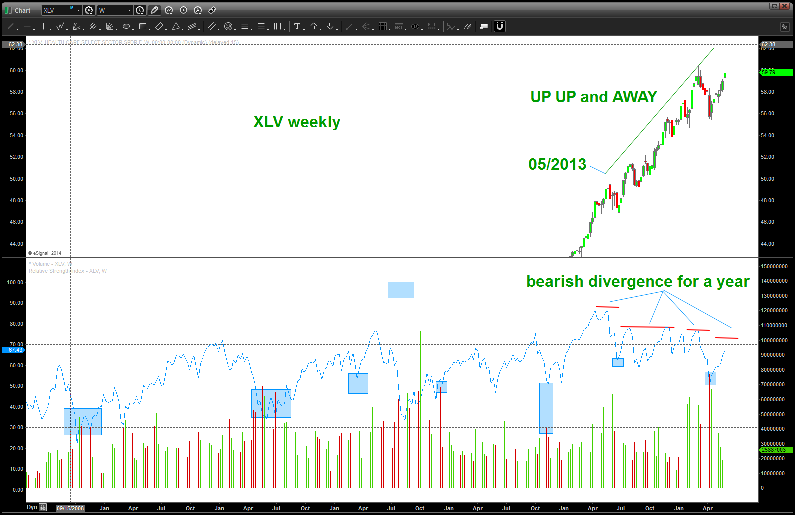
3. Health Care is 13.3% of the S&P 500. I have chosen the XLV as a proxy
- I see NO PATTERNS nothing but a straight up rocket ship. I reference Sir Isaac Newton and the law of gravity.
- check out the RSI … so much for bearish divergence. A YEAR OF IT! But, HERE IS A KEY POINT – NOTE THE SPIKE IN THE BEARISH (RED) VOLUME AT THE LOWS (BLUE SQUARES) EVERY TIME THE SELLING SURGES THE ETF BOTTOMS. LOOK FOR THAT AGAIN ….
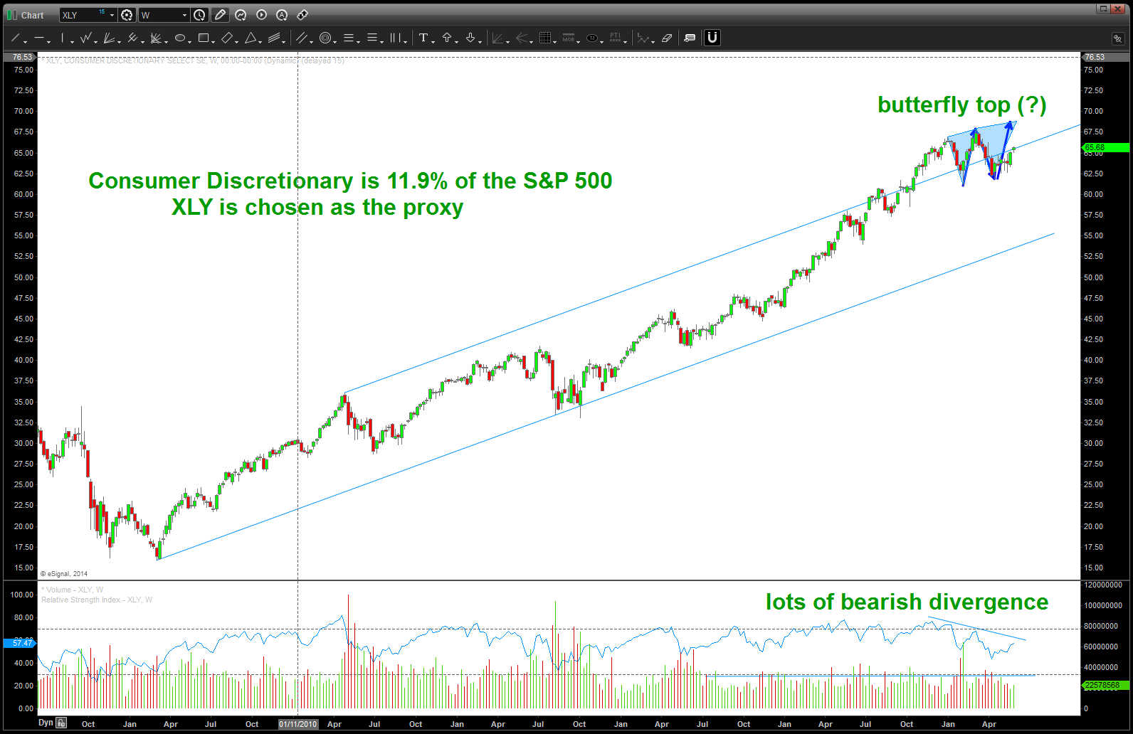
4. Consumer Discretionary is 11.9% I have used XLY as the proxy vehicle.
- I see STRAIGHT up w/ a POTENTIAL BUTTERFLY SELL PATTERN FORMING.
- I see bearish divergence
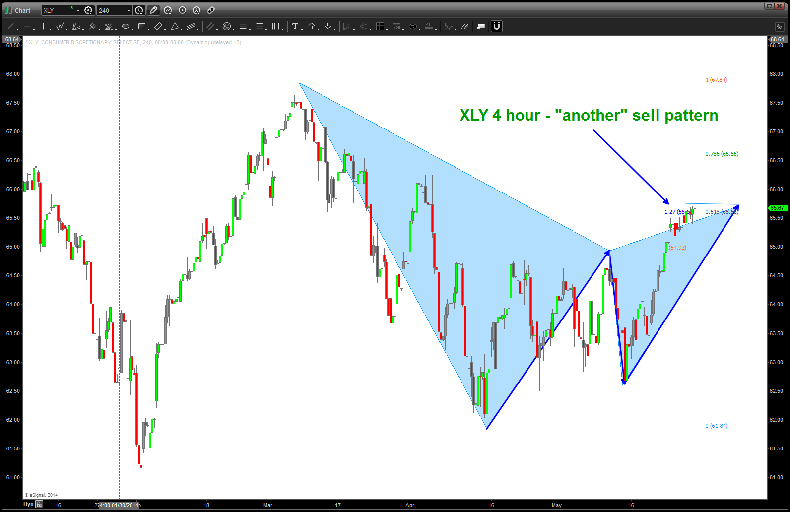
- I see an intraday sell pattern.
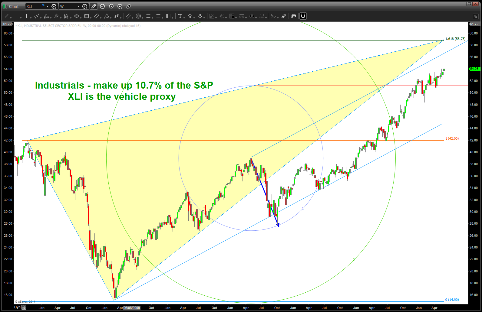
5. Industrial s make up 10.7% of the S&P 500. I have chosen XLI as the vehicle proxy.
- I see the same picture as the past couple. An amazing and powerful bull move up w/ no hint of corrections at all. some daily patterns are present in/around here.
6. Energy makes up 10.5% of the S&P 500. I have chosen XLE as the vehicle proxy.
- please see this post on the IMPORTANCE of the ENERGY SECTOR w/ regards to SECTOR ROTATION and the business/economic cycle:
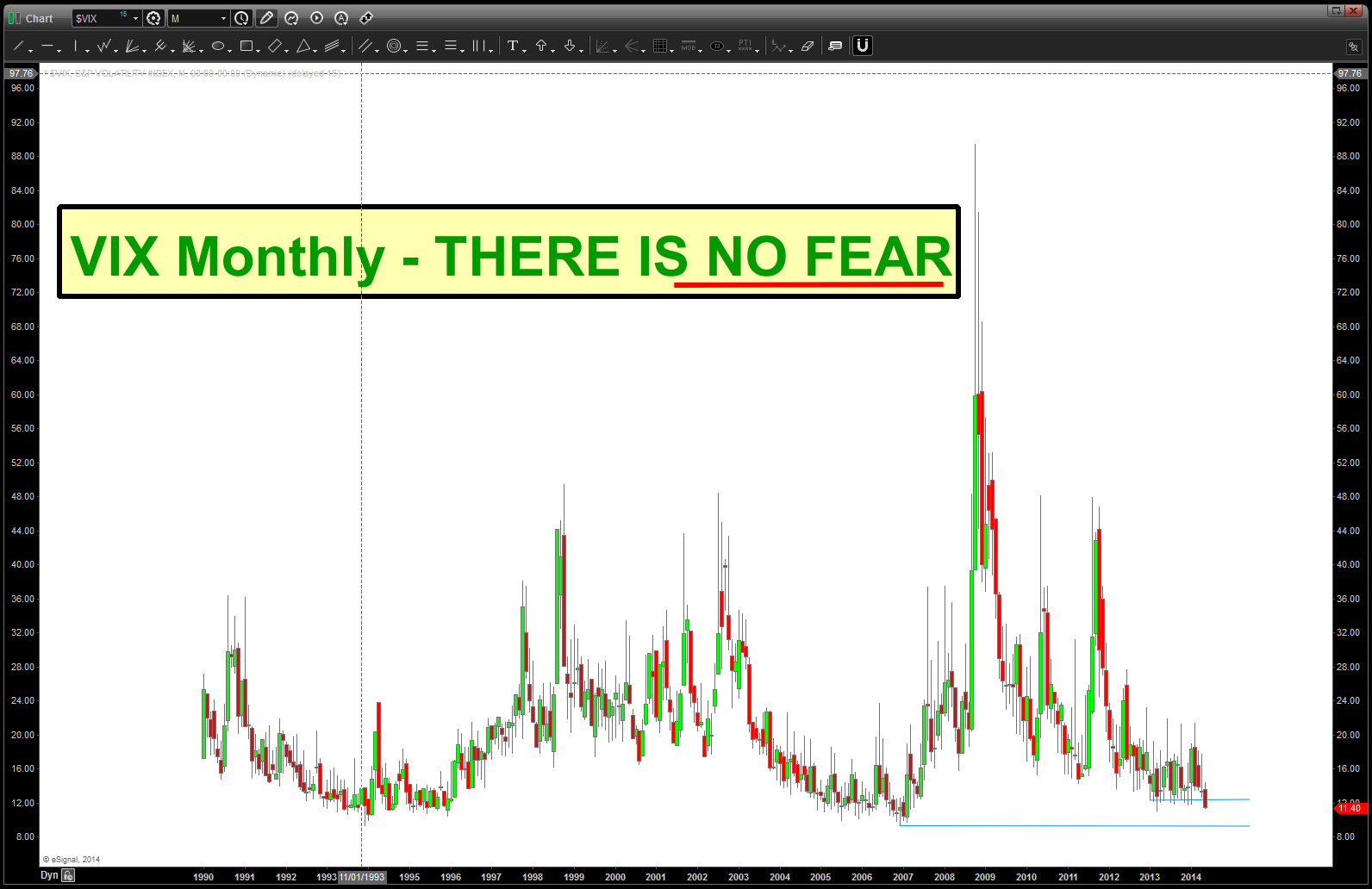
7. VIX – it’s different this time and there is NO FEAR IN THIS MARKET – NONE. All I can say (note: bold,underline, italicized) is REALLY ?????
8. I have shown the importance of ratio analysis and especially the XLP/SPX ratio. I expected it to be making new lows based on the equity action – NOPE, it’s showing remarkable strength which tells me the “big boys/girls” are rotation into this sector. Watching the “standard” .618 and .786 retraces to hold this pullback. If we go into new lows the equities will continue to surge …
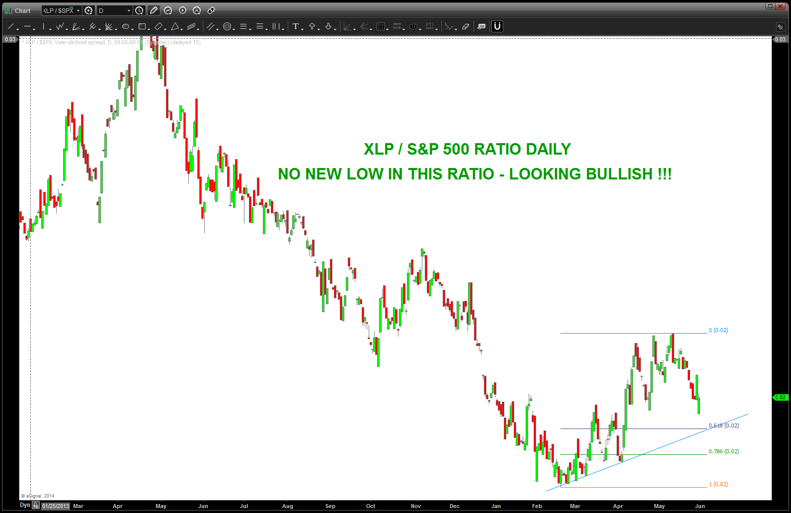
XLP / $SPX ratio
