the EUROZONE the P I G S and the ECB
Posted on May 20, 2014 Leave a Comment
CLIFF NOTES: the yields on the Italian and Spanish bonds had a big jump last week. The question is – will the ECM support the bonds? These are price swings that must be watched closely. I honestly don’t know IF (the BIG IF) the ECB can support the market but it must be watched.
I’ve attached a chart that was done on the Social Media ETF showing the amazing increase in VOLUME as the sell PATTERN was completing. Folks, if we took away the price of the EZU and SOCL ETF the volume would almost look exactly the same. Here’s the picture of the SOCL at the highs:
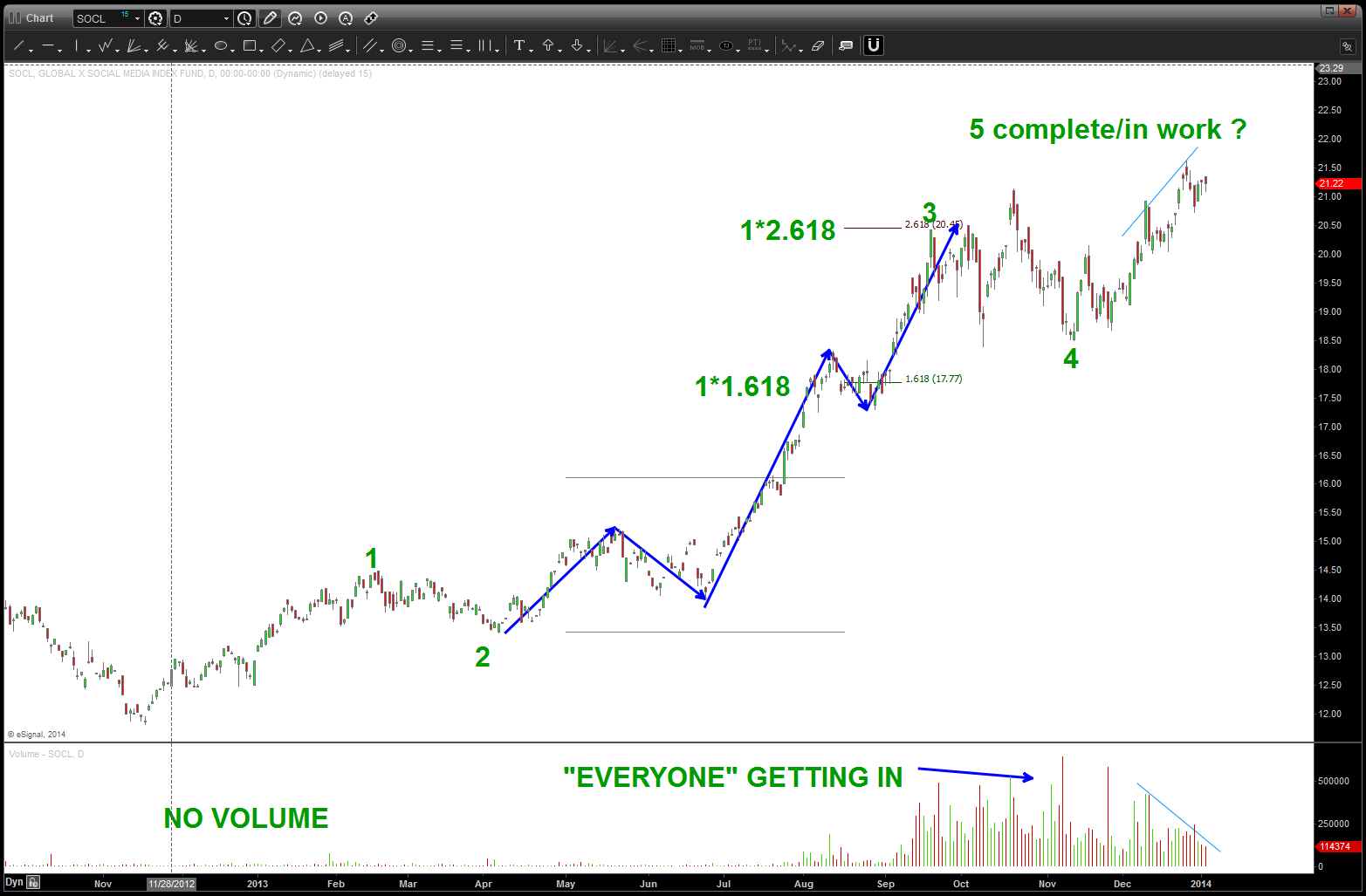
notice the volume increasing as the “end was near”
the SOCL is off those highs 30-40%. Now take a look at the picture w/ the EZU ETF:
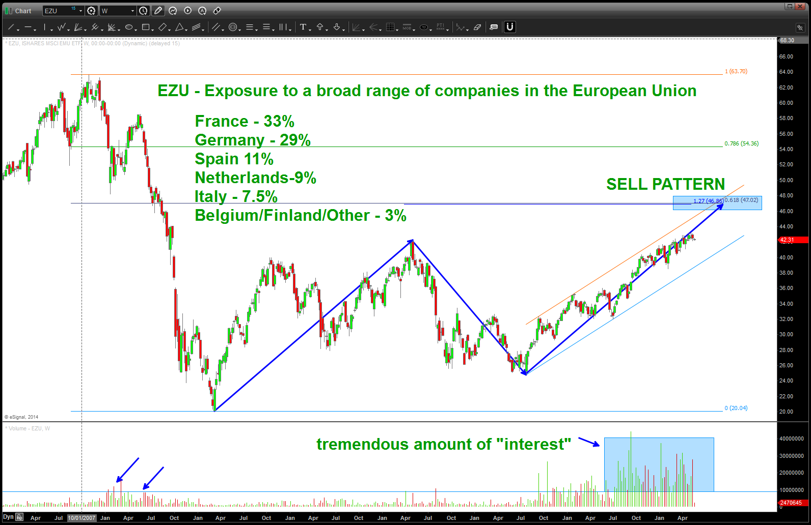
notice the volume ..almost exactly like the SOCL.
next we overlay the XLF (financial ETF) w/ the EZU and it sure looks like this ETF is one big financial institution – as the banks go, so does the EZU and if you go back some posts you’ll see the XLF completed it’s sell pattern at 22. So …this bears watching. We do have a little more to go for the EZU SELL PATTERN but, w/ the EZU so synced w/ the XLF it might not get there. Now, the banks could very well EXPLODE UP thru the 22-23 level and the band will play on. But just remember, we are at an inflection point and it’s time to watch this closely ….
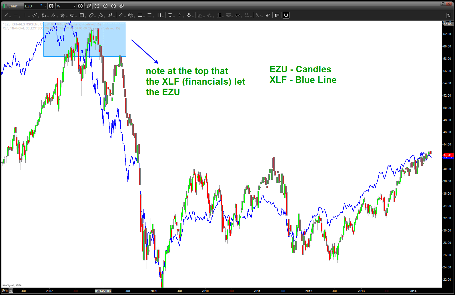
EZU w/ XLF overlaid
Are the PIGS good to go (Portugal, Italy, Greece, Spain) out of the woods or not…? Believe this upcoming pattern will tell us everything we need to know….
YEN is about to get really interesting …
Posted on May 19, 2014 Leave a Comment
CLIFF NOTES: 99.40-99.80 is where we “should” see some support come in … take a review at the charts below. as you can see we have finished 5 waves up at the 105.40 handle. (note, see this chart below as the 5th wave was completing we were calling for it) so, since we have finished 5 waves up we are either at a 1 w/ 3,5 up to come and we are tracing out 2…or we just did an A and now we are correcting B for a C wave UP. Also note, we are a couple days (max) away from the same amount of TIME that the triangle shown below formed and completed. So … it’s going to get interesting, to say the least. Personally, I wish this pattern was completing lower as the DEPTH of the correction isn’t as big as I would think but is that a sign of the overarching bullishness? hard to say ..but from a TIME perspective we are finishing up the same amount as the triangle. Keep an eye on this one ….
Here’s is the TOP (real time):
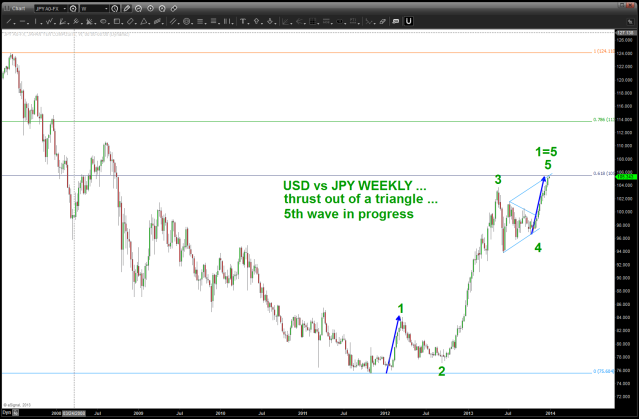
JPY top at 105.40
here’s a revisit of the long term picture and then, finally, the DAILY pattern that is forming:
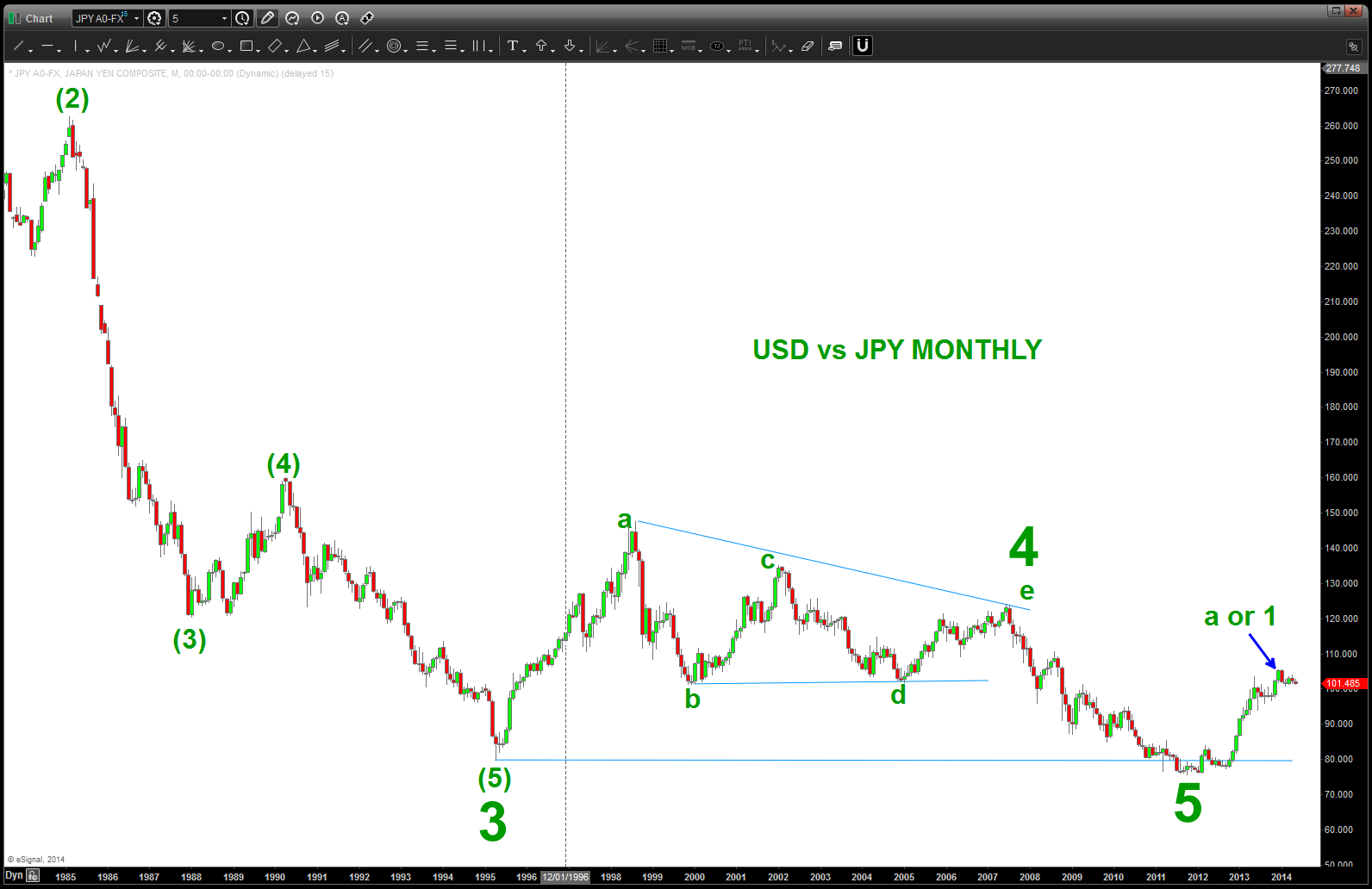
Long Term Monthly Picture
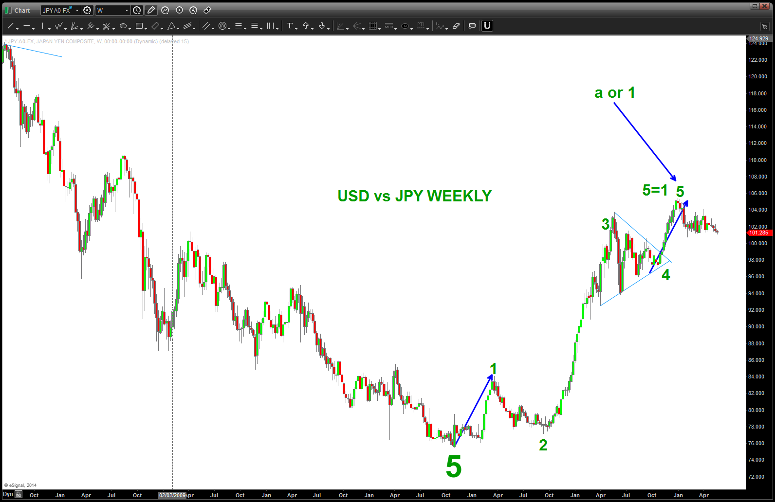
WEEKLY
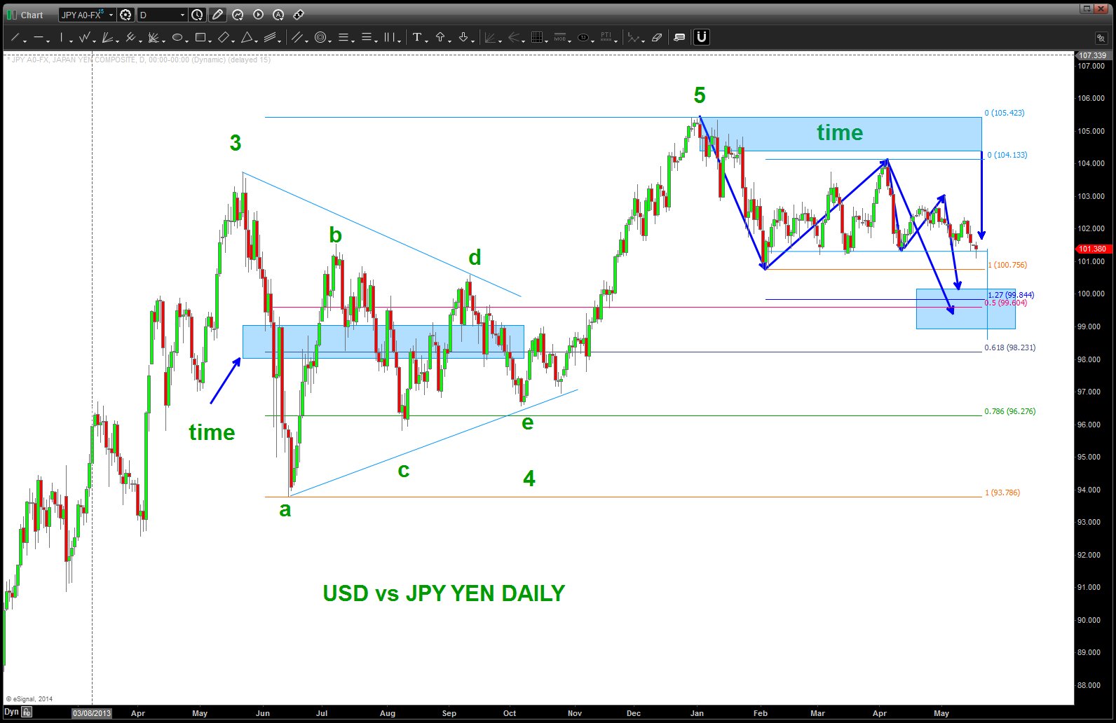
Daily Pattern Completing a little LOWER
A REVISIT OF THE DOW IN CHARTS FROM NOV 2013
Posted on May 17, 2014 Leave a Comment
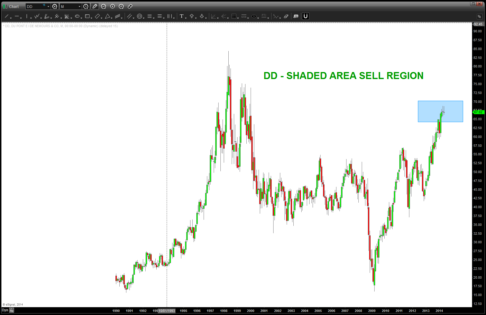
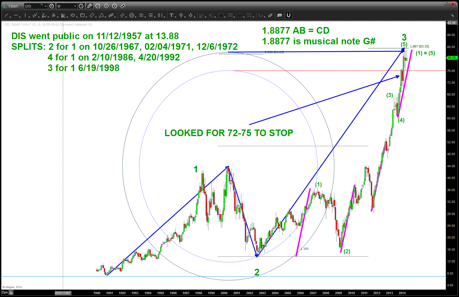
Cliff Note – besides DIS (which I think I have now found the pattern) the “DOW in charts” from NOV 2013 seems to be working. it’s amazing that it’s been 6 months. recommend taking a look at this post and put the current side by side – https://bartscharts.com/2013/11/27/the-dow-components-in-charts/


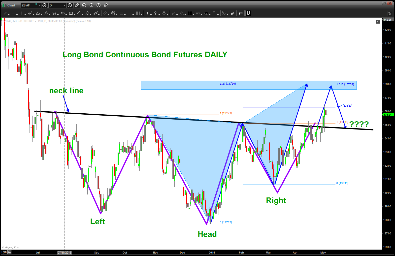
Fixed Income …at the inflection point
Posted on May 16, 2014 Leave a Comment
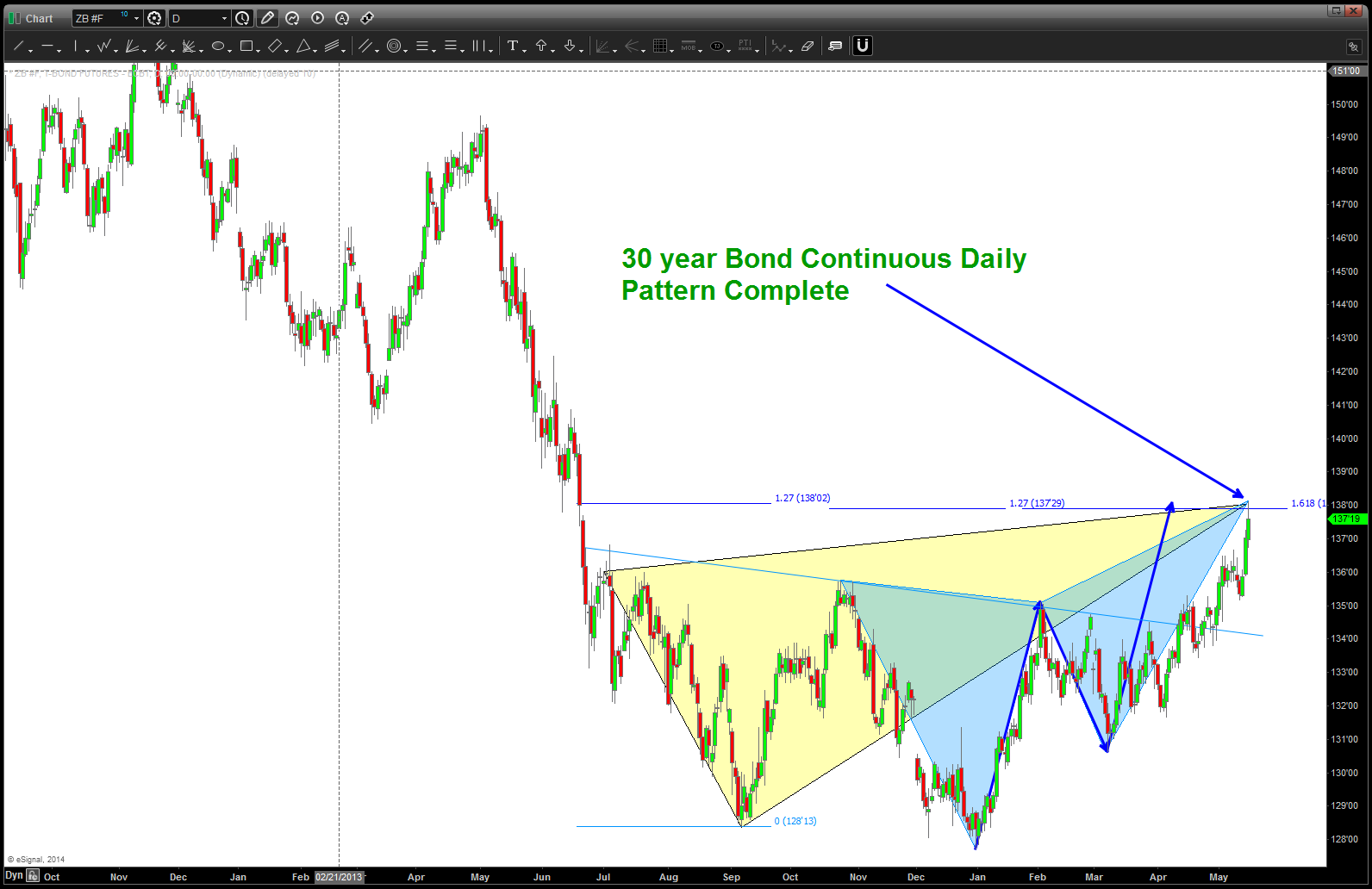
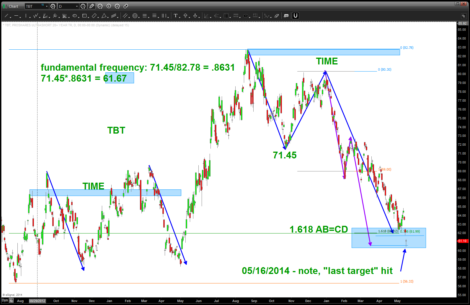
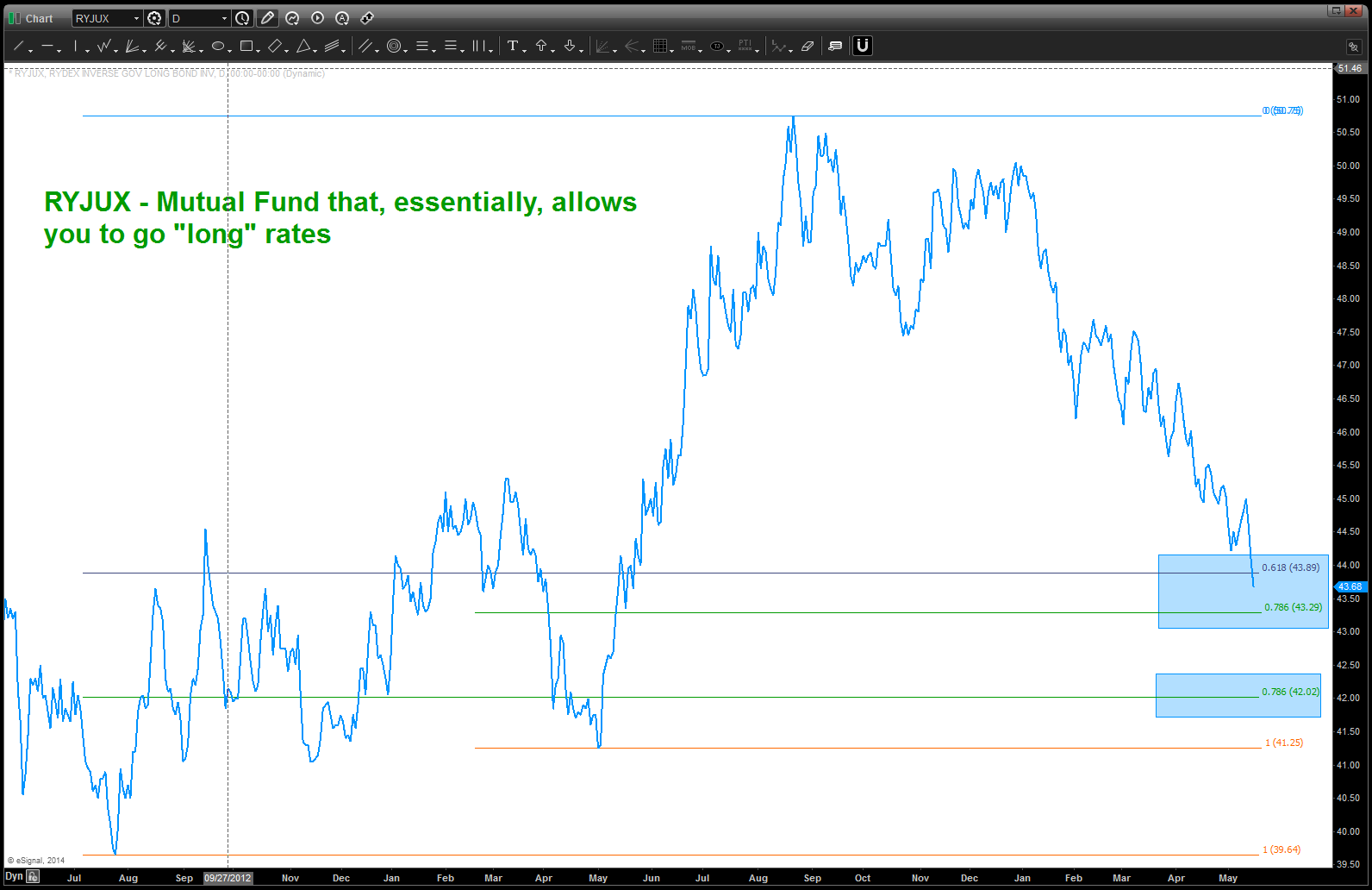
CLIFF NOTES: target hit on the long bond, last target hit on TBT, RYJUX hitting some key support. No doubt the move up from the neckline and multi month consolidation is a big deal and now we’ll see if the neckline is attacked as we are suggesting. Note, it already came down and bounced off the neckline for a very nice LONG Bond opportunity. W/ this many patterns completing there is, of course 1 of 2 things that are going to occur … THEY WORK or DO NOT WORK.
CLIFF NOTES 2: we showed this chart before but note the FRACTAL that was present in the LONG BOND is EXACTLY the same as 10/1987. Not making any crazy crash forecasts just bringing it up that the PATTERN was EXACT.
Watch these levels very very closely ….

Vesica Pisces and the Euro vs USD
Posted on May 10, 2014 2 Comments

Vesica Pisces
I woke up this AM and decided to do the Vesica Pisces for the EURO. Not sure why, just did, so below you’ll find the construction of the Vesica Pisces using the Euro as our template.
Background – in the ancient times the VP was used as the archetype for construction of everything. From the most minute DNA to the universe everything was constructed using these ratios. The key ingredient of the ratios is the fact they are using square roots. This isn’t going to be a diatribe about Fibonacci or anything like that. All I am going to say is Fibonacci is important but it is a subset of the discipline called sacred geometry. I am going to disagree and say that a .786 retracement is a Fibonacci number. No, it’s the square root of .618. That brings us to the subject of square roots and the inverse of square roots. That’s the key and that’s musical theory. Anything that vibrates can be understood by number and therefore, since I truly believe the “market” is vibratory then the same theories behind musical theory and square roots and vibration should work…. so, it’s the key square root structure of the market that is vibratory. And that my friends is the key …
Anyway, here’s the deal. 1) I picked, only because I liked it, a vector to use. 2) I never re-scaled my chart 3) I did not have any idea what was going to come up w/ the drill of creating the vector lengths from the center of the Vesica Pisces. 4) I think what appears is pretty amazing …5) ENJOY
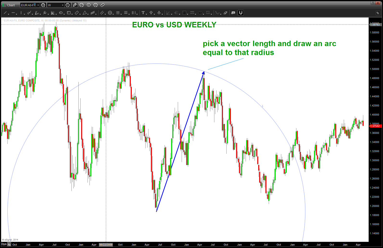
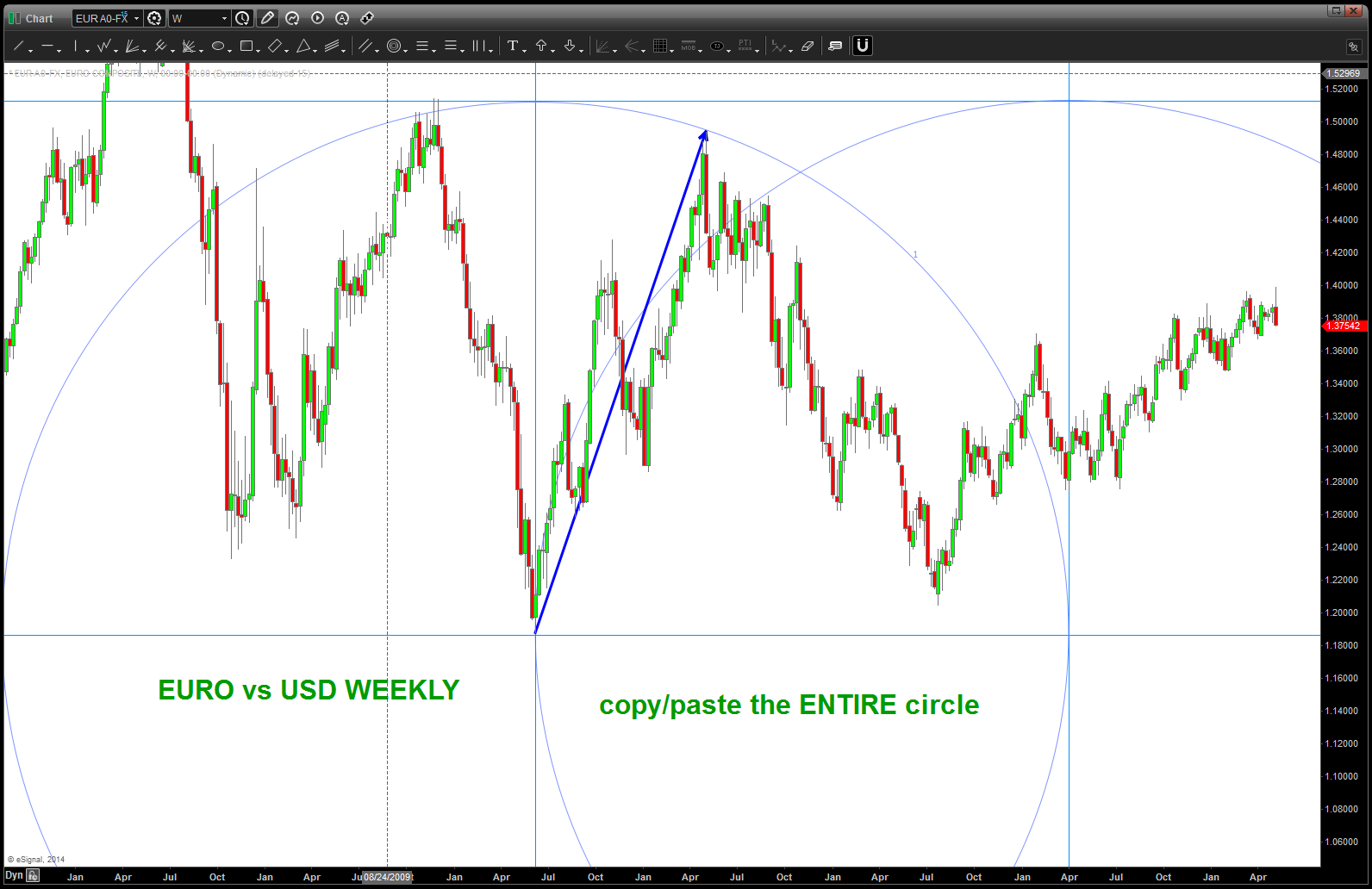
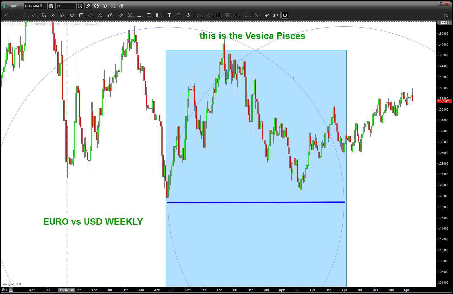
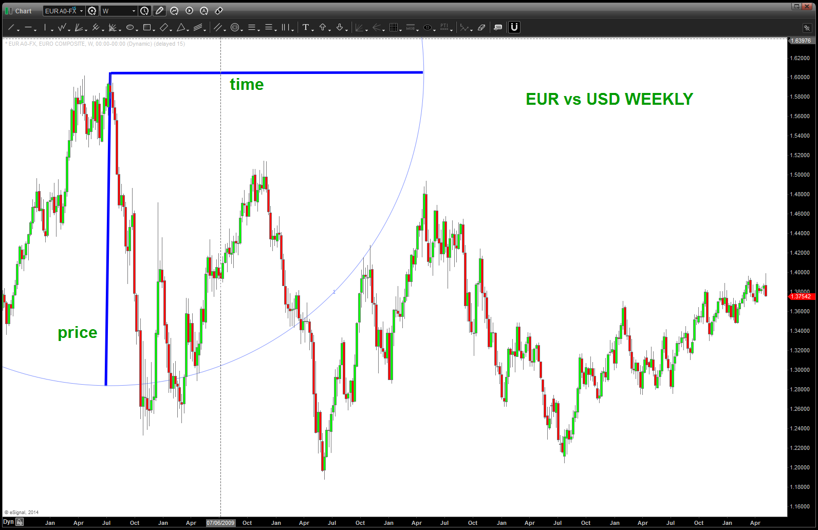
note, the above dark blue line. This is the vector length that we are going to use. Again, I have no idea if it’s going to work or not. All of the above charts are “real time” just going thru the drill. The chart below shows how I used this radius vector to work with TIME:
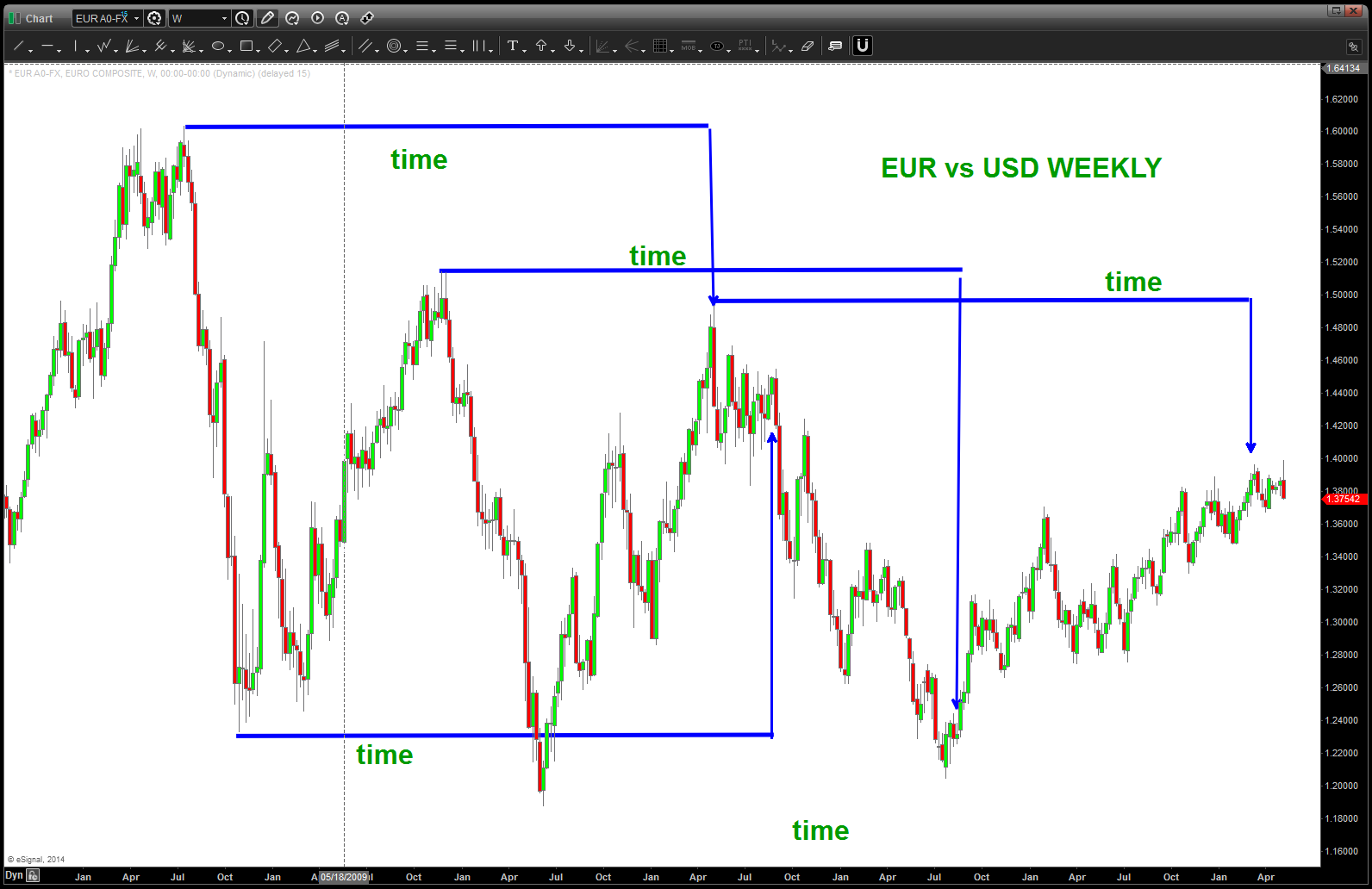
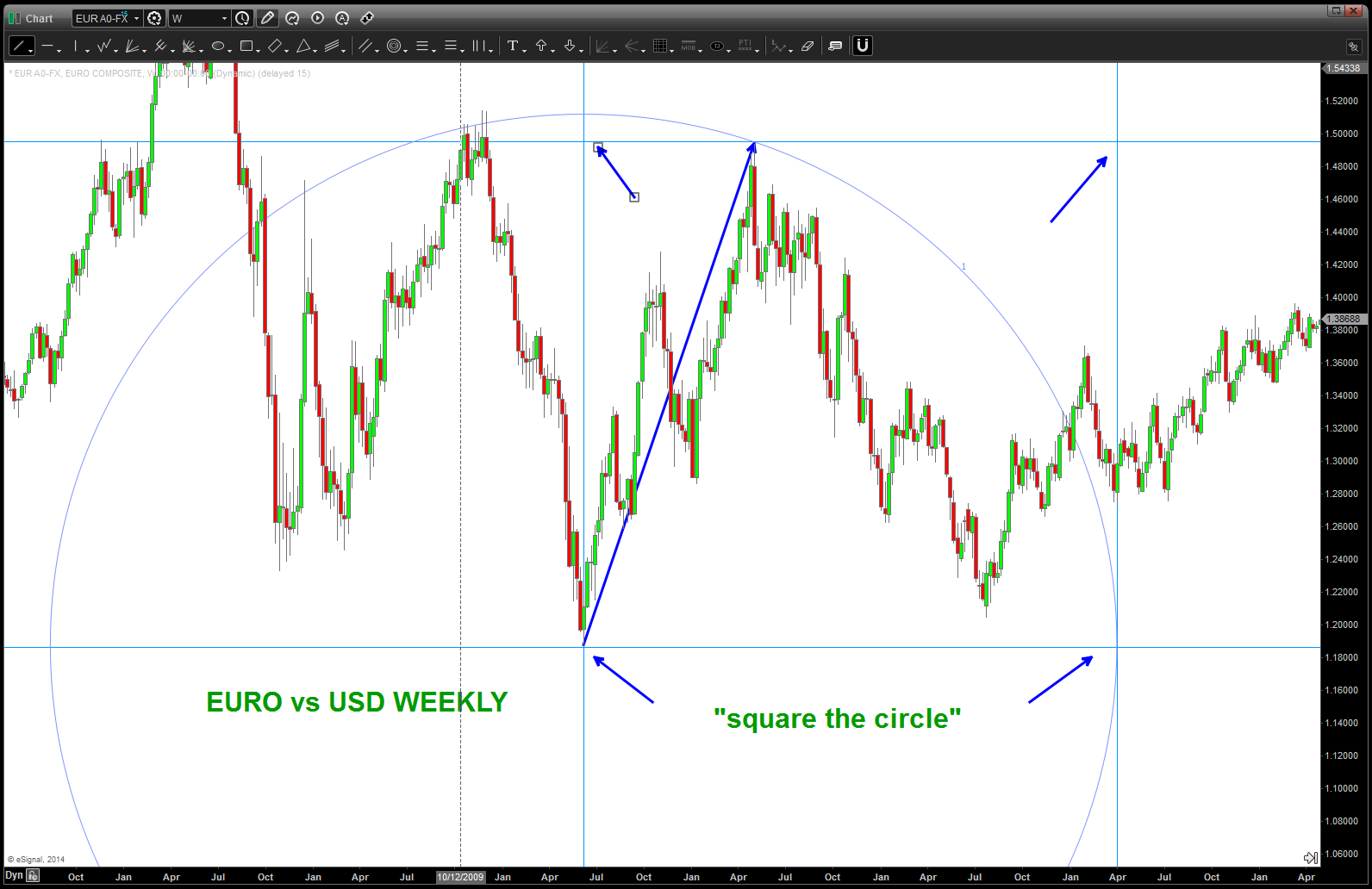
note, using this vector length established a nice cycle potentiality … so, using the HIGH as the component for the next vector, we use the TIME component as the radius and make an arc. The vertical in this case will also be subdivided by the normal .382/.5/.618/.786 to look for fractal properties of price.
this next chart shows the subdivisions … again, all of this is real time as I worked on the chart just doing print to screens.
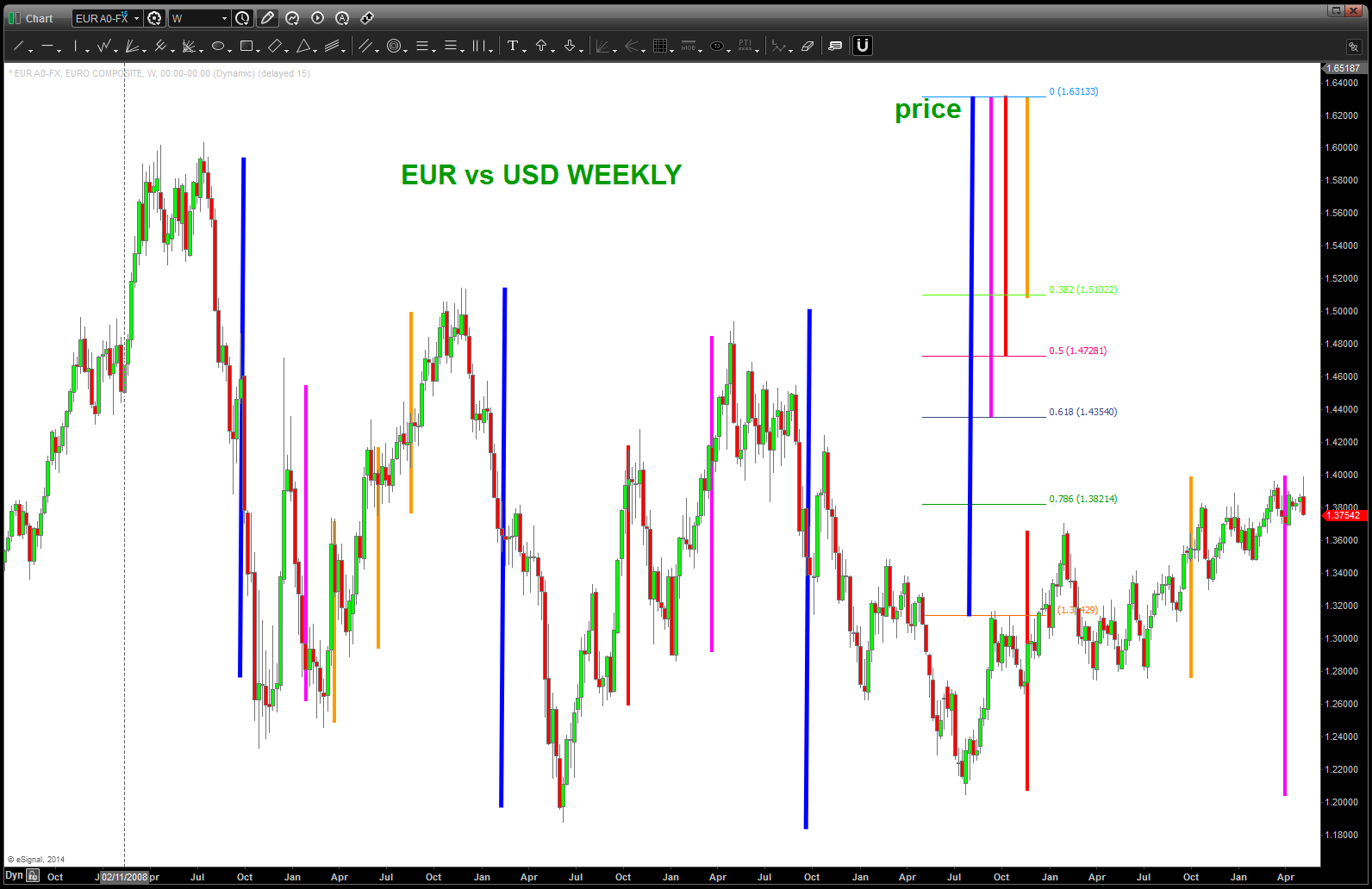
I think this shows EVERY MOVE in price for the EURO since the high. Our most recent high last week was .618 of the vector radius used in the beginning …
Digest and have a wonderful Mothers day w/ family and friends …
Bart
first the NAZZIE then the S&P – a warning
Posted on May 9, 2014 1 Comment
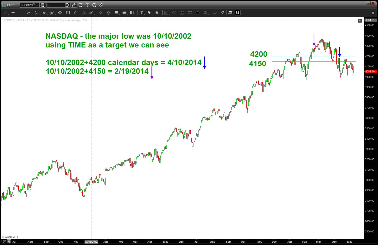
at the beginning of the year, we showed how the NASDAQ was exhibiting the very powerful TIME and PRICE equality. here is the post:
look for a close in/around 4106 on NASDAQ tomorrow …equality of TIME and PRICE
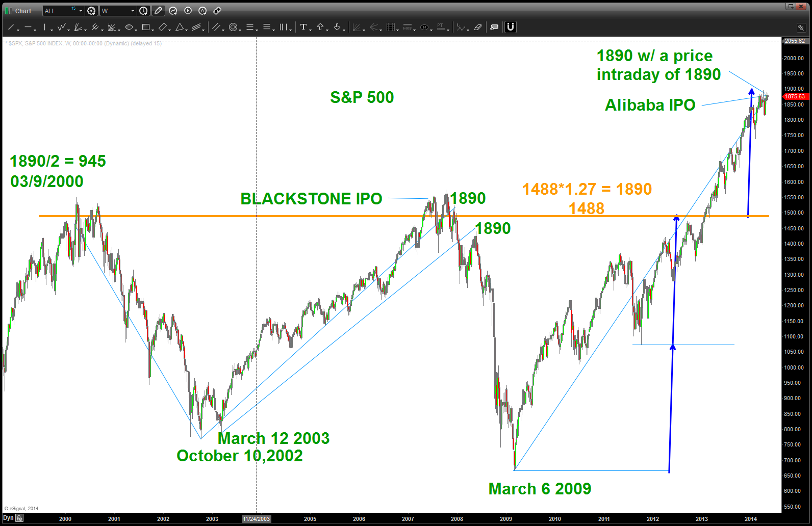
when time equals price it’s a heads up for either a BUY or a SELL. It is something to pay attention to … my friend and mentor Mike Jenkins (www.stockcyclesforecast.com ) pointed out the importance of 1890 yesterday. My charting package showed an intraday high on the cash SPX of 1889. Is it a coincidence that the March 6, 2009 low was 1890 days ago? Yes …maybe?
Here’s the chart of the Monthly S&P showing 1890 calendar day counts also 1890/2 from the 10/10/2002 low. Folks, simply saying the last time we had TIME equal PRICE not soon there after a correction occurred. What’s interesting is the GEOMETRY that plays out w/ this number … notice when this calendar count occurs (1890) PRICE was banging around, essentially, the same level. So I played w/ some numbers and divided 1890/1.27 and got 1488. Put 1488 on the chart and measured UP from that point to the 1900 is area. As you can see, I then put that measured move to the low and we had a perfect 1/3rd. It’s neat stuff …
We had some major cycles hit the past two-three weeks, we see “most” of the glamor names have sold/are selling off. We see the NASDAQ leading the crowd (well, in our world, it was the first to hit a TIME and PRICE equality) and the IWM sell pattern and it goes on and on …. not a bear, not a bull just a pattern recognition expert. In this case the patterns are SELLs and we better pay attention.
the Dollar Index Fractal
Posted on May 8, 2014 Leave a Comment
CLIFF NOTES: I thought I had posted this once before .. the POTENTIAL mirror image foldback on the US DOLLAR. I have gone thru my charts and I can’t find it but I know I sent it to Larry P so … here it is. Also, go back and look at the UUP (Dollar ETF) chart that we looked at for the .886 retrace and “one last hope.” Well, today’s action was pretty impressive …is the dollar bull thesis still alive? Shoot, I don’t know so I sit on my hands, STILL. Keep an eye out on the dollar … perhaps it set a low?
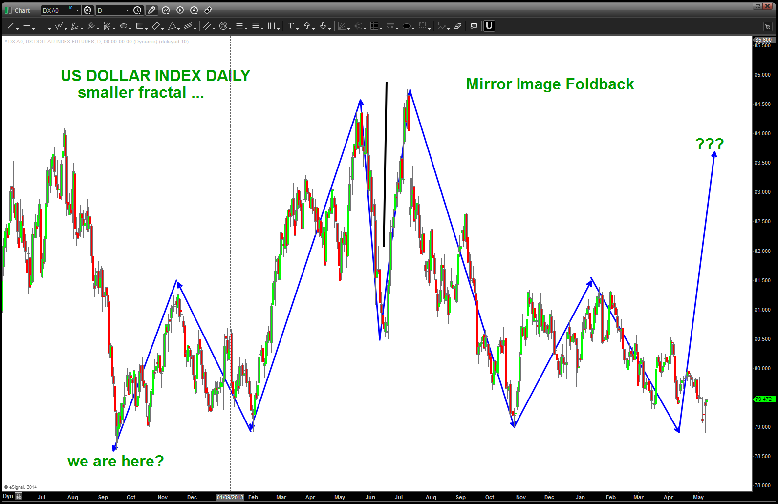
Mirror Image Foldback
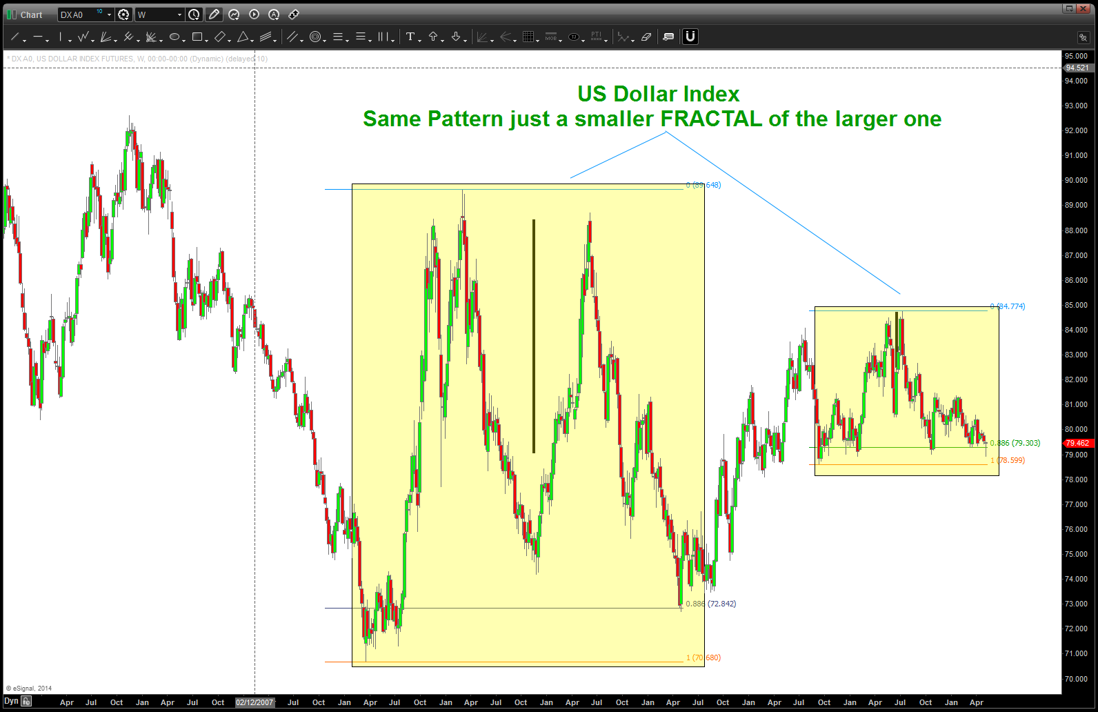
the other thing that is interesting is the FRACTAL pattern that appears to be working itself out on a longer term chart …
BUY pattern on the NASDAQ
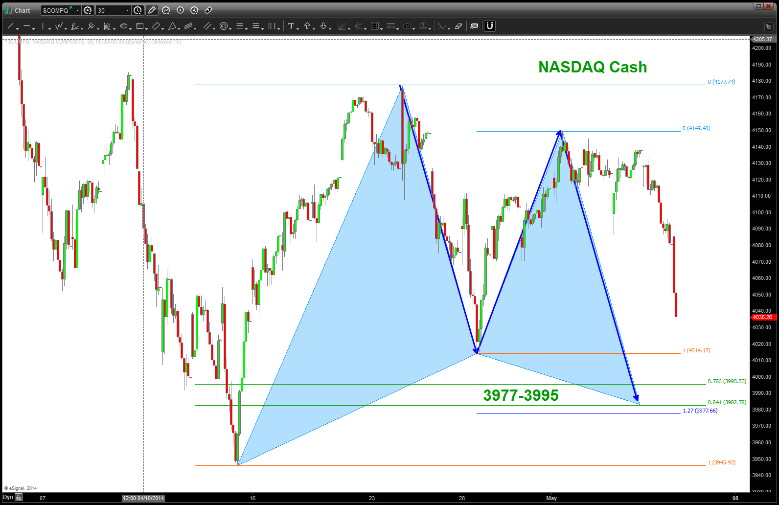
Posted on May 7, 2014 Leave a Comment
CLIFF NOTES: we have been in an amazing trend for the past 5 years and now we have a very nice BUY pattern appearing on the NASDAQ. As we all know, the trend is your friend till it ends so .. if BULLISH then the 3977-3995 level should hold for another leg up. If you are BEARISH then the first sign of a continued correction is when a pattern fails . Today (5/7) the thrust into this level is pretty strong so we’ll have to wait and see what support brings or not. Watch this level closely. A daily close below this level warns of a deeper correction at hand. Strong, momentum driven buying in here says we should go up.
PATTERNS ARE GREAT BECAUSE THEY LET YOU KNOW WHERE YOU ARE WRONG!
gameplan for the long bond structure …
Posted on May 5, 2014 Leave a Comment
CLIFF NOTES: if you look at the chart below, you will see an inverse head and shoulders pattern that had it’s genesis almost a year go – 07/2013. Just recently (the past 3 trading days) we have broken from this neckline ….price on the bonds should start up. Here’s the gameplan — expect the 137 28 level to hold as resistance. (It’s a butterfly sell pattern) and then price should come down to the neckline and here is where we really see the battle between the bulls and bears. All things being equal, the standard gameplan is to trade the return to the neckline and therefore go LONG in/around the 134-135 level. However, if the rates are really going to rise, then this neckline will be defeated and we’ll go thru the black line to the downside. This is the gameplan …
monitoring this ratio closely …
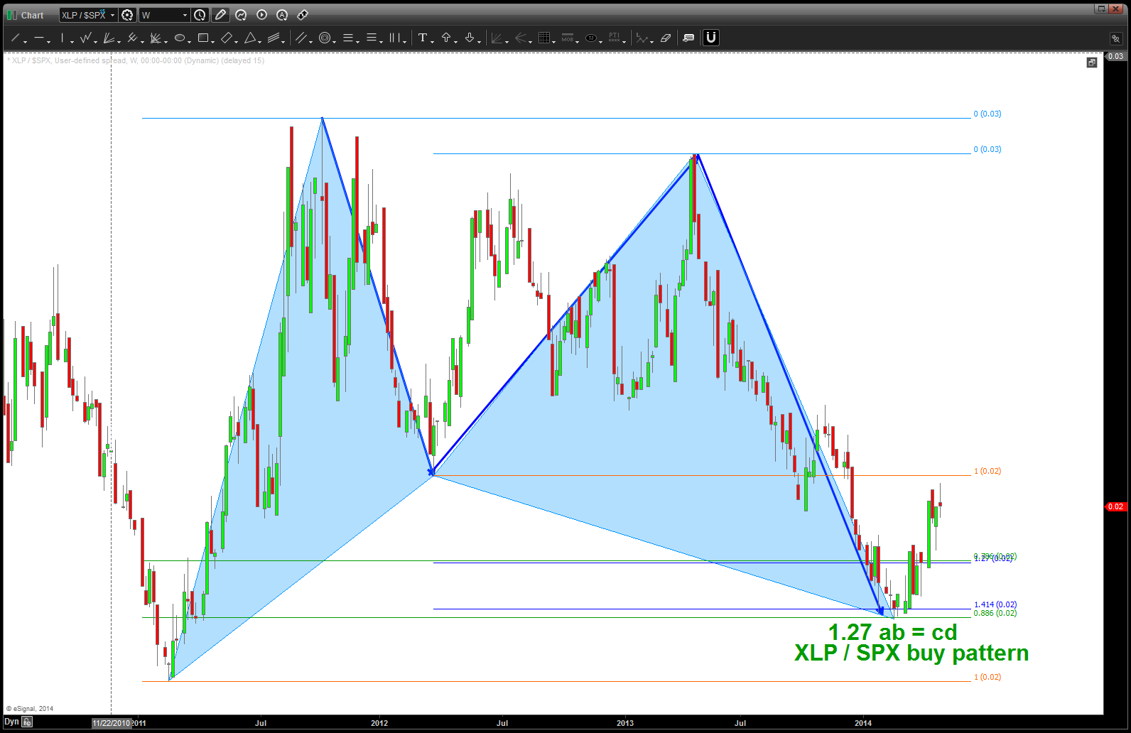
Posted on May 4, 2014 1 Comment
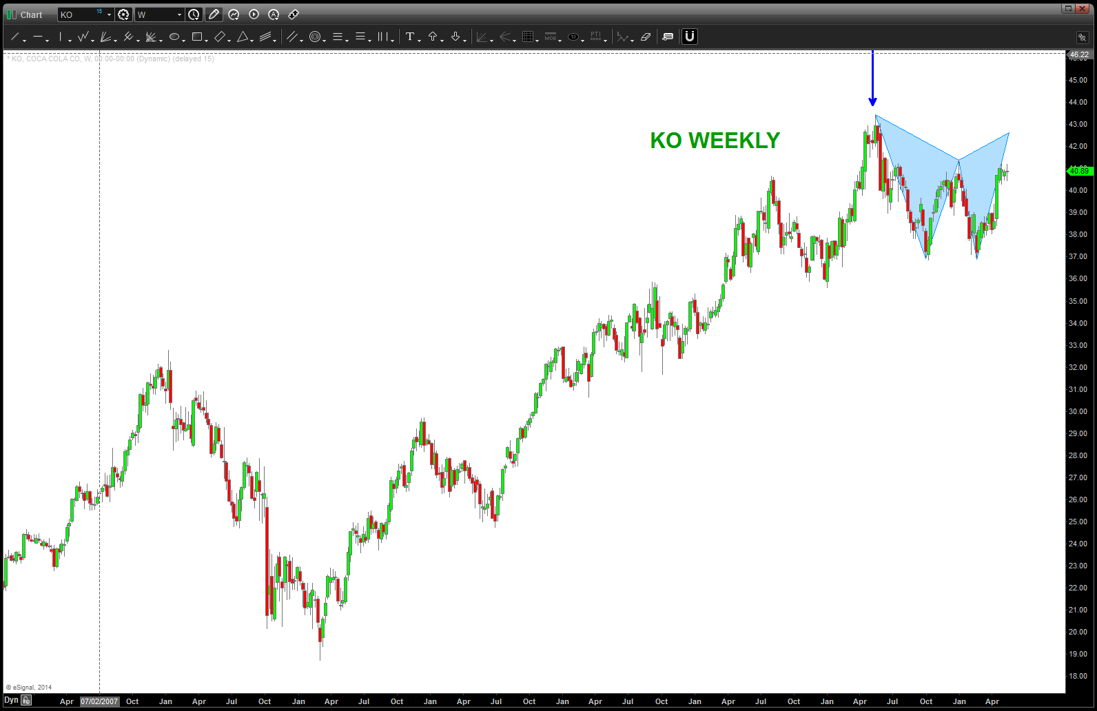
CLIFF NOTES: sector rotation is a fact of life …we’ve shown how the institutions follow a well defined script and how, usually, energy is the last shoe to drop before the inevitable correction (it’s different this time) occurs. ratio’s are important because they show relative strength of something versus something. In this case, we have the XLP (consumer staples) over the broader S&P 500. The thesis – in times of volatility/risk off – there is a move to consumer staples and the consumer staples become stronger …the NUMERATOR (XLP) is stronger than the denominator (S&P 500).
CLIFF NOTES 2: the line below is the S&P 500 and at EVERY top since 2000 (labeled w/ a blue rectangle and the word “top”) the ratio bottomed. What’s interesting is the new highs in the S&P 500 were not confirmed by lower lows in the ratio. That’s something to monitor and watch….note, we do have a MONTHLY signal reversal candle present so, monitor this ratio closely ….
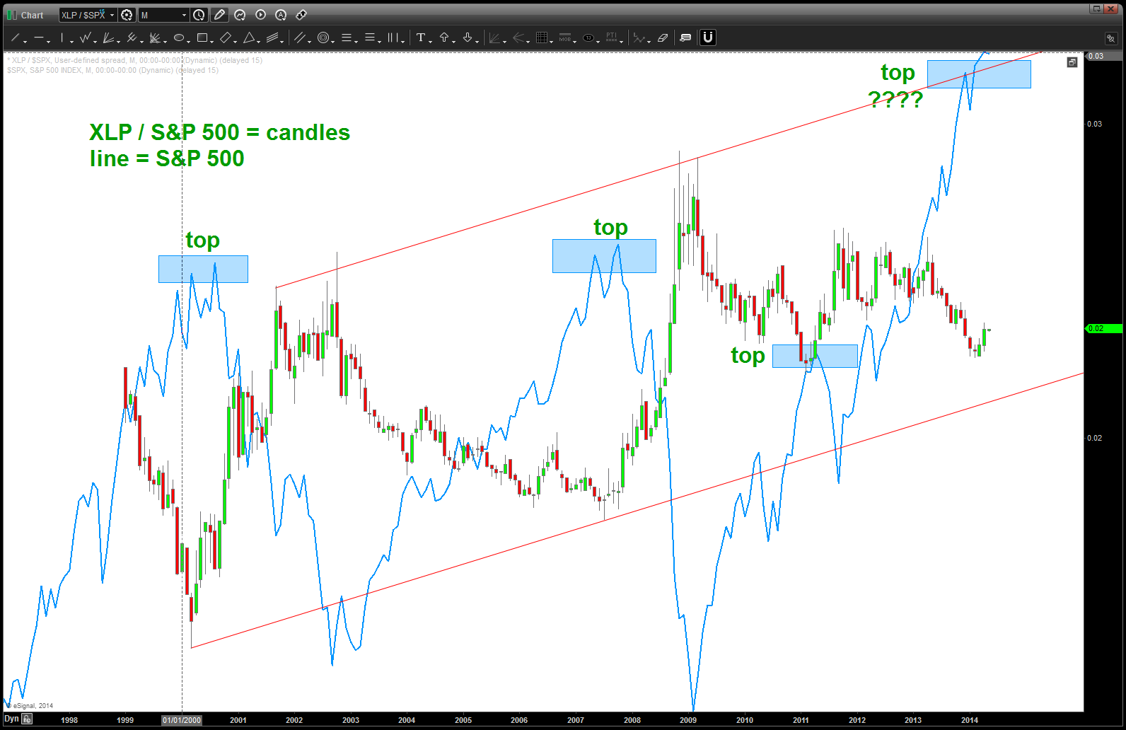
XLP / SPX is candles and line is S&P 500