Aussie vs USD updated – part 3
Posted on September 27, 2015 Leave a Comment
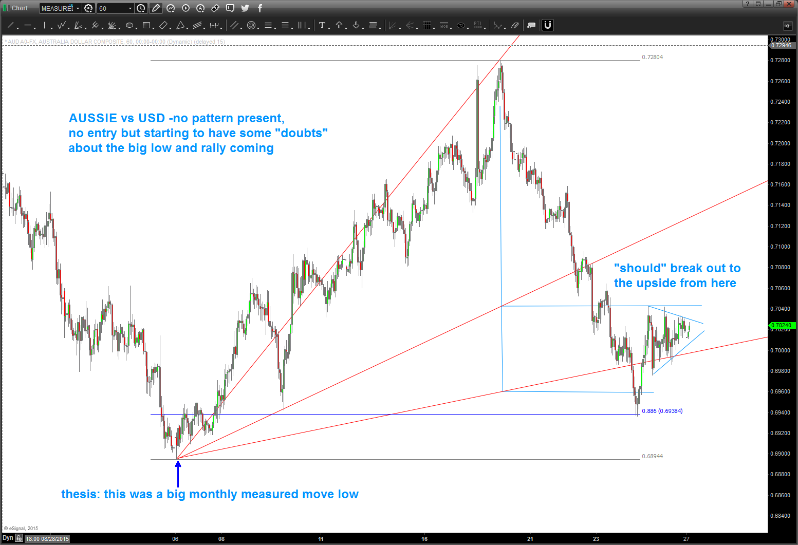
09/27/2015 – no pattern, no investment. big old move back down but am not in yet. have to wait for a pattern because ONLY then can I manage how much risk to take. sure looks heavy, but I see a BIG MONTHLY measured move at 6894 low. So, we’ll wait …also, gasoline futures haven’t made a new low either.
09/20/2015 – target zone was “OK” at holding back the AUD vs USD advance. (the FED craziness rolled thru it by 30 pips) but it did stop at the .707 retracement level – exactly. .707? (2, square root of 2=1.4142, 1/1.4142 = .707)
so, the current form, proportion and harmony tells me “lower” so I’m still WAITING for 7130 area.
gold/silver “should” be taking off for a “head fake” rally C wave that could be very powerful. hence my interest in Aussie, Kiwi, Loonie. I like the Aussie for reasons below – the long long term measured move hit exactly on September 06 2015. so, yes, I’ve have been sitting on my hands to go long for 14 days. and I’ll keep waiting till a BUY pattern emerges. 🙂
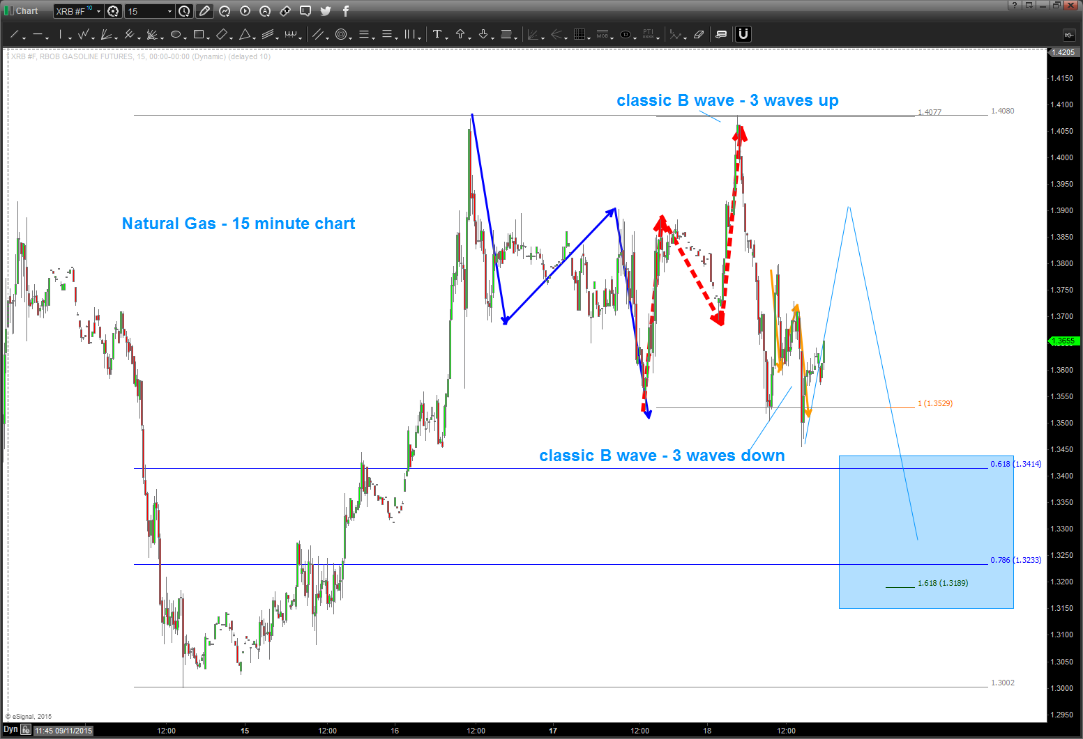
Gasoline futures are giving me a “better” picture because the FORM is very nice. take a peak below – see the 3 wave move UP into a new high – CLASSIC B WAVE STUFF. only problem is the recent price action I convoluted. but, USUALLY, when we have a 3 wave move UP into a new high the move down is 1.618 of the first move down .. shown below.
So, we wait.
09/08/2015 – my target area/zone got crunched pretty bad, and my count is wrong. all that being said, I didn’t take into account the measured move from 89-01. quite frankly, w/ all that ‘stuff’ coming into the areas as shown below I didn’t think it could. So the age old adage of “thinking” versus “seeing” left my target thumped. W/ so much thrust and momentum going I did not take the long trade but have been waiting …
but, as of last night it has give us a DAILY SRC and when I went back and erased everything I saw a monster cycle coming in and the measured move hit perfectly …hmmm.
how to play ? WAIT for a PATTERN to appear on perhaps a 60 minute chart .. watch gasoline futures and crude and the All Ordinaries for a sign of life and also the Chinese market …
here’s the updated chart:
will update (real time) the play here and the risk and the real time move of a dude in his home juggling dynamite w/ gorilla’s in a cage .. cool hugh?
Bart
Folks, back in October the post below the two dash lines was searching for a low to be in place on the AUD. The form and proportion were just about right. However, w/ the big move in crude, the interest rate extravaganza and the a whole host of other fundamental reasons the real issue is the PATTERN level didn’t work … it went approximately 300 pips below. HOWEVER, the overall thesis that the Aussie is bottoming versus the dollar still holds true. It’s showing some nice strength tonight …would love to get a very nice pullback to go long in/around these levels.
Updated charts below:
Note the monthly RSI levels … the BIG MOVES UP occurred right where we are sitting. Also, a case can be made that 4 is complete and we are going to new highs …
last time I checked the Aussie wasn’t part of the US Dollar index … so, watch this one closely. At a minimum we are completing/completed an A and a nice B wave up is to occur.
let’s just get on the right side of the trade and right now that looks like bullish entry for the AUD vs USD.
The Aussie has been correcting for a while and, folks, the move down from 1.100 ish certainly appears to be corrective. What does that mean? We are “at” or “near the beginning of a multi year advance that will take out the high July 2011. Here’s the monthly picture …
TILT … everyone is talking about US Dollar strength – yes, but they are talking about the dollar index which the Aussie isn’t even a part of it. Or if it is the weight is negligible so in this case we have to take this pair as a single entity – not a weighted index.
here’s the weekly:
note the 3 waves down … that is the key. it was not a 5 wave movement. has this correction been complex – yes. But it’s falling right in line w/ a double three labeled w,x,y.
and, the daily, shown below, just completed 5 waves down. While it would be perfect symmetrical three drives to a bottom is we go down and attack 8400 – there is a good case to be made that a low is in place. we’ll have to wait for an intraday pattern to appear …
and finally, we’ll see the move down on a 60 minute chart is a clearly defined 5 waves.
so … there ya have it.
what to do? Well, our thesis is we are beginning a multi year move to take out the old highs from 2011. IF THAT IS CORRECT THEN WE ARE IN the first stages of the advance. the first move up (wave 1) will complete and then wave 2 will come and, more than likely, w/ a vengeance because everyone thinks the “old trend” is in play. That’s the BUYING OPPORTUNITY and price should never go below the low that was formed last week.
stay tuned …get ready to rumble.
Bart
the “Willie Willie” ,Derivatives and Deutsche Bank
Posted on September 26, 2015 2 Comments
One of the things REQUIRED before flying was to check the weather. Makes sense, hugh?
One day, we checked the weather and, well, there was a “Willie Willie” or weather warning for our local area for when we were going to be landing. News flash, don’t go flying…..BUT (always the “but” rebuttal) we HAD TO GET A JET “profile checked” before going to the boat. So, we looked at each other and said the proverbial words –
“doesn’t look like this WW is going to develop as forecasted.”
that was “always” the defense of idiots who launched into bad weather ….
Guess what, it was one hell of storm, we landed w/ a tornado touching down around 8 miles from our location BUT (the proverbial BUT) the jet flew out to the aircraft carrier the next day.
“idiots, party of two your table is ready”
“we’re here and will take our seat”
folks, we have another “Willie Willie” on the horizon and it’s financial in nature. Here’s the “weather radar picture” of the storm approaching – Deutsche Bank.
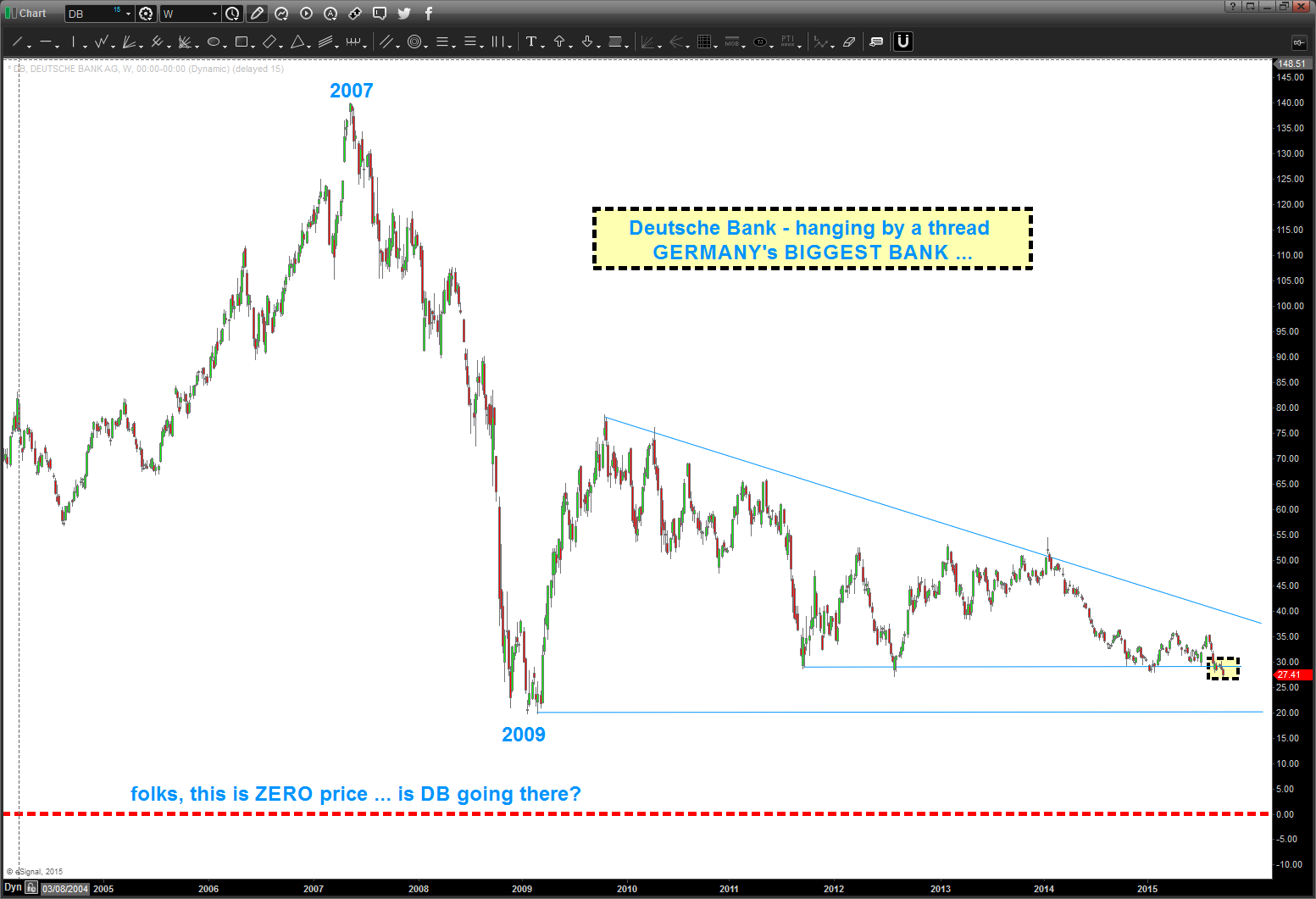
hate to mention the fundamentals, but all of this has happened in the past 6 months:
– Deutsche co-CEOs announce “resignation” nine months before their contracts expire
– CEO Anshu Jain was given more power to reorganise the bank
– Deutsche have been engaged in money laundering, tax evasion, derivative and manipulation scandals
– Deutsche is world’s largest holder of financial weapons of mass destruction (FWMD)
– Deutsche Bank’s derivatives position almost 15 times as large as Germany’s GDP
here’s what the “Oracle of Omaha” thinks about Derivatives:
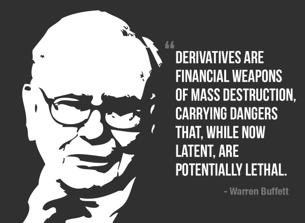
there are 1.4 QUADRILLION DERIVATIVES OUTSTANDING …..
So, YOU make the FINANCIAL DECISION to go “flying” into a “Willie Willie” or not and YOU can also “play it safe” and NOT go “flying” into something that looks pretty bad …
REMEMBER SINCE 2009 NONE OF THE “DOOM AND GLOOM” FORECASTERS HAVE BEEN CORRECT BUT EVERY ONCE IN A WHILE A “WEATHER MAN/WOMAN” GET’S IT RIGHT AND YOUR SOCKS GET KNOCKED OFF BY ONE HELL OF A STORM!
As for me … the recent 6 months have given us plenty of warning that a storm is definitely brewing and, perhaps, is going to develop as forecasted.
Now, for the “if-then”
IF
$DB breaks another level of support (20/share)
THEN
IS
the worlds largest derivative holder bankrupt?
IF
this is the case
THEN
things could/will get pretty ugly, pretty fast
SO
keep your powder dry and
PERHAPS
NOT
take off into a forecasted (read probable) storm that is forecasted. the forecasters of “doom-gloom” haven’t gotten it right, yet.
folks, notice that no jets are flying off the deck this night. sometimes they “develop as forecasted” and “sometimes they don’t” …it’s all probability

if you want to know what’s going to happen, read this post.
Posted on September 26, 2015 Leave a Comment
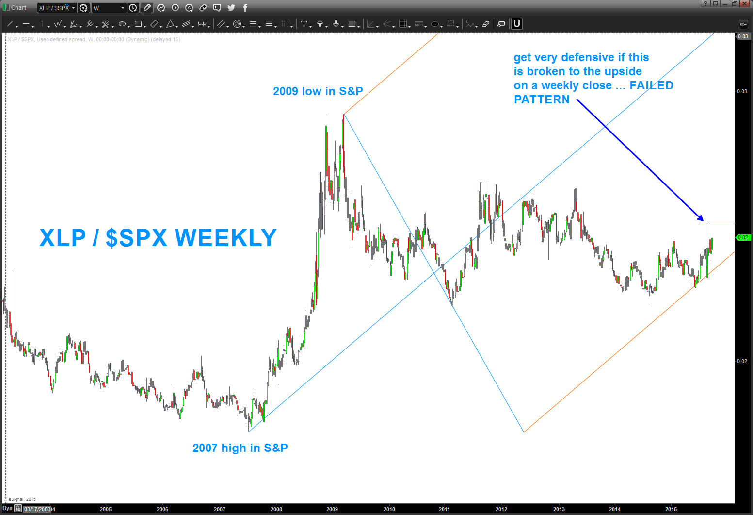
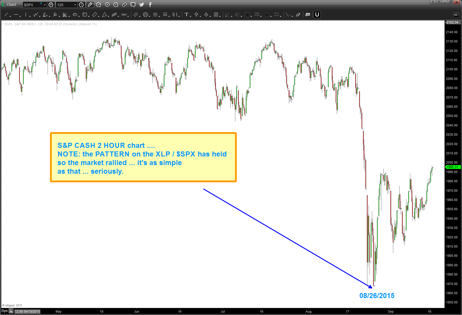
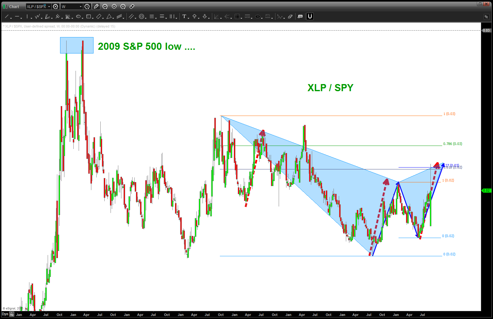
update as of 9/26/2015 – so far we have not taken out the high of the pattern on the XLP/S&P ratio. if we close above the level indicated on a weekly basis, then become very defensive in the coming days/weeks.
so many people are talking about the FED … who cares, really. I have no idea how they set rates, no idea of PPI and CPI and no idea about any of the fundamentals. nope .. I just know patterns and when combined w/ ratio analysis I don’t need anything else.
this is an update of a post that I put out on 8/26/2015
As people were jumping up and down saying CRASH and saying BUY this pullback I was simply looking at patterns. This beautiful SELL pattern worked – perfectly. In the ratio analysis – when the chart goes up the Staples are outperforming which means – institutional rotation out of risk and into, well, staples.
here’s the updated chart as of the close today – it hasn’t sold off tons but it certainly hasn’t closed above this level …
so, in the world of ‘if-then’ lets work thru this …
IF the ratio closes (daily) above the SELL PATTERN then the market is going lower, potentially much lower.
IF the PATTERN holds and the ratio stays below the PATTERN level THEN the market isn’t in chaos mode …
it’s that simple, folks.
if you want, search the site for ratio analysis .. it works and the key is it really gives you a feeling for how the big boys are moving the money around … this move isn’t about “Mom and Pops” folks, it’s about institutional money flow …
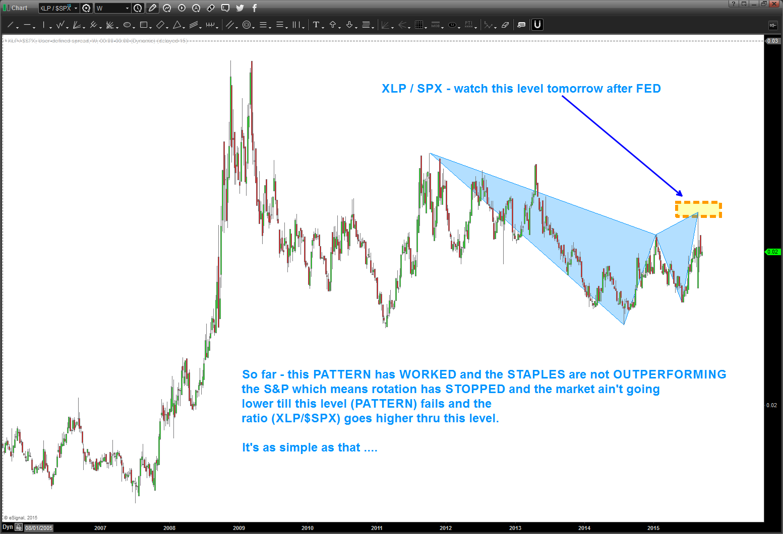
we’ve done this before but here it is again:
- if volatility rises XLP (staples) outperforms the overall market
- when volatility goes away rotation out of XLP occurs.
today’s move to be expected … a monster SELL of the XLP/SPX ratio occurred.
now, the key will be this level and what happens in around it in the next few days.
B
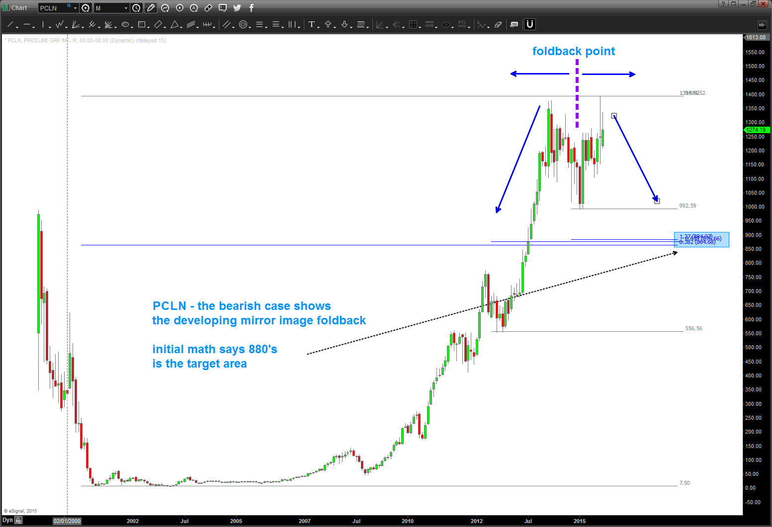
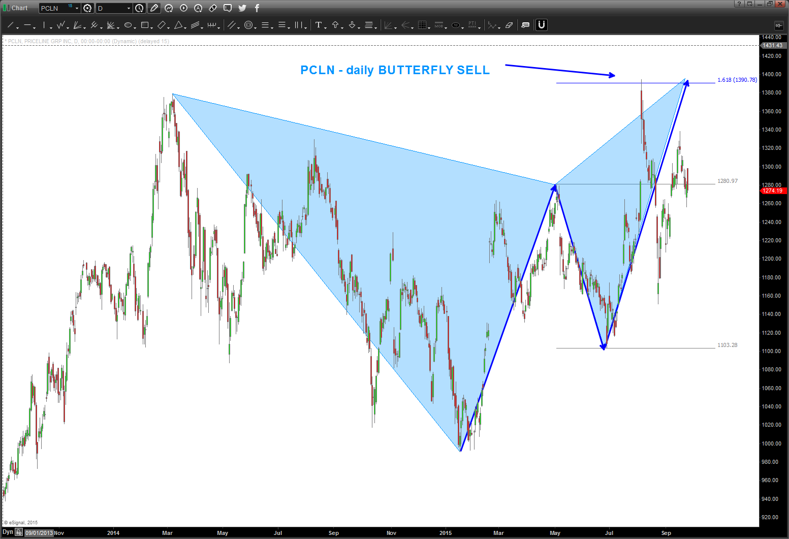
$PCLN and a potential mirror image fold back
Posted on September 25, 2015 Leave a Comment
have blogged about “mirror image foldbacks” before … when they work they are truly amazing. do a “search” for Mirror Image Foldback on this site and you’ll see the work. right now, it appears the Natural Gas Mirror Image Foldback is at risk of feeling … other than that, most have worked.
here’s the picture of a mirror image foldback for $JEC. note the geometry of the parabolic blow off. much like a LOT of stocks out there …
then, below these charts is the mirror image foldback for $PCLN.
here’s the POTENTIAL mirror image appearing on $PCLN. Note, the second chart shows the “daily butterfly sell” that is “causing” this … this will be a very good one to watch. These patterns all fail when the high is taken out .. all probability folks.
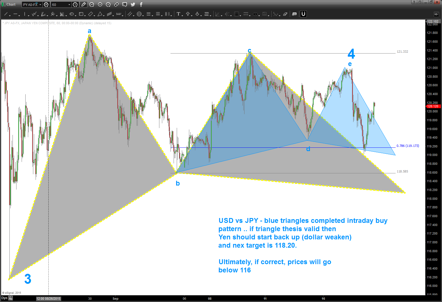
USD vs JPY gameplan
Posted on September 20, 2015 Leave a Comment
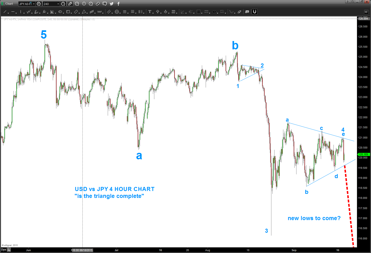
note the blue triangle – finished a BUY pattern after breaking the support … IF this is a correct view (the a-b-c-d-e triangle completing the 4th wave) then prices should not go back up above “e” and we are in a “corrective move” up for more weakness to follow.
once prices start back down (if they do) then we’ll see 118.20.
ultimately, this will draw prices down below 116.00 IF CORRECT … as long as price stays below “e” I am going w/ the triangle thesis …
hope you’ve had a GREAT weekend …unbelievable weather here in Northern VA.
cheers to you and yours – wherever you are …
B
Aussie vs USD updated
Posted on September 20, 2015 Leave a Comment
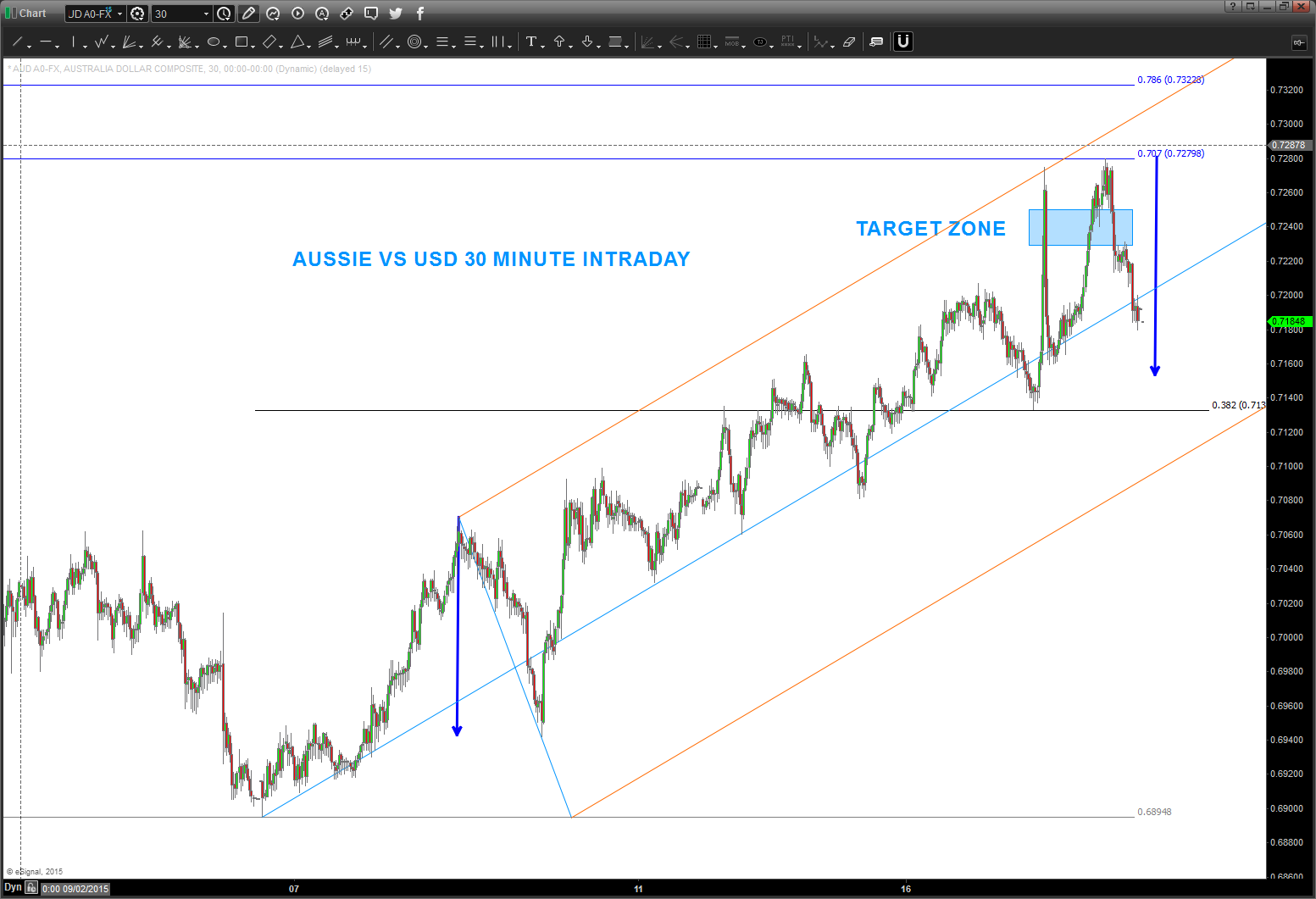
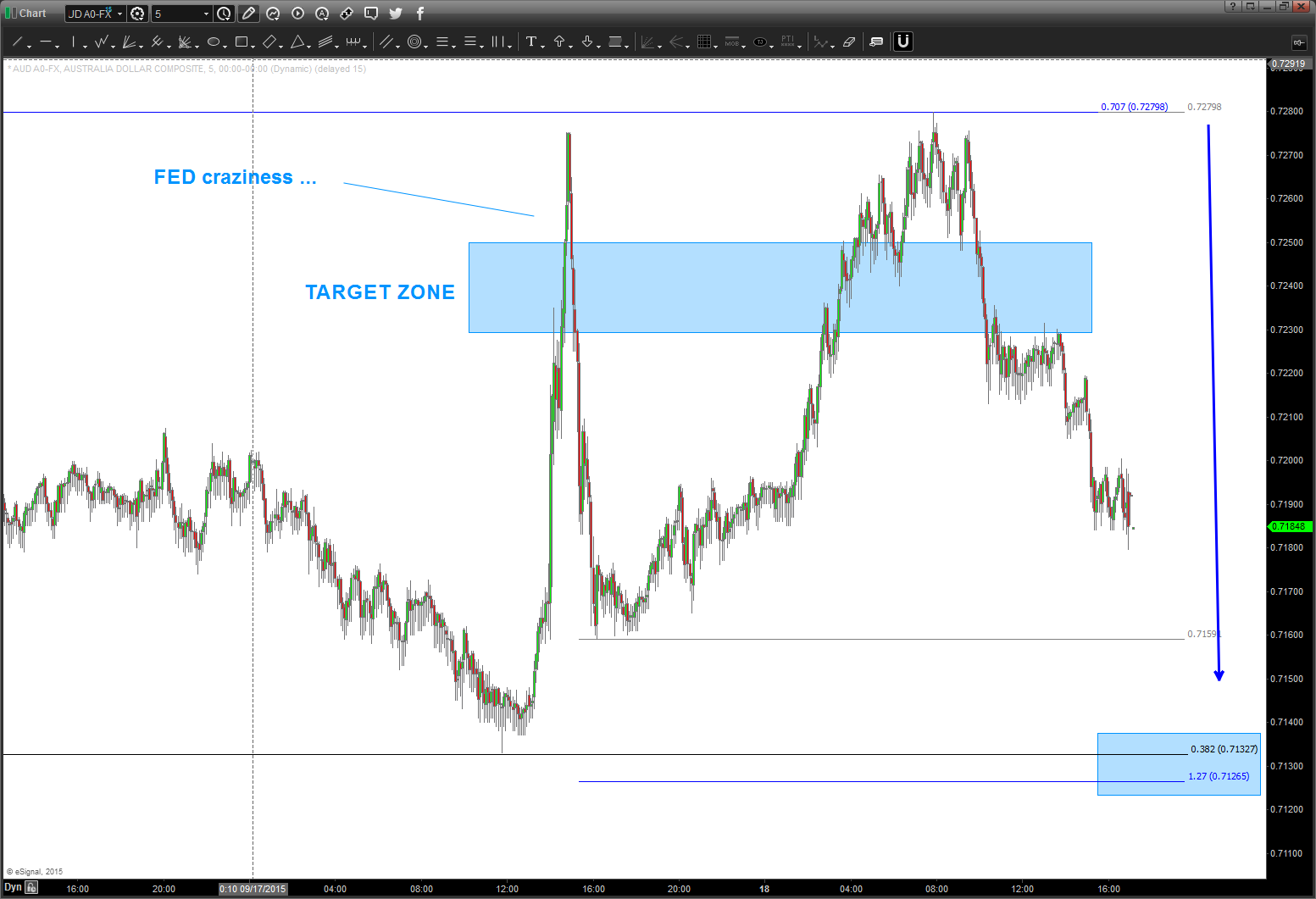
09/20/2015 – target zone was “OK” at holding back the AUD vs USD advance. (the FED craziness rolled thru it by 30 pips) but it did stop at the .707 retracement level – exactly. .707? (2, square root of 2=1.4142, 1/1.4142 = .707)
so, the current form, proportion and harmony tells me “lower” so I’m still WAITING for 7130 area.
gold/silver “should” be taking off for a “head fake” rally C wave that could be very powerful. hence my interest in Aussie, Kiwi, Loonie. I like the Aussie for reasons below – the long long term measured move hit exactly on September 06 2015. so, yes, I’ve have been sitting on my hands to go long for 14 days. and I’ll keep waiting till a BUY pattern emerges. 🙂
Gasoline futures are giving me a “better” picture because the FORM is very nice. take a peak below – see the 3 wave move UP into a new high – CLASSIC B WAVE STUFF. only problem is the recent price action I convoluted. but, USUALLY, when we have a 3 wave move UP into a new high the move down is 1.618 of the first move down .. shown below.
So, we wait.
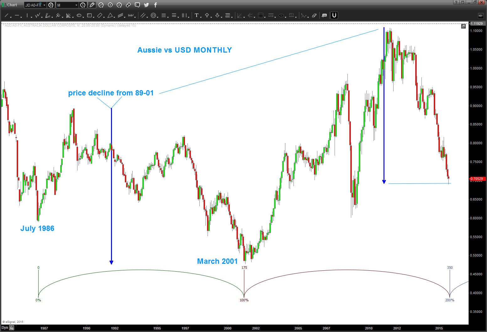
09/08/2015 – my target area/zone got crunched pretty bad, and my count is wrong. all that being said, I didn’t take into account the measured move from 89-01. quite frankly, w/ all that ‘stuff’ coming into the areas as shown below I didn’t think it could. So the age old adage of “thinking” versus “seeing” left my target thumped. W/ so much thrust and momentum going I did not take the long trade but have been waiting …
but, as of last night it has give us a DAILY SRC and when I went back and erased everything I saw a monster cycle coming in and the measured move hit perfectly …hmmm.
how to play ? WAIT for a PATTERN to appear on perhaps a 60 minute chart .. watch gasoline futures and crude and the All Ordinaries for a sign of life and also the Chinese market …
here’s the updated chart:
will update (real time) the play here and the risk and the real time move of a dude in his home juggling dynamite w/ gorilla’s in a cage .. cool hugh?
Bart
Folks, back in October the post below the two dash lines was searching for a low to be in place on the AUD. The form and proportion were just about right. However, w/ the big move in crude, the interest rate extravaganza and the a whole host of other fundamental reasons the real issue is the PATTERN level didn’t work … it went approximately 300 pips below. HOWEVER, the overall thesis that the Aussie is bottoming versus the dollar still holds true. It’s showing some nice strength tonight …would love to get a very nice pullback to go long in/around these levels.
Updated charts below:
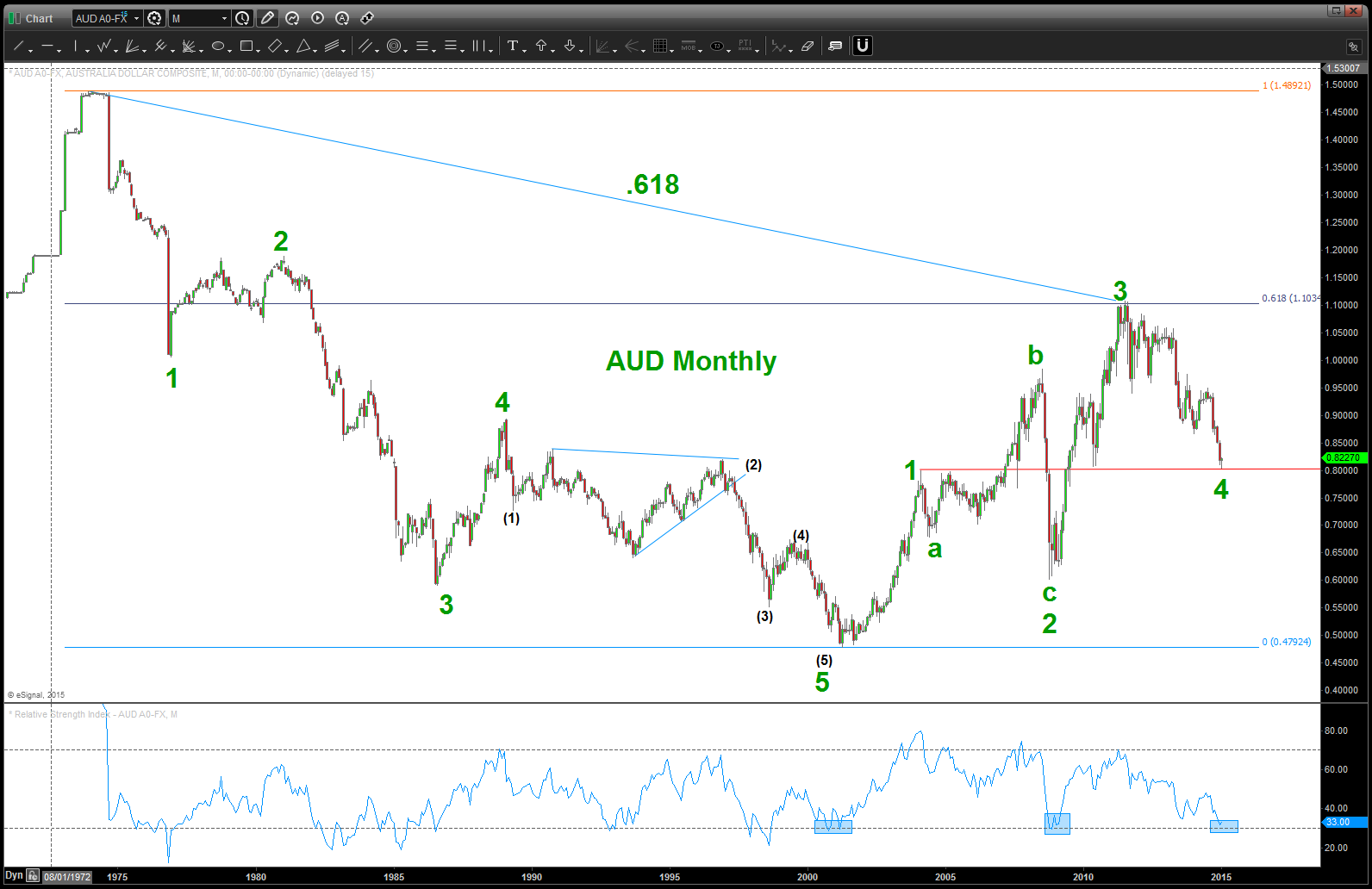
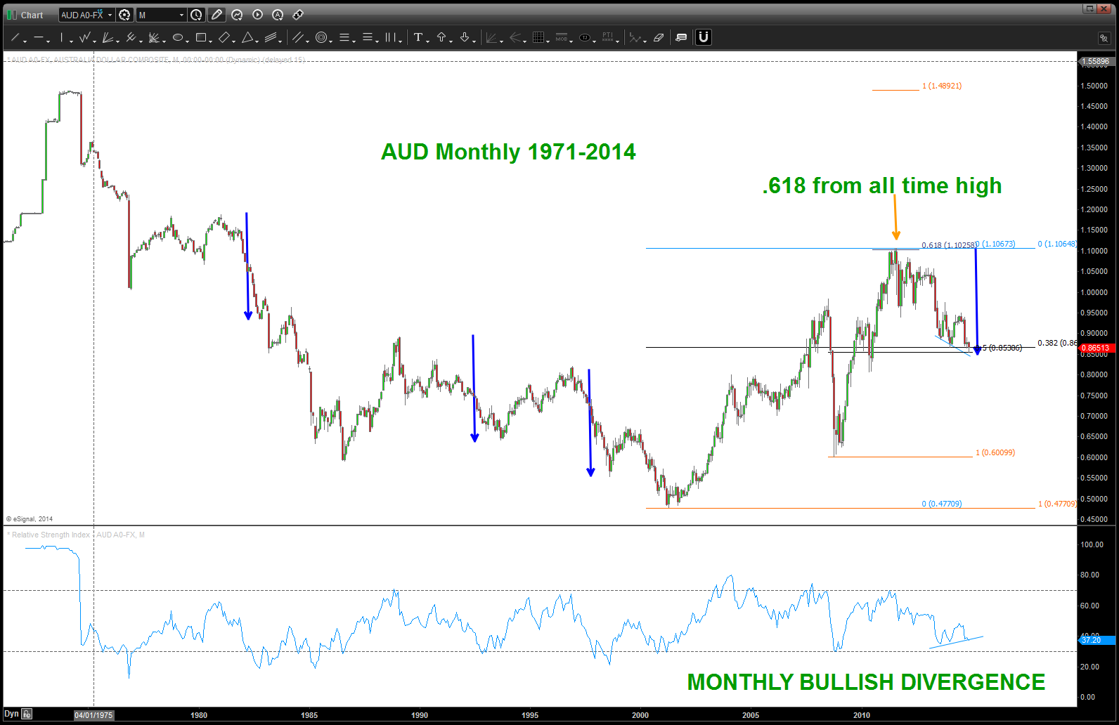
Note the monthly RSI levels … the BIG MOVES UP occurred right where we are sitting. Also, a case can be made that 4 is complete and we are going to new highs …
last time I checked the Aussie wasn’t part of the US Dollar index … so, watch this one closely. At a minimum we are completing/completed an A and a nice B wave up is to occur.
let’s just get on the right side of the trade and right now that looks like bullish entry for the AUD vs USD.
The Aussie has been correcting for a while and, folks, the move down from 1.100 ish certainly appears to be corrective. What does that mean? We are “at” or “near the beginning of a multi year advance that will take out the high July 2011. Here’s the monthly picture …
TILT … everyone is talking about US Dollar strength – yes, but they are talking about the dollar index which the Aussie isn’t even a part of it. Or if it is the weight is negligible so in this case we have to take this pair as a single entity – not a weighted index.
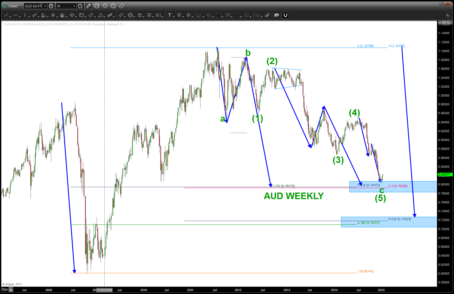
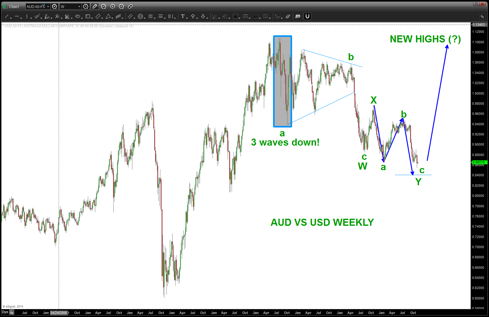
here’s the weekly:
note the 3 waves down … that is the key. it was not a 5 wave movement. has this correction been complex – yes. But it’s falling right in line w/ a double three labeled w,x,y.
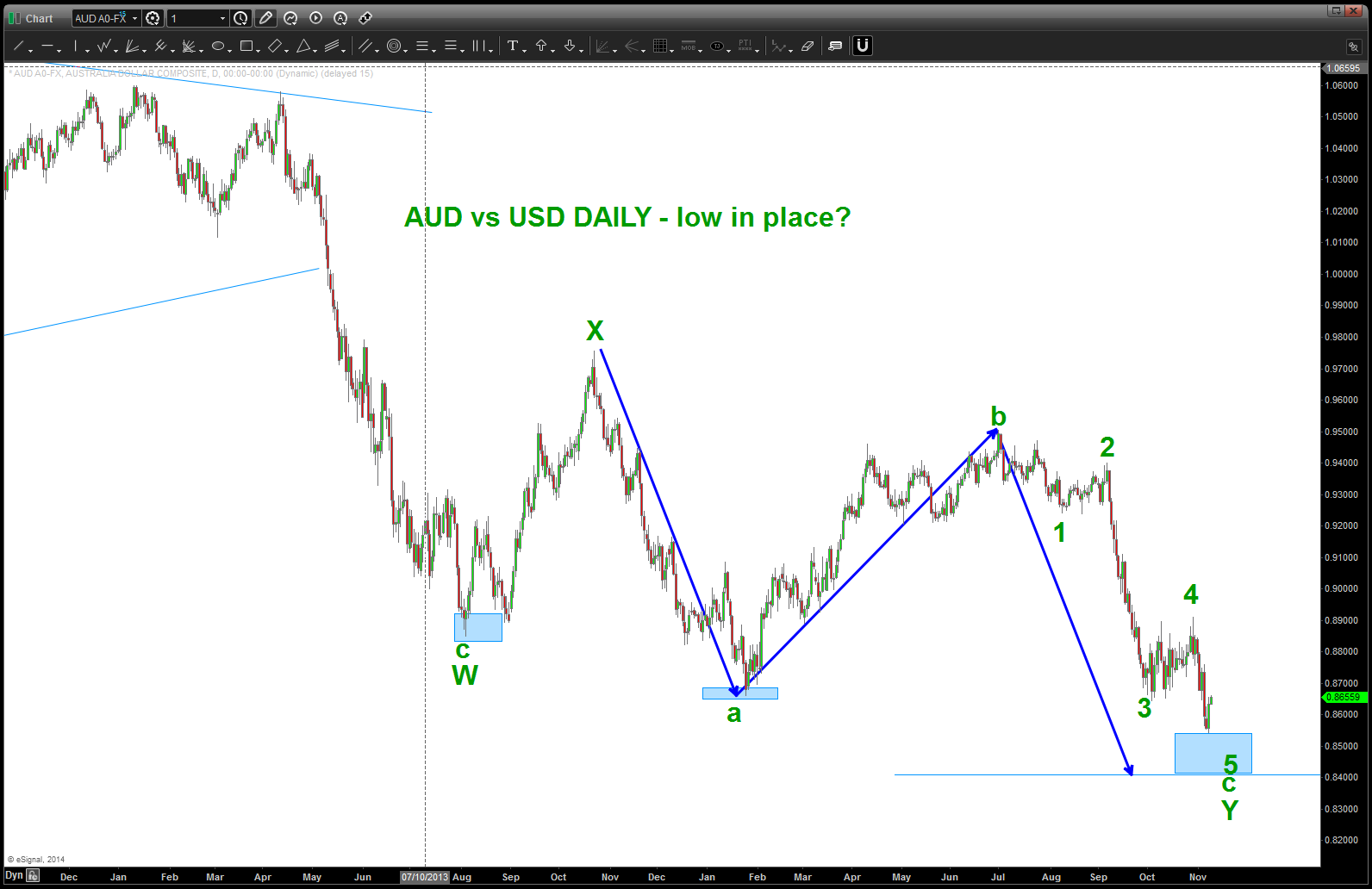
and, the daily, shown below, just completed 5 waves down. While it would be perfect symmetrical three drives to a bottom is we go down and attack 8400 – there is a good case to be made that a low is in place. we’ll have to wait for an intraday pattern to appear …
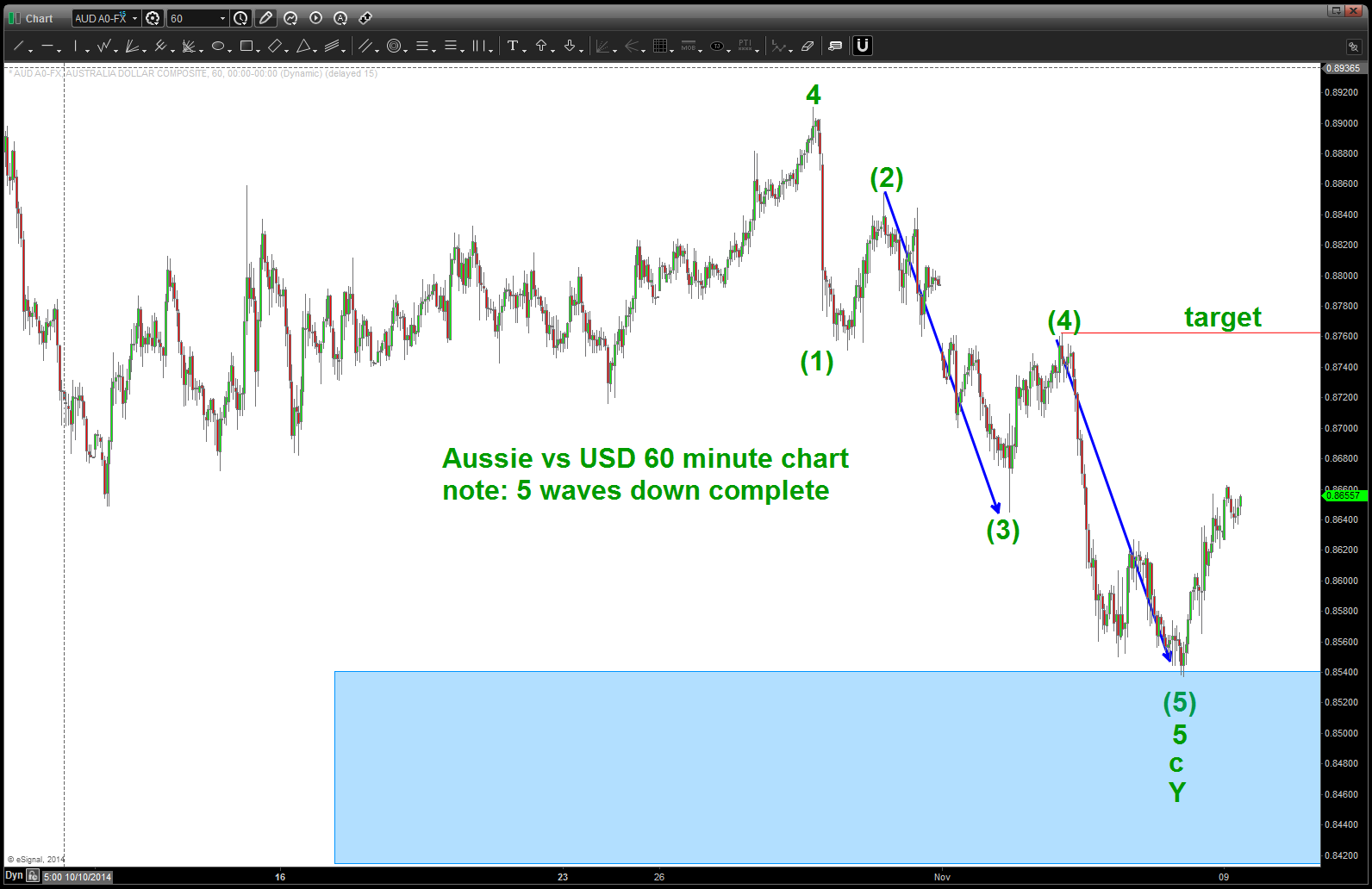
and finally, we’ll see the move down on a 60 minute chart is a clearly defined 5 waves.
so … there ya have it.
what to do? Well, our thesis is we are beginning a multi year move to take out the old highs from 2011. IF THAT IS CORRECT THEN WE ARE IN the first stages of the advance. the first move up (wave 1) will complete and then wave 2 will come and, more than likely, w/ a vengeance because everyone thinks the “old trend” is in play. That’s the BUYING OPPORTUNITY and price should never go below the low that was formed last week.
stay tuned …get ready to rumble.
Bart
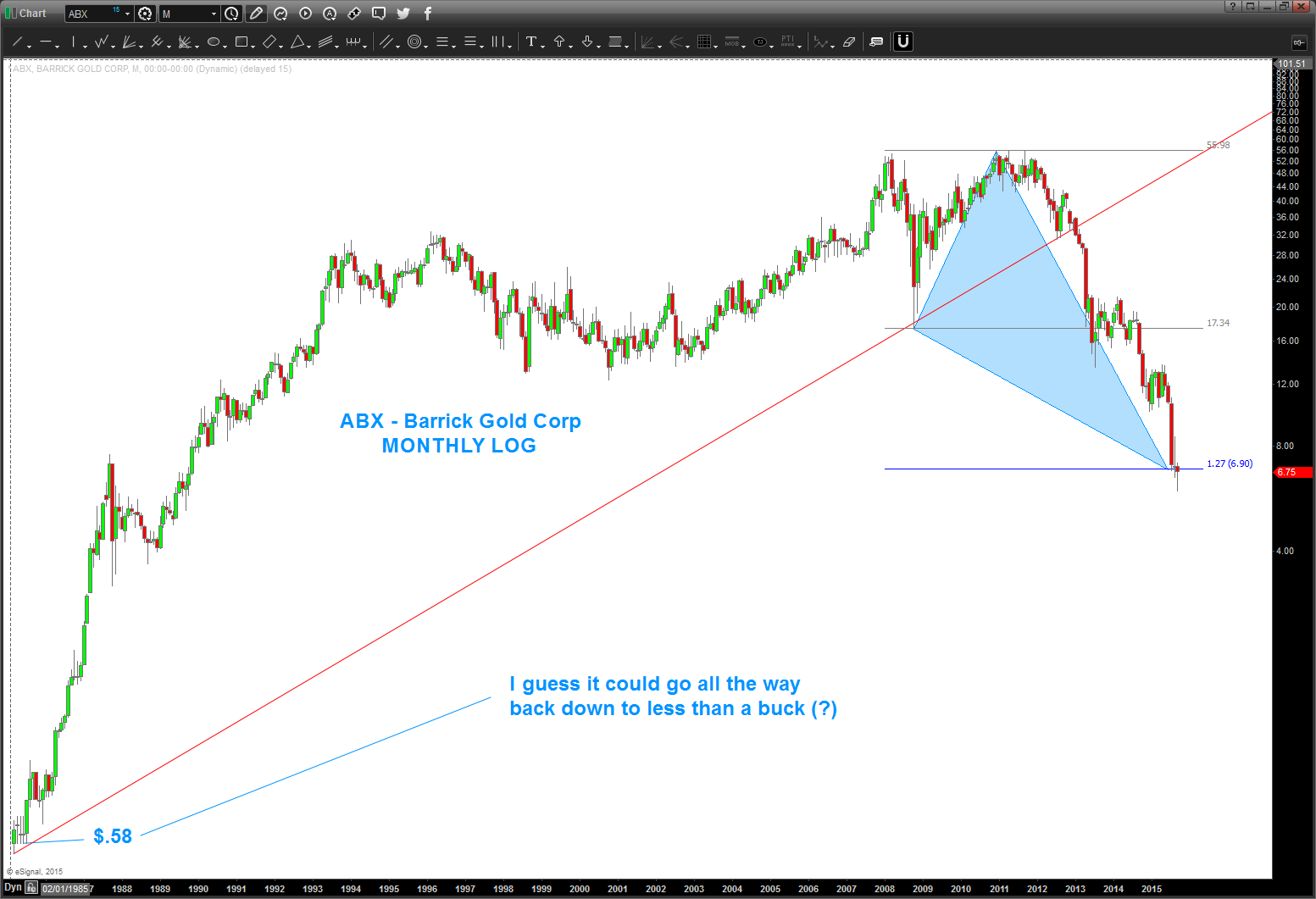
ABX update
Posted on September 20, 2015 Leave a Comment
well this puppy is a dead cat, hugh?
here’s some former posts on ABX – https://bartscharts.com//?s=abx
note the current price action on a monthly log chart – low, open/close, current “high” for the month close all at the level were targeting….guess if it blows thru here it could go down below a buck? watch this one folks, “popping” here isn’t out of the question.
when the big boys eat soup volatility rises ….
Posted on September 19, 2015 Leave a Comment
Below the two dashed lines is a post that I did 2 years ago – almost to the day. Pretty amazing …some would call it synchronistic. I’ll just leave it at that …
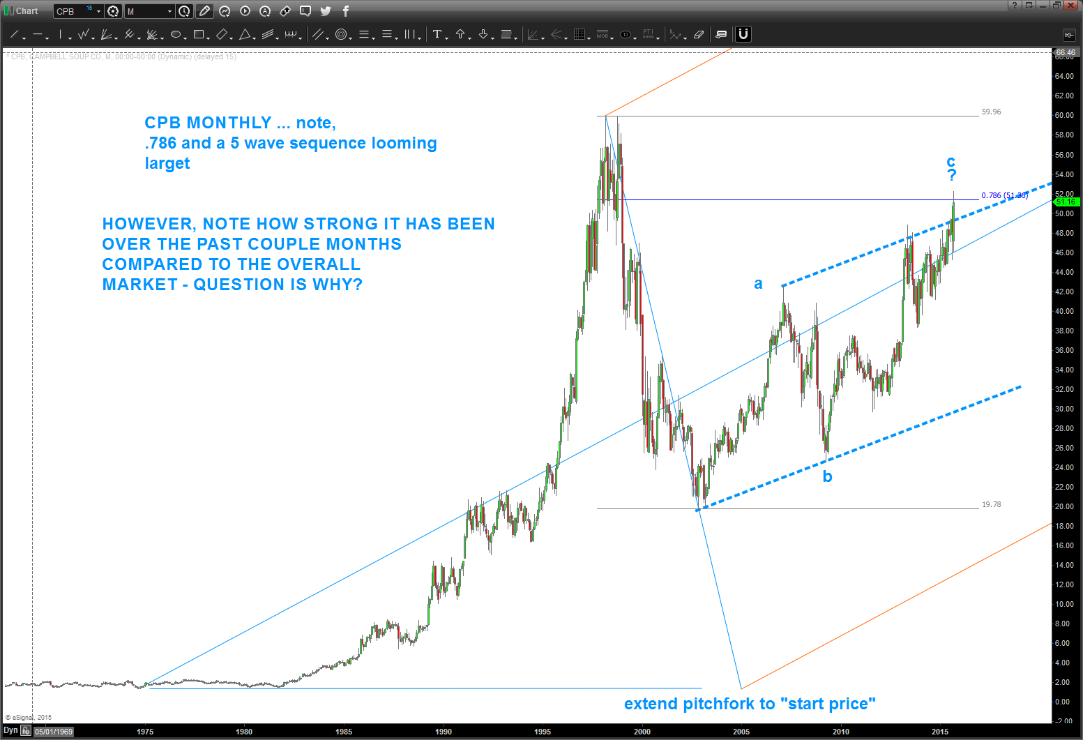
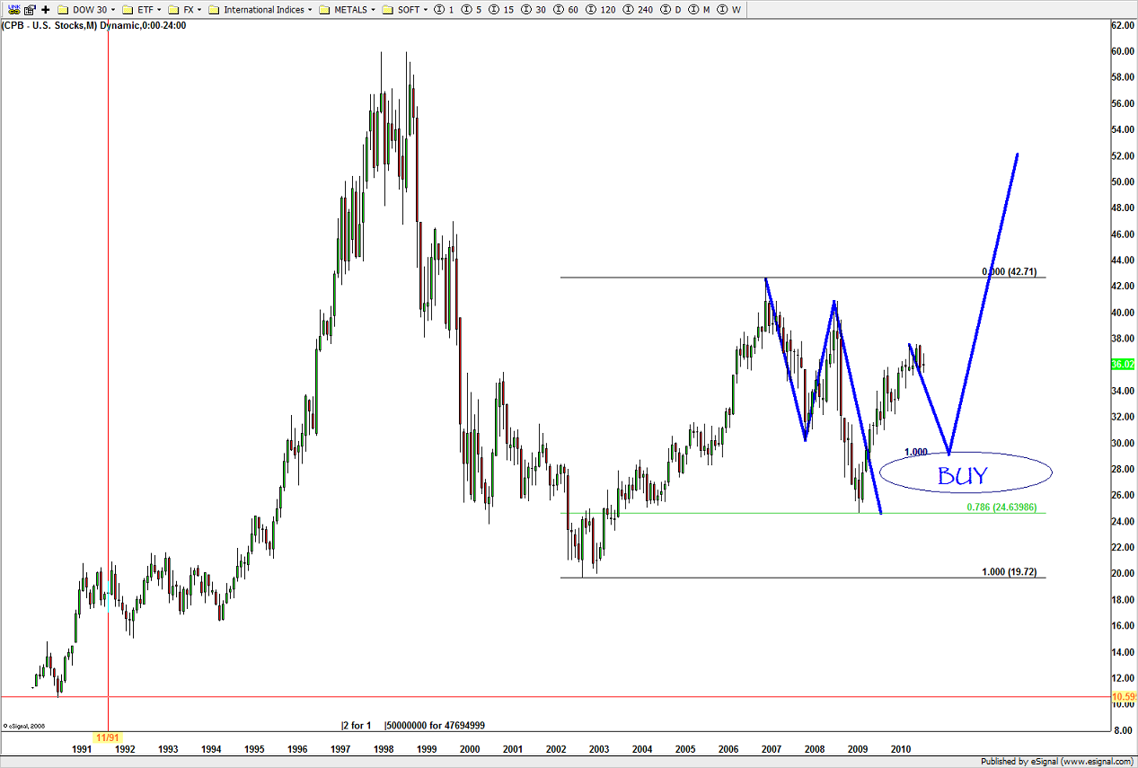
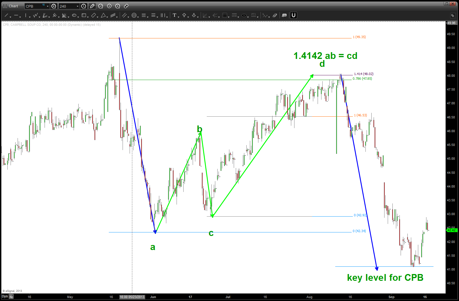
Personally, I enjoy my Saturday and Sunday morning’s w/ a cup of coffee. Nothing going on, put a little Pandora on the headset and just “chill” and enjoy the amazing fall weather in VA. Little Bird said – “hey Bart, how about CPB soup?” So I took a look and – BAM – I was surprised.
If you go all the way back 2 years ago you’ll see that we had a nice pattern forming and it hit – to a tee at 48.
The market pulled back about 10 bucks and then started to march back up … a slow grind but it did go up.
As you can see above 52 and it was considered a failed pattern.
This week we went up and touched that level and, while I can see a 5 wave count up into this area and seeing an a-b-c type of correction what REALLY made me go hmmm is, of course the relative strength of CPB compared to the NYA. Why? STAPLES BABY …. a couple posts ago I mentioned we should be watching the XLP / $SPX for strength to signal more market weakness. Soup is a staple – period.
So, couple things of note:
- CPB is strong compared to the overall market.
- It has closed, on a weekly basis, the trend channel defined by the blue dashed line.
- there is a 5 wave count into the 52 area so warrant caution here if going to play on the long side.
- the short side is also a play, but would wait for the 48 level to be broken to the downside on a weekly close.
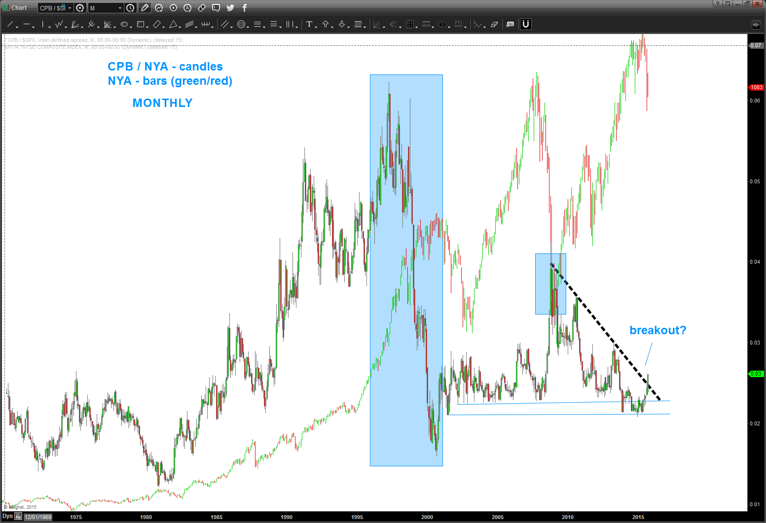
here’s what really has me interested in the RELATIVE STRENGTH OF CPB vs NYA
Points of Interest
- from the 1980’s CPB “outperformed” (the ratio went up) the overall market.
- the ratio TOPPED in 1997. the overall market didn’t top until 2000.
- but when the market did, eventually, top, the relative strength of CPB / NYA bottomed exactly the same time
- think about it for a moment .. the ratio CRASHED going into the top in 2000. Folks, that’s irrational exuberance. throw caution to the wind and get in, get in, get in and then ….ouch.
- while not as dramatic, the same thing occurred in the 2007-2009 period.
- the ratio bottomed as the market topped.
- presently, we do have some strength taking off and we have closed above the black dashed trend line.
- is that a signal that a strong move in the ratio is coming? Potentially, so monitor closely and do not be lulled to sleep. Strength in this ratio is not good for the overall health of the equity market.
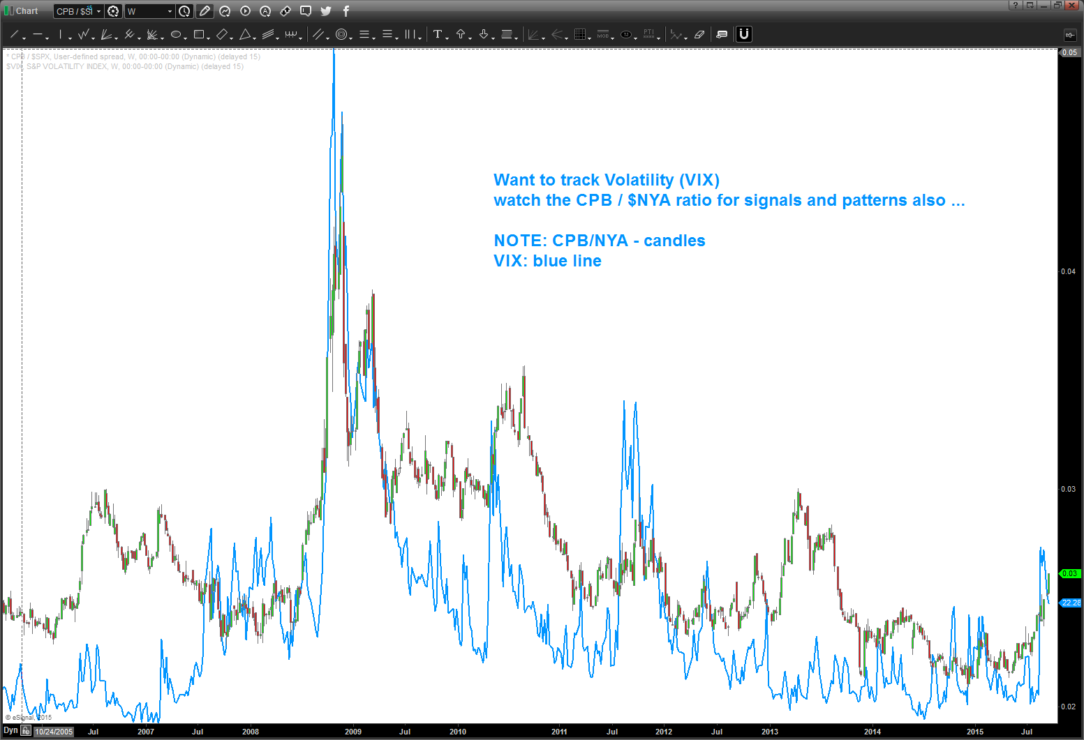
one last folks … let’s not try to “fundamentalize” this last chart. that’s for the really smart people .. but take a look at the CPB/NYA ratio and the VIX. It’s a near perfect match.
When the institutions start eating soup … expect volatility to rise.
swings on this puppy have been extremely nice ….charts below.
just follow the bouncing ball …
nice BUY pattern emerged at level forecast …
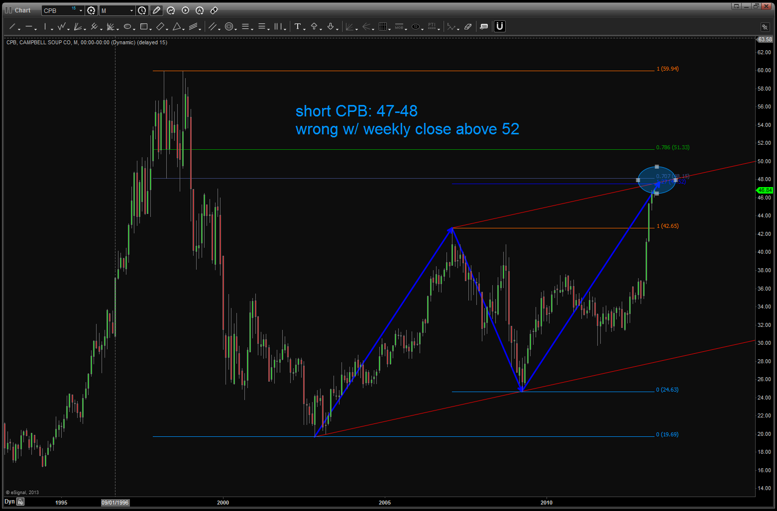
long term pattern came into play. good pattern/good defined risk …
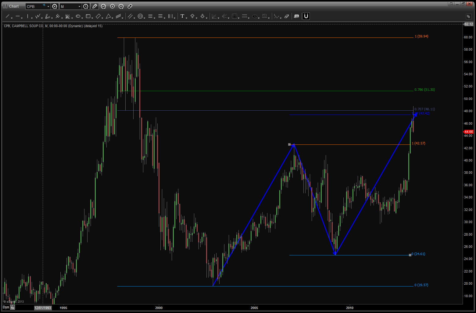
level being hit ….
note, now we have completed the equality of swings and the level held at/around 41.
watch the lower level on CPB … if we break it, selling could really come in ….

the JPY and a “high probability” 4th wave triangle … not good for stocks
Posted on September 17, 2015 Leave a Comment
Folks, going to point you to a post that my “boy” ( he says that a lot, not sure why – must be a Cuban thing?) wrote about the YEN and it’s importance to the US Equity Market: http://allstarcharts.com/why-yen-is-the-most-important-chart-for-us-stocks/ . If your not one of the 50K+ following him on stock twits you should.
When I was an instructor for the CMT III course we would have a bunch of people go online from all over the world – it was cool. As the market was cracking in 2007-2008 I would play Led Zeppelin “when the levy breaks” before each class. There was one dude who would be all out of breath and I would ask – what the hell are your doing man? The reply – “going for a run in central park listening to an audio book on technical analysis and CMT III”… that’s JC. Enough said.
After you digest his blog post, if you still feel like it, take a look at these two charts. My thesis – we have completed a pretty big high on the USD vs JPY. Do a search on the YEN on my post and you’ll see I’ve been following this count pretty well. Why is that important? Well, because it’s time for true confessions …
See the little yellow arrow on the first chart below? (boxed in w/ blue background?)
I GOT STOPPED OUT AT THAT LEVEL TRYING TO GO LONG THE USD VS JPY. I GOT STOPPED OUT BY 7 PIPS …
THAT PUT ME INTO MY FIRST EVER DRAWDOWN IN 10 YEARS AND, WELL, WELCOME TO A TRADER MEETS CRYPTONITE …
NEEDLESS TO SAY, I’M INTERESTED IN THE USD VS JPY … 🙂
So, to the charts …folks, I like this count. I don’t see it going much higher and, according to the rules I taught in CMT III the previous wave 4 of a lesser degree is a target. Ummmmm, that’s around 100. In currency terms that is HUGE. (Kind of like the quadrillion of derivatives outstanding)
So (saw that Peter Gabriel concert where he played it exactly like the CD – more on that later) if were correct here AND the correlation w/ stocks remains in tact THEN equities are going to have a tough time.
To the charts …
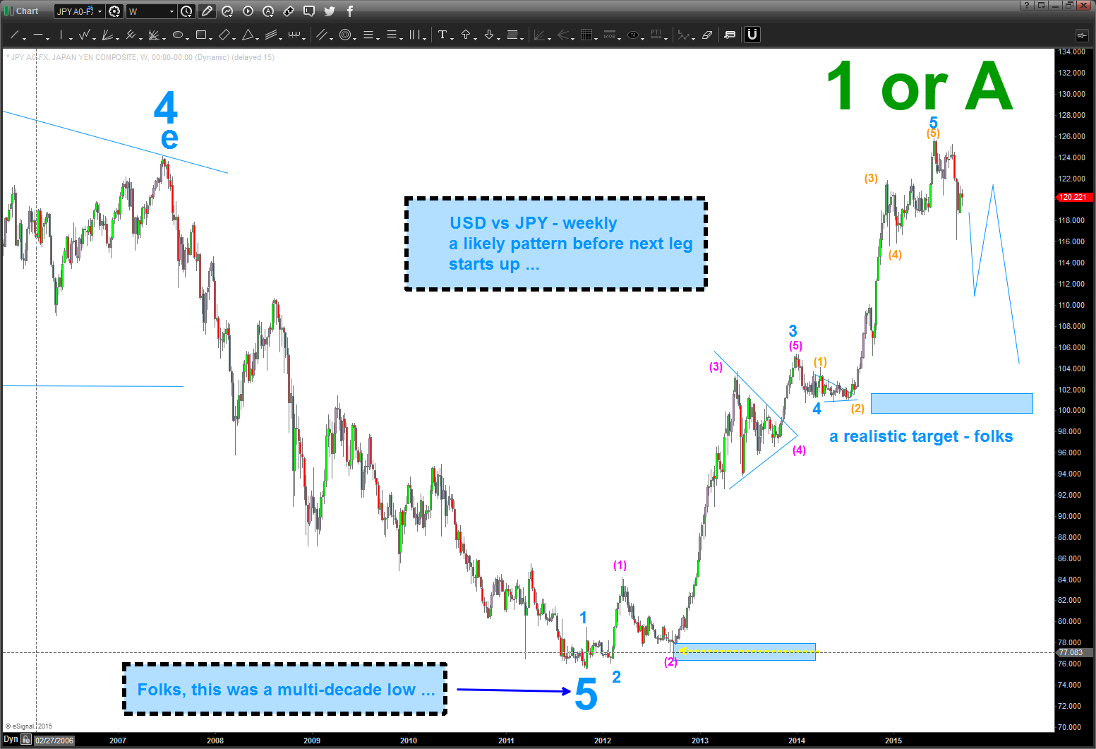
You can see (chart below) that I am labeling it A-B-C (we just finished triangle 4 w/ a 5th wave to come) for now because the uptrend is so powerful … the probability is that we will see a new low below 116 on the USD vs JPY. At that time … we’ll take a look at labeling this A w/ B-C to come or correction complete. For now, if we break that lower trend line below, consider another move lower and therefore weakness in stocks over the coming weeks.
Let me know if you have any questions.
B
