Trend lines ….the real way
If you want to draw “real” trend lines then it’s imperative you have a good place to start …
the key w/ trend lines is “LINING THEM UP W/ THE PLANE OF THE CHART .. the chart doesn’t go just UP and DOWN. It goes according to vector math w/ an X/Y (it also has a Z component but that’s another post) component.
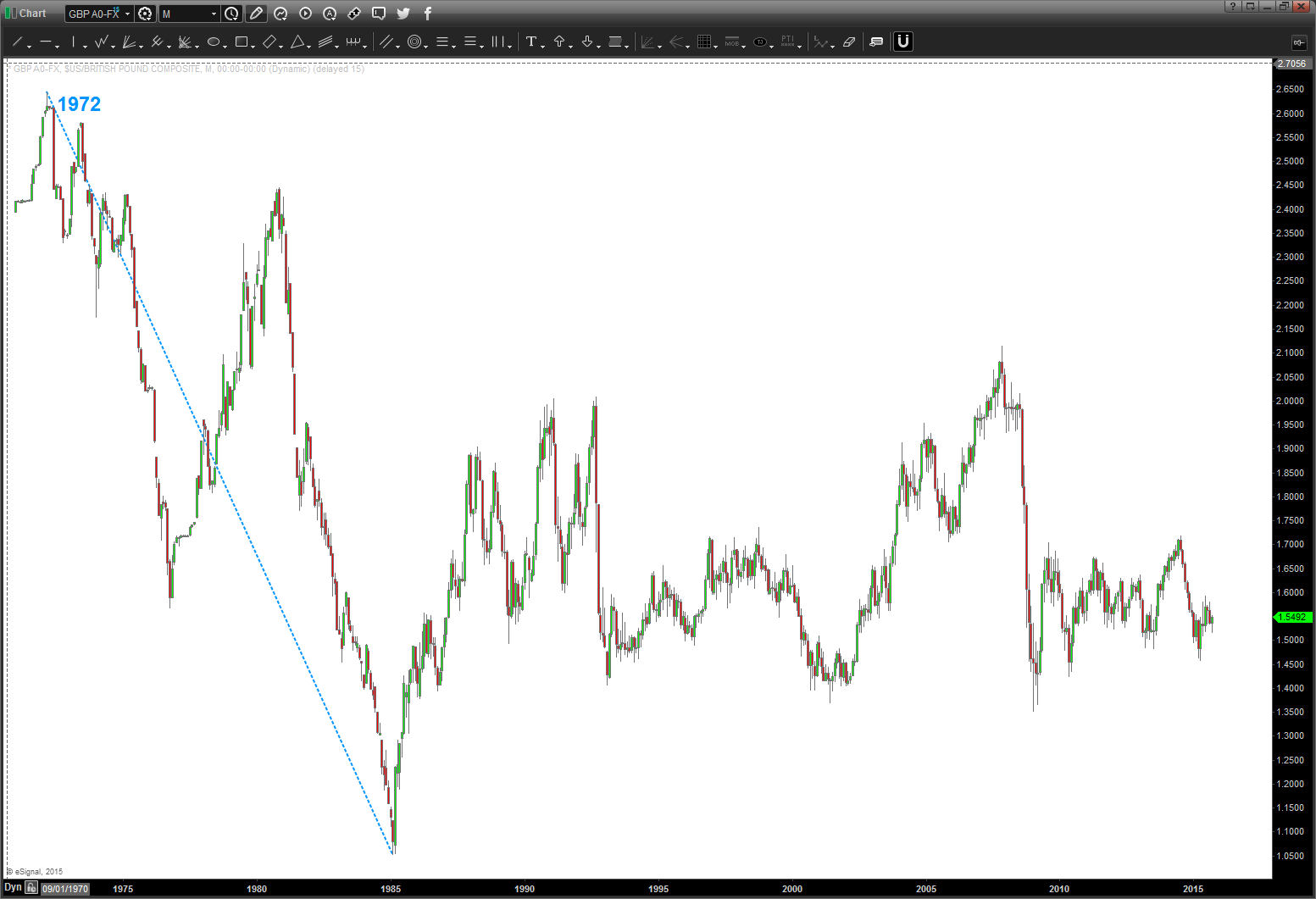
below is the LONG TERM GBP chart … note the dashed blue line. that move will define the geometry of only two more trend lines. a 90 degree and 45 degree angle.
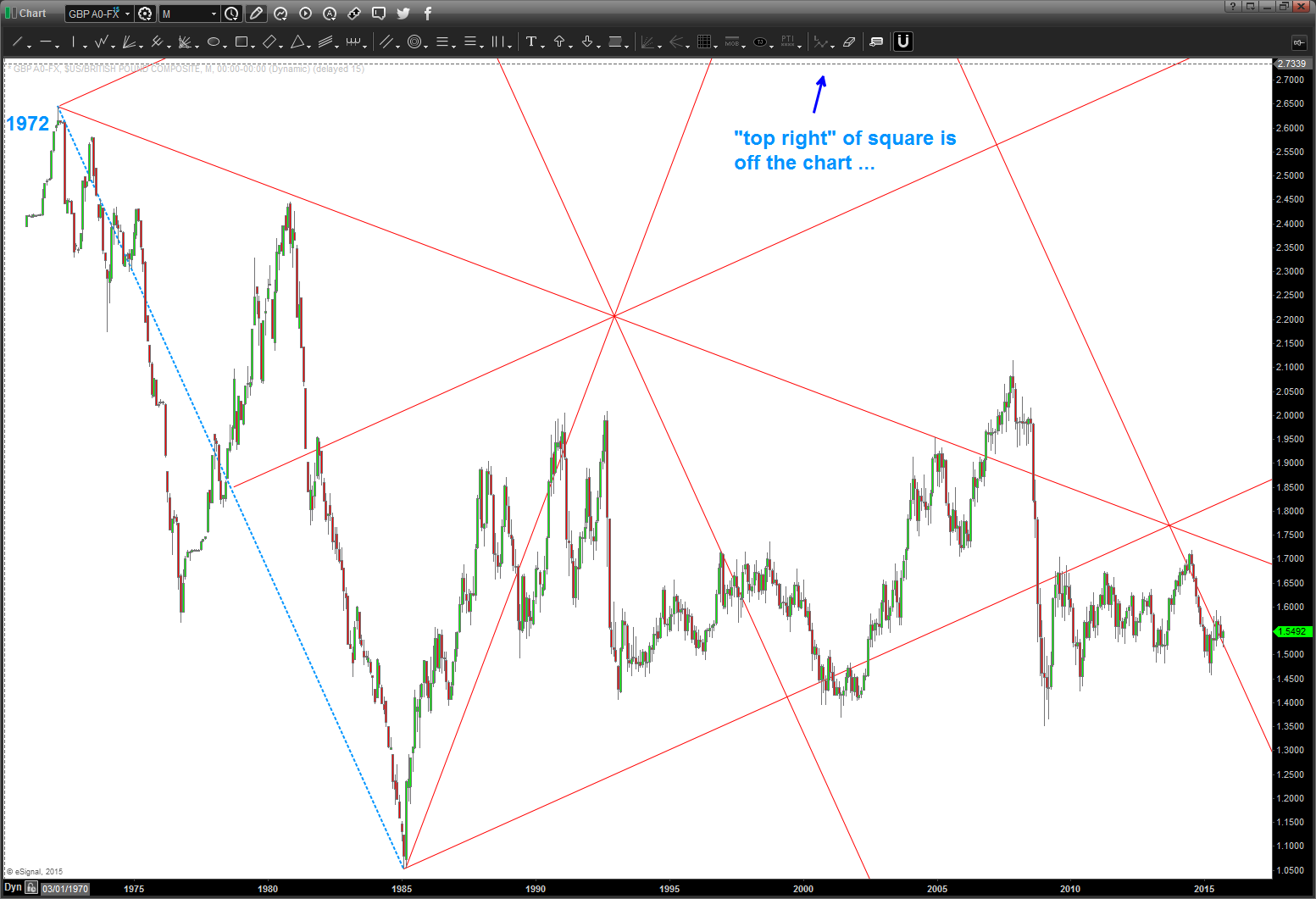
next, you’ll see red “rays” drawn w/ only 90 and 45 degrees. Look at the price action around these lines …
now it’s just a matter of drawing more squares …note the highlighted area. That’s where I wanted to focus but in order to do that I had to go WAY BEYOND the SIDES and TOPS AND BOTTOMS to draw the real trendlines .. once I found at point which “found” the support and resistance area since 2009 I now have a clue of the IMPORTANCE of this area and can/will develop a gameplan around it ..
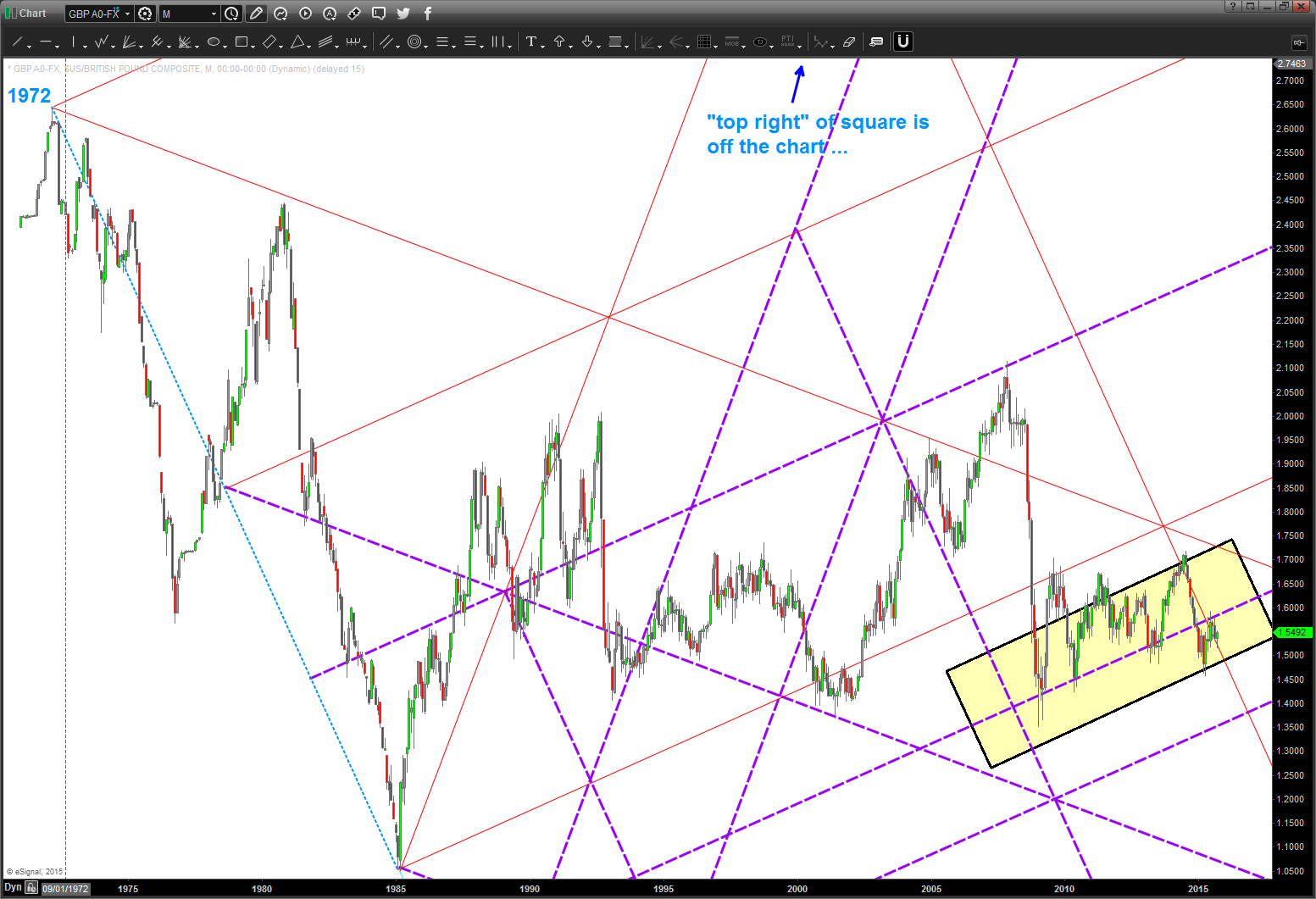
why squares? why not?

let’s have some fun tomorrow and rock and roll ….
Bart
