the Great British Pound redux …

CLIFF NOTE: POUND to attack 1.7, make it thru and then set up for a SHORT.  If it does not break thru, then waiting for a sell pattern.  Am NOT going to try and count the current consolidation.  If/when it makes it thru 1.7 it will be quite the cookoff!

CLIFF NOTE 2: please see the following link and you’ll see that my “triangle” thesis in the POUND was, well, wrong … it’s been over 3 months since I have looked at it.  Took that long to bring a fresh perspective.  I can still tell you that I am waiting for a PATTERN but I’m not tied to the triangle anymore …

Great British Pound – again

the first thing I am going to do is go back a 100 years … I should go back further but 1) it’s the weekend and 2) believe this is accurate.  While it’s true the Pound wasn’t necessarily floating against the dollar til 1971 I want to remind us that Spot Gold stopped on the .382 from the early 1900’s and it was fixed then also.  So, here’s a long term count POTENTIAL from 1915

GBP 1915-2014
GBP 1915-2014


here’s a POTENTIAL look at the BIG PICTURE (note it’s not EXACT) but a quick look at some major trendline POTENTIAL

GDP-decline-history 2

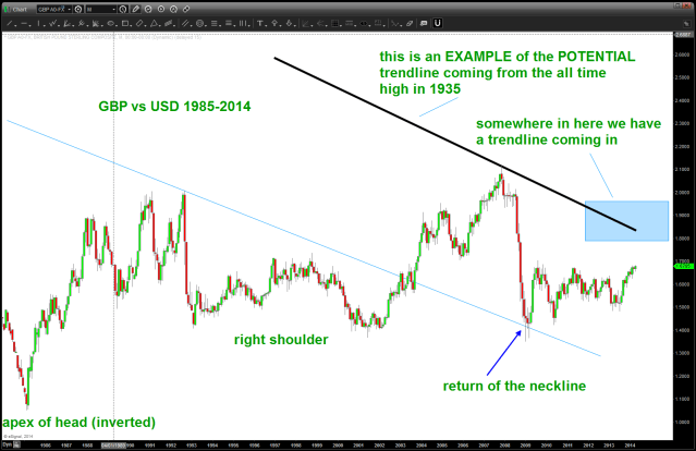
note the inverted head and shoulders pattern present and how the 2007-2009 THUMP came right back down to the trendline and STOPPED.  Folks, that’s BULLISH … basic TA says to WAIT for the neckline break UP or DOWN on a H+S patterns and for price to “come back to the neckline” — that’s what happened…

So, now let’s “zoom in” to a MONTHLY look at the GBP ….

Main20140426114330

some things to notice – 1.4 is a BIG DEAL from a support perspective and the 1.70 handle has been key since 1996 as RESISTANCE and support.  I think it’s inevitable that we are going to go up and attack 1.7.

let’s digest two major points:

1. so, believe a case can be made of the inverse head and shoulders and the return to the neckline as shown below.  (note: these trendlines are not exact but are used to give us a sense/feel of where are.)  Our light blue line is the neckline of the inverted head and shoulders and illustrating how we “returned to the neckline” and bounced.  Now, let’s think about it for a moment — if you can remember back to 2009 the financial world was coming unglued.  So, take a look at the candles coming into this low.  THEY ARE VERY BEARISH and the NECKLINE HELD.  Overall — bullish ….

2.  I do not have the chart data that goes back 100 years.  I have used the chart above to make a BEST GUESS ESTIMATE of the trendline coming from the all time high in 1935 up in the 5.xxx’s.  What we can say is this trendline is going to come into play.  If I can get my hand on a good CQG chart or something like that THEN I could get more exact but it’s something to understand.  There is MAJOR resistance on the POUND higher but the fact that the data isn’t as good as I would like it “could be” a 300-500 pip range.  Way to much to manage risk … but be aware.

Main20140426114920


now that we have defined the key areas we can also get a “feel” by using the long term RSI support and resistance zones

Main20140426120543

what do we see ?  In the long term picture there have been times where it has bounced off BULLISH support in the 40-50 area but it has NEVER broken thru the BEARISH resistance levels defined by Constance Brown.

Main20140426121245

so, note sure I am any farther along then when I started but I do think I have put together an executable gameplan.  Let me know what you think ….


DJ Transports and Utilities updated

CLIFF NOTES: I am a patter recognition chartist.  I am NOT trying to be overtly bullish or bearish.  Just using this forum to show the PATTERNS that area ppearing.

On the DJ Transports we have completed a MAJOR AB=CD sell pattern w/ a 1.618 extension.  That is bearish.  It’s particularly bearish because the pattern using the former all time highs and lows. I am also showing the Utilities almost completing a very bearish pattern.  Again … heads up folks, these are NOT 60 minute intraday scalping trades.  These are MAJOR patterns that bear close watching.

DJ Transports
DJ Transports


DJ Utilities
DJ Utilities

SPX updated as of April 21, 2014

CLIFF NOTES: my initial quick look at the S&P appears wrong from the counting perspective.  Once the gap up occurred it signaled the characteristics of a C wave so I readjusted and am looking at a FLAT correction occurring and it should be done at the close today or just a little higher.  Expect selling to come in …

Main20140421185105

Energy is usually the last shoe to drop

CLIFF NOTES: below you will see a butterfly top coming into play in the XLE.  98 and/or 110 should act as major resistance.  Let’s take a look at the potential set-up’s coming into play:

  • DJ Transports have completed a MAJOR BEAR pattern w/ the AB=CD completing from the late 1800’s.
  • DJ Utilities have a MAJOR BEAR pattern just a little bit higher that should act as major resitance.
  • THE XLF (proxy for the financials) has completed a WEEKLY BEAR pattern … the banks usually lead us UP and lead us DOWN.
  • Parabolic Charts have shown the first sign of weakness (IBB, GOOG, PCLN, etc, etc) which usually results in weakness.  The Social Media darlings have “cracked”
  • Multiple Long Term 5 wave counts are complete on some very important big cap stocks
  • And, from a cycles perspective one of my mentors, Mike Jenkins at http://www.stockcyclesforecast.com wrote this:

The biggest cluster of cycles we will face for the next decade hit from April 14 to 23rd, but
not really ending until the solar eclipse on the 29th. In my life I’ve never seen anything like it
except perhaps for 1974. My guess is a Middle East War or major stock market collapse, or
major earthquake. I would be extremely defensive until we get to the May 2nd to 5th pivot.

So, the band can continue to play on but let’s trade what we see … the XLE is important  because it is usually the last to top in a bull market.

rotation

With that in mind we now present a BEARISH BUTTERFLY SELL PATTERN as shown …

I left the background of the chart black for Easter Color affect ...
I left the background of the chart black for Easter Color affect …

We have been watching this target per this post: http://bartscharts.com/2013/09/15/part-iv-sp-and-energy/

Main20140420115954

Main20140420120216


Main20140420120418


Stay tuned as this market is topping (has topped) folks and w/ the amount of evidence being shown, it’s time to seriously get defensive and take profit or be in cash.   Once these patterns complete …


Happy Easter — Bart


Dow Jones Utilities Long Term (1942) Price Pattern

CLIFF NOTES: major target appearing on Dow Jones Utilities at/around 573.  Definitely the stronger of the Dow components but 1) monthly divergence is presenting itself, 2) a possible 5 wave (monthly) count completing, 3) THE AB=CD pattern from the all time low in 1942 is a little higher …so, believe this is the most important index to watch over the next couple weeks.

Main20140419095123 Main20140419095440 Main20140419095748

this never gets old …

CLIFF NOTES: I have NEVER taken an econ or business course in my life.  I wouldn’t begin to even know how to look at anything that has to do w/ the fundamentals.  I am not saying that fundamentals (CFA) aren’t applicable or don’t work or anything like that I am only saying I know NOTHING about them and I look at the market ONLY threw the lens of numbers and patterns.  Quite frankly, in my mid-40’s, I’m 1) too lazy and 2) not smart enough to climb the wall of the CFA or MBA in Finance.

So, I fully acknowledge that trading the market based on sacred geometry, musical theory, square roots and their inverses, geometry and  fibonacci (note I put that last) is not necessarily in the main stream.  Come on … SPOT FX is a 3-4 trillion /day market.  At any given time 1000’s if not 100,000’s of computers, eyeballs and mouse clicks are buying and selling.  And w/ the massive flow of funds on a global basis I’m going to pull the trigger on some numbers coming together based on a $50/month charting package in my pajama’s here in Leesburg, VA?  That is crazy …well, for those that know me, I am a tad bit off the beaten path.

Full disclosure, in order to step up to the plate and take the  trade I consumed the theory of “why” these numbers and concepts worked everywhere else in the world.  And, you know what?  These PATTERNS are everywhere, the same NUMBERS that govern these PATTERNS are present everywhere and since EVERYTHING is vibration then perhaps the market is also vibratory?

Let’s take, for instance, JPM.  I know JPM is a big company and I know that they do “stuff” w/ Finance, Banking, etc.  And, that’s about it.  In my mind, I only see “J P M” on the top left but other than that I just look at the PATTERNS:

I presented this and a couple more charts at the MTA Conference in 2009 as an “Emerging CMT” –

JPM at the low
JPM at the low


JPM beautiful sell pattern

JPM updated w/ a SELL pattern complete

April 18 2014 JPM

I think the PATTERNS are the holy grail … because they work EVERY TIME.  TILT …?  Are you saying they are perfect?  YES – they are perfect at letting you know where you are wrong so you can manage the risk each and every time !!!!!!

To put this in context … let’s visit a book that is necessary in every investors library.  Mark Douglas ‘s Trading in the Zone 

  1. Anything can happen
  2. You DO NOT need to know what is going to happen next in order to make money
  3. There is a random distribution between wins and losses for any given set of variables that define and edge
  4. An edge is nothing more than an indication of a higher probability of one thing happening over an other.
  5. Every moment in the market is unique.

Here is my edge, which never gets old:

Have a wonderful weekend w/ family and friends …

B

And the band played on … ?

the band on the titanic

CLIFF NOTES: couple days ago, posted the “chart of my lifetime” and it showed a very long term pattern completing on the Dow Jones Transports:

the most important chart in my lifetime

We did have a break down after levels were hit and, on an intraday basis, a 5 wave count down can be seen.  The BIG QUESTION: is that the top of a big correction or resumption of a bear trend?  Who knows .. it was a pattern and they either 1) work or 2) don’t …so, to put it in context I have attached a long term MONTHLY chart of the S&P cash and show the POTENTIAL PATTERN (bearish) at play and then go all the way down to a 5 minute chart to show how the lower time frames might be giving us a warning of what is coming OR not ….

either way, it’s all about the swing low and STRATEGY of either 1) taking profit or 2) moving stops up or 3) trying to get short … believe the charts below can serve as a road map.

one last thing … keep in mind the past couple months of charts.  not ONE has shown a BUY pattern and 5 wave counts are everywhere (FB, AMZN, LNKD, BIDU, etc), parabolic charts are everywhere (PCLN, TSLA, IBB, GOOG, etc) and indices are completing all kinds of patterns (SELL) on decreasing volume.  Not to mention there is absolutely NO FEAR in the market and EVERYONE surveyed is bullish.  Margin debt is a big deal and the geo political environment is always a big deal … folks, it’s time to be very prudent in allocation, stop placement (if long) and for goodness sakes don’t listen to the talking head TV pundits …

Main20140410084520

Main20140410085231Main20140410091608

WMT / SPX ratio revisted

CLIFF NOTES: support found in the relative strength of WMT/SPX. When this ratio goes UP the stock market goes down, when the ratio goes DOWN the stock market goes UP.

In the world of ratio analysis we are looking at the relative strength of something versus something.  This has nothing to do w/ the RSI.  If the numerator is BIGGER (more strength) than the denominator then the ratio goes UP and vice versa.  This does not mean that the individual securities being compared will not go up or down.  Just they should go up or down based on the strength or weakness.

The concept behind the WMT/SPX ratio is one of volatility and risk.  The only thing I can say is to look at the chart below:

WMT/SPX ratio w/ the S&P (blue line) overlaid

when this ratio hits a bottom the market tops and vice versa.  now, we have been watching patterns get hit and work for a time but then fail (BUY patterns of the ratio) and, most recently, we hit another pattern and the ratio has shown strength and, well, the S&P has shown some weakness. Also, note the new highs in the S&P were NEVER confirmed by new lows in the ratio.  per a couple posts ago – it’s all about the swing low – so watch weekly swing lows.  Until they are taken out, this band can definitely play on.  Guess it doesn’t matter that the band is on the Market Titantic.

Just bringing up a simple technique to look for POTENTIAL correlations that most would not consider …

Main20140406060848