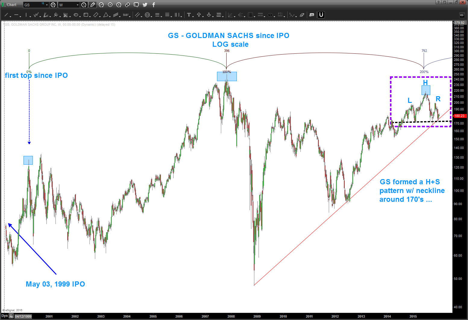
Goldman Sachs flirting w/ a top-top cycle and the dreaded neckline
Posted on January 2, 2016 Leave a Comment
w/ the breaking of the red trend line from 2009 and the neckline at 170 believe GS will be in trouble w/ this occurring.
it very well could go higher and attack my upper target, but just not sure if it’s going to get there … we’ll see.
keep any eye on this one .. first confirmation is a break (daily/weekly close below) of the red trend line and then the neckline around 170. that should put tremendous pressure on the GS bulls, so to speak.
also, note the high-high cycle that is working since the IPO. this “balances” the chart very nicely. my thesis, for now is we are moving back down RIGHT TO LEFT off that first high from the early 2000’s and a PERCENTAGE CORRECTION of that magnitude is a minimal first target if/when we break trendlines mentioned above.
just an FYI .. that “percentage correction” is roughly 122 to 58 or 50% ….so the low 100’s isn’t out of the question.
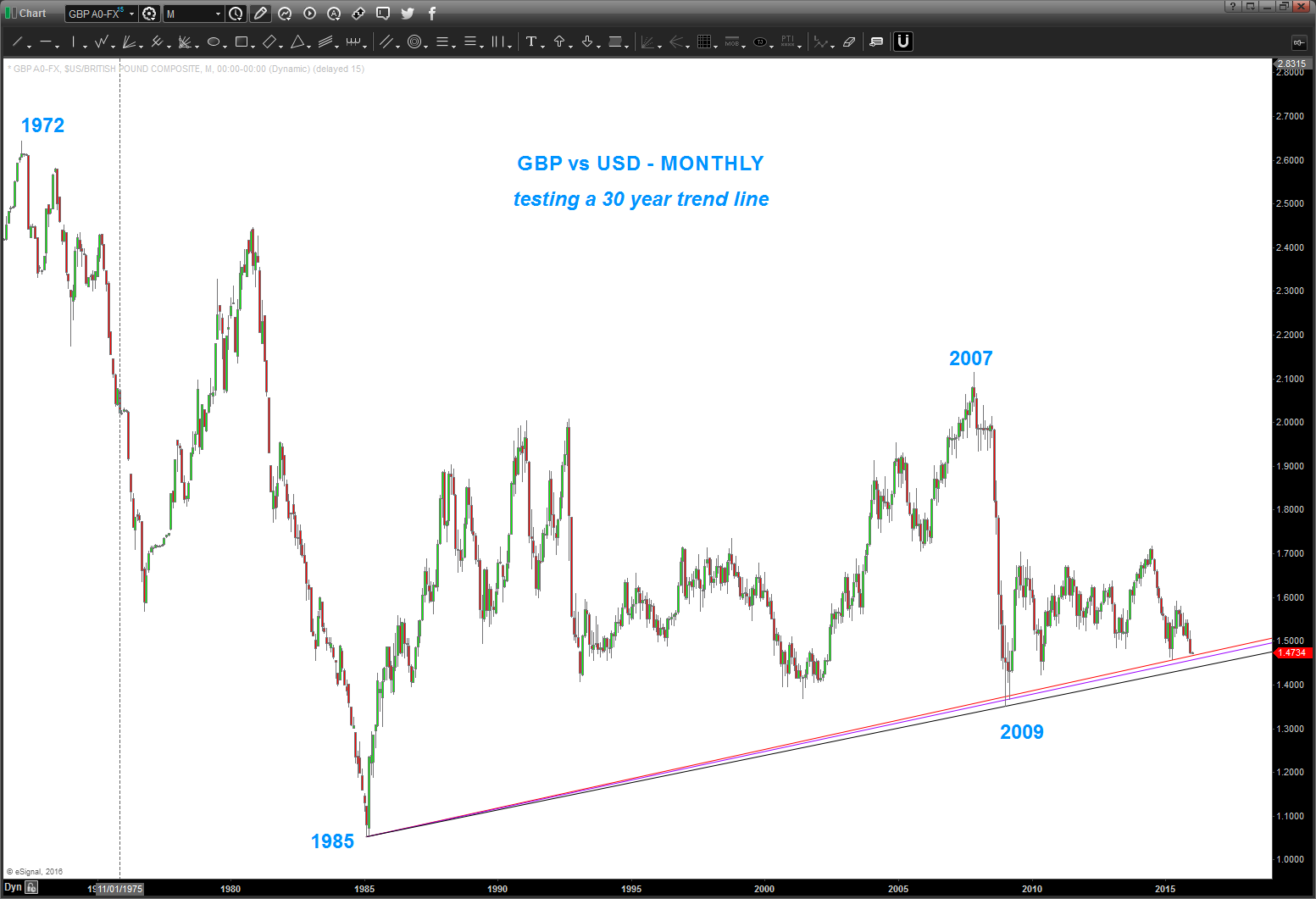
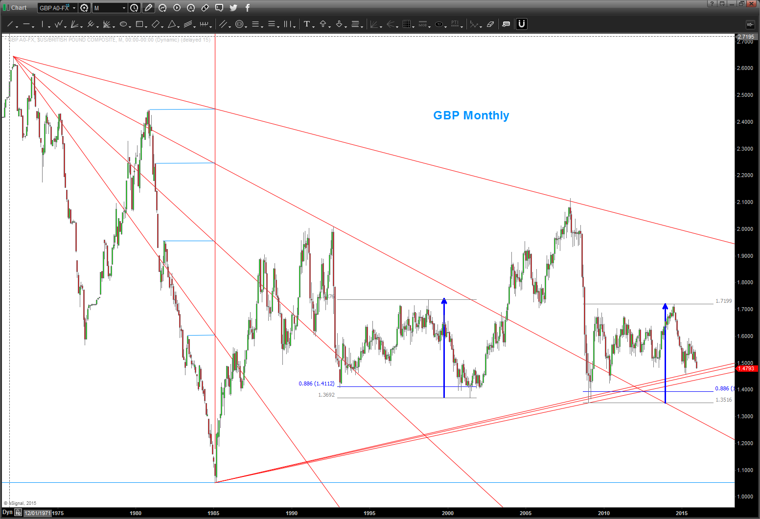
the GBP vs USD is about to test a 30 year trend line … I M P O R T A N T test
Posted on January 2, 2016 Leave a Comment
1/2/2016 – Pound is flirting w/ a 30 year trend line . this is going to get very very interesting.
note, when drawing the trendlines I did the “usual” and connected the lows but also use some higher wicks and the most recent low in 2015 to get a zone where the the important support could come in. those are the red, purple and black trend lines below.
we’ve spent some time in the past blogging about the importance of square roots …their importance is based on musical theory.
after spending way too much time studying the spot currency market, it’s a little known fact that the Pound vs USD “likes” to bounce around the .886 retracement level and, occasionally, the .841.
.886?
square root of .886.
here’s a weekly chart showing the .886 and .841 in action:
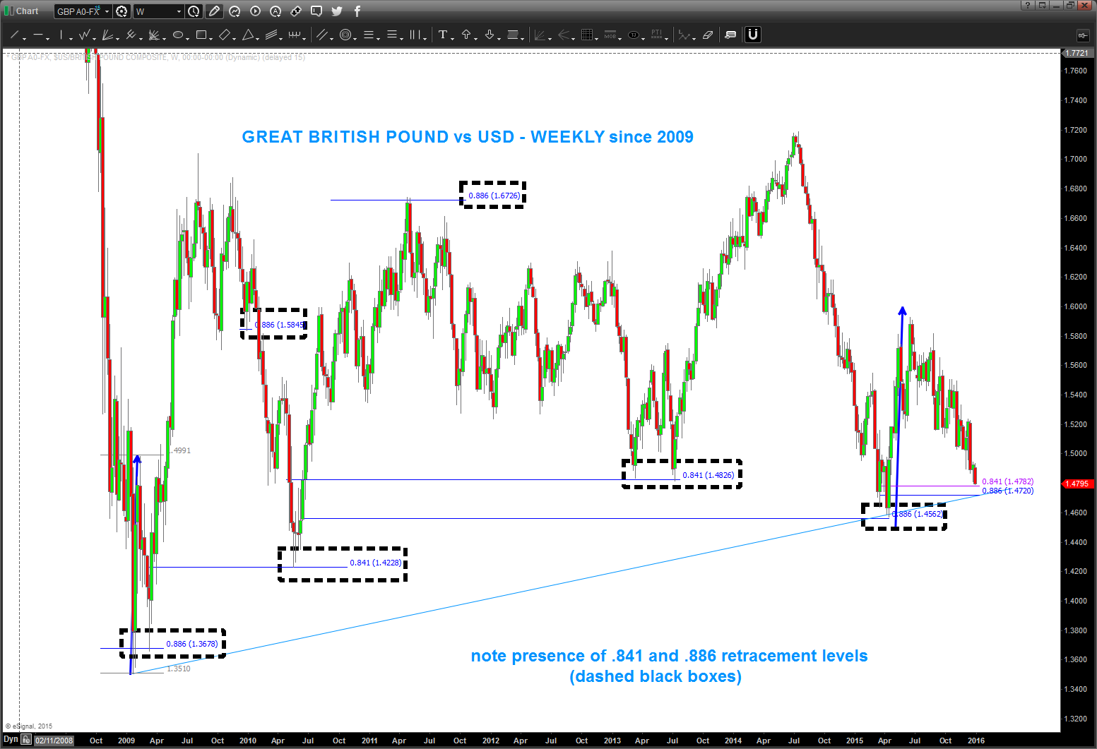
even the “minor” bounces caused moves in excess of 600 pips. so, I like to pay attention to them …
additionally, as you can see above we are approaching a VERY VERY crucial level on the POUND. It’s about to slam into the long term trend line from 2009 low AND (more importantly) it’s approaching the key retracement level.
so what do we do? step down a level to the daily.
in the daily, we have a LOT going on ….
- 3 drives to a bottom w/ what appears to be a 19 day cycle carving out the 3 drive (hint hint we are 194 (19.4) calendar days from the top)
- blue arrows
- RSI divergence being shown and key RSI support a little lower
- .886/.841 zones
- some SQUARE OUT’s of PRICE and TIME
- We went up from the low in April 1364 pips. working/moving decimal we get 136.4. 136.4 trading days or candles from the top is today.
- note, I used the ‘breakdown” candle
- We went up from the low in April 1364 pips. working/moving decimal we get 136.4. 136.4 trading days or candles from the top is today.
- fundamental frequency target
- we’ve done this before and when using the initial impulse move we yield a target of 1.4700 which lands right on the “key” trend line from the 2009 low.
- some “geometry” techniques taught to me by my friend and mentor Mike Jenkins. (www.stockcyclesforecast.com)
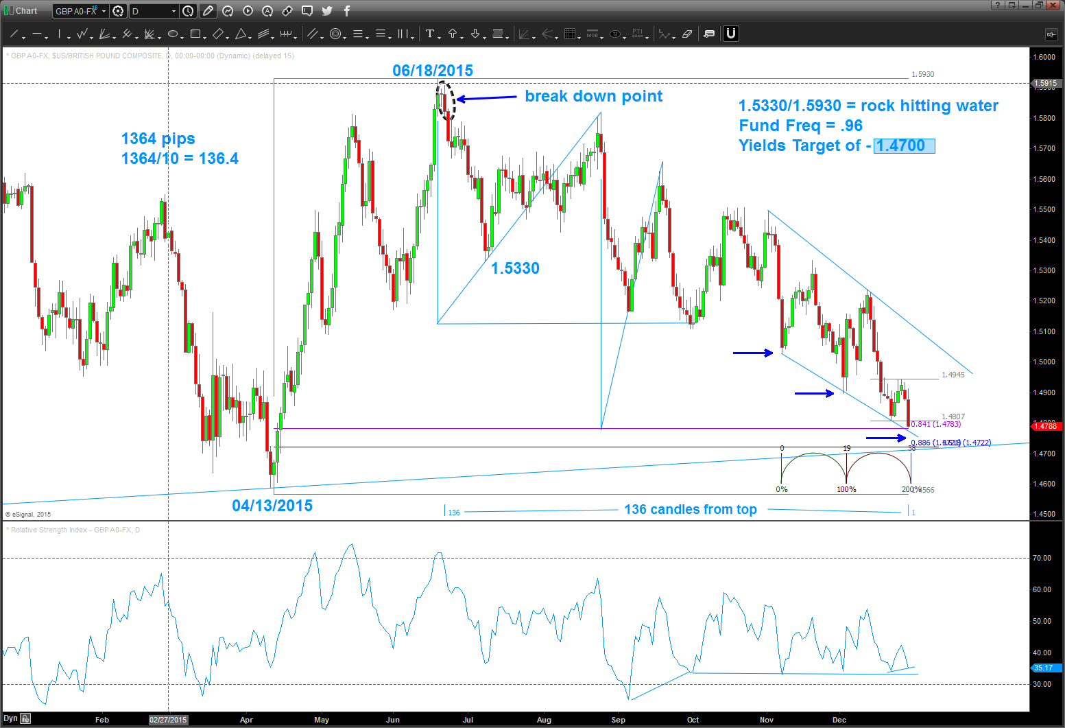
as you can see, we have some key areas of support coming in …. now, IF WE LOSE THESE LEVELS (a total possibility) THEN we have a MAJOR MONTHLY PATTERN WORKING OUT that is roughly 800-1000 pips lower.
Not ready to make a trade on it – yet, but here’s a preview. if you’ve been following you’ll see the PATTERN that is forming.
for now, if you decide to play the daily/weekly pattern working right now THEN use a close stop. I’m going to nibble long ….but after the first 3 wave move up plan to exit.
B
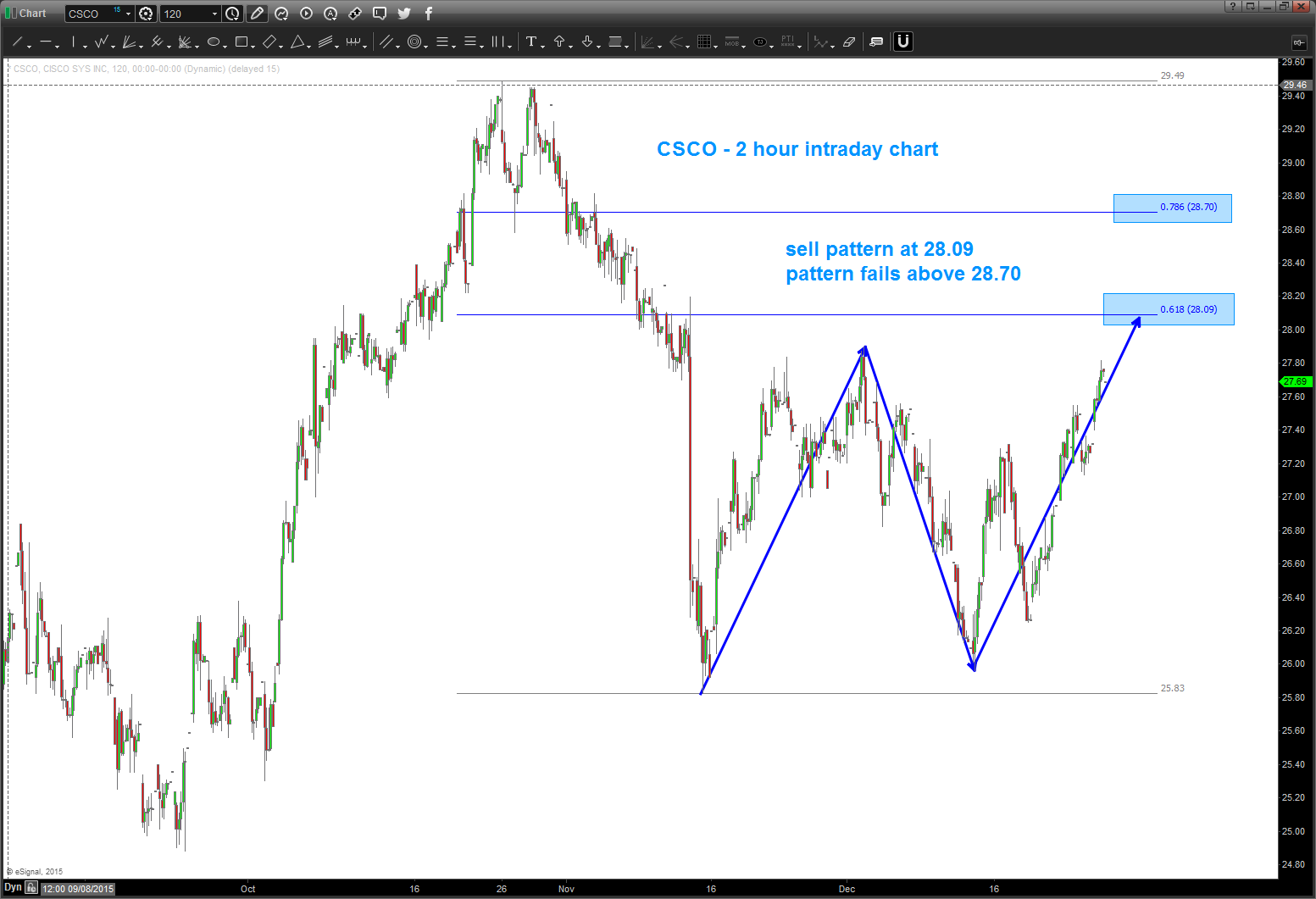
$CSCO
Posted on December 29, 2015 Leave a Comment
$CSCO has been putting in higher lows on the weekly and after the earnings miss, it’s approaching a very very important SELL PATTERN at 28.09. (it could also surge up to the .786 at 28.70.
simply, for the bullish move to continue, this pattern needs to FAIL. If it does not fail, then CSCO will more than likely target the low 20’s and we’ll take a look at after this pattern either works or doesn’t.
what’s great …? NO IDEA and DO NOT CARE which way it goes. IT’S JUST A PATTERN and and edge to manage risk.
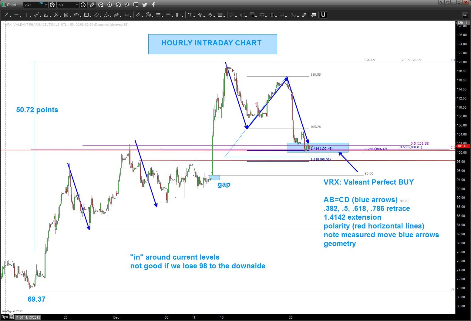
Valeant
Posted on December 29, 2015 Leave a Comment
a very nice intraday pullback .. “should” start back up from here.
out if we lose 98, if that’s too close then if we fill the 95 gap and keep running lower then bail.
nice stair steps and now a PERFECT GARTLEY BUY pattern w/ PRICE equals time today ….
IF THIS PATTERN FAILS, THEN don’t stick around too long.
B
the Pound and .886
Posted on December 29, 2015 Leave a Comment
we’ve spent some time in the past blogging about the importance of square roots …their importance is based on musical theory.
after spending way too much time studying the spot currency market, it’s a little known fact that the Pound vs USD “likes” to bounce around the .886 retracement level and, occasionally, the .841.
.886?
square root of .886.
here’s a weekly chart showing the .886 and .841 in action:
even the “minor” bounces caused moves in excess of 600 pips. so, I like to pay attention to them …
additionally, as you can see above we are approaching a VERY VERY crucial level on the POUND. It’s about to slam into the long term trend line from 2009 low AND (more importantly) it’s approaching the key retracement level.
so what do we do? step down a level to the daily.
in the daily, we have a LOT going on ….
- 3 drives to a bottom w/ what appears to be a 19 day cycle carving out the 3 drive (hint hint we are 194 (19.4) calendar days from the top)
- blue arrows
- RSI divergence being shown and key RSI support a little lower
- .886/.841 zones
- some SQUARE OUT’s of PRICE and TIME
- We went up from the low in April 1364 pips. working/moving decimal we get 136.4. 136.4 trading days or candles from the top is today.
- note, I used the ‘breakdown” candle
- We went up from the low in April 1364 pips. working/moving decimal we get 136.4. 136.4 trading days or candles from the top is today.
- fundamental frequency target
- we’ve done this before and when using the initial impulse move we yield a target of 1.4700 which lands right on the “key” trend line from the 2009 low.
- some “geometry” techniques taught to me by my friend and mentor Mike Jenkins. (www.stockcyclesforecast.com)
as you can see, we have some key areas of support coming in …. now, IF WE LOSE THESE LEVELS (a total possibility) THEN we have a MAJOR MONTHLY PATTERN WORKING OUT that is roughly 800-1000 pips lower.
Not ready to make a trade on it – yet, but here’s a preview. if you’ve been following you’ll see the PATTERN that is forming.
for now, if you decide to play the daily/weekly pattern working right now THEN use a close stop. I’m going to nibble long ….but after the first 3 wave move up plan to exit.
B
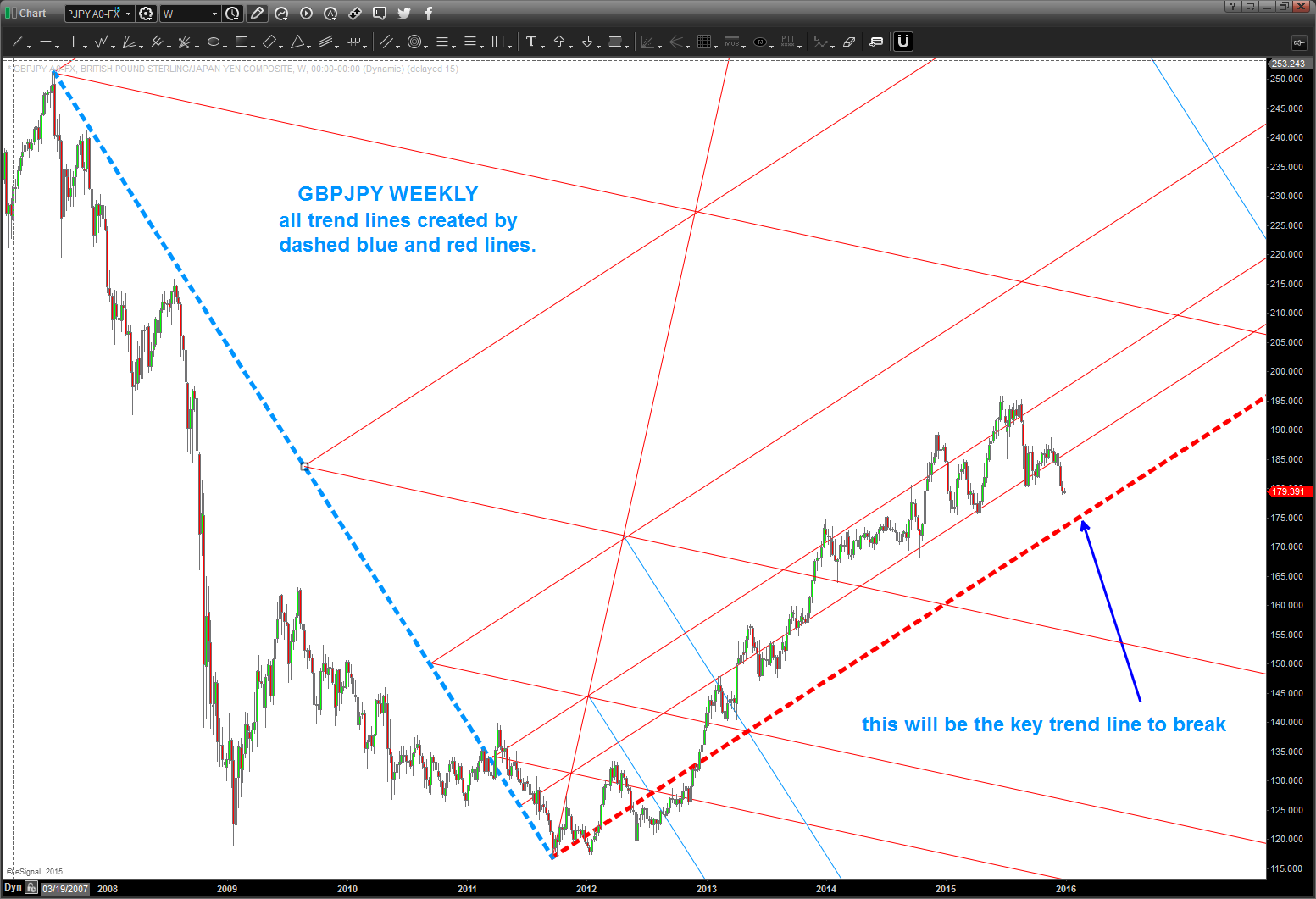
GBPJPY looking heavy … so what do we do?
Posted on December 28, 2015 Leave a Comment
draw the geometry … using the move down into the low (dashed blue line) I drew a 90 degree angle (dashed red line) and then “connected the dots” and you can see the geometry of this move.
sure looks heavy and looks like it wants to attack the dashed red line … we break that, it’s not good so to speak.
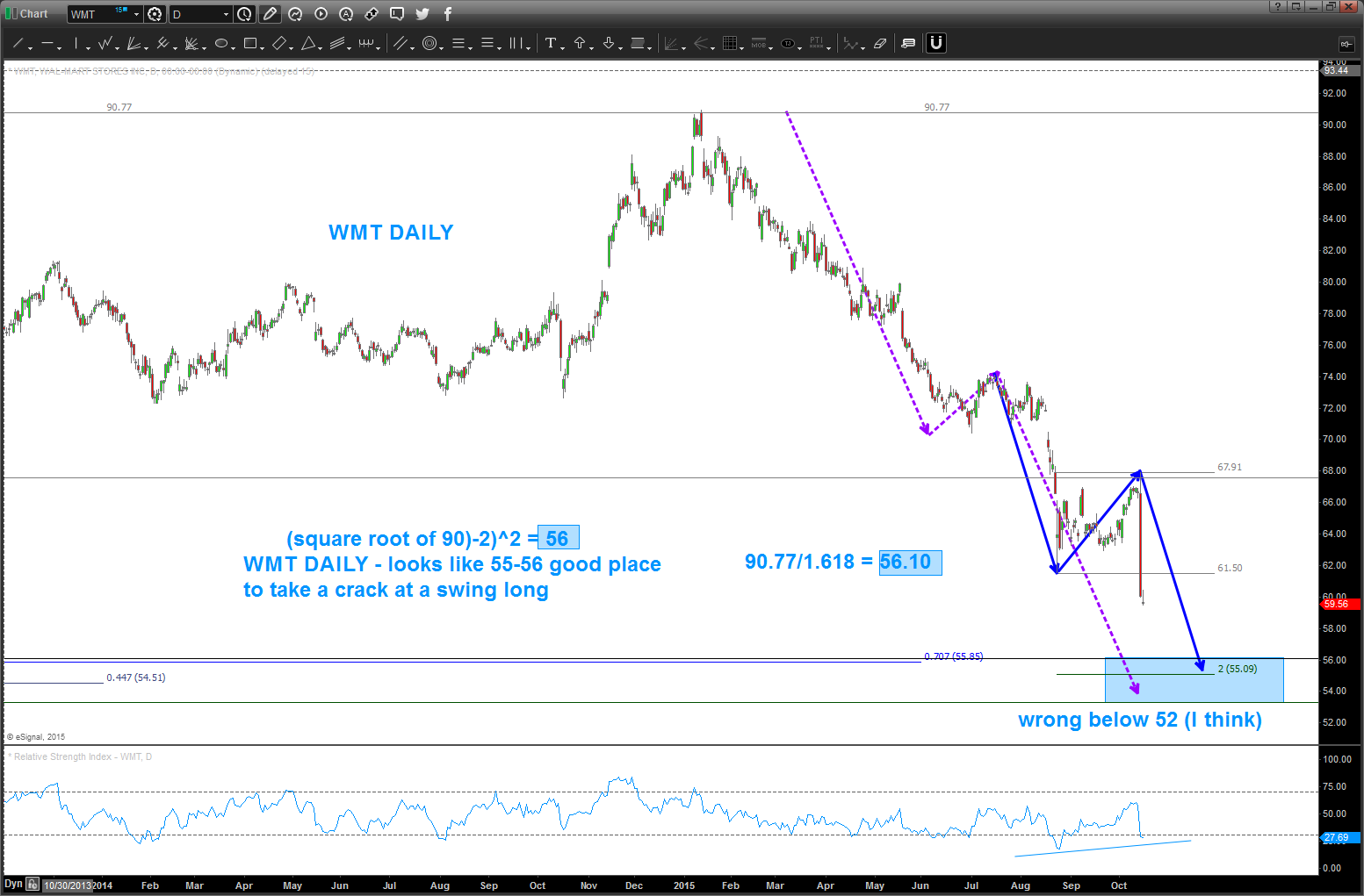
WMT – into the high 60’s?
Posted on December 26, 2015 Leave a Comment
$WMT hit the support area and has been climbing. certainly appears the high 60’s could be in play? Please see below.
hope you had a great Festivus w/ family and friends.
spend some time working thru this post from the bottom up …
rock on, ok?
Bart
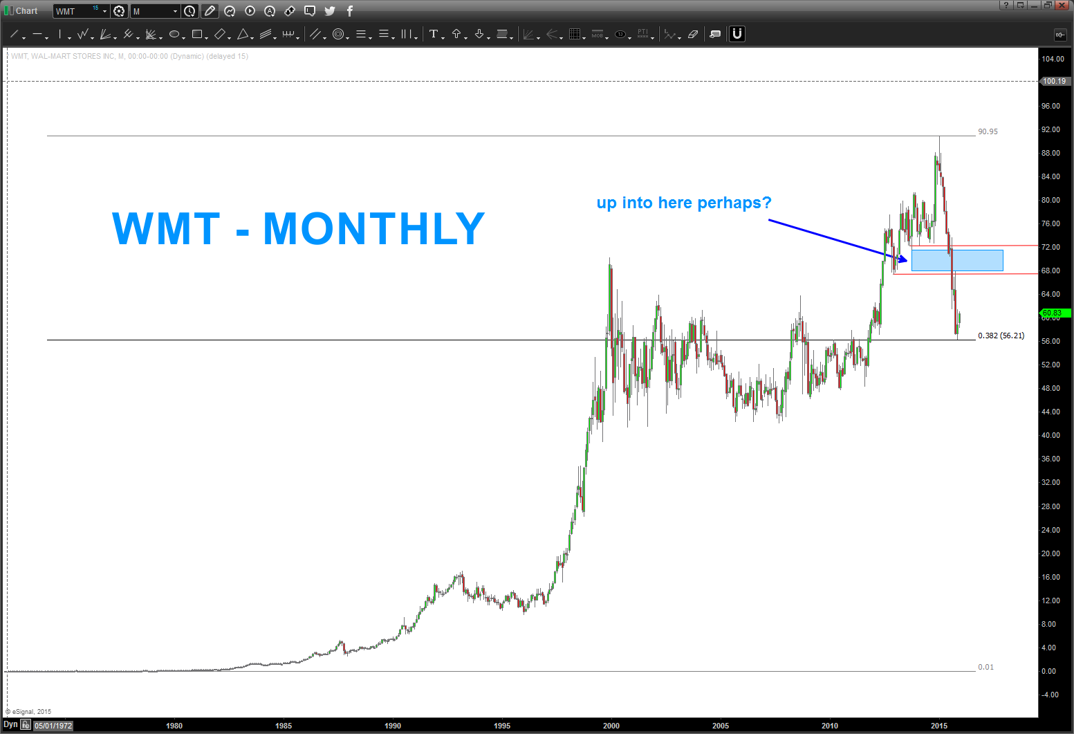
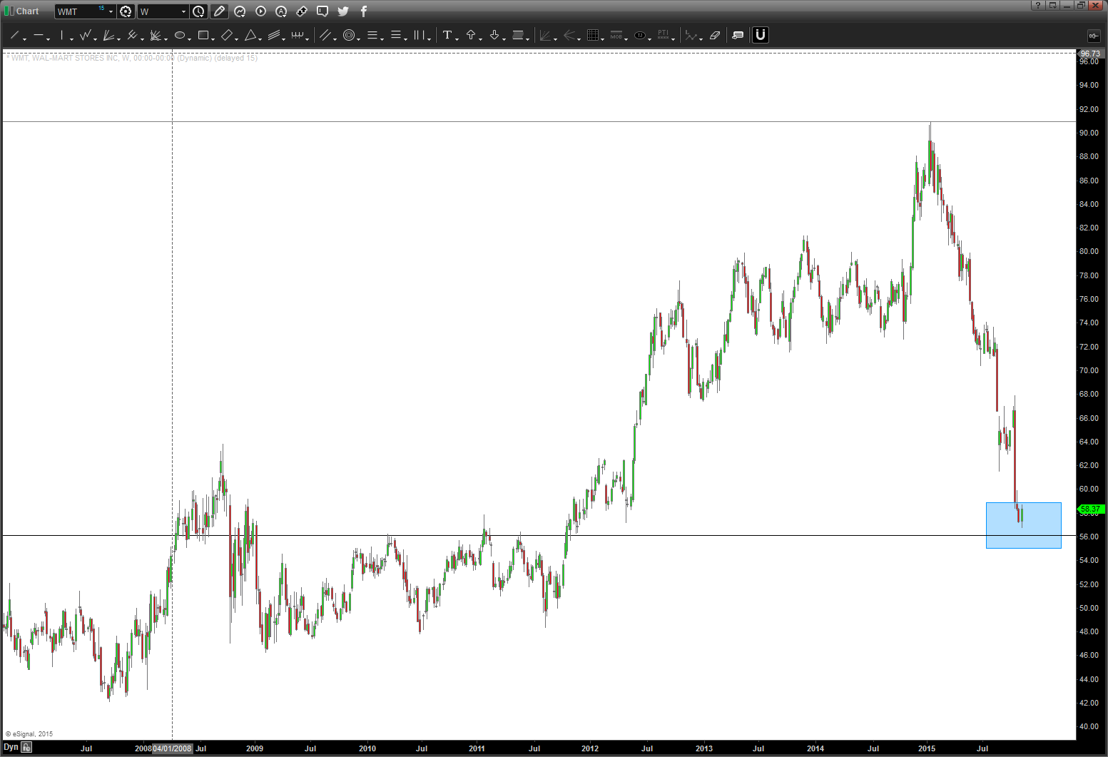
Just a heads up … were “there” or “close” w/ regards to potential WMT support.
Here’s the picture of $WMT in 2013 – sure looked, at the time, we were finishing 5 waves and the circle area was the target area for a “potential” top.
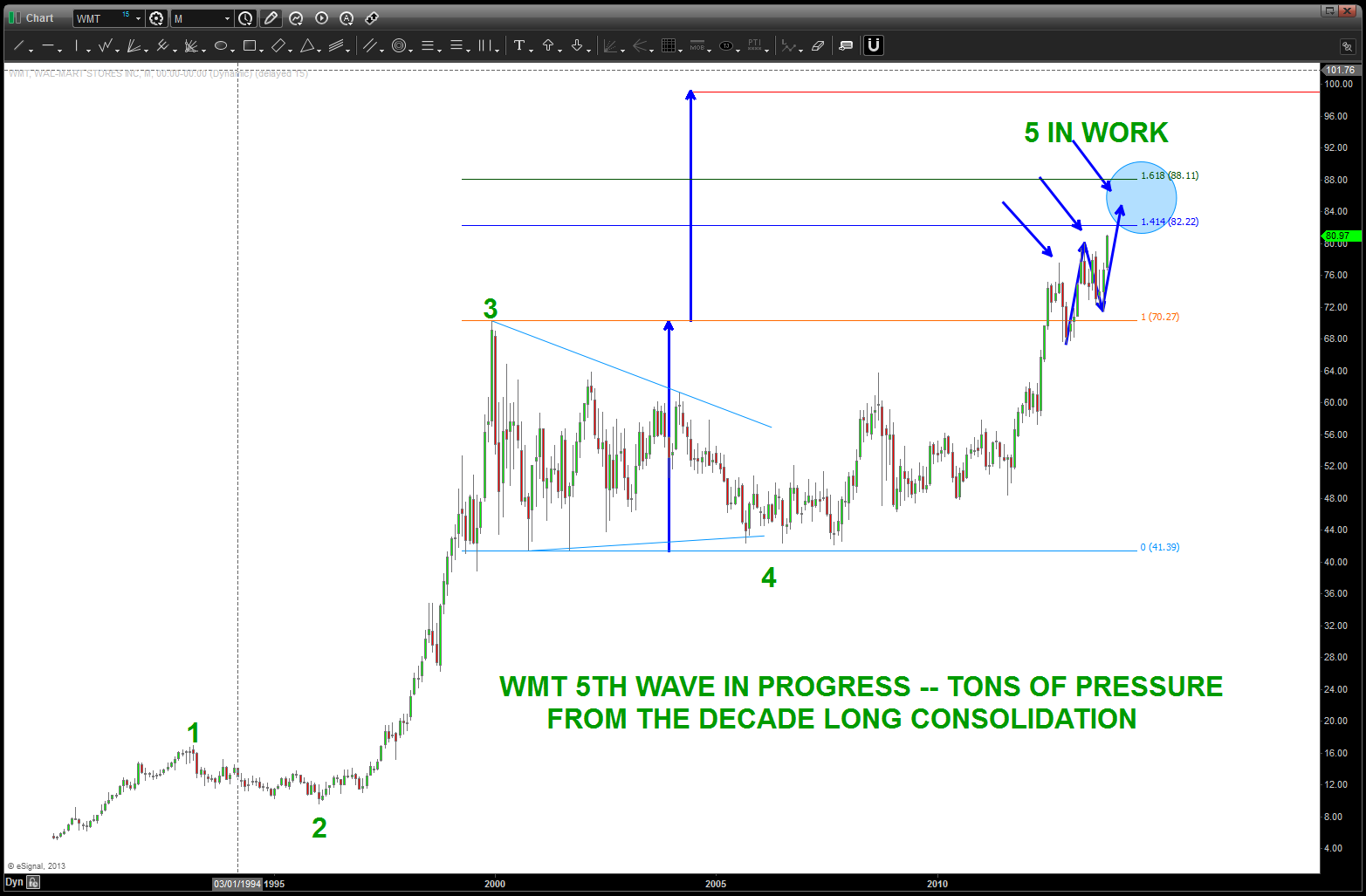
$WMT moving into the highs – Nov 2013
Target was hit and yesterday the move rally began. Hard to believe it’s roughly 2 years ago that this pattern was ID’d and it took that long for it to start to make the “news” so to speak. Anyway, now that the chaos and news is getting ahold of it, believe a look at a potential long swing trade in the mid to low 50’s is reasonable.
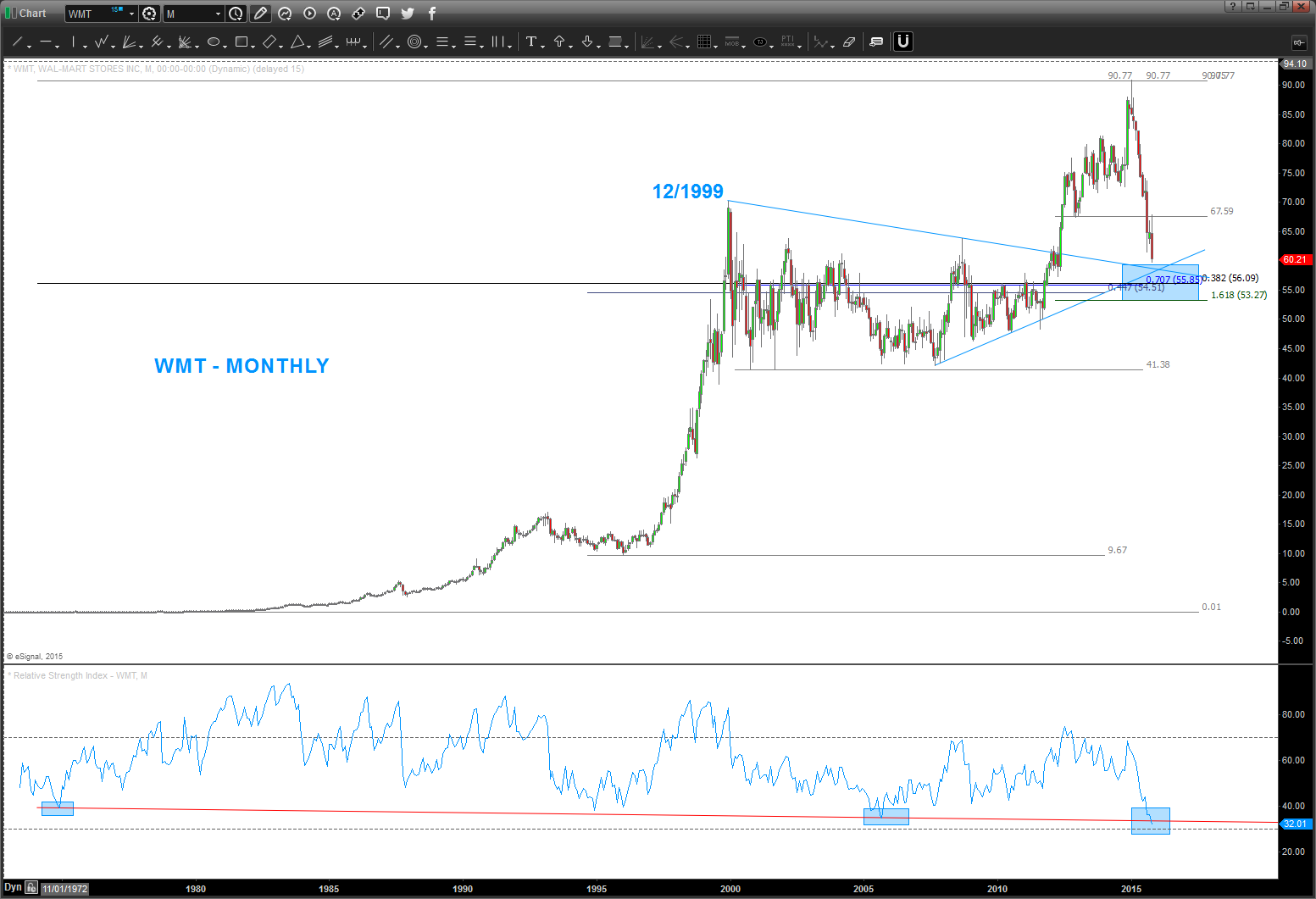
Here’s the daily chart … note the square root target of 56 lands right on the .382 retracement from the all time low. I like that … watch that 55-56 level.
Just another math thing … 90/1.618 = 56. Another reason to like the level.
Here’s the weekly 1/8th projection method …
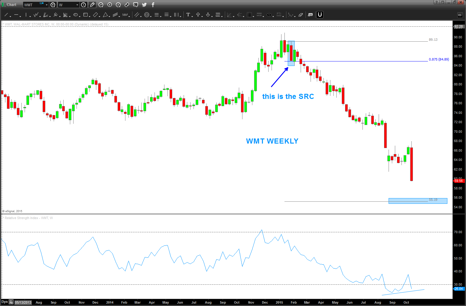
55-56 sure seems like it’s key WHICH MEANS IF IT FAILS THEN WE GOT SOMETHING REALLY WRONG AT THE CIRCLE K.
B