the Great British Pound and “the” line …
here’s a Monthly chart of the GBP vs USD since the float started in 1972. (Wish I had more data)
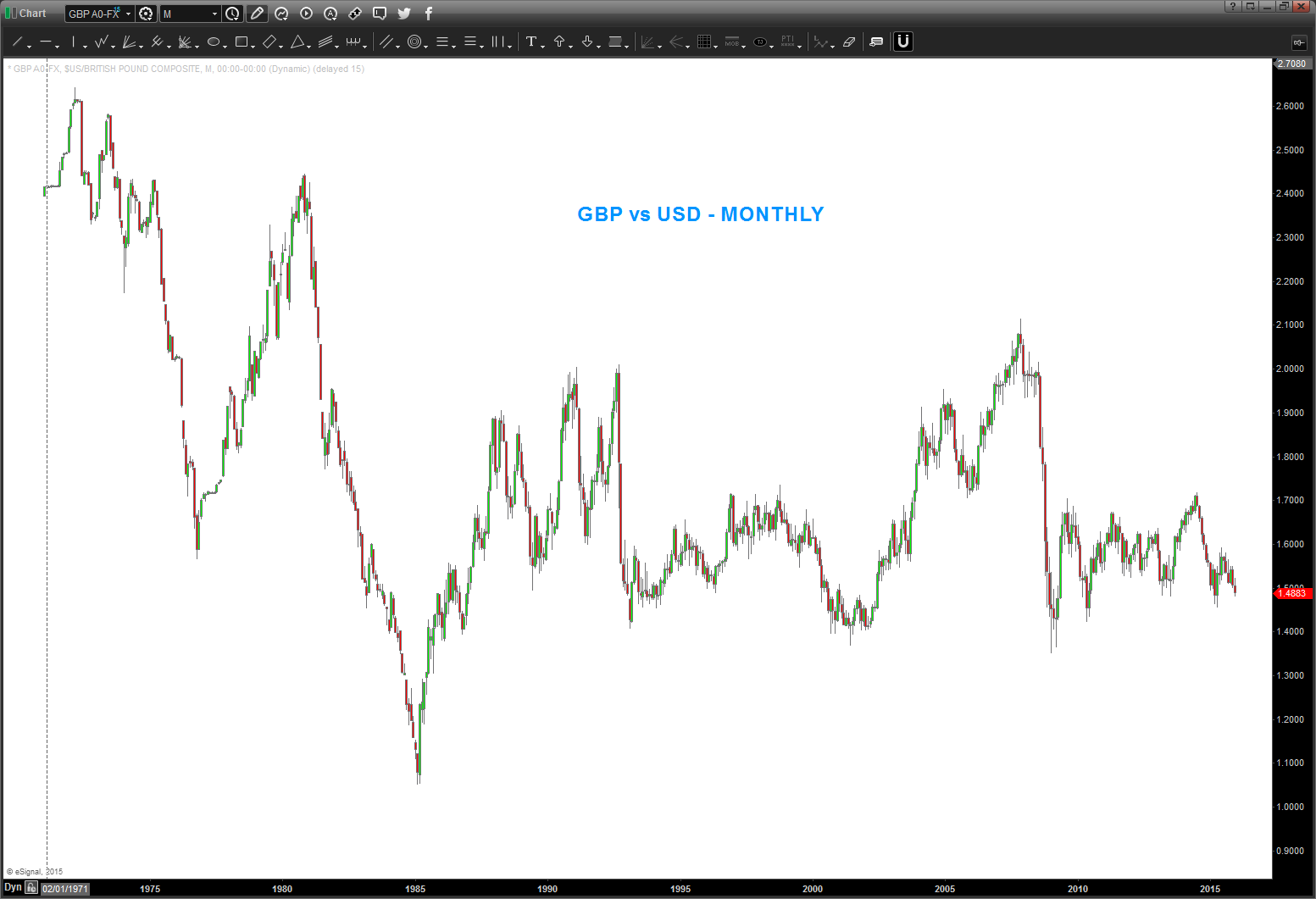
what I’m trying to “find” is the genesis of the LINE that caused the highlighted area of support .. it might be horizontal, or diagonal or vertical. I don’t know. So, am going to work real time and find the line ..
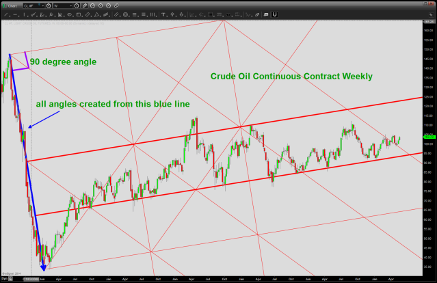
why? because this chart simply doesn’t look good, at all. and the last time I did this exercise, it was for crude oil. once the trend line broke, collapse. here’s the link: https://bartscharts.com/2014/05/22/where-did-that-crude-oil-support-trend-line-come-from/
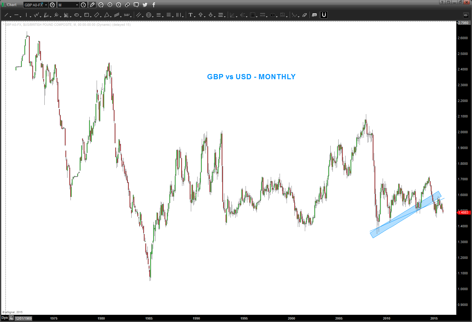
here’s the chart:
so, it might be a couple minutes (you won’t know that) but just picture me w/ a triangle, a mouse and a protractor. cheers …
well that didn’t take long … no kidding, just looked at the chart, said “let’s start w/ the initial impulse move” and bam … there it was.
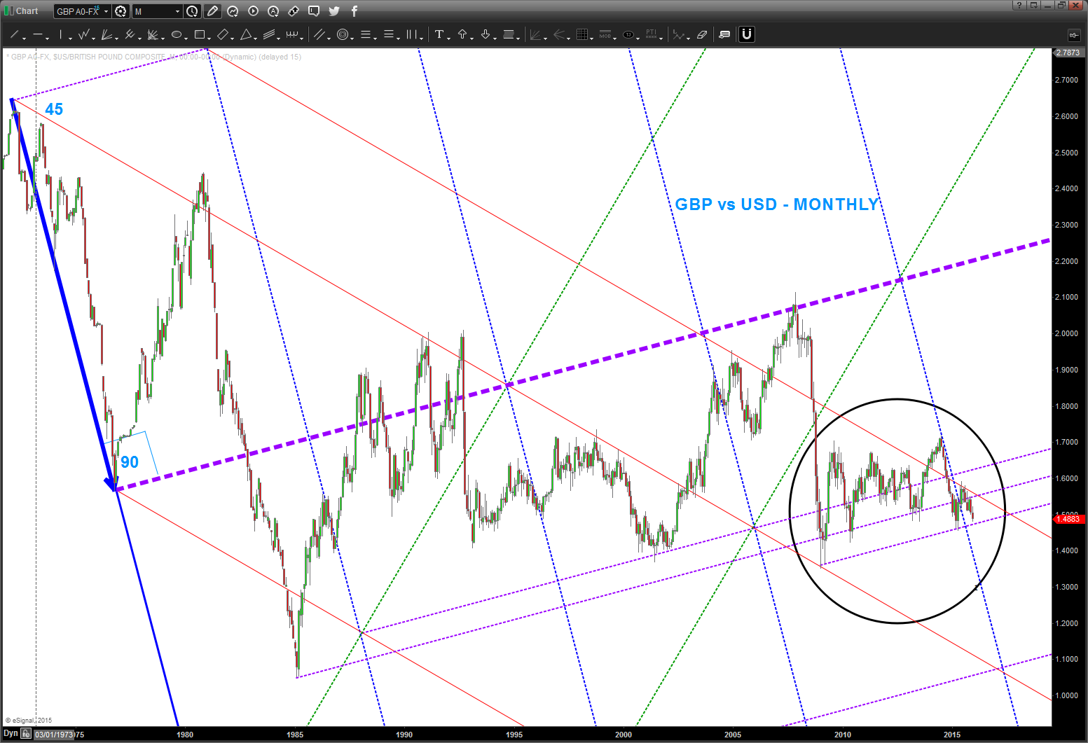
all we have to pay attention to is the first bold blue arrow coming down into the initial impulse move low from 1972 and the bold dashed purple line which is a simple 90 degree angle off that low. from there we drew our first red 45 degree angle and now we have the GEOMETRIC STRUCTURE OF THE POUND AND CAN DRAW ALL THE SQUARES NECESSARY TO CAPTURE THE MOVES. I know you don’t want to believe it … but just start from the all time high in 1972 and follow price action and you’ll see EVERY MAJOR TURN was at one of these trend lines.
now, how do we make money? note the area that is circled. that is PRESENT time and that’s all that matters … see the lower dashed purple line? If I were a betting man that likes to have probability in his favor (I am) then I would bet that the pound is going to go down and seek that line. IF we break below that line THEN we will have the first hint that the general HORIZONTAL support that has held since the 80’s is going to be tested. IF we break that … this puppy could collapse.
now, I realize this is a LONG TERM Pound chart but it’s telling us something ….in the chart below I want you to pay attention to two things:
- simply note the horizontal blue dashed line: that has held since 1986. I like to use open/closes for these type of horizontal support areas and you can see where the “wicks” tried to get below but were defeated. This is a big time horizontal line of support.
- RSI – thanks Connie Browne
- top dashed green line is RSI resistance zone in a BULL market, bottom green line is RSI support zone in a BULL market
- top red dashed line is RSI resistance zone in a BEAR market, bottom red line is RSI support zone in a BEAR market.
NOTE, IN 2009 WE BROKE BELOW THE RSI HORIZONTAL SUPPORT ZONE AND RALLIED UP TO THE BEAR MARKET RESISTANCE ZONE. THAT IS THE MARKET TELLING US THE POUND IS GOING TO TRY AND TAKE OUT THAT BLUE LINE …

It’s coming …. use this bounce to position accordingly.
Instead of doing the obligatory Happy Holidays so to not offend anyone, I’m going to say Happy Winter Solstice. That’s the reason behind the season anyway ….
Cheers!
Bart
