Key level on Fed Fund futures destroyed today @seeitmarket
Posted on December 3, 2015 Leave a Comment
take notice of this one folks … been blogging about it a bunch here for a while. THE KEY LEVEL was smoked today. the probability of a generational low in interest rates just went up. let’s not get to crazy – yet. we have next week FOMC decision to deal w/ and then we’ll see where the big guys are positioning themselves.
however, today’s damage was pretty big and historic: http://www.seeitmarket.com/fed-funds-futures-smash-through-support-chart-15044/
here’s a link to the fed fund futures blogged about in the past:
- https://bartscharts.com/2015/09/05/rates/
- https://bartscharts.com/2015/11/09/interest-rates-playing-w-the-gang-over-seeitmarket/
- https://bartscharts.com/2015/08/10/is-it-live-or-is-it-memorex-what-is-going-on-w-fixed-income/
- https://bartscharts.com/2014/02/08/fixed-income-pattern-and-october-1987/
if you go thru these posts you’ll see how the important support zone had been holding and, today, it gave away.
happy reading and let me know if you have any questions.
Bart
Gold, an update
Posted on November 28, 2015 Leave a Comment
CONCLUSION: the 3 waves to a new low did NOT turn out to be a “B” wave w/ a big C UP to come. However, I’m still seeing Gold carving out a bottom HERE or a little lower in the coming days/weeks. charts to follow …
the C wave that did not come did show a continual 3 wave structure making new lows … that fits the scenario of an ending diagonal which is 5 waves in nature but each leg is 3 waves. that’s what appears to be happening as of the close today.
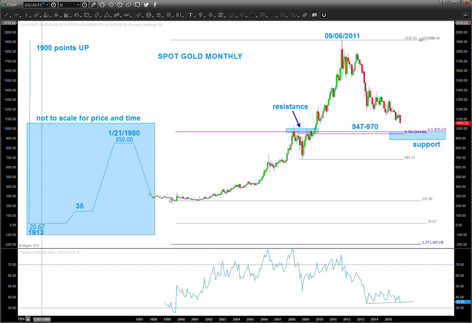
SPOT GOLD MONTHLY:
- note the blue shaded area to the bottom left of the chart
- that shows the fixed price back in 1913 at 20.67.
- That 20.67 “node” was the reason for the bounce at/around 1200 ending wave 3. a 50% retrace of the entire run in gold lies a little low 970. also, note the RSI.
- It’s the lowest it’s been in 14 years and as PRICE makes new lows, the RSI is holding it’s levels. that’s bullish divergence. it certainly could break that shelf and blow off to the bottom but, again, we have “nice” support in/around 947-970
- also, note the the thinner blue rectangle areas w/ resistance and support noted – polarity. the resistance held for 17 months.
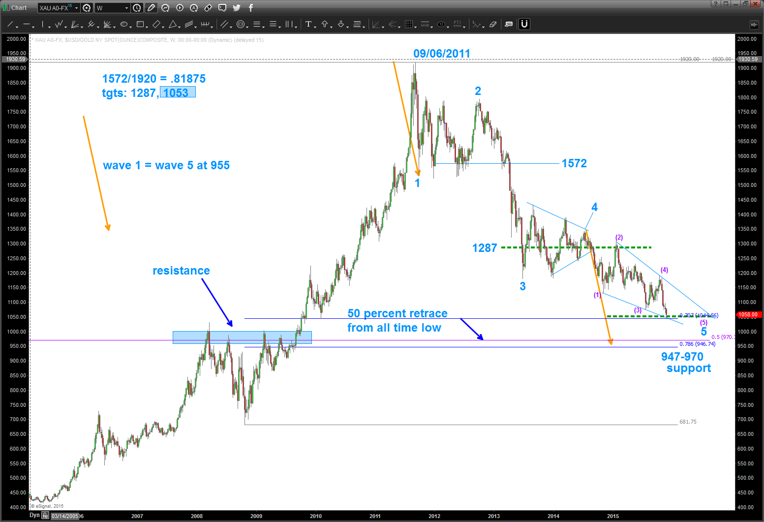
SPOT GOLD WEEKLY
- put the count on that makes the most sense. the BIG caveat to this count was/ is the top at 1920 a 3 or a 5…. really doesn’t matter that much because we are on the right side of the move but it does and will have big picture ramifications. either way, I feel confident that a 5 wave move lower is about to end.
- one of the very powerful price projection target techniques is that of the fundamental frequency. we have that in the upper left corner below. You can see that the 1st FF Tgt was 1287 and that was responsible for the “shucking and jiving” we had at that level before finally breaking. the triangle formed using that level as the center . pretty cool hugh? the next target, that was hit today was 1053
- note, I used 1572 NOT the lower “wick target” at 1 because of the open/closes around that level. so, 1053 might be off a little but I used what i was SEEING for that target.
- one last, to balance and harmonize a move a lot of times wave 1 will equal wave 5 since 3 was so extended and powerful. Those orange arrows come right into the 946-970 level.
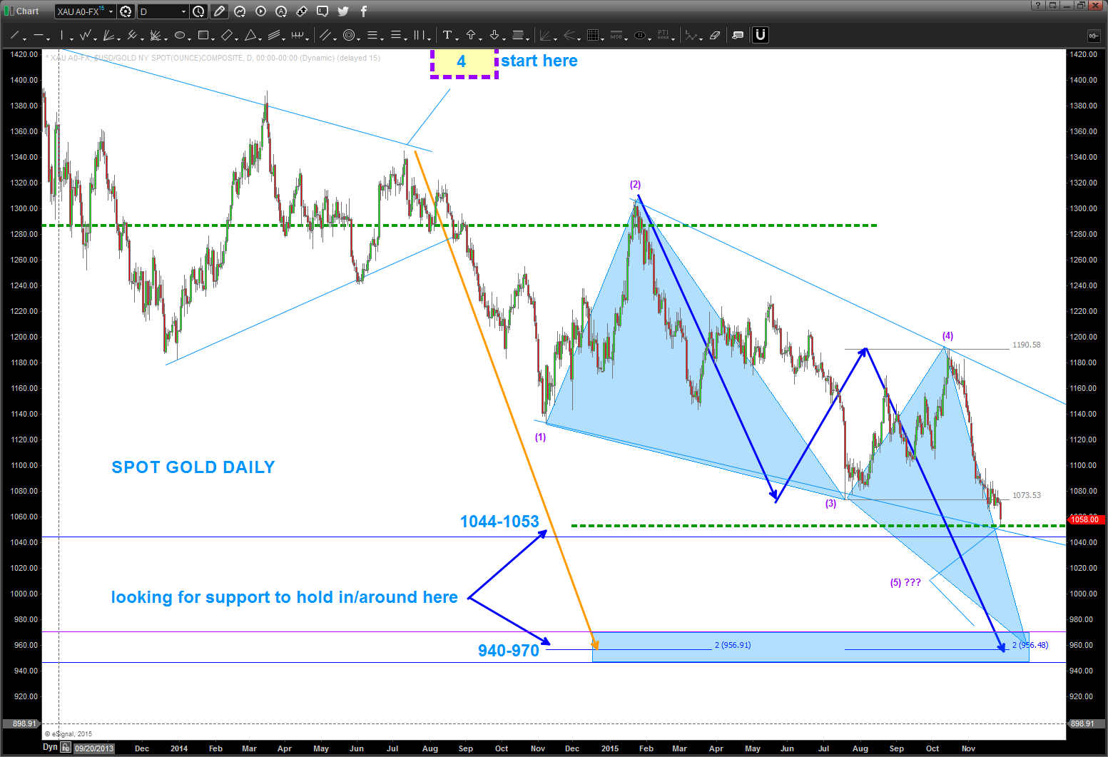
SPOT GOLD DAILY
I kept all of the work on the chart so you can work your way down from Monthly, Weekly to daily.
- pay attention to the wave that begins w/ the dashed purple (yellow shaded box) that says “start here”
- note the orange line – that is the representation of Wave 1 = Wave 5 and take us down to the 956 level.
- we appear to be carving out (Turkey reference) an ending diagonal. see page 36 of EWP.
- this is the same formation that we discussed about Coffee here: http://www.seeitmarket.com/coffee-futures-update-trading-price-targets-and-time-frames-14978/
- BUT AGAIN, the triangle 4 is a classic PATTERN so were in the 5th wave lower.
for now, pay attention to 1044-1053 and then 940-970.
one last chart …
- the entire “wave” structure that occurs is based on the initial impulse move.
- in this case, the blue arrow from the top at 1920 is the “rock that hits the water” and starts all of the waves.
- from there, we simply PROJECT the arcs outward using sacred geometry, musical notes, fibonacci, etc. and what we do is actually LOOK TO THE LEFT ON THE WAY UP.
- It’s basically “musical polarity” in that where the arcs caused support and resistance in the past should be areas of resistance and support in the future.
- also, the arcs usually have “measured moves” associated w/ them and at times the are the exact same move that occurred in the past happens in the future. shown below you’ll see another blue arrow that is associated w/ the 3rd expansion of the initial impulse.
- note the orange ellipses. those are area of support and resistance that the arcs caught on the way up and on the way down.
- can you trade off of this information? sometimes yes, but, what’s most important, is you can use the past to ascertain the rhythm and flow of the move.

cheers … Bart
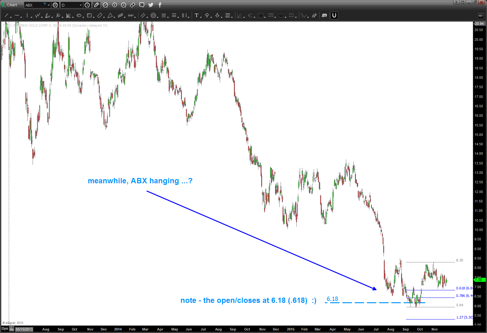
$ABX hanging in there …
Posted on November 25, 2015 Leave a Comment
higher lows being made … is it going higher?
also, note, the open/closes at 6.18 (.618) … just a coincidence, I know.
also, note, back in 03/2009 XLF closed at 6.18. Again, a coincidence.
rock on, ok?
Bart
$CMG update w/ @seeitmarket
Posted on November 24, 2015 Leave a Comment
@seeitmarket is one of the best places to get market research. being a part of the @seeitmarket team of contributors is a blast and an honor. thanks Andy and have a great Thanksgiving Holiday.
Here’s the latest update for $CMG. Posted back in Feb that a top was coming. Hit my target area perfectly but zoomed up to one more high. More than likely would have been stopped out at entry. But note … it smacked right into the 180 degree square of nine target.
enjoy, let me know if you have any questions.
Bart
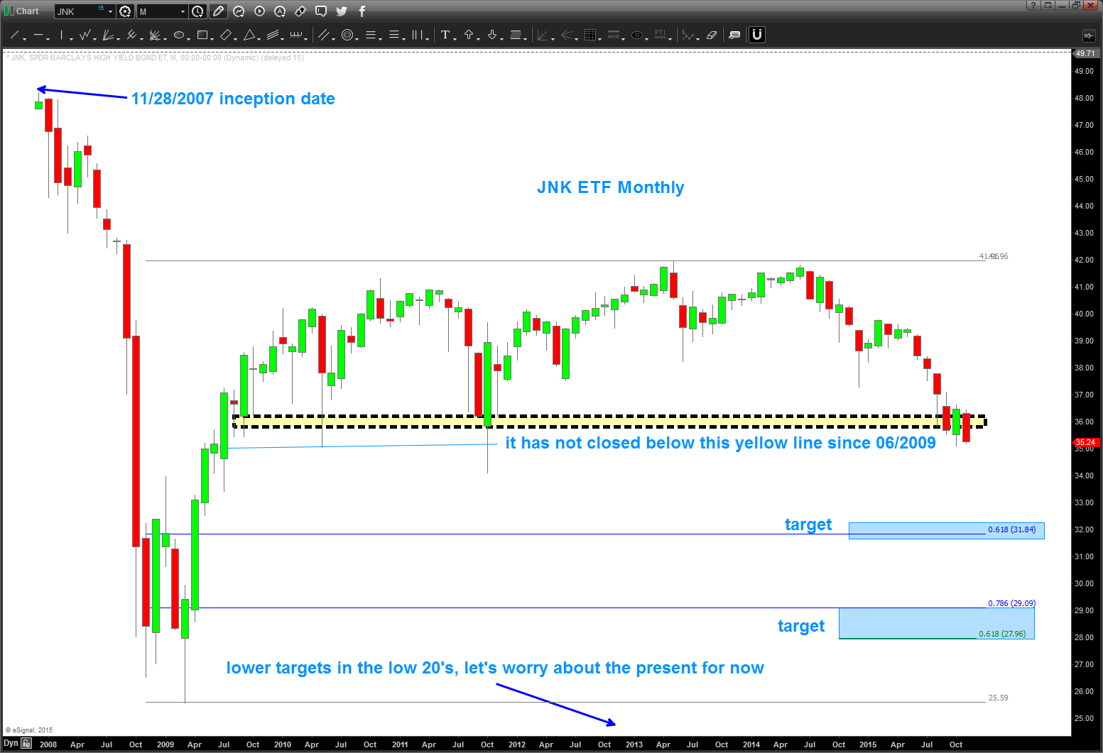
$JNK looking heavy …
Posted on November 23, 2015 Leave a Comment
note, $JNK found support and the market rallied. we had a pattern completing at 35 which held but it certainly looks heavy to say the least.
we need to watch this one, closely. if you simply look at the picture presented we have never closed below the yellow boxed area since the rally started and 06/2009.
Institutions bail out of risk assets when they are “risk adverse” … watch this closely.
sure looks heavy, hugh?
NATGAS update for a friend …
Posted on November 23, 2015 Leave a Comment
NATGAS as of 11:52 EST 11/23/2015
- note the red horizontal line – that is still just a little bit left of the gap that has not closed. it could go back down there to close it BUT price action from this level is promising.
- also, note the 2.021 level at that is a target (1.618 extension)
- RISK is a daily close below 1.949 for the larger time frame
- RISK intraday is the low that was made at the .786 at 2.058. NEED IT TO STAY ABOVE THERE.
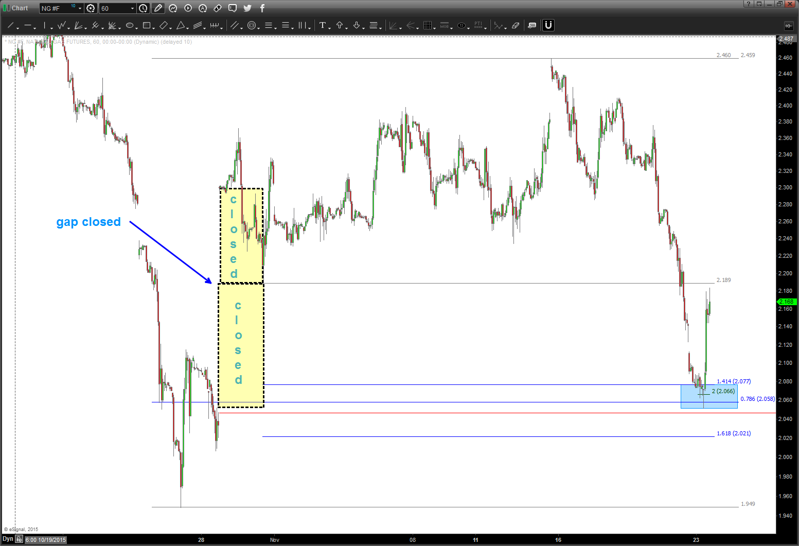
Moving forward believe 2.231-2.56 will act as resistance moving forward. for the bullish case to work – need to bust thru there. DO NOT EXPECT IT TO HAPPEN on the FIRST ATTEMPT. IF it does THEN it’s strong.
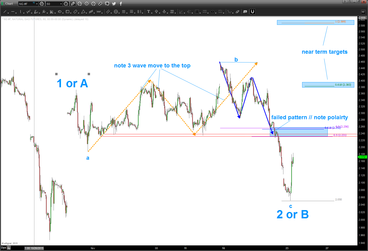
- note the count that I am going with …
- see the 3 waves to a top at (b)? that is a classic “b” wave and action after that top sure smells like a C wave. Thus, at 2 0r B if we are bullish then this level will hold and we should continue to start up.
- two projection are near term targets only …. 2.383 and 2.589.
- see the 3 waves to a top at (b)? that is a classic “b” wave and action after that top sure smells like a C wave. Thus, at 2 0r B if we are bullish then this level will hold and we should continue to start up.
- believe the 3.0 level is still possible but need to see price action at areas of resistance noted.
one last, a big picture look at the weekly/monthly so we don’t get to focused on the soda straw of intraday.
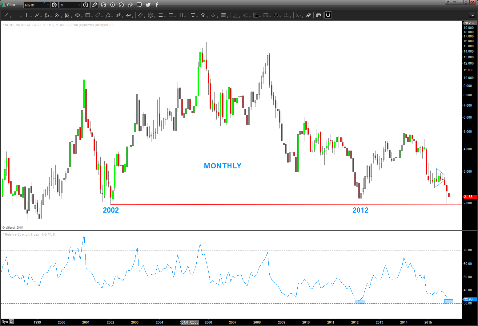
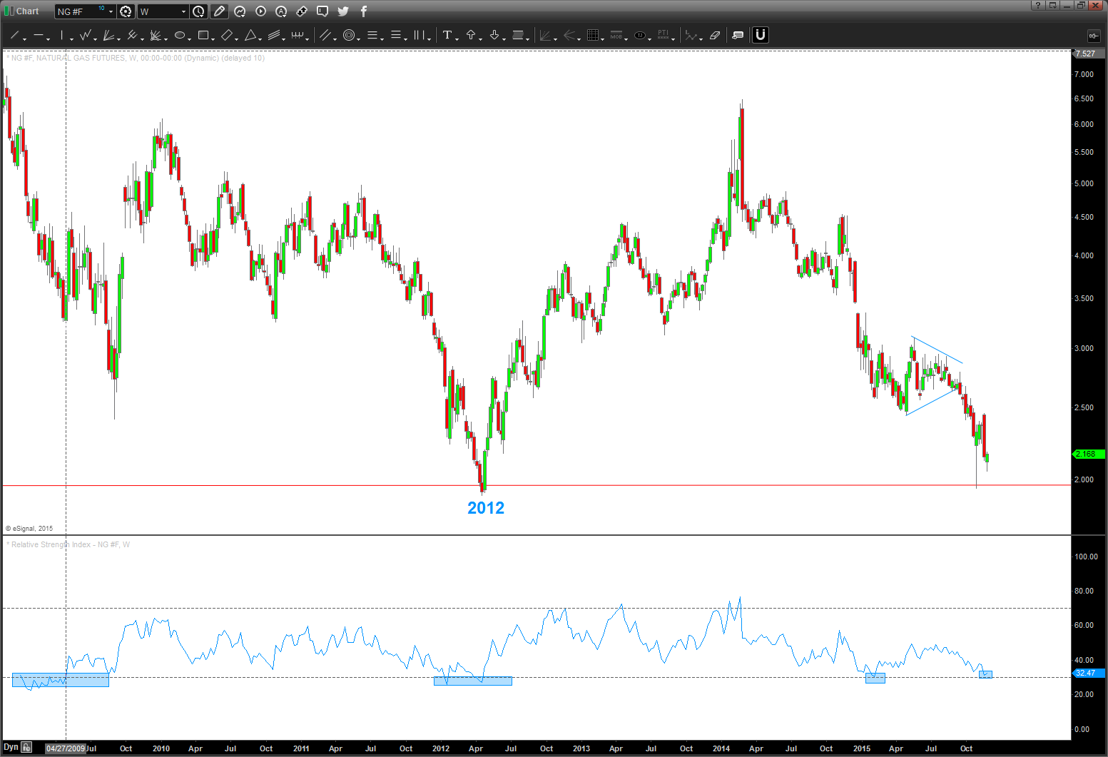
so, we are at deeply oversold levels and a countertrend bounce is due.
hope this helps.
Bart
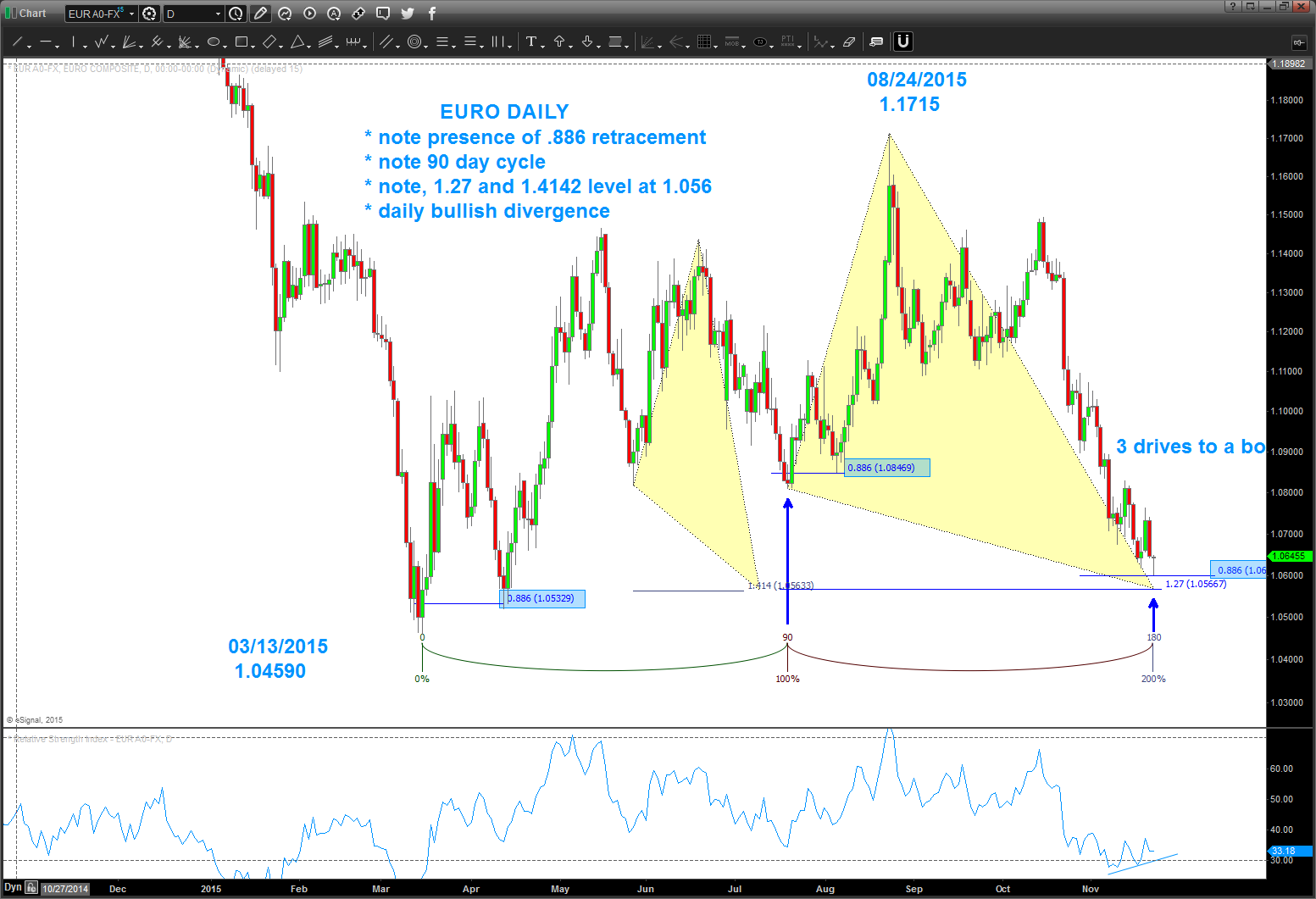
the EURO and .886
Posted on November 23, 2015 Leave a Comment
.886 is derived from square roots.
A quick review:
Frequency of a string is:
- proportional to the square root of it’s length
- inversely proportional to the square root of it’s tension
Here’s the frequencies of the equal octave scale of music:

the GOLDEN MEAN is 1.618
square root of 1.618 is 1.27
1/1.27 = .786
square root of .786 = .886
1/.886 = 1.128 sure looks very very close to musical note D, hugh? Coincidence, I know.
So, to the EURO ….
- daily bullish divergence
- nice 90 day (basic) cycle coming in
- .886 retrace (note how it reacted after every .886 retrace shown (blue shaded rectangles)
- personally was waiting for the 1.27 extension pattern but today’s action doesn’t look like it want’s to get down there.
Conclusion: extremely bearish big picture for the EURO but an A-B-C three wave rally should occur in the coming days.
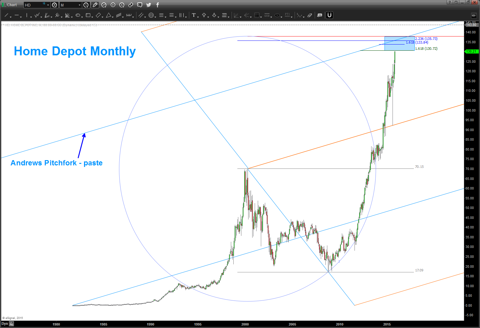
Home Depot Rocketship …. $HD
Posted on November 22, 2015 Leave a Comment
Well, every other pattern level has been defeated so why not the one’s shown below? We have a bunch of math coming in …130-135.
stay tuned.
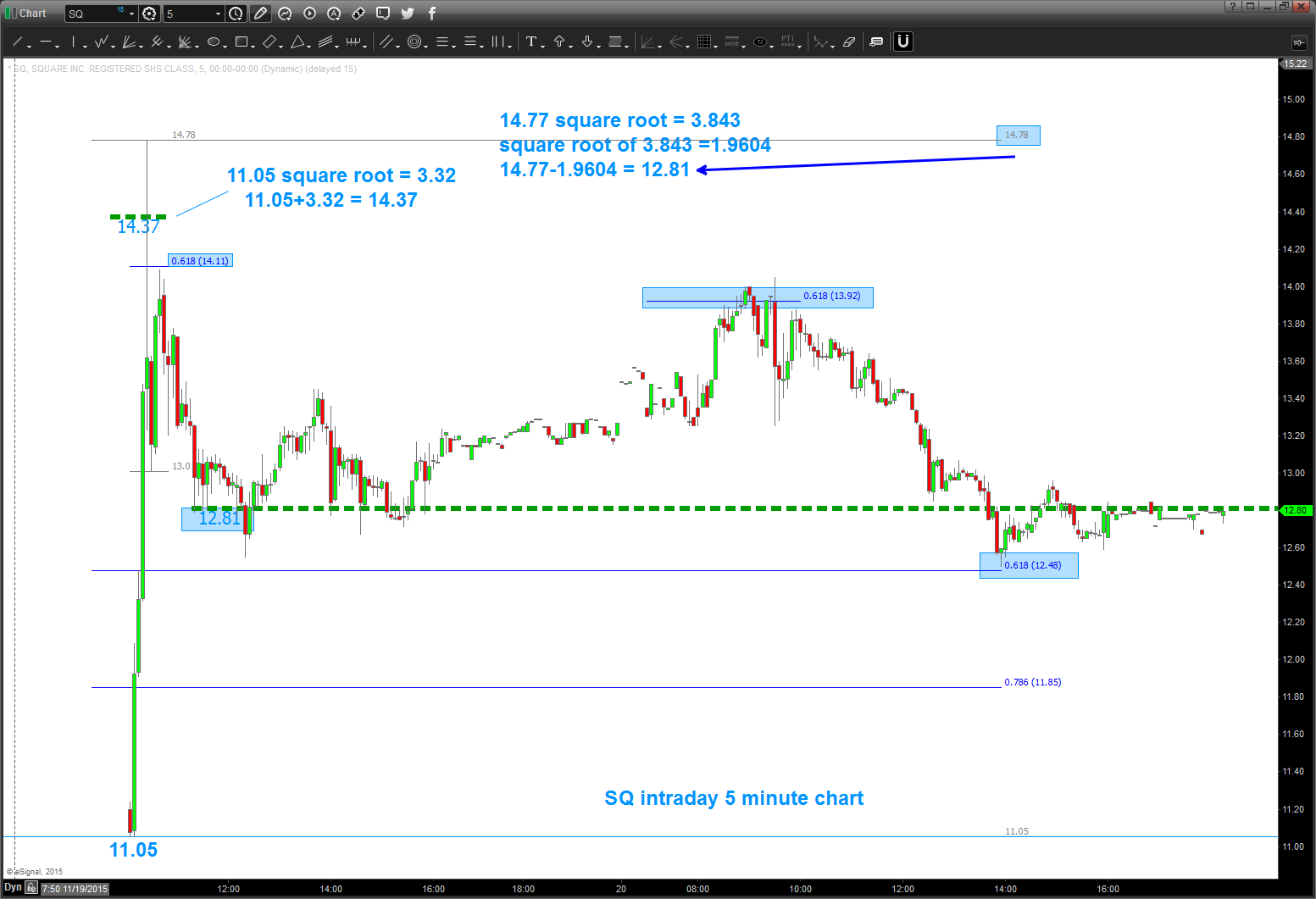
SQ ($square) and it’s SQUARE ROOTS …hahaha
Posted on November 21, 2015 Leave a Comment
folks …took a peak at Square’s Square Roots this afternoon.
math is on the chart. note, I like how we have to take the square root of the square root of the high at 14.78 and note the dashed green line and how prices gravitated to that the rest of the day.
interesting?
pay attention to square roots …
enjoy.
B
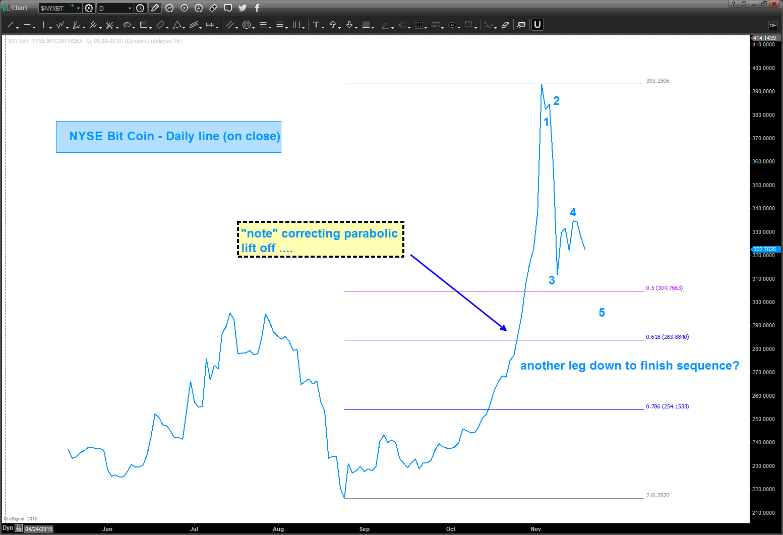
$BITCOIN
Posted on November 21, 2015 Leave a Comment
sequence looks like it wants one more move lower to complete 5 legs …
however, note the measured move of the last major correction – it’s completed that and a tad bit more.
make it a great weekend.
Bart