$FB post earnings ..
Posted on November 5, 2015 Leave a Comment
Here’s the chart that I quickly uploaded to StockTwits from my e-signal feed BEFORE $FB announced earnings. (by the way, Howard, AWESOME functionality .. so easy to use and to do. NICE)
now, I know I’m going to get tons of hate mail tonight … look, I get that they had an AMAZING earnings release. but, work w/ me, I understand none of that … honestly, I really don’t understand it. I’ve work my way thru the market as pure play pattern recognition dude. sometimes I’m right, sometimes I’m wrong BUT ALWAYS know where the pattern has failed.
you can see the PATTERN called for $FB to tag 108-110. Guess what? It did! And?
- ab=cd in price and time (this is a sell pattern)
- butterfly sell pattern (this is bearish)
- potential island reversal (this is bearish)
- shooting star daily candle formation (this is bearish)
now for the IF-THEN .. IF we break (daily close below 104 THEN this could be a big top for $FB.
CONCLUSION: sell patterns are complete. IF FB continues higher w/ thrust and momentum then it is extremely BULLISH. But, if we start selling off … then might look to take some profits based on your risk tolerance.
OK, I just ducked at all of the hate objects that were thrown my way … calling it like I SEE it and not believe it ….
cheers!
Bart
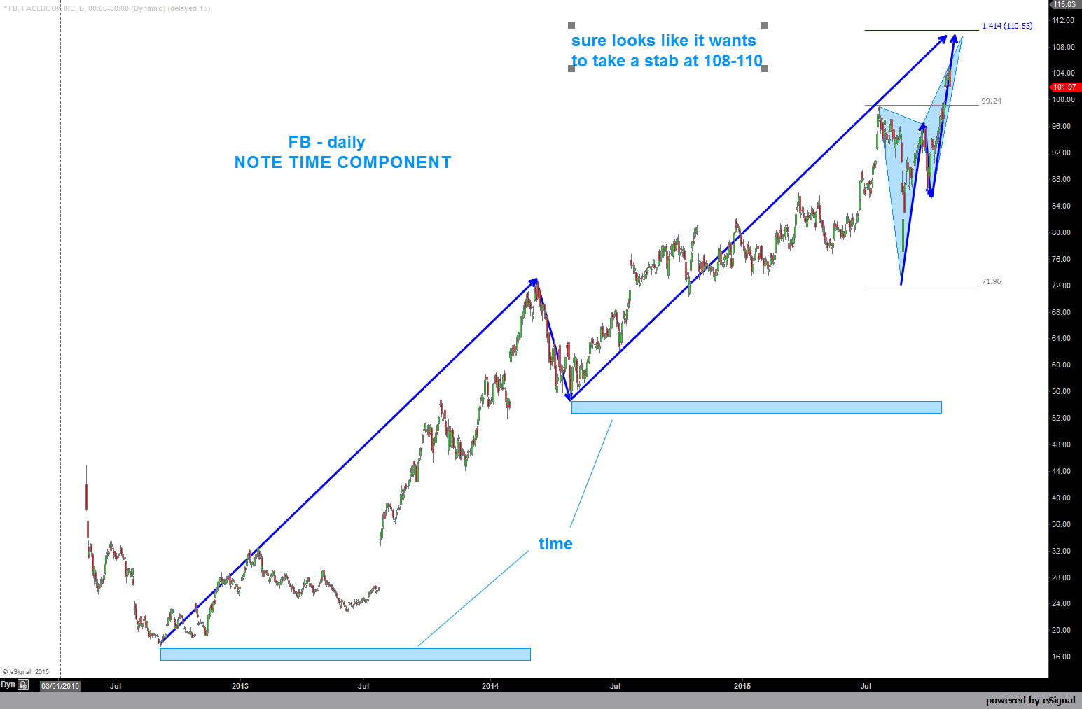
FB before earnings …
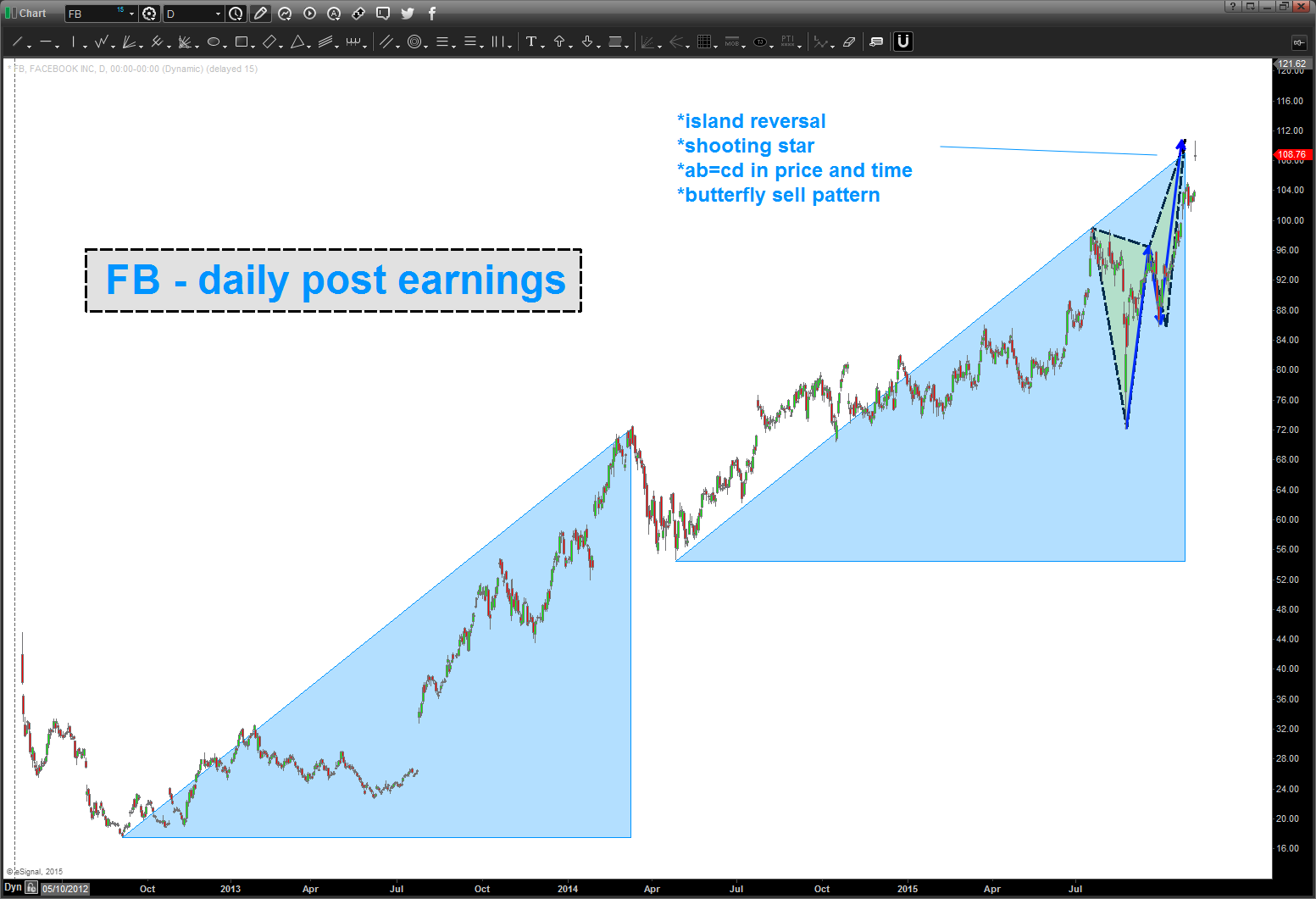
FB post earnings … sell patterns are complete.

when the big boys eat soup volatility rises …. BOINK
Posted on November 4, 2015 Leave a Comment
11/4 – BOINK. target hit …
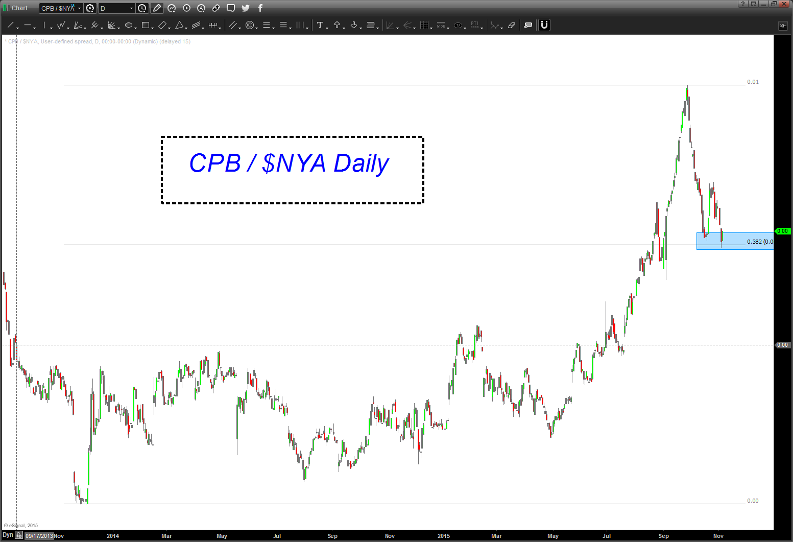
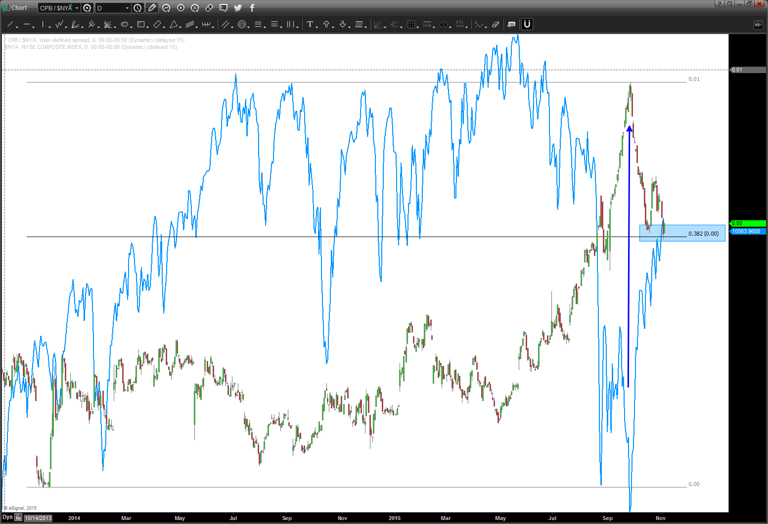
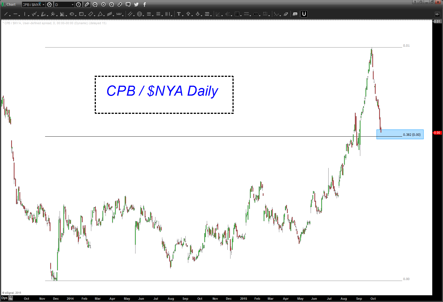
support here means “institutions” are getting conservative. Hmmmmm, something to watch. Here’s the comparison w/ the $NYA. Note how they are INVERSE. When the blue line ($NYA) is going UP the ratio goes down and when the ratio goes UP the $NYA goes down. We’ve hit big time support on the ratio … again, I expect a pullback/churn from these levels.
October 18 2015: note, the CPB/NYA ratio has been straight down but it running into potential support a little lower. The thesis is during times of “risk off” institutions roll into the staples and stuff like toilet paper, toothpaste, food, soup, etc. has stronger relative strength. Keep an eye on this next week as support for the ratio “should” work it’s way into more volatility and be bearish for the overall equity picture.
Below the two dashed lines is a post that I did 2 years ago – almost to the day. Pretty amazing …some would call it synchronistic. I’ll just leave it at that …
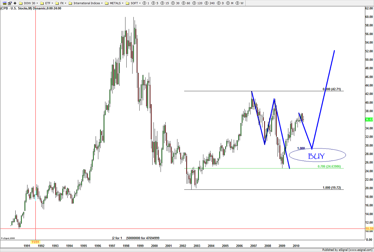
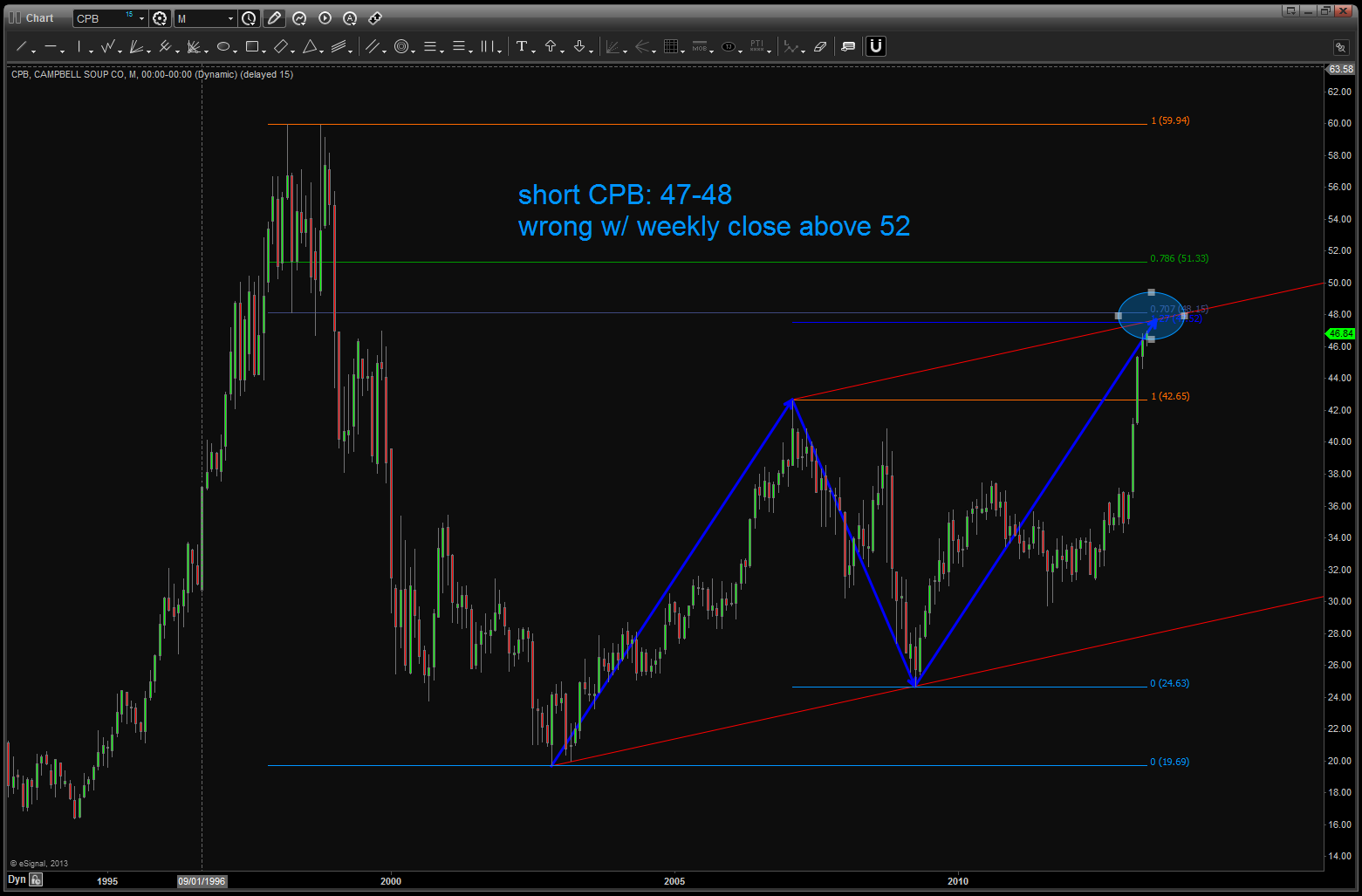
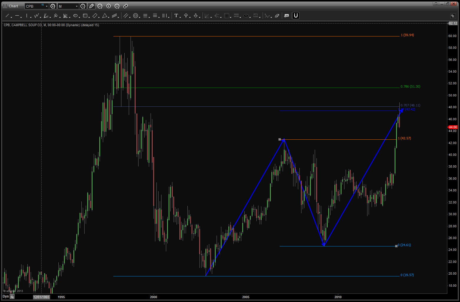
Personally, I enjoy my Saturday and Sunday morning’s w/ a cup of coffee. Nothing going on, put a little Pandora on the headset and just “chill” and enjoy the amazing fall weather in VA. Little Bird said – “hey Bart, how about CPB soup?” So I took a look and – BAM – I was surprised.
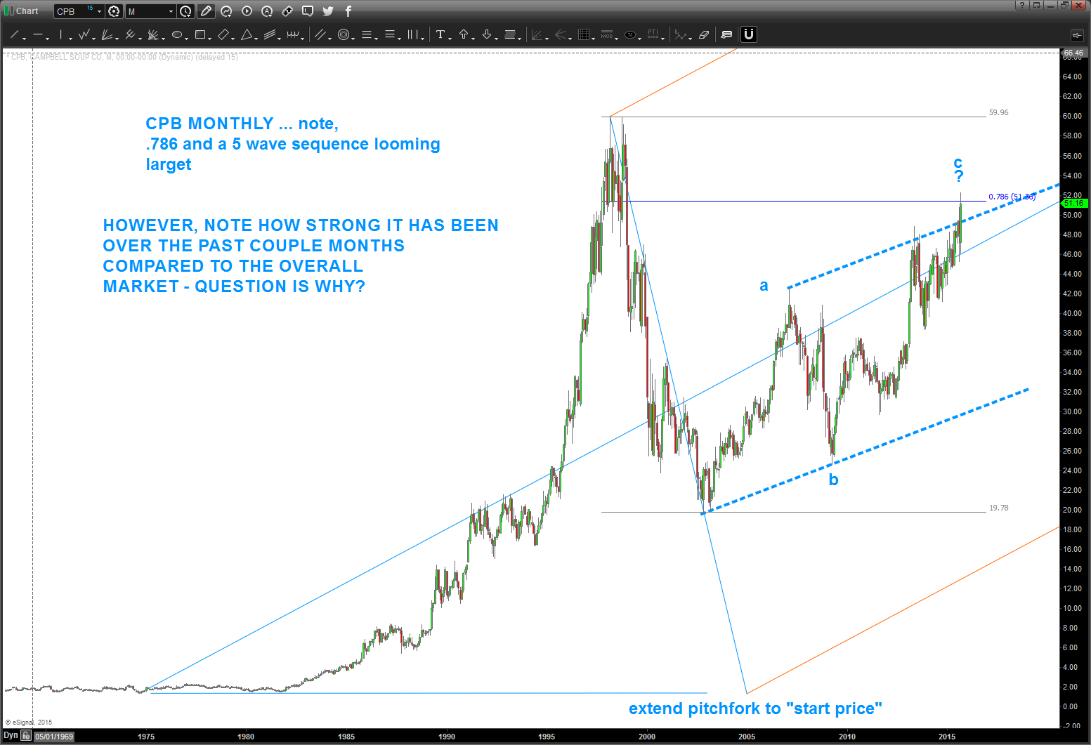
If you go all the way back 2 years ago you’ll see that we had a nice pattern forming and it hit – to a tee at 48.
The market pulled back about 10 bucks and then started to march back up … a slow grind but it did go up.
As you can see above 52 and it was considered a failed pattern.
This week we went up and touched that level and, while I can see a 5 wave count up into this area and seeing an a-b-c type of correction what REALLY made me go hmmm is, of course the relative strength of CPB compared to the NYA. Why? STAPLES BABY …. a couple posts ago I mentioned we should be watching the XLP / $SPX for strength to signal more market weakness. Soup is a staple – period.
So, couple things of note:
- CPB is strong compared to the overall market.
- It has closed, on a weekly basis, the trend channel defined by the blue dashed line.
- there is a 5 wave count into the 52 area so warrant caution here if going to play on the long side.
- the short side is also a play, but would wait for the 48 level to be broken to the downside on a weekly close.
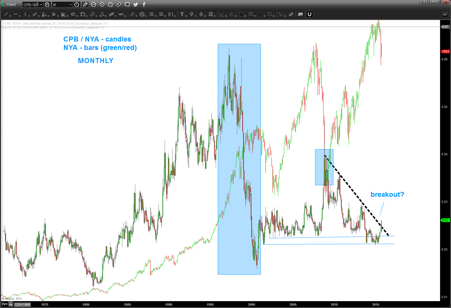
here’s what really has me interested in the RELATIVE STRENGTH OF CPB vs NYA
Points of Interest
- from the 1980’s CPB “outperformed” (the ratio went up) the overall market.
- the ratio TOPPED in 1997. the overall market didn’t top until 2000.
- but when the market did, eventually, top, the relative strength of CPB / NYA bottomed exactly the same time
- think about it for a moment .. the ratio CRASHED going into the top in 2000. Folks, that’s irrational exuberance. throw caution to the wind and get in, get in, get in and then ….ouch.
- while not as dramatic, the same thing occurred in the 2007-2009 period.
- the ratio bottomed as the market topped.
- presently, we do have some strength taking off and we have closed above the black dashed trend line.
- is that a signal that a strong move in the ratio is coming? Potentially, so monitor closely and do not be lulled to sleep. Strength in this ratio is not good for the overall health of the equity market.
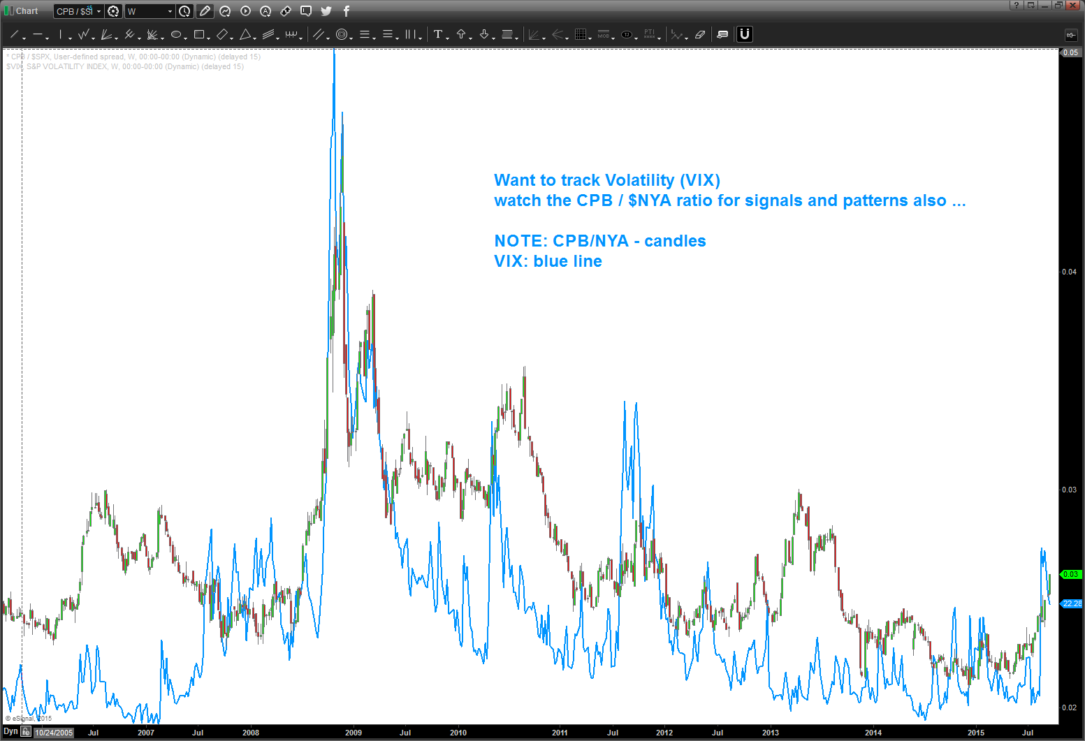
one last folks … let’s not try to “fundamentalize” this last chart. that’s for the really smart people .. but take a look at the CPB/NYA ratio and the VIX. It’s a near perfect match.
When the institutions start eating soup … expect volatility to rise.
swings on this puppy have been extremely nice ….charts below.
just follow the bouncing ball …
nice BUY pattern emerged at level forecast …
long term pattern came into play. good pattern/good defined risk …
level being hit ….
note, now we have completed the equality of swings and the level held at/around 41.
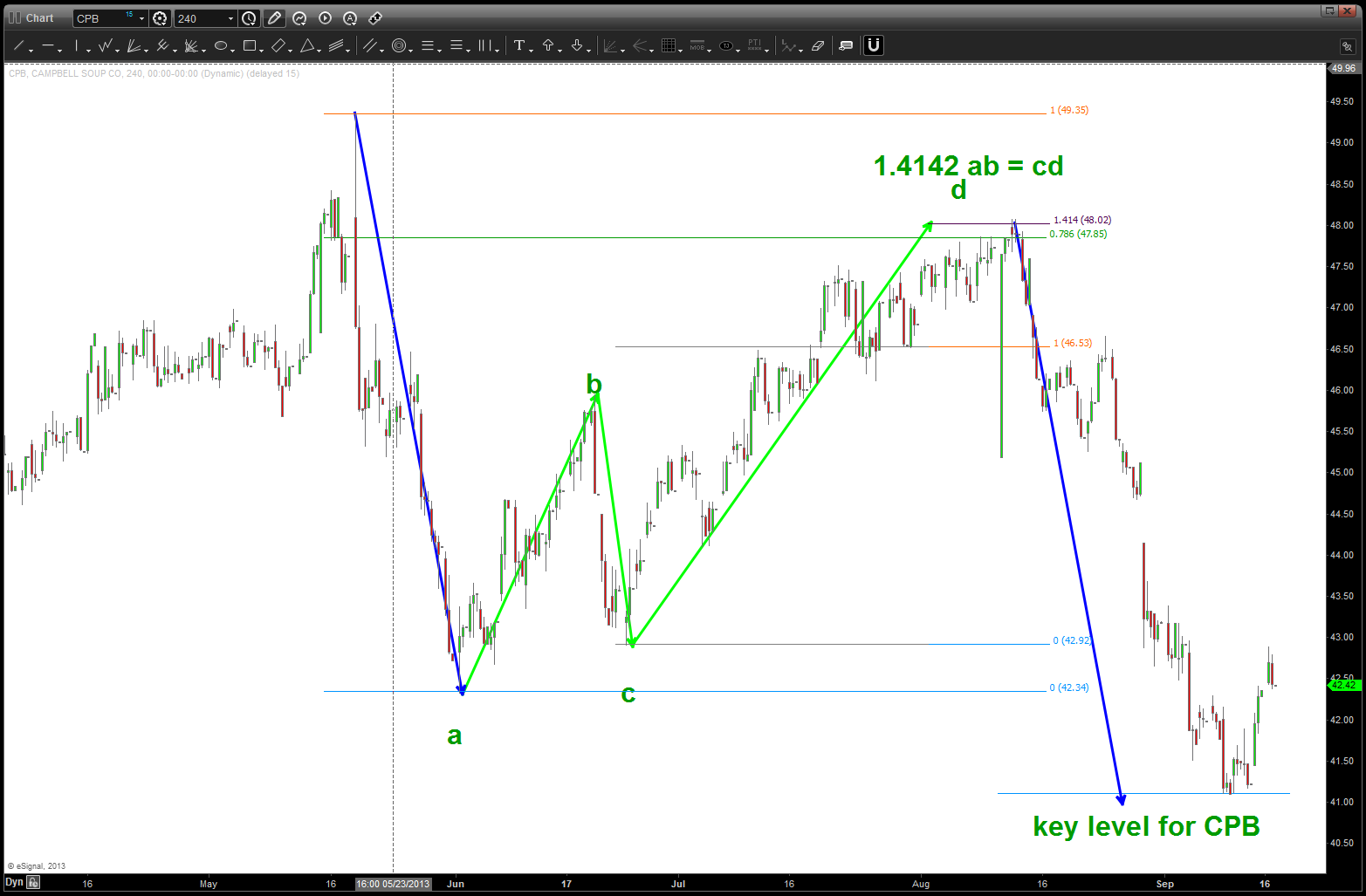
watch the lower level on CPB … if we break it, selling could really come in ….
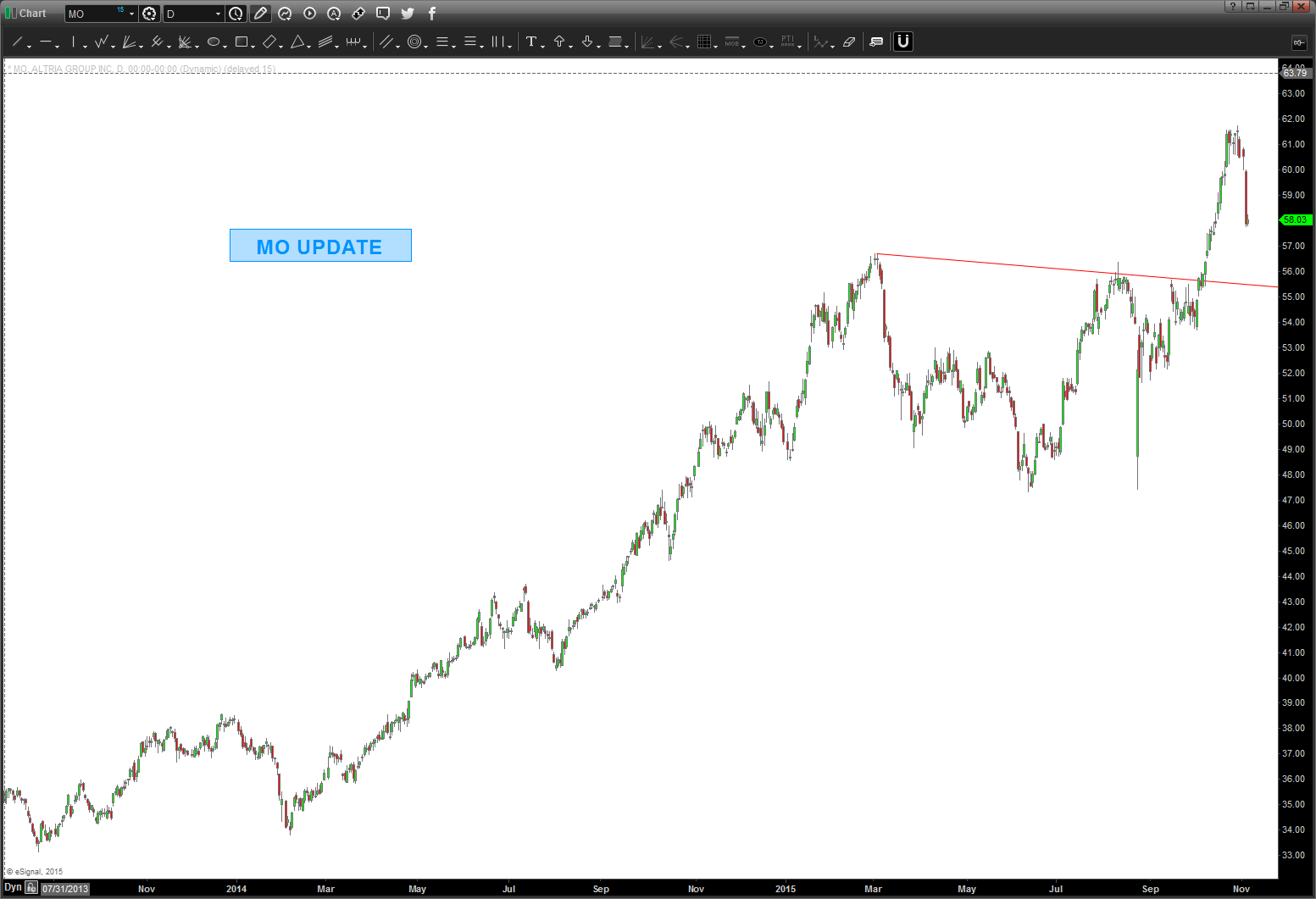
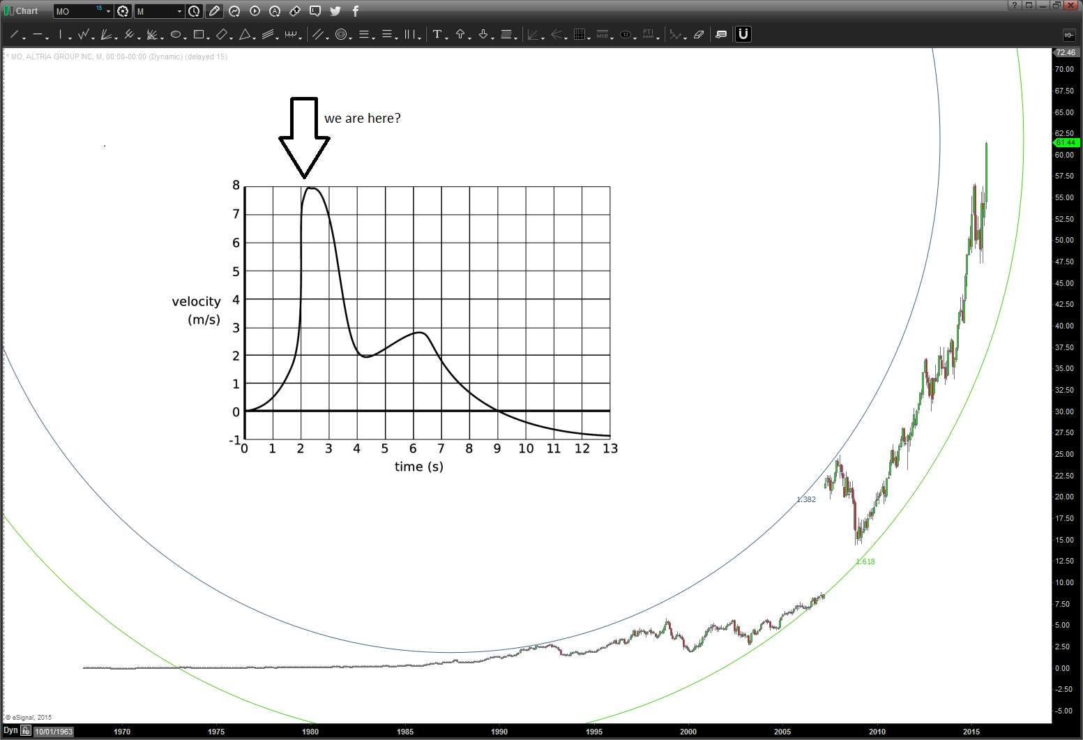
Parabolic Velocity ….and $MO an update ….
Posted on November 4, 2015 Leave a Comment
11/4 – update. again, I don’t even know what the Altria Group Inc. does … but I do know that parabolic velocity can only hit a certain Ps=0. What the hell does that mean? Well it’s the VN diagram when fighting a high performance fighter. You see at ANY given time in a fight you have a certain airspeed, altitude and G that will give you a turn radius and turn rate. In order to NOT give up energy you wanted your sustained rate of turn/radius to stay constant …. if your going to rip the g’s on and get a really powerful turn RADIUS going then your going to give up energy…. so you better be right OR your going to have to UNLOAD and get energy back and that will make you arc like an albatross. Get it .. Ps=0 might not be the best turn rate or radius but you know that your not giving up any ENERGY.
MO … tons and tons of VELOCITY but guess what? to get that HIGH of a price and go parabolic “it” had to be all in and a certain point you ain’t got “no moe thrust” and it stops and falls.
is this the top? I have no idea, but having been in many many 2 circle and 1 circle fights you learn to SEE how your enemy is doing/reacting and this puppy ($MO) gave it ALL. It’s time to UNLOAD (go down) and get some more knots (ENERGY) up to make another run …
watching this one, a move down into high 40’s not out of the question …
first stop SHOULD BE the top of that read trend line …
Bart
spent some time in the Navy and, one time, we (two seat Tomcat) decided to “see how high we could get from sea level” off the coast of SOCAL. So, we lit the afterburners and got going pretty fast and then the pilot smoothly pulled back on the stick and very soon we were pointing 90 degrees nose high and climbing like a bat out of hell. Pretty cool … and we kept climbing and climbing and finally (you could hear the TF30 engines grasping for any air) topped out around 55K feet or so … you could see the curvature of the earth. The ECS (environmental control system) was working overtime trying to keep the cockpit pressurized and …. we simply couldn’t go any higher, even w/ the engines going FULL GRUNT AFTERBURNER, it simply stopped.
guess what happened next? we fell like a stone … just left the hands off the controls and that was it … we had exhausted the power of the Tomcat to go any further …
folks, same thing happens w/ stocks. IF you can get into a pre-parabolic move based on your decision criteria (technical or fundamental) then ride it and go w/ it …. however, once you “sense” the parabolic stage then take some money off the table. I’m going to say it again … they have NEVER ended well. and depending on the size of the motor taking you straight up – it will eventually fail. Gravity is real in both a physical and subconscious way. Subconscious? Yes, the euphoria of the monster bullish move and the despondency of the bearish move will, eventually, yin-yang you and take off in the opposite direction.
here’s MO … were either “here” now or close to being parabolic. stay tuned …
continue to make it a great week.
Bart
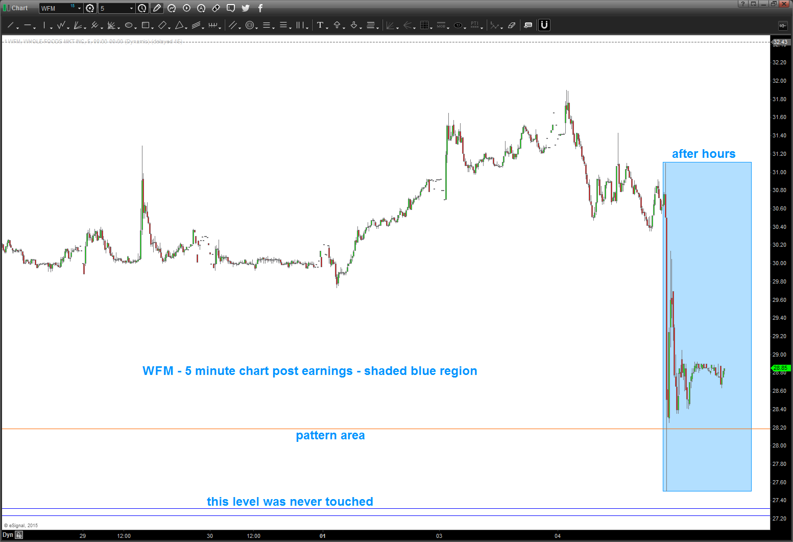
$WFM …update
Posted on November 4, 2015 Leave a Comment
WFM – as of earnings release went into the pattern zone and bounced back up … still didn’t hit the 5627.20 level so perhaps a down opening and then bounce? target at 25.99 … don’t risk much here if trying to play long.
I enjoy listening to JC Parets (@allstarcharts) (www.allstarcharts.com ) as he’s entertaining as hell and also knows his stuff. I blame him for getting me blogging and haven’t looked back since …he’s introduced me to blogging, google hang out, twitter and now periscope. today, was doing some emails and “periscope” popped up that he was cruising the charts so I simply hit the app and was immediately logged onto his computer screen where he was pushing some charts around.
one of the charts – Whole Foods. Besides something about overhead supply, divergence, moving averages and stuff like that I called up the chart on a monthly and saw a PERFECT BUY PATTERN.
- note the blue arrows – projects into 27.94
- but more importantly, note that they are equal in PRICE and TIME right in/around here.
- note the extensions (sitting on the 1.27 extension right now)
- 1.4142 extension hits right on the .618 retrace (that’s good) at 27.16-27.21
- last, look at the dashed orange line .. it’s a measured move which represents the largest corrective move since the all times lows in the early 1990’s
So, sure looks like it “should not” go thru 27 so it presents a nice risk reward.
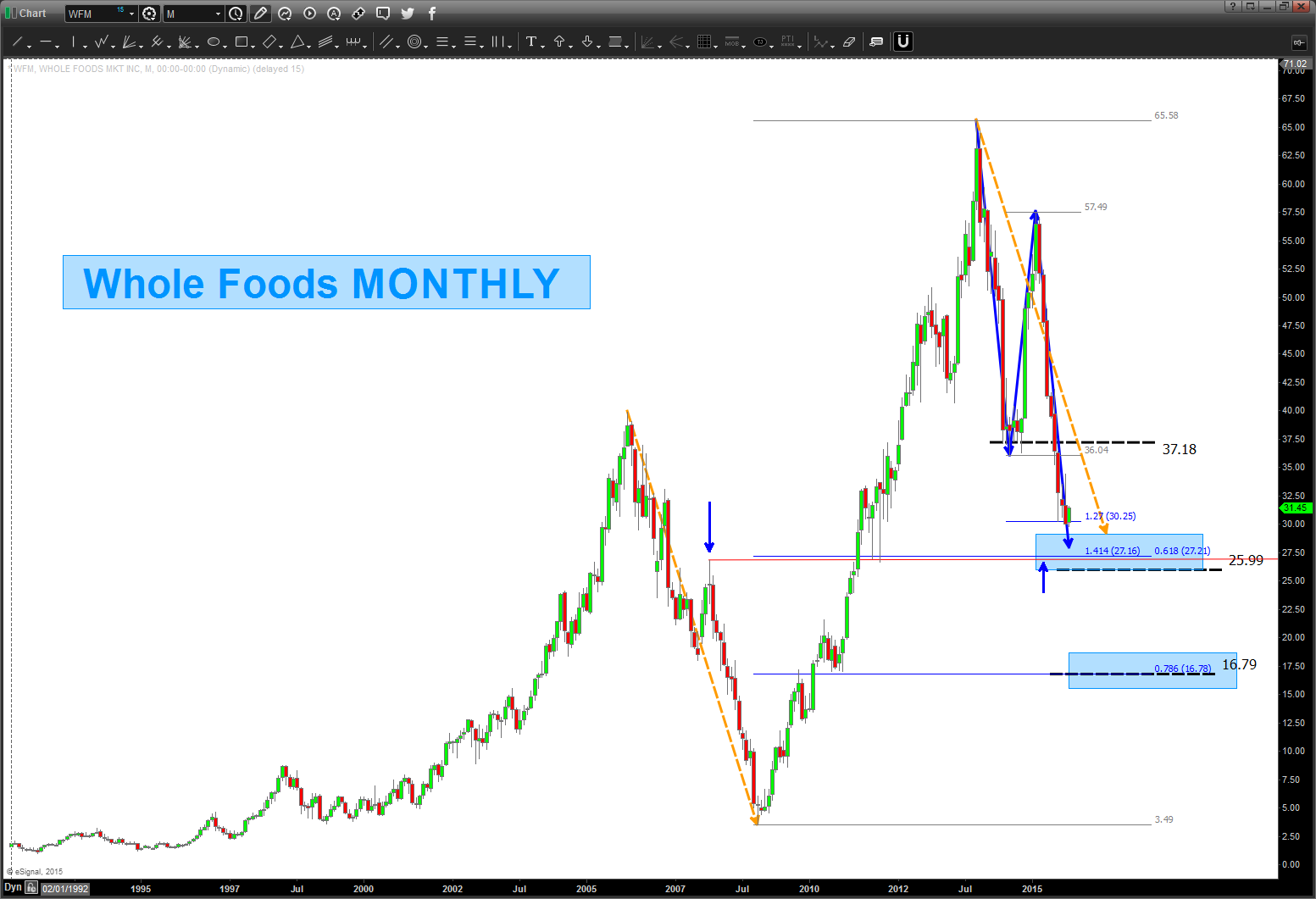
how about some math?
- (square root 65.58-2)^2 = 37.18
- (square root 65.58-4)^2 = 16.79 (right on the .786)
- (square root 65.58-3)^2 = 25.99
so, we have a LOT of thrust coming into this level but a lot of math is coming into play in/around 26-27.
thanks JC!
Bart
WMT – heads up support area approaching
Posted on November 4, 2015 Leave a Comment
Just a heads up … were “there” or “close” w/ regards to potential WMT support.
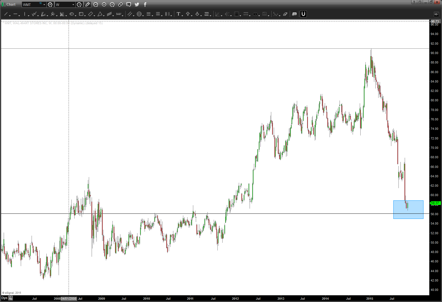
Here’s the picture of $WMT in 2013 – sure looked, at the time, we were finishing 5 waves and the circle area was the target area for a “potential” top.
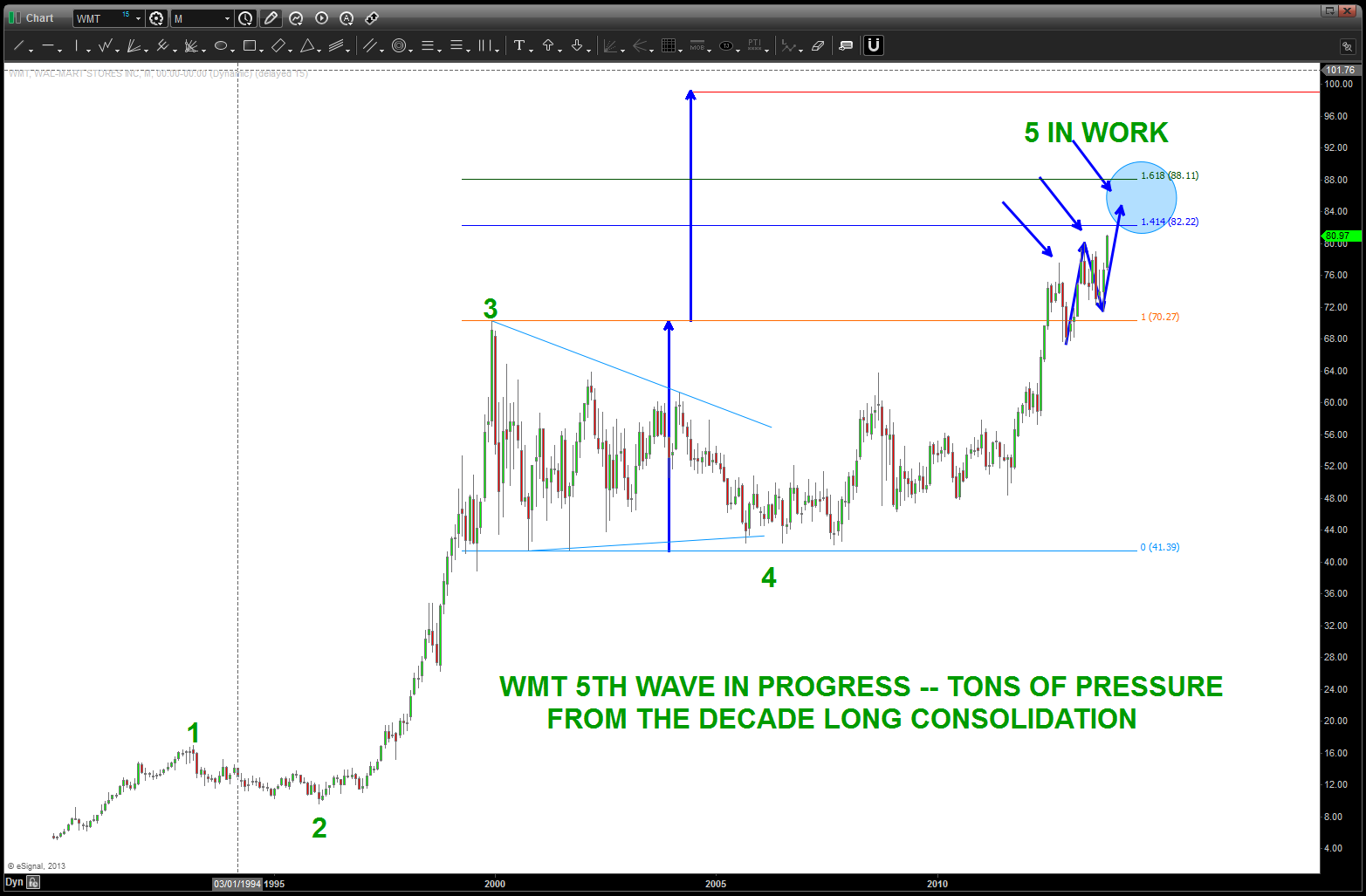
$WMT moving into the highs – Nov 2013
Target was hit and yesterday the move rally began. Hard to believe it’s roughly 2 years ago that this pattern was ID’d and it took that long for it to start to make the “news” so to speak. Anyway, now that the chaos and news is getting ahold of it, believe a look at a potential long swing trade in the mid to low 50’s is reasonable.
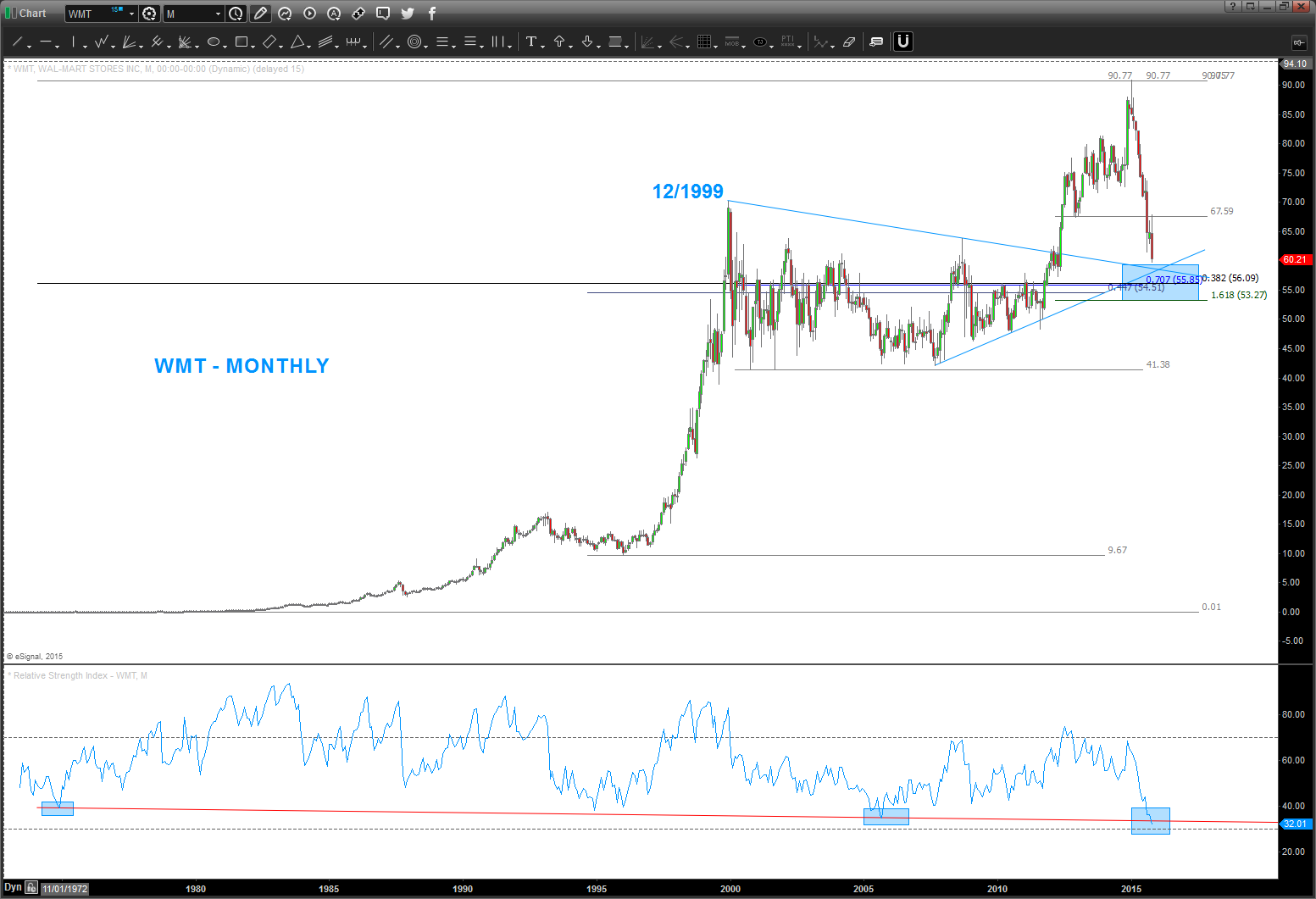
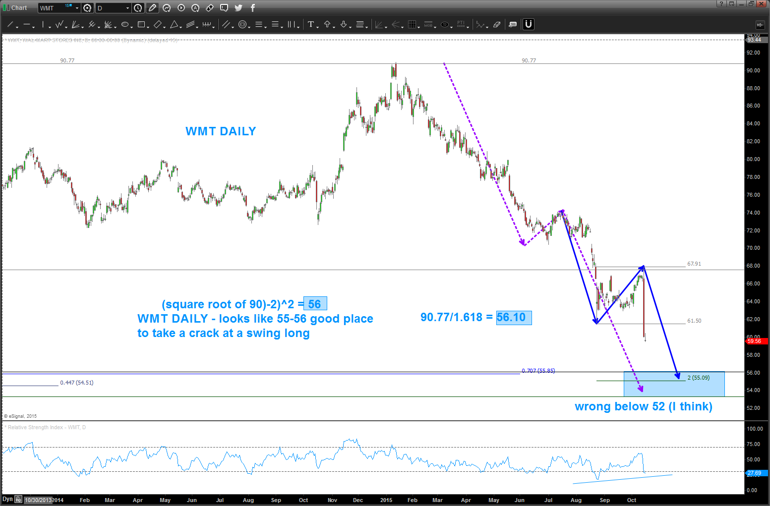
Here’s the daily chart … note the square root target of 56 lands right on the .382 retracement from the all time low. I like that … watch that 55-56 level.
Just another math thing … 90/1.618 = 56. Another reason to like the level.
Here’s the weekly 1/8th projection method …
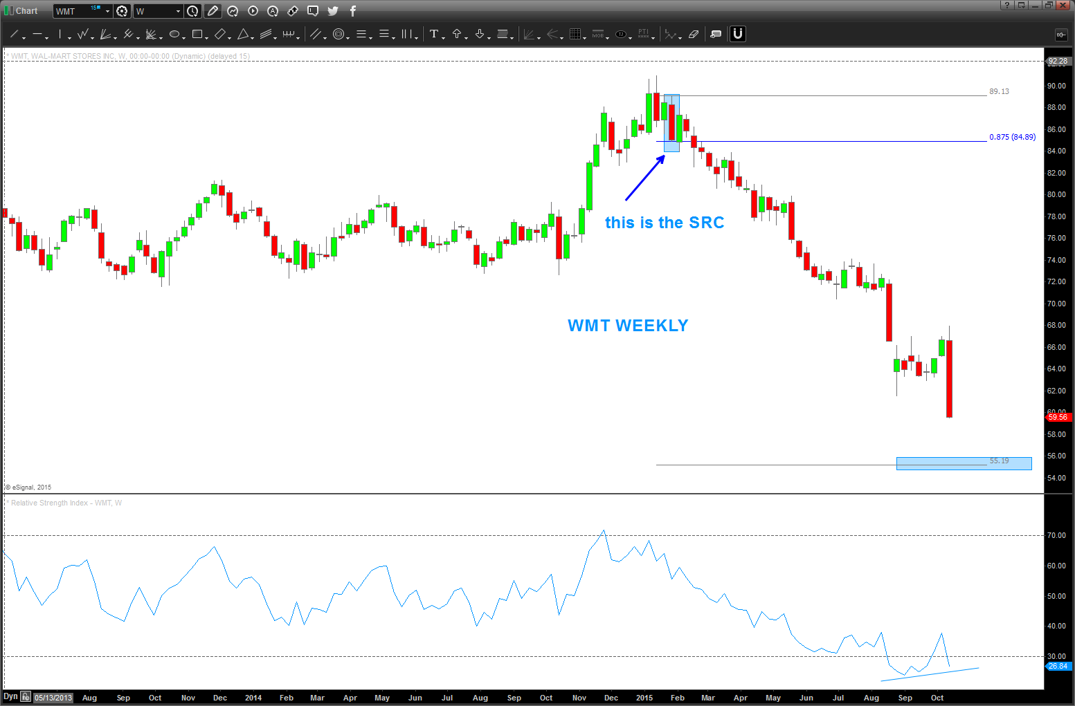
55-56 sure seems like it’s key WHICH MEANS IF IT FAILS THEN WE GOT SOMETHING REALLY WRONG AT THE CIRCLE K.
B
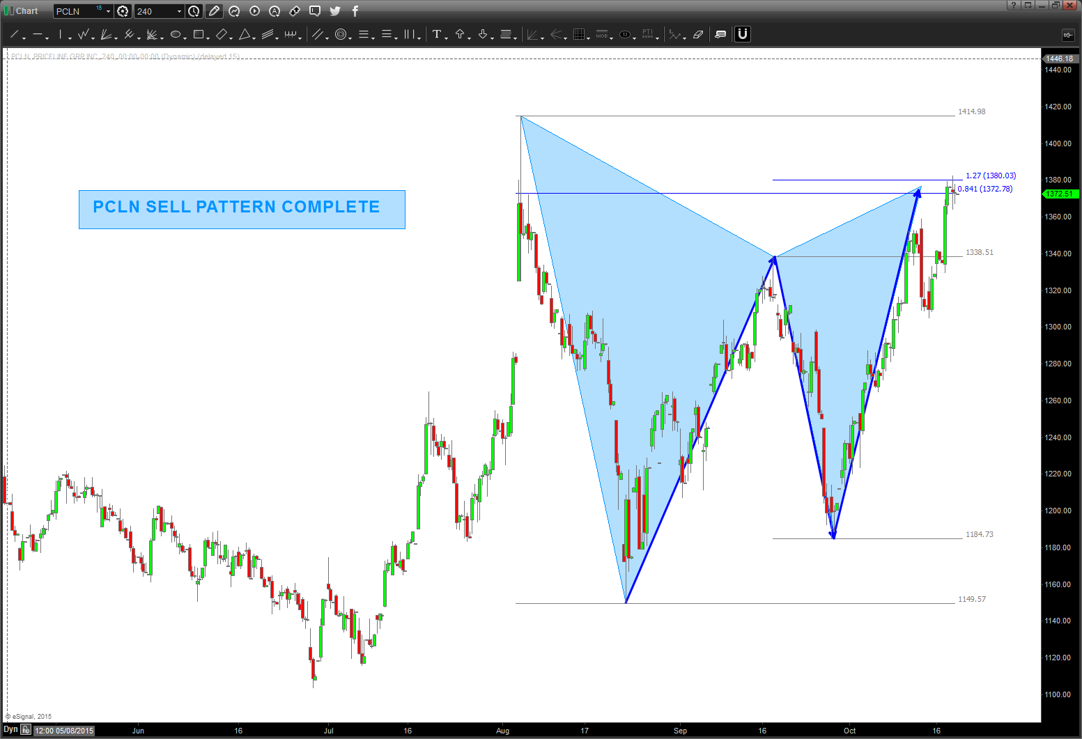
$PCLN sell pattern complete – FAILED PATTERN
Posted on November 4, 2015 Leave a Comment
Folks, this mirror image got smoked. Much like the mirror image for Natural Gas … the mirror images fail at the inflection points and $PCLN has rolled thru the pattern. ERASE … ERASE…ERASE.
Where are we now?
Well, if we look at the candles you’ll see the 2nd largest monthly candle since the IPO occurred last month (OCT) So, we have 1484 coming in but it sure looks like momentum and thrust will carry it to the 1600 level. I’m going to spend some time on this one over the next couple days …
here’s the MONTHLY picture …
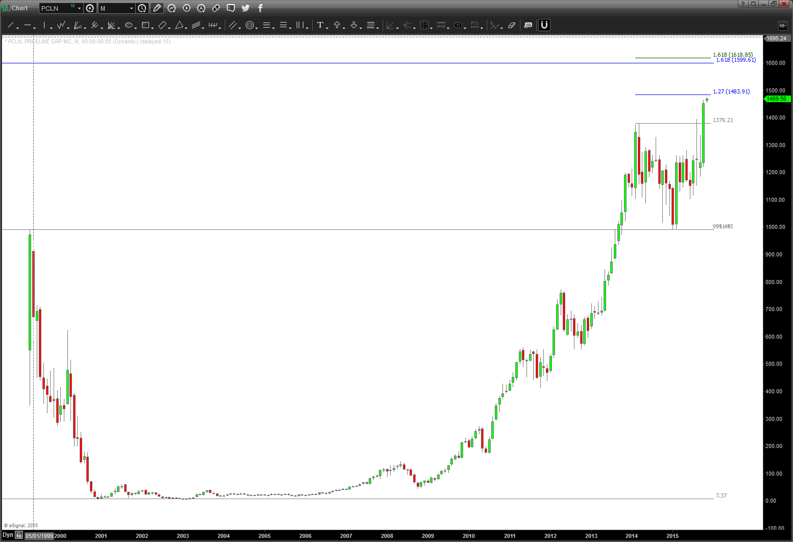
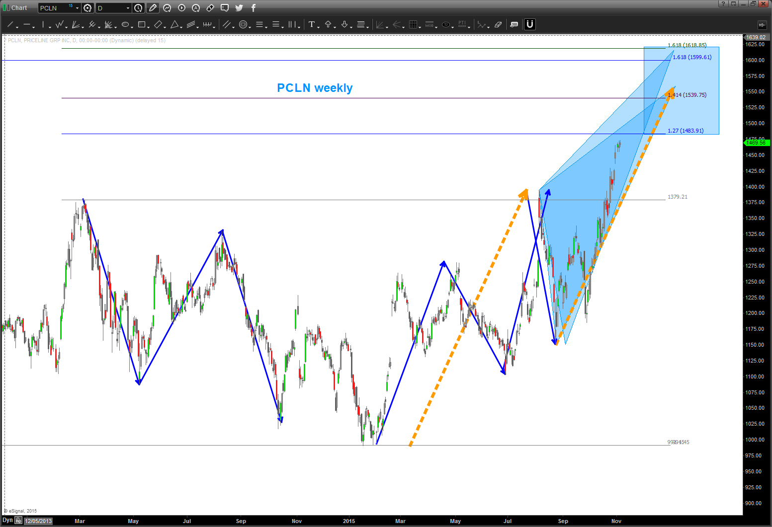
IF the mirror image foldback is in play THEN this pattern needs to hold and start down. a move below 1360 would bolster conviction that the mirror image mentioned earlier is in play.
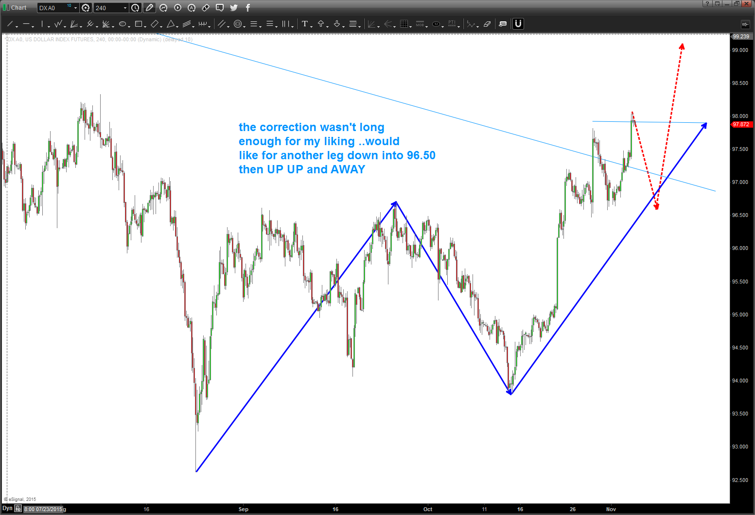
Dollar Index .. on it’s way
Posted on November 4, 2015 Leave a Comment
you know what, we might be surprised at how big this coming run is going to be for the dollar … make no doubt, the next rise has begun.
if your already in, stay in. if your not, believe we’ll find some short term resistance in/around here for a pull back to 96.50 or so to get a ticket on this train.
this takes time to digest … slow down and read/study it
Posted on November 4, 2015 Leave a Comment
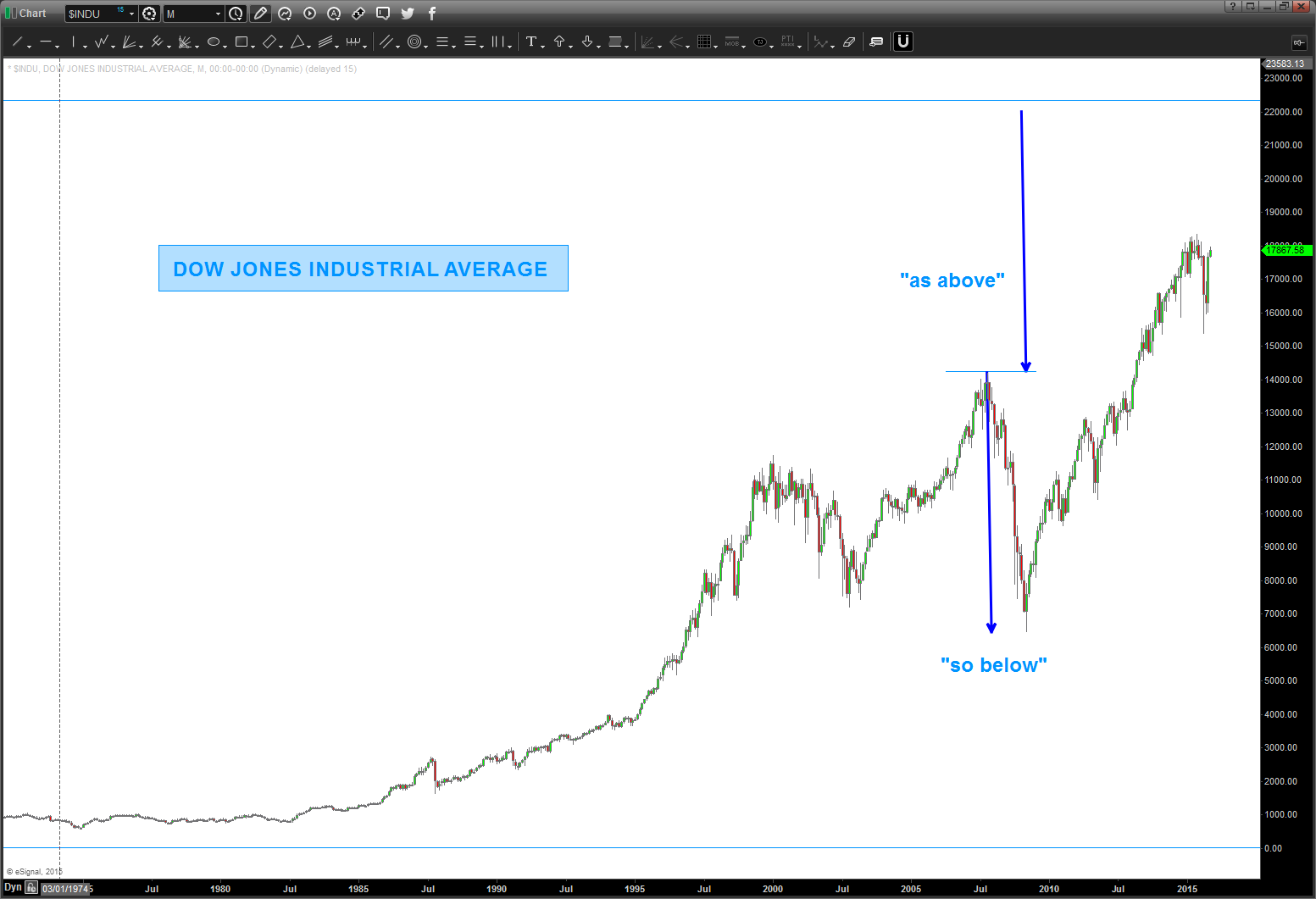
CLIFF NOTES: the market has rallied since the August lows … this move up is impulsive which give probability to the bulls that were going to continue. that being said, SELL patterns are present as of the past couple days so I expect resistance or a churn for the next week. In looking at the DOW please read below – sure looks like it wants to go up to 22,000.
I am posting this again because I want to spend some time “looking” at the picture that is created below. It’s using LOG’s and Musical scale properties and, if you study it you’ll see how the market “zoomed” up into the next octave and that’s exactly where it’s been stuck for the past 15 years. Most, if not all of the turns have been one of these levels ….so, to “end” the next octave we need to get up to 22,000. That’s another 20% or so … it sure seems to ‘want’ to do it.
Just a pattern guy and I sense/feel the craziness creeping in all over …. but that really doesn’t matter does it? The market DOES WHAT IT WANTS and a “sprint” up to 22,000 on the DOW just doesn’t seem out of the question.
Here’s the art … just study the picture and see the math/music at work .. it’s an incredible picture. Also, note the importance of the major third. folks you can’t make this up … that ratio was present at the 1987 high and the 2007 high. Is that a coincidence? Someone please prove me wrong here OR the biggest hedge funds in the world – Citadel, Paul Tudor Jones, Steve Cohen, etc – were all waiting right at those NUMBERS to short the market. Me, I don’t think so … no, I think there is something actually more powerful at work. But we’ll leave that for a discussion face to face over a nice glass of wine …
either way, here’s the chart again and another chart showing the “as above” – “so below” technique … again, looks like 22,000 is the target.
enjoy and let me know if you have any questions … one last, read below regarding the EXACT high on the NYSE using LOGS and the price of the all time low (move the decimal) – folks you can’t make this shit up.
Bart

What a great day yesterday … was working thru what my wife calls the “man flu,” it was pouring rain and nothing but great college football and logs. I know, that was geeky but during half-time of the Navy vs AF game I just sat down in front of my computer and said “self, let’s see if music is really involved in the market.” I think it is …
- I have never done this before, what you see is the result of starting from the all time low of 28.48 on 08/08/1896 some 43,250 calendar days ago as of this posting and simply “did the math.”
- Background:
- the frequency of a string is:
- inversely proportional to the square root of its length and
- directly proportional to square root of it’s tension
- here is a chart of the notes and the ratio’s and their inverses
- the frequency of a string is:
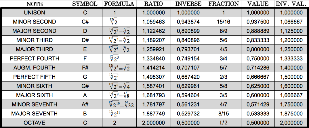
- Here is the math:
- 28.48 LN = 3.3492
- 3.34492 + ratio of equal octave scale = XXX
- anti-log of XXX = YYY
- plot YYY on long term monthly of DJIA
- For example:
- NOTE E: ratio 1.259921 and the inverse 1/1.259921 = .7937005
- 3.3492+.7937005 = 4.1429005
- 4.1386205 anti-log = 13896
- interesting to note how close that was to the top in 2007
- some 20 years prior the same “E” was wreaking havoc – here’s the math
- 3.3492+.07937005 (note the number stays the same – JUST SHIFT THE DECIMAL POINT) = 3.42857005
- anti-log of 3.42857005 =2683
is it any coincidence that the musical note E was found in 1987 and 2007 from the all time low in 1896?
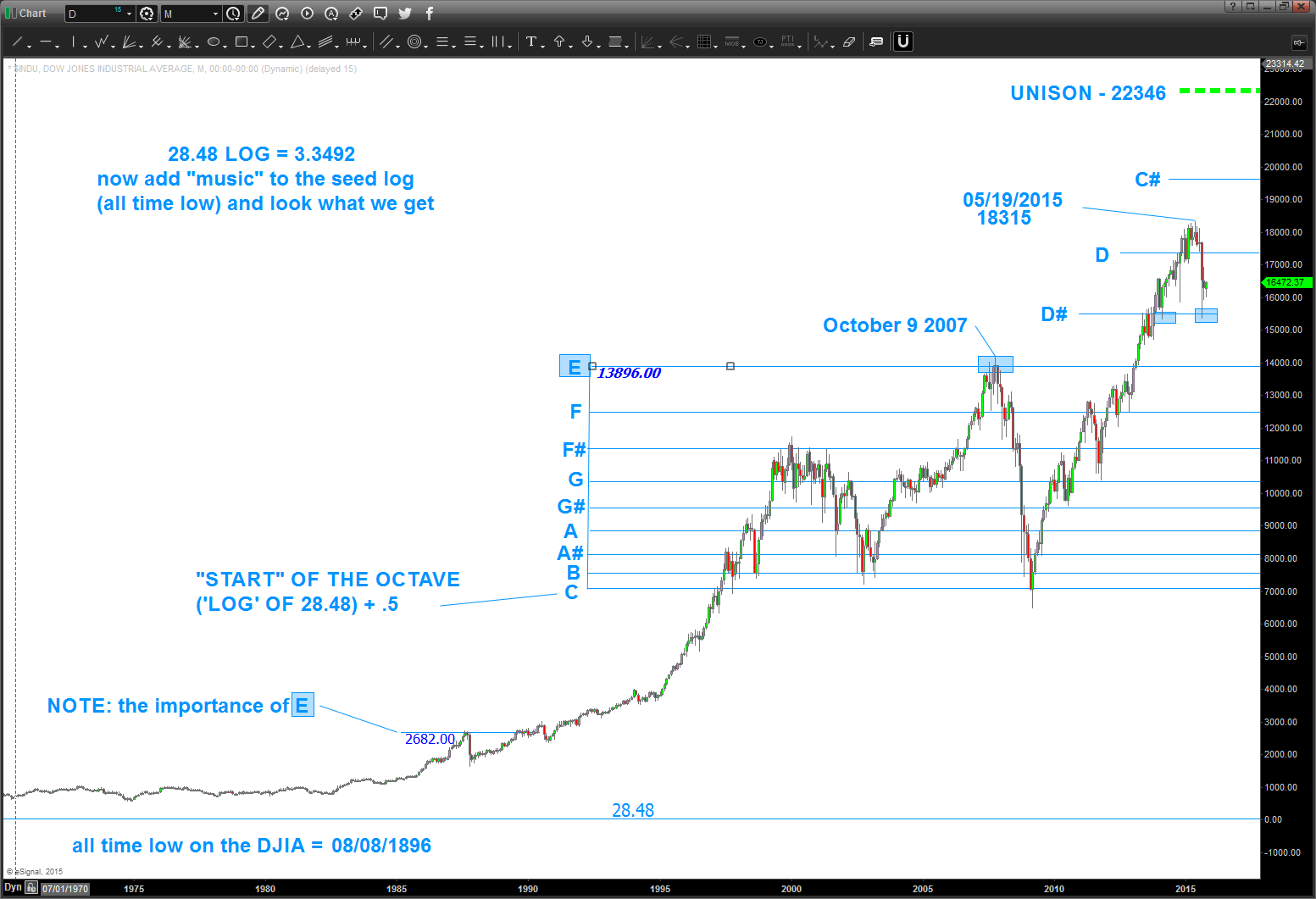
So what does this mean? Well, take a look at the chart … in 1997 the market came up and started another octave and has been banging in/around C-E for the past 20+ years. Note, the market did not CLOSE below the start of the octave “C” in 2009 … if I was in charge (and trust me I’m not) I sure think this market naturally wants to finish it’s symphony, so to speak, so is 22K out of the question? Who knows but I’m certainly going to be aware of these long term targets from 1896 as a guide.
Here’s a look on the way down …
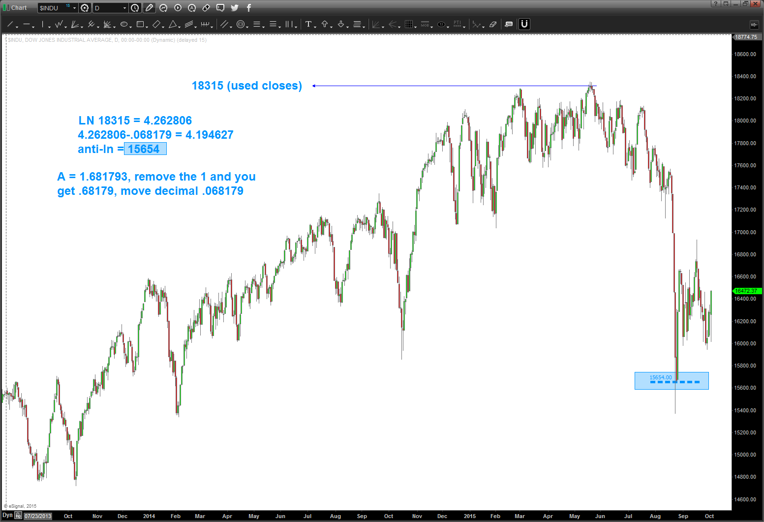
Happy Hunting and study up …
Bart
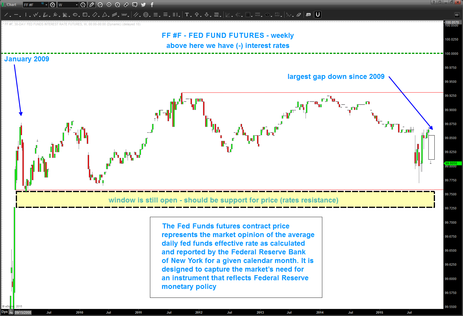
anyone else notice the GAP DOWN in Fed Fund Futures?
Posted on November 4, 2015 Leave a Comment
I will claim, right now, to have ZERO IDEA or INTEREST what fundamentals drive interest rate policy. Not a clue. However, I will claim to be able to read charts to manage risk. Am I “right” every time … well yes, because I know where I’m wrong every time (TILT) because I’m a pattern dude.
That being said, I am hawking the Fed Fund Futures contract (FF #F) and this week we had the largest gap down (interest rates higher) since 2009. Note, right below this channel is a “window” that has not been “closed” so perhaps we see a move out of the channel and into the window. IF we have a WEEKLY close below the channel THEN believe we have changed trend and interest rates will be going a LOT higher.
Use your fundamentals and other technicals to derive and idea but please use these levels as key demarcation points.
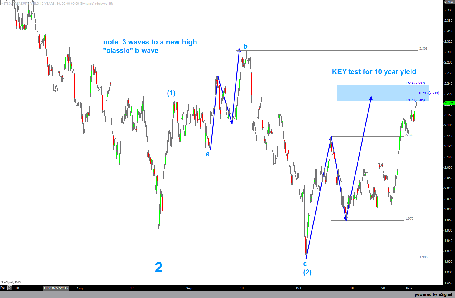
Ten Year: approaching a KEY SELL PATTERN. Let’s do the “IF – THEN” …IF rates are continuing to rise THEN this SELL pattern will fail. THIS IS A KEY LEVEL. Here’s the chart:
TLT: here’s the beauty of PATTERNS. Correspondingly, we have a BUY PATTERN on TLT. I’m showing 2 buy patterns. 1 in the light blue is approaching or at the buy level. It’s roughly 120. The other (yellow) is lower and is down at 116.
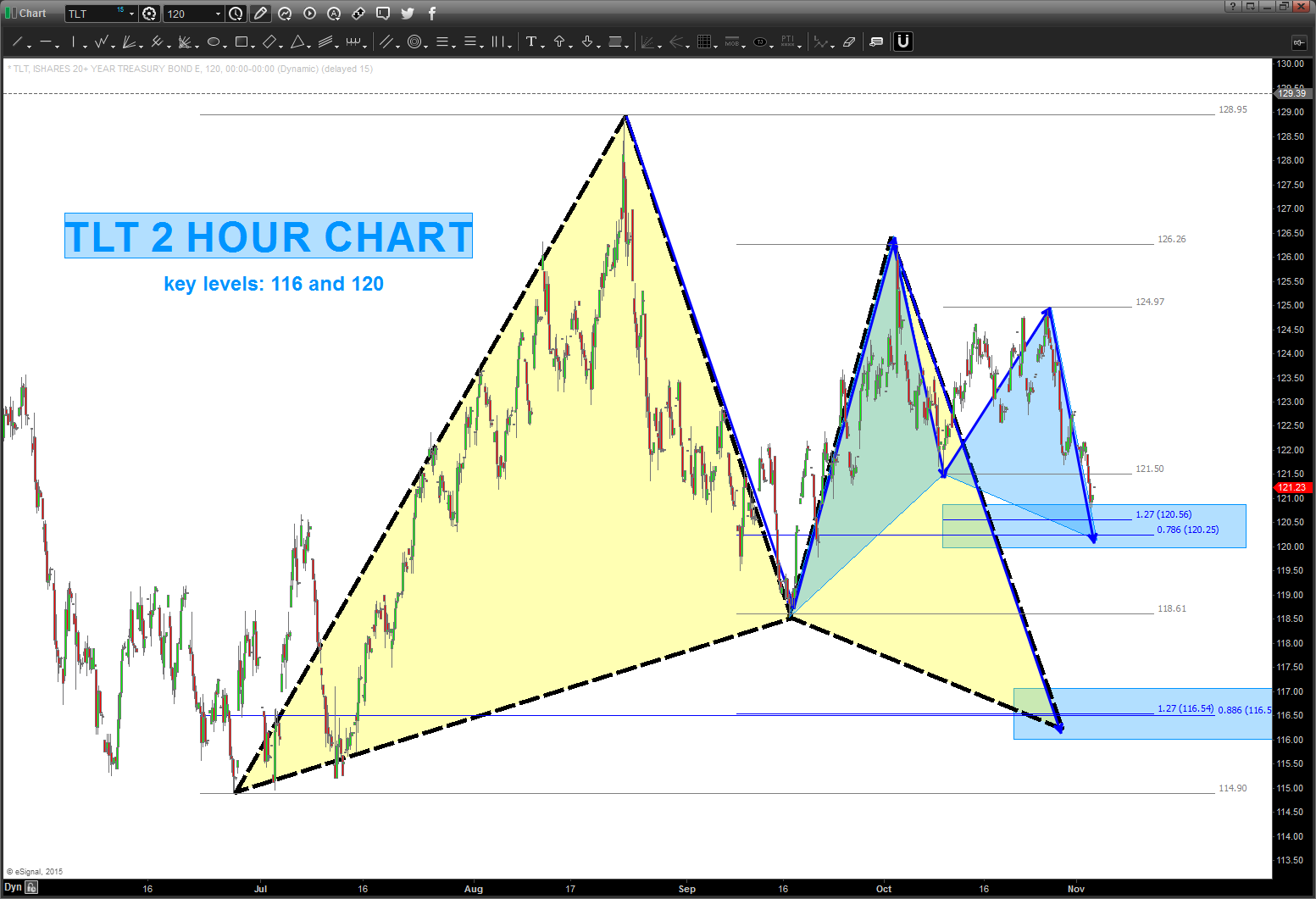
IF you want to SHORT YIELD THEN one of these levels will work and the 10 year will hold. IF you are a LONG RATES person then the TLT levels will fail and rates should continue to rise.
One last thing … when you have a “change” in trend, the market will tell you. I have used the RSI (long term) in the past and want to call attention to the ratio of TEN YEAR / GOLD. Note, the last support found in this ratio was ABOVE 30 and, basically, on the BULLISH support zone. The market very well might be telling us something.
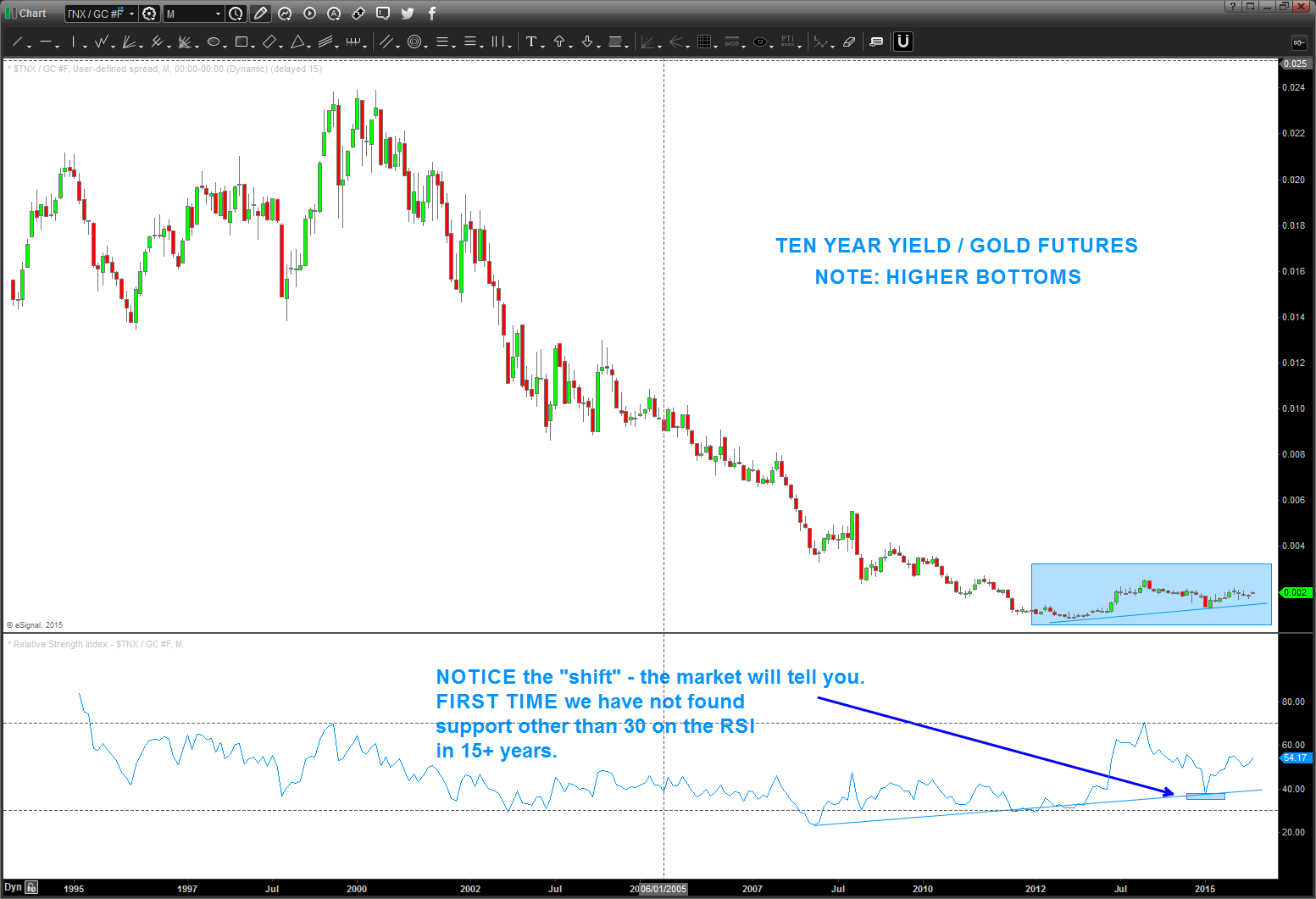
CONCLUSION: w/out ANY fundamental back drop – trust me they are important but I’m not smart enough to learn it – the charts below show me very important SELL and BUY patterns that are inverse of each other. One of them will fail (yield vs price) and THAT will dictate the direction of rates for the coming months … no matter what the talking head pundits on TV claim.
thanks for reading this far ….
Bart
