USD vs Japanese Yen
Posted on February 12, 2017 Leave a Comment
here’s some work that I’ve been doing on the YEN: https://bartscharts.com//?s=yen
just taking a look at the weekly RSI and, when I trained under Constance Brown she said “the market will tell you when it’s shifting, watch the RSI zones for clues.”
as you can see below … the, what I believe, multi-decade wave 5 occurred in 10/2011 and a VERY powerful advance occurred. You’ve read about my chaos w/in the YEN and how I got stopped out something like 6-8 times (I’ve tried to flush it from my memory) in around 76 ..(yes, 76! and, no one said this was going to be easy!) for what I was expecting was going to be a monstrous ride.
anyway, note how support SHIFTED up after the decades long bear trend … (see dashed green lines) and how, after this correction – which might be pretty much complete it the support and resistance has now shifted down (see dashed red lines) ….
I’m in no mans land right now .. while I believe another advance of the USD against the YEN may be forthcoming I would have really liked to see the RSI resistance SHIFT back up into the 80’s. So .. while our ‘count’ isn’t complete in this wave, I’m going to step aside and see what happens the rest of the month.
as you can see w/ the ???? it’s time to sit on my hands and see what plays out … that’s only me. you do what you want and follow our plan, as always.
Bart


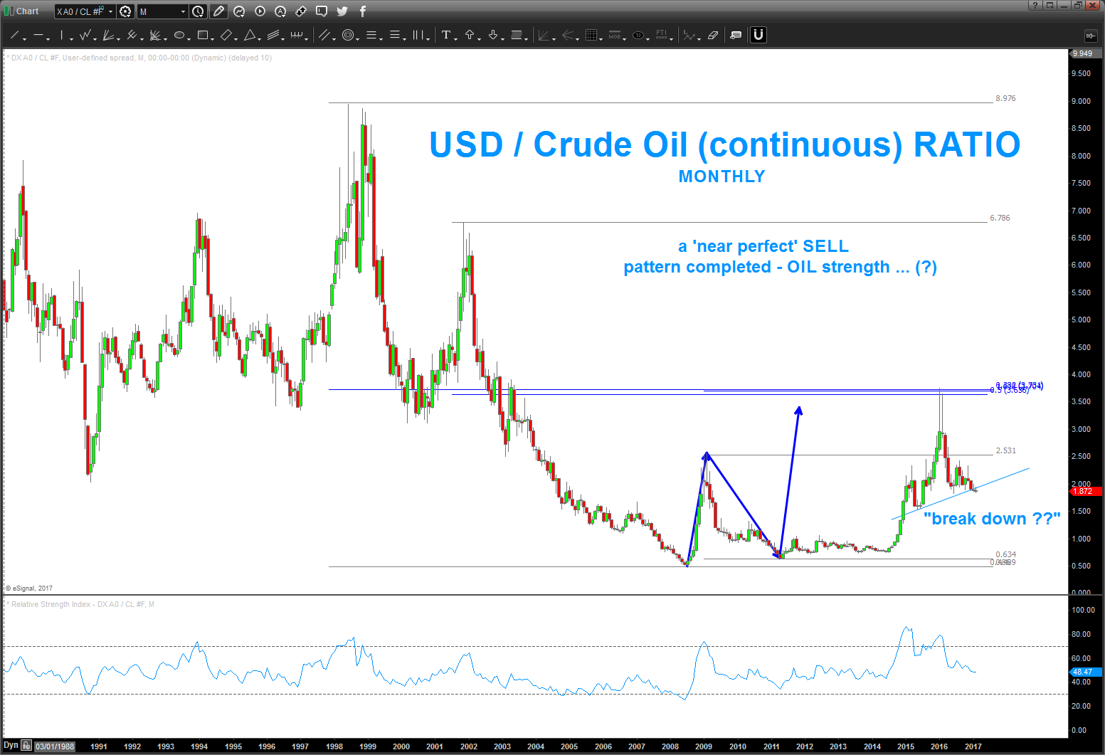
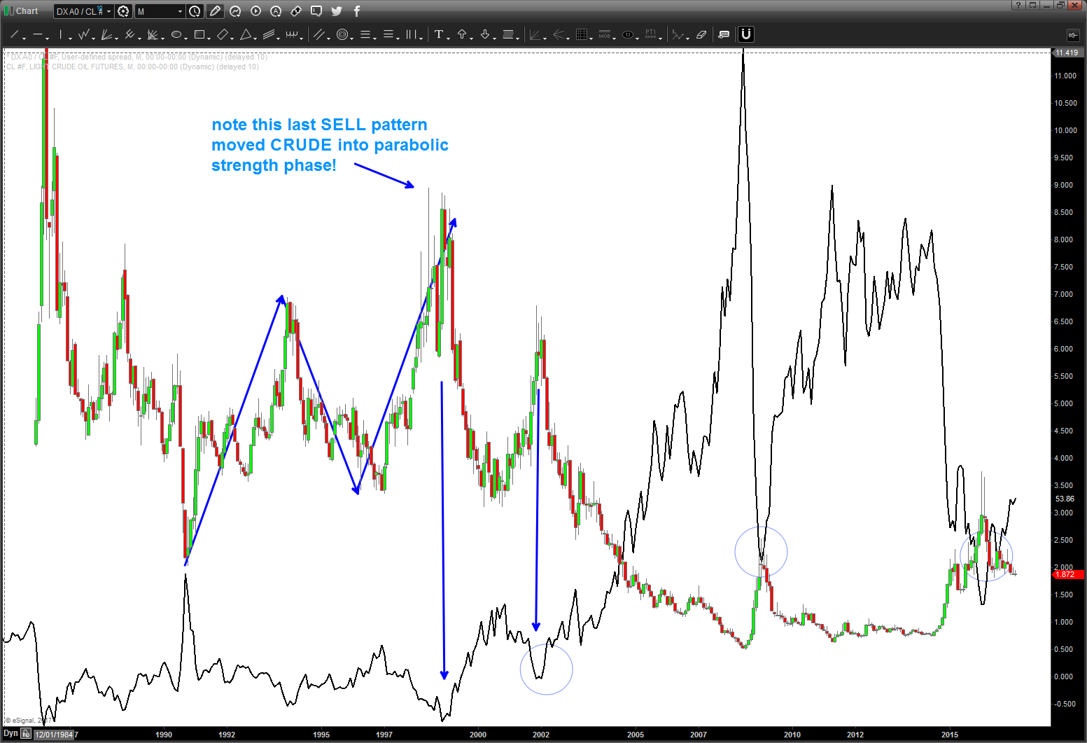
interesting … the RATIO of USD / CRUDE
Posted on February 12, 2017 Leave a Comment
folks, need to pay attention here … below you’ll find two charts:
- RATIO of $$$ / Crude Oil (continuous contract) – note the nice sell pattern that completed a couple months ago.
- now notice … we are hanging by a thread for USD to continue to weaken against Crude
- Ratio of $$$ / Crude oil (continuous contract) – note the nice correlation of the tops/bottoms in the ratio and the moves in crude (makes sense)
All I’m saying is perhaps .. crude is going to continue to strengthen – relative strengths basis – against the USD?
WATCH CLOSELY …
B
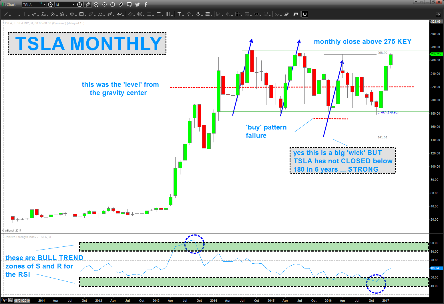
$TSLA – batteries appear charged UPDATE
Posted on February 11, 2017 Leave a Comment
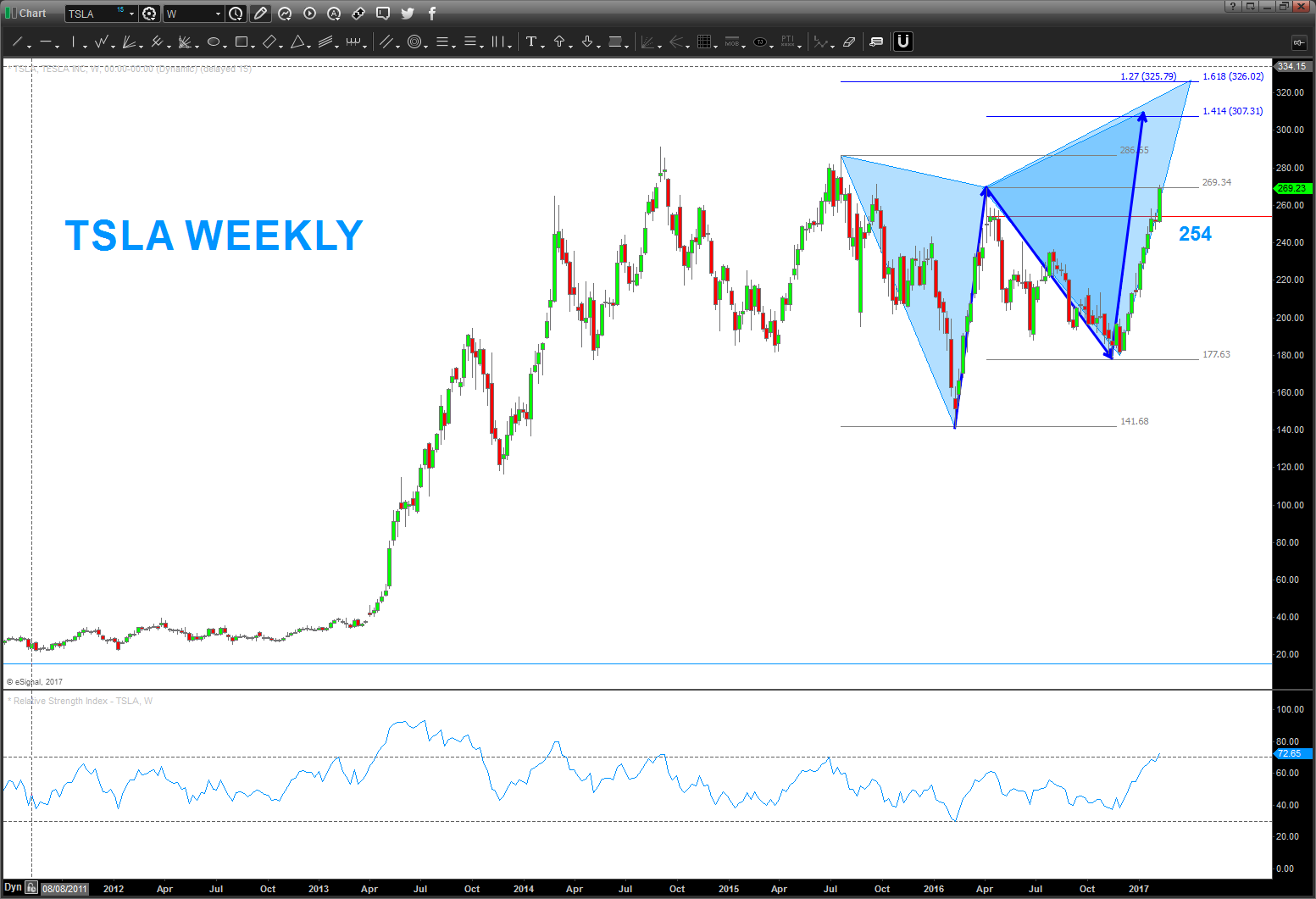
02/11/2017 – can’t believe it’s been since April 16 since I blogged about $TSLA. Tons going on in my life .. all good.
As you can see – the measured move (blue arrows below) stopped the market around 260 and it fell 80 bucks BUT the move out of the 180 area is STRONG and the BULL TREND RSI zones are telling us that this stock (car) has some juice.
Note, i’ts NEVER MONTHLY closed below, basically, 180. Say what you want about the stock and it’s fundamentals (I claim and rightly so DO NOT know a thing about them) BUT a weekly close 280 and/or a MONTHLY close above 275 tells me this puppy should target 307 and then 326 has two key ratio’s coming together. For the next couple months, would be watching those levels.
WEEKLY close below 250-254 would render the above WRONG.
Cheers and rock on, ok?
Bart
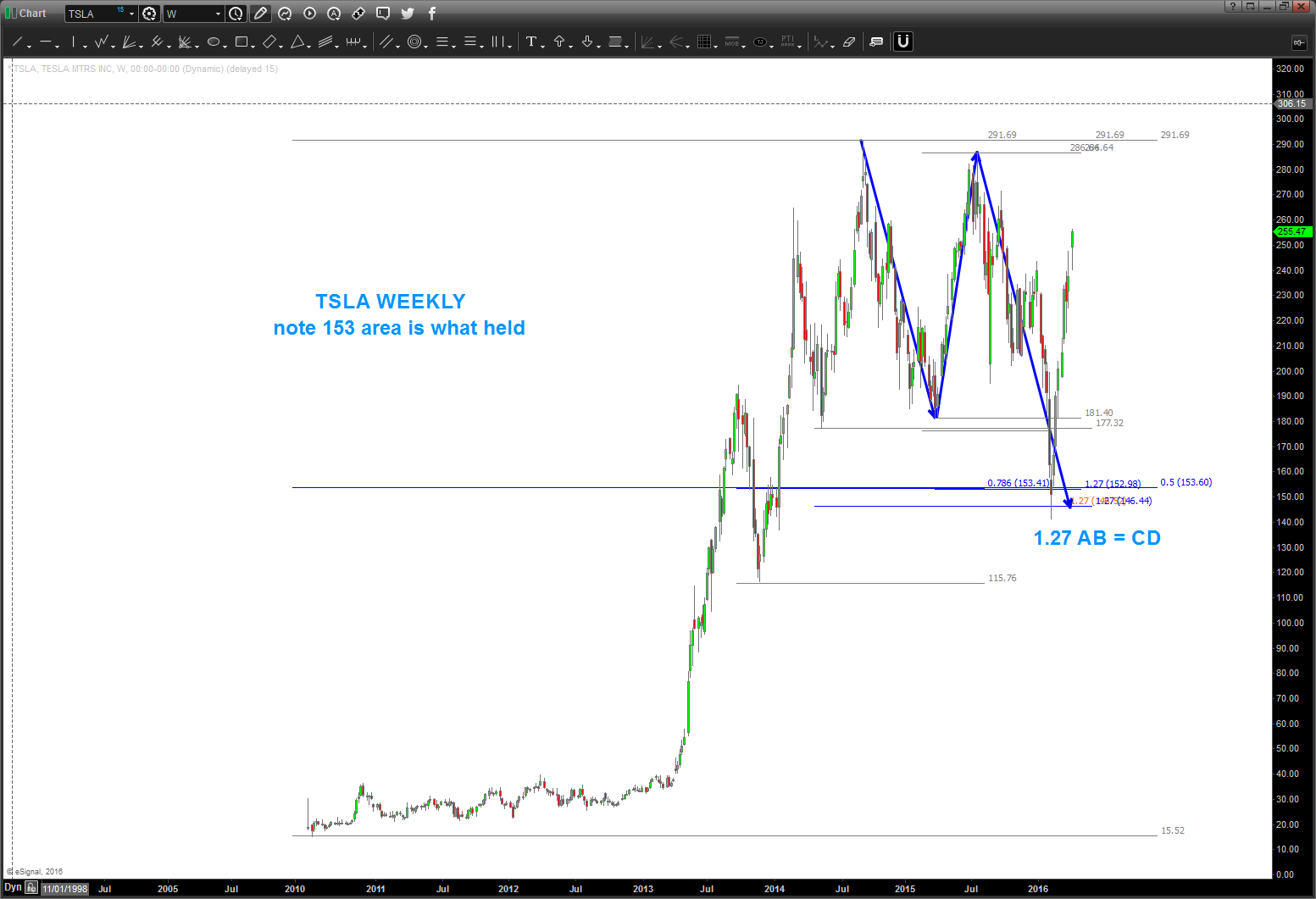
04/05/2016
As you can see the pattern in/around 173-179 got smoked. Folks, they don’t all work … but you also see I mentioned 153 would be the next stop.
so, patterns work and patterns fail. want to show you the NUMBERS that led to the next target (I hate the could have would have should have but just want to show) and also note the measured moves UP that TSLA has done. don’t be greedy, were at an important level right now.
Bart

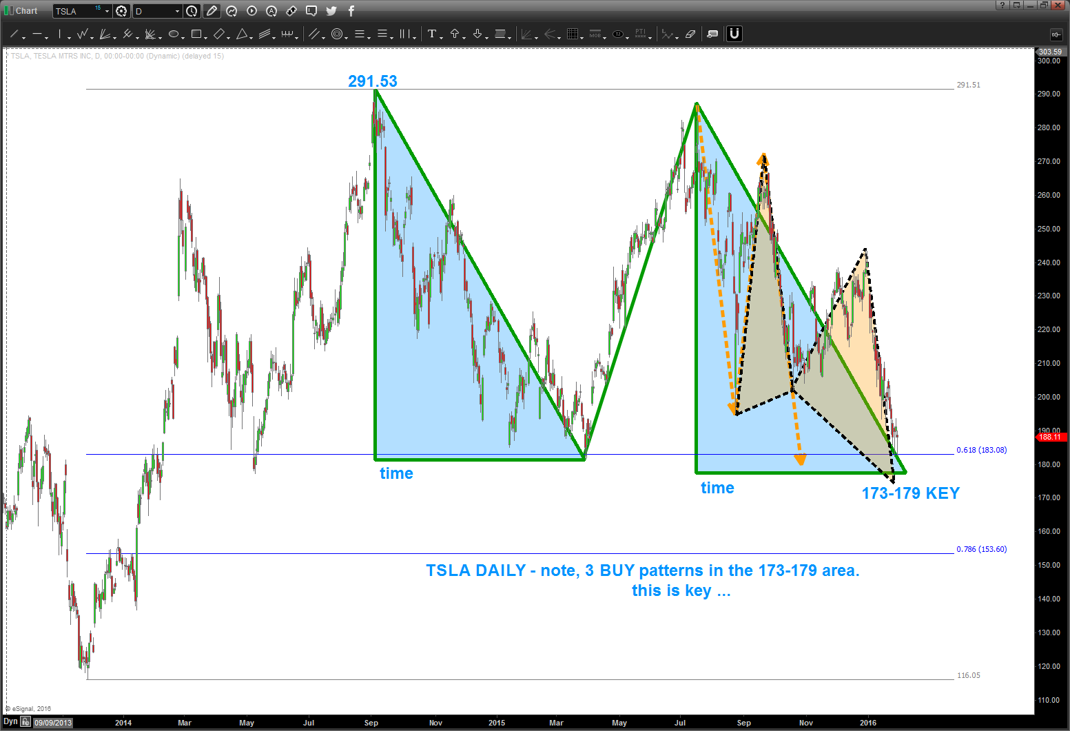
so from my fellow geek technician JC he always loves the “from failed breakdowns/ breakouts come strong moves” well here is a possible set up.
as a PATTERN guy what I have found is – totally technical – there is a reason for the market to stop at resistance or support.
in this case for TSLA you can see it’s “respecting” the .618 retracement from the last low … EVERYONE is watching this level and horizontal support.
and, if it breaks down, then “everyone” shorts and right below this breakdown level? 3 patterns coming in 173-179 ….
- pay attention to the “shaded blue triangles” as they represent equality in both PRICE and TIME. Appears 2/10 is the time frame for this level to be really equal in price and time. TBD …
- this type of pattern is a classic “FLAT” Elliott Wave correction … so, if TSLA is to go higher, believe this level needs to hold.
watch this level closely.
as a corollary, if we have a daily close below 173 then we have 153 and then, potentially, lower in the future.
let me know if you have any questions.
B
this is ‘kind of important’ … I think… and you might want to read to the bottom
Posted on February 10, 2017 Leave a Comment
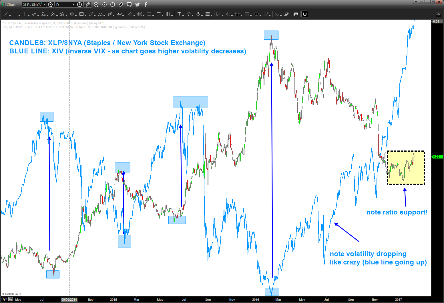
everyone is talking about low volatility .. trust me, I hear ya.
but man, do I love me some ratio’s …here’s the deal, put one security over another and guess what. If it’s going HIGHER then the numerator is stronger and if it’s going LOWER the denominator is stronger. BOOM …
so, a couple weeks ago I blogged about my ‘favorite’ ratio finding support .. the XLP/NYA. It’s a very simple observation … XLP is staples and it’s defensive. the ‘big boys’ shift their focus on staples in time of RISK OFF. yes, i said it .. i know the market will NEVER go down and its always straight up but … well, just take a look
- BLUE LINE is XIV which is an INVERSE of the VIX. Basically when this puppy goes up volatility goes DOWN and when it goes down volatility goes UP. NOTE – it’s a rocket ship right now, corresponding to very very low volatility. that’s the blue line
- the candles are my favorite ratio .. the XLP / $NYA. when the ratio goes UP the XLP is stronger and the thesis is this is defensive rotation by the big boys – aka Goldman Sachs (LOL) and the institutions.
- note, I put them on top of each other to show a pretty important correlation
- note the blue rectangles.
- those represent inflection points in the XIV and the ratio
- NOTE: when the XLP / $NYA bottoms, the XIV goes down (volatility increases) and when the XLP/$NYA tops, volatility – as measured by the XIV – goes down the tubes.
- note the blue rectangles.
So, it’s official:
- the market is NEVER going down as measured by money managers sentiment index the BULLISH SENTIMENT IS AT A 30 YEAR extreme.
- the XIV is basically parabolic w/ the ratio having bottomed …
a simple observation can be made – the XIV is about to decline which should to lead to a volatility increase. now to soon ….
also … well, the Nixon Inauguration of 1/20/1973 was about 2300 weeks ago .. current S&P price, take a peak. the market topped in/around that inauguration.
here’s what the XIV and the S&P look like together …
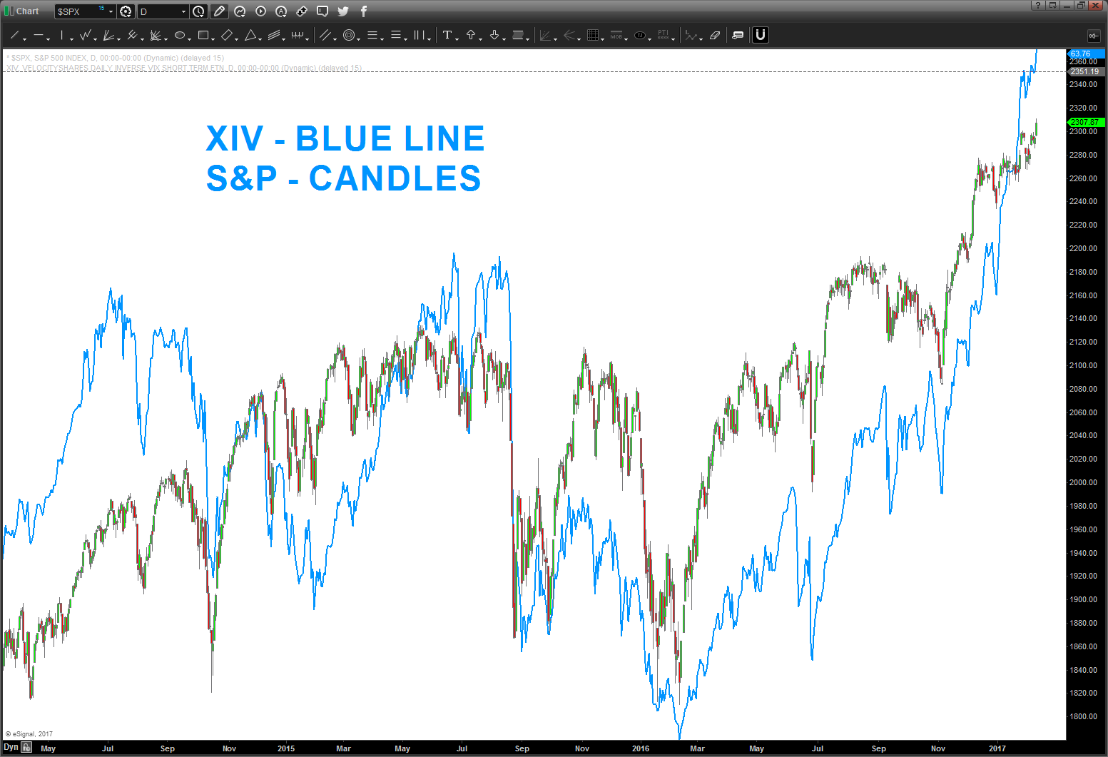
the kind of look the same, don’t they ….?
just typing an observation – the market will never go down.
make it real – B
Crude Oil Approaching BIG low …
Posted on February 2, 2017 Leave a Comment
2/2/2017 – can’t believe it’s been over a year since I posted on crude – but I guess it has. as you can see below, the ‘math’ tagged the low in crude.
where do we go from here? well, the ‘easy count’ and that’s what I’m into says – perhaps – a little higher and then down to take out 26 ?
no way, right? You Never Know.
Bart
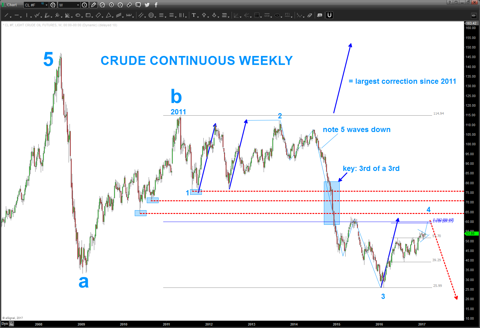
1/11/2016 update.
note the percentage corrections … certainly looks like 30 and 25 are possibility. Especially since the OSX/NYA ratio hasn’t bottomed along w/ the Loonie but i do believe we are getting ready for a big bounce.
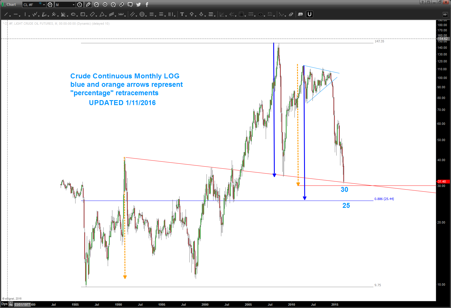
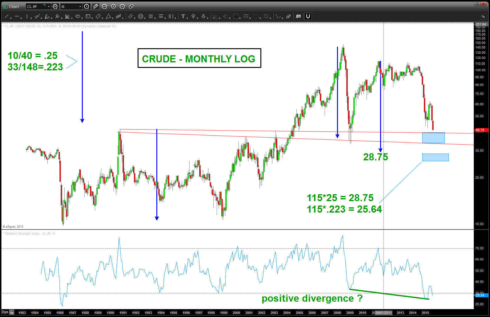
Crude Continuous Monthly Log
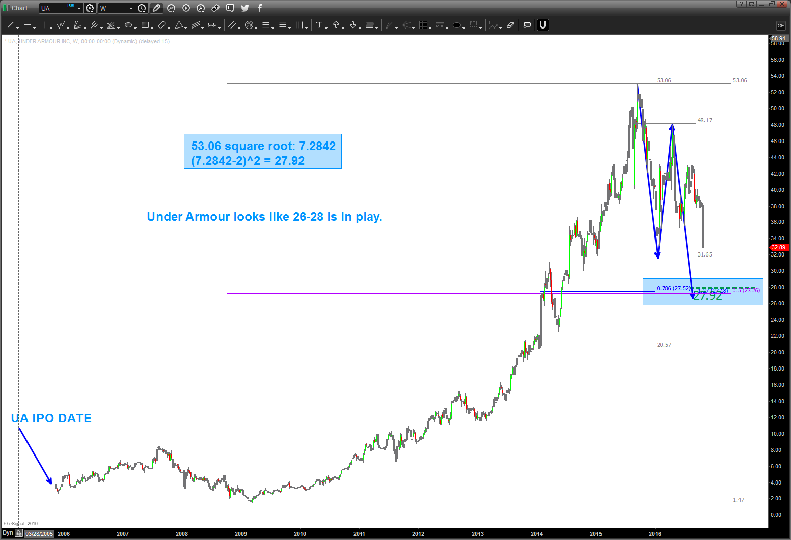
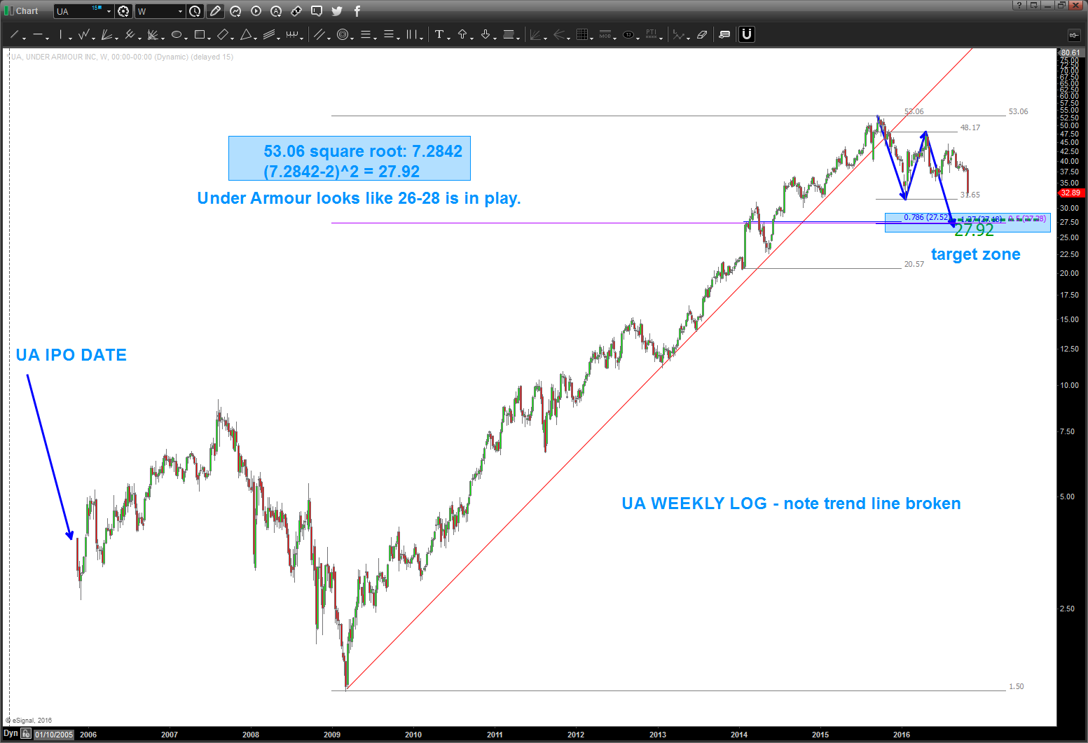
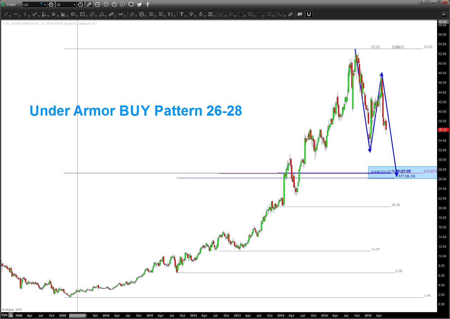
Under Armour ($UA) – updated FAILED PATTERN
Posted on February 2, 2017 2 Comments
2/2/2017 – updated over @seeitmarket
12/22/2016 – important support broke, so looks like the 26-28 zone/area is in play. again, all probability. personally, like UA stuff but have no idea what the fundamentals of their marketspace and strategy are. just patterns peeps. here we go …
also, showed some ‘art’ at how/where to draw retracement grids that are sometimes overlooked … folks, shit pile of numbers coming together. sorry if offended anyone but that just seemed like the correct word to use.
rock on, ok?
Bart
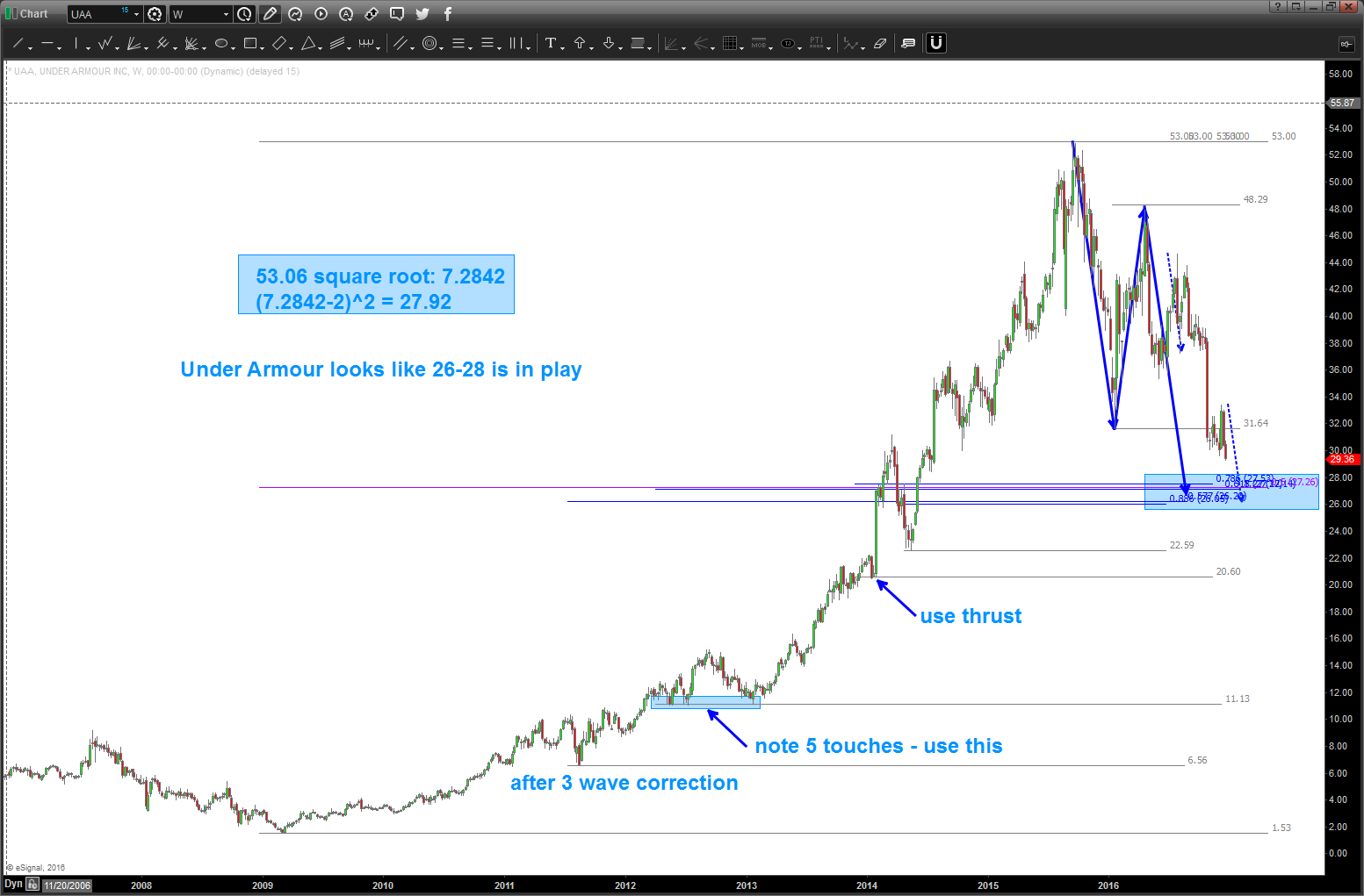
10/25/2016 – I was asked to take a look at Under Armour back in June. I saw this pattern – again – had ZERO idea if it would get down there. As a pattern recognition dude, that’s the pattern .. .as of today, appears it’s going to make that level. Some thoughts …
- this is the first ‘true’ BUY pattern since it’s IPO and after a spectacular and somewhat parabolic run.
- caution w/ the size of the candles coming down – that denotes thrust and patterns fail when huge thrusts hits the levels
- note the square root target hits – basically – right at the BUY pattern. That, my friends, is good.
- remember, the square root target is using the Gann Square of 9. One trip around the wheel is equal to the square root of the base number (in this case the high of 53.06) -2 and then resquared. That’s how it works …
- the second chart is a long term log look at UA. NOTE – it broke it’s fabulous run .. so, this selling pressure is expected. that’s what happens when long term log trend lines are broken.
- this pattern fails – IMHO – with a daily close below 25.
Housing … just keep your head in the sand OR are the clouds forming? UPDATE to the UPDATE
Posted on January 30, 2017 Leave a Comment
1/30/2017 – TON of standing inventory in the 900,000 range for .00004 acres and <2000 sq ft w/ rates rising. (I know that’s fundamental ‘stuff’ but it helps cast a picture)
a ‘basic’ H+S on the Home-builders sure seems to be building … only ‘TIME’ will tell. note the ‘time’ symmetry between the L and R shoulders. Kind of cool.
be well, do good.
Bart
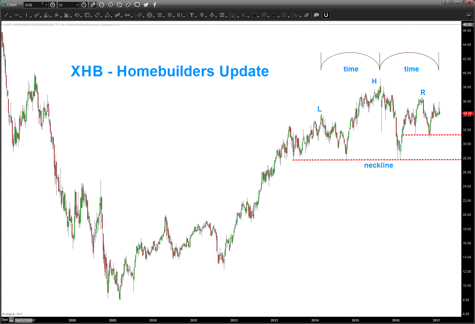
11/14/2016 – since the Election, the XHB ETF has taken off like a rocket ship. You can see below that it hit the .618 retracement from the Spring low of 16′. Upper targets are being shown in around 34-35.
were still working w/ the thesis that the 39 level was the completion of a major sell signal for the homebuilders. This straight up action of late is something to watch closely for this thesis to hold.
of note, a friend of mine sent me this headline:
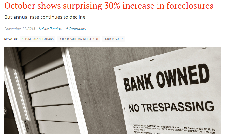
the rise in foreclosures last month was the highest since the big crash. Something to note .. however, the annual rate is still declining. Is this a divergence forming and a potential inflection point? I don’t know … but price/time will tell us.
Bonds are getting smoked of late causing rates to rise …
For those who have followed me you know that I’m usually ‘first to the party’ and ‘see’ things months if not a year in advance. that’s what patterns tell you … i’m not trying to put any spin on this folks. We are at ZIRP, I have houses all over the place going into standing inventory status, rates are rising and we just had a ‘big’ increase in foreclosures last month. Remember – almost a year before anyone paid attention to the Chinese Yuan I saw the BIG JUMP and said … this is something to notice. (https://bartscharts.com/2014/12/06/most-important-chart-to-end-2014/)
So, that’s all I’m doing again ….
Also, take notice of the big time SELL PATTERN FAILURE on the Banking Index. Multi-level chess game going on right now … trust the patterns and they will all line up. That I know …
Do well, be good and rock on, always.
Bart
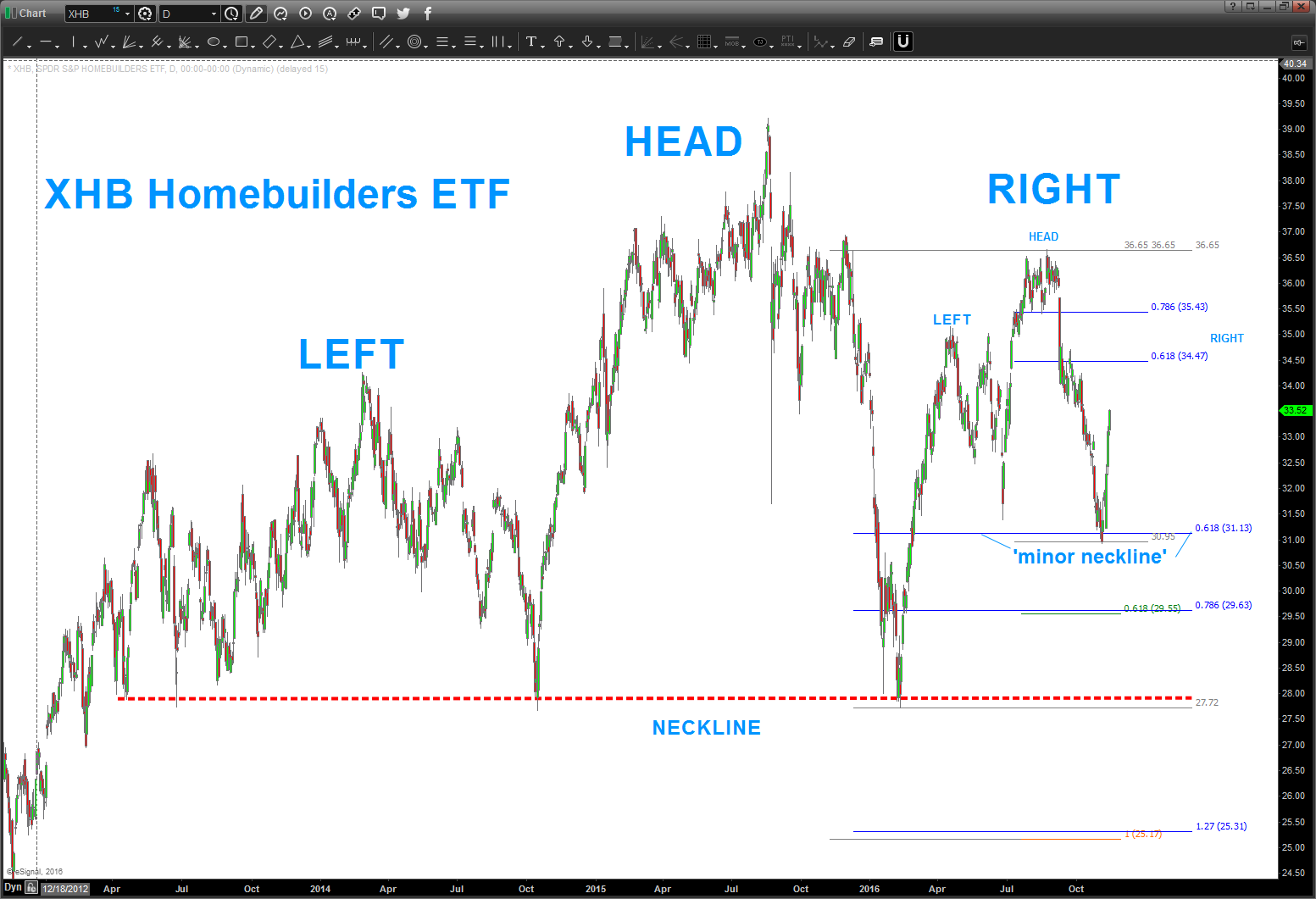

I sold my house in VA and moved out to SoCal to rent .. did it for a number of reasons. The NUMBER 1 reason was to learn how to Stand Up Paddle-board Surf and enjoy the weather. YES, I understand it’s financial suicide out here .. the taxes are crazy, the cost of living is crazy but the surf is good man …
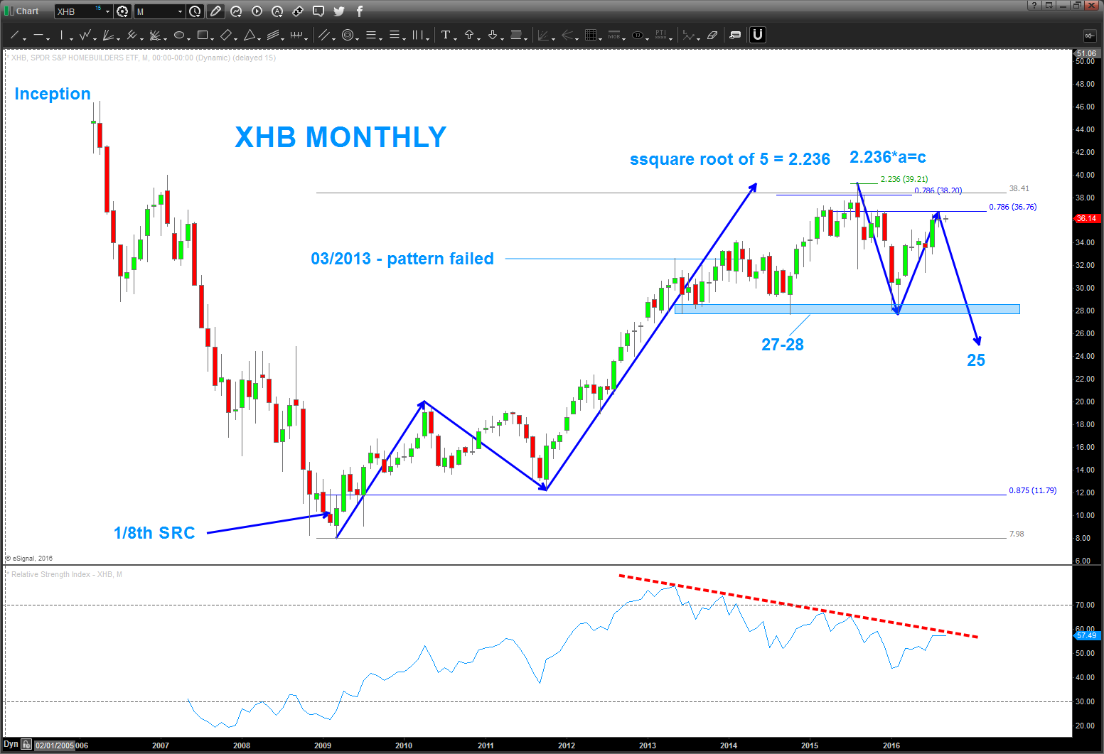
I was SO HAPPY to unload the house … why? Well, I think we are on the verge of another big old smack down in housing. Of note, my post from March 2013 (yes, 3+ years ago that the home builders had topped in/around 32 did not come to fruition. In essence the pattern failed .. so, it went up to the .786 and also completed the 1/8th signal reversal candle. Now, we’ve rallied right back up to the .786 level and are at the demarcation point.
Study:
- this ETF doesn’t want to go below 27. Big support …
- also, note the AB-CD projection down to 25.40 – if we crack from here expect support there and if BULLISH this will hold and bring it to new highs. If it fails … watch out below.
- THOSE are the levels to watch …
- sure looks like a MONTHLY H&S pattern for this ETF … doesn’t it?
To finish the story about San Diego … I was driving around the other day and noticed TONS of standing inventory …plus the houses were selling for 850K to 1.0 + MM. Folks, that dog don’t hunt man …
Also, the PATTERNS suggest a MAJOR top in bonds which means higher rates … so, it’s been 3+ years since my last post on home builders. It’s moved, a little, perhaps it will move more, but man this sure looks like a BIG top is coming in housing ….

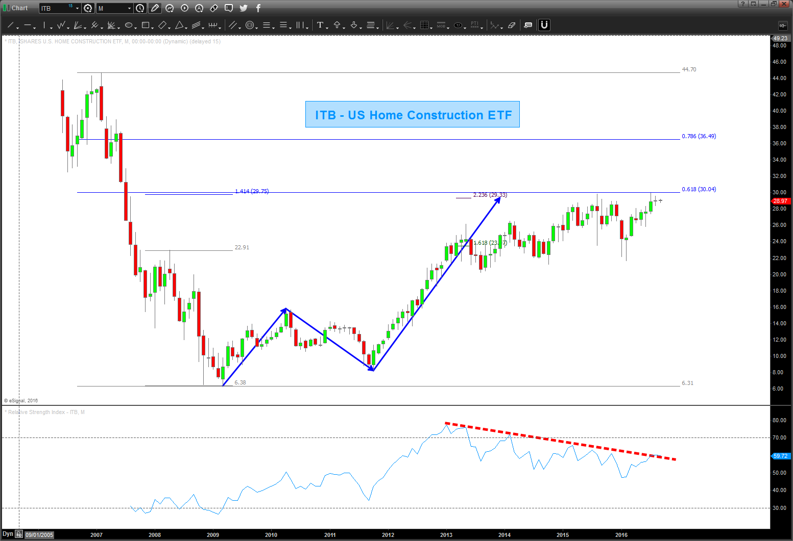
Here’s the Home Construction and Home Builders ETF (ITB and EHF)
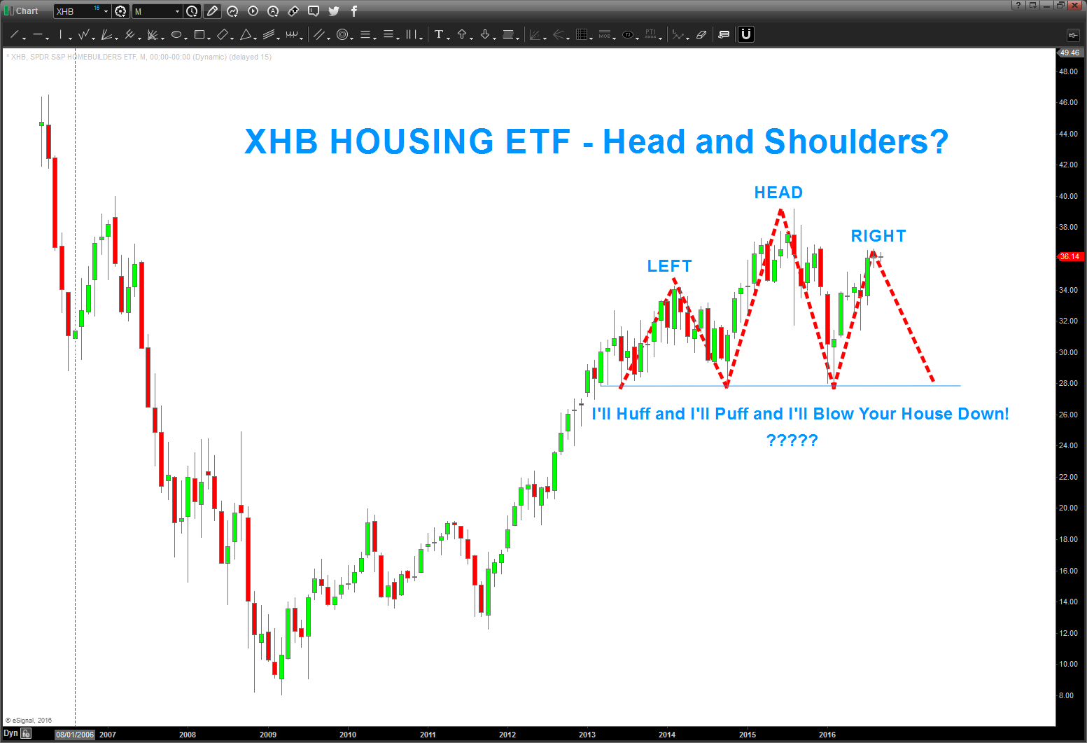
Again, folks, it’s just PATTERNS. Sometimes they work, sometimes they don’t … but at least we have some guides to support what could (could being the operative word) a BIG OLD THUMP in housing …
Bart
