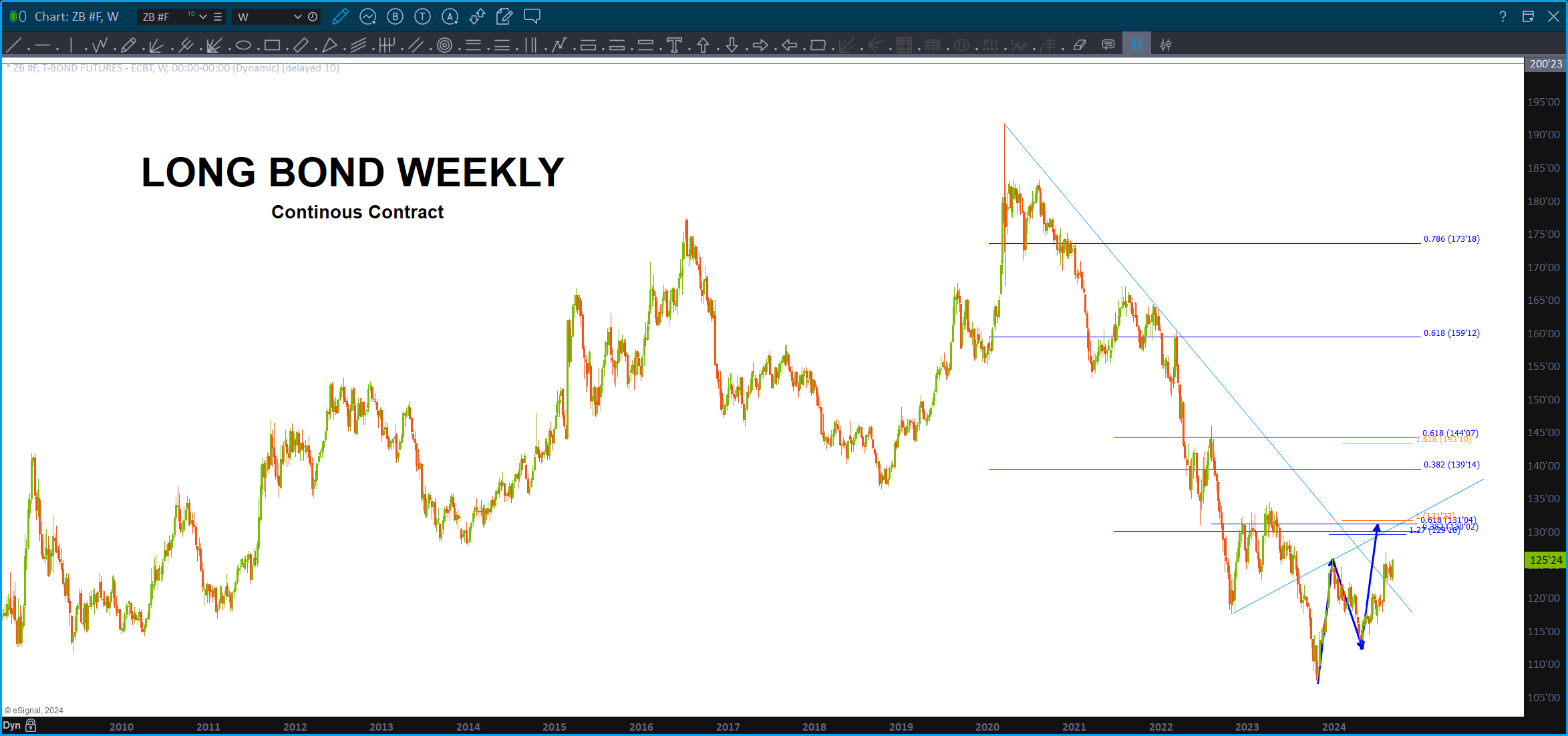
Bond Complex – September 5, 2024
Posted on September 5, 2024 Leave a Comment

Well, I fully admit my mistakes on this blog. Yes, went long around 14 on TBT and now, wondering if “this was just a correction and we go back to ZIRP. ” Sure looks like TBT is about to fall off the proverbial cliff and w/ that we’ll get a rate cut and then bonds will go higher and blah blah. Good thing our interest payment on our debt isn’t crushing still ….hmmm, about that! 🙂
anyhoo … my goal has been to get into a position at what I ‘think’ (that might be the problem) and ride the entire WAVE. As you may or may not know I am a surfer and enjoy being on the water riding, what I call, echoes of the primordial big bang thru the medium of water and a surfboard. Wow … folks, you see, the water isn’t moving … it’s the PULSE of the ENERGY flowing thru the water.
so, we are close to judgement time and it’s going to close out on my head (been there done that) or have I picked the right line (you literally maneuver the surfboard to match a line that will encompass the FORM, PROPORTION and BALANCE (sound like Elliott Wave Theory?) of that wave so you can keep making sections and ride the wave up and down and up and down. It’s zen.
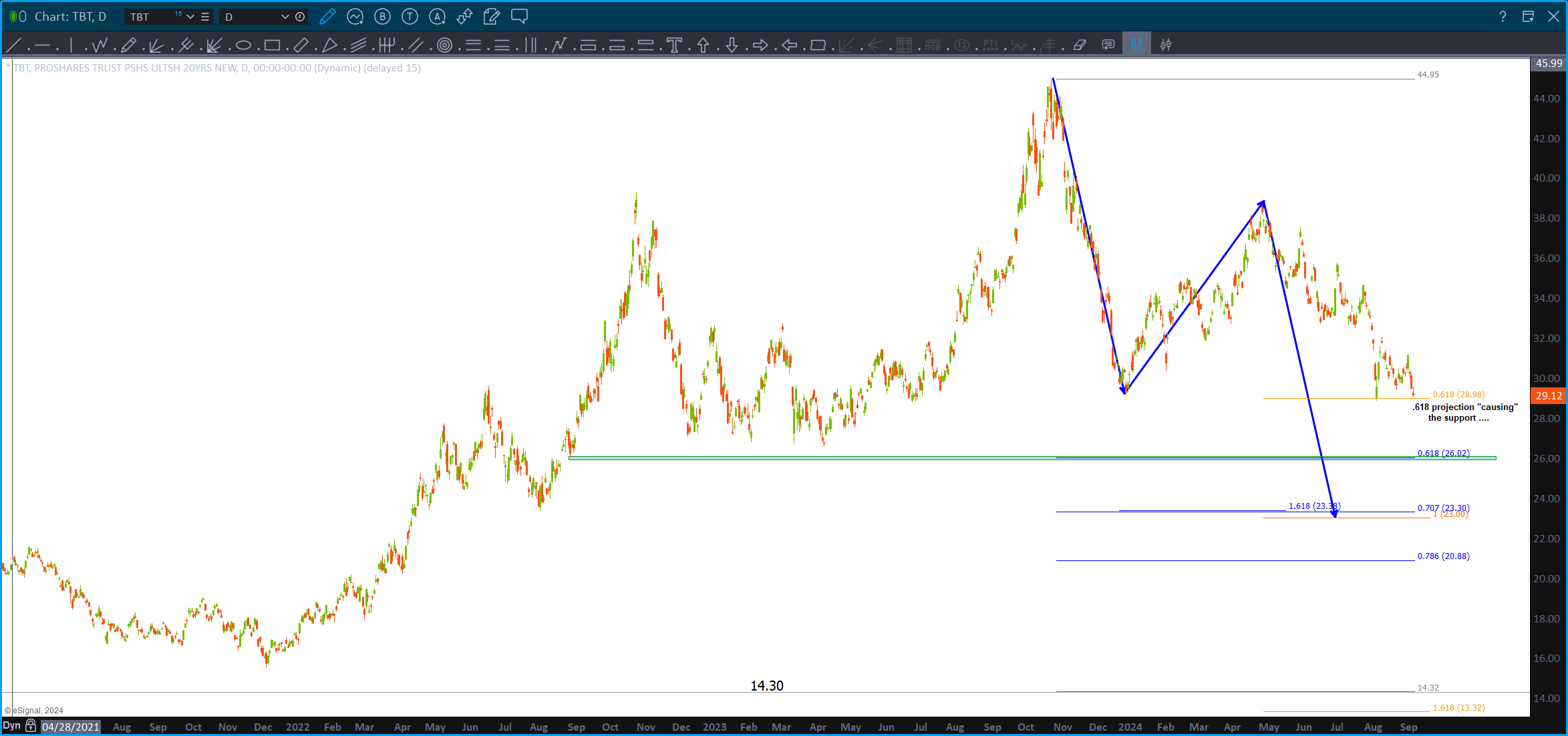
we can see the H+S neck line we are about to crack thru (or we should see them) and take note of the .618 price projection is precisely causing the support (hmmm – note, don’t forget, always know where the .618 price projection is) and then we go lower into a small unfilled gap on the .618 but finish a near perfect BUY pattern @23.30. Little lower is the .786 and then, well, perhaps this was an a-b-c correction and another low to be made.
Maybe I’ll just put my stop a little below the .786.
I’m no fundamentalist – fully admit it.
It just looks like way way back at the top I said this could be the top for a few decades as it sure looked like 5 waves UP from the 1982 low on bonds. So … one of these levels will hold – and start back up – which means rate increases over time.
Who knows …
now, objectively speaking, if we look at the 10 year interest rate, it really hasn’t budged that much has it? and, if we use Mr. Measured Move we can see that it does have some higher targets.
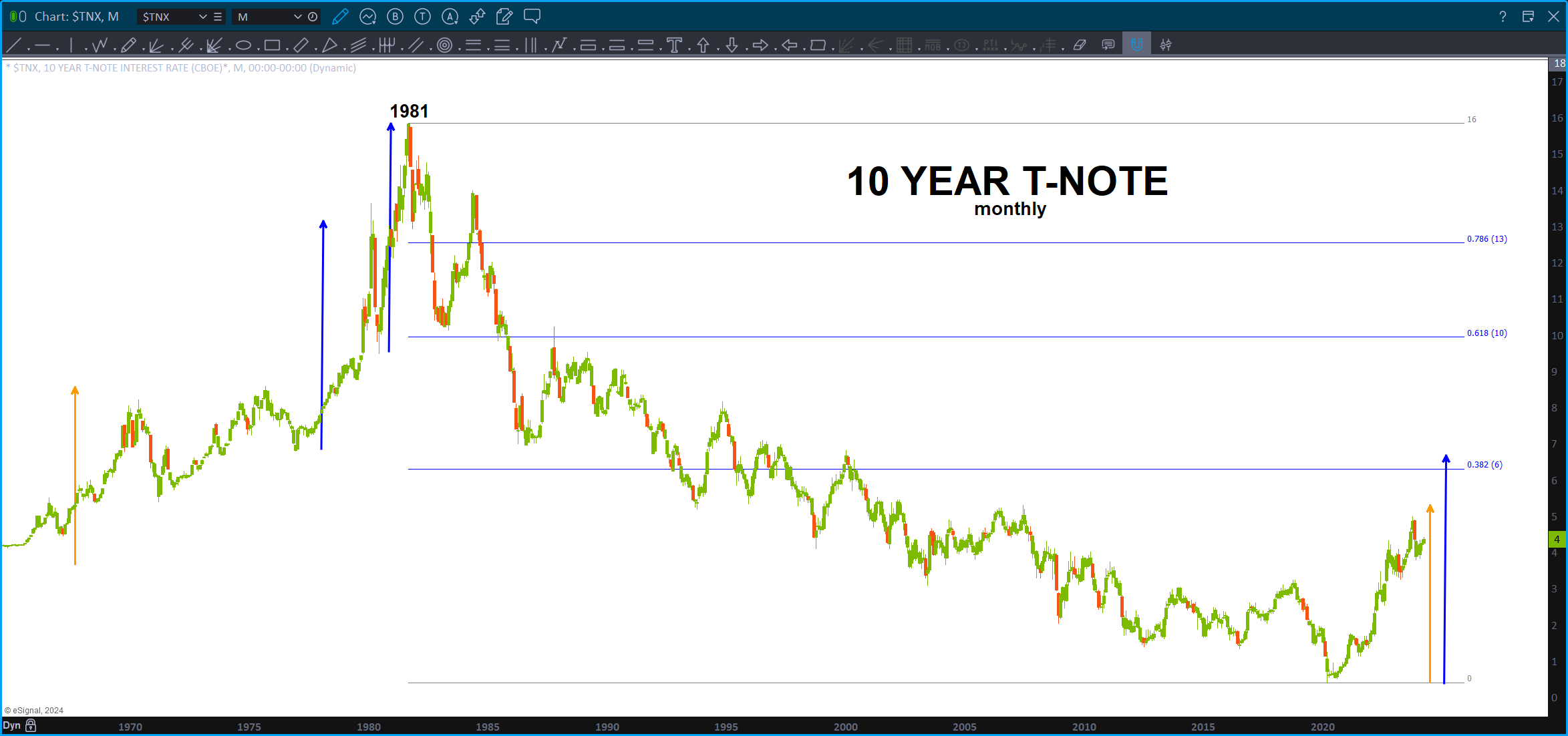
Here’s a look at interest rates
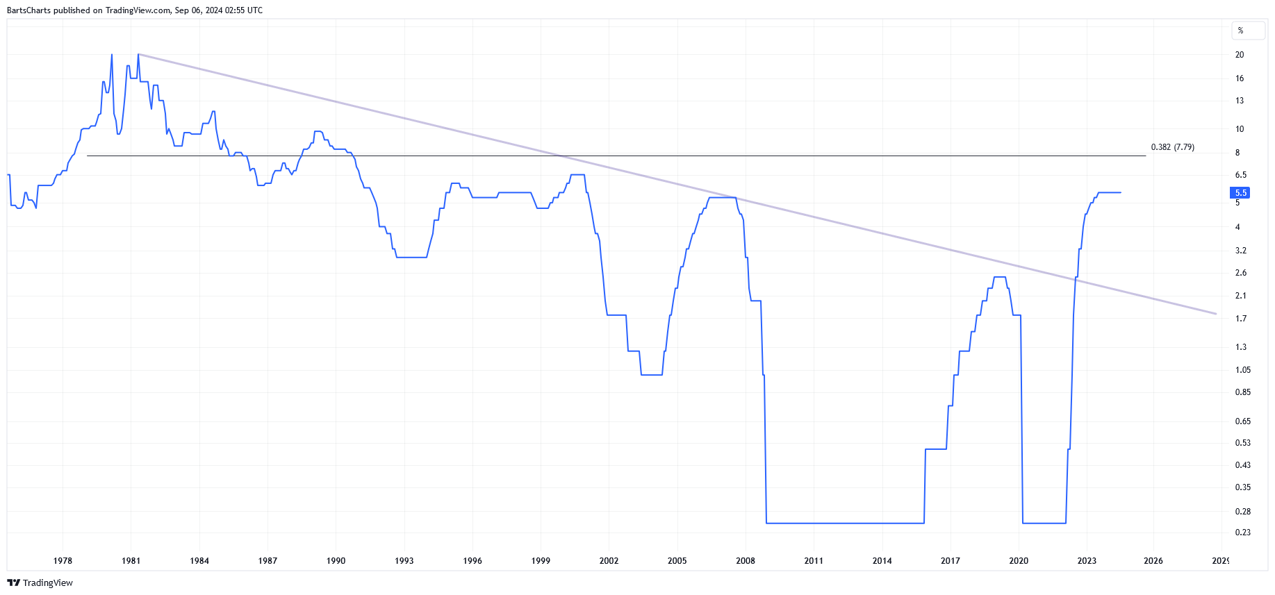
So, either way we look at it, we are coming to a very important inflection point according to the patterns.
Which way will they go?
B
BITCOIN and MSTR – Sept 4, 2024
Posted on September 4, 2024 4 Comments

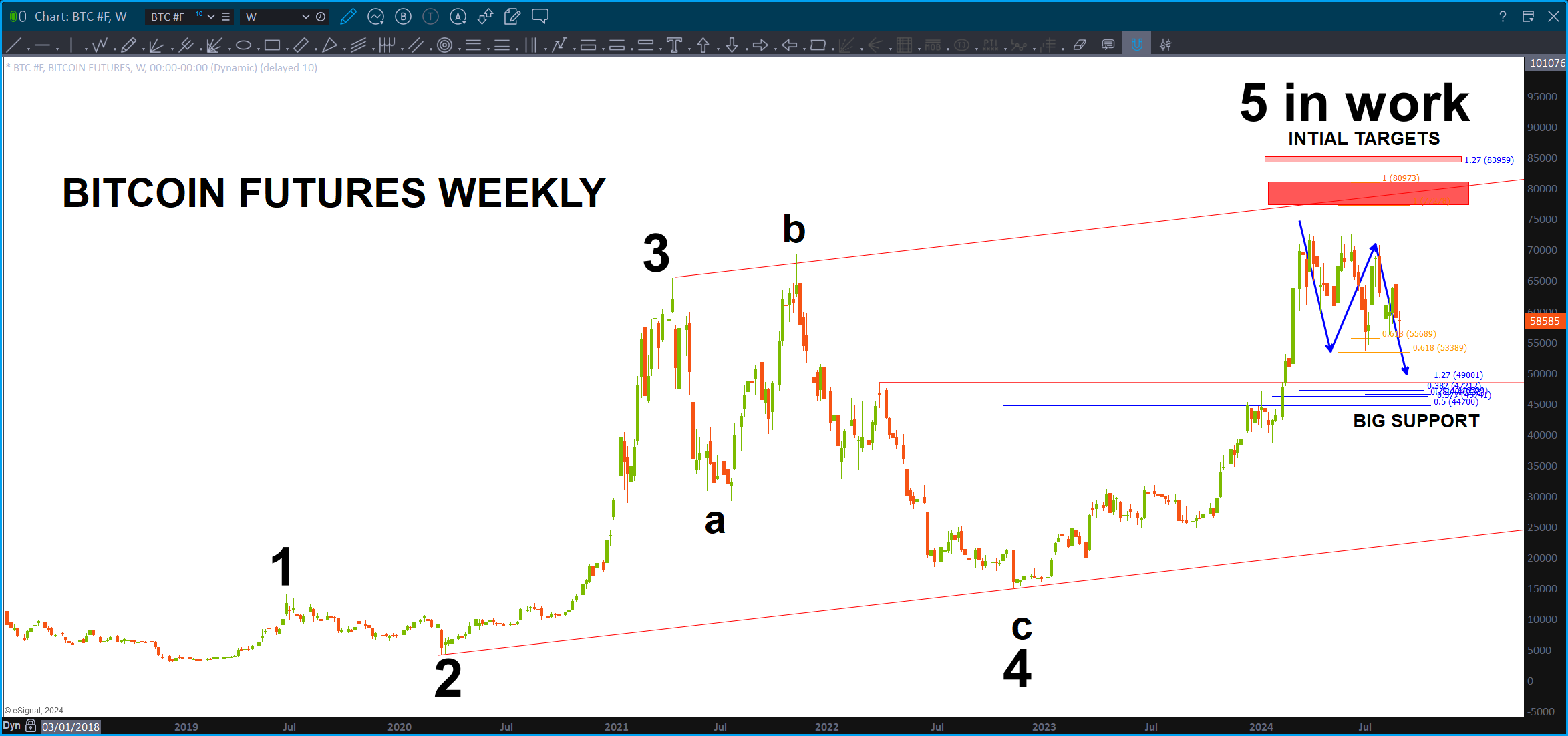
Bitcoin and MSTR (Microstrategy) shake and jive well together.
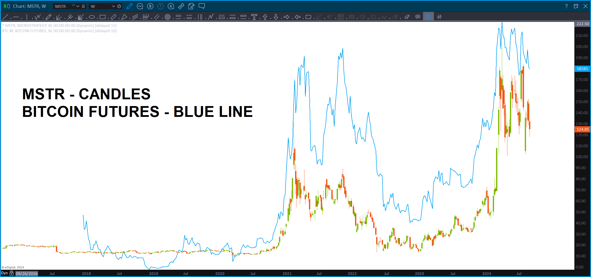
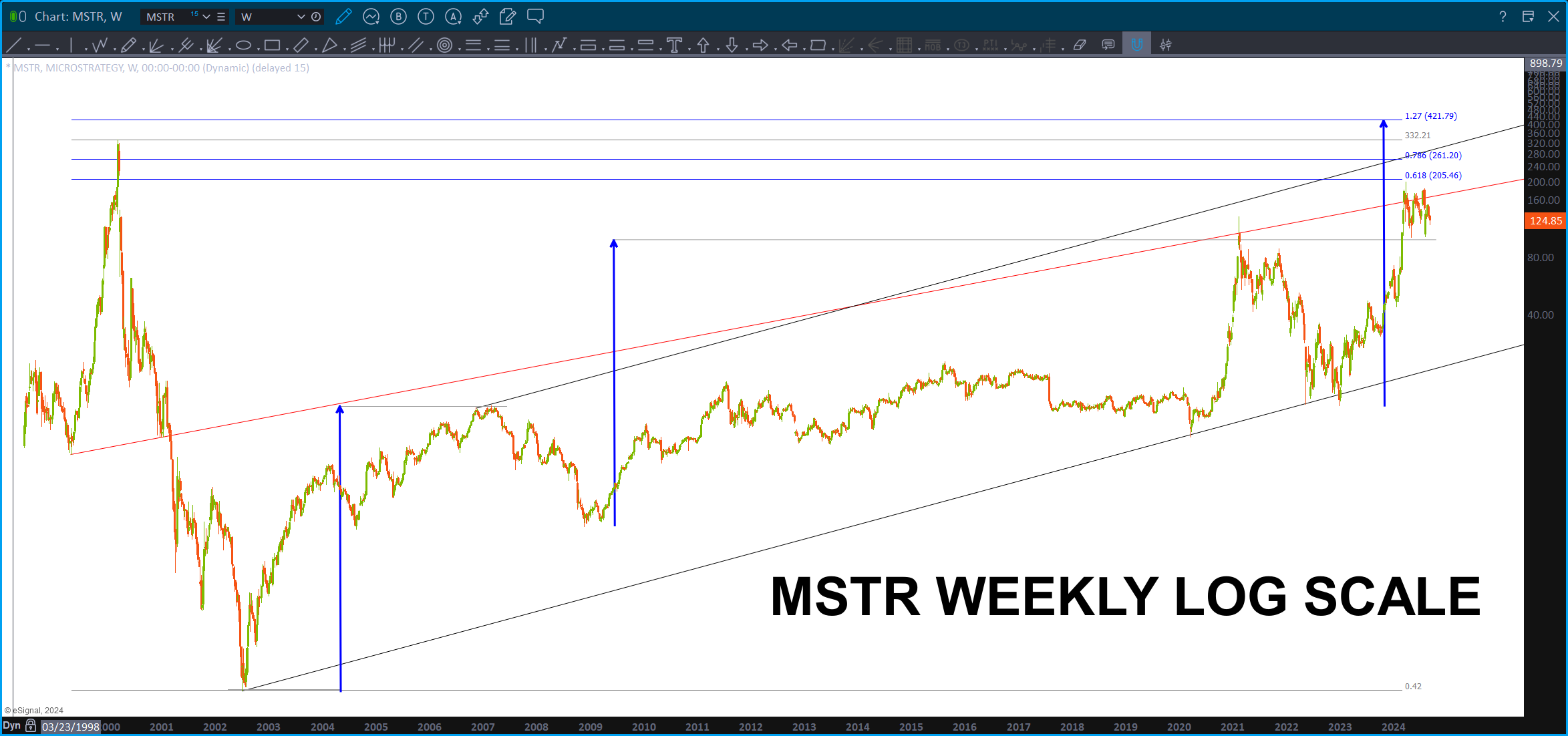
If we look at the MSTR chart we have a couple things going on:
- Square Out – WD Gann said you could square out a high, a low or a range. In this case, we took the range of the move from the high to low and converted that to calendar days. That gives us a DATE of 9/30/2024. The ‘perfect’ scenario would be for PRICE to be at the BUY PATTERN level shown on 9/30. We shall see …
- Take a look at the RED MEASURED MOVE – it lands right on top of the projection and a .618 retracement. We like that ..
- The second chart is some more work looking for the key levels – shown in Green for MSTR.
- Last, took LOG SCALE measured moves and, in doing that, shows a nice target appearing higher on MSTR.
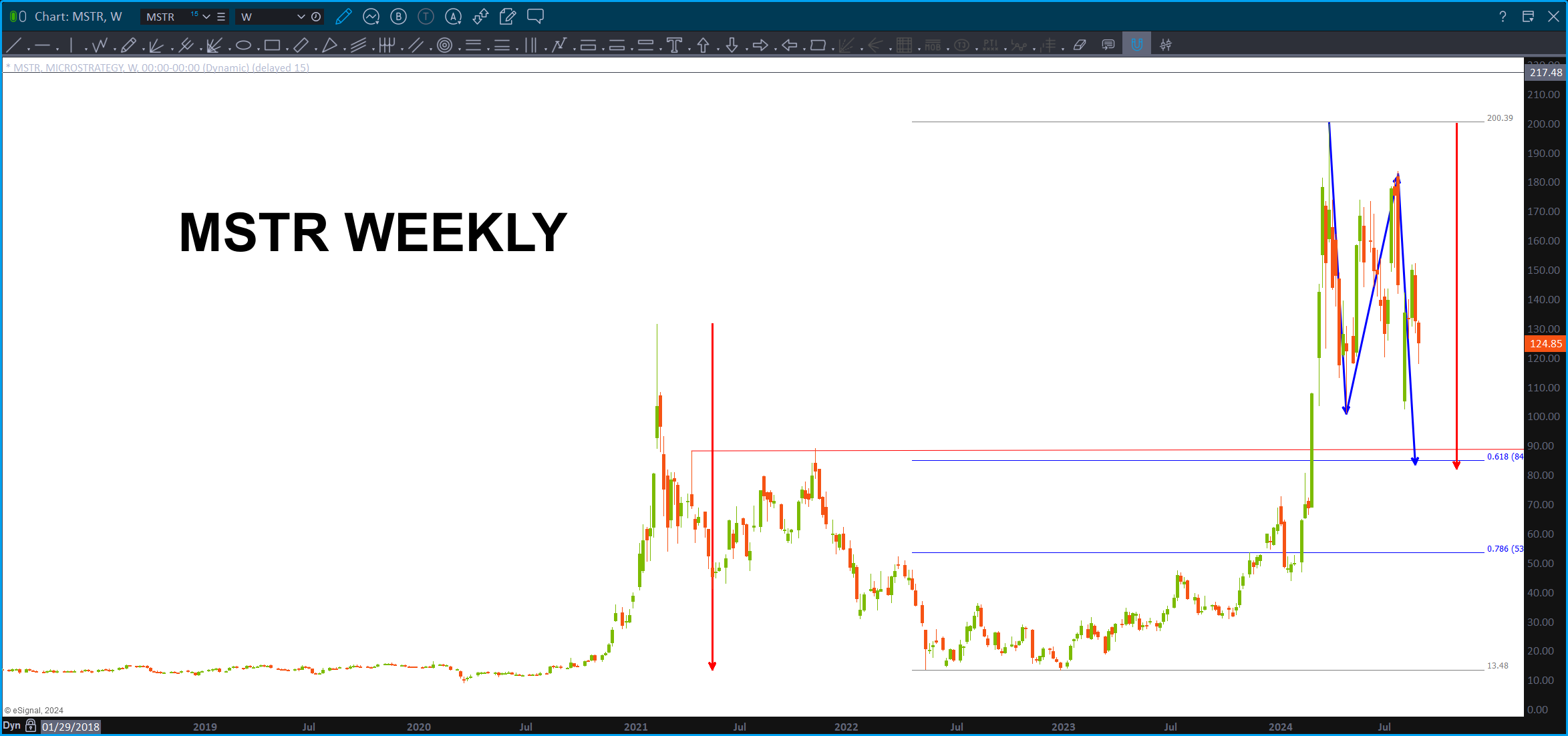
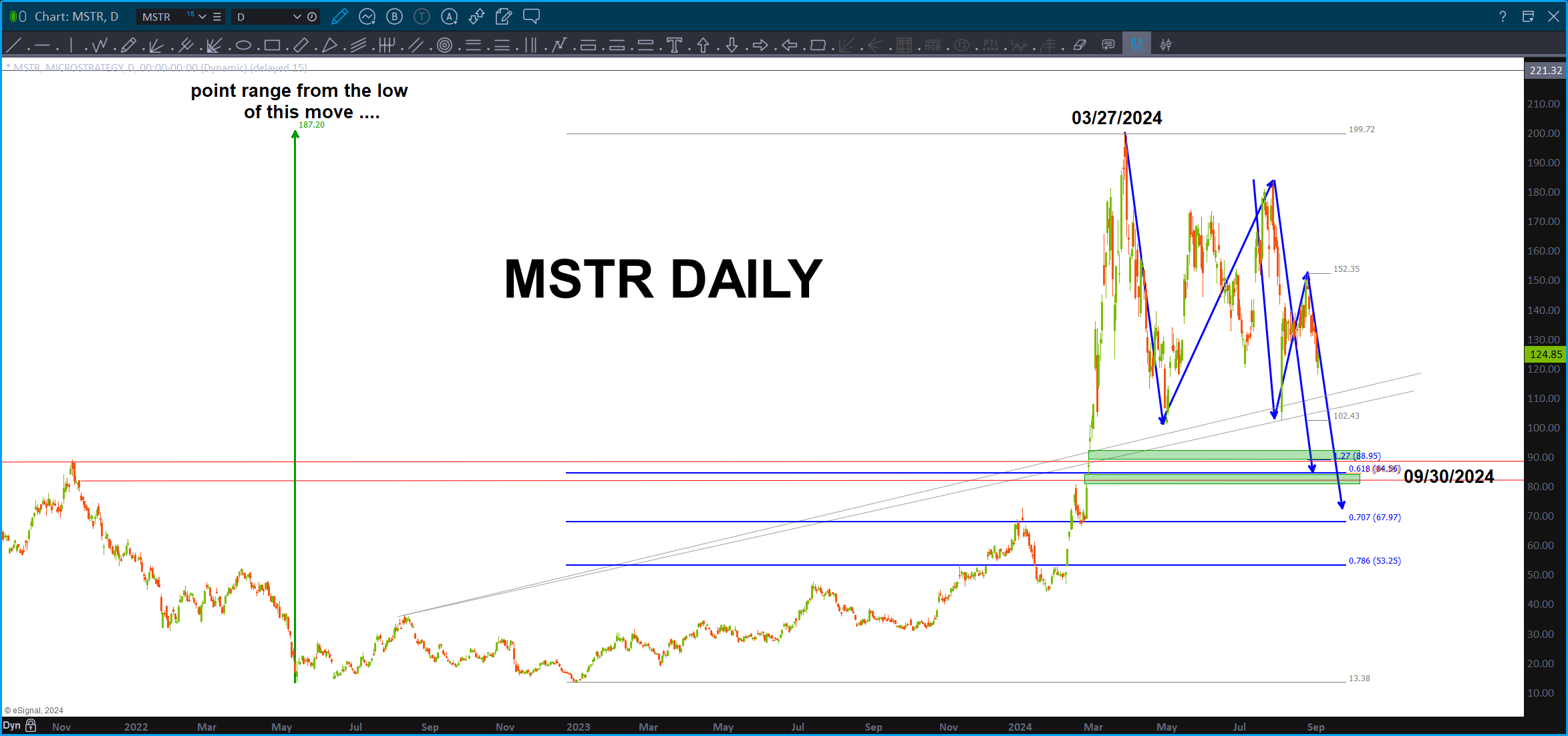
- Certainly looks like a ‘valid’ 5 wave count so I do feel confident in saying – be cautious – as this 5th wave could have ended but certainly looks like it wants to make another run higher …
- IF this PATTERN fails on MSTR then would expect the support to give away on Bitcoin futures. If it holds, then we “should” be off to new highs into the target areas shown for Bitcoin.
The Markets – September 2, 2024
Posted on September 2, 2024 Leave a Comment

This has been some rebound and move higher – across the board.
We are coming into a VERY key week from a cycles perspective and that means we could start down around mid-week or we explode higher. I was bearish going into the highs I blogged about in mid-July w/ the YEN hitting major targets and the DOW JONES hitting the measured move targets. There was a LOT of major long term targets that were hit and the market reacted downward, pretty strongly. But, that has all dissipated.
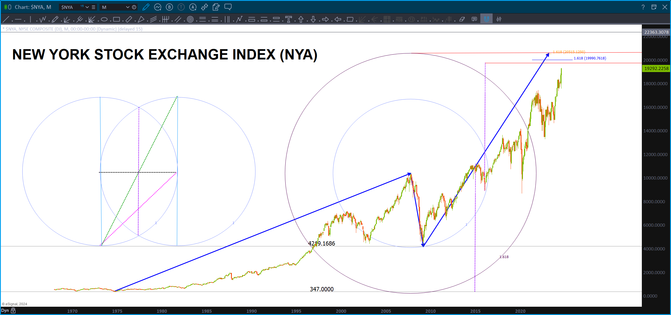
On the NYA we have a LONG TERM 1.618 projection target about 6% higher. There is also a Geometrically Derived (center of the Vesica Pisces) target a little higher. This entire zone “should” be resistance.
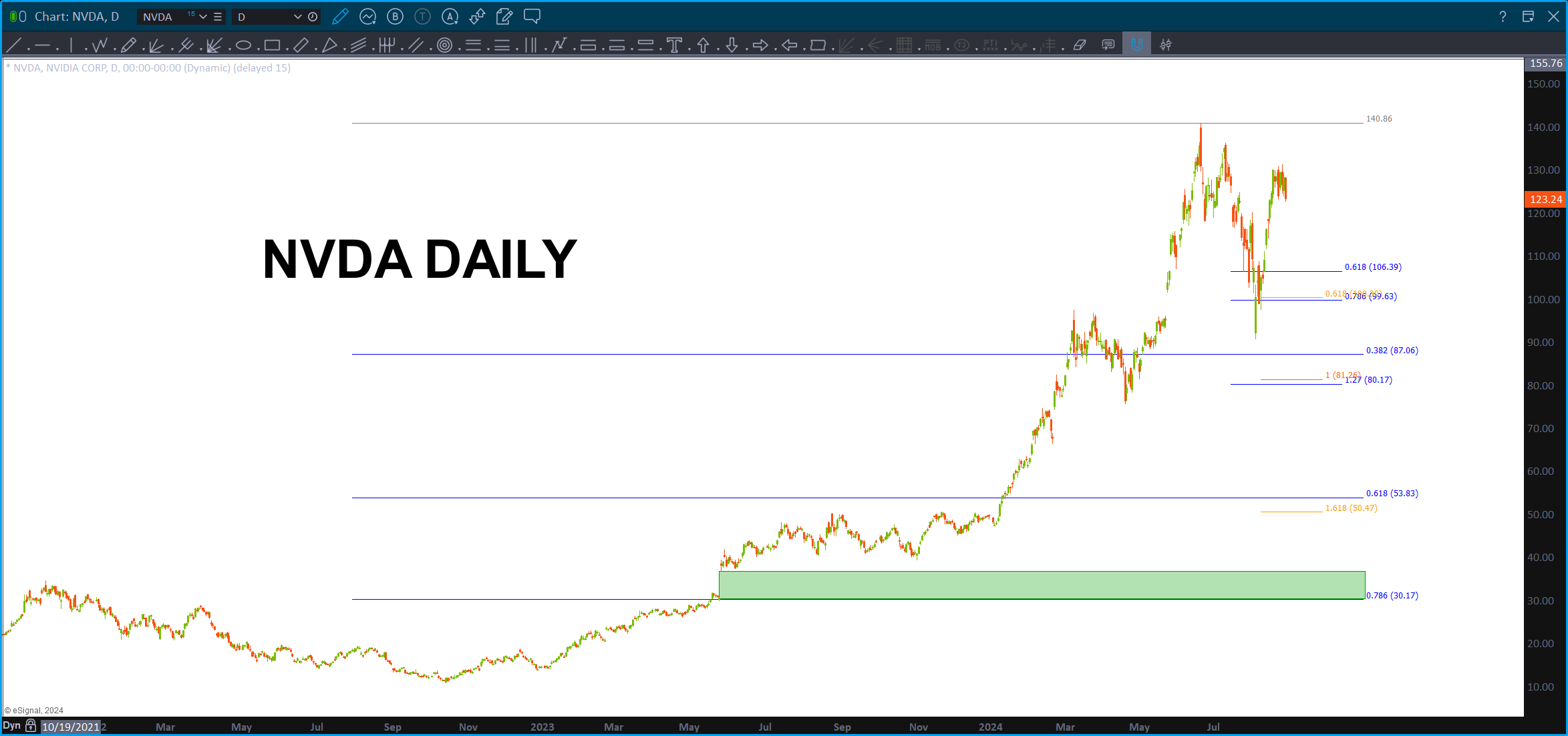
If NVDA blows thru thru the .786, then another target looms a little higher.

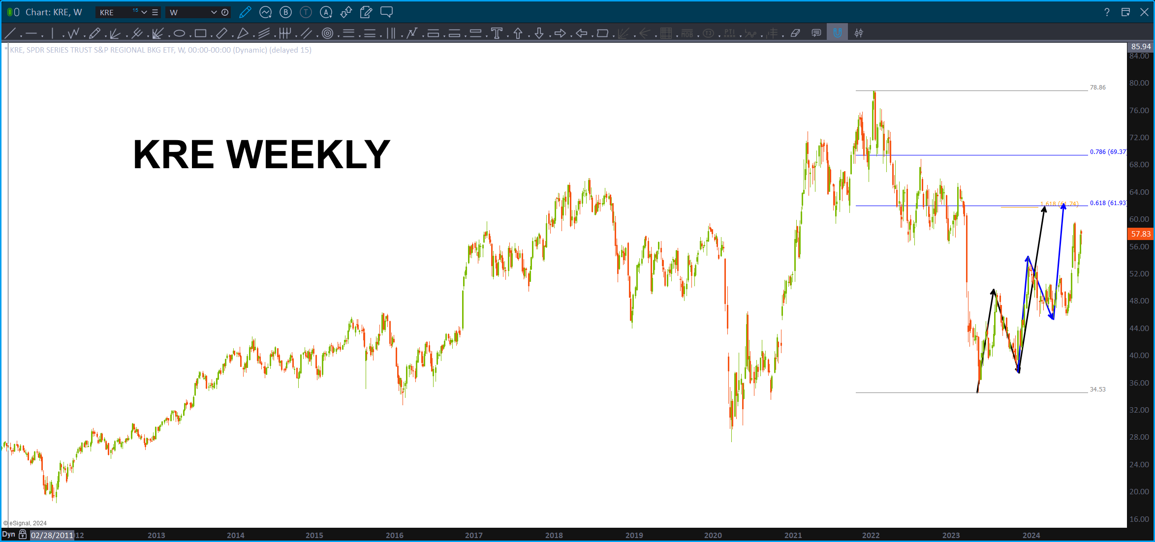
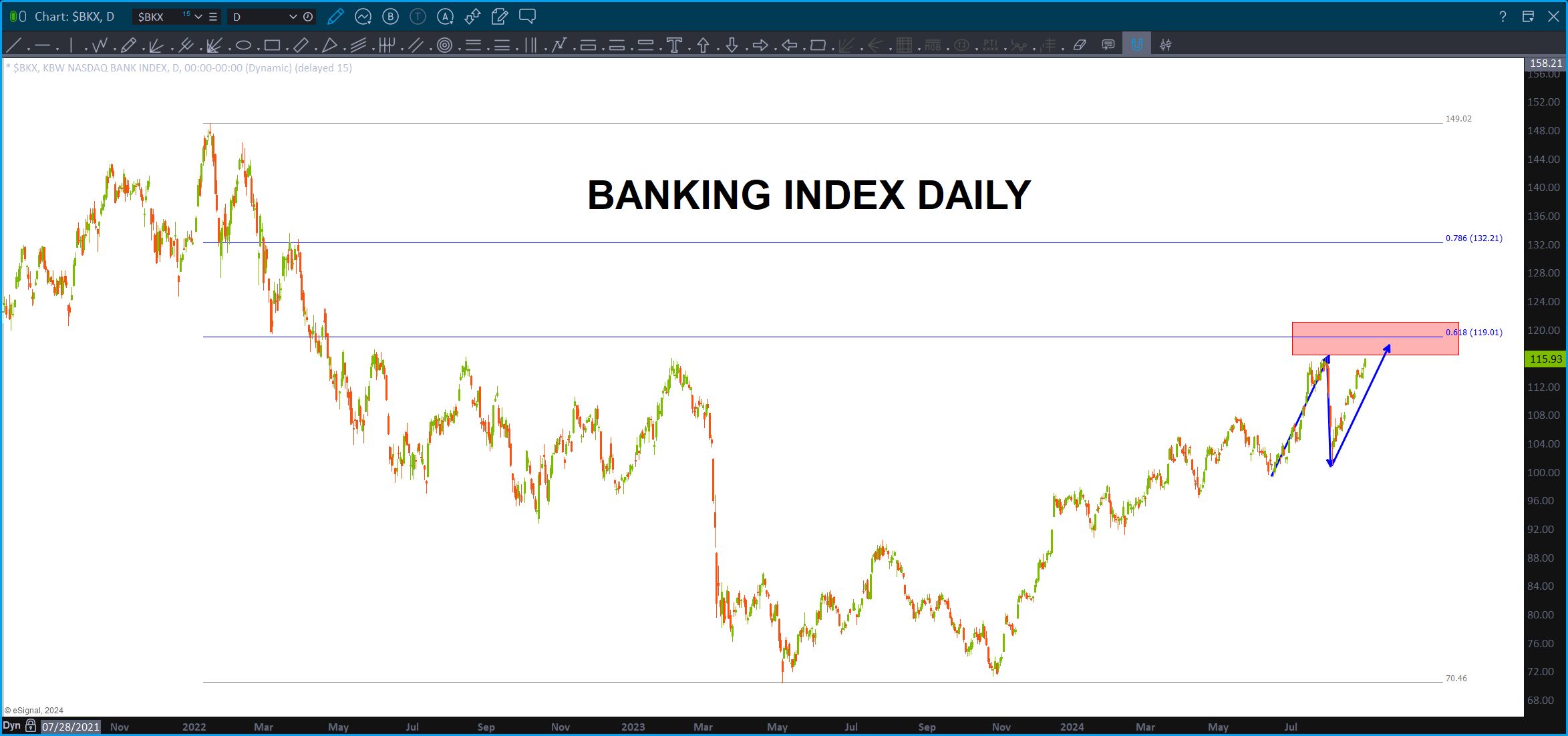
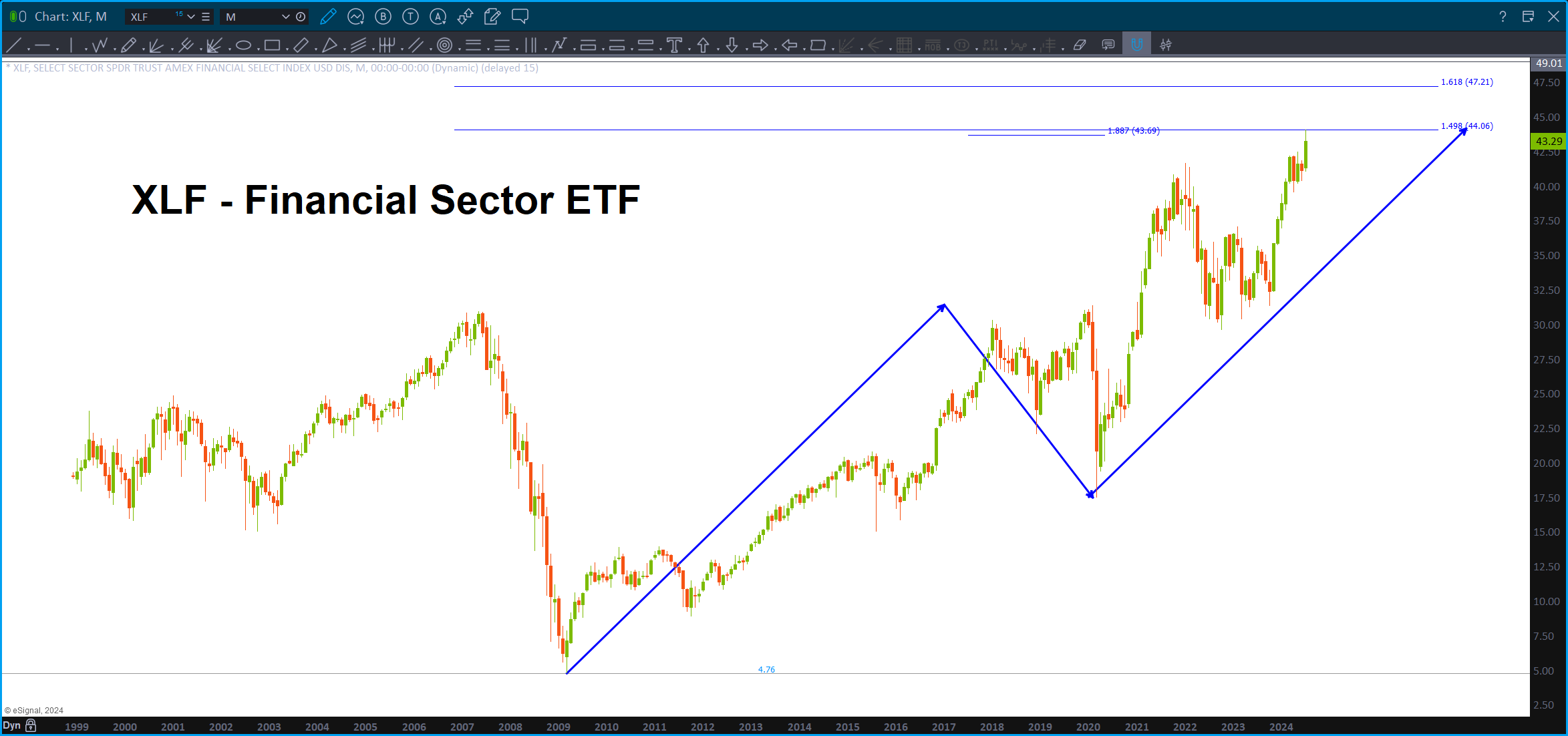
The banks have been rallying – they are NOT near the all time highs and are approaching resistance.
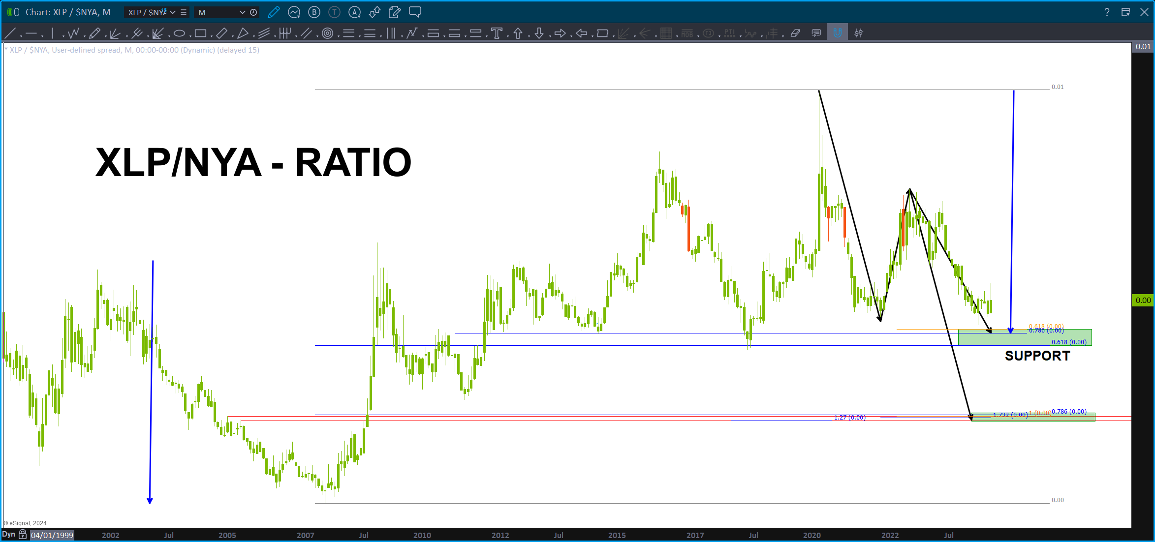
The XLP/NYA ratio is close to MAJOR support and if we lose that ‘neckline’ of support you can see the BUY of the ratio down at the ABCD on the .786. If we lose this support on the ratio, then I find it hard to believe the market will go down. Watch this level closely.
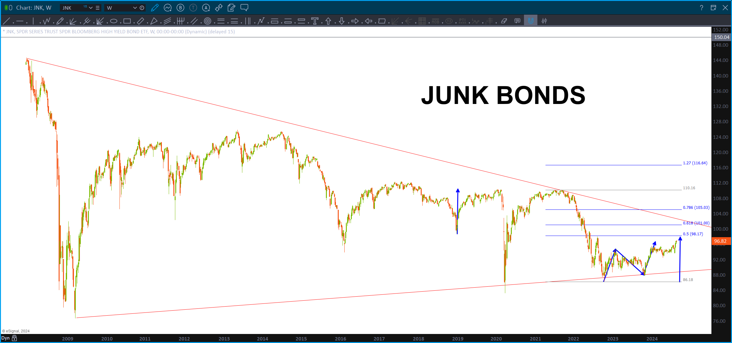
Even JUNK BONDS have gotten into the game BUT , again, a large target looms a little higher.
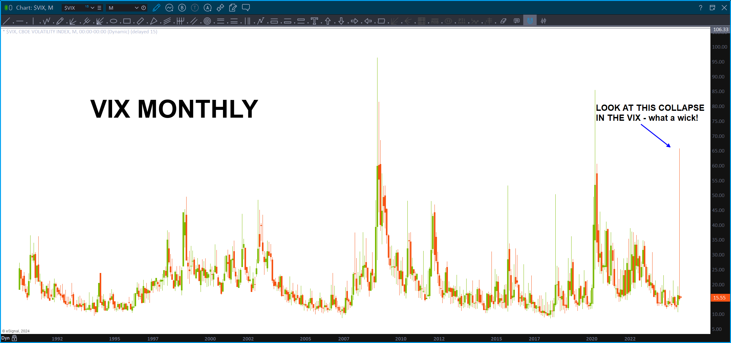
Look at the size of this candle wick in the VIX. WOWZA …
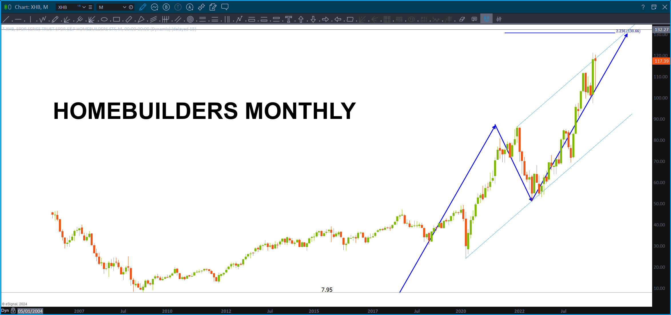
Home builders are cruising – but take a looksy a little higher and we have a major target appearing.
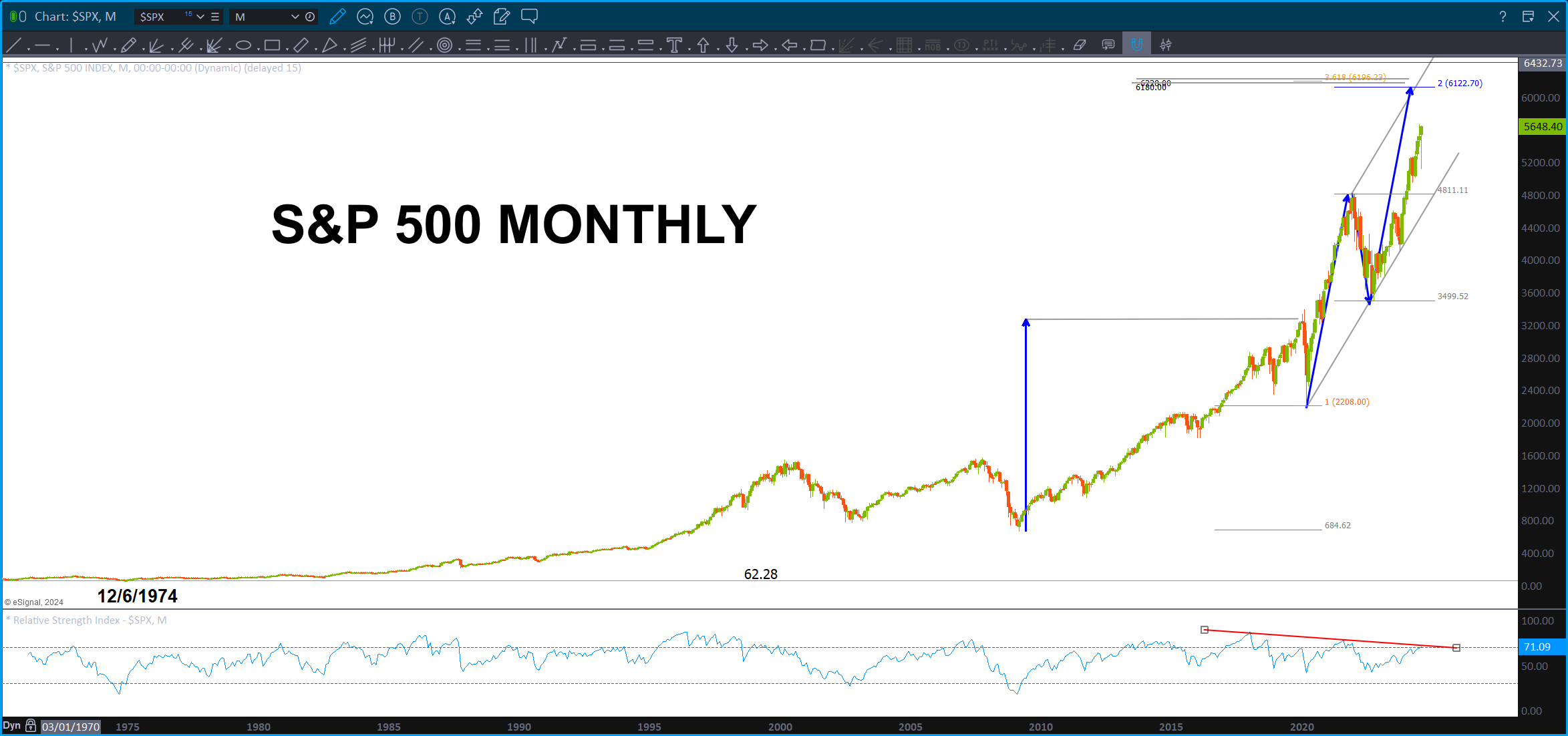
Here’s another target a little higher on the S&P 500.
And last, but not least, we have the USDJPY. The YEN is the big canary in the coal mine. Just a little higher is the .618 price projection and .786 and then the ABCD higher.
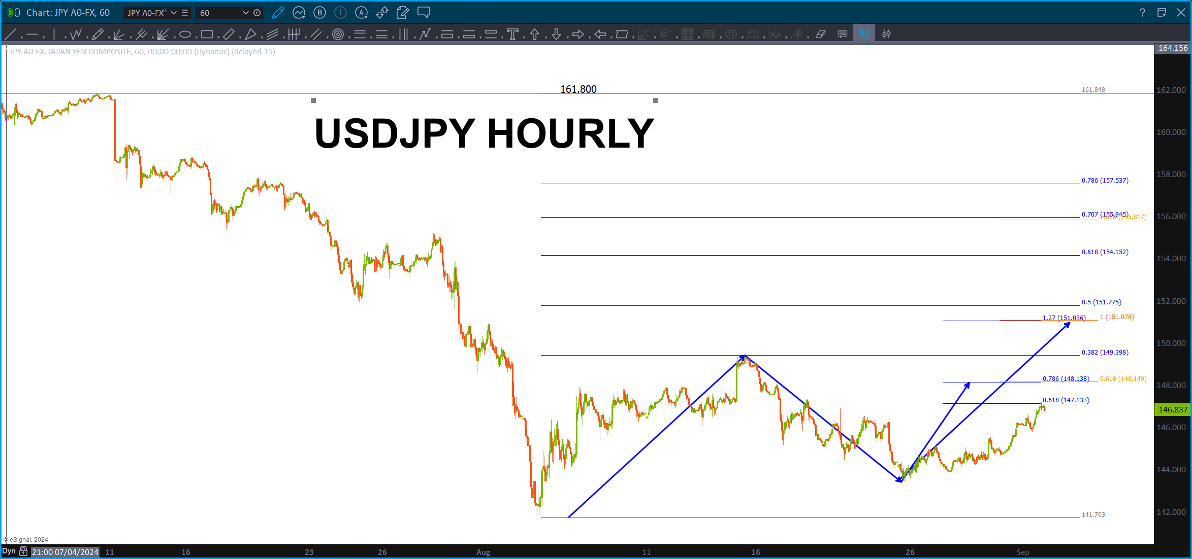
In July, it looked pretty clear cut that resistance was being hit .. now, it’s NOT as clear but still begs of caution going into this week.
I’m looking for the targets on the JPY to be hit …that will tell us a lot about where we are.
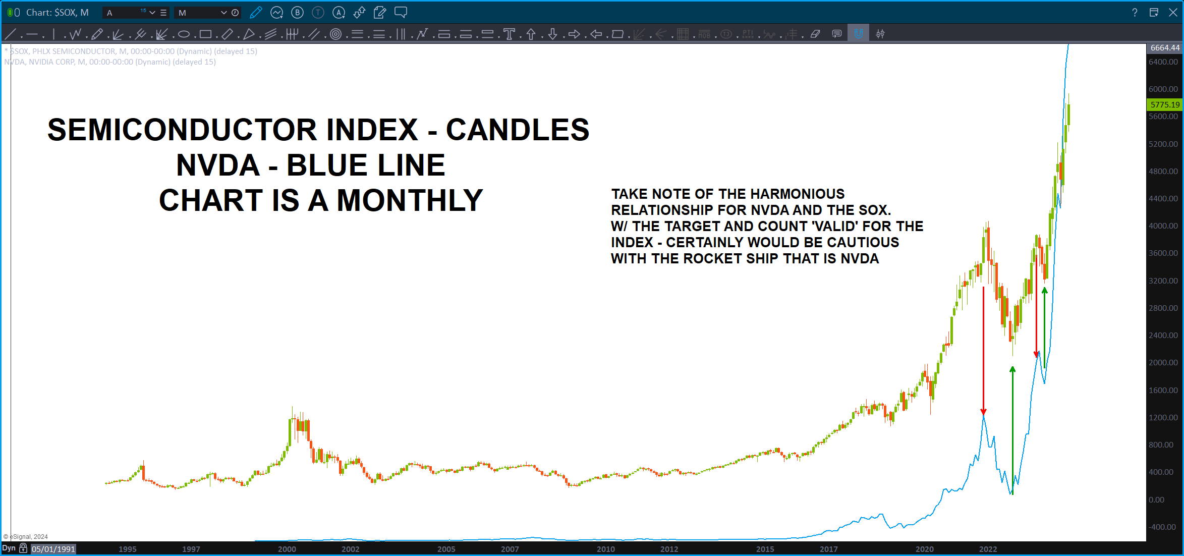
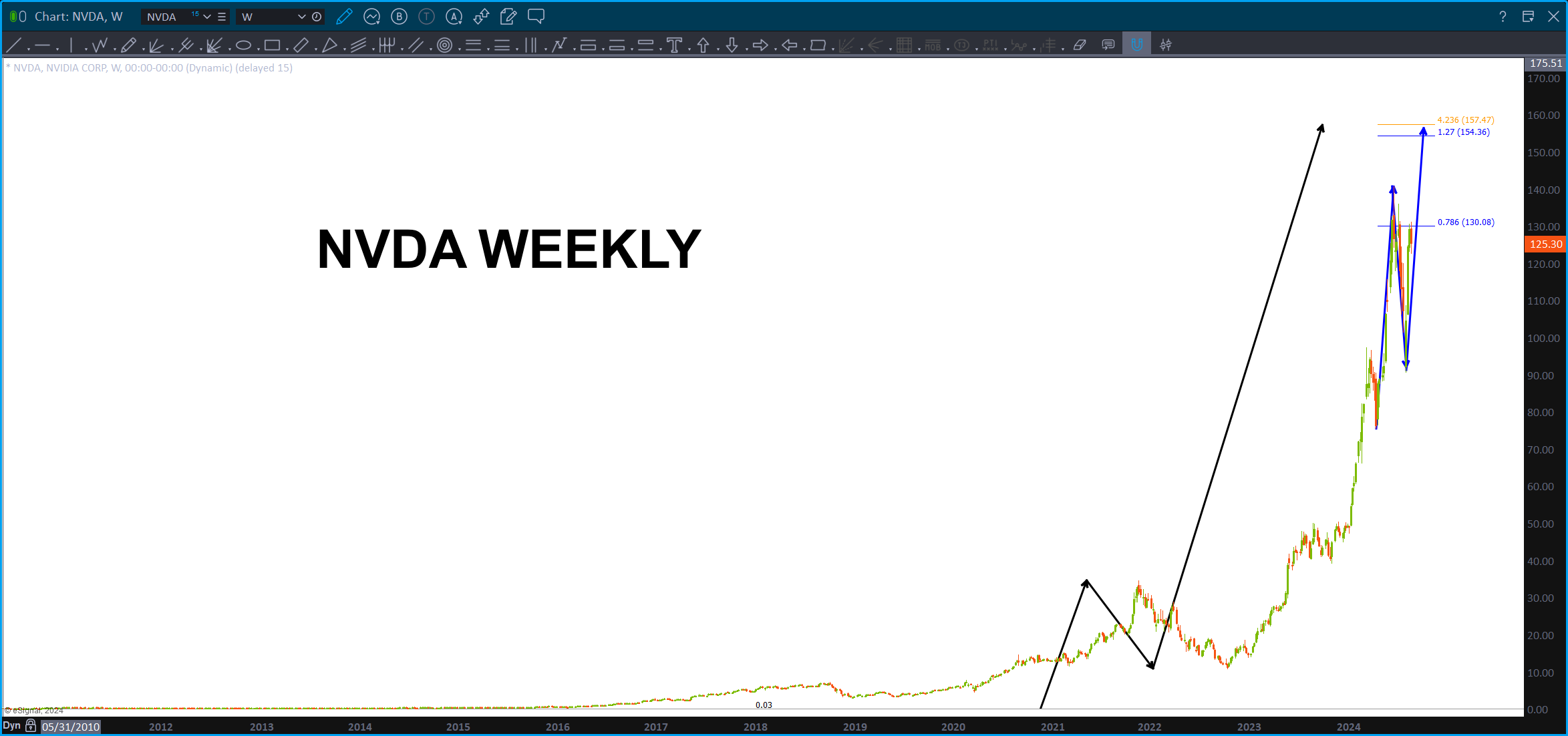
NVDA – 08/28/2024
Posted on August 28, 2024 Leave a Comment

NVDA earnings today …
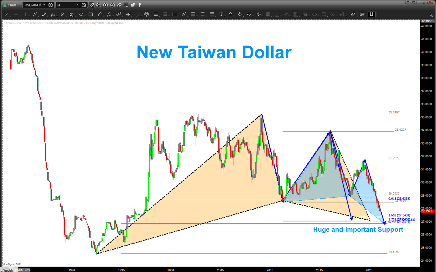
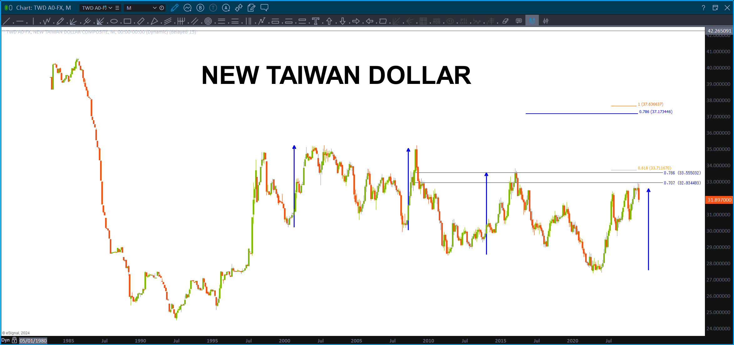
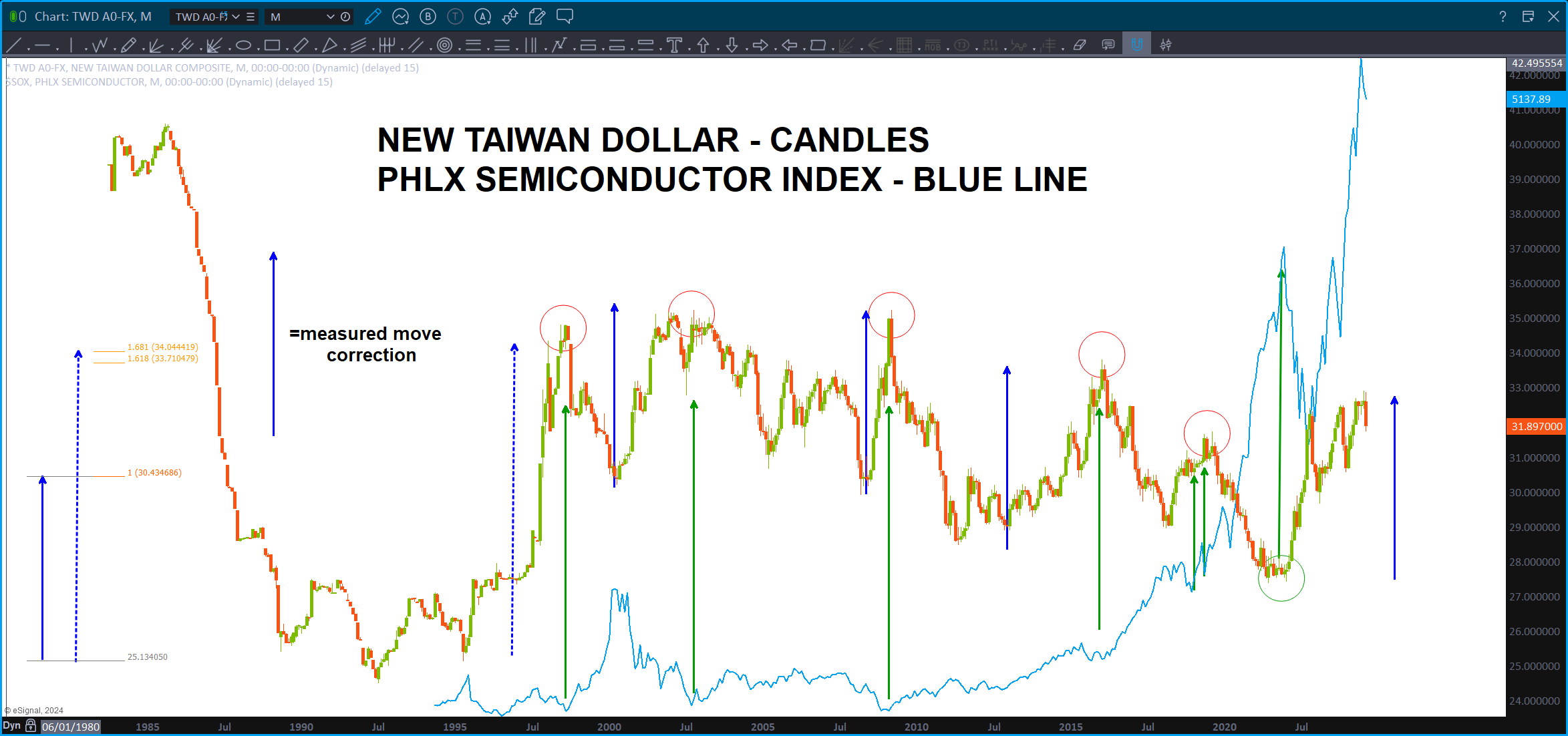
Very interesting inflection … watch the New Taiwan Dollar as it looks to be inflecting. Historically, when the chart tops, the SOX takes off and goes higher.
We have a major target hit on the SOX and, what appears to be a valid 5 wave count.
Note the .786 and .618 price projection around 99-100 for support and if we blow thru that then the projection/1.27 around 79-81.
Here’s some targets for NVDA and the New Taiwan Dollar …
Last post on Semi’s: https://atomic-temporary-44460632.wpcomstaging.com/2024/07/14/semiconductor-index-july-14-2024/
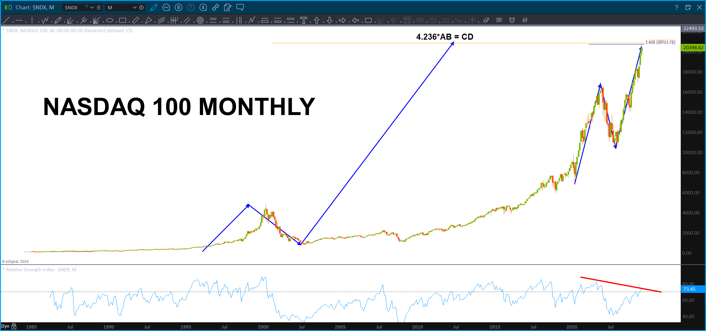
NASDAQ 100 – July 16, 2024
Posted on July 16, 2024 Leave a Comment

Well, folks, here’s another one …
Again, Mr. Jenkins taught me that often times “end of moves” occur when 4.236*AB=CD. (4.236 = 1.618^3)
Right at this level is a monthly projection, 1.618 extension and the 4.236 projection. Throw in a little bearish RSI and …
Folks, trust me, it’s hard to be the only person that I know (and I honestly don’t know if anyone is doing this – just doing it for the dramatic effect. 🙂 ) that is presenting BEARISH PATTERNS completing/completed pretty much all over the place.
I fully expect them to get run over …have no short position on, yet, but just continue to get levels blown out of the water.
OBTW, the projection on the DOW was almost hit but we are in the “red horizontal DOW target zone” so if it’s going down, it “should” be starting soon. If we have another blow off day to the upside tomorrow I’m going to watch some commodities and currencies. OBTW, anyone notice that the BULLISH YEN PATTERNS hit and have held. That “usually” spells resistance for the US equities.
Sure appears the “easy” and “logical” thing to do right now is to be max long and “set and forget it.” Sorry, I can’t.
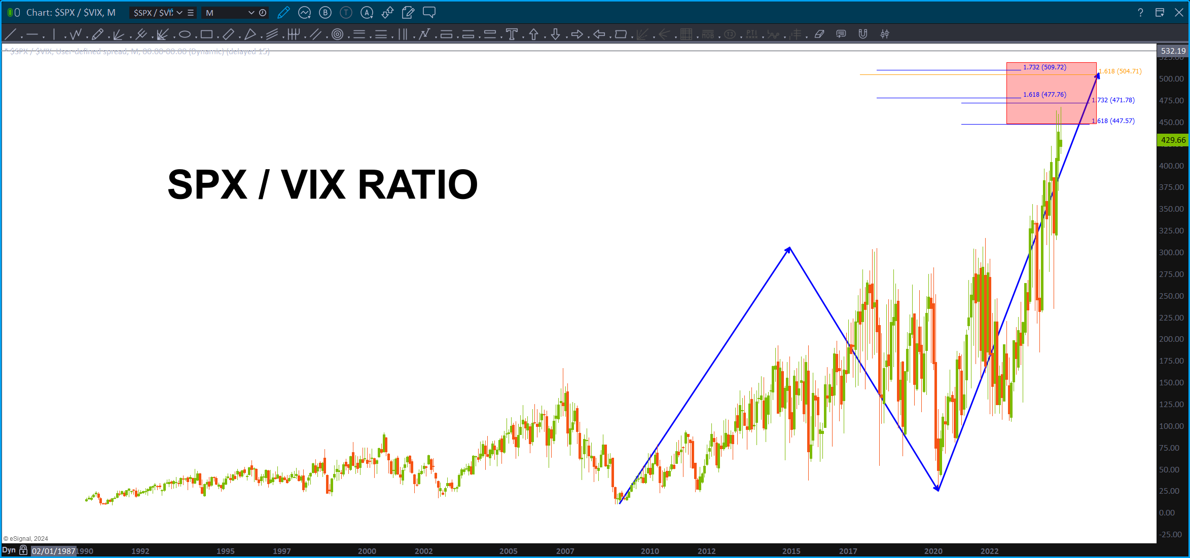
VIX and S&P 500
Posted on July 16, 2024 Leave a Comment
Love ratio analysis and also love using the PATTERNS w/ it …
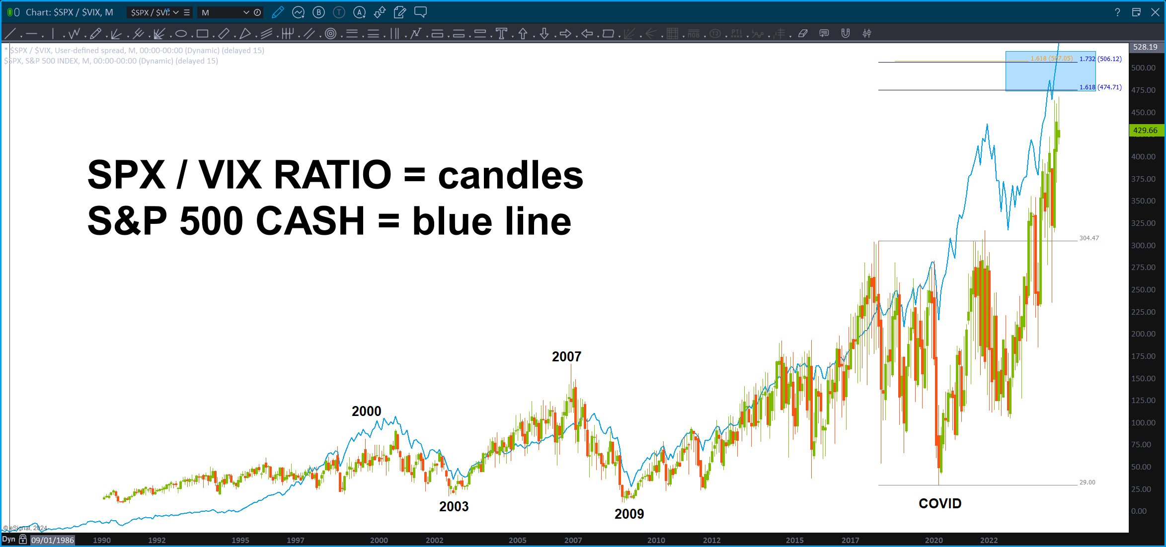
Here’s the S&P 500 / VIX ratio.
Note the resistance area we are at or maybe a little higher. Also, take note how high the ratio is compared to, say, 2007? WOW.
My musical note log projection got SMOKED today and so did the PATTERNS. I’m not there yet, mostly because the broader market really didn’t participate .. the DOW and R2000 but the other indices were barely up.
I’m about to throw my “short” strategy in the trash can … another up day like today on WED will have me take out the eraser.
No worries, the PATTERNS aren’t perfect … but man did this one sure look like a GREAT set up. We’ll see …
DJIA – July 15, 2024
Posted on July 15, 2024 2 Comments

Last post on DJIA: https://atomic-temporary-44460632.wpcomstaging.com/2023/12/18/dow-jones-industrial-average-december-18-2023/
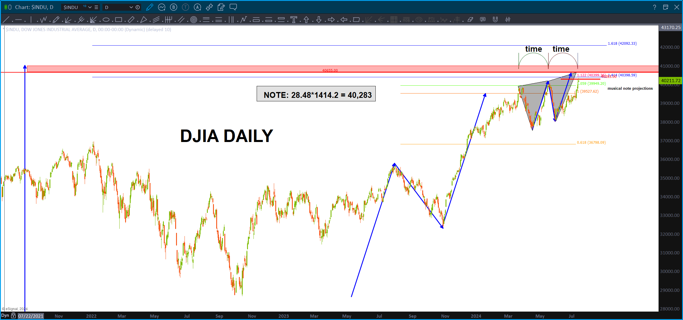
Folks, if you want to see why 40,655 isn’t a random number then take a peak at the link above. I was taught this technique by my mentor and friend, Michael Jenkins, and it’s basically using logs – the actual numbers – for projections. In the case above, I noticed something interesting w/ “musical note E” as its projection was present – almost to the point – at the highs in 1987 and 2007. Yeah, no kidding, take a look.
Hence – 40, 655 is a key level and take a note, just a little higher is my favorite technique – Mr. Measured Move.
Now, want to see something amazing? Take a peak to the left side of the chart and you’ll see the harmonics of EVERY MAJOR move in the DJIA. Amazing.
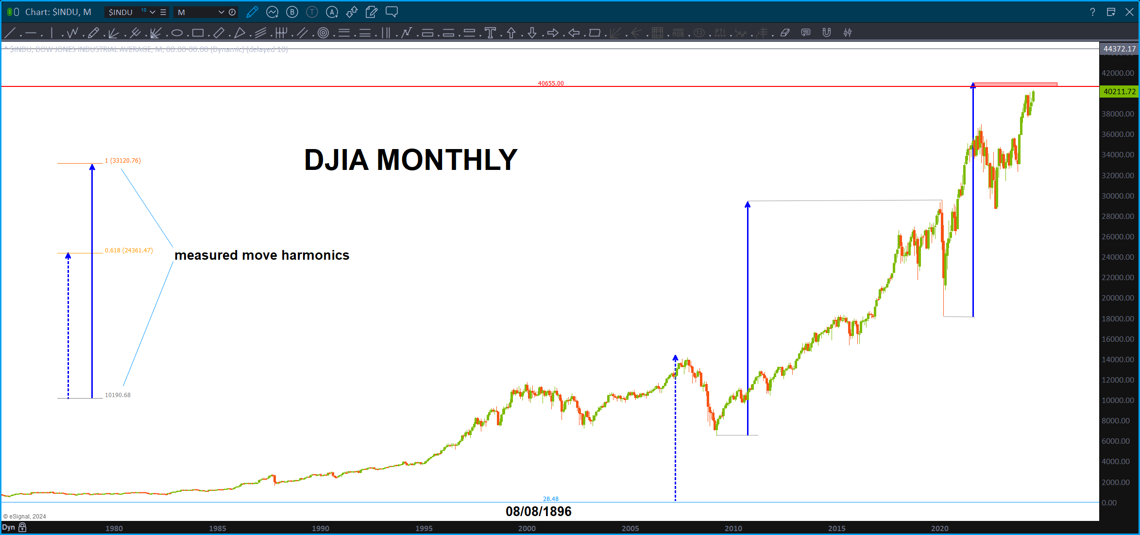
So, just a little higher than the level above, is the measured move and then, when we go down to the daily, you’ll see an almost perfect three drives to a top – right at our level! Can’t make this crap up peeps, can you?
So, that red zone is my target area.
Of course, I don’t have to remind you that at times all this work gets smoked and run over like a freight train. Hence, you never know folks.
One last, thru a little numerology in there … no kidding as I was typing it just came to me to “check out” the current high w/ the all time low.
1.4142 = square root of 2.
28.48*1414.2 = 40, 283
And, let’s not forget this amazing trend line (hint hint from the all time low) that we are batting up against. Yes, I know I truncated the high in the late 1920’s. The reason I did that is because it fits nicely the rest of the price chart. It “looks good” to me.
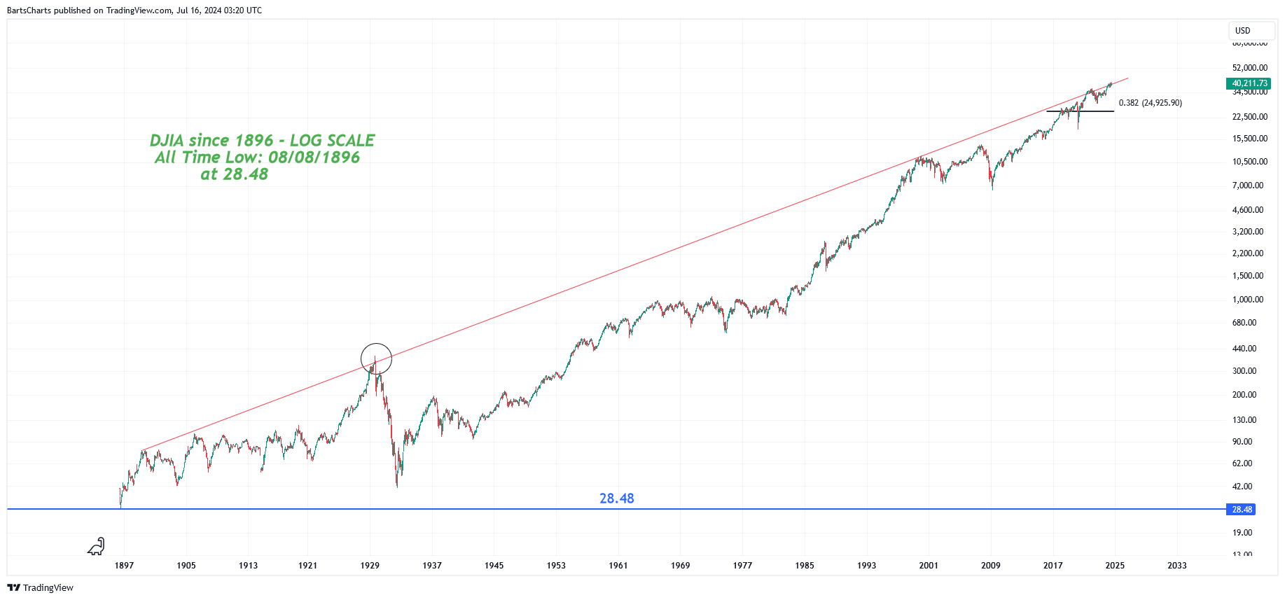
The .382 of the entire darn run from 28.48 is – basically – 25,000. I’ll take it and, in the big scheme of things might seem like a big correction, but it really isn’t it. Depending on the environment going around, that might be a superb BUY to get into this insane run.
Who knows, but for now, I’m thinking we hit the breaks for a bit.
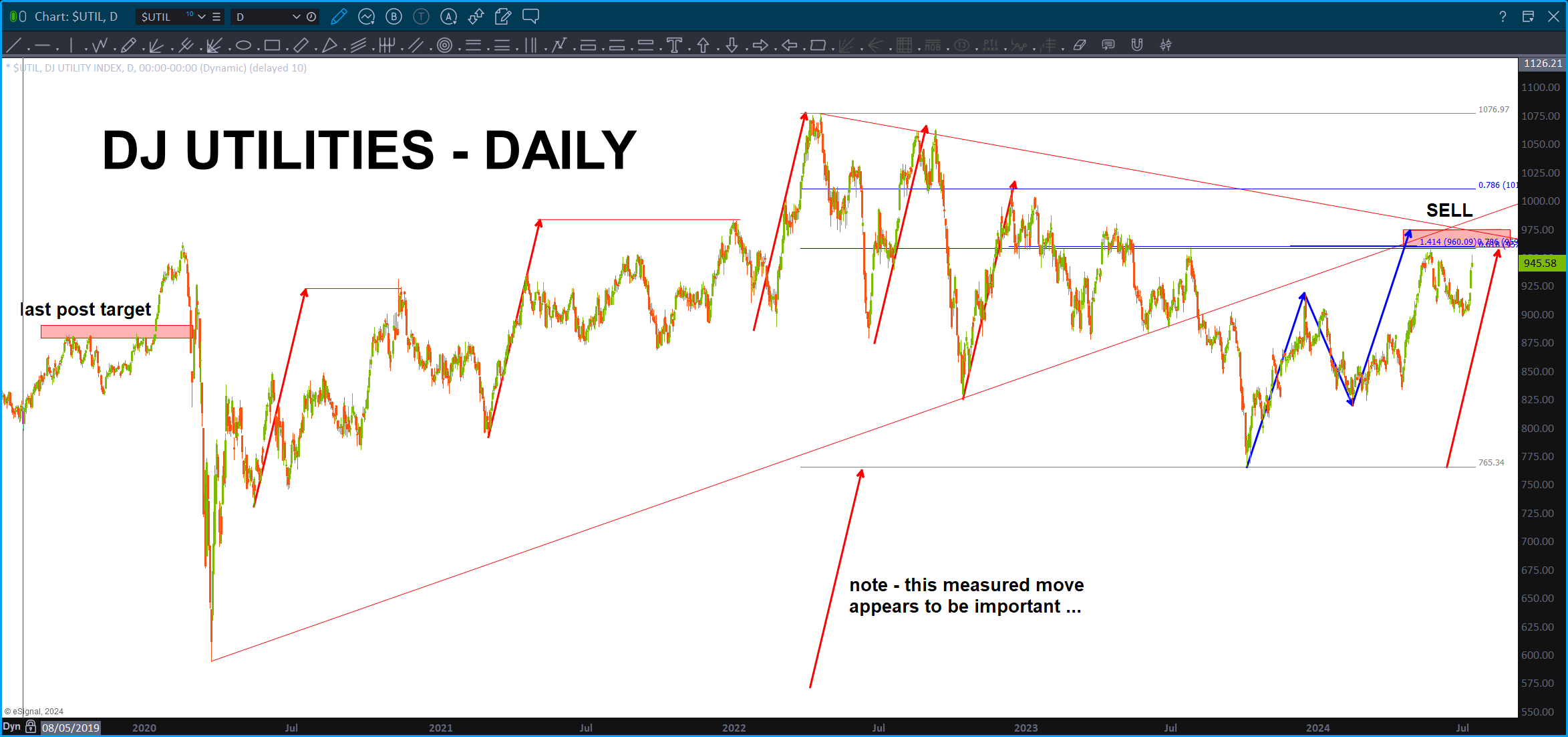
Utilities – July 14, 2024
Posted on July 14, 2024 Leave a Comment

Last post on Utilities: https://atomic-temporary-44460632.wpcomstaging.com/2019/11/10/utilities/
Got to be honest, this one sure looked like a doozy as the measured moves were really lining up. Thinking about it for a few seconds, this might have been the most spectacular failure of Mr. Trusty Measured Move that I’ve seen.
We are running into stiff resistance … just a wee bit higher and we complete the ABCD.
If the Utilities break above the .786 then the wild wild west continues.
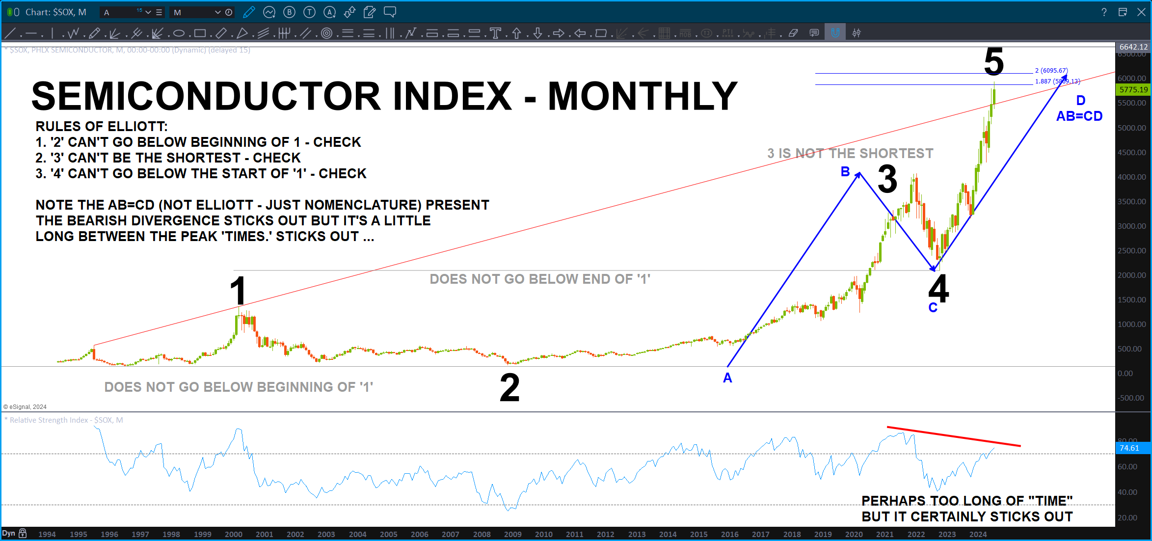
Semiconductor Index – July 14, 2024
Posted on July 14, 2024 1 Comment

Last post on Semiconductor Index: https://atomic-temporary-44460632.wpcomstaging.com/2023/04/05/phlx-semiconductor-index-april-05-2023/
Well, this pattern worked for a little bit but then got blown away. What’s interesting and we see it all the time is that level, once failed, was reattacked one last time before it took off to where it is now. Remember failed levels as, most of the time, they will perform polarity and you can invest/trade off of failed levels also – usually on the first retest and then it takes off. FYI.
So, here we are w/ a ‘valid’ count … and a wee bit higher we have the ABCD. Sure looks like a top.
Also, take a peak at NVDA. Tracks very nicely w/ the Semiconductor Index and also has a daily Gartley SELL that just hit.
Of course, this market continues higher and higher and higher … so, take that w/ a grain of salt.