Ratio Analysis Time – June 28, 2023
Was over on the Top Gun options group chat working some NVDA charting and I decided to pull out some ratio analysis on the XLP and NVDA.
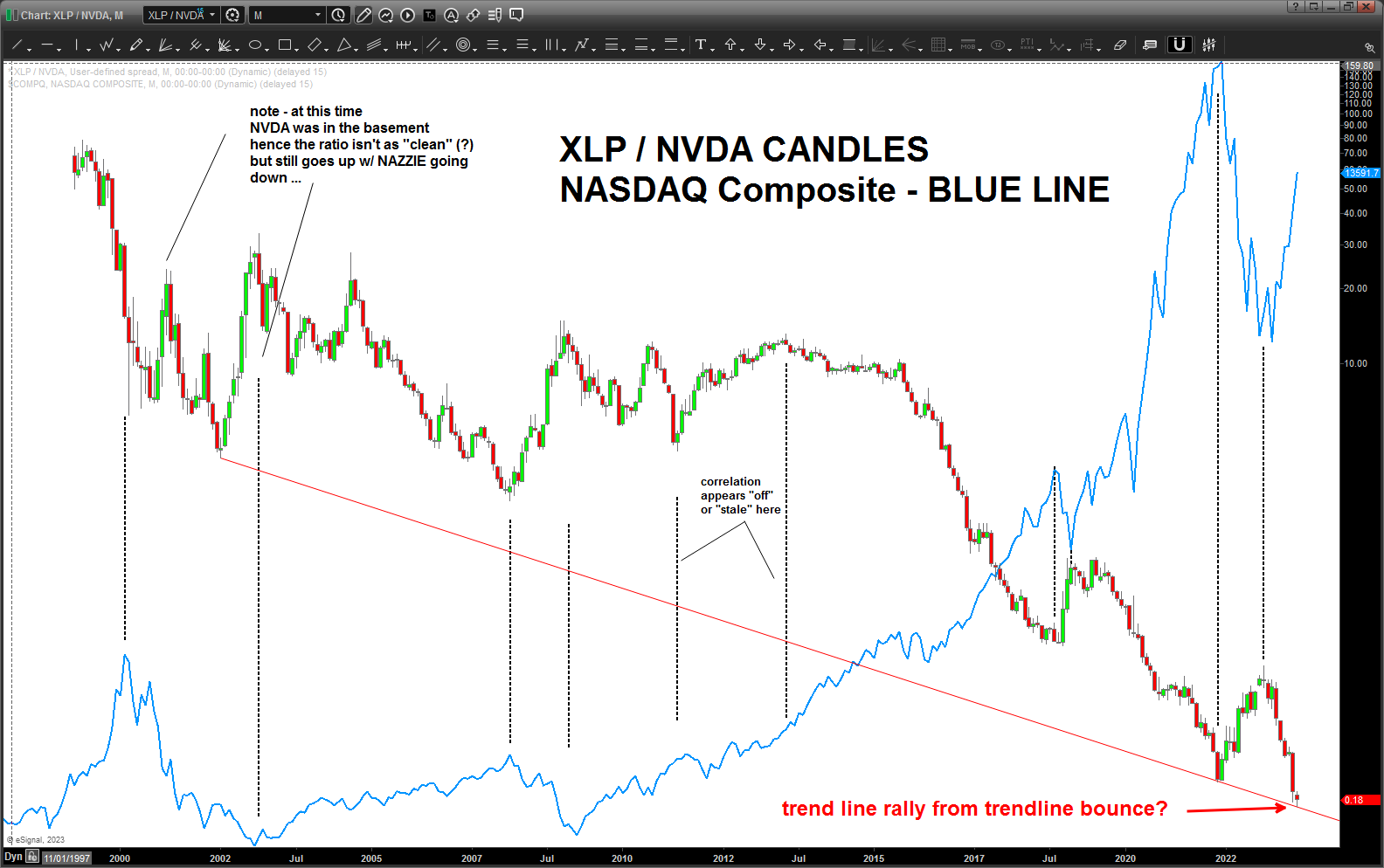
XLP/NVDA
Some stuff we need to consider:
- Note the red trend line connecting the lows .. it’s a perfect fit. Certainly suggests the “ratio” is about to rise which means, in the past, some heavy weight for the NASDAQ and I imagine the overall market. Hmmmm …
- Overlaid on top of the ratio (blue line) is the NASDAQ composite … take a peak at how it reacted when the ratio rose … except for one time during the 2010-2012 timeframe, it rose and so did the market. That’s pretty much it … of late, it’s “timed” the NASDAQ pretty well.
When we add up the 20 year trend line support that sure looks like it wants to hold and the ratio starts rising – the NASDAQ hasn’t necessarily been bullish during these times now, has it?
