January 25, 2026

Spent the weekend pre-reading the upcoming novel by Alan Green – America Codes. Appollo to Artemis. Trump and Pope Leo XIV Prophesied in The Declaration of Independence.
You read that correctly.
I am changed from reading this novel … the perfection of this 3D Holographic Matrix of Consciousness is beyond description. It’s truly perfect … anyone following this blog will have to read this book. It will change you … Egypt, Shakespeare and the Declaration of Independence all interconnected in ways that will transcend your mind.
How about this … it HAD to be 1776. There is only one year that would have worked when we look at the locus of the moon and sun distances from the earth and calculate the speed of light (Remember folks GOD said “Let there be light …!” Genesis 1:3 or Genesis 1:111 perhaps …
That’s our first vibration … and when the last word “light” was spoken, that became the first radius. From there … we connect it thru time/space by the eternal cycle represented by the circle. We can’t divide perfection so we double it … the two intersecting circles become the Vesica Piscis (“bladder of the fish”) which creates the initial VECTORS for the square roots of 2, 3, 4, 5 … the 7 days of creation in Genesis? That’s the first 7 circles which create the seed of life. We now have the ratio’s present to create everything w/in this 3d world that we need. Creation occurs by the finishing of Metatron’s Cube. Metatron, the Arch Angel responsible for ALL of the geometry across all dimensions of existence was, at one time, a mere mortal like us …remember John 14:12?
Well, who was Archangel Metatron? … that would be Enoch. A descendant of Adam and the Great Grandfather of Noah. Yeah … he’s also the main figure in the BOOK OF ENOCH. (recommend you go and read it folks … it’s still in the Ethiopian Bible but was struck from the King James during the council of Nicea in 325. Why? ;)) The book of Enoch is where John Dee downloaded the Enochian tables and that was the encryption method used to encrypt ALL of Shakespeare. Yup … Shakespeare was baptized 4/26/1654. 426 whose mirror image is 624. John Dee faked his death on June 24th. There are 624 characters in the Enochian Table.
Folks you might want to brush up on your mythology and learn about this dude …

To the markets …
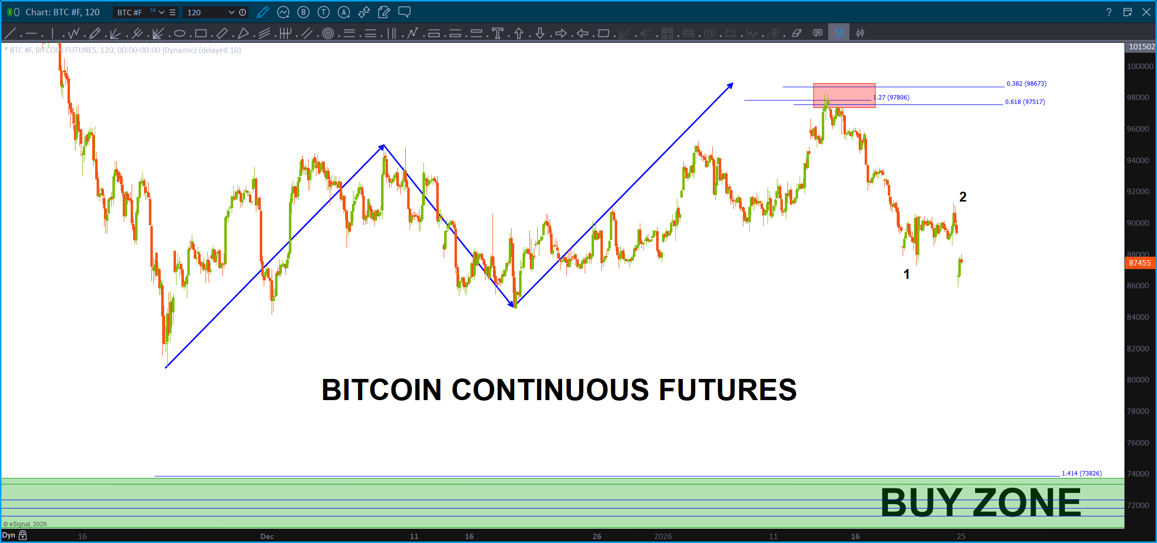
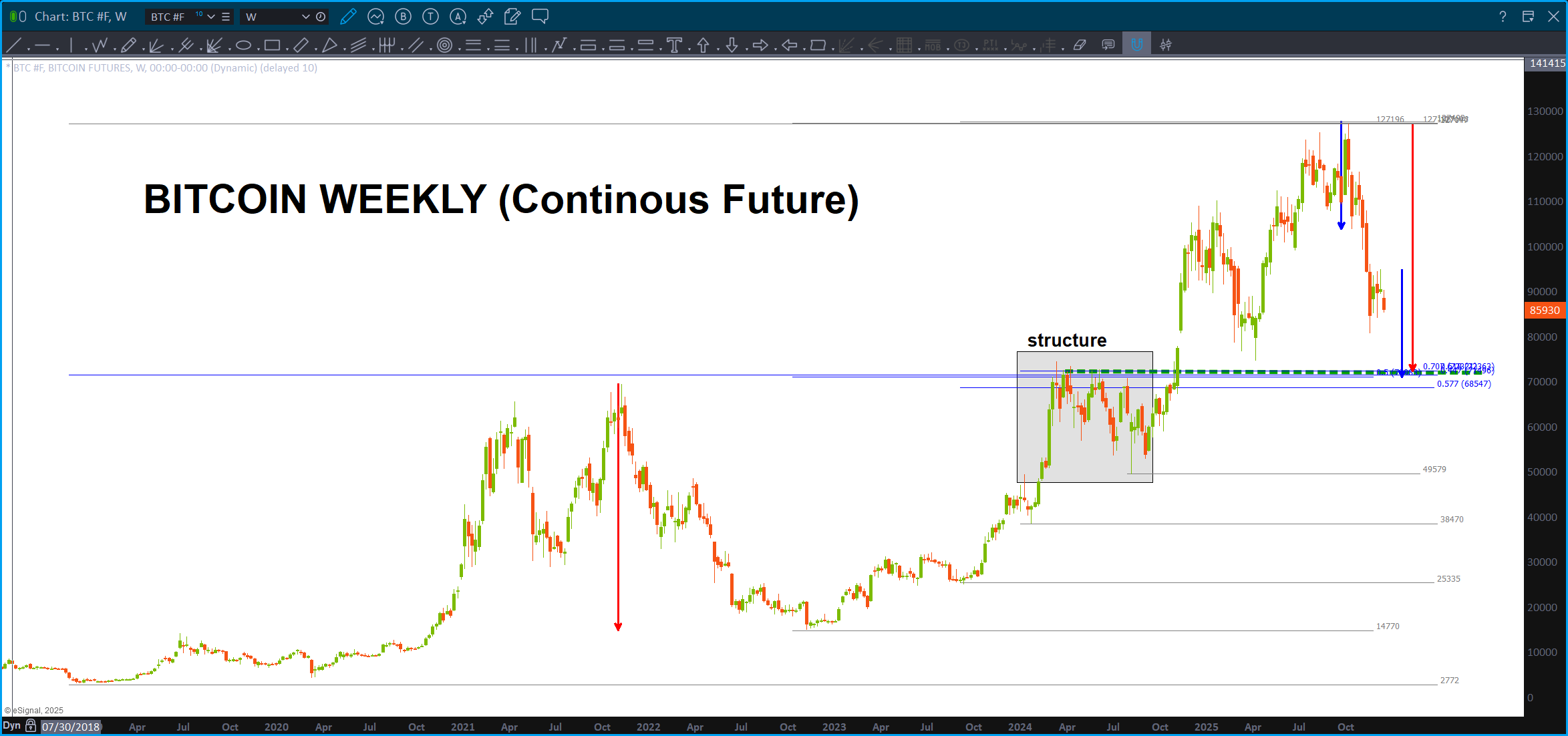
Bitcoin …our target level in the low 70’s still stands as the zone to BUY. Big question is, and I REALLY don’t know, new highs or a corrective bounce. If you think El Coin is going much higher then roll w/ it but it you think we have another leg down then this is a scalp BUY.
Or, BUY here and see if the ‘first’ SELL PATTERN works or not … ? Reasonable …

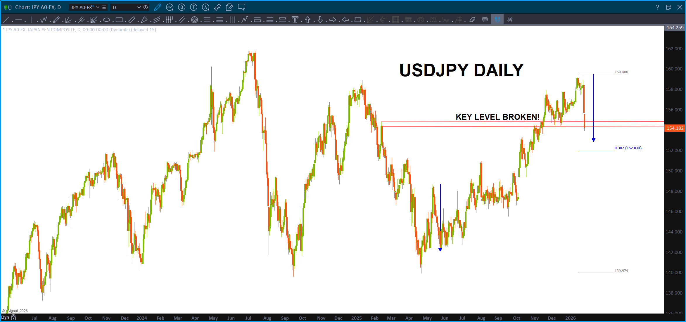
Folks … have to be aware and watch what is going on in the Land of the Rising Sun …
Silver is ROLLING … I like this count so expecting some resistance here/little higher BUT we are buying any pullback. Month or so pullback …? If long, stay long.
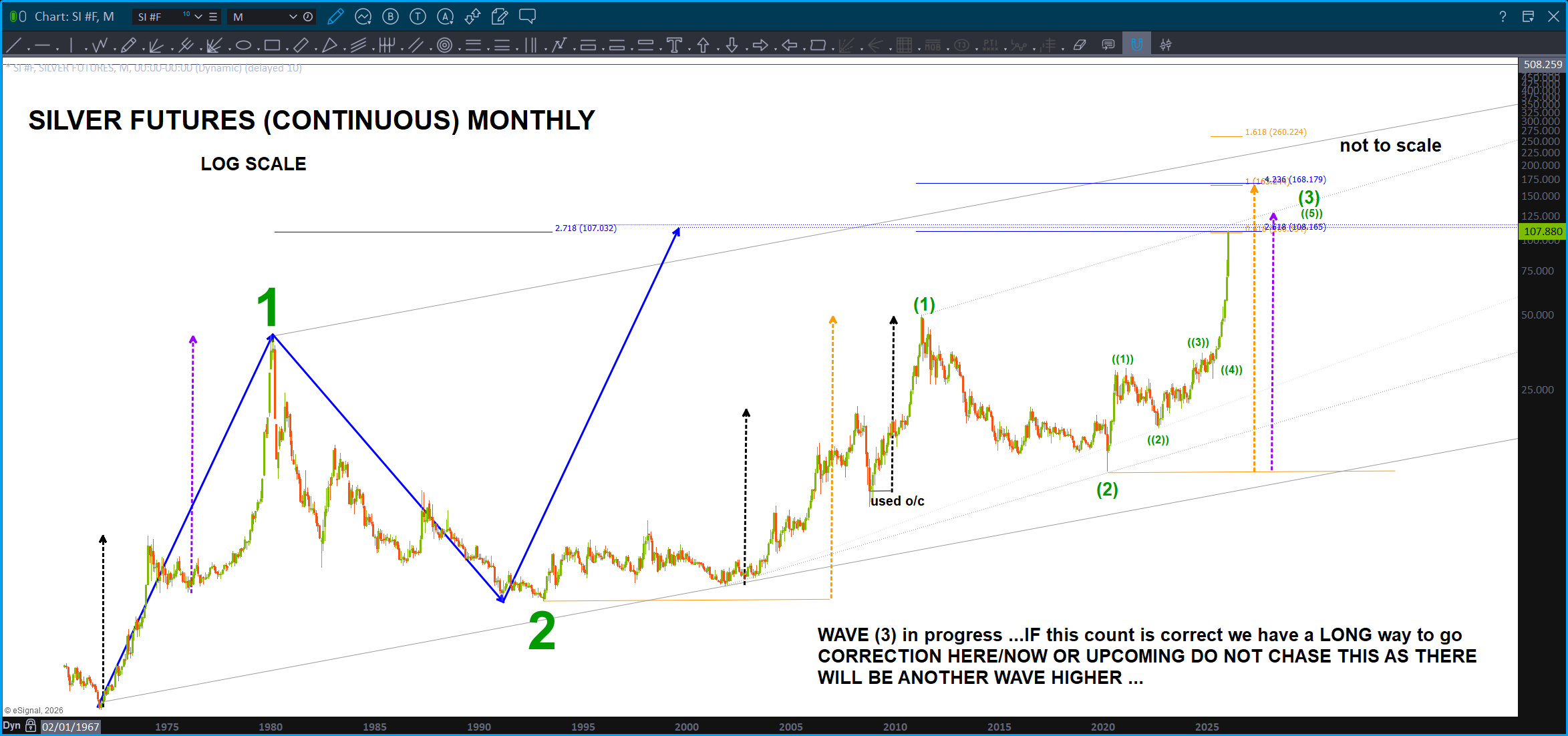
Folks … here’s the deal w/ Silver. A LOT of the Banks are SHORT SILVER so … it’s pretty cool to see all the pattern prices being hit on the banks as this is all happening. Check this one out on JPM:
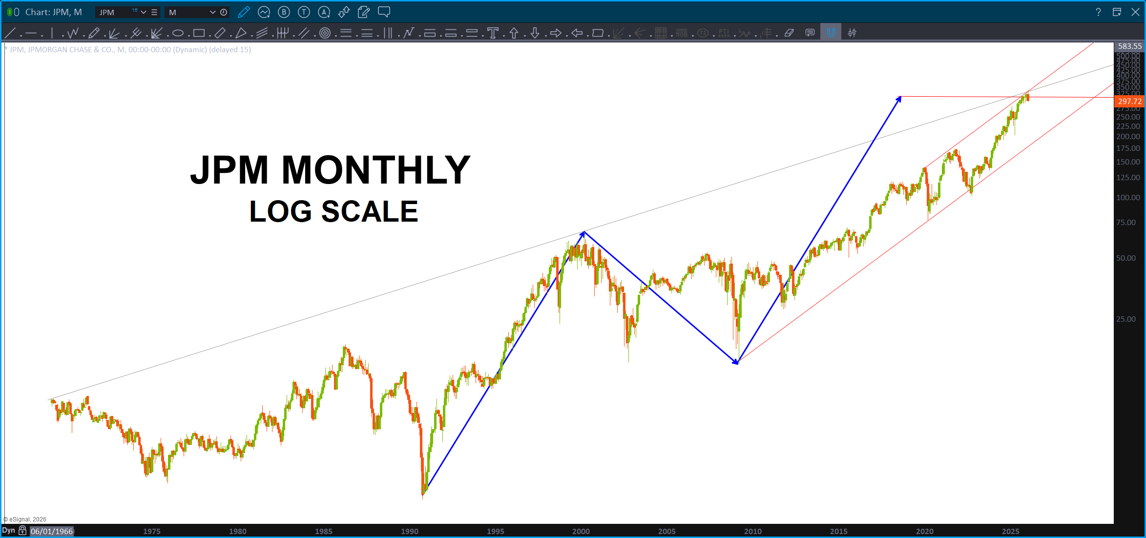
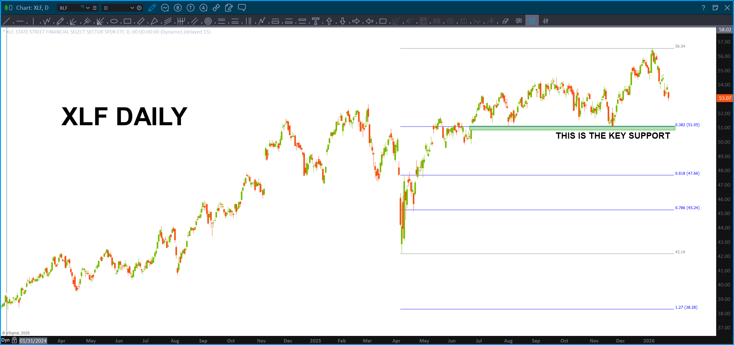
You can see the key level for the banks – and- truth be told – the entire market to be honest by the “this is the key support” – guess we’ll have to wait and see.
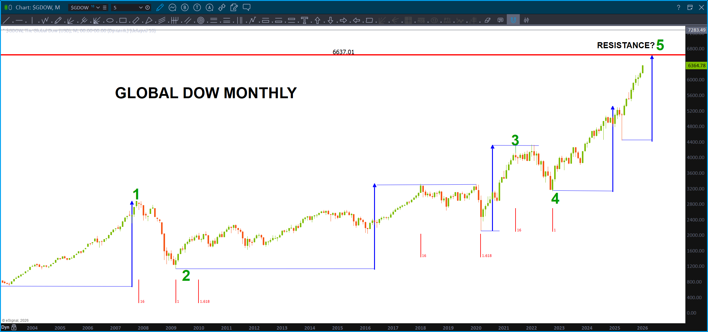
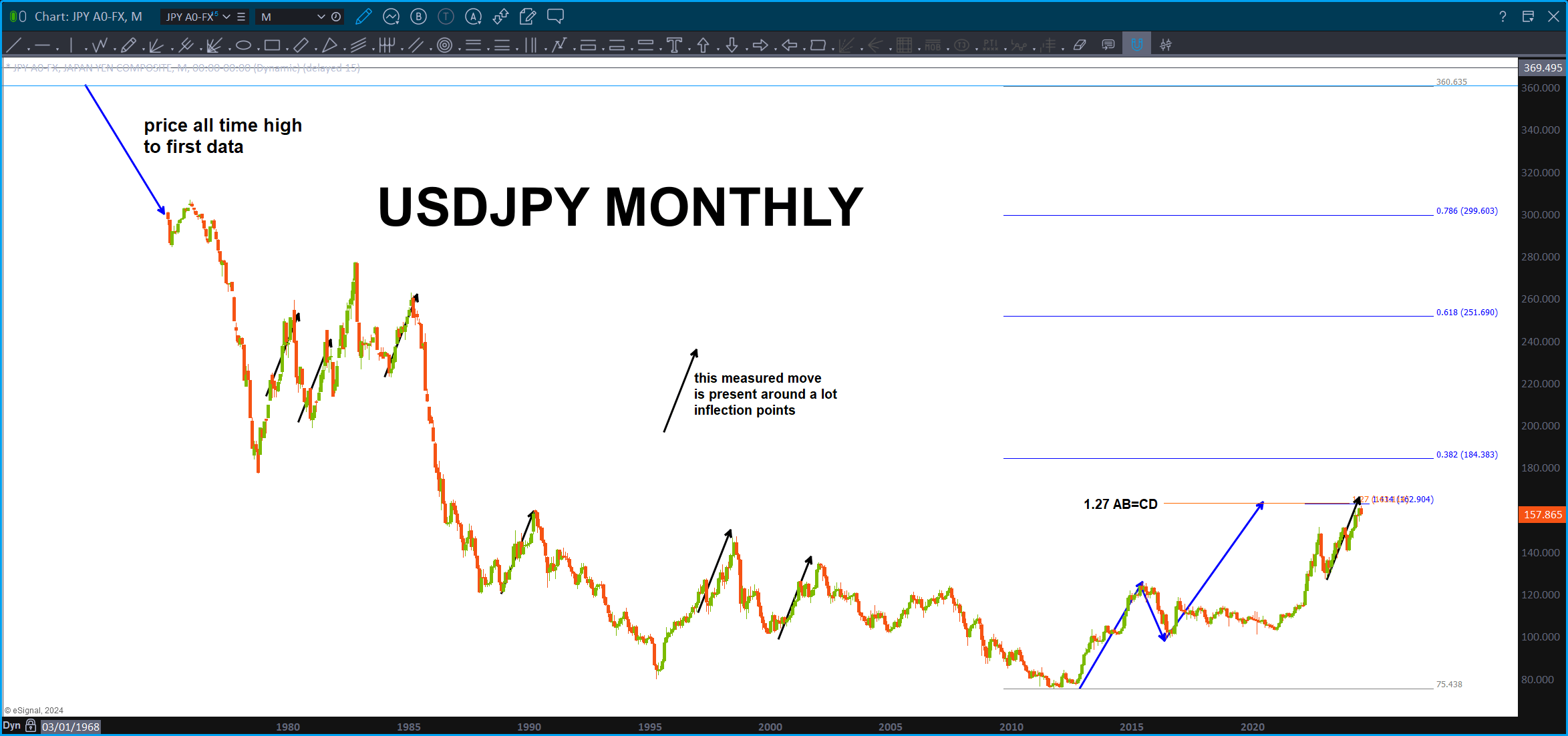
Figured I put this one out there … the Global Dow. What am I missing … sure looks like in the life of this index, there hasn’t been one move higher than the blue measured move.
New Car or Toilet Paper? January 14, 2026

Ratio analysis, you gotta love it …
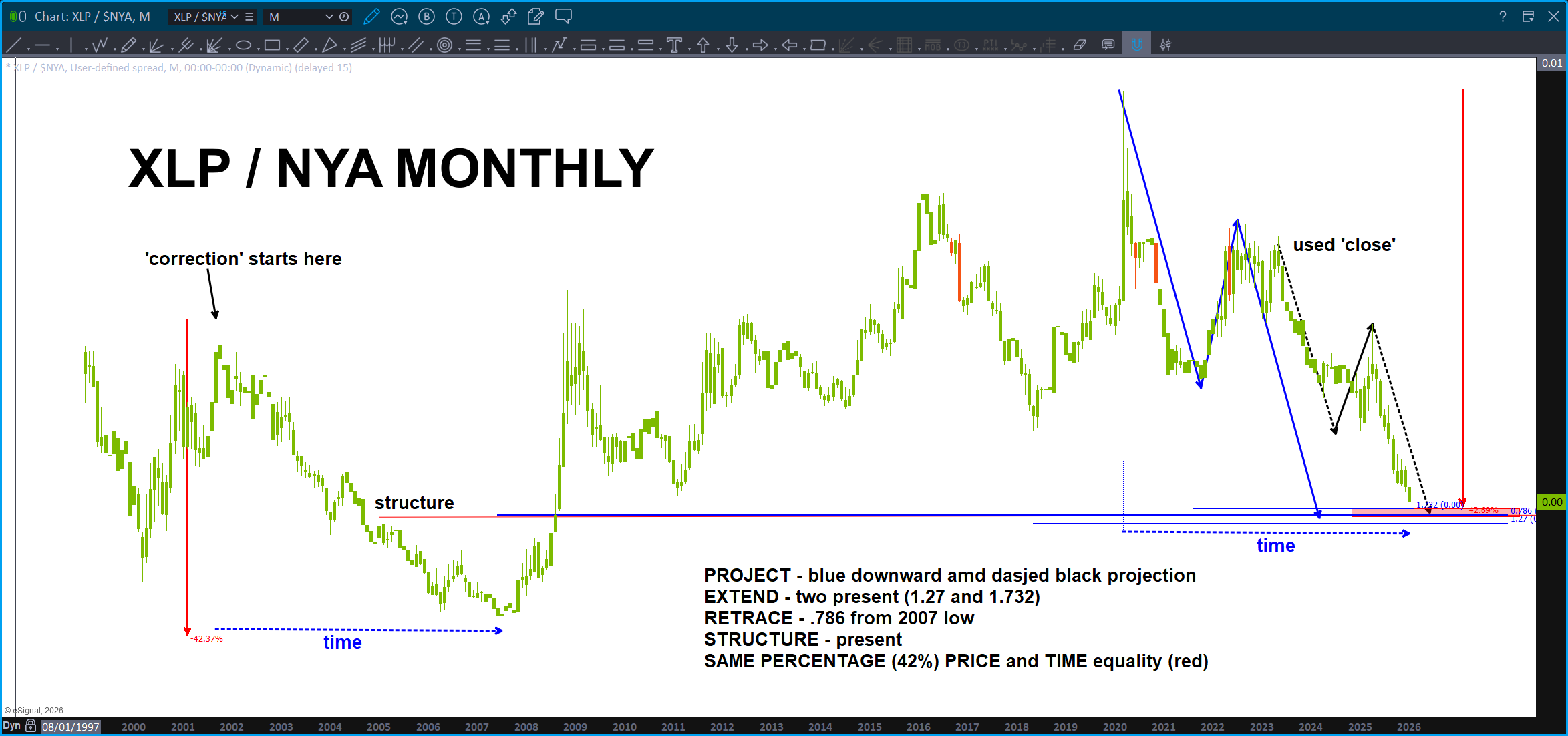
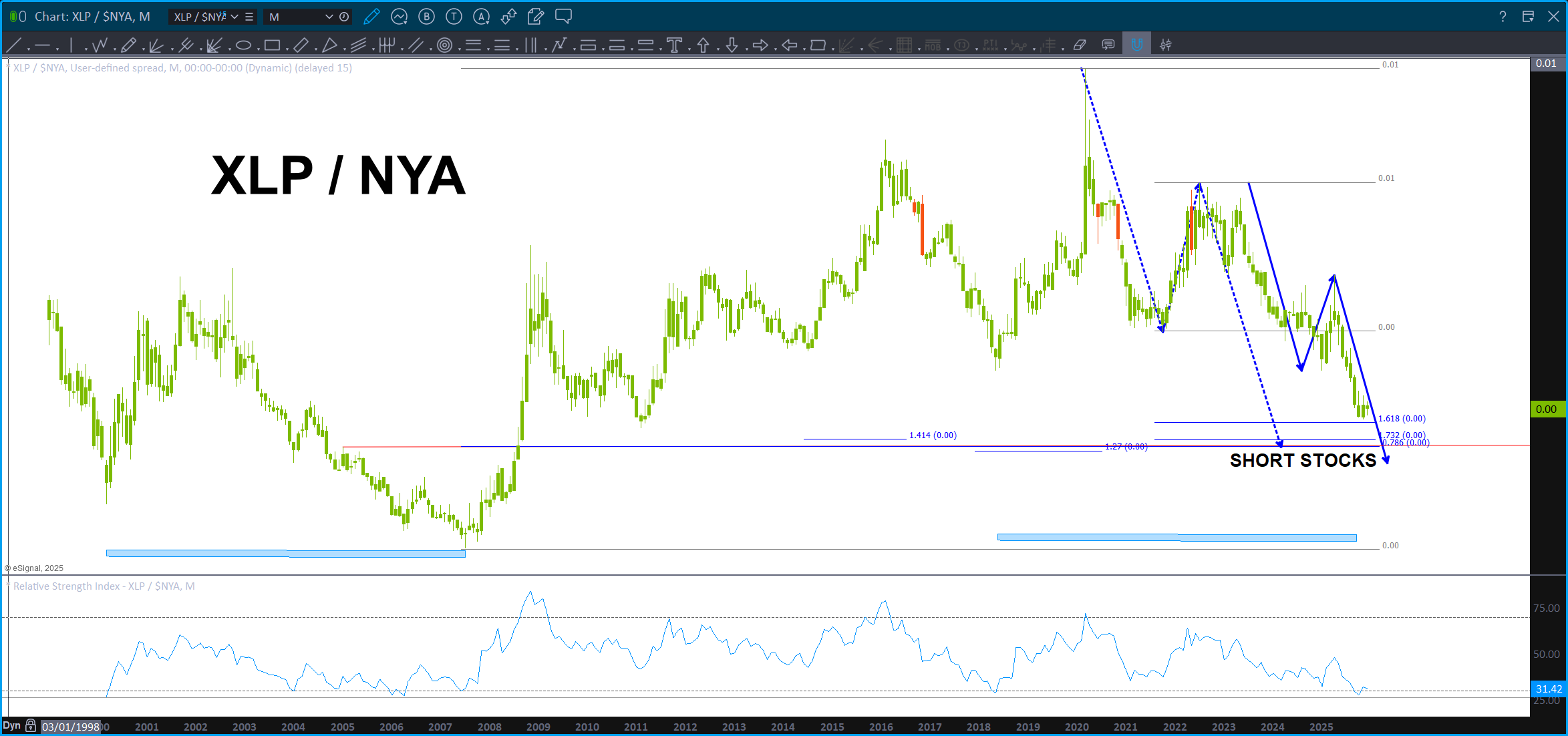
Last night we showed you a bunch of charts. The most important, at least for me, was the chart of the XLP/NYA ratio. Been blogging about this target zone for a WHILE. Was getting really sick of it to be honest :), and, remember, the PROJECTION lies right on the .786 so ‘ technically’ it hasn’t been hit but, I’m making the call based on the PRICE and TIME confluence (price being percentage same).
Here’s another one popular among technicians. Discretionary / Staples.
Discretionary – I’m going out and buying my NEW CAR! Let’s go the bull is on ….! woot …
Staples – everyone needs TP, propane, toothpaste, etc. The ‘staples’ of life. Ain’t nothing discretionary about that!
So, when the chart is going UP UP and AWAY life is good …when it’s going down, not so much. Not surprised to see it has been going down the past couple days/weeks (kind of makes sense) but what I did not expect was the PATTERNS that are completing to be present like they are. Especially in light of the beautiful BUY pattern present on the XLP/NYA, the financials topping at their measured moves and the YEN did not go above the pattern we were discussing last night. Well, ok then …
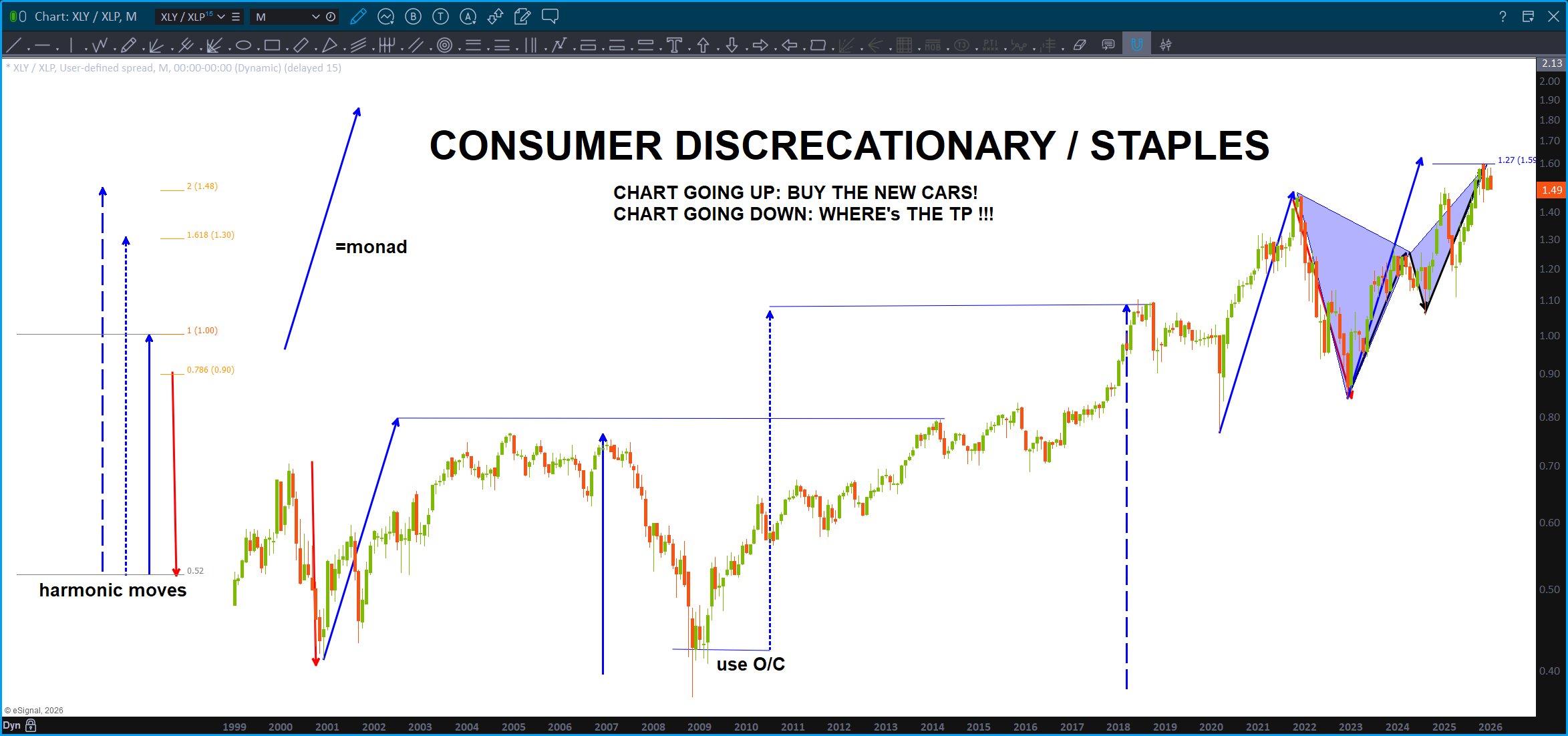
Folks, we have an ABCD (monthly) and a BUTTERFLY (perfect CD leg in price and time) along w/ a three drives to a top pattern. WOWZA …in normal terms, it appears that people aren’t going to be buying their new cars anymore because this ration has smacked into HUGE resistance.
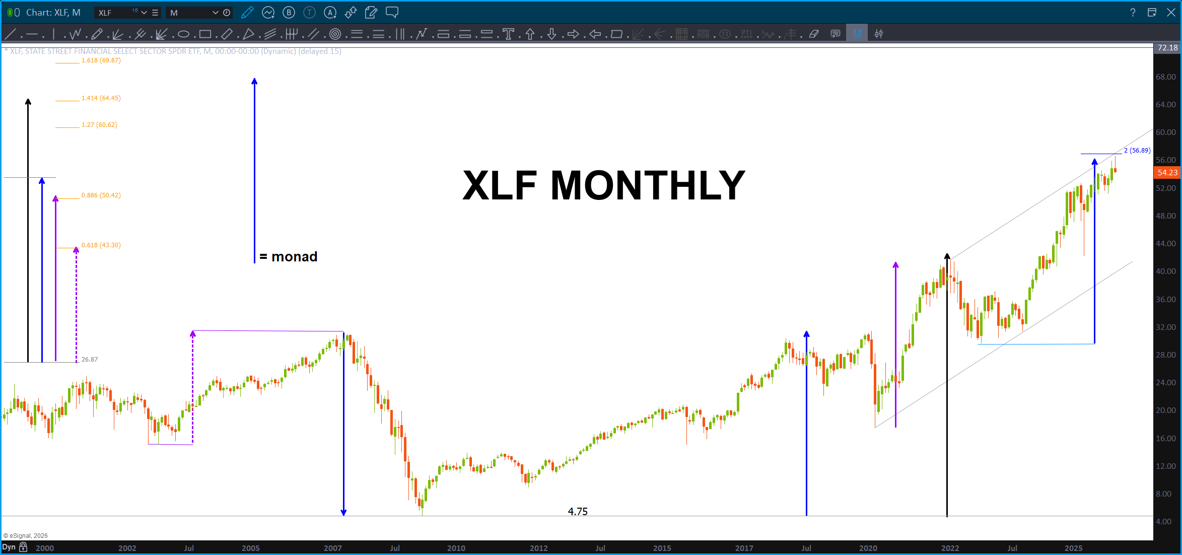
Last, look at the harmony w/ the ‘monad’ to the left of the screen. All the moves are harmonic to the solid blue arrow. Just stop and try to comprehend, what is going on here … this chart is bouncing around – somehow – with harmonic fractals to the measured move that nailed the top. Even look at the ‘red’ corrections – yup, the same.
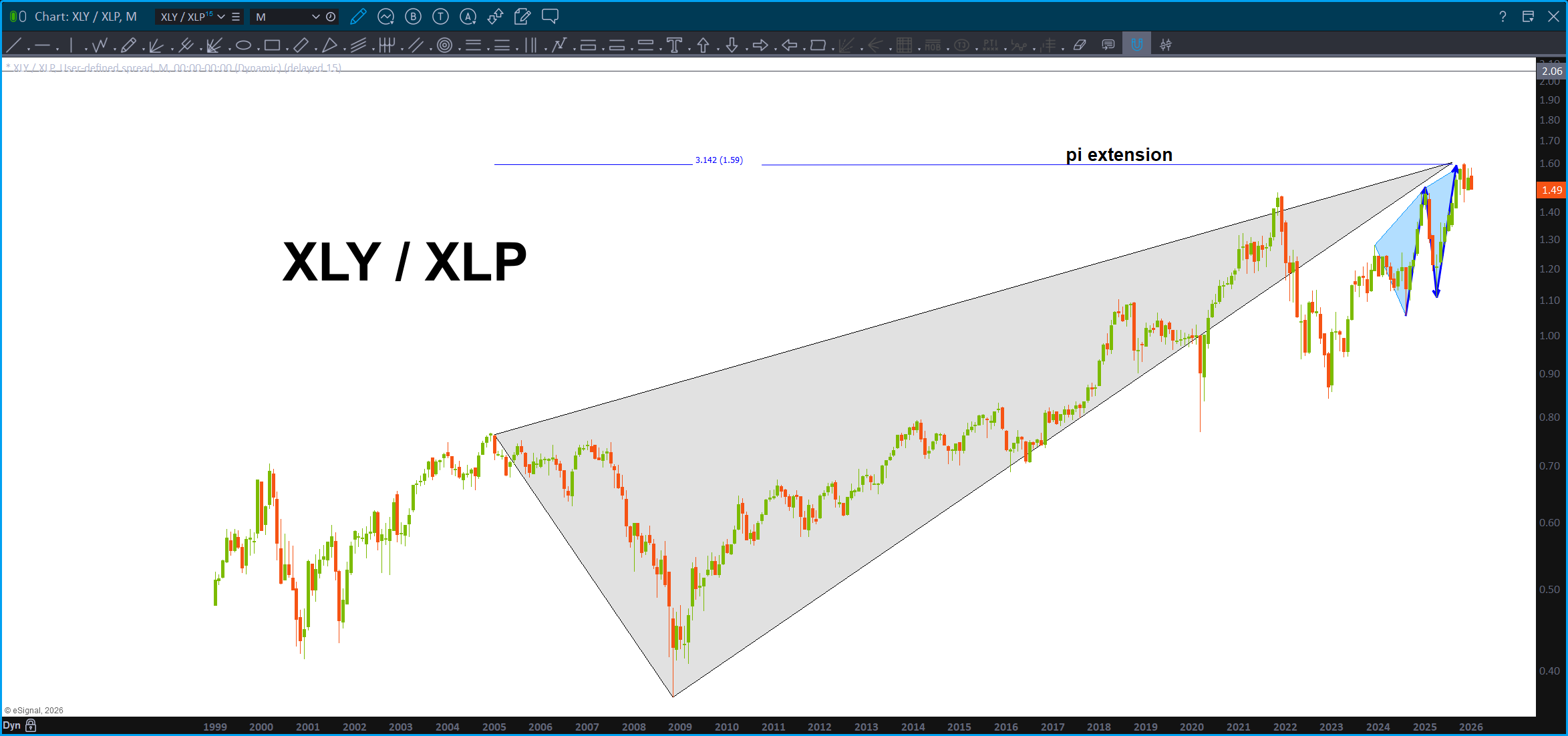
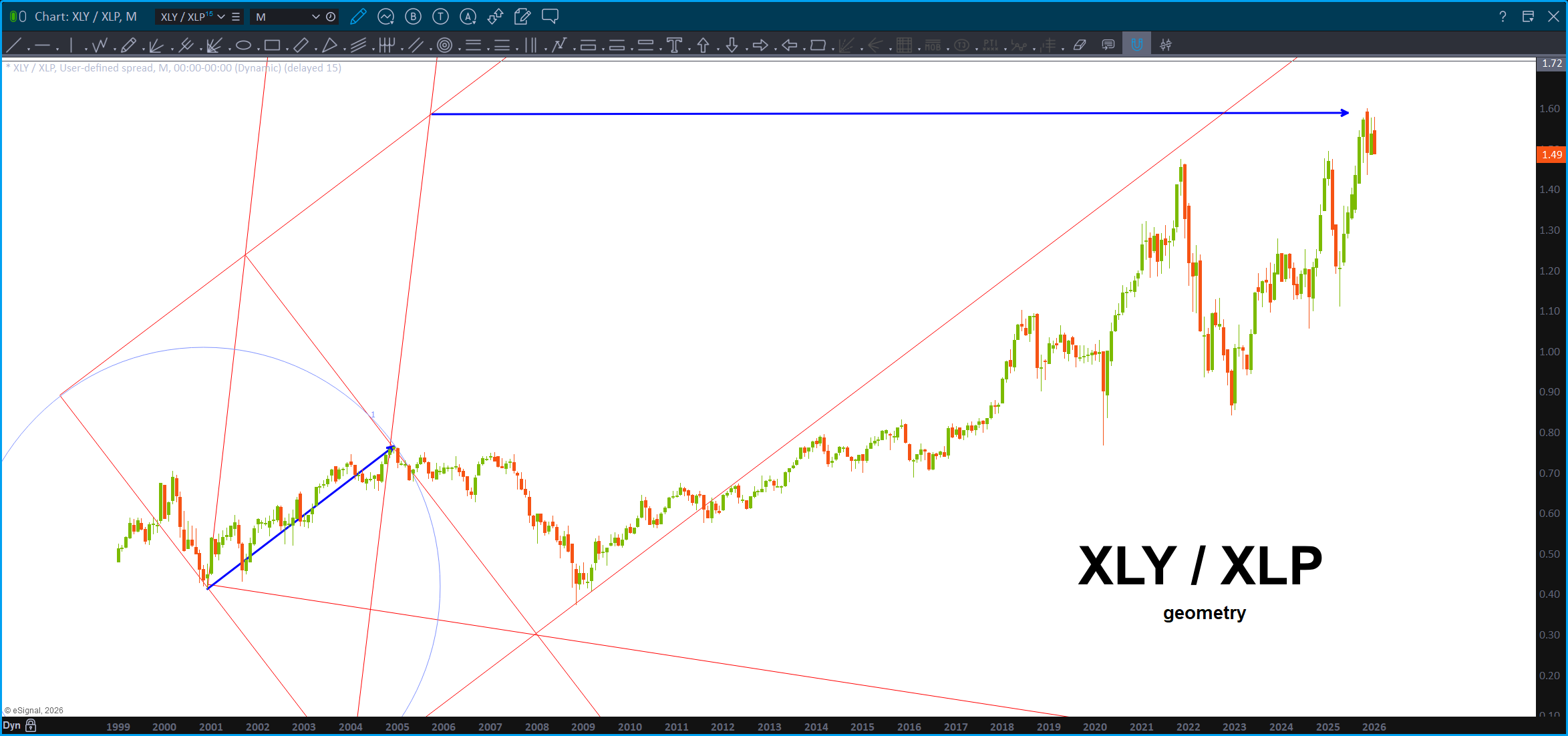
Then, it does all go back to geometry:
Folks, pull the plug, the tops in.
This analysis is wrong if the .786 level on the XLP/NYA breaks down w/ a daily (or weekly for more conservative) close below this level.
Oh, and don’t forget, it’s just a pattern. 🙂
Some charts … January 13, 2025

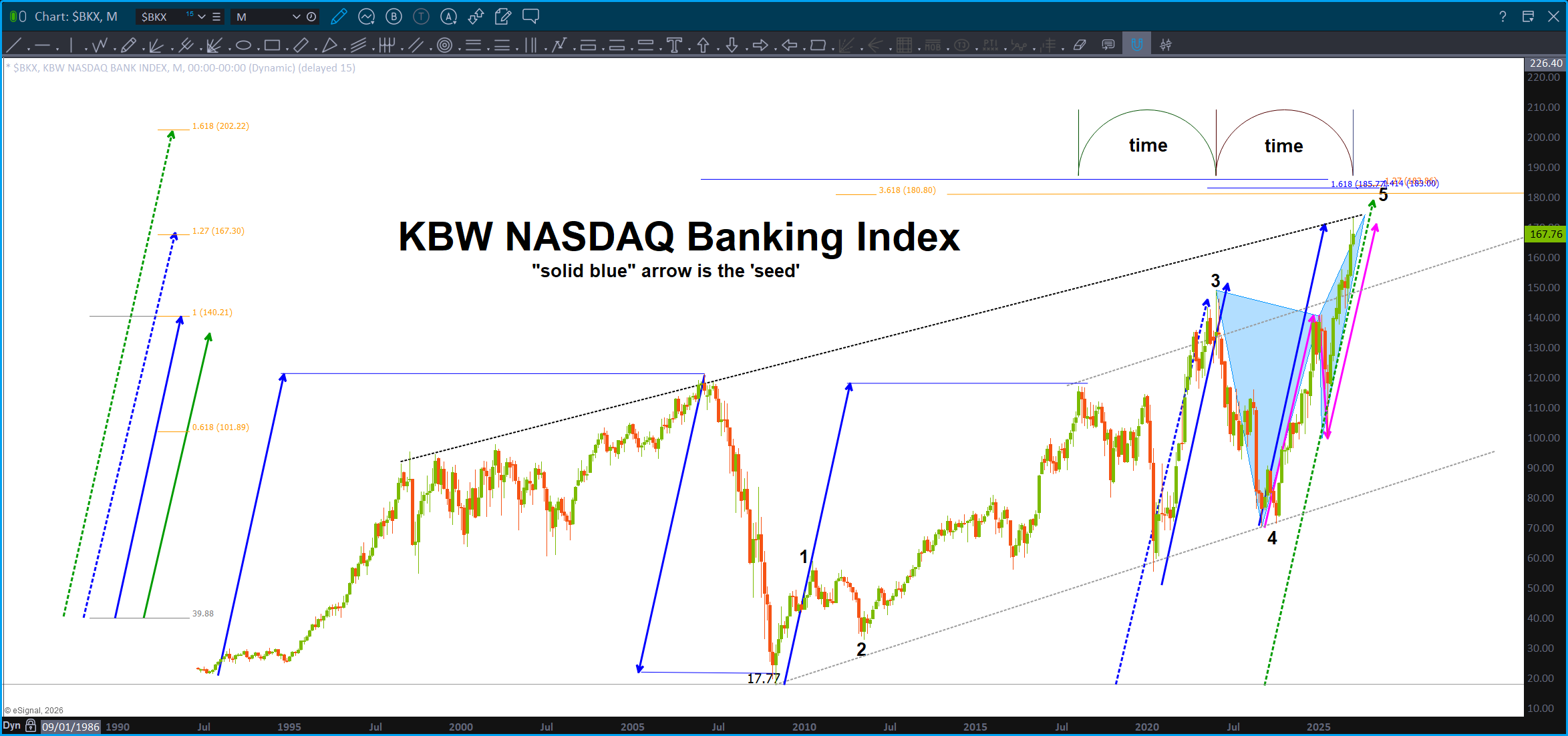
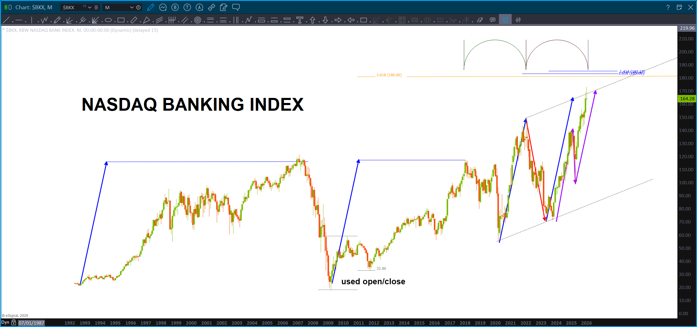
Shown this one a couple times … certainly looks like we are getting or at the VERY crucial resistance level on the KBW.
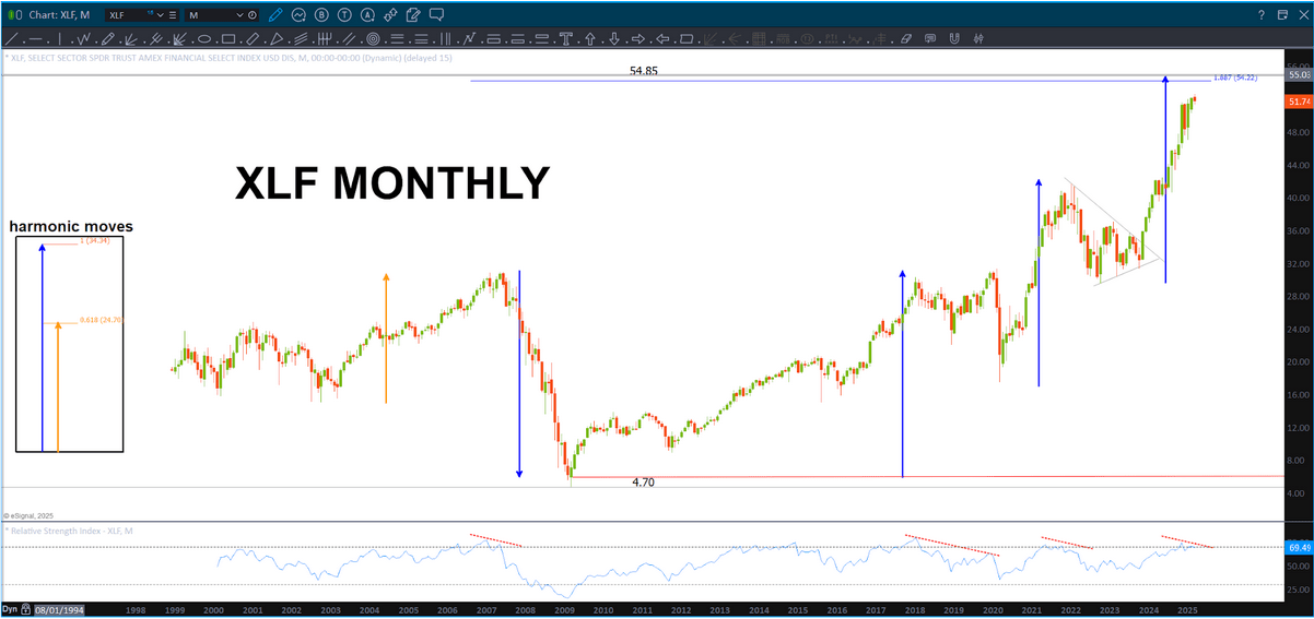
Same picture, sort of, w/ the XLF:
Folks, I’ve been blogging about the banks/financials – they lead us up and lead us down. Until “they” crack this fragile march up the wall of worry can continue. That being said, these charts are showing the measured moves associated corrections in the past are appearing, now.
The two charts above also exhibit a clear 5 waves … hmmmm.
Well, how about JPM?
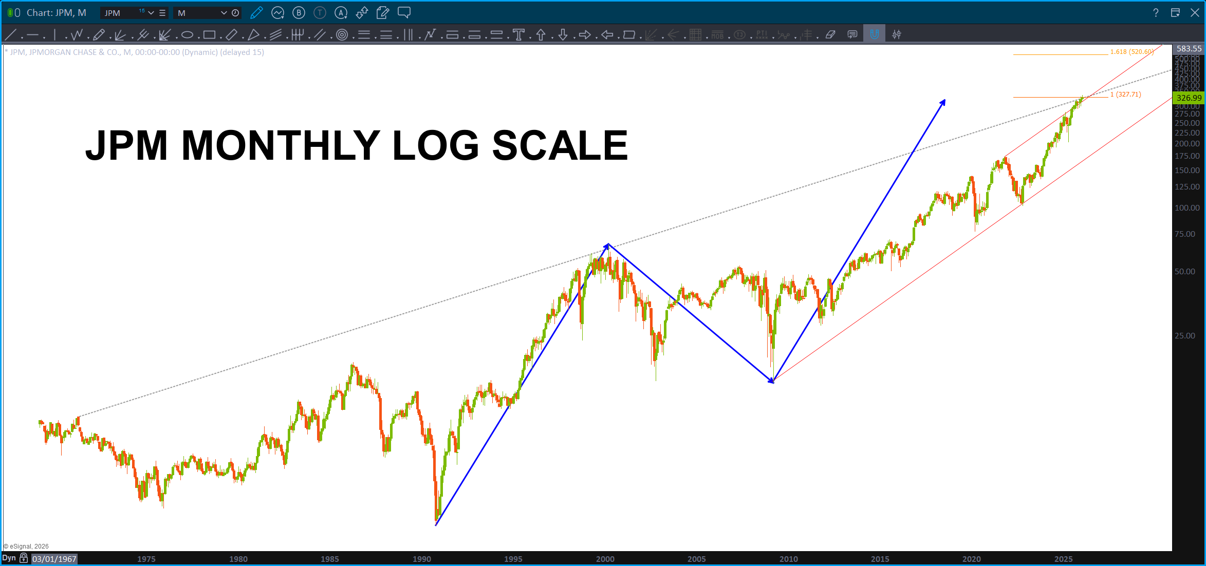
Note, this is a Monthly, since IPO, chart of JPM. Also note, it’s LOG scale so we are dealing w/ percentages .. you can always tell by looking at the right (or left) price margin. When it’s normal spacing you are using normal scaling but when you see big jumps like above – that’s LOG scaling. Well, guess what? ABCD on LOG scale works also! So … couple converging trendlines w/ a projection pattern complete. Note, remember the above about the KBW/XLF.
Well, what else is in the news folks? Silver …yes, I’ve been tracking silver and nailed the LOW in silver (folks, it was just the same correction as the last one ..) at 11 and said ‘it will go to new highs.’
Well, now is the true confessions time … I’ve been doing some fundamental reading (woah, what?) about Silver simply because it’s a weapons system w/in the already started cognitive 5D global war which is raging around us. If you don’t think that, well, “that’s your opinion … (pause) ….man” The Dude . There is SO MUCH GOING ON RIGHT NOW FOLKS ON MANY DIMENSIONS that its hard to keep up. We are living in the most AMAZING TIMES. Period. Dot. So, the reading has helped me understand some of the moves occurring right now … but this euphoria? Well, another confession time, I went to the long term futures chart below many times and ‘in my mind’ labeled it an A-B-C long term pattern. Why?
Folks, sometimes, I just simply don’t see it. Well, when the ABCD failed – BIG OBTW 🙂 – on Silver I went to the futures chart and said could this be a 1-2 ….? And we have started and are in a WAVE THREE OF THREE? And, that my friends, it exactly what this looks like. I’m bummed I went to the dark side and read some socio-economic and foreign affairs articles about Silver because what I’m about to say really does sound funny because it’s pretty outrageous.
I could easily see Silver, from a long term perspective hitting 200 dollars in the coming days.
Here’s why:
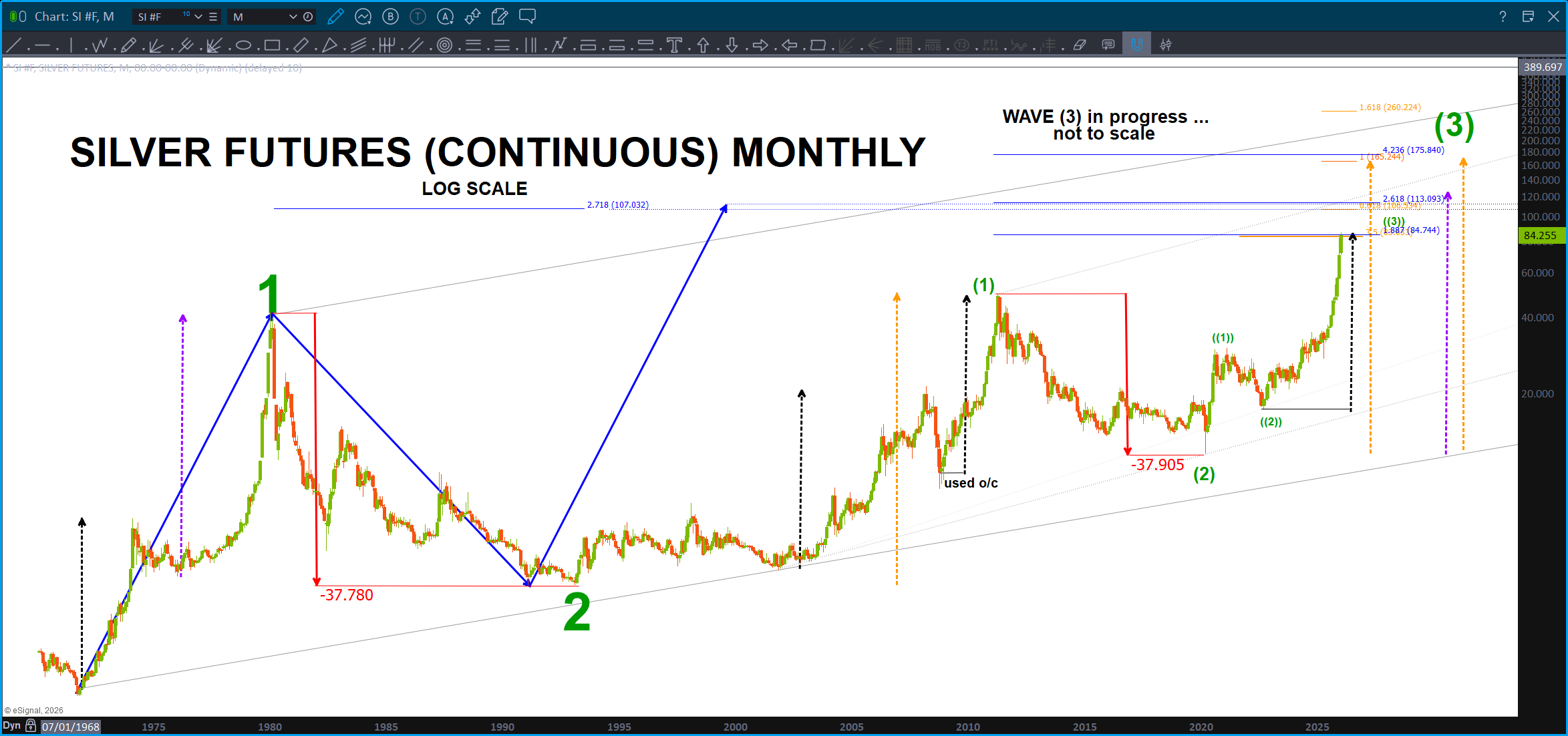
This charts goes back to 1972 folks and, IF my count is correct (obviously the big if) THEN we are going to have a pullback soon, but folks, you want to BUY THIS PULLBACK and I will be hawking it to BUY also as we haven’t even finished wave 3 yet. SILVER IS A BUY. Woah …. IYKYK. The chess match for precious metals has just got a lot more interesting, hasn’t … 200 dollar silver? Again, WOAH.
PS – remember my counting, I try. Give this a 70 percent change of being right? Maybe? 🙂
This was a pretty wild sequence on Lockheed. I had ID’d this pattern a week or so ago and I was on X w/ Ponch and we talked about LMT PATTERN and how it would probably fail (w/ the war and everything) but just look at it and remember what Trump said and then the budget request so … it bounced right off the pattern. Crazy.
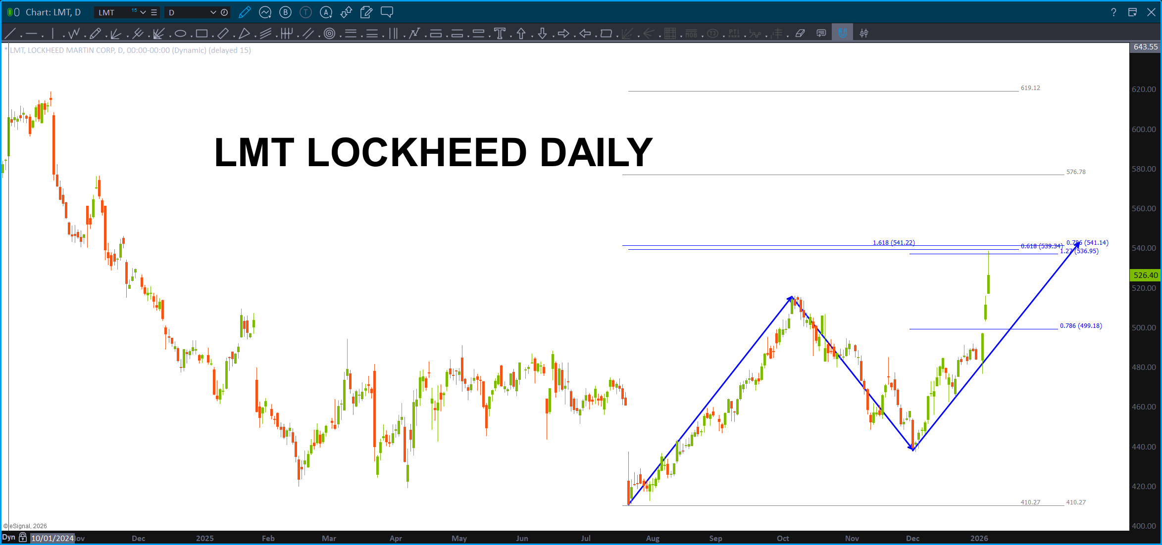
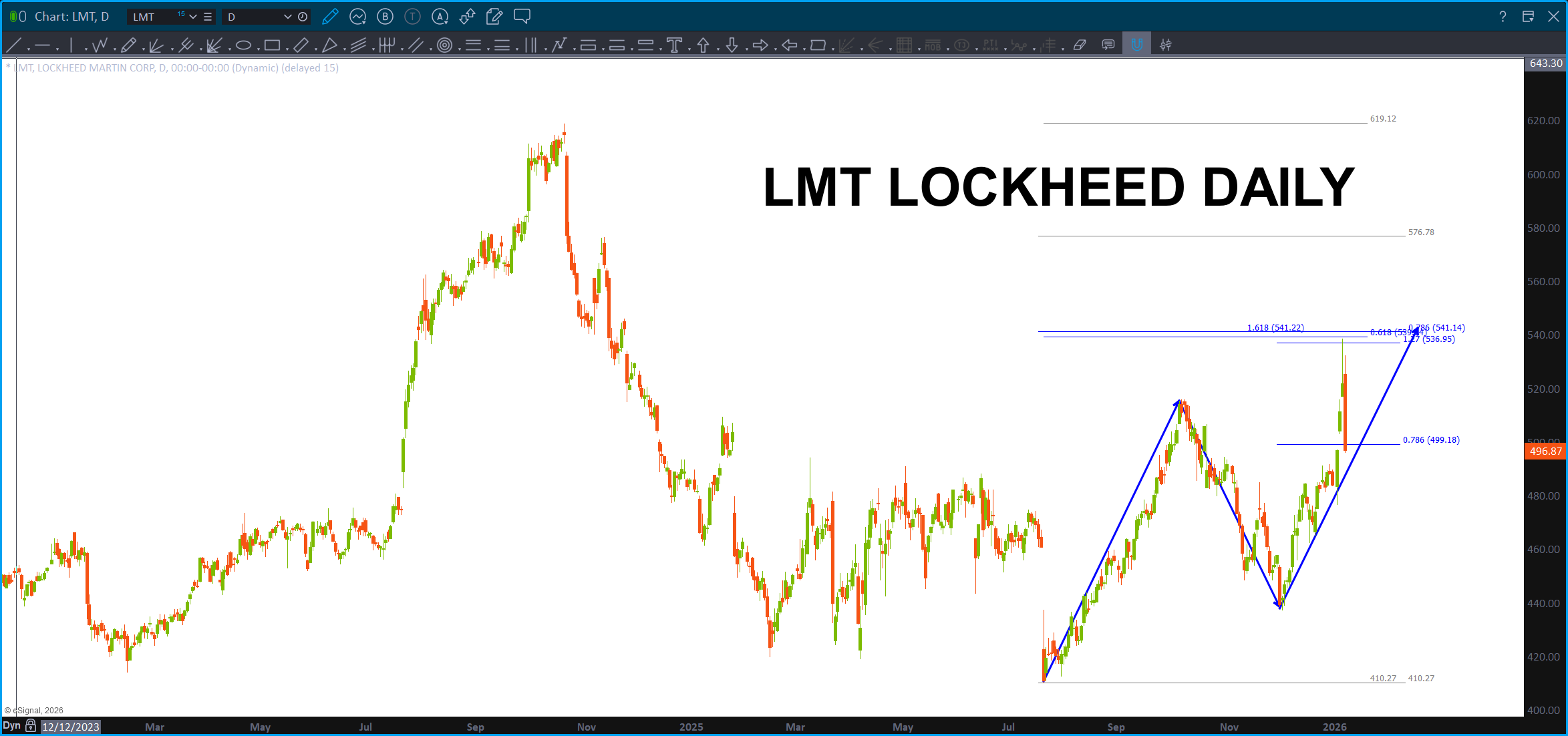
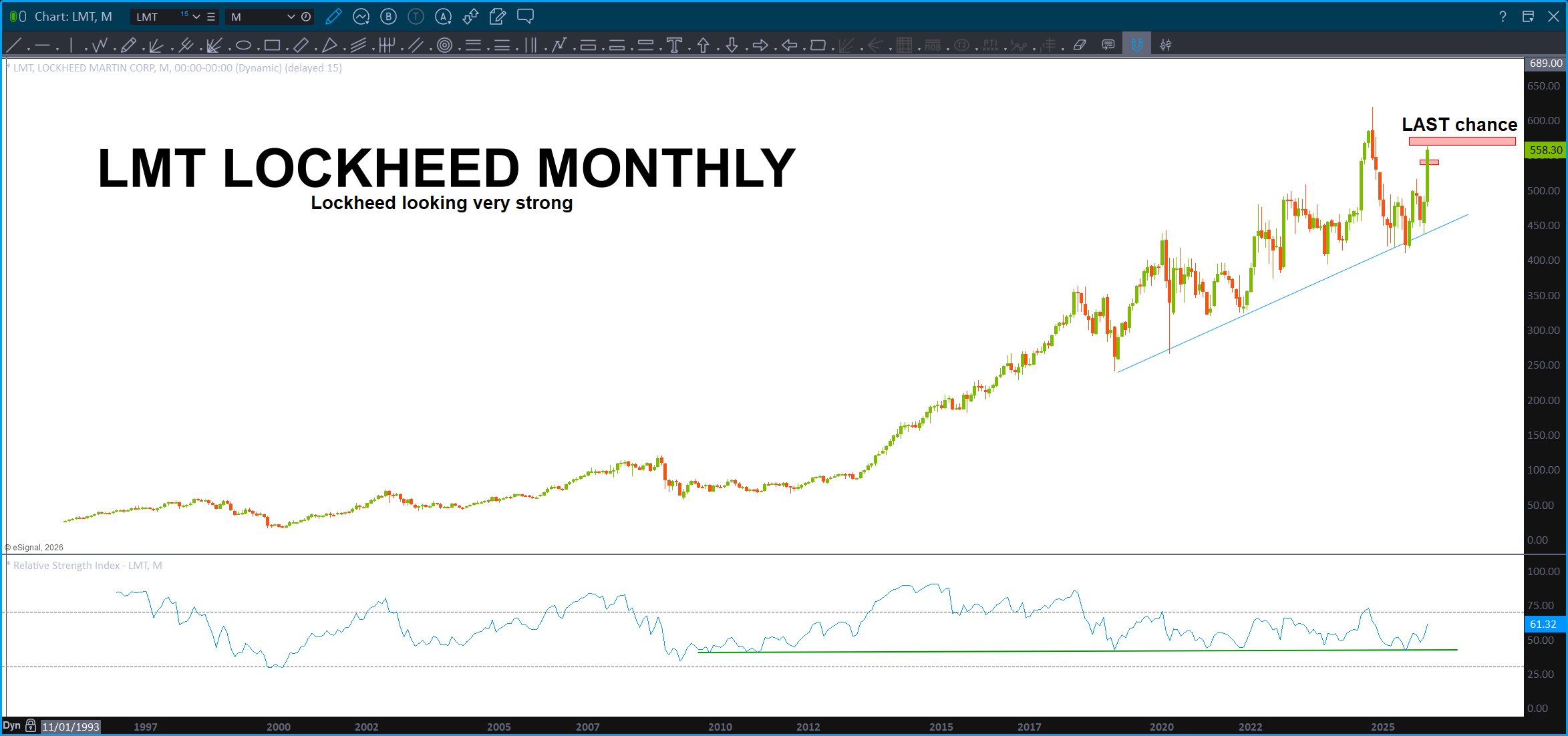
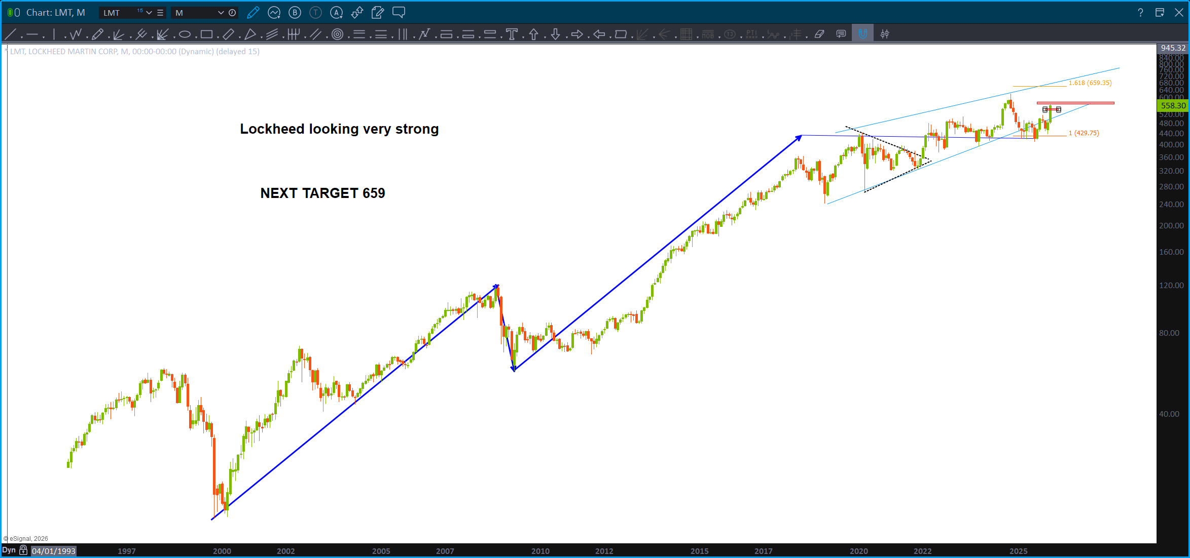
Here’s what the pattern failure looks like on a Monthly. There is some resistance approaching but, w/ the big Department of War (why Department of Peace?) asking for a HUGE increase in Defense Spending … yeah, I’m thinking we might pause here or something but this puppy looks STRONG.
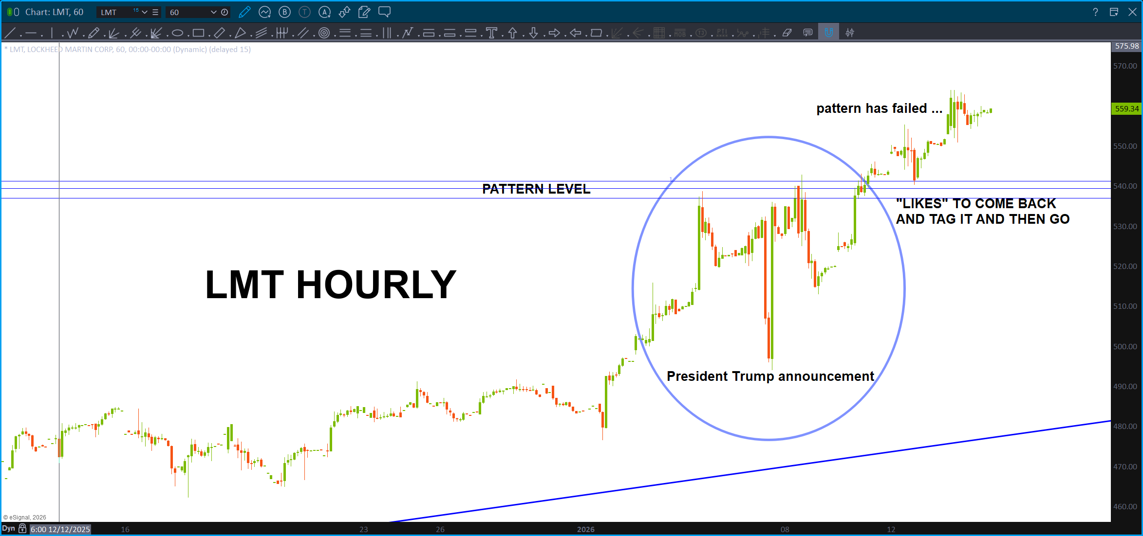
BOOM, there’s a PATTERN FAILURE for ya, near real time….
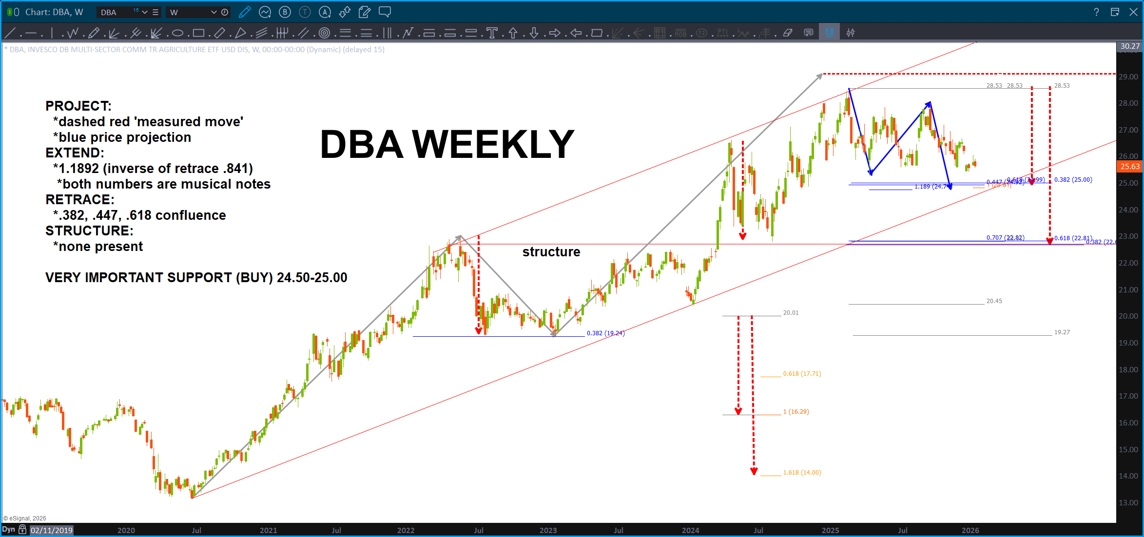
Here’s a fun one – DBA. I’m still long from the low and am thinking higher but we did just finish and ABCD (or close) … two key levels.
Check THIS one out on AMZN. Woah boy …
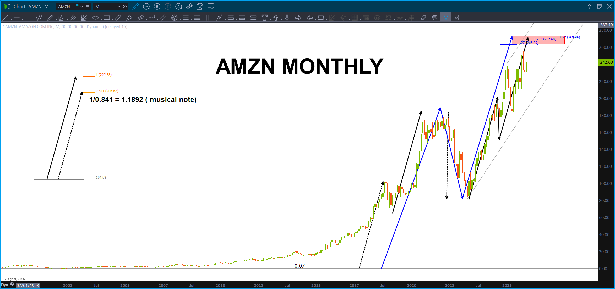
Folks, check out the measured moves and the harmonics of those measured moves … ZERO technical indicators, zero fundamentals just ‘measured moves.’ Could these be attractor states? Hmmm … if the SAME price movement occurs over and over and over again then … just like the flock of pelicans that came zooming very close by me as I was surfing this AM at Del Mar. (note – it was GLORIOUS) but think about it, just for a second. The pelicans were cruising the waves, or more likely, the air flow that moved due to the energy which is causing the wave to crest and crash producing a ‘force’ that energy can tap into. Wow … or the pod of dolphins which also came thru and I made eye contact w/ one and it was … let me just say, very cool. Even this Sunday, I had 3 dolphins surfing w/ me. Yes, actually surfing the waves and one of them flipped out of the wave as to say “cya dude.” I said to myself “cya dolphin dude.” It was cool … Anyway, these measured moves repeat. If we can find the MONTHLY long term measured moves then we can calculate those moves and there harmonics which is simply noting more than – the ratio’s created from the Vesica Piscis. Wow, pretty cool. I’ll stop for now.
Take all that and here wave have AMZN. Hmmmmm … two projections with extensions make this THE key level for AMZN going any higher in the near term. Would really like to see it go up there and tag that level.
Finally, the ratio appears to be putting in a pretty strong “hammer” candle and, technically, it was in our ‘target zone’ but I do wish it will go down and tag the projected area that we have been watching for months. That being said, looking at the charts above and some others one has to consider, the pattern complete. So, IF the XLP/NYA ratio has bottomed on a MAJOR MONTHLY pattern that has, in the past, been reason to ‘baton down the hatches’ as a correction is coming.
Here’s the link discussing the ratio from a few days ago: https://atomic-temporary-44460632.wpcomstaging.com/2026/01/05/orientation-update-the-ratio-january-5-2026/
And would you look at that … Mr. Measured Move in percentage terms:
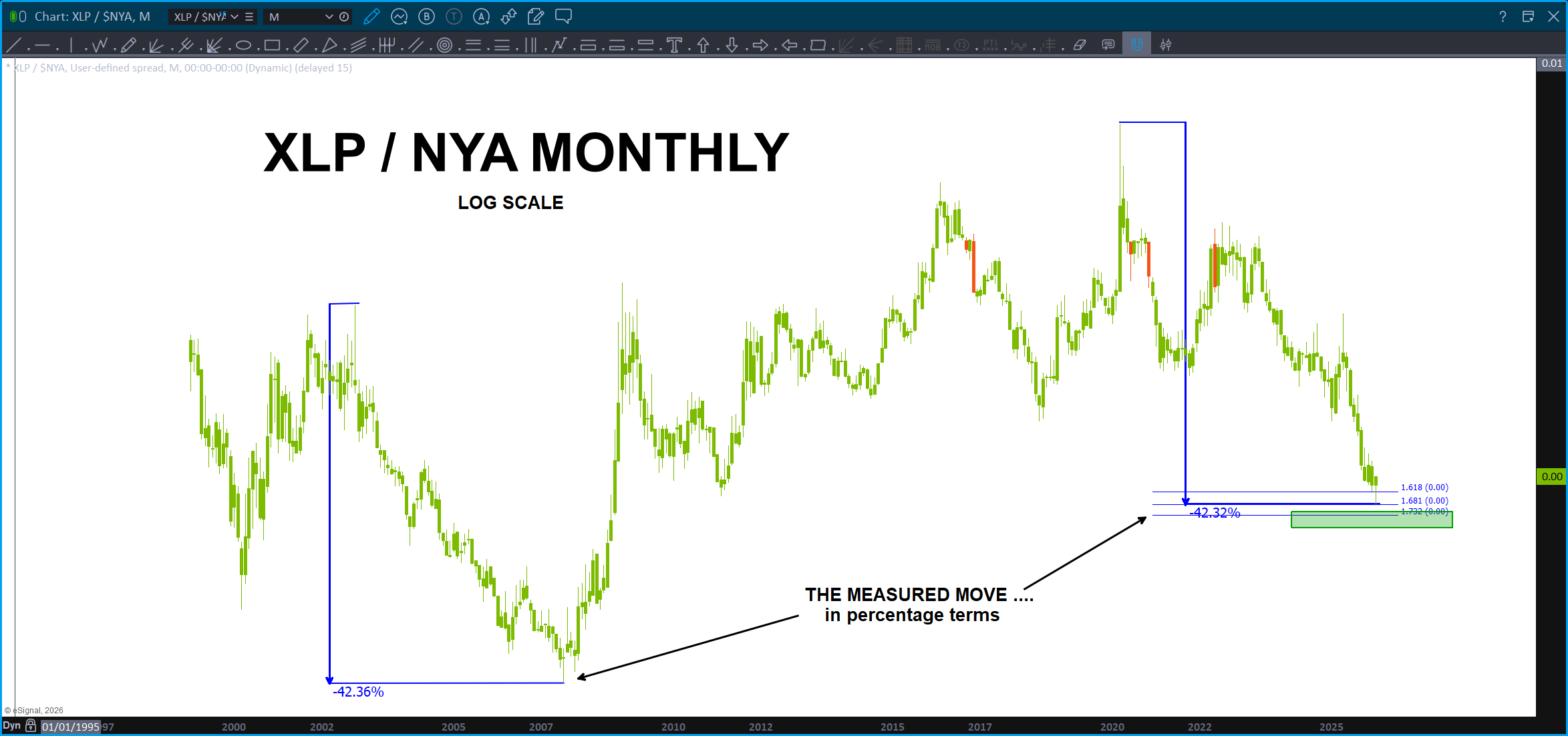
Woah … yup.
What about the USDJPY? Exactly … here ya, go real time:
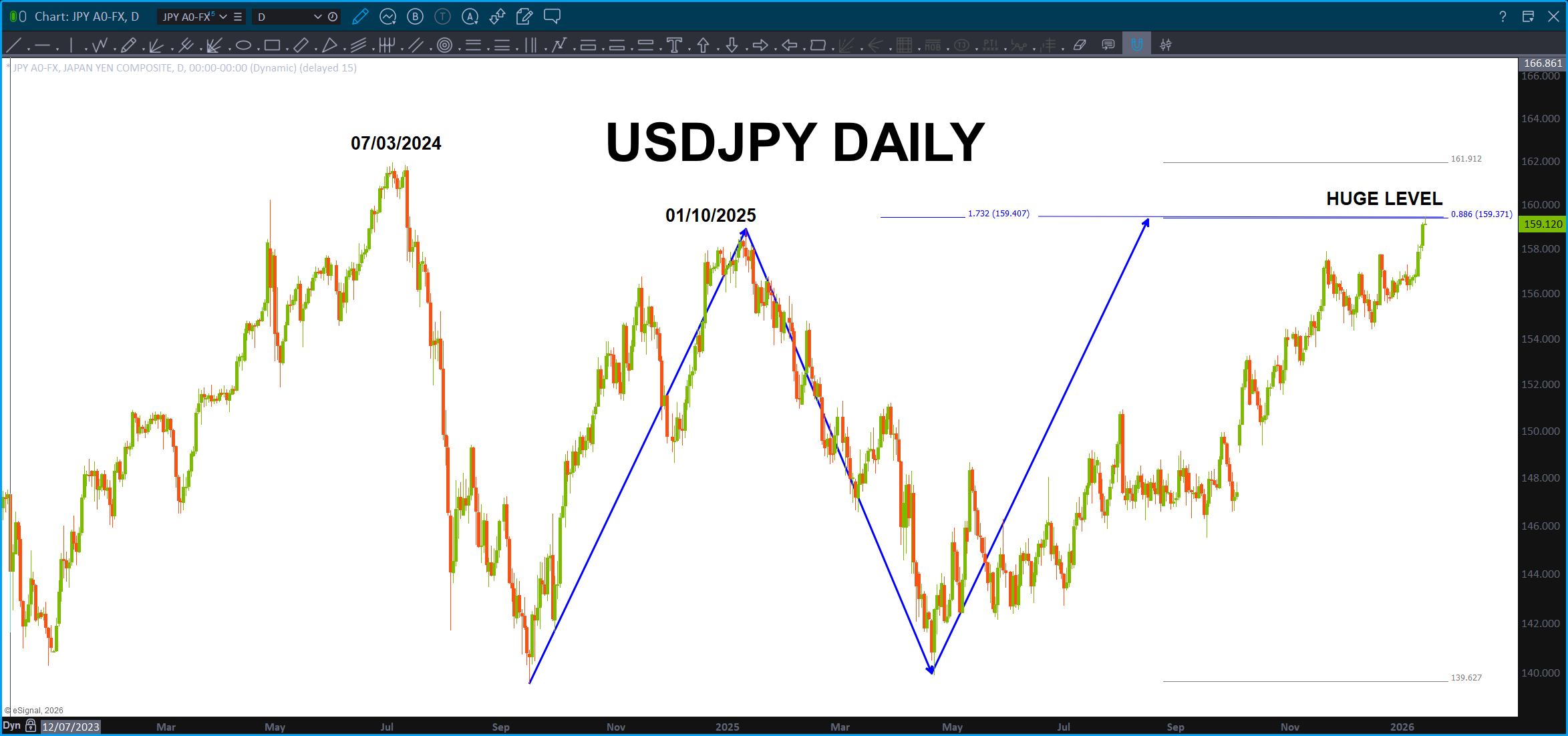
This is actually a PATTERN called the “crab” where the projection hits the .886.
IF the USD blows thru this level THEN that will give some relief for the global macro picture. It’s just hit the level folks …watch this level closely, because, remember, it came after this:
Remember … ? Man, that was a year and half ago! The YEN complex just blew up w/ strength – it was all the patterns. But, some of them have failed so … maybe this does also and off we go? It does work the dollar strength thesis. Again, keep an eye on this for the sole purpose of the carry trade.
KEY: The FX market is the LARGEST market in the world. When I first started trading the FX market it was something like ‘every stock, bond, commodity, futures market would have to trade continuously 90 days to equal one day of liquidity on the FX market.
Here’s what GROK says: Based on the most recent data from the Bank for International Settlements (BIS) Triennial Survey, the average daily turnover in the global FX market reached $9.6 trillion in April 2025.
So, the pattern at play, right now, is going to be KEY. Watch the USDJPY and the entire YEN complex, closely.
Let’s just consider the pattern on the XLP/NYA complete. Which means, support has been found on the XLP/NYA ratio:
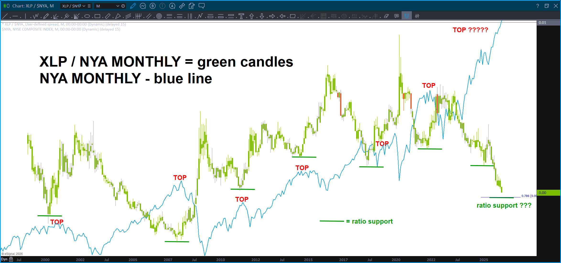
We should all know what that means … it’s time to get defensive. Now.
Cut all your positions and run for the hills? I’m not saying that, I’m saying, you might want to take some profit or you might be living thru another round of dollar cost averaging but what if … just if …this was/is a BIG TOP. Hmmmm … guess we’ll just have to wait and see.
Watch for a weekly or monthly signal reversal candle before doing anything too crazy but if we do get them … I would take it seriously.
Orientation Update – the ratio – January 5, 2026

We’ve been watching this ratio for over a year and never thought the BUY pattern would get tested. Certainly looks like that will happen.
This is THE level to watch for the market to continue its climb or correct … it’s that simple.

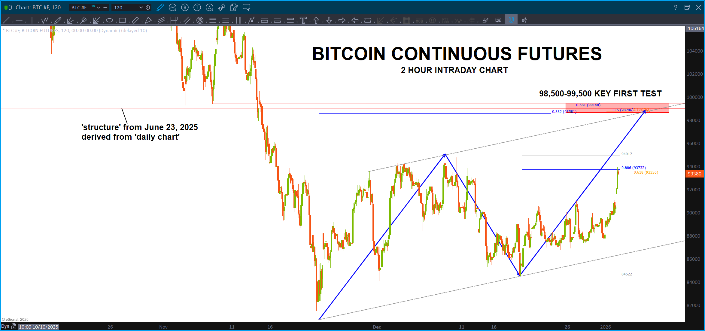
Orientation Update – BITCOIN January 4, 2025

Sure appears that Bitcoin is going to propel higher and, perhaps, make a new high.
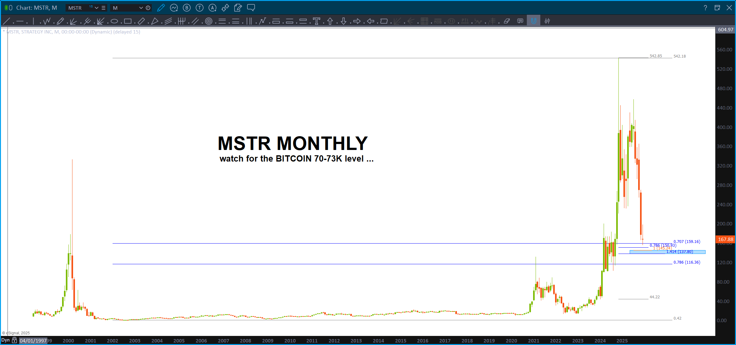
First test and, if bearish, should offer significant resistance is below. If we gap and go above that or just smoke thru it w/ ease then our map is orienting us to new highs in Bitcoin. Yes, I was looking lower for a VERY, near perfect, BUY zone in the 70K’s but w/ everything going on, it might not just get there. We’ll see … don’t forget that MSTR chart either. They kinda move together …
Hmmmm … we are dodging the gorillas w/ the dynamite and the short fuse right now. Isn’t this fun?
Orientation Update – TSLA – January 4, 2026

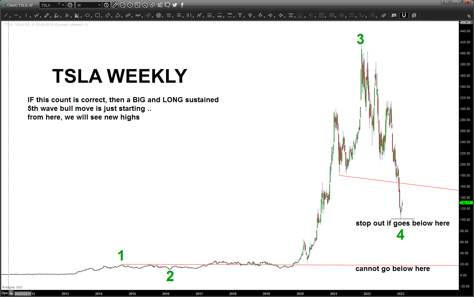
Thus far this count has worked … since we made a new high and smacked into the 1.27 extension and a clean 5 wave count can be seen, perhaps it’s time to take some profit on TSLA?

Orientation Update

Folks, not even going to pretend I know what direction Silver is going to go or IF my thesis about the first wave (of a lot more) in Bitcoin being complete and if MSTR is going to hold this major pattern. I don’t. They are just patterns and I’m trying to connect the dots the best I can. My frustration is “time” in that I know I could figure out the synthesis of time but, honestly, I’m waiting for a technology to appear and then I’m going to DUMP all of what I’ve studied the past 24 years into it and, I honestly think, it will be unlike anything ‘out there.’
The big key is thinking in the terms of OBJECTS (time as an object) and fractals (time as a fractal) and then the logic (help start a Virtual Reality software company 20 years ago – maybe THIS is why? 😉 of how to fuse the different disciplines of time computations (planetary, calendar/trading day, fundamental frequency, tides (yes, I said it – the tides), planetary returns, etc. etc. … so in this analysis I did a ‘little bit’ of time for MSTR and the ‘fractal’ of the golden mean is present w/ regards to trading day time and with the ‘Gutenberg Press Moment’ occurring in the Silver market globally, along w/ the FED playing Mr. Repo again, Japan raising their rates, Venzuella, China, Russia, Minnesota … I thought that this ‘time component’ is particularly compelling because, as of THIS day, China (worlds largest exporters of Silver peeps) is no longer allowing Silver to be exported out of China w/out strict controls. Yup, you read that right AND, as a former CFA (yes I played a Commodities Futures Advisor in a past light managing a small Spot FX account in … 2004-2009 (I WAS UP – but everyone had to roll their money out to cover losses!) I can tell you that something is amiss at the circle K when the physical (dare I say ‘real’) price is MUCH higher than the PAPER. (NY and London)
Now, call me a conspiracy theorist BUT are we, dare I type, seeing the first salvo of a global reset and economic warfare? Folks, just think about what’s going on right now …
Venezuela – big buddies? Russia, China … not big buddies? US
Silver – BIGGEST EXPORTER? China … paper players (paper tigers?) US, London
Back when I was being taught by Mr. Joe Dinappoli (www.fibtrader.com) he once said “never forget, YOU as a retail trader are entering into a cage w/ Gorillas that are mean, angry, hungry and are carrying lit dynamite!”
Folks, the dynamite has been burning for a PRETTY LONG TIME and the fuze is getting short.
Happy 2026 …
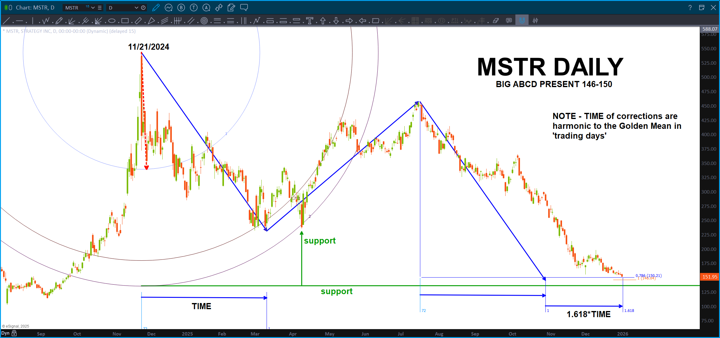
Be sure to have a stop in place for this one … (below the ‘green support’ is advisable) After reading the above … what if Bitcoin becomes a ‘real’ asset as the global gold/silver monetary value, along w/ a continual rise of the BRICS (precisely due to Russia being kicked out of the USD due to the Biden Administration) economic value, not to throw in natural disasters galore (more on that later if you would like ;)) and we have what is called a volatile situation.
This MSTR BUY could explode w/ a BIG RUN in bitcoin higher based on everything going on …

Ratio’s – December 14, 2025

I didn’t know what to call this post, so I just put the date.
Over the weekend, I read everything from “we have another 4-5 years in this bull run” to an Elliott Wave label of a Grand Super Cycle III and my good friend and mentor Larry (trading daily for the past 50+ years) talk about a monster top here or inbound.
I
DO
NOT
KNOW
Just looking for a pattern … the CLEANEST PATTERN I SEE IS MY OLD TRUSTY XLP/NYA.
First, take a peak at this ‘static’ cycle – it was near perfect for about 15 years and then, w/ the recent cycle, it has failed. Hmmmmm ….
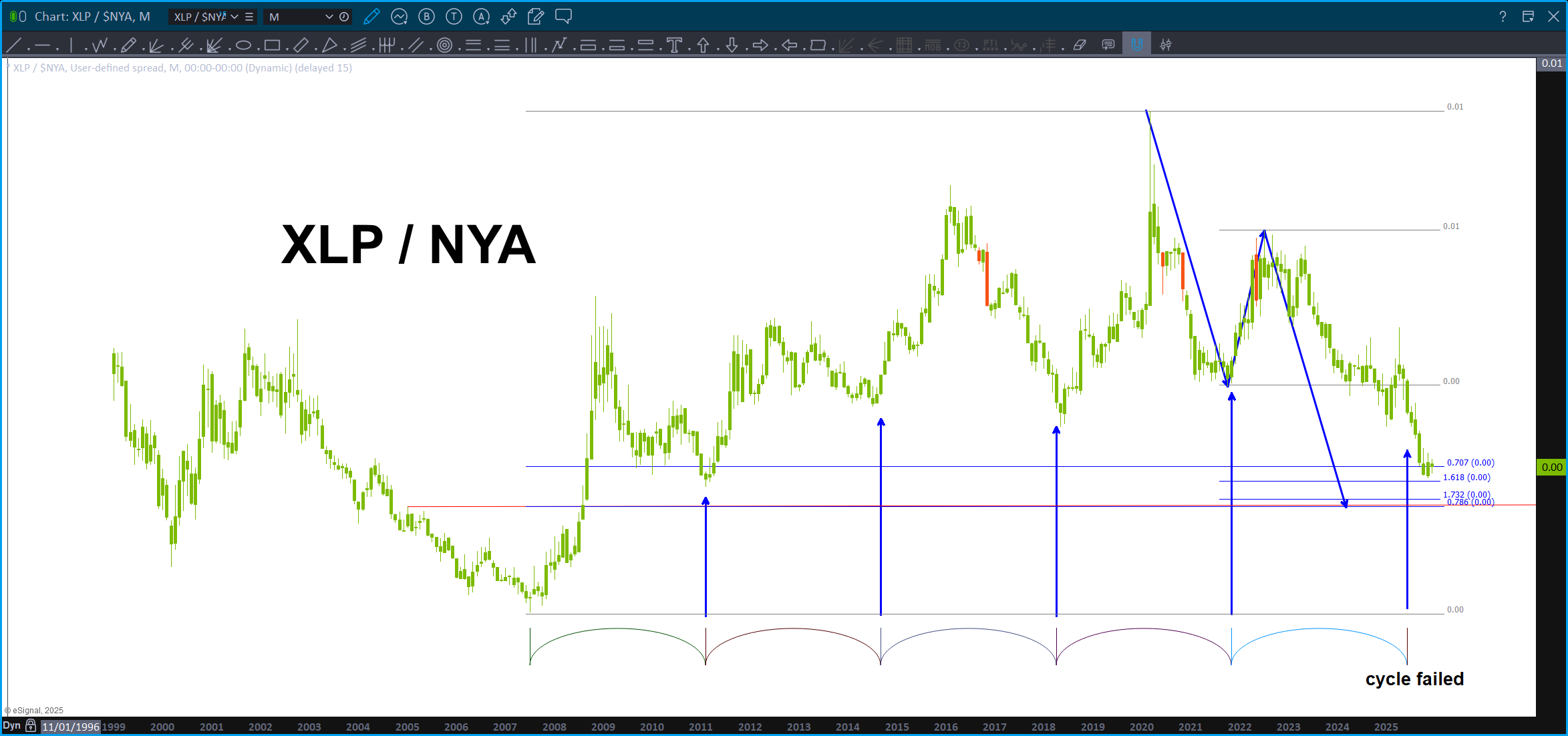
So, one would think w/ the measured move, the ‘timing’ and the patterns that we would have seen a more pronounced sell off. We did for a little bit but it still didn’t appear to be the ‘real pattern’ – that was lower.
Over the past year it’s been pretty frustrating, at least for me, in that I had a ‘bearish’ bias since the patterns that were completing was from years ago and sometimes 100’s of years ago. Why not at least expect a nice thump … well, some of the patterns have held, others worked in didn’t, some got smoked and some are still out there ….
This pattern, a little bit below is MASSIVE in it’s ramifications. From a simple ‘chart’ perspective it’s the first MONTHLY ABCD BUY PATTERN that is simply near perfect.
So, for my BULLS out there, you want this pattern to fail and if you can take all the gyrations that appears to be happening in the market I would hold your longs until the “short stocks” level.
And, for the BEARS, it certainly looks like the play to keep your sanity is to WAIT for the “short stocks” level to be hit on the ratio. Then, you have a well defined zone to understand your risk. We could be starting down hard … some think so. As discussed earlier, I have no idea. Nope … but, that level is SO BIG and we have so many ‘bearish’ fundies coming into play …
I sense a nice top is here or coming ….
