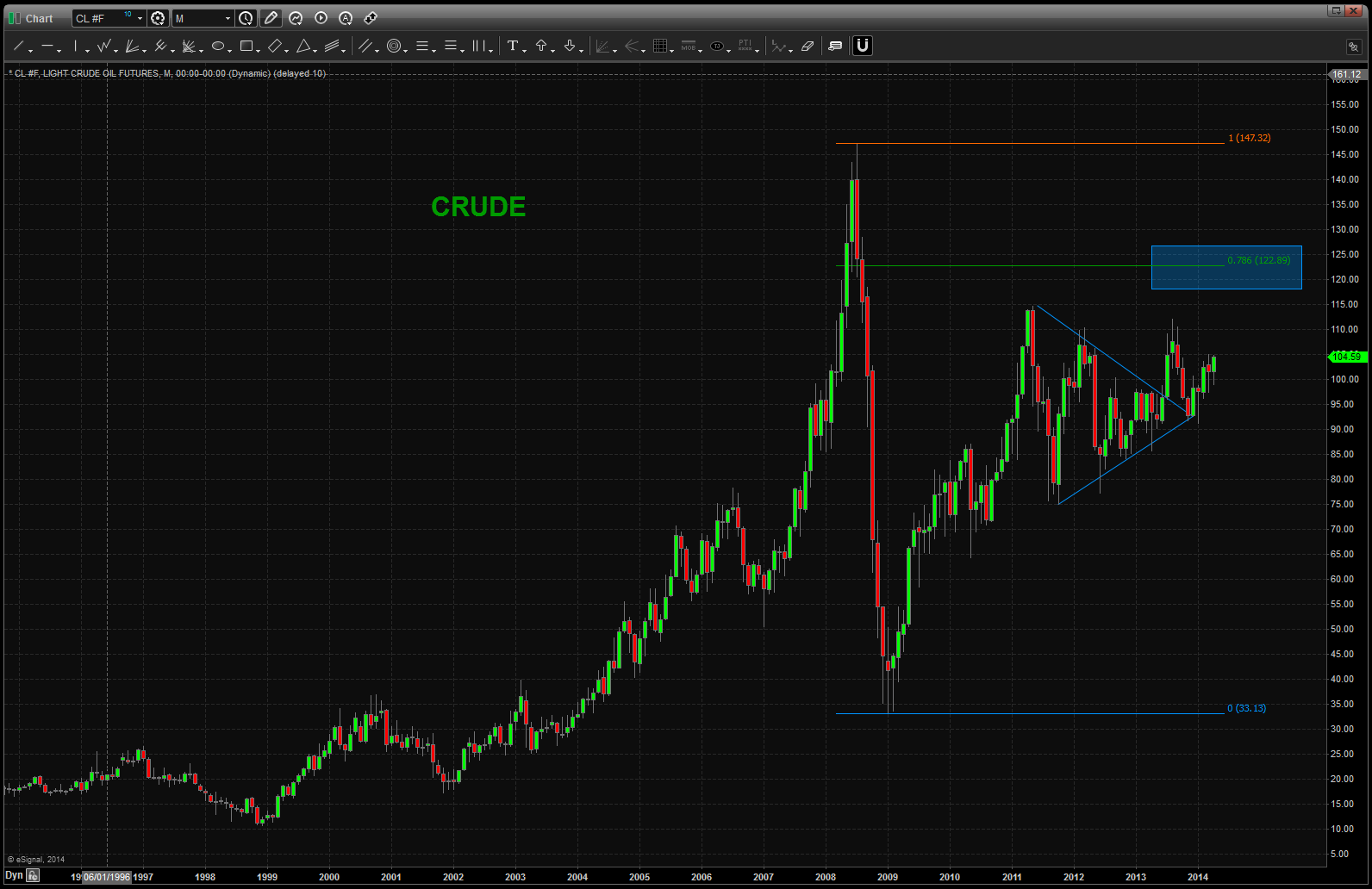
quick look at China
Posted on April 27, 2014 Leave a Comment
in what appears to be the largest IPO ever ALIBABA should be coming to the street …pushing the limits of 20 BB it’s something to be watched. Not for the John Q Public but for the banks Credit Suise, Goldman, Morgan Stanley, etc. are going to make 100’s of millions on this one. So, I don’t think they will let this one go by the wayside …

ALIBABA
but here’s what’s interesting … we have the Chinese Yuan FX pair causing quite the unwind and a representative ETF, FXI, of China is on a clff …here, take a look:
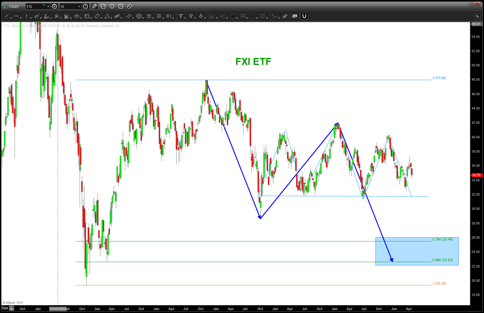
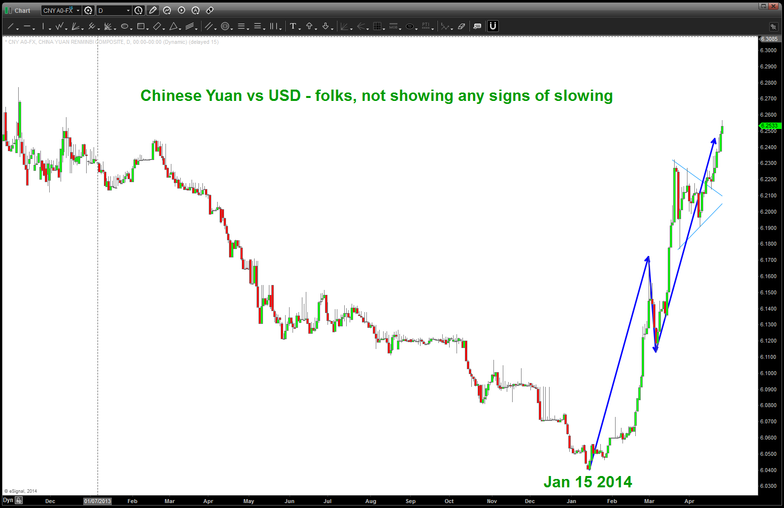
this sure is an amazing dance to watch … kind of reminds me of the Blackstone (BX) IPO . These two charts should tell you the story:
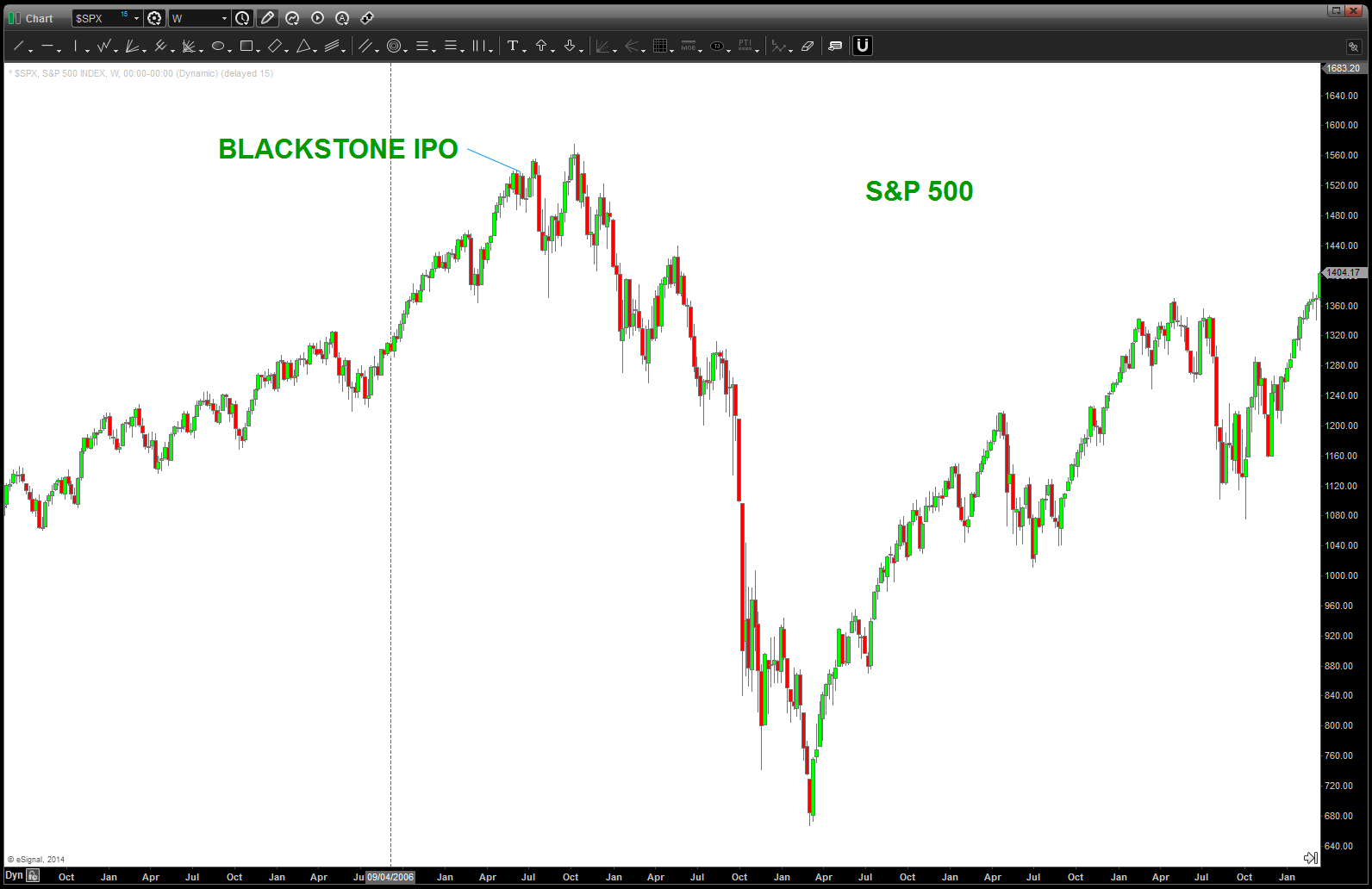
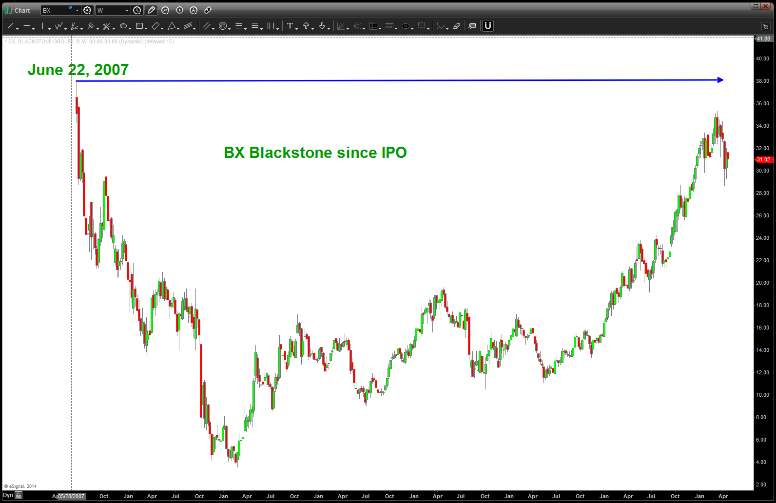
the bears are getting hungry and this IPO is going to be one heck of a show. the biggest IPO in history couldn’t possibly end up w/ the same fate as BX? Could it …? Stay tuned …
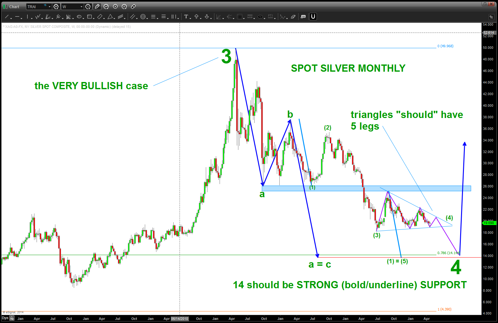
Silver and 14/oz
Posted on April 26, 2014 Leave a Comment
Cliff Notes: sure looks like a 4th wave triangle working out …a,b,c,d,e and we are in a rally up for e and then down into 14. EXPECT 14 to be BIG TIME support. Also, this is showing the high as 3. I have mentioned before I am really not sure if it was a 3 or a 5. BUT a BULLISH pattern is at 14.
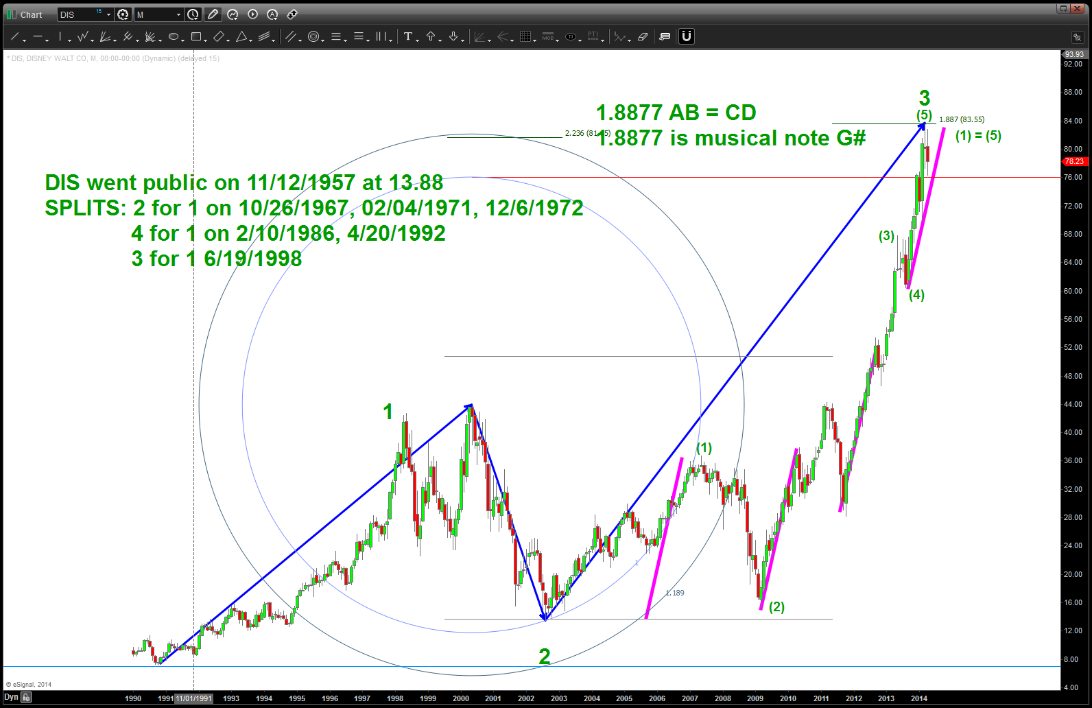
DISNEY (DIS)
Posted on April 26, 2014 Leave a Comment
CLIFF NOTES: recommend take profit w/ a weekly close below 76.
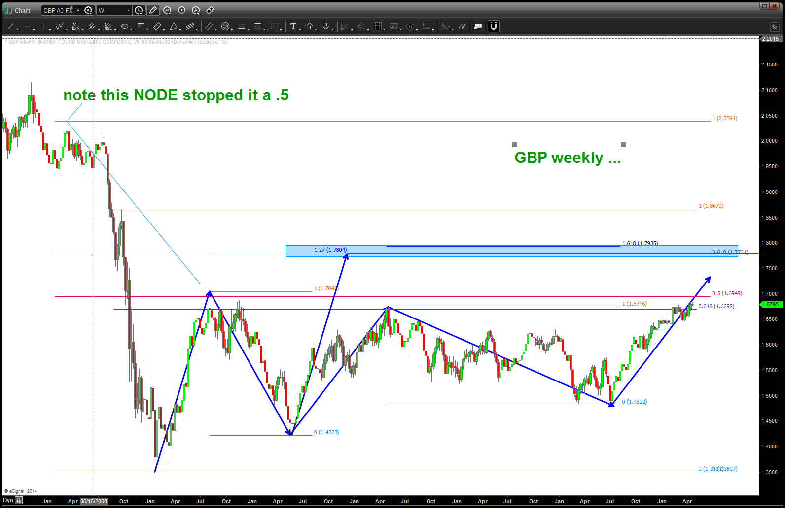
the Great British Pound redux …
Posted on April 26, 2014 Leave a Comment
CLIFF NOTE: POUND to attack 1.7, make it thru and then set up for a SHORT. If it does not break thru, then waiting for a sell pattern. Am NOT going to try and count the current consolidation. If/when it makes it thru 1.7 it will be quite the cookoff!
CLIFF NOTE 2: please see the following link and you’ll see that my “triangle” thesis in the POUND was, well, wrong … it’s been over 3 months since I have looked at it. Took that long to bring a fresh perspective. I can still tell you that I am waiting for a PATTERN but I’m not tied to the triangle anymore …
the first thing I am going to do is go back a 100 years … I should go back further but 1) it’s the weekend and 2) believe this is accurate. While it’s true the Pound wasn’t necessarily floating against the dollar til 1971 I want to remind us that Spot Gold stopped on the .382 from the early 1900’s and it was fixed then also. So, here’s a long term count POTENTIAL from 1915
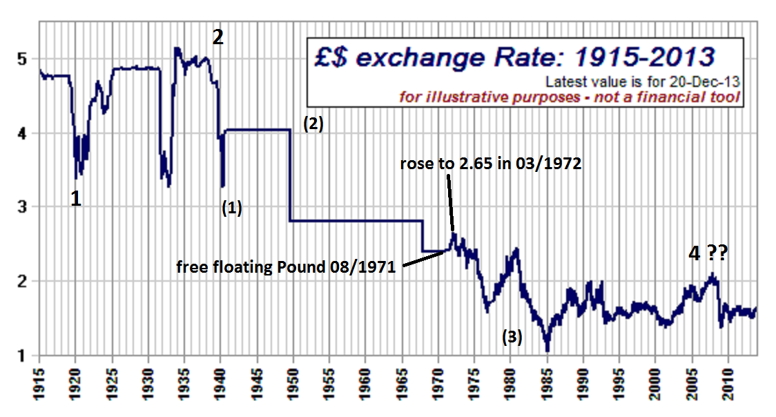
GBP 1915-2014
here’s a POTENTIAL look at the BIG PICTURE (note it’s not EXACT) but a quick look at some major trendline POTENTIAL
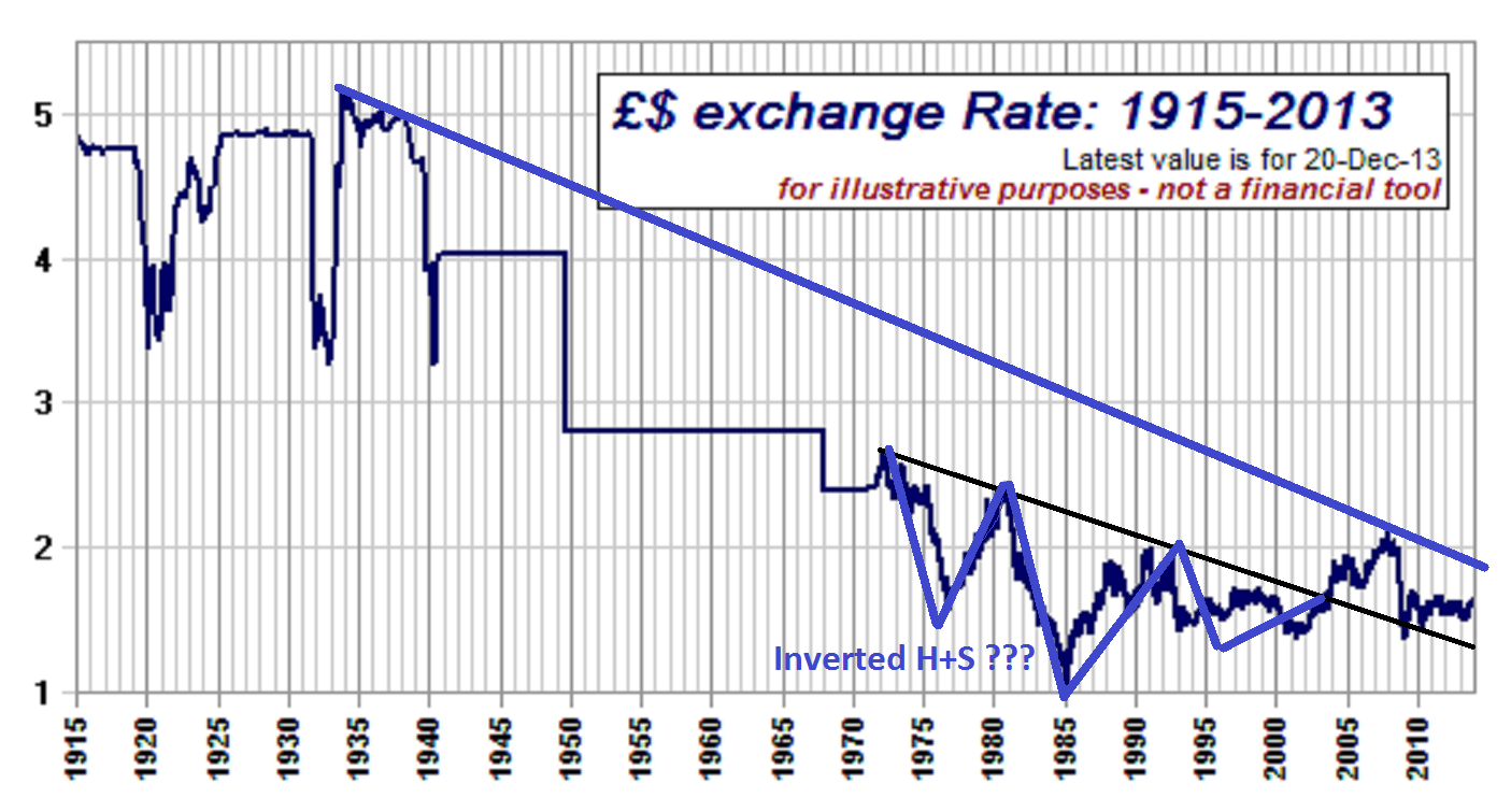
note the inverted head and shoulders pattern present and how the 2007-2009 THUMP came right back down to the trendline and STOPPED. Folks, that’s BULLISH … basic TA says to WAIT for the neckline break UP or DOWN on a H+S patterns and for price to “come back to the neckline” — that’s what happened…
So, now let’s “zoom in” to a MONTHLY look at the GBP ….
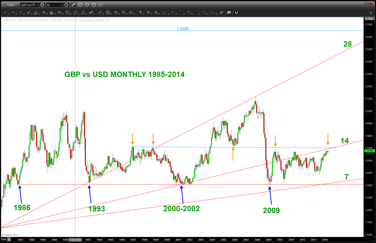
some things to notice – 1.4 is a BIG DEAL from a support perspective and the 1.70 handle has been key since 1996 as RESISTANCE and support. I think it’s inevitable that we are going to go up and attack 1.7.
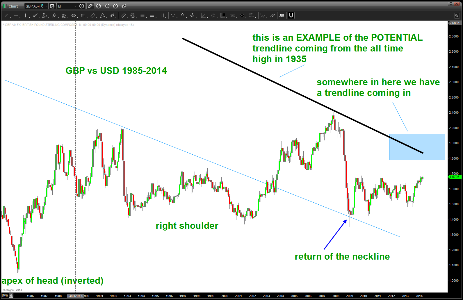
let’s digest two major points:
1. so, believe a case can be made of the inverse head and shoulders and the return to the neckline as shown below. (note: these trendlines are not exact but are used to give us a sense/feel of where are.) Our light blue line is the neckline of the inverted head and shoulders and illustrating how we “returned to the neckline” and bounced. Now, let’s think about it for a moment — if you can remember back to 2009 the financial world was coming unglued. So, take a look at the candles coming into this low. THEY ARE VERY BEARISH and the NECKLINE HELD. Overall — bullish ….
2. I do not have the chart data that goes back 100 years. I have used the chart above to make a BEST GUESS ESTIMATE of the trendline coming from the all time high in 1935 up in the 5.xxx’s. What we can say is this trendline is going to come into play. If I can get my hand on a good CQG chart or something like that THEN I could get more exact but it’s something to understand. There is MAJOR resistance on the POUND higher but the fact that the data isn’t as good as I would like it “could be” a 300-500 pip range. Way to much to manage risk … but be aware.
now that we have defined the key areas we can also get a “feel” by using the long term RSI support and resistance zones
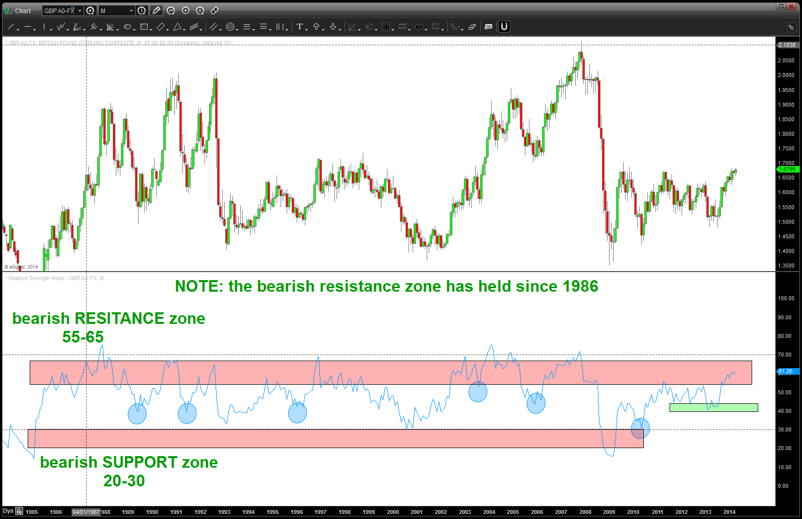
what do we see ? In the long term picture there have been times where it has bounced off BULLISH support in the 40-50 area but it has NEVER broken thru the BEARISH resistance levels defined by Constance Brown.
so, note sure I am any farther along then when I started but I do think I have put together an executable gameplan. Let me know what you think ….
DJ Transports and Utilities updated
Posted on April 25, 2014 Leave a Comment
CLIFF NOTES: I am a patter recognition chartist. I am NOT trying to be overtly bullish or bearish. Just using this forum to show the PATTERNS that area ppearing.
On the DJ Transports we have completed a MAJOR AB=CD sell pattern w/ a 1.618 extension. That is bearish. It’s particularly bearish because the pattern using the former all time highs and lows. I am also showing the Utilities almost completing a very bearish pattern. Again … heads up folks, these are NOT 60 minute intraday scalping trades. These are MAJOR patterns that bear close watching.
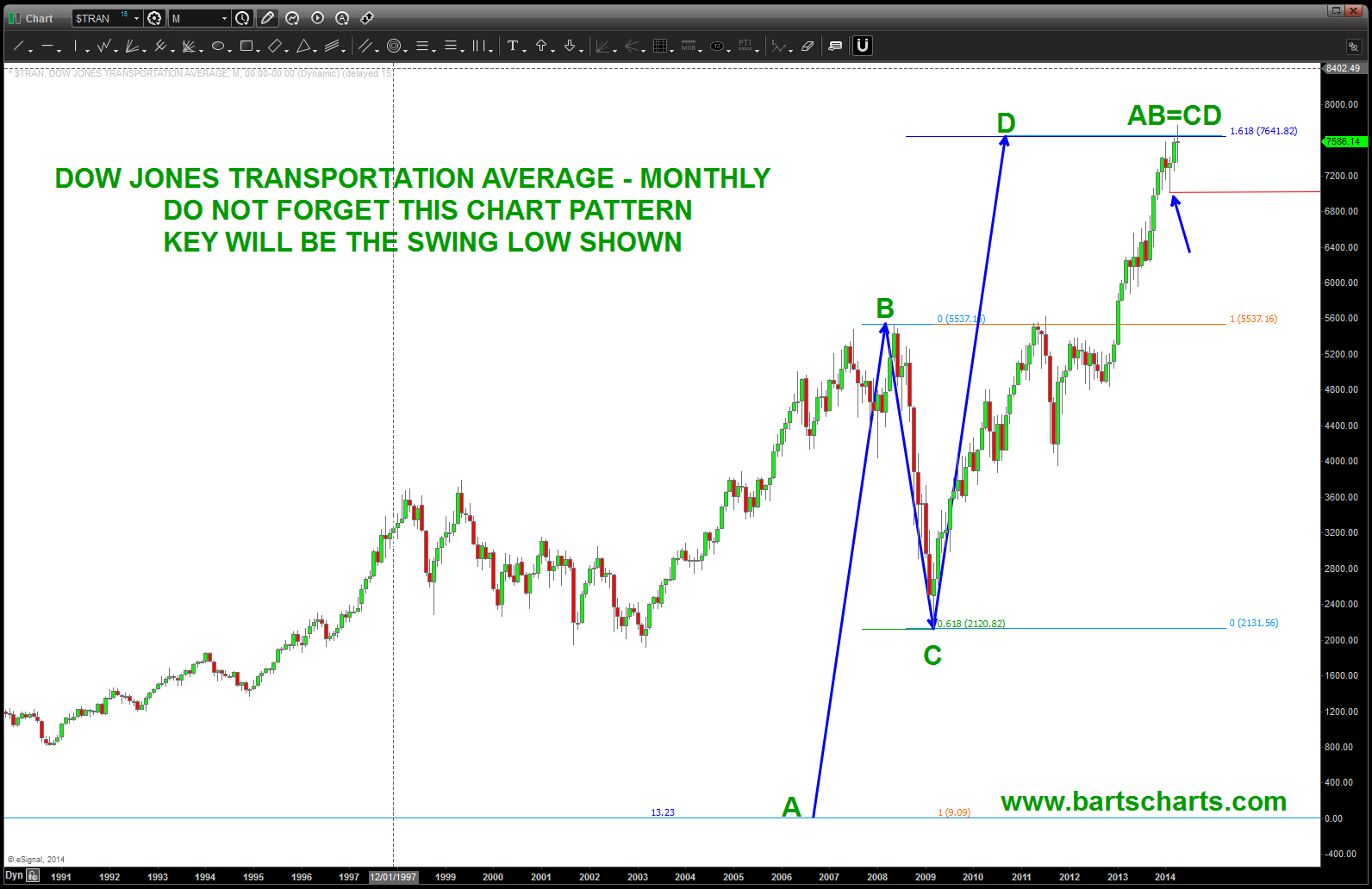
DJ Transports
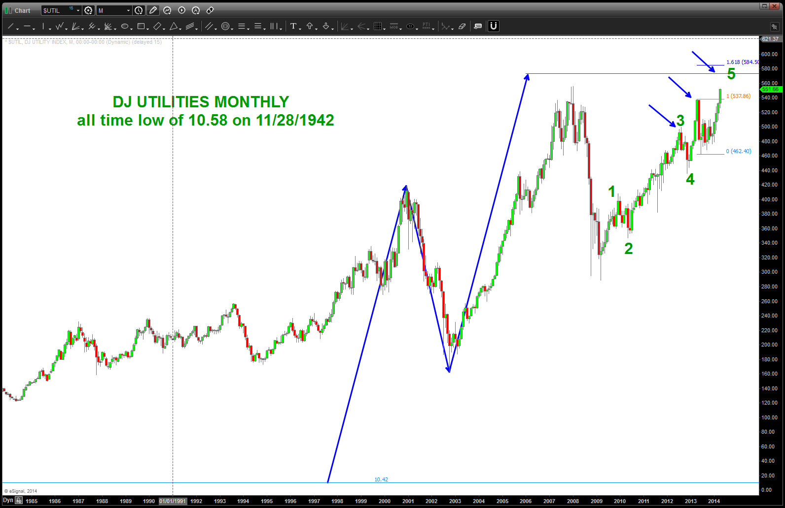
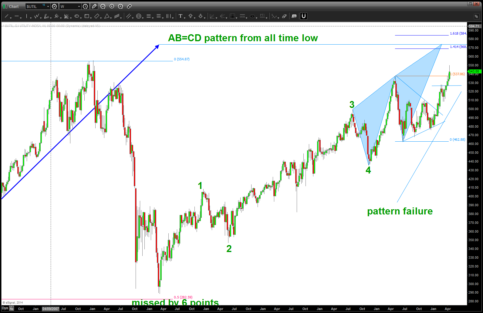
DJ Utilities
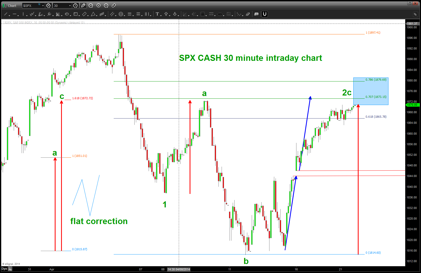
SPX updated as of April 21, 2014
Posted on April 21, 2014 Leave a Comment
CLIFF NOTES: my initial quick look at the S&P appears wrong from the counting perspective. Once the gap up occurred it signaled the characteristics of a C wave so I readjusted and am looking at a FLAT correction occurring and it should be done at the close today or just a little higher. Expect selling to come in …
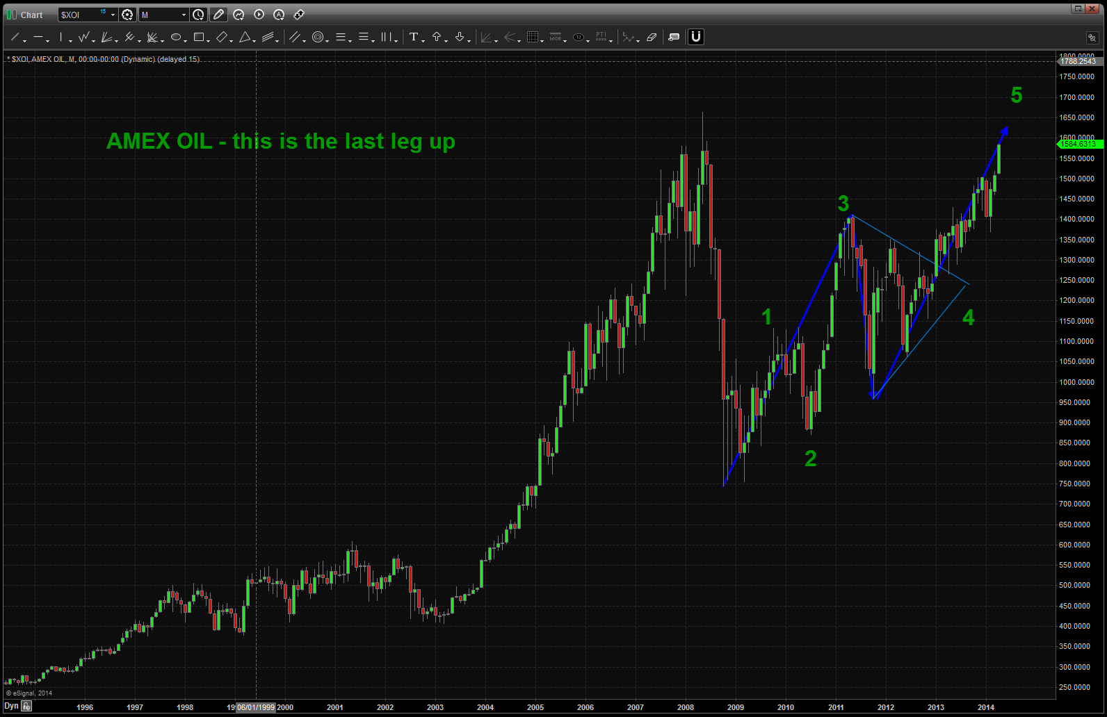
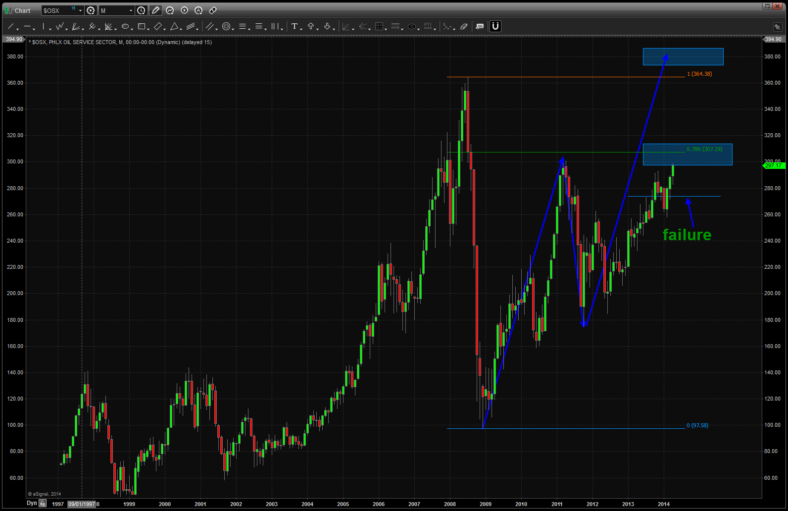
Energy is usually the last shoe to drop
Posted on April 20, 2014 Leave a Comment
CLIFF NOTES: below you will see a butterfly top coming into play in the XLE. 98 and/or 110 should act as major resistance. Let’s take a look at the potential set-up’s coming into play:
- DJ Transports have completed a MAJOR BEAR pattern w/ the AB=CD completing from the late 1800’s.
- DJ Utilities have a MAJOR BEAR pattern just a little bit higher that should act as major resitance.
- THE XLF (proxy for the financials) has completed a WEEKLY BEAR pattern … the banks usually lead us UP and lead us DOWN.
- Parabolic Charts have shown the first sign of weakness (IBB, GOOG, PCLN, etc, etc) which usually results in weakness. The Social Media darlings have “cracked”
- Multiple Long Term 5 wave counts are complete on some very important big cap stocks
- And, from a cycles perspective one of my mentors, Mike Jenkins at http://www.stockcyclesforecast.com wrote this:
The biggest cluster of cycles we will face for the next decade hit from April 14 to 23rd, but
not really ending until the solar eclipse on the 29th. In my life I’ve never seen anything like it
except perhaps for 1974. My guess is a Middle East War or major stock market collapse, or
major earthquake. I would be extremely defensive until we get to the May 2nd to 5th pivot.
So, the band can continue to play on but let’s trade what we see … the XLE is important because it is usually the last to top in a bull market.
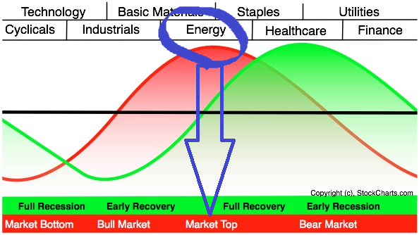
With that in mind we now present a BEARISH BUTTERFLY SELL PATTERN as shown …
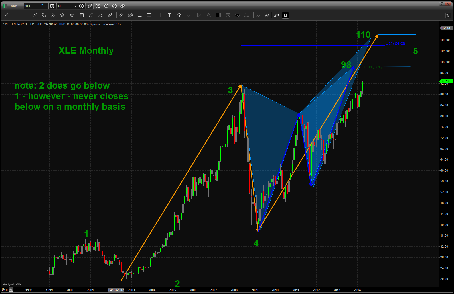
I left the background of the chart black for Easter Color affect …
We have been watching this target per this post: https://bartscharts.com/2013/09/15/part-iv-sp-and-energy/
Stay tuned as this market is topping (has topped) folks and w/ the amount of evidence being shown, it’s time to seriously get defensive and take profit or be in cash. Once these patterns complete …
Happy Easter — Bart
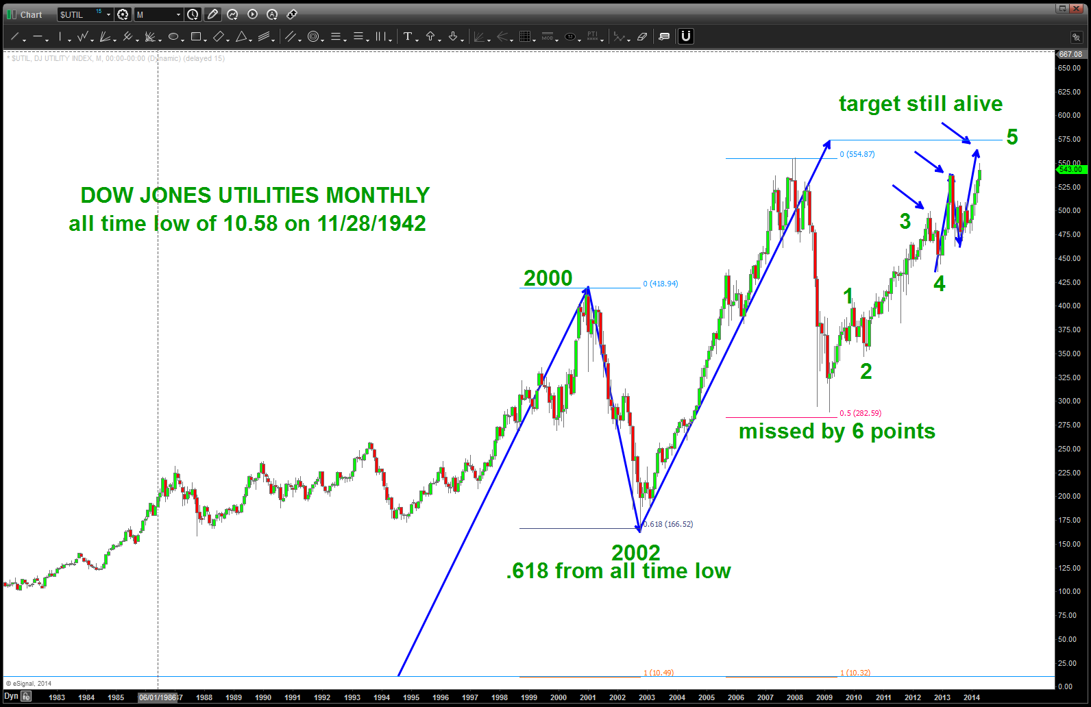
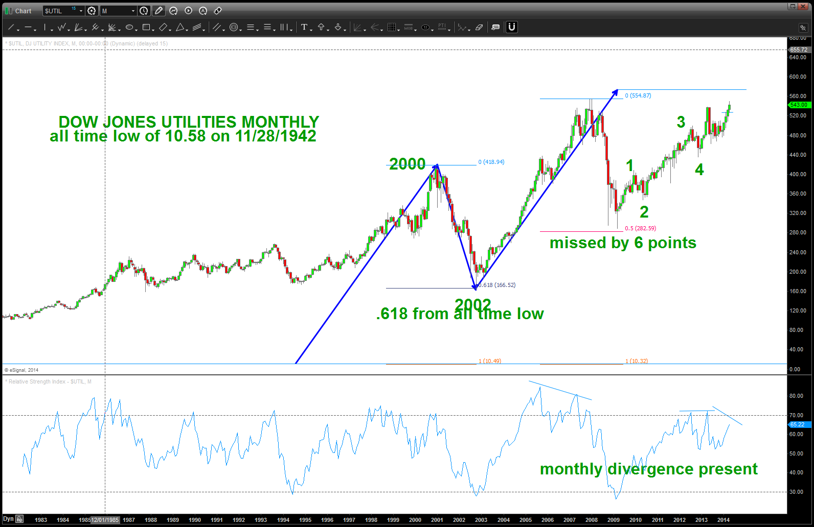
Dow Jones Utilities Long Term (1942) Price Pattern
Posted on April 19, 2014 2 Comments
CLIFF NOTES: major target appearing on Dow Jones Utilities at/around 573. Definitely the stronger of the Dow components but 1) monthly divergence is presenting itself, 2) a possible 5 wave (monthly) count completing, 3) THE AB=CD pattern from the all time low in 1942 is a little higher …so, believe this is the most important index to watch over the next couple weeks.