when the big boys eat soup volatility rises ….
Below the two dashed lines is a post that I did 2 years ago – almost to the day. Pretty amazing …some would call it synchronistic. I’ll just leave it at that …
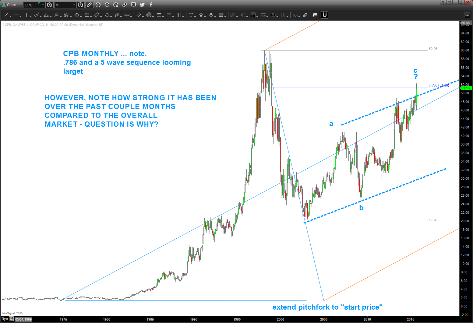
Personally, I enjoy my Saturday and Sunday morning’s w/ a cup of coffee. Nothing going on, put a little Pandora on the headset and just “chill” and enjoy the amazing fall weather in VA. Little Bird said – “hey Bart, how about CPB soup?” So I took a look and – BAM – I was surprised.
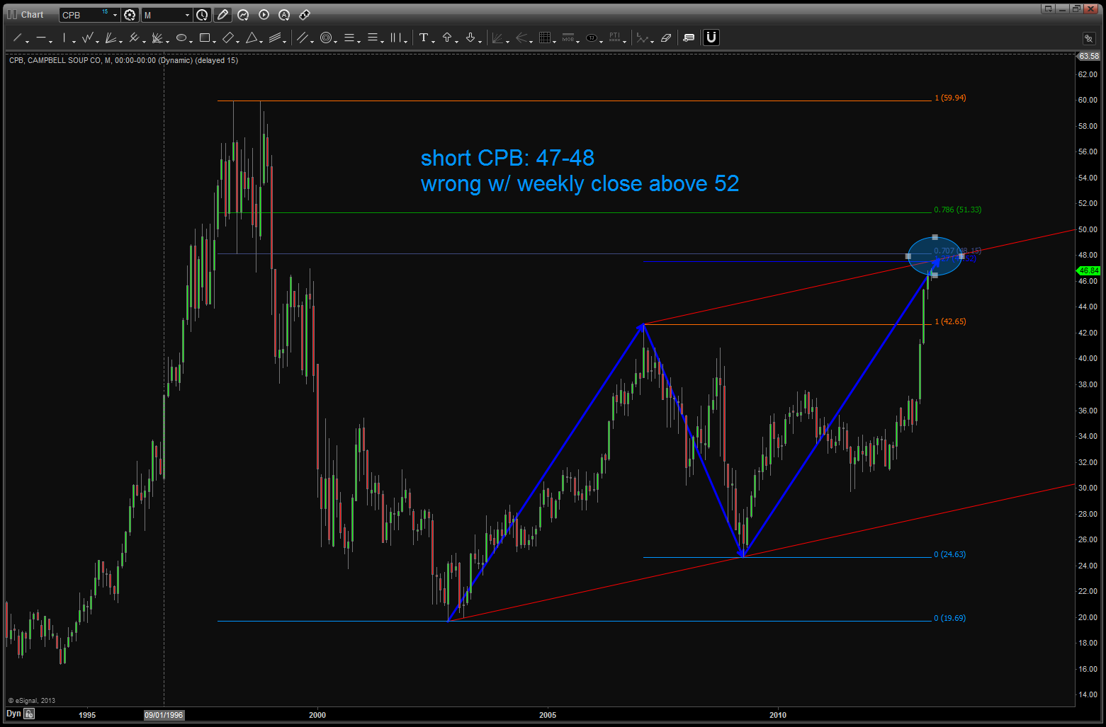
If you go all the way back 2 years ago you’ll see that we had a nice pattern forming and it hit – to a tee at 48.
The market pulled back about 10 bucks and then started to march back up … a slow grind but it did go up.
As you can see above 52 and it was considered a failed pattern.
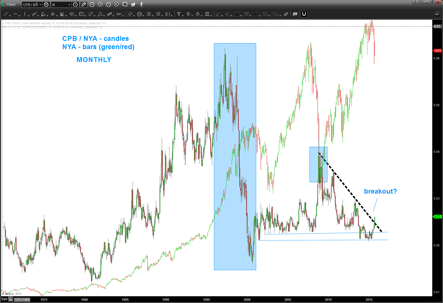
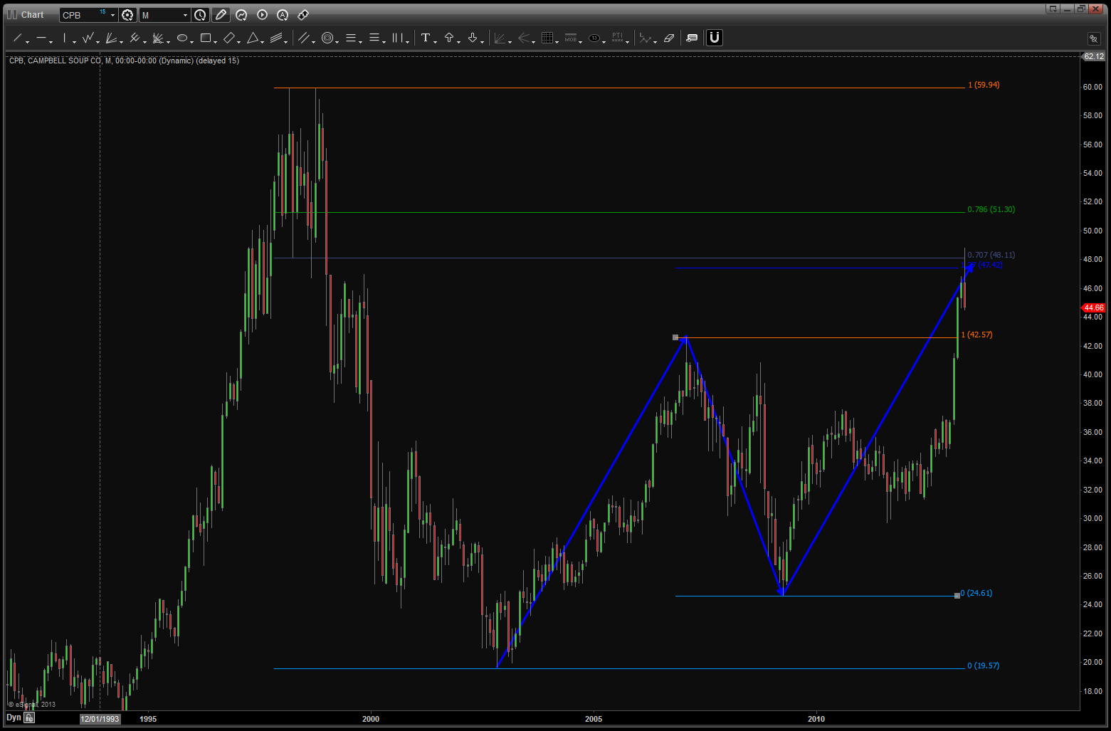
This week we went up and touched that level and, while I can see a 5 wave count up into this area and seeing an a-b-c type of correction what REALLY made me go hmmm is, of course the relative strength of CPB compared to the NYA. Why? STAPLES BABY …. a couple posts ago I mentioned we should be watching the XLP / $SPX for strength to signal more market weakness. Soup is a staple – period.
So, couple things of note:
- CPB is strong compared to the overall market.
- It has closed, on a weekly basis, the trend channel defined by the blue dashed line.
- there is a 5 wave count into the 52 area so warrant caution here if going to play on the long side.
- the short side is also a play, but would wait for the 48 level to be broken to the downside on a weekly close.
here’s what really has me interested in the RELATIVE STRENGTH OF CPB vs NYA
Points of Interest
- from the 1980’s CPB “outperformed” (the ratio went up) the overall market.
- the ratio TOPPED in 1997. the overall market didn’t top until 2000.
- but when the market did, eventually, top, the relative strength of CPB / NYA bottomed exactly the same time
- think about it for a moment .. the ratio CRASHED going into the top in 2000. Folks, that’s irrational exuberance. throw caution to the wind and get in, get in, get in and then ….ouch.
- while not as dramatic, the same thing occurred in the 2007-2009 period.
- the ratio bottomed as the market topped.
- presently, we do have some strength taking off and we have closed above the black dashed trend line.
- is that a signal that a strong move in the ratio is coming? Potentially, so monitor closely and do not be lulled to sleep. Strength in this ratio is not good for the overall health of the equity market.
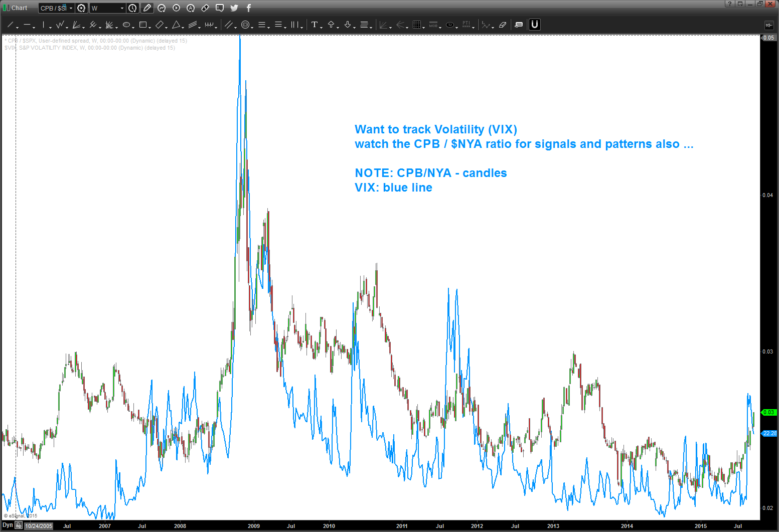
one last folks … let’s not try to “fundamentalize” this last chart. that’s for the really smart people .. but take a look at the CPB/NYA ratio and the VIX. It’s a near perfect match.
When the institutions start eating soup … expect volatility to rise.
swings on this puppy have been extremely nice ….charts below.
just follow the bouncing ball …
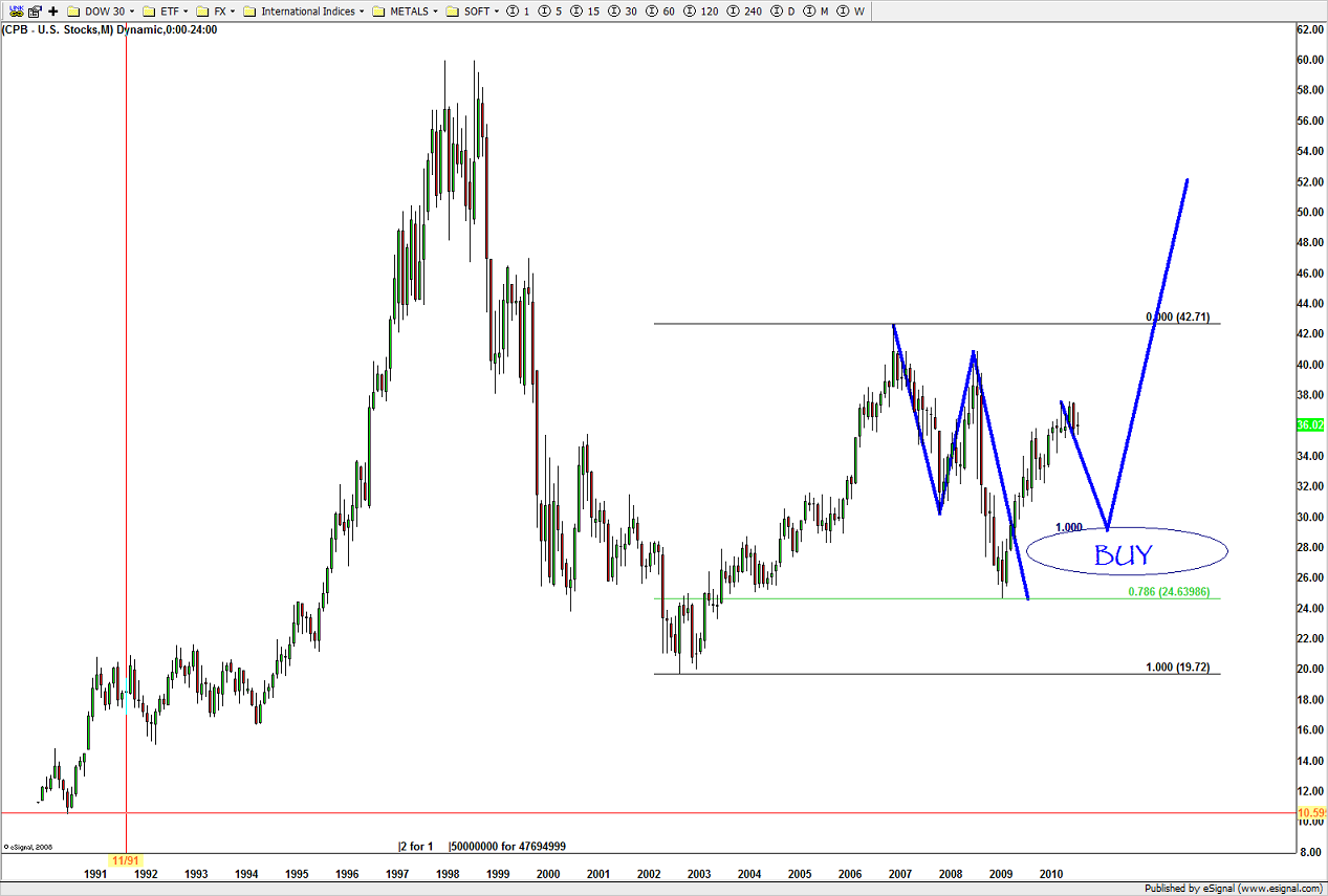
nice BUY pattern emerged at level forecast …
long term pattern came into play. good pattern/good defined risk …
level being hit ….
note, now we have completed the equality of swings and the level held at/around 41.
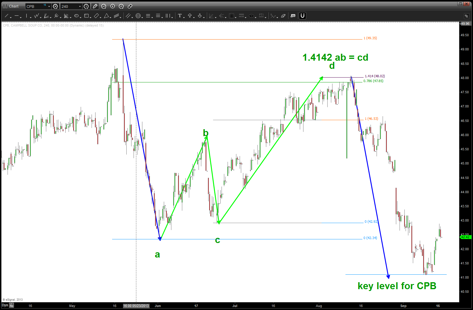
watch the lower level on CPB … if we break it, selling could really come in ….
