the Ratio – July 29, 2026

I’ve decided to check in on the XLP/NYA and let it guide our way … hopefully this will answer any question on what is ahead and provide strategies to manage risk and profit.
I truly live and die by the XLP/NYA ratio. It’s a ‘near perfect’ indicator of real-time institutional mindset – are they risk on or risk off? I use the NYA (NYSE Composite Index) because its big and isn’t weighted and just gives, big picture, how it’s really going … at least for me.
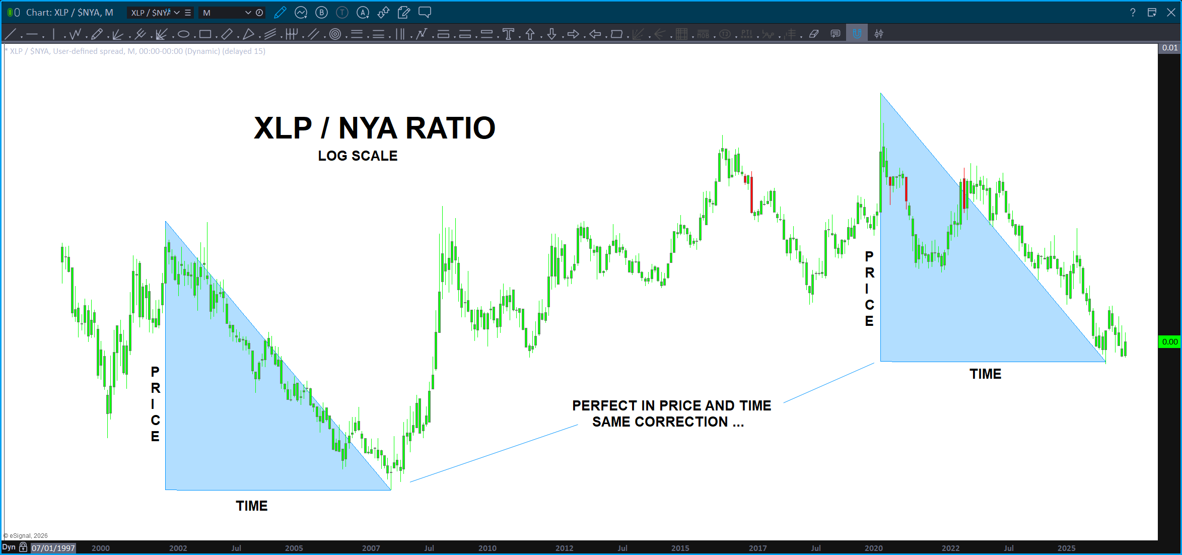
The chart below is truly a picture perfect work of art … it’s a LONG TERM monthly chart on the log scale. Think ‘percentages’ versus pure ‘price.’ The correction that we have just performed matches in both PRICE and TIME the same correction in the past. Why the big deal? It’s a perfect match of the biggest ‘correction’ for the history of the ratio.
Hence, that is why it was a line in the sand. I went on Stock Twits a few weeks ago and said “well, we are pretty much ‘here’ because I knew we were butting right up against support on the ratio and the move was coming – it was either 1/ going to find support and start up (bad for equities) or 2/ crash on thru the biggest correction and the replica of it in price and time. Market would have exploded higher …
Guess what?
Looks like it’s starting back up …
So, w/ the probability the ratio going up versus going down, where could it go?
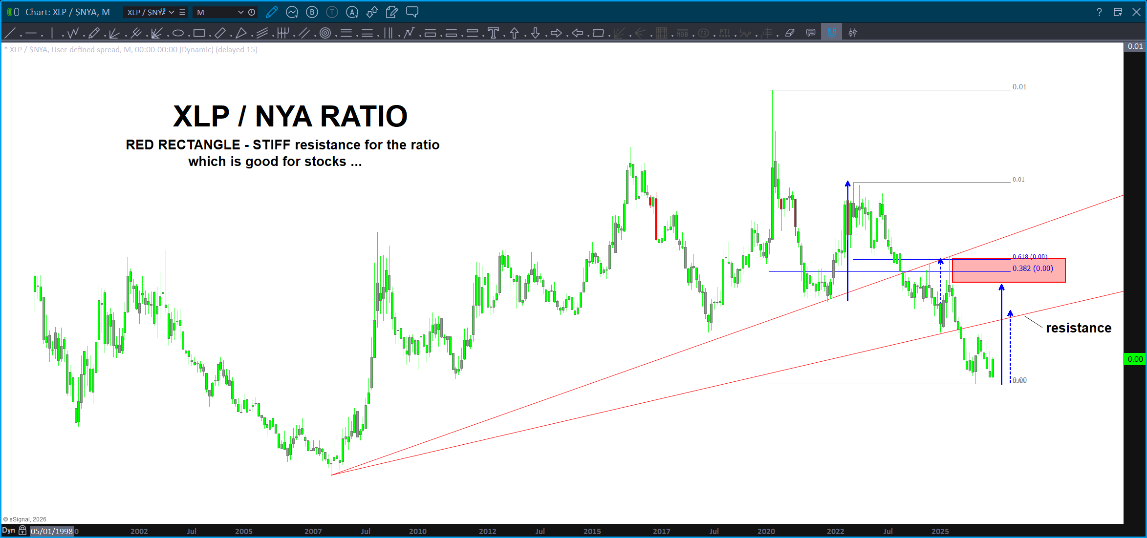
In the chart above, I’m using ‘measured moves’ of the prior corrections (the blue and dashed blue arrows) to PROJECT where this ‘correction’ could be going …
Using the concept of polarity and using the trend line from the all time low we can see that strong resistance ‘should’ be present at the arrow and it’s also about equal to a minor correction in the past.
Using the larger corrective moves and a Fibonacci confluence zone, this is where we will start to think about getting LONG the stock market. Yes, that appears to be a far distance and, frankly, it is.
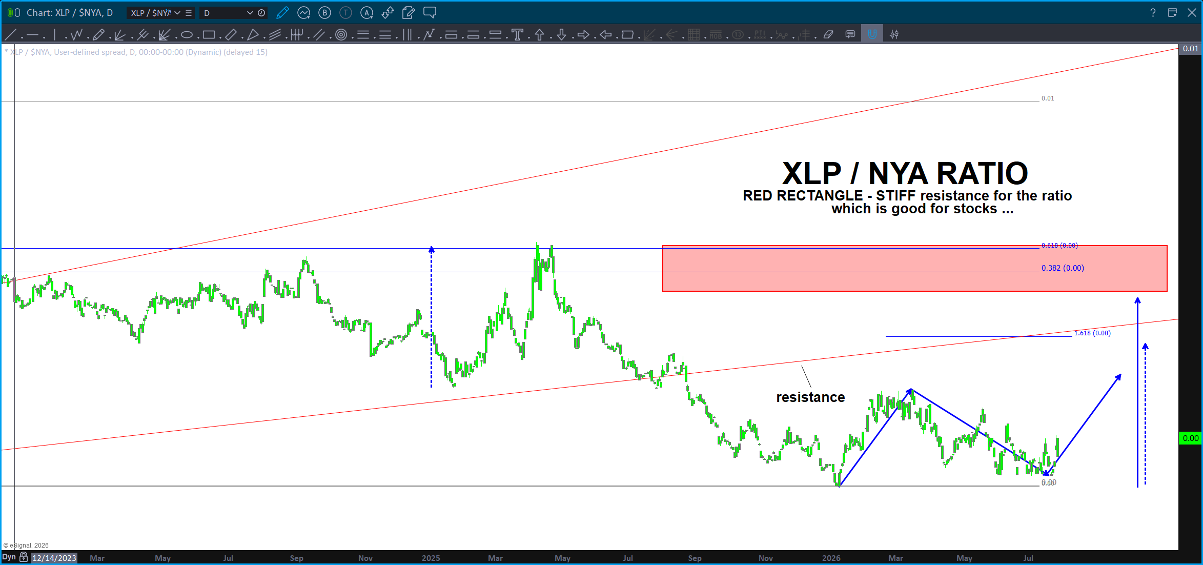
Above is the daily chart – take note we have moved from Monthly, Weekly, down to the daily. Always funnel yourself into time frames where you can take action. As discussed above, the target zones are above. It doesn’t ‘have to’ go all the way up there … we need to see strength in the rotation (as in continued selling – the institutions – who most of the time have to stay invested all the time – are getting out of speculative holdings and moving over to good old Toilet Paper!
Also, take a look at this target on the JUNK BONDS. Yup … I was telling someone the other day, forget who it was, that the Junk Bonds have been diverging from the markets and that’s usually been and ‘other’ in the world of goods and others. Looks like the are selling off, below, but also look at the VERY powerful support confluence on JNK. That should be STRONG SUPPORT.
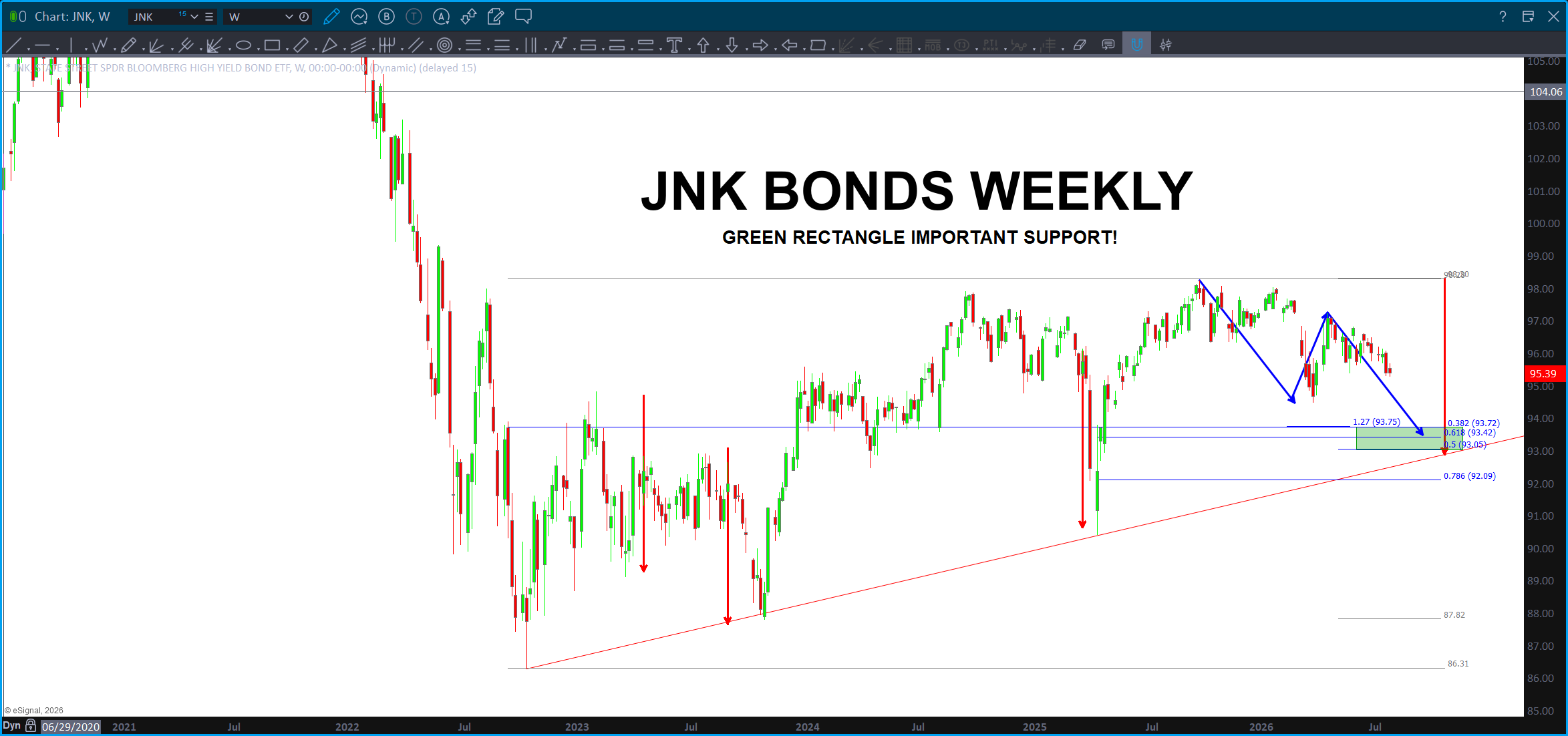
This is a weekly BUY pattern w/ a zone showing measured moves, ‘the’ bullish trend lines that have kept the junk bonds alive and a bunch of ‘numbers’ creating a confluent zone. If we are going to get a ‘first clue’ IF this is a BIG TOP or if this is a pretty normal, perhaps a little scary because ‘some’ sectors of the market were going parabolic but for the ‘steady eddies’ they’ll correct but, ultimately, release some steam and then start chugging again.
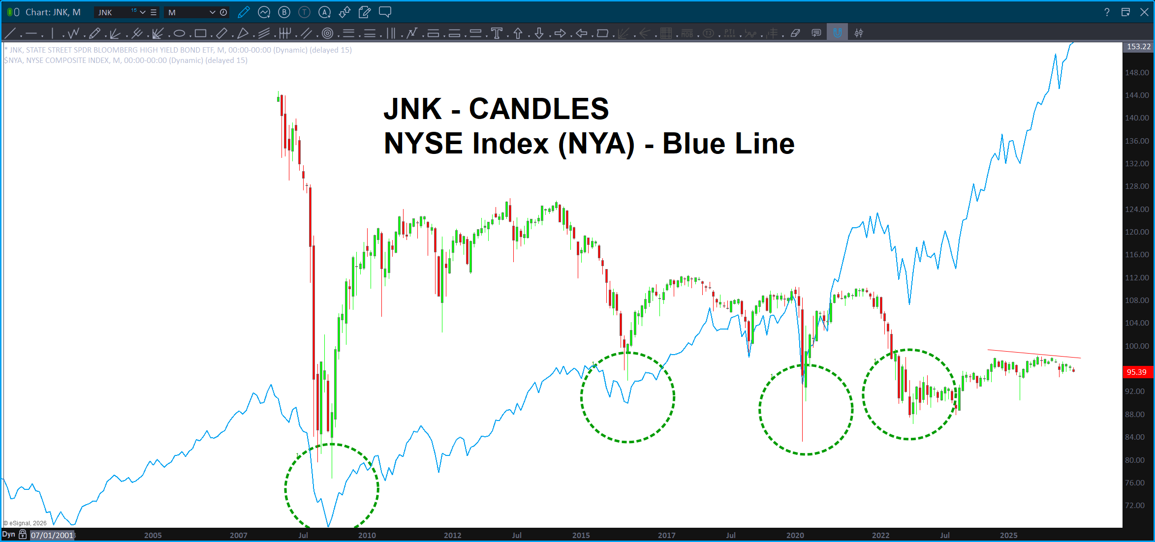
The pattern shown on the JNK is, in my humble opinion, THE level to watch for the severity of the correction. W/ today’s sell off it sure looks like some selling will continue in conjunction w/ the JNK so, simply, expect that. Let’s get really really interested when price approaches the green support – BUY – zone. That’s a good first line in the sand to see what’s really going on …
Technology or Toilet Paper – Mr. Institution?
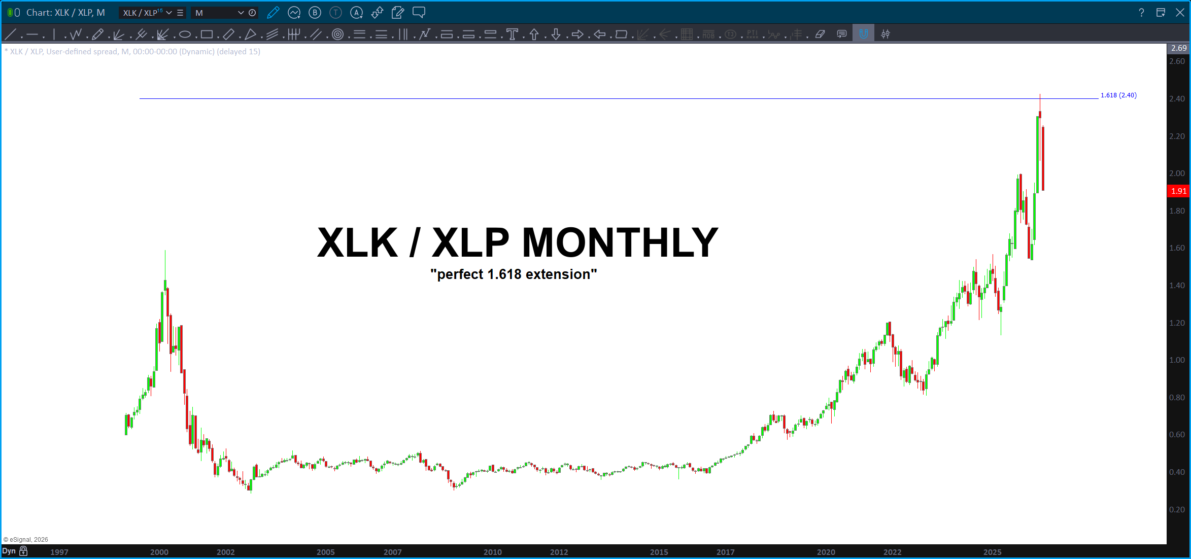
The XLK (technology)/ XLP (staples) ratio slammed right into the 1.618 extension and certainly looks like it wants to go lower …
So, some good targets for the ratio. My bet is the patterns have held and today’s price action gave us the first hint to expect some selling. The real severity of the selling? We’ve got some perfect targets below …
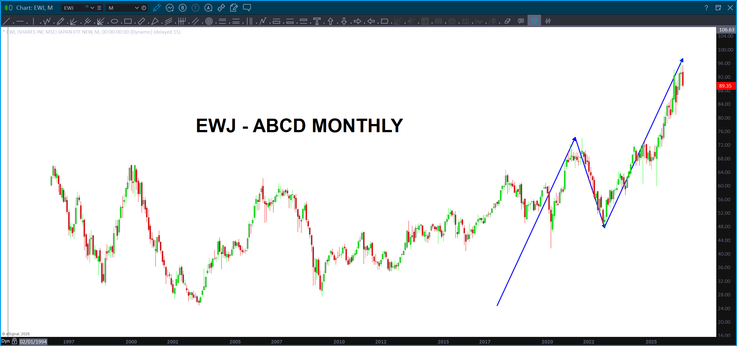
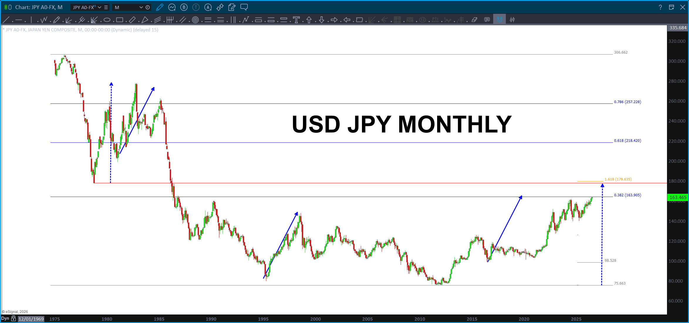
Keep an eye on Japan. The Yen keeps losing strength, but there is quite the thumping going on, unfortunately, for our Asian friends and their markets. No kidding, people were SO LEVERED they are getting wiped out … does this mean it will be a contagion spreading to other markets? I have no idea, objectively. Subjectively, just me who isn’t a fundamentalist at all. (Not smart enough.) But, wouldn’t it make sense that there would be some reciprocal selling? Probs …
And here is the USD vs JPY. Check that out – right at the .382 of the entire bear market run from 1972. Hmmmmm resistance anyone? If that doesn’t hold it, we have another set of strong targets a little higher also. Keep an eye on the Yen!
 Bart's Charts