Using ratio’s for relative strength comparison
If the Numerator is bigger than the Denominator then the ratio goes UP. If vice versa, the ratio goes down. If we put one security over another then we can plot the relative strength and note when a shift in this relative strength takes place. This shift can show rotation. What you’ll find is the XLP/$SPX ratio EXACTLY nailed all the highs and lows since 2000. Yes, the high in 2000 was accompanied by an inflection in the ratio … what is of interest now is the ratio has not made a new low while the S&P makes new highs. This divergence is important …

XLP/SPX showing a buy after a typical a-b-c correction
here’s a long term monthly of the ratio posted on this blog in/around November. 2014 has shown a divergence that has not occurred since the XLP came on line. The divergence is a “new high” in the S&P while the ratio has NOT made a new low. Monitor …
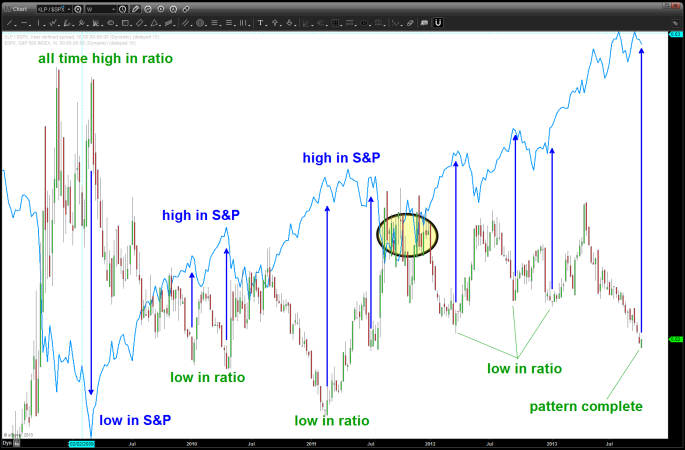
long term chart showing tops and bottoms since 2000 have corresponded in the XLP/SPX ratio inflection
lastly, I like to use a “real world” or “main street USA” stock to monitor w/ the ratio analysis … WMT/SPX has also been extremely helpful in topping or bottoming at major inflection points. Suprisingly, this ratio has not made new lows either. In the classic technical analysis realm – looks like a double bottom forming.
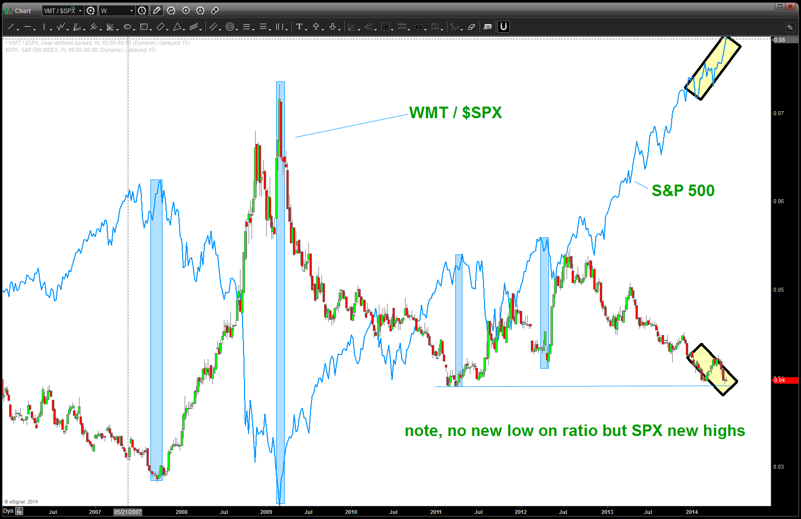
WMT/SPX ratio
