CLIFF NOTES: below is a weekly continuous contract of the lumber futures. all the ratios come together at 241-242. this is a very nice one….stay tuned. might/could find support a little lower and then it’s off to the races in/around here but the larger pattern is very nice. appears bullish from a WOOD/CUT/Lumber Futures perspective.
CLIFF NOTES: the “chart of my lifetime” is still just that – an amazing chart of, quite frankly, my lifetime. I think it’s safe to say that the pattern from genesis of the Dow Jones Transports has been defeated. A pattern that took 45,000 days (+) to form and complete. Again, please, let that sink in … read it again, and one more time. In the world of probability this was a highly probable pattern that should have at least cause some pullback congestion ….! NOPE … not even close. Take a look at the BREAKAWAY MOVE and the explosion from the pattern area. Reminds me of the GOOGLE short at 921…if you remember, that level held for 6 months! Then exploded higher in a 100 point gap that was definitely egg in my face. O U C H …but, this pattern was less than 10 years old and it held GOOG for 6 months. Please, again, go back a couple sentences …the Transports pattern was 100+ years old. The PATTERN didn’t even hold it for a week …
CLIFF NOTES 2: I’ve gone back thru BA, AAPL, WYNN, PCLN, FB, IBM, LNKD, AMZN, SBUX, etc and those patterns WORKED and while they have all retraced the initial crack lower they sure do appear to be ready to surge forward w/ the rest of the market.
CLIFF NOTES 3: I’m baffled, a little concerned and well quite angry. Why? Not because the PATTERNS failed or didn’t….that’s called probability folks. I’m sharing my emotions because this puppy NEEDS TO CORRECT and that’s a good thing. Mentors of mine that have traded for 40+ years have taught me (which I believe) cycles that are extremely reliable and some of the most BEARISH CYCLES that we have ever witnessed (if you know it or not) hit in MAY and NOTHING happened. Read that last sentence again … it was, literally, the perfect storm of cycles. Am I questioning the cycles – nope. I AM QUESTIONING WHAT THE HELL IS GOING ON !!!!
1. IT makes up 19% of the S&P 500. I have chosen to use the VGT ETF as a proxy.
I see blue arrows which represent maximum measured moves since 2009. We are completing one of those moves up against the 5 year trend line.
I see a black/yellow triangle which represents TIME and we are 7 weeks past the last major move w/out a “nice” correction.
I see BEARISH DIVERGENCE
I see an increase of volume which reminds me of FOMO “selling at the bottom” and “buying at a top”
CONCLUSION: resistance and correction ahead. Expect anywhere from 94-100 to hold this puppy back. 64 is not out of the question for a correction.
IT ETF 19% of S&P 500
2. Financials are 16% of the S&P 500. I have chosen XLF as our proxy vehicle for this sector
I see the “basic” AB=CD (blue arrows) holding, so far.
I see bearish divergence
I see very very low volume
XLF Financial ETFintraday XLF
3. Health Care is 13.3% of the S&P 500. I have chosen the XLV as a proxy
I see NO PATTERNS nothing but a straight up rocket ship. I reference Sir Isaac Newton and the law of gravity.
check out the RSI … so much for bearish divergence. A YEAR OF IT! But, HERE IS A KEY POINT – NOTE THE SPIKE IN THE BEARISH (RED) VOLUME AT THE LOWS (BLUE SQUARES) EVERY TIME THE SELLING SURGES THE ETF BOTTOMS. LOOK FOR THAT AGAIN ….
4. Consumer Discretionary is 11.9% I have used XLY as the proxy vehicle.
I see STRAIGHT up w/ a POTENTIAL BUTTERFLY SELL PATTERN FORMING.
I see bearish divergence
I see an intraday sell pattern.
5. Industrial s make up 10.7% of the S&P 500. I have chosen XLI as the vehicle proxy.
I see the same picture as the past couple. An amazing and powerful bull move up w/ no hint of corrections at all. some daily patterns are present in/around here.
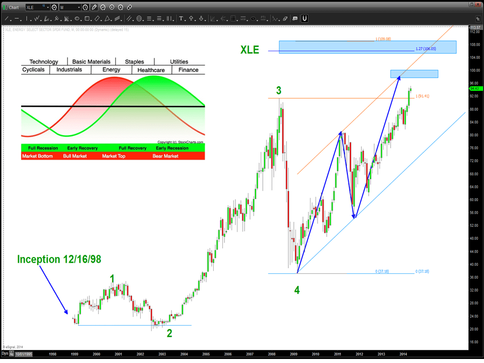
6. Energy makes up 10.5% of the S&P 500. I have chosen XLE as the vehicle proxy.
please see this post on the IMPORTANCE of the ENERGY SECTOR w/ regards to SECTOR ROTATION and the business/economic cycle:
7. VIX – it’s different this time and there is NO FEAR IN THIS MARKET – NONE. All I can say (note: bold,underline, italicized) is REALLY ?????
8. I have shown the importance of ratio analysis and especially the XLP/SPX ratio. I expected it to be making new lows based on the equity action – NOPE, it’s showing remarkable strength which tells me the “big boys/girls” are rotation into this sector. Watching the “standard” .618 and .786 retraces to hold this pullback. If we go into new lows the equities will continue to surge …
CLIFF NOTES: in Mark Douglas’s amazing work, on page 132 of Chapter 8 he defines an edge as “nothing more than an indication of a higher probability of one thing happening over another.” My edge is pattern recognition based on square roots and the inverse of those square roots. As my friend and mentor Larry Pesavento (www.tradingtutor.com) said “defy the human condition and do the work.” If you spend as much time as I have in front of charts you’l find that in the midst of the chaos there is patterns that appear and they give you an edge.
My exemplar below is, simply, silver and the PATTERN that existed from $8.00 to 50 and then back down and the PATTERN that is now coming into play at/around 14. What does this mean? Well, see above – it mean it’s an edge and it might hold and, then again, it might not.
All of these charts are real time w/ ZERO “could of, would of, should of” … the PATTERNS work, technical analysis works and get ready to rumble at 14/oz.
ROCK ON, ok?
ONE: note the red line – EXACT same corrective move DOWN into 8/oz
TWO: I like the symmetry, I like the mirror image fold back and I LOVE the EXPLOSIVE MOVE UP back in the past – BUY at 8
THREE: here we go … NOBODY BELIEVED ME WHEN I SAID GET IN FOR A POTENTIAL $50 dollar targetFOUR: the geometry at the top that was completing the foldback pattern from the past – time to shortFIVE: symetry and measured moves complete – sure looks like falling off a cliff on the other side of the foldback
SIX: the game plan of the correction unfoldingSEVEN: 3 waves up complete – looks like a FLAT CORRECTION – here comes CEIGHT: triangle 4 then a plunge into the 14 area seems like a PROBABILITYNINE: continued look at the potential for the fall into the 14TEN: Silver as of 05/29/2014
CLIFF NOTES: the cash S&P closed at 1909.78 yesterday. 1909 days ago was 03/07/2014. Price is equal to time …What I have also shown is, simply, how powerful this move IS … zero, notta, none, null set, etc. describes a single swing low being broken. Note the blue lines … we have discussed them before. Until a swing low breaks this band is going to continue to play. TONS of patterns showing SELLS but perhaps TONS of patterns will all fail?
CLIFF NOTES: I think the “blue box” will be major support.
the BLUE BOX
On more than one occasion I’ve been asked if flying F-14’s has helped me investing. The answer is YES and NO. Yes because it made you appreciate risk, be methodical and “check list” oriented and, believe it or not, become somewhat analytically motivated. But, it has also HURT because of the detail oriented nature that it takes to be a strike fighter aviator these days. Let’s face it, margin for error is EXTREMELY low and therefore, at the expense of slippage, I try to get it too much to a “gnat’s ass” then is necessary in the fluid and dynamic ecosystem of the liquid markets. I’ve come to accept that so I’ll let moves go because they never made my level ….
in flying off an aircraft carrier you get to that point where you do ask yourself – “have I done everything I can to not become fish food?” in tension, w/ the thumbs up and the pilot saluting your about to go on “Mr. Toad’s Wild Ride …” It’s the same thing trading/investing. So, the ride is now the Spot FX market so let’s see what ride is waiting for us …
have we done everything to manage risk .. here comes Mr. Toad’s Wild Ride …!
1. USD vs CAD (Loonie) – look for polarity. Having a PATTERN smack against the brick wall (resistance or support) of polarity increases probability
2. try (the operative word) to figure out past/former corrective moves in PRICE and TIME. Note, since the BIG yearly correction (10/2011-09/2012) the current move has been the “longest” in TIME. shown below is the black arrows down at the low and pasted on current price action. it takes us right down into the two blue horizontal lines (polarity) that is good ….I am going to remove them so as not to cloud the picture.
note the black arrows – equal corrective moves
3. now, before we do some projections I want to go into some “basic” Elliott wave corrections. Note, the first chart that had the dashed box around it? We are seeing a three wave into a new high. quite frankly, that is what this entire analysis of a BUY USD vs CAD is banking on. this is a classic “B” wave correction. Right now, current price action down is a C wave and that denotes we are coming to an end of move. below you will find a daily chart showing the 3 wave move up. also note, typically in an expanded flat (the correction which is unfolding) the C wave is 1.618 of the A wave. Also shown is a “classic” butterfly topping pattern (shaded blue triangles – it looks like a butterfly) Also make you see the purple and blue projections into the shaded blue areas. To finish here, typically (as a rule of thumb) corrections tend to go or stop at the previous 4th wave of a lower degree. I have cleaned up the chart to show this .. note the classic 5 wave triangle of a,b,c,d,e and then the thrust up into the high. Well, that’s the 4th wave of a lower degree and guess what? our blue shaded region is right in this area. so, additional confirmations to add to the PROBABILITY.
the key to this analysis is an expanded flatprevious 4th wave triangle of a lesser degree lines up w/ shaded blue area
4. now, we are going to add in some extension PATTERNS. Note, we are starting the extensions from wave a and have the .14142 and 1.618 extensions right in our shaded blue area and then we do an extension from the last low in/around 1.080 to complete the 3 drives to a bottom a shown by the black arrows. note – all of these extensions are taking us into the blue shaded region.
extension targets
5. do retracement grid.
retracement grid and note the RULE that 4 can’t go below 1
6. do other stuff that nobody else believes works …
7. I want to mention is how the USD vs LOONIE used to be inverse/opposite and was a good indicator to look for a SELL index and BUY USD vs LOONIE. That relationship, for whatever reason is synced. Believe it might come uncoupled sooner or later but make sure to keep an eye on it.
Cliff Notes: if your new to this blog you’ll find that it’s all based on geometry and pattern recognition. If you take a look at weekly crude it’s not hard to see that beautiful support line that’s been holding crude up since September 2009. So, when I see that I say “why” and “what’s important about that from a geometrical stand point.
1. Draw a line down from the all time high on crude into the crash low in the low 30’s. That vector is aligned in PRICE and TIME and gives rise to a natural angle.
2. Get a protractor and draw a 90 degree angle. (shown by the purple 90 degree angle shown up at the top of the all time high)
3. Now just “copy/paste” the red vector lines and create squares.
4. note the trend lines that have been “bounding” crude oil (bold red lines)
5. now, be patient and watch price as these lines are “attacked” so, no matter what the fundamentals say, we have our targets and ranges to play and add in additional tools that fit your style, techniques and fundamentals.
6. get a glass of wine or whatever fits your fancy, blow this chart up and look at gaps, consolidation you’ll find there is a lot of action …
just showing by the chart below 1) a 5 wave count since it’s inception and some targets and 2) the sector rotation guide that shows energy peaking last before the cycles turn down. we have shown many many PATTERNS that are calling for a sell. Some have worked, some haven’t but as you can see the targets depicted on the XLE are just a little higher and then, again, we take pause and adjust accordingly.
CLIFF NOTES: we are up almost 3% above the PATTERN that completed from the all time low on the transports some 46,000 ish days ago. Is that statistically significant? Well, I honestly don’t know. We do have the 1.618, 1.68179 (musical note F#) and the 1.732 extension targets that are being played with …so, my “line in the sand” so to speak will be the 8050 level. IF WE GET A DAILY CLOSE ABOVE 8050 THEN THIS PATTERN HAS FAILED. Again, this pattern is 46,000 days “old” and SHOULD be massive resistance. Not calling for a crash or anything like that but it certainly should pause it. And, let’s take a look – no swing low has been broken and it just keeps on “trucking” so to speak. (pardon the pun)
here is the post w/ the chart: http://bartscharts.com/2014/04/01/the-most-important-chart-in-my-lifetime/
I do see a 5 wave sequence coming into play so we’ll just have to wait and see …


